Data smoothing
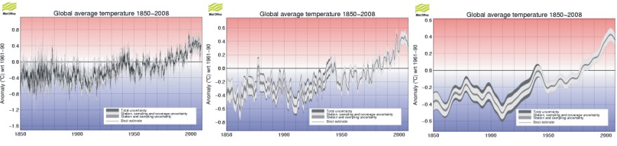
HadCRUT3 monthly global surface air temperatures since 1850 (left panel). HadCRUT3 annual global surface air temperatures since 1850 (centre). HadCRUT3 annual global surface air temperatures since 1850 smoothed with a 21-point binomial filter (right panel). All diagrams were downloaded from the Hadley Center 7 March 2009.
Smoothing of data series is a common technique in many branches of science, and many fine textbooks discuss various approaches to this. The first paragraphs below is adopted and modified from Davis (1973), but similar texts can be found in other statistical books.
Statisticians have borrowed several terms from the jargon of electrical engineering, and sometimes speak of a sequence of data as being “noisy”. This implies that the observations consist of two parts; a underlying signal (a meaningful pattern of variation), and a superimposed noise (a random variation with little meaning). These expressions are most likely to be encountered in time series problems, because research on radio-signal analysis has contributed greatly to this branch of statistics. In geophysics the smoothing process usually is known as filtering, and the mathematical equation describing the smoothing calculation is called a filter.
The idea that a meaningful message is submerged in the mixture of often confusing data that a meteorologist accumulates is an appealing one, and attempts to apply time series techniques to meteorological and climatologically data are becoming increasingly prevalent.
Electrical engineers have developed a number of techniques for enhancing a signal with respect to noise. Noise is short-term, and fluctuates rapidly. Signals, in contrast, tend to be long-term. In other words, successive values of the signal usually are autocorrelated, whereas noise at one point is completely independent of noise at adjacent points. As the signal tends to be the same from one point to nearby point and the noise does not, an average of several adjacent points will tend to converge on the value of the signal alone.
The most obvious type of data smoothing is a simple moving average, but other calculations may be adopted instead. The moving average is calculated as the sum of N observations, divided by N (N should be an odd number), plotted at the central year in the observation series. By this, a 3-yr moving temperature average is calculated as the sum of temperatures three years in a row, divided by three, and the resulting average value plotted at the interval midpoint year. The interval midpoint year is also called the estimated point or year. It should be noted that, because the smoothing interval extends N/2 years on either side of the estimated year, the moving average cannot be computed for points at the beginning and at the end of the data sequence considered. If N is 11 years, for example, a smoothed estimate cannot be computed for the first five or last five years in a sequence. In other words, a uniformly smoothed graph can never extend all the way to the endpoints of the data series considered.
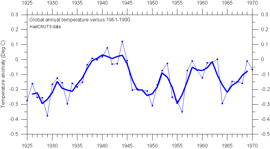
HadCRUT3 annual global surface air temperature, compared to the WMO reference period 1961-1990 (thin line). The thick line show the 3-yr moving average.
Now consider the HadCRUT3 global temperature 1925-1970 shown in the diagram above. The thin line indicates the individual years, and the solid line is the 3-yr moving average. As an example, the smoothed value for 1955 is calculated as the sum of temperatures 1954-1956, divided by the length of the smoothing interval (3 years). The meaning of the expression data smoothing should be apparent from this illustration. Smoothing reduces the variance of the original data; the longer the smoothing interval, the greater the reduction.
The figure above also indicates some of the hazards associated with data smoothing. For the time interval 1935-1940 the annual temperatures increased regularly, and the smoothed curve is a subdued approximation of the original thin curve. In the remaining part of the diagram, however, the real data are fluctuating much more, and the smoothed line deviates markedly from the original data.
The most serious consequence of smoothing or filtering is the shift of peaks and troughs in the smoothed curve, relative to the original data. As an example, the smoothed temperature peak 1952 is shifted away from the real peak occurring the following year. Likewise, the smoothed temperature minimum in 1965 really occurs the year before in the originally data. In addition, the smoothing procedure tends to indicate the onset of both temperature increases and -decreases before they really occur. As an example, the 3-yr moving average shown above above suggests a temperature increase beginning in 1949, one year before it really happens according to the original data. Likewise, the smoothed data suggest a temperature decrease beginning 1952, while the temperature decrease first began in 1953, according to the original data. In general, if the original data contain asymmetric peaks, smoothing can seriously and persistently shift the peak locations; the actual error in all such cases increasing with the length of the smoothing interval adopted.
The diagram below show the identical data series as shown in the diagram above, but now smoothed with an 11-yr smoothing interval. This illustrates how more and more details are lost as the length of the smoothing interval is increased.
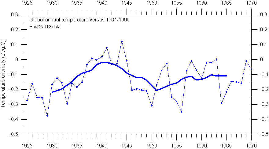
HadCRUT3 annual global surface air temperature, compared to the WMO reference period 1961-1990 (thin line). The thick line show the 11-yr moving average.
This diagram illustrates another consequence of data smoothing: The smoothed values cannot be calculated for the very first and last years in the data series, as the smoothed value usually is associated with the smoothing interval midpoint year. The cut-off length at each end is calculated as: (length of the reference period-1)/2.
The need for practical solutions in electrical engineering, however, have here created a tradition for drawing the smoothed curve all the way to the endpoints of the original data series. This may be done by assuming that the last observation in the existing data series is representative for the future, but still unknown data, or it may be estimated by other means. This is, however, a procedure with great potential for both errors and surprises. If the temperature data series towards the end is showing gradually increasing values, the smoothed graph drawn all the way to the end point will show an enhanced temperature increase, and vice versa, when temperatures are decreasing towards the end of the data series. As the drawing of smoothed graphs beyond the cut-off points is not dictated by necessity within climate science, this unfortunate habit should consequently be avoided. A frequent, but invalid, argument for extending smoothed graphs beyond their formal limits is that it looks nice.
The above considerations remains the basic explanation for the late March 2008 correction carried out by the Hadley Center, which identified an error in how they visually presented smoothed temperature data up to then. The official explanation given by the Hadly Center is reproduced below:
"We have recently corrected an error in the way that the smoothed time series of data were calculated. Data for 2008 were being used in the smoothing process as if they represented an accurate estimate of the year as a whole. This is not the case and owing to the unusually cool global average temperature in January 2008, the error made it look as though smoothed global average temperatures had dropped markedly in recent years, which is misleading".
The honourable
Hadley Center far
from alone in doing this, and the habit of extending smoothed graphs beyond
their formal limits is widespread today. The reason for drawing attention to the
Hadley Center here is simply that they recently went public on the issue of data
smoothing, when they realised they faced a problem. The fact remains, however, that
extending smoothed graphs beyond their formal endpoints represents an
unfortunate habit which should be avoided in the analysis of meteorological data
series. Always ask to see a plot of the original data along with the smoothed
graph.