Ocean temperatures and sea level
-
Tropical sea surface temperature and global surface air temperature
-
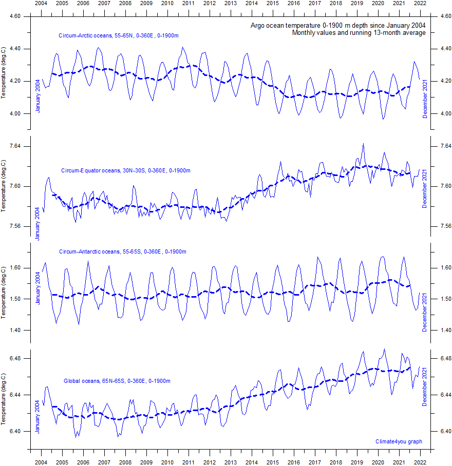
Circum-Arctic ocean temperatures from surface to 1900 m depth
-
Circum-Equator ocean temperatures from surface to 1900 m depth
-
Circum-Antarctic ocean temperatures from surface to 1900 m depth
-
Global ocean net temperature change since 2004 at different depths
-
Average sea temperatures in the upper 300 m at Equator in the Pacific
-
Global average temperature versus La Nina and El Nino episodes
Open Climate4you homepage
Recent sea surface temperature
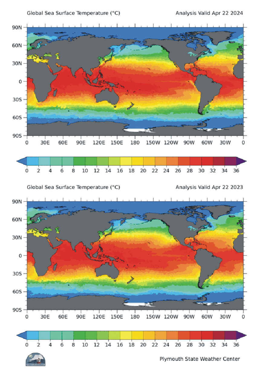
Global sea surface temperatures 24 April 2025 (upper panel) and 2024 (lower panel) according to Plymouth State Weather Center.
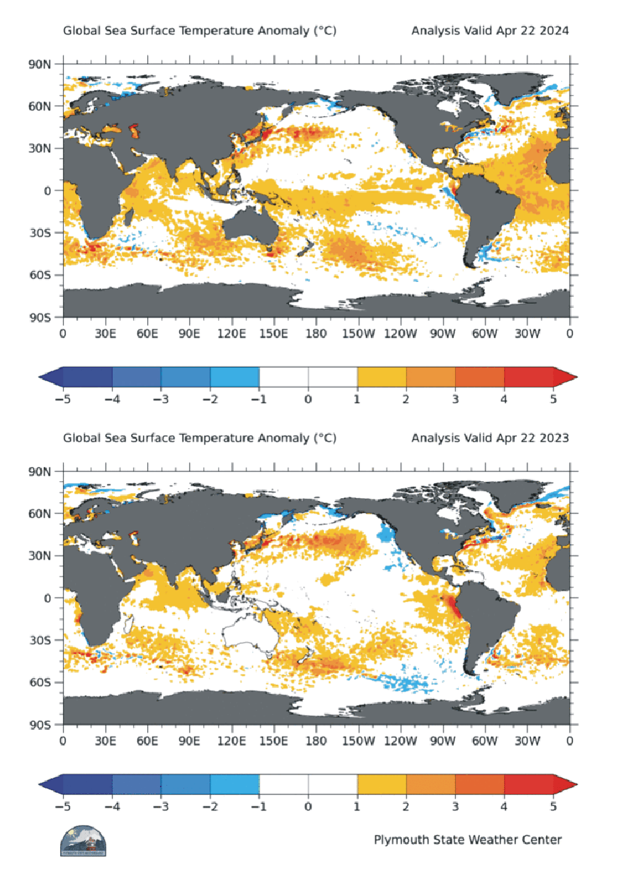
Global sea surface temperature anomaly 24 April 2025 (upper panel) and 2024 (lower panel) according to Plymouth State Weather Center. Reference period: 1977-1991.
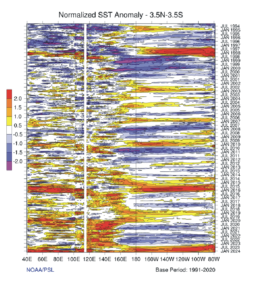
Sea surface temperature variations since January 1983 across the Indian and Pacific Ocean, between 3.5 degrees north and south of Equator. The west-east transect shown covers the area between the east coast of Africa and the west coast of South America. Diagram source: NOAA/ESRL. Please use this link if you want to see the original figure or want to check for a more recent update than shown above. Last day shown: 15 April 2025.
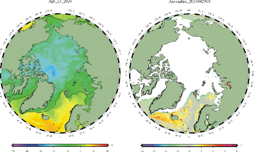
Arctic and North Atlantic sea surface temperature (degrees C) on 25 April 2025, according to the Centre for Ocean and Ice at the Danish Meteorological Institute (DMI). This map shows the current sea surface temperature (SST) to the left, and the anomaly (deviation from the average of the reference period) to the right. White areas represents the current sea ice cover. Grey areas are land areas. Reference period: 1961-1990. Please use this link if you want to see the original figures or want to check for more recent updates than shown above.
Click here to jump back to list of contents.
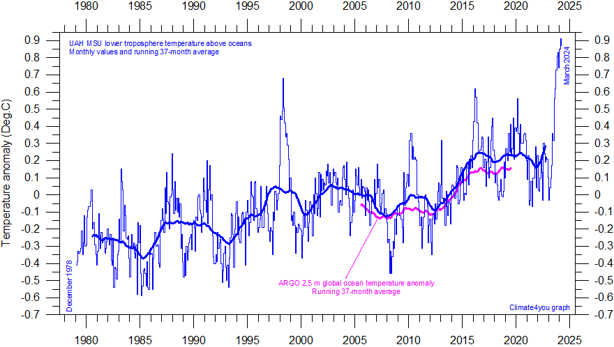
Global monthly average lower troposphere temperature above oceans since 1979, according to University of Alabama at Huntsville, USA. The thick line is the simple running 37 month average, nearly corresponding to a running 3 yr average. Reference period 1981-2010. Magenta line is the running 37-month average of Argo float measurements, shown for comparison. Reference period 1991-2020. Last month shown: March 2025. Last diagram update: 19 April 2025.
-
Click here to download the entire series of UAH MSU global monthly lower troposphere temperatures since December 1978.
-
Click here to read about data smoothing.
-
Click here or here to see more Argo-measurements.
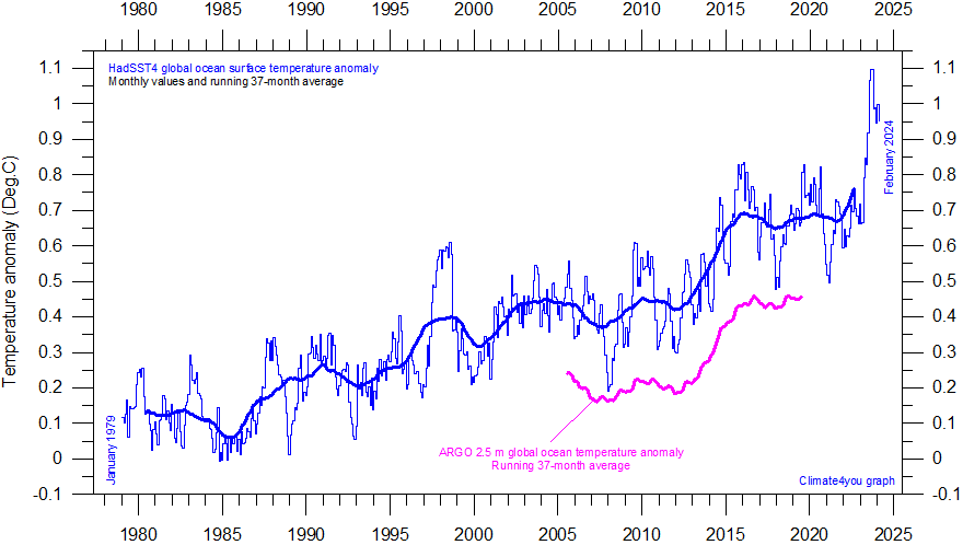
Global monthly average sea surface temperature (SST) since 1979 according to University of East Anglia's Climatic Research Unit (CRU), UK. The data series (HadSST2) are described by Ranier et al. (2006). Base period: 1961-1990. The thick line is the simple running 37 month average, nearly corresponding to a running 3 yr average. Magenta line is the running 37-month average of Argo float measurements, shifted +0.2 degrees for easy comparison. Last month shown: March 2025. Last diagram update: 13 May 2025.
-
Click here or here to download the entire HadSST4 temperature series since 1850.
-
Click here to read a description of the data file format.
-
Click here to read about data smoothing.
-
Click here or here to see more Argo-measurements.
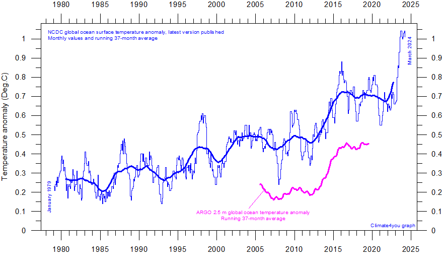
Global
monthly average sea surface temperature (SST) since 1979 according to the National
Climatic Data Center (NCDC), USA. Base period: 1901-2000. The thick line is the simple running 37 month average, nearly
corresponding to a running 3 yr average. Base
period: 1901-2000. Magenta
line is the running 37-month
average of Argo float
measurements, shifted +0.4 degrees for easy comparison.
Last month shown: April 2025. Last diagram update: 14 May 2025.
-
Click here to download the entire NCDC SST temperature series since 1880.
-
Click here to read a description of the data types used for producing the NCDC SST data series.
-
Click here to read about data smoothing.
-
Click here or here to see more Argo-measurements.
June 18, 2015: NCDC has introduced a number of rather large administrative changes to their sea surface temperature record. The overall result is to produce a record giving the impression of a continuous temperature increase, also in the 21st century. As the oceans cover about 71% of the entire surface of planet Earth, the effect of this administrative change is clearly seen in the NCDC record for global air temperature. The comparison with the Argo data (magenta line) show that the latest NCDC administrative change unfortunately resulted in an inferior record, compared to the previous (May 2015) version.
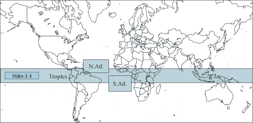
Coverage map for sea surface temperatures shown in the four diagrams below. See also this link.
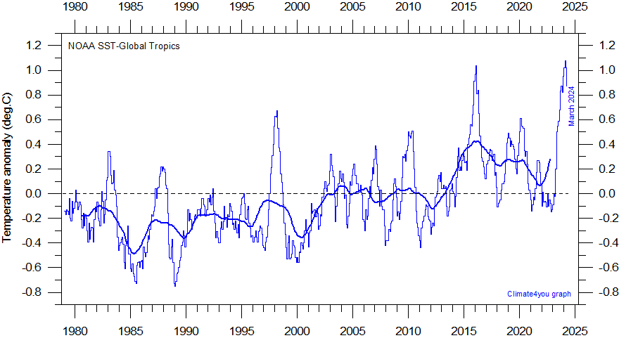
Global monthly sea surface temperature (SST) in the Tropics (10oN-10oS, 0-360o) since 1979 according to the National Oceanographic and Atmospheric Administration (NOAA) Climate Prediction Center (CPC). The geographical sampling area is shown in map above as 'Tropics'. The thick line is the simple running 37 month average, nearly corresponding to a running 3 yr average. The warming period directly influenced by the 1998 El Niño is clearly visible. The data series goes back to January 1950. Here it is shown since 1979, to enable easy comparison with air the global temperature estimates shown above. Reference period: 1981-2010. Last month shown: April 2025. Last diagram update: 14 May 2025.
-
Click here to download the entire series of NOAA CPC monthly sea surface temperatures since January 1950.
-
Click here to read about data smoothing.
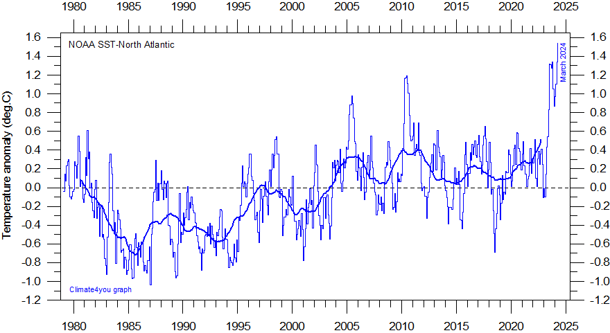
Global monthly sea surface temperature (SST) in the North Atlantic (5o-20oN, 30-60oW) since 1979 according to the National Oceanographic and Atmospheric Administration (NOAA) Climate Prediction Center. The geographical sampling area is shown in map above as 'N.Atl'. The thick line is the simple running 37 month average, nearly corresponding to a running 3 yr average. The data series goes back to January 1950. Here it is shown since 1979, to enable easy comparison with air the global temperature estimates shown above. Reference period: 1981-2010. Last month shown: April 2025. Last diagram update: 14 May 2025.
-
Click here to download the entire series of NOAA CPC monthly sea surface temperatures since January 1950.
-
Click here to read about data smoothing.
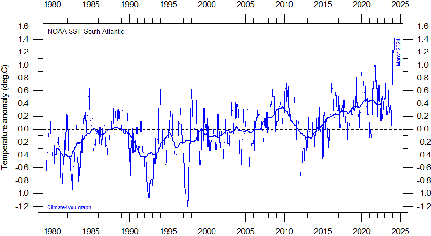
Global monthly sea surface temperature (SST) in the South Atlantic (0-20oS, 30oW-10oE) since 1979 according to the National Oceanographic and Atmospheric Administration (NOAA) Climate Prediction Center. The geographical sampling area is shown in map above as 'S.Atl'. The thick line is the simple running 37 month average, nearly corresponding to a running 3 yr average. The data series goes back to January 1950. Here it is shown since 1979, to enable easy comparison with air the global temperature estimates shown above. Reference period: 1981-2010. Last month shown: April 2025. Last diagram update: 14 May 2025.
-
Click here to download the entire series of NOAA CPC monthly sea surface temperatures since January 1950.
-
Click here to read about data smoothing.
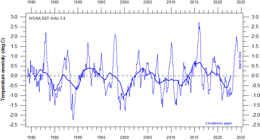
Global monthly sea surface temperature (SST) in the Niño 3.4 region (5oN-5oS, 17oW-120oW) of the central Pacific Ocean since 1979 according to the National Oceanographic and Atmospheric Administration (NOAA) Climate Prediction Center. The geographical sampling area is shown in map above as 'Niño 3.4'. The thick line is the simple running 37 month average, nearly corresponding to a running 3 yr average. The data series goes back to January 1950. Here it is shown since 1979, to enable easy comparison with air the global temperature estimates shown above. Last month shown: April 2025. Last diagram update: 14 May 2025.
-
Click here to download the entire series of NOAA CPC monthly sea surface temperatures since January 1950.
-
Click here to read about data smoothing.
Click here to jump back to list of contents.
Tropical sea surface temperature and global surface air temperature
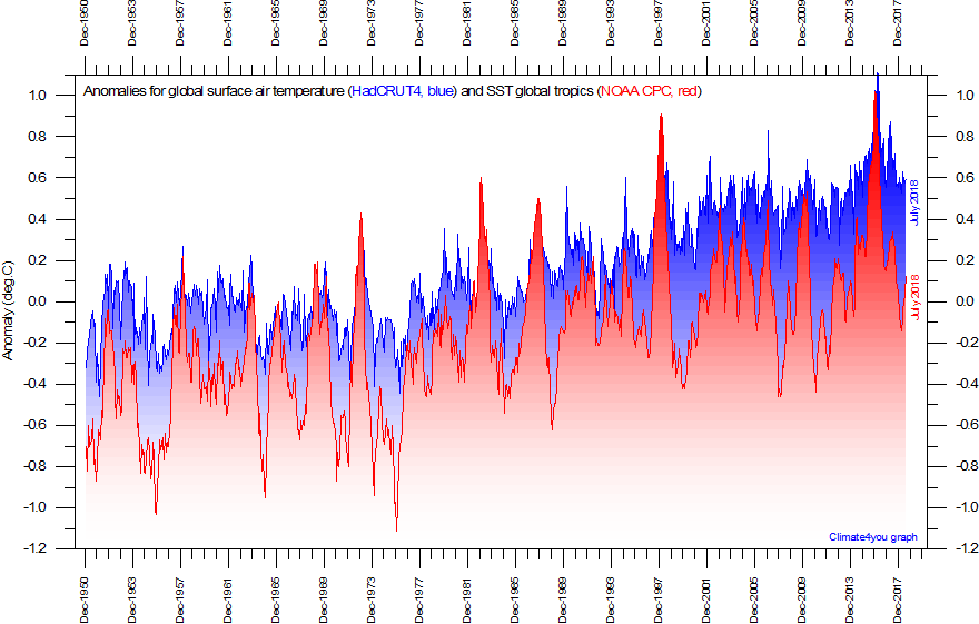
Global monthly sea surface temperature (red) in the Tropics (10oN-10oS, 0-360o) since January 1950 according to the National Oceanographic and Atmospheric Administration (NOAA) Climate Prediction Center (CPC). The geographical sampling area is shown in map above as 'Tropics'. Global monthly average surface air temperature (blue) since January 1950 according to Hadley CRUT, a cooperative effort between the Hadley Centre for Climate Prediction and Research and the University of East Anglia's Climatic Research Unit (CRU), UK. Base period for the NOAA series is 1971-2000, while the HadCRUT3 series uses 1961-1990 as base period. Last month shown: July 2018. Last diagram update: 30 August 2018.
-
Click here to download the entire series of NOAA CPC monthly sea surface temperatures since January 1950.
-
Click here to download the entire series of estimated HadCRUT4 global monthly surface air temperatures since 1850.
The relation the global surface air temperature (HadCRUT3) and the tropical sea surface temperature (NOAA) shown in the diagram above is interesting. The offset between the two data series is due to the different base periods adopted, but in general the two data series tend to follow each other, without the general offset growing or decreasing since 1950.
Typically, 1-5 yr variations in the sea surface temperature have a larger amplitude than the corresponding variations in global surface air temperature. In addition, quite often a change in sea surface temperature appears to be initiated 1-3 months before the corresponding change in surface air temperature. In such cases, the temperature in the lower atmosphere appears to be controlled by change in sea surface temperatures, and not the other way around. Oceanographic processes such as, e.g., upwelling of warm or cold water masses might one obvious explanation. Another explanation might be variations in the amount of direct short wave solar radiation reaching the ocean surface. Whatever the control, the above diagram suggests that the tropical oceans are important for understanding global surface air temperature changes.
The apparent significance of the tropical oceans between 10oN and 10oS for the global surface air temperature is not entirely surprising. About 80% of the planet surface is covered by oceans between 10oN and 10oS, so the surface area covered by oceans is huge in this sector of the planet. Presumably the explanation for the significance of these tropical oceans is therefore relatively straight forward: The huge ocean surface in the Tropics is nearly perpendicular to the incoming direct solar radiation at daytime. Little of the direct short wave radiation reaching the ocean is therefore reflected, and the amount of absorbed solar radiation is essentially controlled by the tropical cloud cover. Variations in the tropical cloud cover may therefore be expected to represent an important control on the global surface air temperature, along with oceanographic phenomena (upwelling, etc.) within the tropical regions.
Click here to jump back to list of contents.
Ocean 0-1900 m depth temperature summary
Diagram
showing average 0-2000m depth ocean temperatures in selected latitudinal bands, using
Argo-data.
The thin line shows monthly values and the thick line shows the running 13-month
average. Source: Global
Marine Argo Atlas
-
Acknowledment and additional information: Roemmich, D. and J. Gilson, 2009. The 2004-2008 mean and annual cycle of temperature, salinity, and steric height in the global ocean from the Argo Program. Progress in Oceanography, 82, 81-100.
Click here to jump back to list of contents.
Oceanic average temperature 0-100 m depth
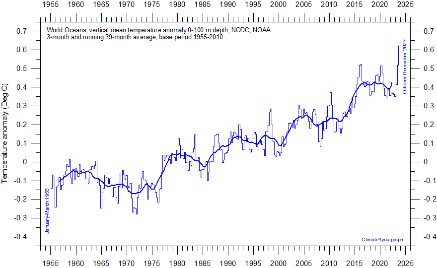
World Oceans vertical average temperature 0-100 m depth since 1955. The thin line indicate 3-month values, and the thick line represents the simple running 39-month (c. 3 year) average. Data source: NOAA National Oceanographic Data Center (NODC). Base period 1955-2010. Last period shown: October-December 2024. Last diagram update 25 February 2025.
-
Click here to download the entire series of three-monthly oceanic temperature anomalies since January-March 1955.
-
Click here to read about data smoothing.
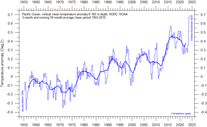
Pacific Ocean vertical average temperature 0-100 m depth since 1955. The thin line indicate 3-month values, and the thick line represents the simple running 39- month (c. 3 year) average. Data source: NOAA National Oceanographic Data Center (NODC). Base period 1955-2010. Last period shown: October-December 2024. Last diagram update 25 February 2025.
-
Click here to download the entire series of three-monthly oceanic temperature anomalies since January-March 1955.
-
Click here to read about data smoothing.
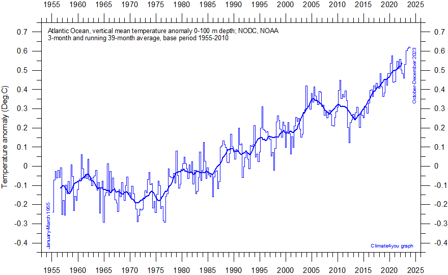
Atlantic Ocean vertical average temperature 0-100 m depth since 1955. The thin line indicate 3-month values, and the thick line represents the simple running 39- month (c. 3 year) average. Data source: NOAA National Oceanographic Data Center (NODC). Base period 1955-2010. Last period shown: October-December 2024. Last diagram update 25 February 2025.
-
Click here to download the entire series of three-monthly oceanic temperature anomalies since January-March 1955.
-
Click here to read about data smoothing.
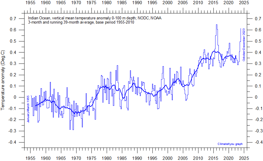
Indian Ocean vertical average temperature 0-100 m depth since 1955. The thin line indicate 3-month values, and the thick line represents the simple running 39- month (c. 3 year) average. Data source: NOAA National Oceanographic Data Center (NODC). Base period 1955-2010. Last period shown: October-December 2024. Last diagram update 25 February 2025.
-
Click here to download the entire series of three-monthly oceanic temperature anomalies since January-March 1955.
-
Click here to read about data smoothing.
Click here to jump back to list of contents.
Global oceanic temperature anomaly 0-700 m depth
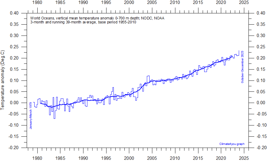
World Oceans vertical average temperature 0-700 m depth since 1979. The thin line indicate 3-month values, and the thick line represents the simple running 39-month (c. 3 year) average. Data source: NOAA National Oceanographic Data Center (NODC). Base period 1955-2010. Last period shown: October-December 2023. Last diagram update 8 February 2024.
-
Click here to download the entire series of three-monthly oceanic temperature anomalies since January-March 1955.
-
Click here to read about data smoothing.
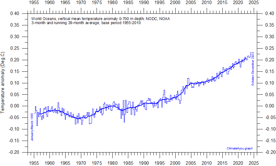
World Oceans vertical average temperature 0-700 m depth since 1955. The thin line indicate 3-month values, and the thick line represents the simple running 39-month (c. 3 year) average. Data source: NOAA National Oceanographic Data Center (NODC). Base period 1955-2010. Last period shown: October-December 2023. Last diagram update 8 February 2024.
-
Click here to download the entire series of three- monthly oceanic temperature anomalies since January-March 1955.
-
Click here to read about data smoothing.
Click here to jump back to list of contents.
Global ocean temperatures from surface to 1900 m depth
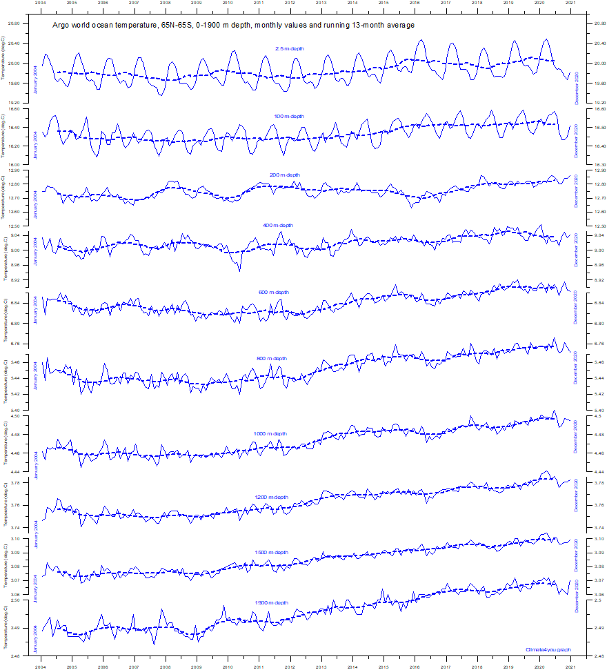
Diagram
showing global ocean temperatures at selected depths, using Argo-data.
The thin line shows monthly values and the thick line shows the running 13-month
average. Source: Global
Marine Argo Atlas
-
Acknowledment and additional information: Roemmich, D. and J. Gilson, 2009. The 2004-2008 mean and annual cycle of temperature, salinity, and steric height in the global ocean from the Argo Program. Progress in Oceanography, 82, 81-100.
Click here to jump back to list of contents.
Circum-Arctic ocean temperatures from surface to 1900 m depth
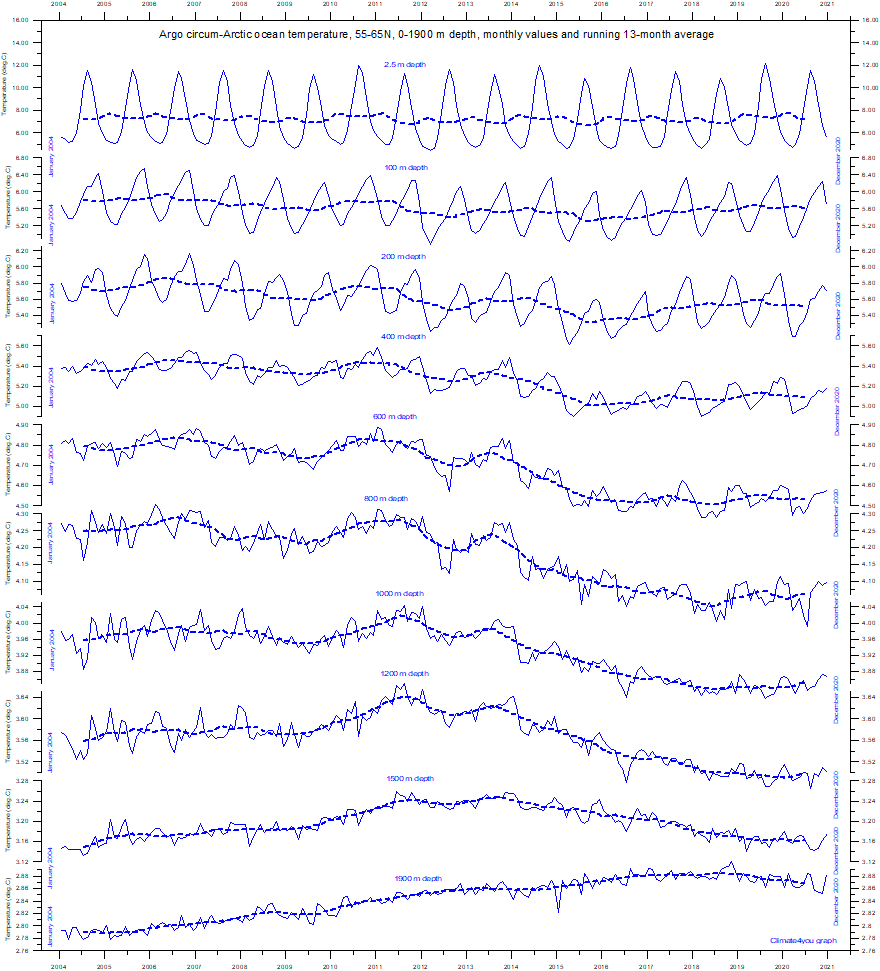
Diagram
showing circum-arctic ocean temperatures at selected depths, using Argo-data.
The thin line shows monthly values and the thick line shows the running 13-month
average. Source: Global
Marine Argo Atlas
-
Acknowledment and additional information: Roemmich, D. and J. Gilson, 2009. The 2004-2008 mean and annual cycle of temperature, salinity, and steric height in the global ocean from the Argo Program. Progress in Oceanography, 82, 81-100.
Click here to jump back to list of contents.
Circum-Equator ocean temperatures from surface to 1900 m depth
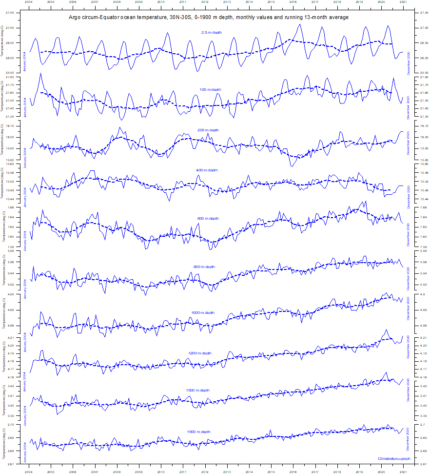
Diagram
showing circum-equator ocean temperatures at selected depths, using Argo-data.
The thin line shows monthly values and the thick line shows the running 13-month
average. Source: Global
Marine Argo Atlas
-
Acknowledment and additional information: Roemmich, D. and J. Gilson, 2009. The 2004-2008 mean and annual cycle of temperature, salinity, and steric height in the global ocean from the Argo Program. Progress in Oceanography, 82, 81-100.
Click here to jump back to list of contents.
Circum-Antarctic ocean temperatures from surface to 1900 m depth
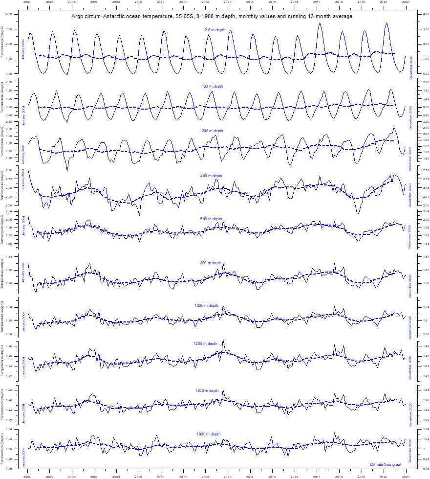
Diagram
showing circum-antarctic ocean temperatures at selected depths, using Argo-data.
The thin line shows monthly values and the thick line shows the running 13-month
average. Source: Global
Marine Argo Atlas
-
Acknowledment and additional information: Roemmich, D. and J. Gilson, 2009. The 2004-2008 mean and annual cycle of temperature, salinity, and steric height in the global ocean from the Argo Program. Progress in Oceanography, 82, 81-100.
Click here to jump back to list of contents.
Global ocean net temperature change since 2004 at different depths
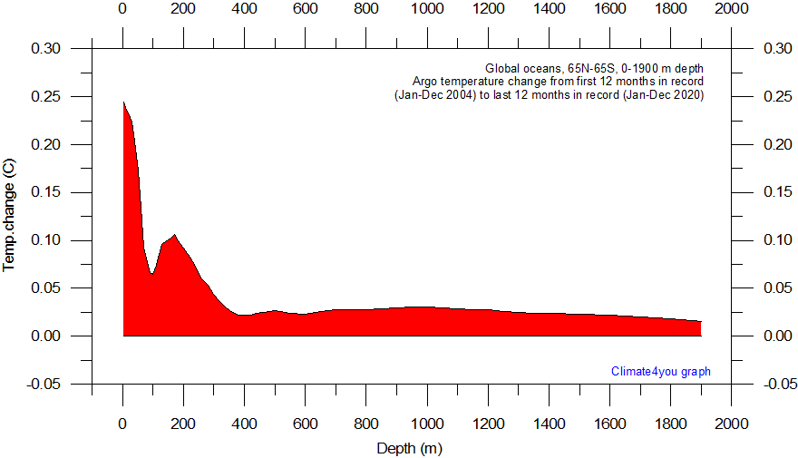
Global ocean net temperature change since 2004 from surface to 1900 m depth, using Argo-data. Source: Global Marine Argo Atlas. Additional information can be found in: Roemmich, D. and J. Gilson, 2009. The 2004-2008 mean and annual cycle of temperature, salinity, and steric height in the global ocean from the Argo Program. Progress in Oceanography, 82, 81-100. Last diagram update: 5 December 2023.
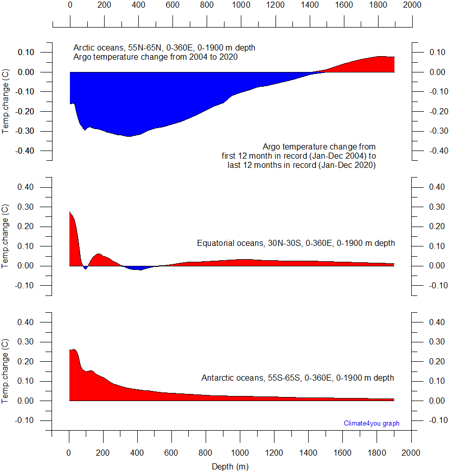
Net temperature change since 2004 from surface to 1900 m depth in different parts of the global oceans, using Argo-data. Source: Global Marine Argo Atlas. Additional information can be found in: Roemmich, D. and J. Gilson, 2009. The 2004-2008 mean and annual cycle of temperature, salinity, and steric height in the global ocean from the Argo Program. Progress in Oceanography, 82, 81-100. Please note that due to the spherical form of Earth, northern and southern latitudes represent only small ocean volumes, compared to latitudes near the Equator. Last diagram update: 5 December 2023.
Click here to jump back to list of contents.
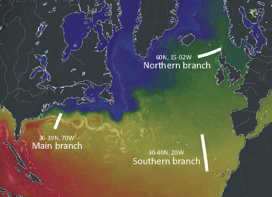
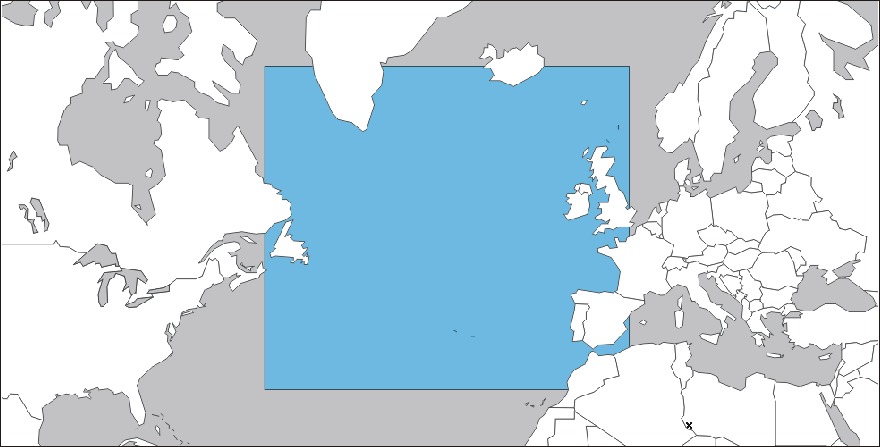
Map showing location of Gulf Stream transects 0-800 m depth shown below. The background map show sea surface temperatures as displayed for March 8, 2019. Map source: Earth.Nullschool.Net.
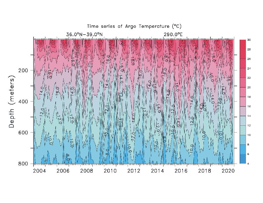
Time-depth
temperature
diagram along 36-39 N, 70 W, 0-800 m depth, across the main branch of the Gulf
Stream near the east coast of USA (see location
map above), since January 2004.
Temperatures in Degrees Celsius. Source: Global
Marine Argo Atlas
-
Acknowledgment and additional information: Roemmich, D. and J. Gilson, 2009. The 2004-2008 mean and annual cycle of temperature, salinity, and steric height in the global ocean from the Argo Program. Progress in Oceanography, 82, 81-100.
-
See diagram below to inspect a time series corresponding to the above diagram since January 2004.
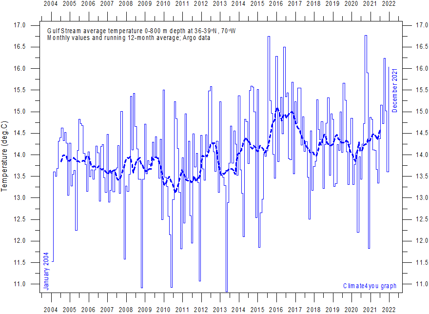
Average
temperature along 36-39 N, 70 W, 0-800m depth, corresponding to the main branch
of the Gulf Stream, using Argo-data.
Source: Global
Marine Argo Atlas
-
Acknowledgment and additional information: Roemmich, D. and J. Gilson, 2009. The 2004-2008 mean and annual cycle of temperature, salinity, and steric height in the global ocean from the Argo Program. Progress in Oceanography, 82, 81-100.
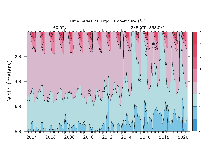
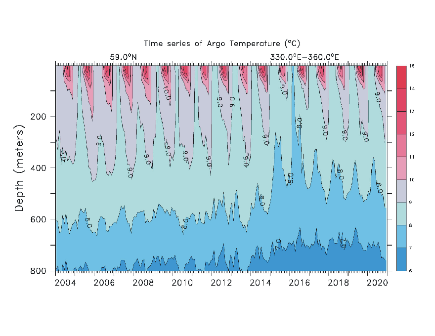
Time-depth
temperature
diagram along 60 N, 15-02 W, 0-800 m depth (see location
map above), across the northern branch of the
Gulf Stream (the North Atlantic Current), since January 2004.
Temperatures in Degrees Celsius. Source: Global
Marine Argo Atlas
-
Acknowledgment and additional information: Roemmich, D. and J. Gilson, 2009. The 2004-2008 mean and annual cycle of temperature, salinity, and steric height in the global ocean from the Argo Program. Progress in Oceanography, 82, 81-100.
-
See diagram below to inspect a time series corresponding to the above diagram since January 2004.
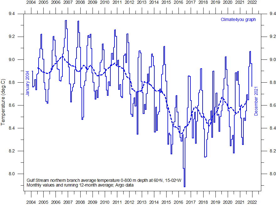
Average
temperature along 60 N, 15-02 W, 0-800m depth, corresponding to the northern branch
of the Gulf Stream (the North Atlantic Current), using Argo-data.
Source: Global
Marine Argo Atlas
-
Acknowledgment and additional information: Roemmich, D. and J. Gilson, 2009. The 2004-2008 mean and annual cycle of temperature, salinity, and steric height in the global ocean from the Argo Program. Progress in Oceanography, 82, 81-100.
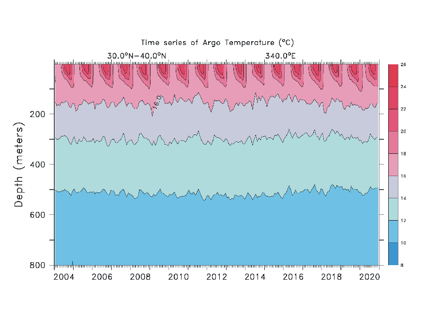
Time-depth
temperature
diagram along 30-40 N, 20 W, 0-800 m depth (see location
map above), across the southern branch of the
Gulf Stream, since January 2004.
Temperatures in Degrees Celsius. Source: Global
Marine Argo Atlas
-
Acknowledgment and additional information: Roemmich, D. and J. Gilson, 2009. The 2004-2008 mean and annual cycle of temperature, salinity, and steric height in the global ocean from the Argo Program. Progress in Oceanography, 82, 81-100.
-
See diagram below to inspect a time series corresponding to the above diagram since January 2004.
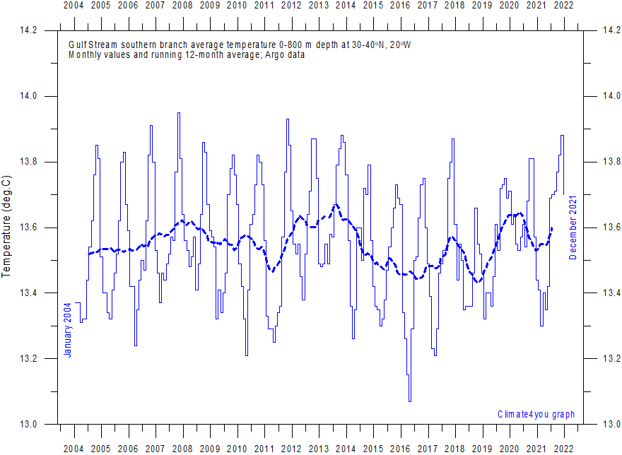
Average
temperature along 30-40 N, 20 W, 0-800m depth, corresponding to the southern branch
of the Gulf Stream, using Argo-data.
Source: Global
Marine Argo Atlas
-
Acknowledgment and additional information: Roemmich, D. and J. Gilson, 2009. The 2004-2008 mean and annual cycle of temperature, salinity, and steric height in the global ocean from the Argo Program. Progress in Oceanography, 82, 81-100
Click here to jump back to list of contents.
North Atlantic (60-0W, 30-65N) heat content 0-700 m depth
Map showing the North Atlantic area within 60-0W and 30-65N, for which the heat content within the uppermost 700 m is shown in the two diagrams below.
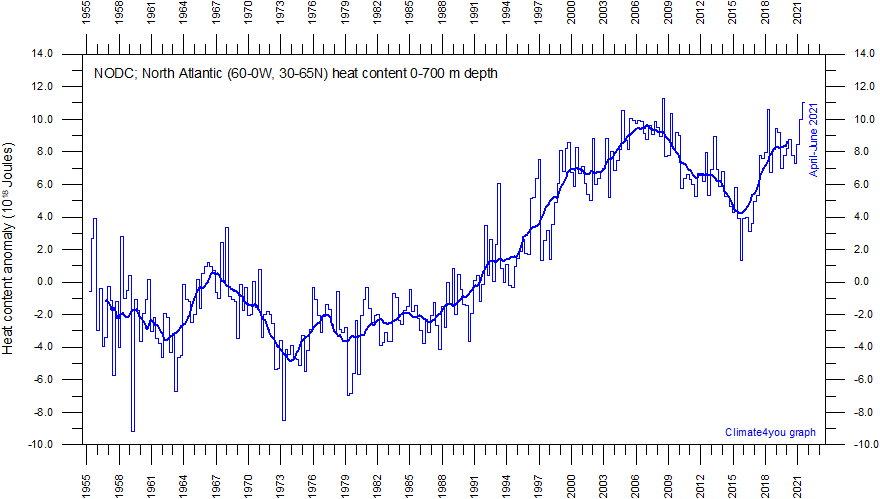
Monthly heat content anomaly in the uppermost 700 m of the North Atlantic (60-0W, 30-65N) ocean since January 1955. The thin line indicate monthly values, and the thick line represents the simple running 37 month (c. 3 year) average. Data source: National Oceanographic Data Center (NODC). Last period shown: April-June 2021. Last diagram update 18 November 2021.
-
Click here to download the entire series of monthly oceanic heat content anomalies since January 1955 (select heat content 1955-now).
-
Click here to read about data smoothing.
-
The diagram above is strongly inspired by the observations put forward by Von Frank Bosse und Fritz Vahrenholt January 7, 2013.
Click here to jump back to list of contents.
North Atlantic 59 N transect to 800 m depth
Time-depth
temperature
diagram along 59 N, 0-800 m depth, across the North Atlantic Current, since
January 2004.
Temperatures in Degrees Celsius. Source: Global
Marine Argo Atlas
-
Acknowledment and additional information: Roemmich, D. and J. Gilson, 2009. The 2004-2008 mean and annual cycle of temperature, salinity, and steric height in the global ocean from the Argo Program. Progress in Oceanography, 82, 81-100.
-
See diagram below to inspect a time series corresponding to the above diagram since January 2004.
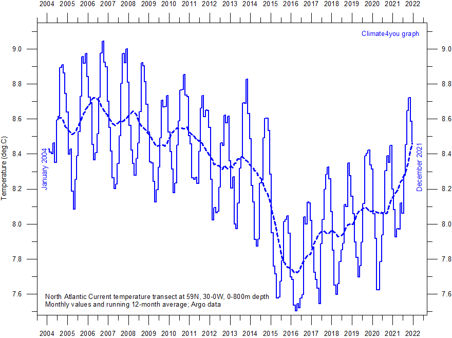
Average
temperature along 59 N, 30-0W, 0-800m depth, corresponding to the
main part of the North Atlantic Current, using Argo-data.
Source: Global
Marine Argo Atlas
-
Acknowledment and additional information: Roemmich, D. and J. Gilson, 2009. The 2004-2008 mean and annual cycle of temperature, salinity, and steric height in the global ocean from the Argo Program. Progress in Oceanography, 82, 81-100
Click here to jump back to list of contents.
Arctic gateway seas (20W-40E. 70-80N) heat content
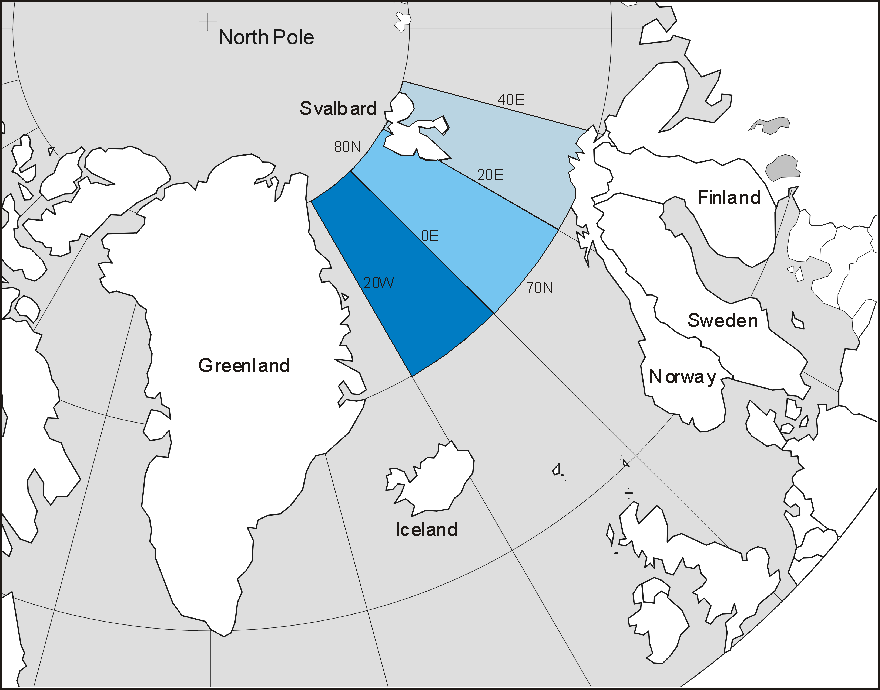
Map showing the Arctic Gateway Seas within 20W-40E and 70-80N, for which the heat content within the uppermost 700 m is shown in the three diagrams below.
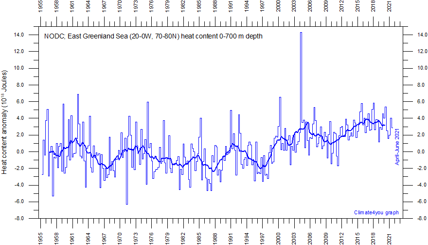
Monthly heat content anomaly in the uppermost 700 m of the East Greenland Sea (20-0W, 70-80N) since January 1955. The thin line indicate monthly values, and the thick line represents the simple running 37 month (c. 3 year) average. These data may be compared with Arctic sea ice variations. Data source: National Oceanographic Data Center (NODC). Last period shown: April-June 2021. Last diagram update 18 November 2021.
-
Click here to download the entire series of monthly oceanic heat content anomalies since January 1955 (select heat content 1955-now).
-
Click here to read about data smoothing.
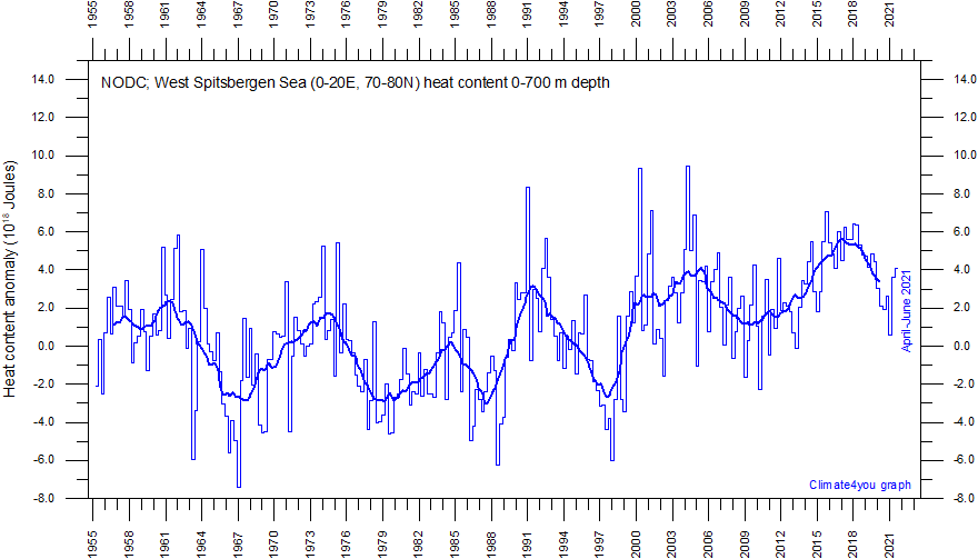
Monthly heat content anomaly in the uppermost 700 m of the West Spitsbergen Sea (0-20E, 70-80N) since January 1955. The thin line indicate monthly values, and the thick line represents the simple running 37 month (c. 3 year) average. These data may be compared with Arctic sea ice variations and Spitsbergen surface air temperatures. Data source: National Oceanographic Data Center (NODC). Last period shown: April-June 2021. Last diagram update 18 November 2021.
-
Click here to download the entire series of monthly oceanic heat content anomalies since January 1955 (select heat content 1955-now).
-
Click here to read about data smoothing.
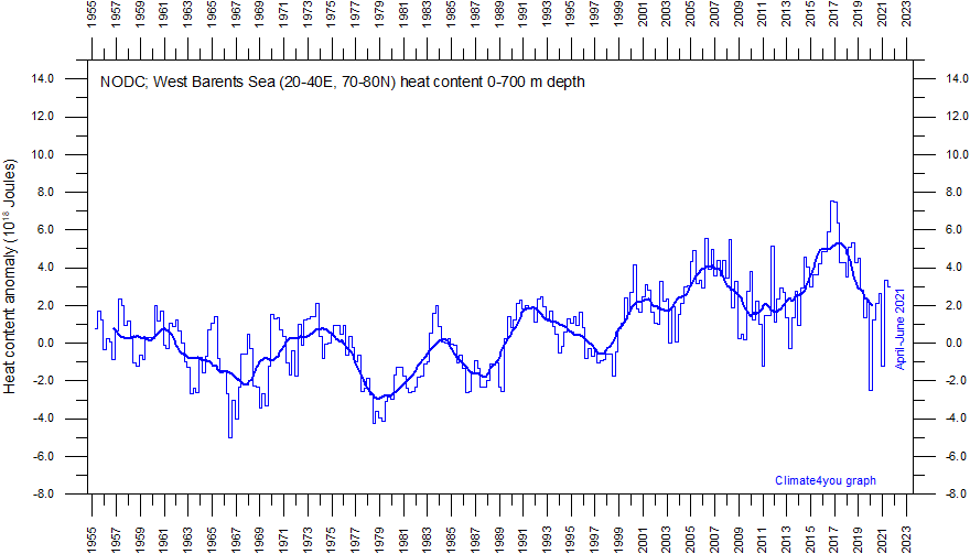
Monthly heat content anomaly in the uppermost 700 m of the western Barents Sea (20-40E, 70-80N) since January 1955. The thin line indicate monthly values, and the thick line represents the simple running 37 month (c. 3 year) average. These data may be compared with Arctic sea ice variations and Svalbard surface air temperatures. Data source: National Oceanographic Data Center (NODC). Last period shown: April-June 2021. Last diagram update 18 November 2021.
-
Click here to download the entire series of monthly oceanic heat content anomalies since January 1955 (select heat content 1955-now).
-
Click here to read about data smoothing.
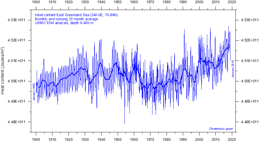
Heat content in the uppermost 400 m of the East Greenland Sea (20-0W, 70-80N) since January 1900. The thin line indicate monthly values, and the thick line represents the simple running 37 month (c. 3 year) average. These data may be compared with Arctic sea ice variations. Data source: UK Met Office (UKMO). Last month shown: January 2019. Last diagram update 13 September 2019.
-
Click here to download the entire series of monthly oceanic heat content anomalies (select heat content UKMO EN4 analysis).
-
Click here to read about data smoothing.
-
Click here to download paper describing the UKMO EN4 data series.
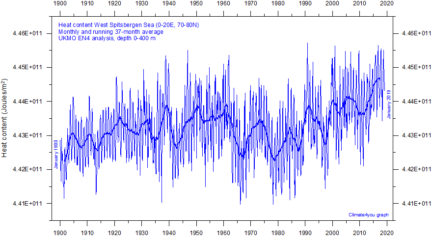
Heat content in the uppermost 400 m of the West Spitsbergen Sea (0-20E, 70-80N) since January 1900. The thin line indicate monthly values, and the thick line represents the simple running 37 month (c. 3 year) average. These data may be compared with Arctic sea ice variations. Data source: UK Met Office (UKMO). Last month shown: January 2019. Last diagram update 13 September 2019.
-
Click here to download the entire series of monthly oceanic heat content anomalies (select heat content UKMO EN4 analysis).
-
Click here to read about data smoothing.
-
Click here to download paper describing the UKMO EN4 data series.
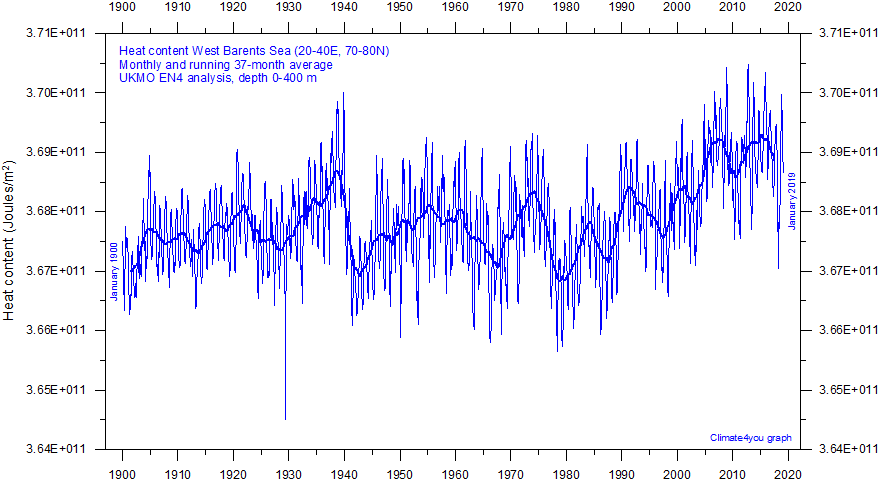
Heat content in the uppermost 400 m of the western Barents Sea (20-40E, 70-80N) since January 1900. The thin line indicate monthly values, and the thick line represents the simple running 37 month (c. 3 year) average. These data may be compared with Arctic sea ice variations. Data source: UK Met Office (UKMO). Last month shown: January 2019. Last diagram update 13 September 2019.
-
Click here to download the entire series of monthly oceanic heat content anomalies (select heat content UKMO EN4 analysis).
-
Click here to read about data smoothing.
-
Click here to download paper describing the UKMO EN4 data series.
Click here to jump back to list of contents.
Average sea temperatures in the upper 300 m at Equator in the Pacific
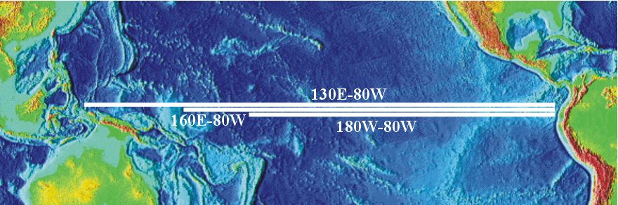
Location map showing the central Pacific Ocean with location of measurement areas shown in the three diagrams below.
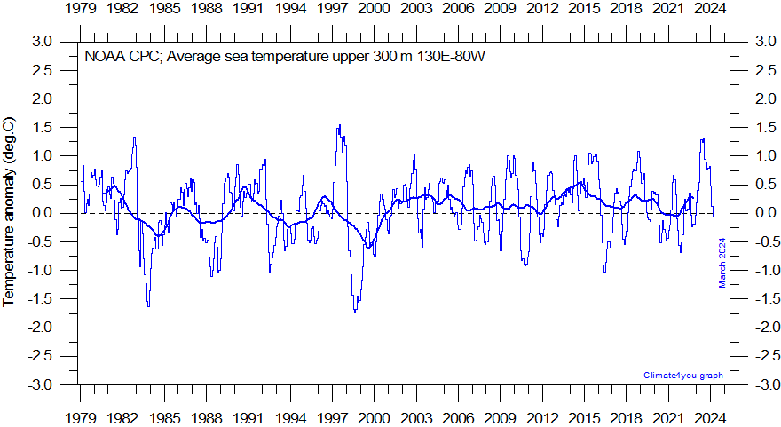
Monthly average temperatures in the uppermost 300 m of the Pacific Ocean between 130oE and 80oW according to the NOAA Climate Prediction Center. For geographical location of transect please see map above. The thin line indicate monthly values, and the thick line is the simple running 7 year average. Reference period: 1981-2010. Last month shown: April 2025. Last diagram update: 5 May 2025.
-
Click here to download the entire series of monthly average temperatures since February 1979.
-
Click here for additional information.
-
Click here to read about data smoothing.
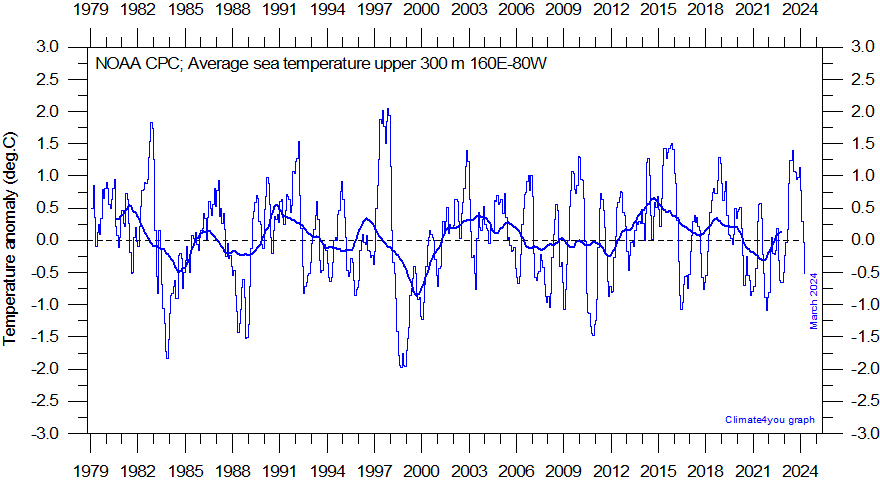
Monthly average temperatures in the uppermost 300 m of the Pacific Ocean between 160oE and 80oW according to the NOAA Climate Prediction Center. For geographical location of transect please see map above. The thin line indicate monthly values, and the thick line is the simple running 7 year average. Reference period: 1981-2010. Last month shown: April 2025. Last diagram update: 5 May 2025.
-
Click here to download the entire series of monthly average temperatures since February 1979.
-
Click here for additional information.
-
Click here to read about data smoothing.
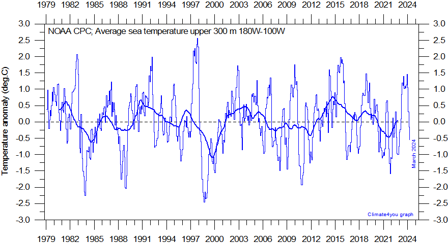
Monthly average temperatures in the uppermost 300 m of the Pacific Ocean between 160oW and 80oW according to the NOAA Climate Prediction Center. For geographical location of transect please see map above. The thin line indicate monthly values, and the thick line is the simple running 7 year average. Reference period: 1981-2010. Last month shown: April 2025. Last diagram update: 5 May 2025.
-
Click here to download the entire series of monthly average temperatures since February 1979.
-
Click here for additional information.
-
Click here to read about data smoothing.
Click here to jump back to list of contents.
PDO - Pacific Decadal Oscillation
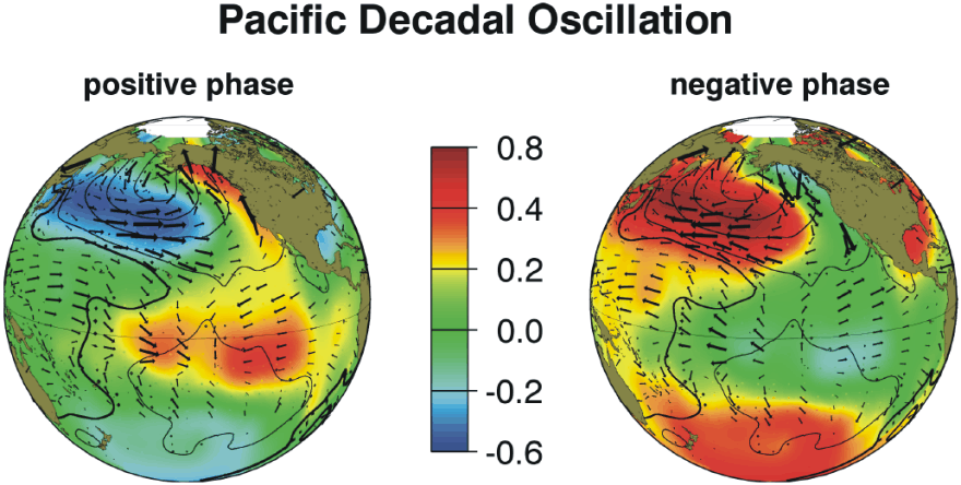
Typical wintertime Sea Surface Temperature (colors),Sea Level Pressure (black lines) and surface windstress (arrows) anomaly patterns during warm and cool phases of PDO. Figure source: Joint Institute for the Study of the Atmosphere and Ocean (JISAO), a Cooperative Institute between the National Oceanic and Atmospheric Administration and the University of Washington.
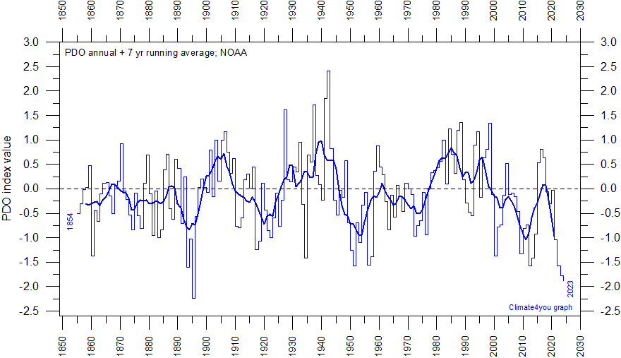
Annual values of the Pacific Decadal Oscillation (PDO) according to NOAA. The PDO is a long-lived El Niño-like pattern of Pacific climate variability, and the data series goes back to January 1900. Causes for PDO are not currently known, but even in the absence of a theoretical understanding, PDO climate information improves season-to-season and year-to-year climate forecasts for North America because of its strong tendency for multi-season and multi-year persistence. The PDO also appears to be roughly in phase with global temperature changes. Thus, from a societal impacts perspective, recognition of PDO is important because it shows that "normal" climate conditions can vary over time periods comparable to the length of a human's lifetime. The thin line indicate annual PDO values, and the thick line is the simple running 7 year average. Last year shown: 2024. Last diagram update: 11 January 2025.
-
Click here to download the entire series of monthly PDO index values since January 1854(PDO ERSST V5 plotted above).
-
Click here to read about data smoothing.
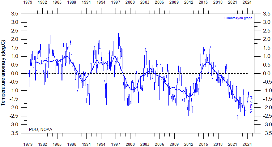
Monthly values of the Pacific Decadal Oscillation (PDO) according to NOAA. The PDO is a long-lived El Niño-like pattern of Pacific climate variability, and the data series goes back to January 1900. Base period: 1982-2002. The thin line indicate monthly PDO values, and the thick line is the simple running 37 month average. Here the PDO data are shown since 1979, to enable easy comparison with air the global temperature estimates shown elsewhere. Last month shown: April 2025. Last diagram update: 6 May 2025.
-
Click here to download the entire series of monthly PDO index values since January 1854 (PDO ERSST V5 plotted above).
-
Click here to read about data smoothing.
The
PDO is a long-lived El Niño-like pattern of Pacific climate variability, with
data extending back to January 1854. Causes for PDO are not currently known, but
even in the absence of a theoretical understanding, PDO climate information
improves season-to-season and year-to-year climate forecasts for North America
because of its strong tendency for multi-season and multi-year persistence. The
PDO also appears to be roughly in phase with global temperature changes. Thus,
from a societal impact’s perspective, recognition of PDO is important because
it shows that "normal" climate conditions can vary over time periods
comparable to the length of a human's lifetime.
The
PDO illustrates how global temperatures are tied to sea surface temperatures in
the Pacific Ocean, the largest ocean on Earth. When sea surface temperatures are
relatively low (negative phase PDO), as it was from 1945 to 1977, global air
temperature often decreases. When Pacific Ocean surface temperatures are high
(positive phase PDO), as from 1977 to 1998, global surface air temperature often
increases.
A
Fourier frequency analysis (not shown here) shows the PDO record to be
influenced by a significant 5.6-year cycle, and feasibly also by a longer
18.6-year long period, corresponding to the length of the lunar nodal tide.
Click here to jump back to list of contents.
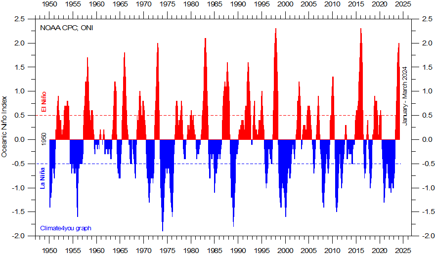
Warm
(>+0.5oC) and cold (<-0.5oC) episodes for the Oceanic
Niño Index (ONI), defined as 3 month running mean of ERSSTv4 SST
anomalies in the Niño 3.4 region (5oN-5oS, 120o-170oW)]. For historical purposes cold and warm episodes are
defined when the threshold is met for a minimum of 5 consecutive over-lapping
seasons. Anomalies are centred
on 30-yr base periods updated every 5 years.
-
Click here to download the entire series of the Oceanic Niño Index (ONI) since December 1949 - February 1950.
-
Click here to read about data smoothing.
In
the Pacific Ocean, trade winds usually blow west along the equator, pushing
warm water from South America towards Asia. To replace that warm water, cold
water rises from the depths near South America. During El Niño episodes,
trade winds weaken, and warm water is spreading back east, toward South America.
In contrast, during La Niña episodes, trade winds are stronger than usual,
pushing more warm water than usual toward Asia, and upwelling of cold water near
South America therefore increases.
The
2015-16 El Niño episode is among the strongest since the beginning of the
record in 1950. Considering the entire record, however, recent variations
between El Niño and La Niña episodes do not appear abnormal in any way.
A
Fourier frequency analysis (not shown here) shows the ONI record to be
influenced by a significant 3.6-year cycle, and feasibly also by a longer
5.6-year cycle.
Click here to jump back to list of contents.
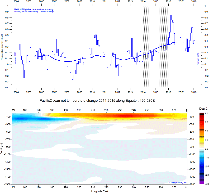
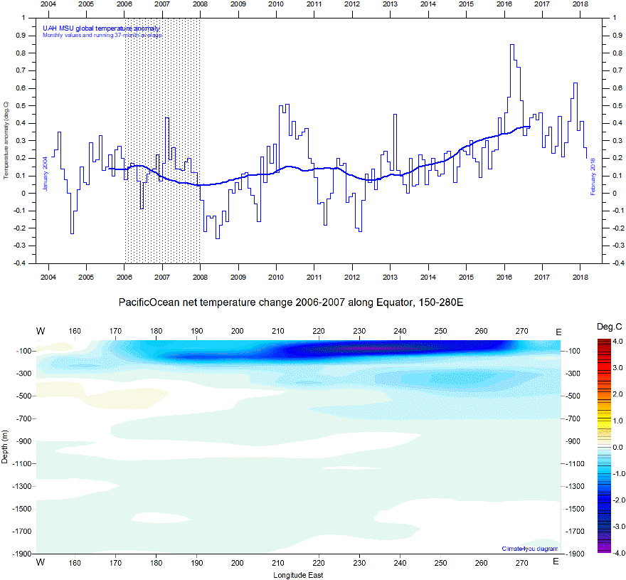
Global average temperature versus La Niña and El Niño episodes
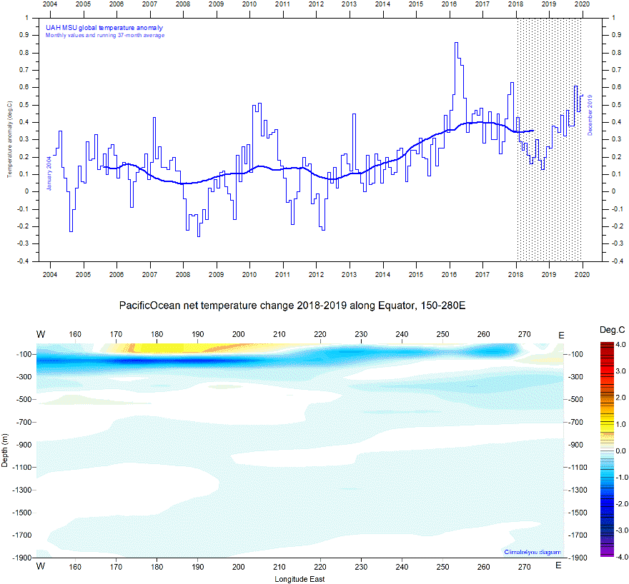
Upper panel: Global monthly average lower troposphere temperature since January 2004 according to University of Alabama at Huntsville (UAH), USA. Reference period 1981-2010. Lower panel: Global ocean net temperature change 2018-2019 (average for 2019 minus average for 2018; period hatched in upper panel) along Equator (150-280 E) from surface to 1900 m depth, using Argo-data. Last diagram update: 23 September 2020.
-
Click here to download the series of UAH MSU global monthly lower troposphere temperature anomalies since December 1978.
-
Source for Argo data: Global Marine Argo Atlas. Additional information can be found in: Roemmich, D. and J. Gilson, 2009. The 2004-2008 mean and annual cycle of temperature, salinity, and steric height in the global ocean from the Argo Program. Progress in Oceanography, 82, 81-100.
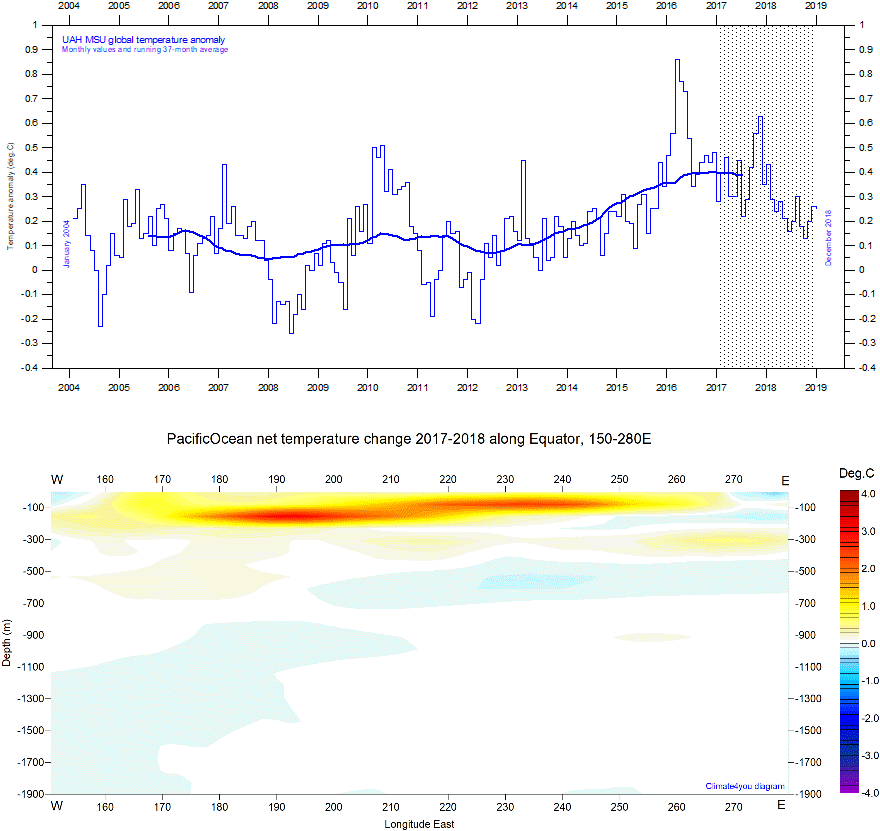
Upper panel: Global monthly average lower troposphere temperature since January 2004 according to University of Alabama at Huntsville (UAH), USA. Reference period 1981-2010. Lower panel: Global ocean net temperature change 2017-2018 (average for 2018 minus average for 2017; period hatched in upper panel) along Equator (150-280 E) from surface to 1900 m depth, using Argo-data. Last diagram update: 22 August 2019.
-
Click here to download the series of UAH MSU global monthly lower troposphere temperature anomalies since December 1978.
-
Source for Argo data: Global Marine Argo Atlas. Additional information can be found in: Roemmich, D. and J. Gilson, 2009. The 2004-2008 mean and annual cycle of temperature, salinity, and steric height in the global ocean from the Argo Program. Progress in Oceanography, 82, 81-100.
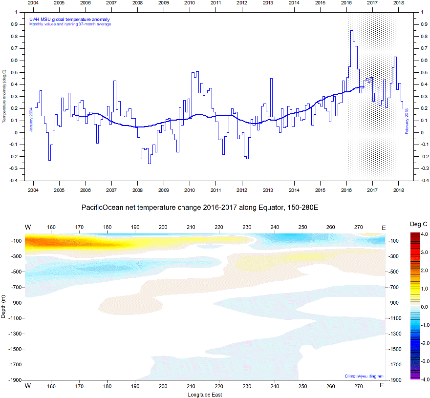
Upper panel: Global monthly average lower troposphere temperature since January 2004 according to University of Alabama at Huntsville (UAH), USA. Reference period 1981-2010. Lower panel: Global ocean net temperature change 2016-2017 (average for 2017 minus average for 2016; period hatched in upper panel) along Equator (150-280 E) from surface to 1900 m depth, using Argo-data. Last diagram update: 12 March 2018.
-
Click here to download the series of UAH MSU global monthly lower troposphere temperature anomalies since December 1978.
-
Source for Argo data: Global Marine Argo Atlas. Additional information can be found in: Roemmich, D. and J. Gilson, 2009. The 2004-2008 mean and annual cycle of temperature, salinity, and steric height in the global ocean from the Argo Program. Progress in Oceanography, 82, 81-100.
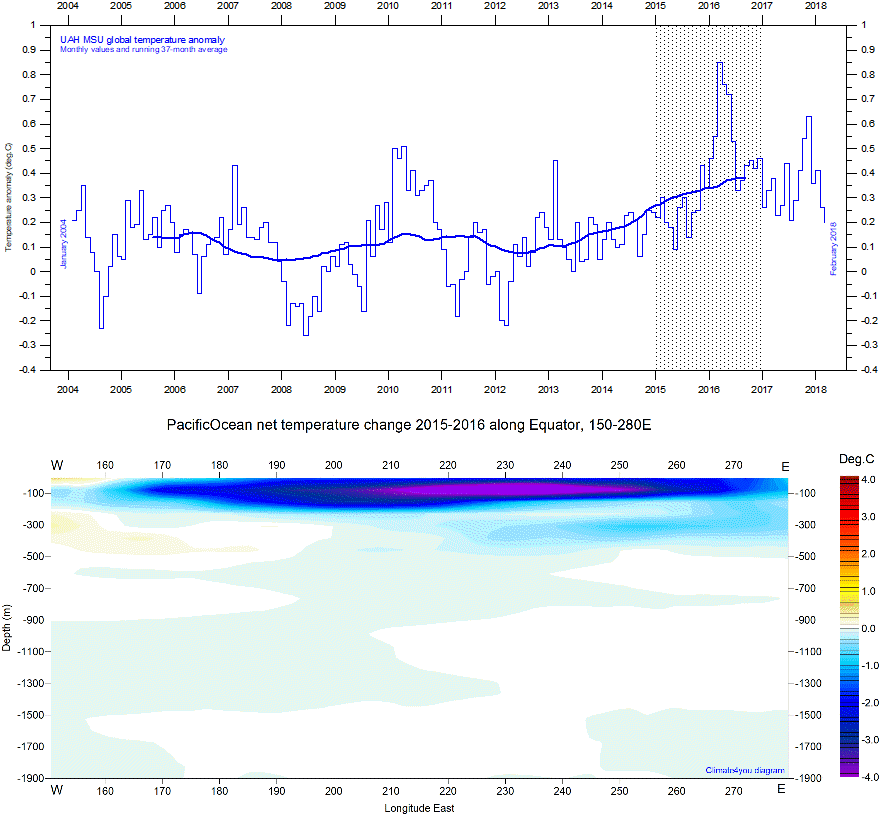
Upper panel: Global monthly average lower troposphere temperature since January 2004 according to University of Alabama at Huntsville (UAH), USA. Reference period 1981-2010. Lower panel: Global ocean net temperature change 2015-2016 (average for 2016 minus average for 2015; period hatched in upper panel) along Equator (150-280 E) from surface to 1900 m depth, using Argo-data. Last diagram update: 12 March 2018.
-
Click here to download the series of UAH MSU global monthly lower troposphere temperature anomalies since December 1978.
-
Source for Argo data: Global Marine Argo Atlas. Additional information can be found in: Roemmich, D. and J. Gilson, 2009. The 2004-2008 mean and annual cycle of temperature, salinity, and steric height in the global ocean from the Argo Program. Progress in Oceanography, 82, 81-100.
Upper panel: Global monthly average lower troposphere temperature since January 2004 according to University of Alabama at Huntsville (UAH), USA. Reference period 1981-2010. Lower panel: Global ocean net temperature change 2014-2015 (average for 2015 minus average for 2014; period hatched in upper panel) along Equator (150-280 E) from surface to 1900 m depth, using Argo-data. Last diagram update: 12 March 2018.
-
Click here to download the series of UAH MSU global monthly lower troposphere temperature anomalies since December 1978.
-
Source for Argo data: Global Marine Argo Atlas. Additional information can be found in: Roemmich, D. and J. Gilson, 2009. The 2004-2008 mean and annual cycle of temperature, salinity, and steric height in the global ocean from the Argo Program. Progress in Oceanography, 82, 81-100.
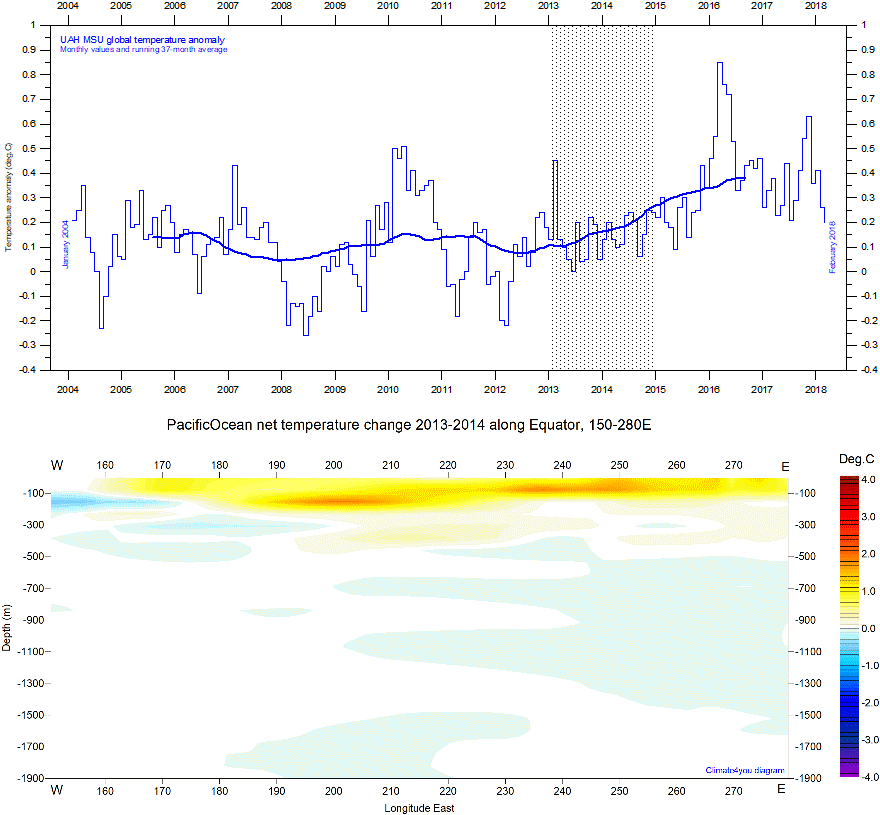
Upper panel: Global monthly average lower troposphere temperature since January 2004 according to University of Alabama at Huntsville (UAH), USA. Reference period 1981-2010. Lower panel: Global ocean net temperature change 2013-2014 (average for 2014 minus average for 2013; period hatched in upper panel) along Equator (150-280 E) from surface to 1900 m depth, using Argo-data. Last diagram update: 12 March 2018.
-
Click here to download the series of UAH MSU global monthly lower troposphere temperature anomalies since December 1978.
-
Source for Argo data: Global Marine Argo Atlas. Additional information can be found in: Roemmich, D. and J. Gilson, 2009. The 2004-2008 mean and annual cycle of temperature, salinity, and steric height in the global ocean from the Argo Program. Progress in Oceanography, 82, 81-100.
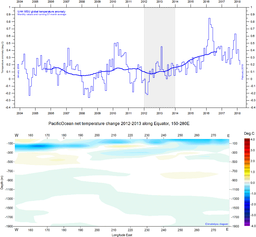
Upper panel: Global monthly average lower troposphere temperature since January 2004 according to University of Alabama at Huntsville (UAH), USA. Reference period 1981-2010. Lower panel: Global ocean net temperature change 2012-2013 (average for 2013 minus average for 2012; period hatched in upper panel) along Equator (150-280 E) from surface to 1900 m depth, using Argo-data. Last diagram update: 12 March 2018.
-
Click here to download the series of UAH MSU global monthly lower troposphere temperature anomalies since December 1978.
-
Source for Argo data: Global Marine Argo Atlas. Additional information can be found in: Roemmich, D. and J. Gilson, 2009. The 2004-2008 mean and annual cycle of temperature, salinity, and steric height in the global ocean from the Argo Program. Progress in Oceanography, 82, 81-100.
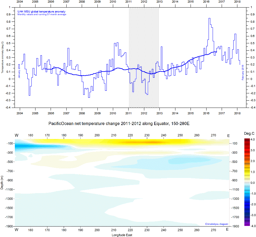
Upper panel: Global monthly average lower troposphere temperature since January 2004 according to University of Alabama at Huntsville (UAH), USA. Reference period 1981-2010. Lower panel: Global ocean net temperature change 2011-2012 (average for 2012 minus average for 2011; period hatched in upper panel) along Equator (150-280 E) from surface to 1900 m depth, using Argo-data. Last diagram update: 12 March 2018.
-
Click here to download the series of UAH MSU global monthly lower troposphere temperature anomalies since December 1978.
-
Source for Argo data: Global Marine Argo Atlas. Additional information can be found in: Roemmich, D. and J. Gilson, 2009. The 2004-2008 mean and annual cycle of temperature, salinity, and steric height in the global ocean from the Argo Program. Progress in Oceanography, 82, 81-100.
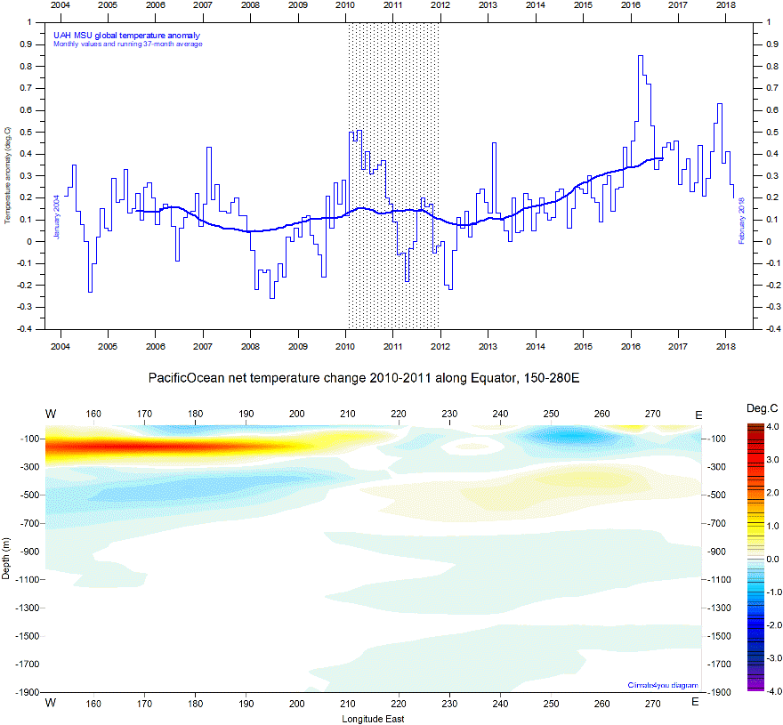
Upper panel: Global monthly average lower troposphere temperature since January 2004 according to University of Alabama at Huntsville (UAH), USA. Reference period 1981-2010. Lower panel: Global ocean net temperature change 2010-2011 (average for 2011 minus average for 2010; period hatched in upper panel) along Equator (150-280 E) from surface to 1900 m depth, using Argo-data. Last diagram update: 12 March 2018.
-
Click here to download the series of UAH MSU global monthly lower troposphere temperature anomalies since December 1978.
-
Source for Argo data: Global Marine Argo Atlas. Additional information can be found in: Roemmich, D. and J. Gilson, 2009. The 2004-2008 mean and annual cycle of temperature, salinity, and steric height in the global ocean from the Argo Program. Progress in Oceanography, 82, 81-100.
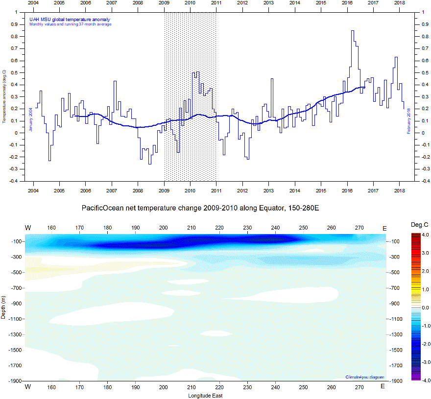
Upper panel: Global monthly average lower troposphere temperature since January 2004 according to University of Alabama at Huntsville (UAH), USA. Reference period 1981-2010. Lower panel: Global ocean net temperature change 2009-2010 (average for 2010 minus average for 2009; period hatched in upper panel) along Equator (150-280 E) from surface to 1900 m depth, using Argo-data. Last diagram update: 12 March 2018.
-
Click here to download the series of UAH MSU global monthly lower troposphere temperature anomalies since December 1978.
-
Source for Argo data: Global Marine Argo Atlas. Additional information can be found in: Roemmich, D. and J. Gilson, 2009. The 2004-2008 mean and annual cycle of temperature, salinity, and steric height in the global ocean from the Argo Program. Progress in Oceanography, 82, 81-100.
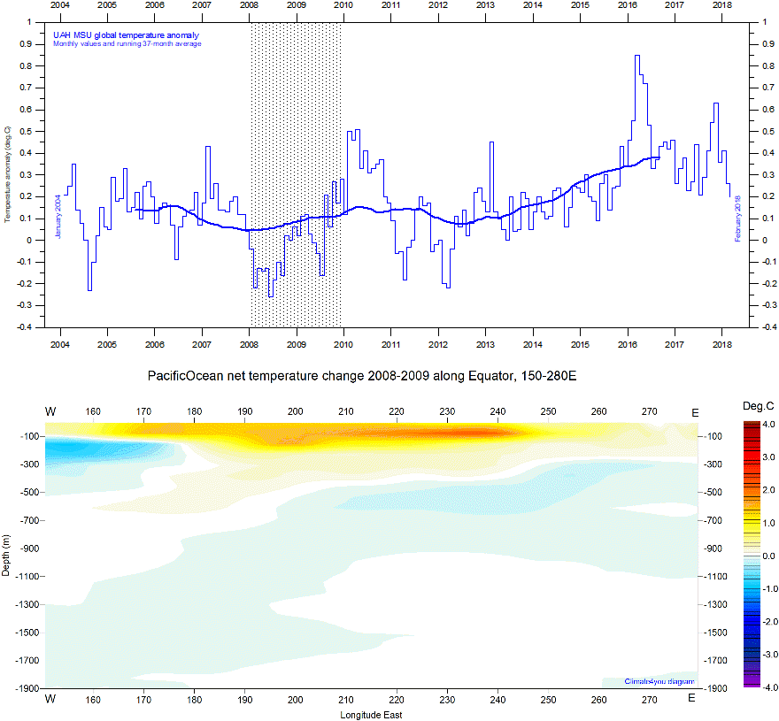
Upper panel: Global monthly average lower troposphere temperature since January 2004 according to University of Alabama at Huntsville (UAH), USA. Reference period 1981-2010. Lower panel: Global ocean net temperature change 2008-2009 (average for 2009 minus average for 2008; period hatched in upper panel) along Equator (150-280 E) from surface to 1900 m depth, using Argo-data. Last diagram update: 12 March 2018.
-
Click here to download the series of UAH MSU global monthly lower troposphere temperature anomalies since December 1978.
-
Source for Argo data: Global Marine Argo Atlas. Additional information can be found in: Roemmich, D. and J. Gilson, 2009. The 2004-2008 mean and annual cycle of temperature, salinity, and steric height in the global ocean from the Argo Program. Progress in Oceanography, 82, 81-100.
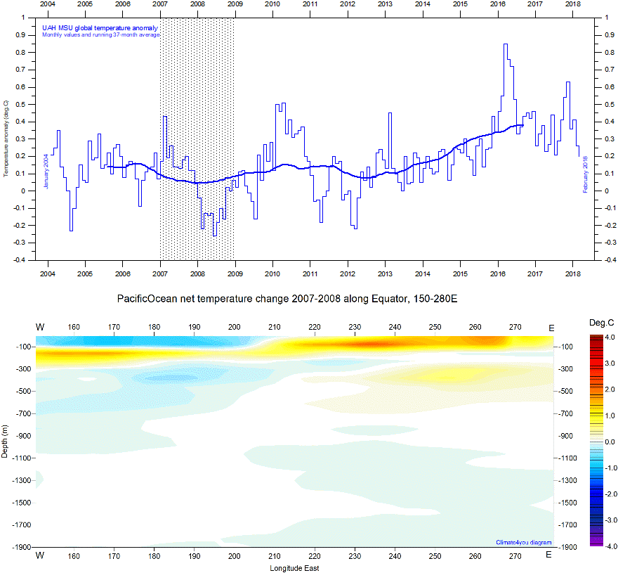
Upper panel: Global monthly average lower troposphere temperature since January 2004 according to University of Alabama at Huntsville (UAH), USA. Reference period 1981-2010. Lower panel: Global ocean net temperature change 2007-2008 (average for 2008 minus average for 2007; period hatched in upper panel) along Equator (150-280 E) from surface to 1900 m depth, using Argo-data. Last diagram update: 12 March 2018.
-
Click here to download the series of UAH MSU global monthly lower troposphere temperature anomalies since December 1978.
-
Source for Argo data: Global Marine Argo Atlas. Additional information can be found in: Roemmich, D. and J. Gilson, 2009. The 2004-2008 mean and annual cycle of temperature, salinity, and steric height in the global ocean from the Argo Program. Progress in Oceanography, 82, 81-100.
Upper panel: Global monthly average lower troposphere temperature since January 2004 according to University of Alabama at Huntsville (UAH), USA. Reference period 1981-2010. Lower panel: Global ocean net temperature change 2006-2007 (average for 2007 minus average for 2006; period hatched in upper panel) along Equator (150-280 E) from surface to 1900 m depth, using Argo-data. Last diagram update: 12 March 2018.
-
Click here to download the series of UAH MSU global monthly lower troposphere temperature anomalies since December 1978.
-
Source for Argo data: Global Marine Argo Atlas. Additional information can be found in: Roemmich, D. and J. Gilson, 2009. The 2004-2008 mean and annual cycle of temperature, salinity, and steric height in the global ocean from the Argo Program. Progress in Oceanography, 82, 81-100.
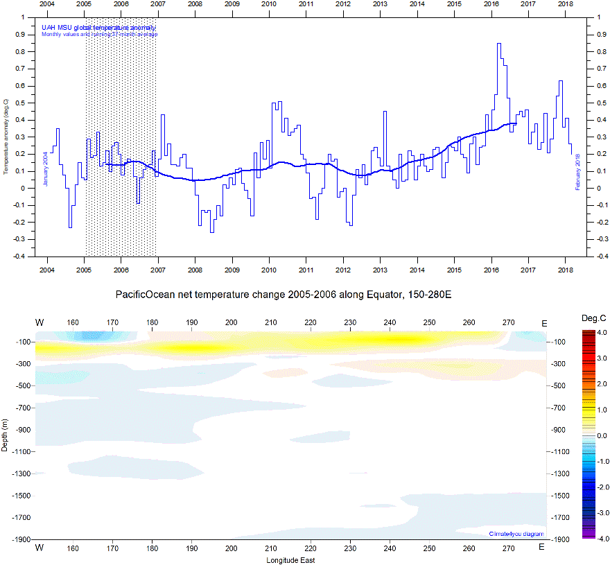
Upper panel: Global monthly average lower troposphere temperature since January 2004 according to University of Alabama at Huntsville (UAH), USA. Reference period 1981-2010. Lower panel: Global ocean net temperature change 2005-2006 (average for 2006 minus average for 2005; period hatched in upper panel) along Equator (150-280 E) from surface to 1900 m depth, using Argo-data. Last diagram update: 12 March 2018.
-
Click here to download the series of UAH MSU global monthly lower troposphere temperature anomalies since December 1978.
-
Source for Argo data: Global Marine Argo Atlas. Additional information can be found in: Roemmich, D. and J. Gilson, 2009. The 2004-2008 mean and annual cycle of temperature, salinity, and steric height in the global ocean from the Argo Program. Progress in Oceanography, 82, 81-100.
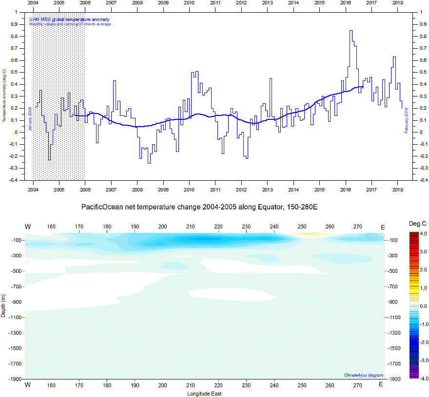
Upper panel: Global monthly average lower troposphere temperature since January 2004 according to University of Alabama at Huntsville (UAH), USA. Reference period 1981-2010. Lower panel: Global ocean net temperature change 2004-2005 (average for 2005 minus average for 2004; period hatched in upper panel) along Equator (150-280 E) from surface to 1900 m depth, using Argo-data. Last diagram update: 12 March 2018.
-
Click here to download the series of UAH MSU global monthly lower troposphere temperature anomalies since December 1978.
-
Source for Argo data: Global Marine Argo Atlas. Additional information can be found in: Roemmich, D. and J. Gilson, 2009. The 2004-2008 mean and annual cycle of temperature, salinity, and steric height in the global ocean from the Argo Program. Progress in Oceanography, 82, 81-100.
Click here to jump back to list of contents.
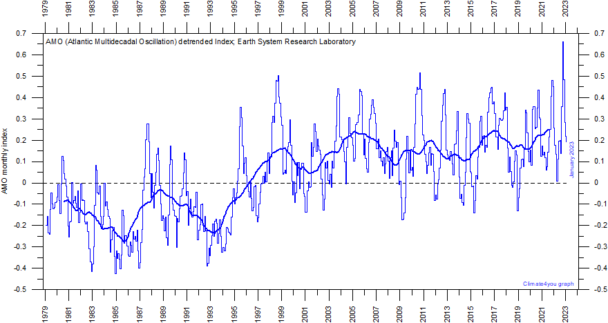
AMO (Atlantic Multidecadal Oscillation) Index
The Atlantic Multidecadal Oscillation (AMO) is a mode of variability occurring in the North Atlantic Ocean sea surface temperature field, identified by Schlesinger and Ramankutty in 1994. The AMO is basically an index of North Atlantic sea surface temperatures (SST).
The
AMO index appears to be correlated to air temperatures and rainfall over much of
the Northern Hemisphere. The association appears to be high for North
Eastern Brazil, African Sahel rainfall and North American and European summer
climate. The AMO index also appears to be associated with changes in the
frequency of North American droughts and is reflected in the frequency of severe
Atlantic hurricanes.
Often AMO values are shown linearly detrended to remove the overall increase since 1856, to emphasise the apparent about 65 year rhythmic variation.

Annual Atlantic Multidecadal Oscillation (AMO) detrended index values since 1856. The thin line indicates 3 month average values, and the thick line is the simple running 11 year average. Further explanation in text above. Data source: Earth System Research Laboratory at NOAA. Last year shown: 2022. Last diagram update: 24 January 2023.
-
Click here to download the entire series of the Atlantic Multidecadal Oscillation (AMO) index values since 1856; choose AMO unsmoothed, long (Standard PSL Format).
-
Click here to read about data smoothing.
Monthly Atlantic Multidecadal Oscillation (AMO) detrended index values since January 1979. The thin line indicates 3 month average values, and the thick line is the simple running 11 year average. By choosing January 1979 as starting point, the diagram is easy to compare with other types of temperature diagrams covering the satellite period since 1979. Further explanation in text above. Data source: Earth System Research Laboratory at NOAA. Last month shown: January 2023. Last diagram update: 11 May 2023.
-
Click here to download the entire series of the Atlantic Multidecadal Oscillation (AMO) index values since 1856; choose AMO unsmoothed, short (1948 to present).
-
Click here to see the entire series of annual AMO index values since 1856.
-
Click here to read about data smoothing.
Click here to jump back to list of contents.
Global (or eustatic) sea-level change is measured relative to an idealised reference level, the geoid, which is a mathematical model of planet Earth’s surface (Carter et al. 2014). Global sea-level is a function of the volume of the ocean basins and the volume of water they contain. Changes in global sea-level are caused by – but not limited to - four main mechanisms:
-
Changes in local and regional air pressure and wind, and tidal changes introduced by the Moon.
-
Changes in ocean basin volume by tectonic (geological) forces.
-
Changes in ocean water density caused by variations in currents, water temperature and salinity.
-
Changes in the volume of water caused by changes in the mass balance of terrestrial glaciers.
1.
In
addition to these there are other mechanisms influencing sea-level; such as
storage of ground water, storage in lakes and rivers, evaporation, etc.
Mechanism 1 is controlling sea-level at many sites on a time scale from months to several years. As an example, many coastal stations show a pronounced annual variation reflecting seasonal changes in air pressures and wind speed. Longer-term climatic changes playing out over decades or centuries will also affect measurements of sea-level changes. Hansen et al. (2011, 2015) provide excellent analyses of sea-level changes caused by recurrent changes of the orbit of the Moon and other phenomena.
Mechanism
2 – with the important exception of earthquakes and tsunamis - typically
operates over long (geological) time scales, and is not significant on human
time scales. It may relate to variations in the sea-floor spreading rate,
causing volume changes in mid-ocean mountain ridges, and to the slowly changing
configuration of land and oceans. Another effect may be the slow rise of basins
due to isostatic offloading by deglaciation after an ice age. The floor of the
Baltic Sea and the Hudson Bay are presently rising, causing a slow net transfer
of water from these basins into the adjoining oceans. Slow changes of very big
glaciers (ice sheets) and movements in the mantle will affect the gravity field
and thereby the vertical position of the ocean surface. Any increase of the
total water mass as well as sediment deposition into oceans increase the load on
their bottom, generating sinking by viscoelastic flow in the mantle below. The
mantle flow is directed towards the sourrounding land areas, which will rise,
thereby partly compensating for the initial sea level increase induced by the
increased water mass in the ocean.
Mechanism
3 (temperature-driven expansion) only affects the uppermost part of the
oceans on human time scales. Usually, temperature-driven changes in density are
more important than salinity-driven changes. Seawater is characterised by a
relatively small coefficient of expansion, but the effect should however not be
overlooked, especially when interpreting satellite altimetry data.
Temperature-driven expansion of a column of seawater will not affect the total
mass of water within the column considered, and will therefore not affect the
potential at the top of the water column. Temperature-driven ocean
water expansion will therefore not in itself lead to lateral displacement of
water, but only lift the ocean surface locally. Near the coast, where people are
living, the depth of water approaches zero, so no temperature-driven expansion
will take place here (Mörner 2015). Mechanism 3 is for that reason not important for
coastal regions.
Mechanism
4 (changes in glacier mass balance) is an important driver for global
sea-level changes along coasts, for human time scales. Volume changes of
floating glaciers – ice shelves – has no influence on the global sea-level,
just like volume changes of floating sea ice has no influence. Only the
mass-balance of grounded or land-based glaciers is important for the global
sea-level along coasts.
Summing up: Mechanism 1 and 4 are the most important for understanding sea-level changes along coasts.
Click
here to jump back to list of contents.
Tide-gauges
are located directly at coastal sites, and record the net movement of the local
ocean surface in relation to land.
Local
relative sea-level change is what counts for purposes of coastal
planning,
so tide-gauge data are directly applicable for
planning purposes for coastal installations (Carter
et al. 2014). In a more scientific context, the
measured net movement of the local sea-level is composed of two local
components: 1) The vertical change of the ocean surface, and 2) the vertical
change of the land surface. If one of these is known, the other component can be
calculated.
The tide-gauge data displayed below are all downloaded from the public access PSMSL Data Explorer. In order to construct time series of sea level measurements at each station, the monthly and annual means have to be reduced to a common datum. This reduction is performed by the PSMSL making use of the tide gauge datum history provided by the supplying authority. The Revised Local Reference (RLR) datum at each station is defined to be approximately 7000 mm below mean sea level, with this arbitrary choice made many years ago in order to avoid negative numbers in the resulting RLR monthly and annual mean values.
A selection of PSMSL-stations are displayed below, organised from north to south (now ion process of being reorganised countrywise).
AUSTRALIA
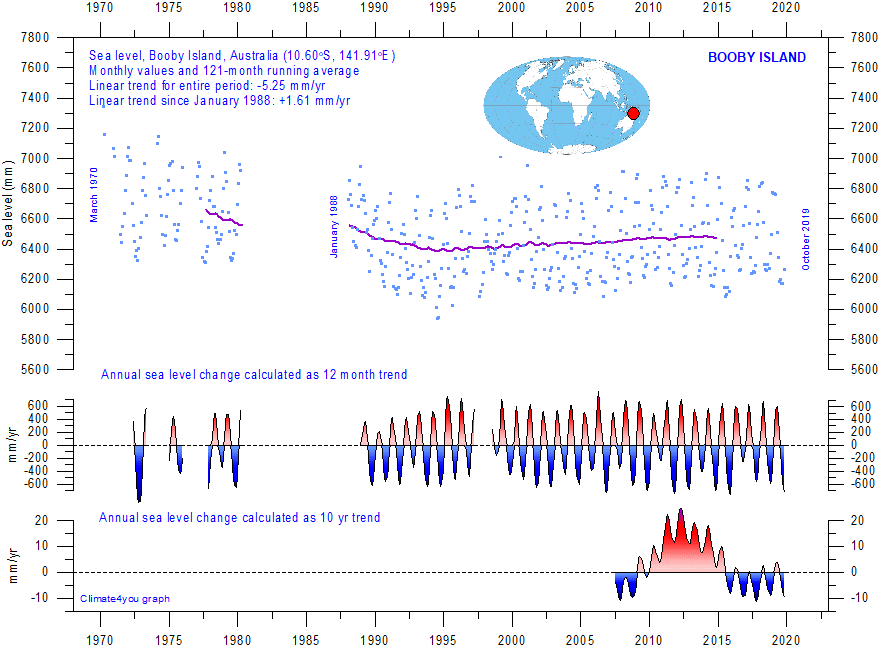
Booby Island (Australia) monthly tide gauge data from PSMSL Data Explorer. The blue dots are the individual monthly observations, and the purple line represents the running 121-month (ca. 10 yr) average. The two lower panels show the annual sea level change, calculated for 1 and 10 yr time windows, respectively. These values are plotted at the end of the interval considered. Last month shown: December 2019. Last diagram update: October 29, 2020.
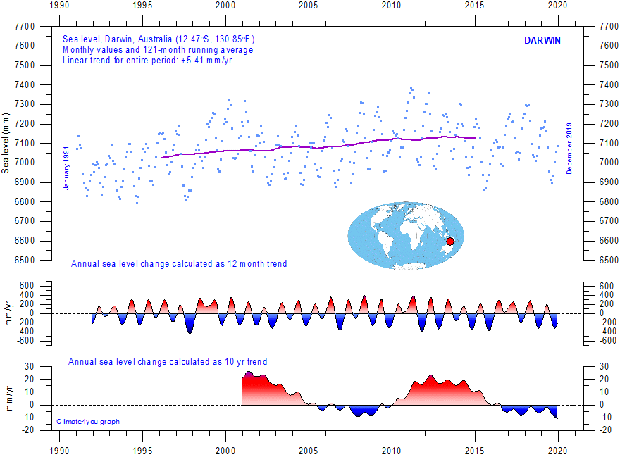
Darwin (Australia) monthly tide gauge data from PSMSL Data Explorer. The blue dots are the individual monthly observations, and the purple line represents the running 121-month (ca. 10 yr) average. The two lower panels show the annual sea level change, calculated for 1 and 10 yr time windows, respectively. These values are plotted at the end of the interval considered. Last month shown: December 2023. Last diagram update: November 8, 2024.
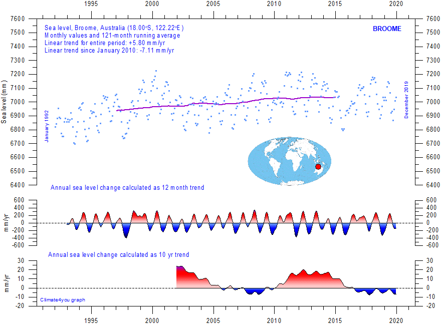
Broome (Australia) monthly tide gauge data from PSMSL Data Explorer. The blue dots are the individual monthly observations, and the purple line represents the running 121-month (ca. 10 yr) average. The two lower panels show the annual sea level change, calculated for 1 and 10 yr time windows, respectively. These values are plotted at the end of the interval considered. Last month shown: December 2023. Last diagram update: March 13, 2025.
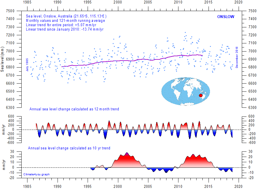
Onslow (Australia) monthly tide gauge data from PSMSL Data Explorer. The blue dots are the individual monthly observations, and the purple line represents the running 121-month (ca. 10 yr) average. The two lower panels show the annual sea level change, calculated for 1 and 10 yr time windows, respectively. These values are plotted at the end of the interval considered. Last month shown: December 2019. Last diagram update: October 29, 2020.
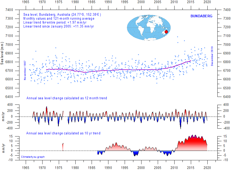
Bundaberg (Australia) monthly tide gauge data from PSMSL Data Explorer. The blue dots are the individual monthly observations, and the purple line represents the running 121-month (ca. 10 yr) average. The two lower panels show the annual sea level change, calculated for 1 and 10 yr time windows, respectively. These values are plotted at the end of the interval considered. Last month shown: December 2023. Last diagram update: November 30, 2024.
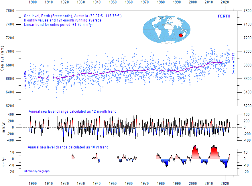
Perth (Australia) monthly tide gauge data from PSMSL Data Explorer. The blue dots are the individual monthly observations, and the purple line represents the running 121-month (ca. 10 yr) average. The two lower panels show the annual sea level change, calculated for 1 and 10 yr time windows, respectively. These values are plotted at the end of the interval considered. Last month shown: December 2022. Last diagram update: 13 November 2023.
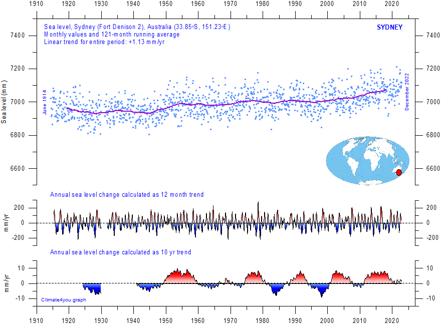
Sydney (Australia) monthly tide gauge data from PSMSL Data Explorer. The blue dots are the individual monthly observations, and the purple line represents the running 121-month (ca. 10 yr) average. The two lower panels show the annual sea level change, calculated for 1 and 10 yr time windows, respectively. These values are plotted at the end of the interval considered. Last month shown: December 2023. Last diagram update: 7 October 2024.
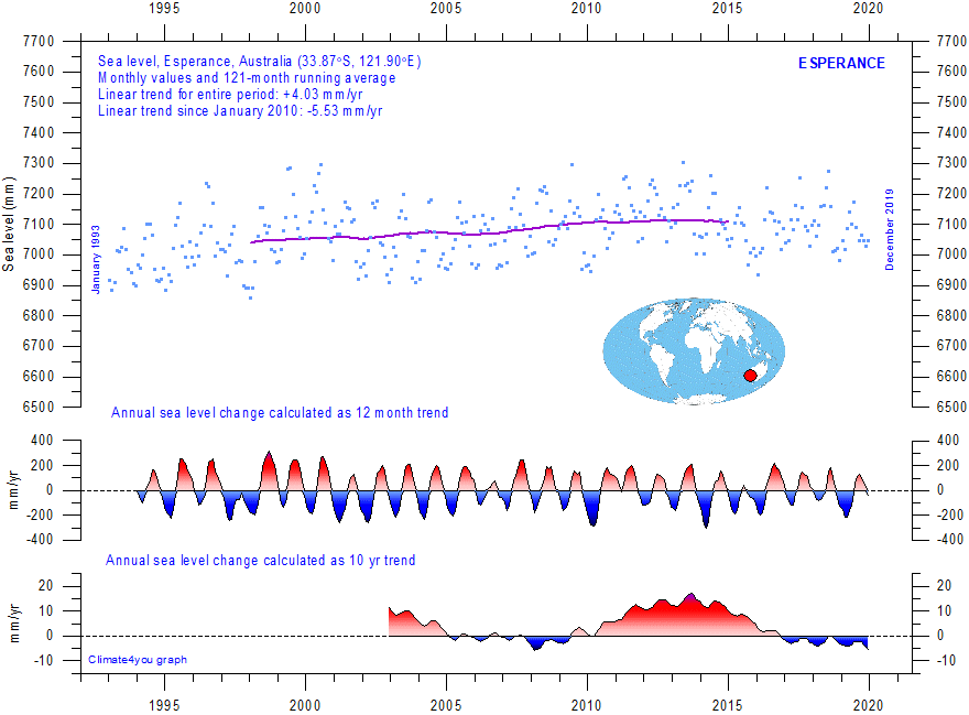
Esperance (Australia) monthly tide gauge data from PSMSL Data Explorer. The blue dots are the individual monthly observations, and the purple line represents the running 121-month (ca. 10 yr) average. The two lower panels show the annual sea level change, calculated for 1 and 10 yr time windows, respectively. These values are plotted at the end of the interval considered. Last month shown: December 2019. Last diagram update: October 29, 2020.
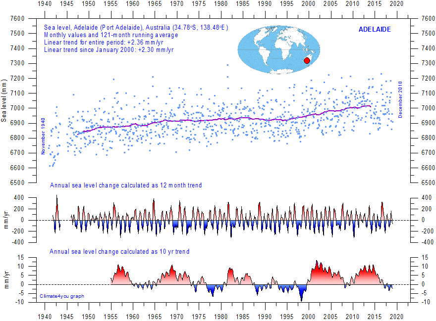
Adelaide (Australia) monthly tide gauge data from PSMSL Data Explorer. The blue dots are the individual monthly observations, and the purple line represents the running 121-month (ca. 10 yr) average. The two lower panels show the annual sea level change, calculated for 1 and 10 yr time windows, respectively. These values are plotted at the end of the interval considered. Last month shown: December 2018. Last diagram update: October 29, 2020.
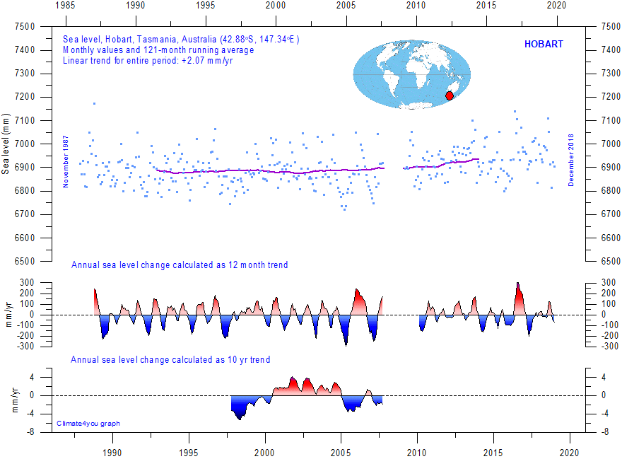
Hobart (Australia) monthly tide gauge data from PSMSL Data Explorer. The blue dots are the individual monthly observations, and the purple line represents the running 121-month (ca. 10 yr) average. The two lower panels show the annual sea level change, calculated for 1 and 10 yr time windows, respectively. These values are plotted at the end of the interval considered. Last month shown: December 2018. Last diagram update: October 29, 2020.
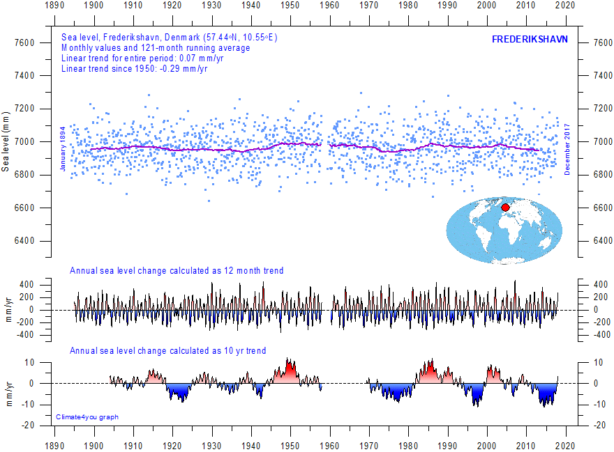
Frederikshavn (N Denmark) monthly tide gauge data from PSMSL Data Explorer. The blue dots are the individual monthly observations, and the purple line represents the running 121-month (ca. 10 yr) average. The two lower panels show the annual sea level change, calculated for 1 and 10 yr time windows, respectively. These values are plotted at the end of the interval considered. Last month shown: December 2017. Last diagram update: October 4, 2020.
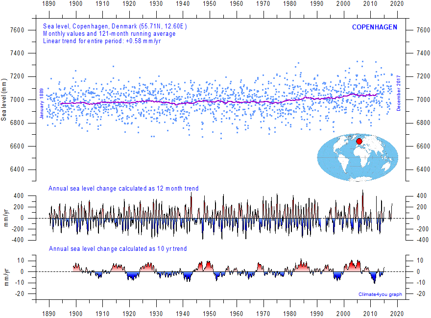
Copenhagen (E Denmark) monthly tide gauge data from PSMSL Data Explorer. The blue dots are the individual monthly observations, and the purple line represents the running 121-month (ca. 10 yr) average. The two lower panels show the annual sea level change, calculated for 1 and 10 yr time windows, respectively. These values are plotted at the end of the interval considered. Last month shown: December 2017. Last diagram update: October 4, 2020.
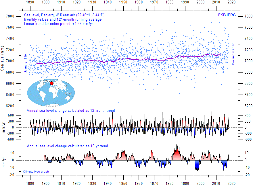
Esbjerg (W Denmark) monthly tide gauge data from PSMSL Data Explorer. The blue dots are the individual monthly observations, and the purple line represents the running 121-month (ca. 10 yr) average. The two lower panels show the annual sea level change, calculated for 1 and 10 yr time windows, respectively. These values are plotted at the end of the interval considered. Last month shown: December 2017. Last diagram update: October 4, 2020.
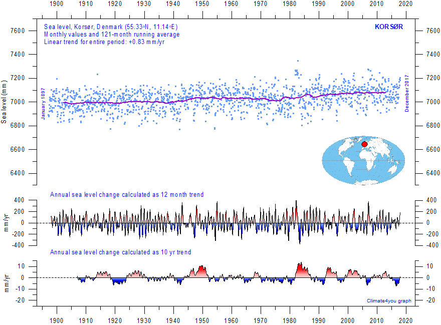
Korsør (Denmark) monthly tide gauge data from PSMSL Data Explorer. The blue dots are the individual monthly observations, and the purple line represents the running 121-month (ca. 10 yr) average. The two lower panels show the annual sea level change, calculated for 1 and 10 yr time windows, respectively. These values are plotted at the end of the interval considered. Last month shown: December 2017. Last diagram update: October 4, 2020.
Few places on Earth are completely stable, and most
tide-gauges are located at sites exposed to tectonic uplift or -sinking (the
vertical change of the land surface). This widespread vertical instability has
several causes, but of cause affects the interpretation of data from the
individual tide-gauges. Of special interest concerning the real short- and
long-term sea level change is therefore data obtained by tide-gauges located at
tectonic stable sites. One example of a long record obtained from such a site is
shown in the diagram above (Korsør, Denmark). This record indicates a stable
sea level rise of about 0.83 mm per year, without indication of recent
acceleration.
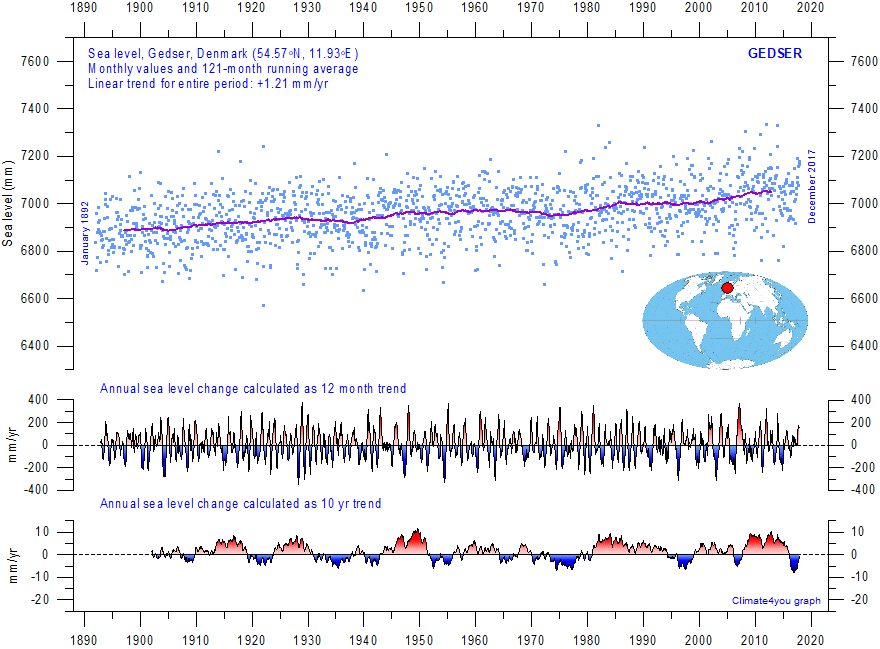
Gedser (Denmark) monthly tide gauge data from PSMSL Data Explorer. The blue dots are the individual monthly observations, and the purple line represents the running 121-month (ca. 10 yr) average. The two lower panels show the annual sea level change, calculated for 1 and 10 yr time windows, respectively. These values are plotted at the end of the interval considered. Last month shown: December 2017. Last diagram update: October 4, 2020.
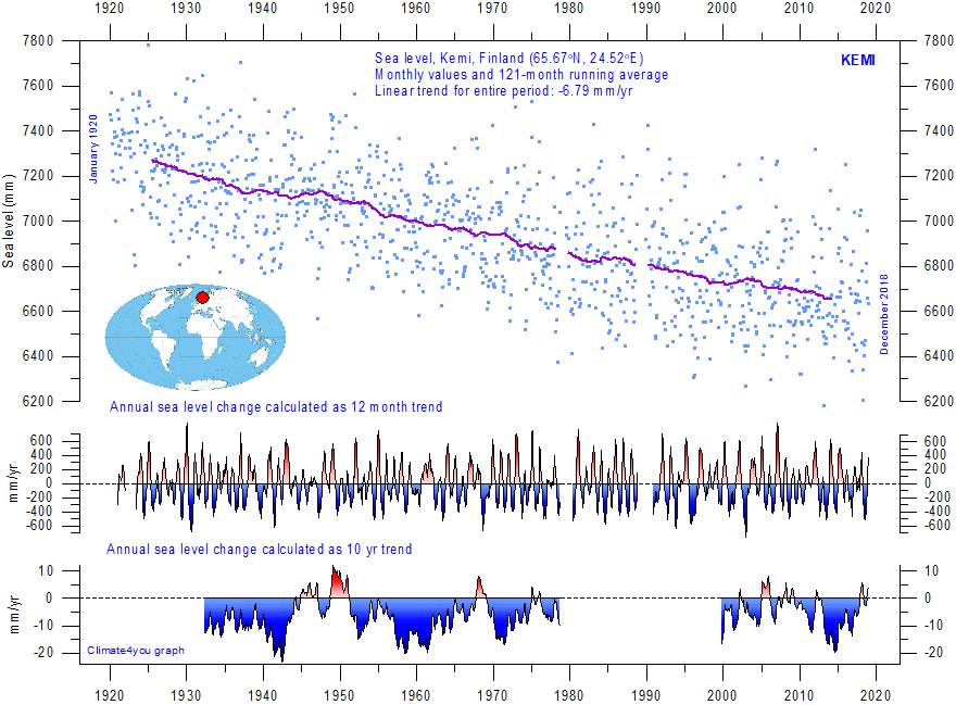
Kemi (Finland) monthly tide gauge data from PSMSL Data Explorer. The blue dots are the individual monthly observations, and the purple line represents the running 121-month (ca. 10 yr) average. The two lower panels show the annual sea level change, calculated for 1 and 10 yr time windows, respectively. These values are plotted at the end of the interval considered. Last month shown: December 2018. Last diagram update: October 7, 2020.
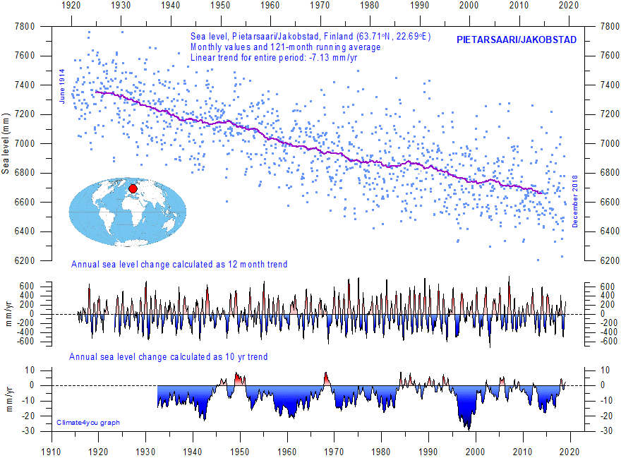
Pietarsaari/Jakobstad (Finland) monthly tide gauge data from PSMSL Data Explorer. The blue dots are the individual monthly observations, and the purple line represents the running 121-month (ca. 10 yr) average. The two lower panels show the annual sea level change, calculated for 1 and 10 yr time windows, respectively. These values are plotted at the end of the interval considered. Last month shown: December 2018. Last diagram update: October 7, 2020.
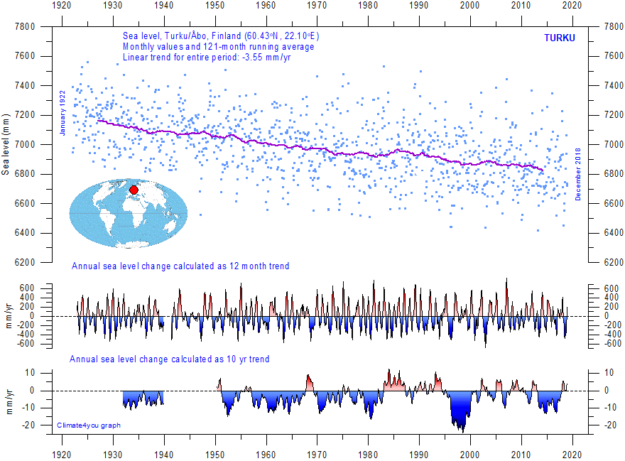
Turku/Åbo (Finland) monthly tide gauge data from PSMSL Data Explorer. The blue dots are the individual monthly observations, and the purple line represents the running 121-month (ca. 10 yr) average. The two lower panels show the annual sea level change, calculated for 1 and 10 yr time windows, respectively. These values are plotted at the end of the interval considered. Last month shown: December 2018. Last diagram update: October 7, 2020.
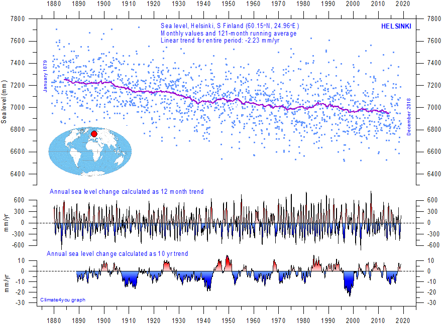
Helsinki (Finland) monthly tide gauge data from PSMSL Data Explorer. The blue dots are the individual monthly observations, and the purple line represents the running 121-month (ca. 10 yr) average. The two lower panels show the annual sea level change, calculated for 1 and 10 yr time windows, respectively. These values are plotted at the end of the interval considered. Last month shown: December 2018. Last diagram update: October 7, 2020.
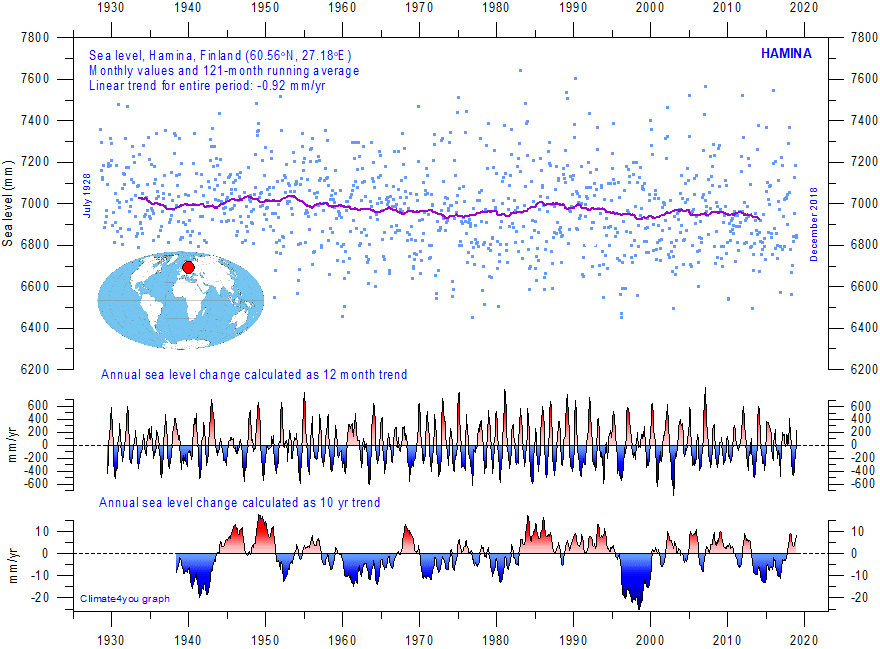
Hamina (SE Finland) monthly tide gauge data from PSMSL Data Explorer. The blue dots are the individual monthly observations, and the purple line represents the running 121-month (ca. 10 yr) average. The two lower panels show the annual sea level change, calculated for 1 and 10 yr time windows, respectively. These values are plotted at the end of the interval considered. Last month shown: December 2018. Last diagram update: October 7, 2020.
GERMANY
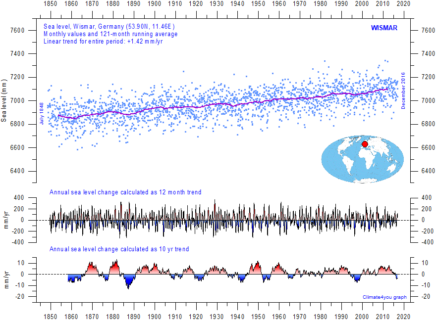
Wismar (N Germany) monthly tide gauge data from PSMSL Data Explorer. The blue dots are the individual monthly observations, and the purple line represents the running 121-month (ca. 10 yr) average. The two lower panels show the annual sea level change, calculated for 1 and 10 yr time windows, respectively. These values are plotted at the end of the interval considered. Last month shown: December 2016. Last diagram update: June 23, 2018.
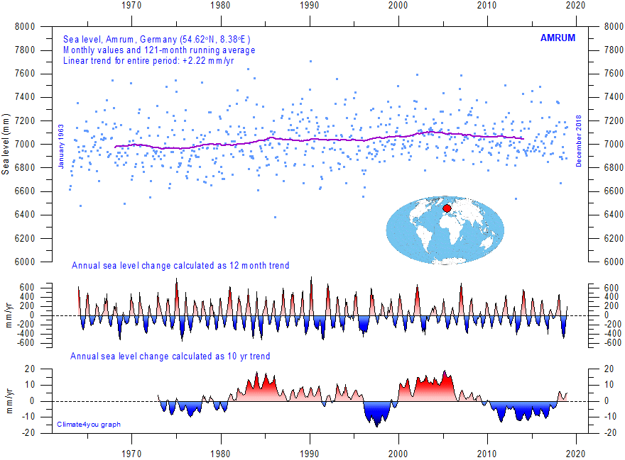
Amrum (NW Germany) monthly tide gauge data from PSMSL Data Explorer. The blue dots are the individual monthly observations, and the purple line represents the running 121-month (ca. 10 yr) average. The two lower panels show the annual sea level change, calculated for 1 and 10 yr time windows, respectively. These values are plotted at the end of the interval considered. Last month shown: December 2018. Last diagram update: October 10, 2020.
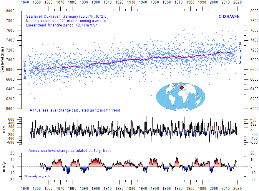
Cuxhaven (NW Germany) monthly tide gauge data from PSMSL Data Explorer. The blue dots are the individual monthly observations, and the purple line represents the running 121-month (ca. 10 yr) average. The two lower panels show the annual sea level change, calculated for 1 and 10 yr time windows, respectively. These values are plotted at the end of the interval considered. Last month shown: December 2018. Last diagram update: October 10, 2020.
NETHERLANDS
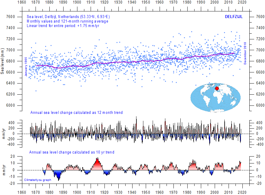
Delfzijl (NE Netherlands) monthly tide gauge data from PSMSL Data Explorer. The blue dots are the individual monthly observations, and the purple line represents the running 121-month (ca. 10 yr) average. The two lower panels show the annual sea level change, calculated for 1 and 10 yr time windows, respectively. These values are plotted at the end of the interval considered. Last month shown: December 2018. Last diagram update: October 10, 2020.
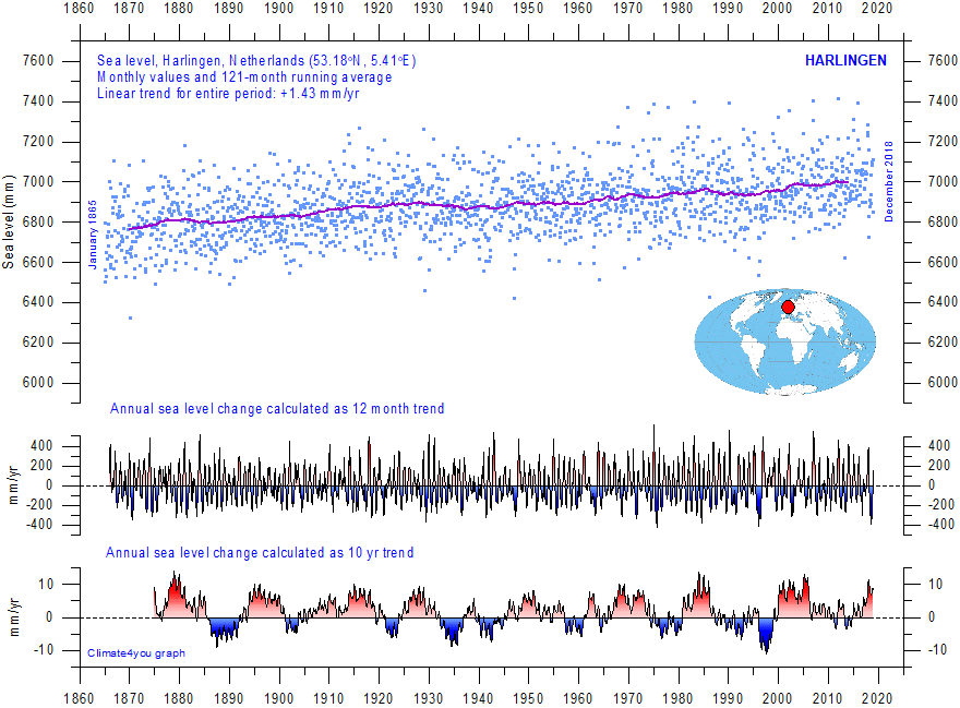
Harlingen (N Netherlands) monthly tide gauge data from PSMSL Data Explorer. The blue dots are the individual monthly observations, and the purple line represents the running 121-month (ca. 10 yr) average. The two lower panels show the annual sea level change, calculated for 1 and 10 yr time windows, respectively. These values are plotted at the end of the interval considered. Last month shown: December 2018. Last diagram update: October 10, 2020.
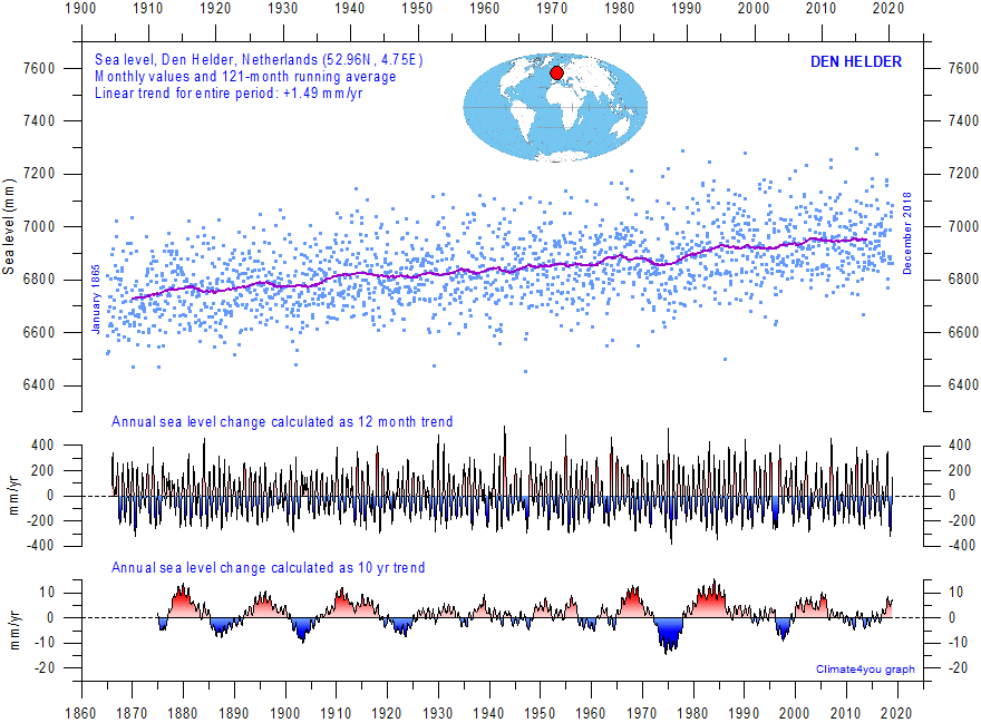
Den Helder (W Netherlands) monthly tide gauge data from PSMSL Data Explorer. The blue dots are the individual monthly observations, and the purple line represents the running 121-month (ca. 10 yr) average. The two lower panels show the annual sea level change, calculated for 1 and 10 yr time windows, respectively. These values are plotted at the end of the interval considered. Last month shown: December 2018. Last diagram update: July 31, 2019.
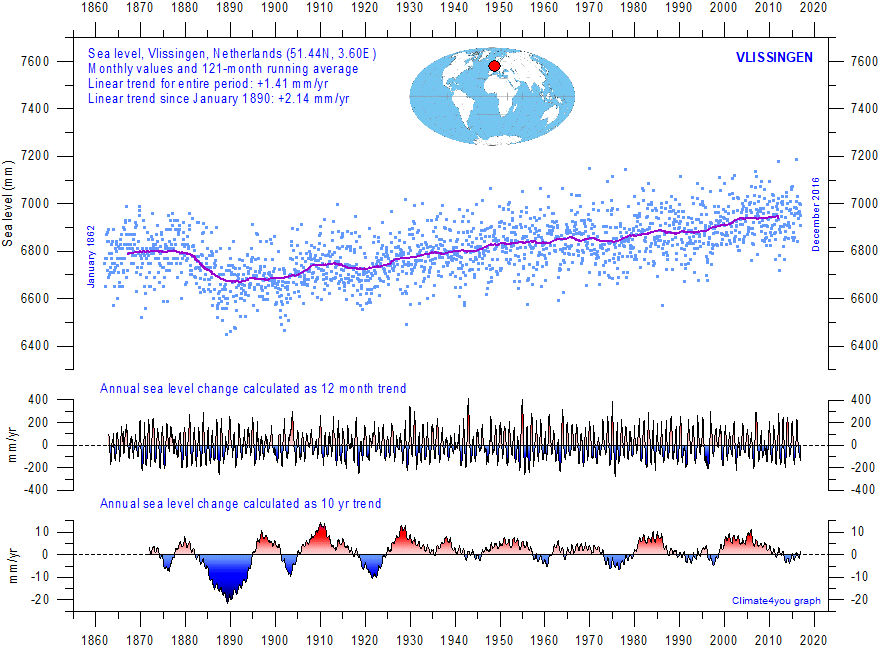
Vlissingen (W Netherlands) monthly tide gauge data from PSMSL Data Explorer. The blue dots are the individual monthly observations, and the purple line represents the running 121-month (ca. 10 yr) average. The two lower panels show the annual sea level change, calculated for 1 and 10 yr time windows, respectively. These values are plotted at the end of the interval considered. Last month shown: December 2016. Last diagram update: October 5, 2017.
NEW ZEALAND
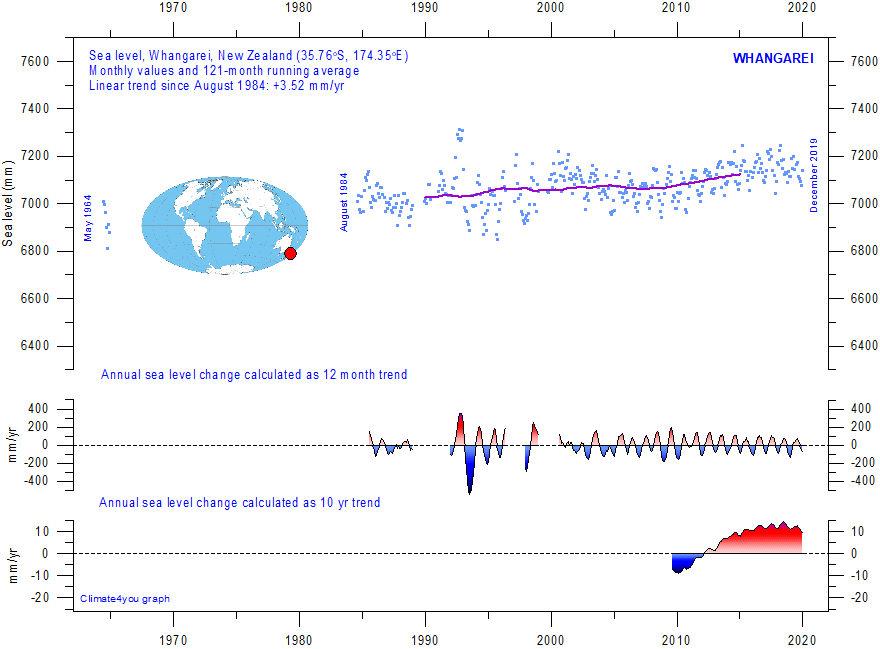
Whangarei (New Zealand) monthly tide gauge data from PSMSL Data Explorer. The blue dots are the individual monthly observations, and the purple line represents the running 121-month (ca. 10 yr) average. The two lower panels show the annual sea level change, calculated for 1 and 10 yr time windows, respectively. These values are plotted at the end of the interval considered. Last month shown: December 2019. Last diagram update: October 23, 2020.
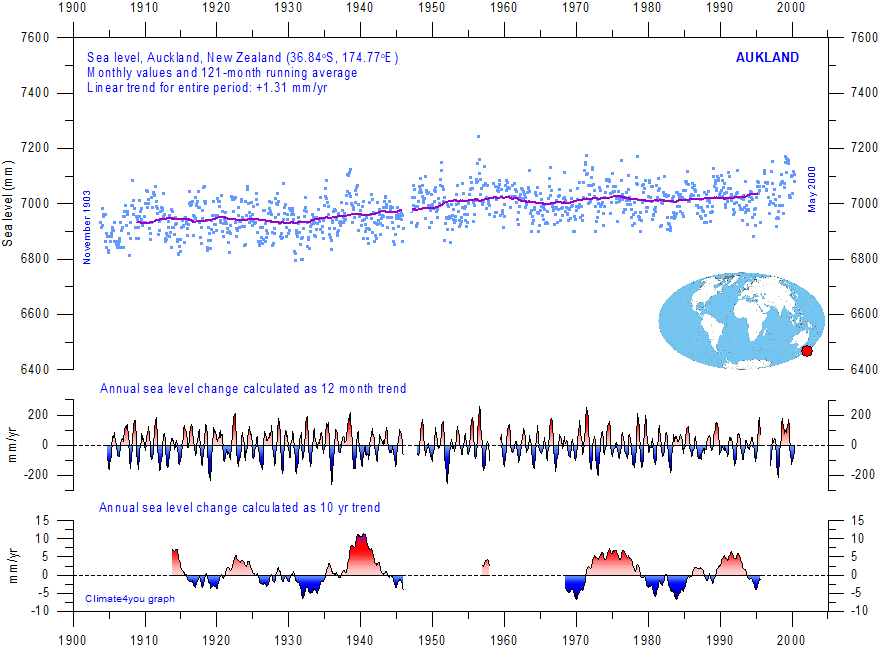
Auckland (New Zealand) monthly tide gauge data from PSMSL Data Explorer. The blue dots are the individual monthly observations, and the purple line represents the running 121-month (ca. 10 yr) average. The two lower panels show the annual sea level change, calculated for 1 and 10 yr time windows, respectively. These values are plotted at the end of the interval considered. Last month shown: May 2000. Last diagram update: October 23, 2020.
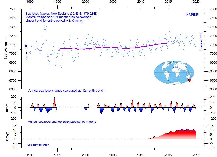
Napier (New Zealand) monthly tide gauge data from PSMSL Data Explorer. The blue dots are the individual monthly observations, and the purple line represents the running 121-month (ca. 10 yr) average. The two lower panels show the annual sea level change, calculated for 1 and 10 yr time windows, respectively. These values are plotted at the end of the interval considered. Last month shown: December 2019. Last diagram update: October 23, 2020.
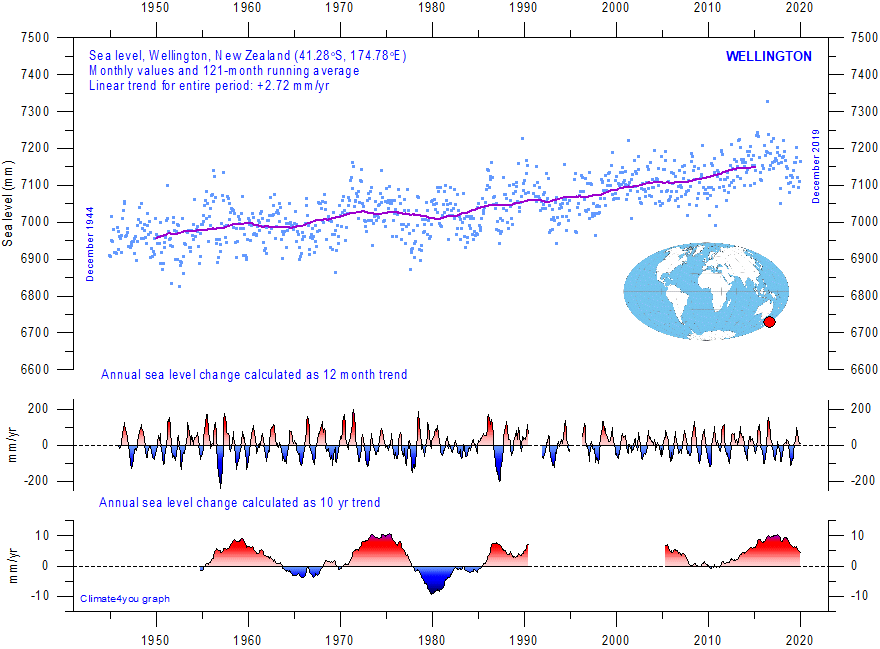
Wellington (New Zealand) monthly tide gauge data from PSMSL Data Explorer. The blue dots are the individual monthly observations, and the purple line represents the running 121-month (ca. 10 yr) average. The two lower panels show the annual sea level change, calculated for 1 and 10 yr time windows, respectively. These values are plotted at the end of the interval considered. Last month shown: December 2019. Last diagram update: October 23, 2020.
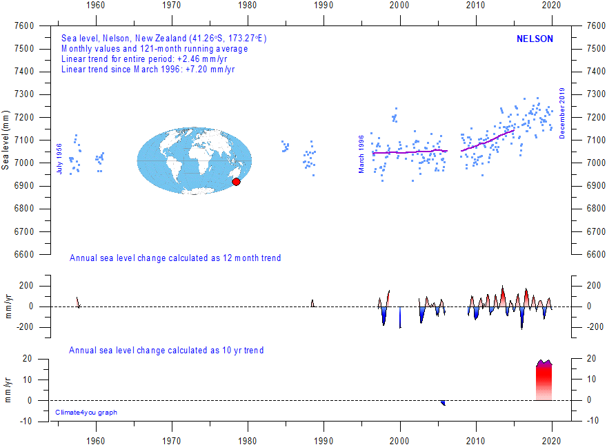
Nelson (New Zealand) monthly tide gauge data from PSMSL Data Explorer. The blue dots are the individual monthly observations, and the purple line represents the running 121-month (ca. 10 yr) average. The two lower panels show the annual sea level change, calculated for 1 and 10 yr time windows, respectively. These values are plotted at the end of the interval considered. Last month shown: December 2019. Last diagram update: October 23, 2020.
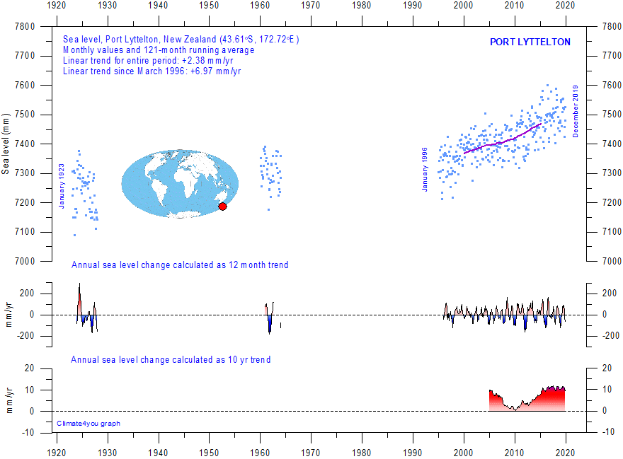
Port Lyttelton (New Zealand) monthly tide gauge data from PSMSL Data Explorer. The blue dots are the individual monthly observations, and the purple line represents the running 121-month (ca. 10 yr) average. The two lower panels show the annual sea level change, calculated for 1 and 10 yr time windows, respectively. These values are plotted at the end of the interval considered. Last month shown: December 2019. Last diagram update: October 23, 2020.
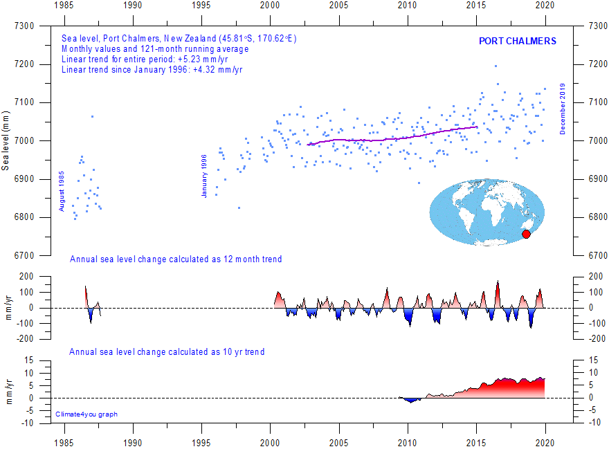
Port Chalmers (New Zealand) monthly tide gauge data from PSMSL Data Explorer. The blue dots are the individual monthly observations, and the purple line represents the running 121-month (ca. 10 yr) average. The two lower panels show the annual sea level change, calculated for 1 and 10 yr time windows, respectively. These values are plotted at the end of the interval considered. Last month shown: December 2019. Last diagram update: October 23, 2020.
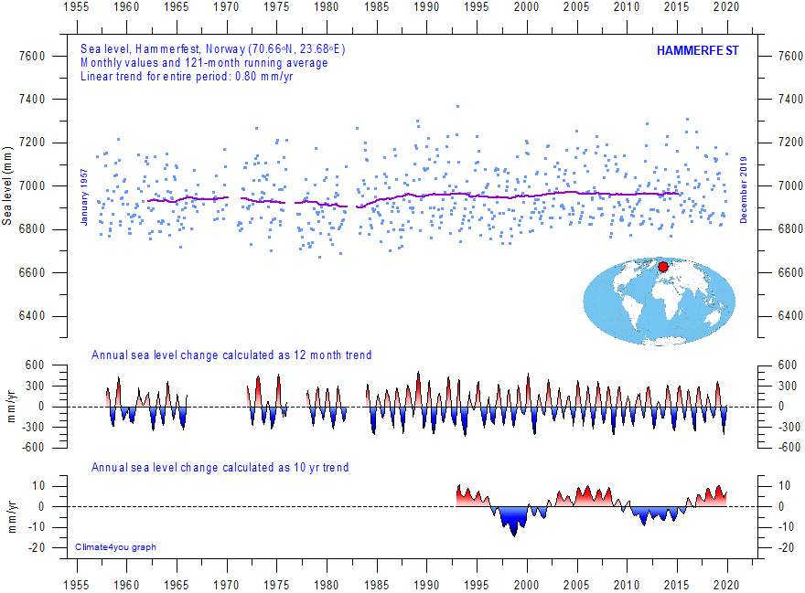
Hammerfest (Norway) monthly tide gauge data from PSMSL Data Explorer. The blue dots are the individual monthly observations, and the purple line represents the running 121-month (ca. 10 yr) average. The two lower panels show the annual sea level change, calculated for 1 and 10 yr time windows, respectively. These values are plotted at the end of the interval considered. Last month shown: December 2019. Last diagram update: October 3, 2020.
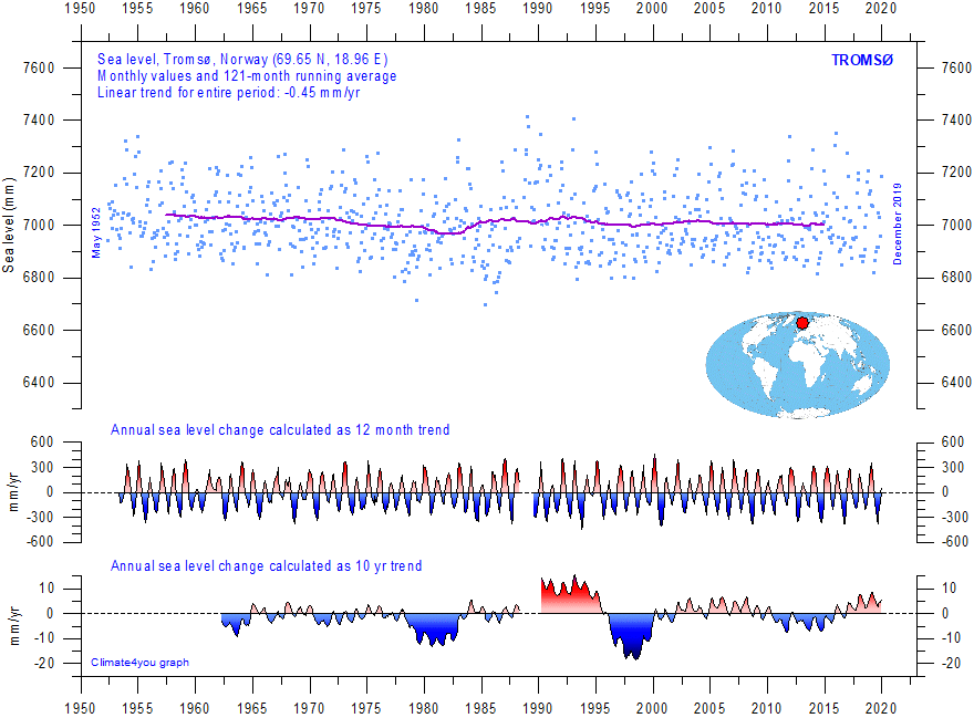
Tromsø (Norway) monthly tide gauge data from PSMSL Data Explorer. The blue dots are the individual monthly observations, and the purple line represents the running 121-month (ca. 10 yr) average. The two lower panels show the annual sea level change, calculated for 1 and 10 yr time windows, respectively. These values are plotted at the end of the interval considered. Last month shown: December 2019. Last diagram update: October 3, 2020.
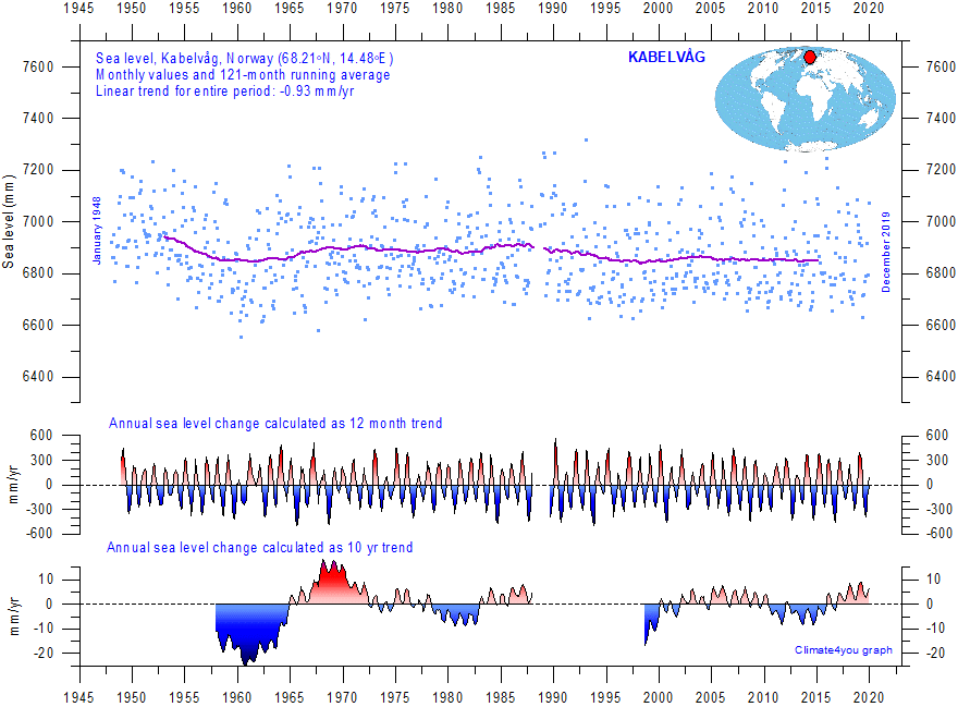
Kabelvåg (Lofoten, Norway) monthly tide gauge data from PSMSL Data Explorer. The blue dots are the individual monthly observations, and the purple line represents the running 121-month (ca. 10 yr) average. The two lower panels show the annual sea level change, calculated for 1 and 10 yr time windows, respectively. These values are plotted at the end of the interval considered. Last month shown: December 2019. Last diagram update: October 3, 2020.
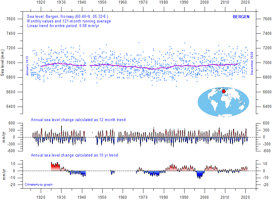
Bergen (Norway) monthly tide gauge data from PSMSL Data Explorer. The blue dots are the individual monthly observations, and the purple line represents the running 121-month (ca. 10 yr) average. The two lower panels show the annual sea level change, calculated for 1 and 10 yr time windows, respectively. These values are plotted at the end of the interval considered. Last month shown: December 2020. Last diagram update: September 9, 2021.
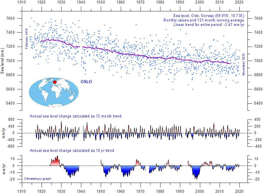
Oslo (Norway) monthly tide gauge data from PSMSL Data Explorer. The blue dots are the individual monthly observations, and the purple line represents the running 121-month (ca. 10 yr) average. The two lower panels show the annual sea level change, calculated for 1 and 10 yr time windows, respectively. These values are plotted at the end of the interval considered. Last month shown: December 2023. Last diagram update: May 11, 2023.
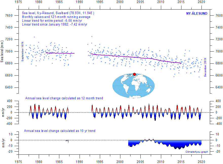
Ny-Ålesund (Svalbard) monthly tide gauge data from PSMSL Data Explorer. The blue dots are the individual monthly observations, and the purple line represents the running 121-month (ca. 10 yr) average. The two lower panels show the annual sea level change, calculated for 1 and 10 yr time windows, respectively. These values are plotted at the end of the interval considered. Last month shown: December 2019. Last diagram update: September 28, 2020.
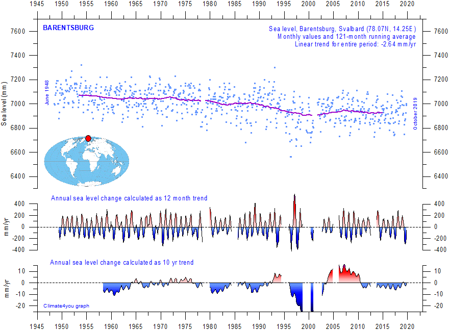
Barentsburg (Svalbard) monthly tide gauge data from PSMSL Data Explorer. The blue dots are the individual monthly observations, and the purple line represents the running 121-month (ca. 10 yr) average. The two lower panels show the annual sea level change, calculated for 1 and 10 yr time windows, respectively. These values are plotted at the end of the interval considered. Last month shown: October 2019. Last diagram update: September 28, 2018.
SWEDEN
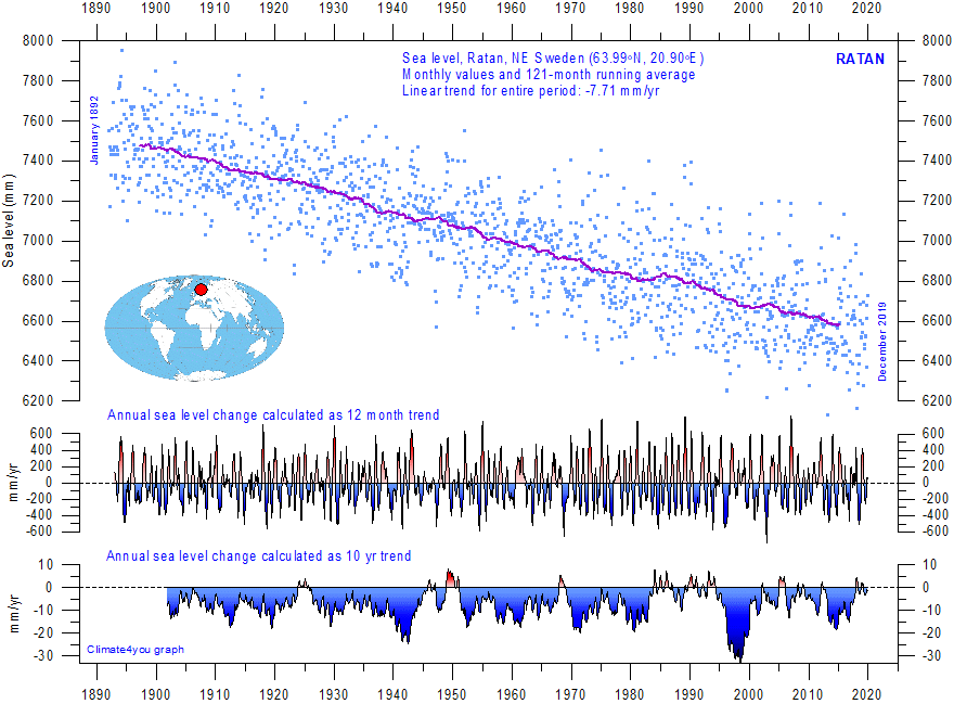
Ratan (NE Sweden) monthly tide gauge data from PSMSL Data Explorer. The blue dots are the individual monthly observations, and the purple line represents the running 121-month (ca. 10 yr) average. The two lower panels show the annual sea level change, calculated for 1 and 10 yr time windows, respectively. Ratan is located near the centre of isostatic uplift, a reminder of the last major glaciation in this region. These values are plotted at the end of the interval considered. Last month shown: December 2019. Last diagram update: October 6, 2020.
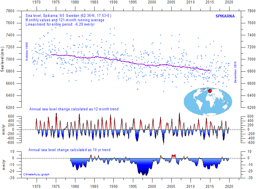
Spikarna (NE Sweden) monthly tide gauge data from PSMSL Data Explorer. The blue dots are the individual monthly observations, and the purple line represents the running 121-month (ca. 10 yr) average. The two lower panels show the annual sea level change, calculated for 1 and 10 yr time windows, respectively. These values are plotted at the end of the interval considered. Last month shown: December 2019. Last diagram update: October 6, 2020.
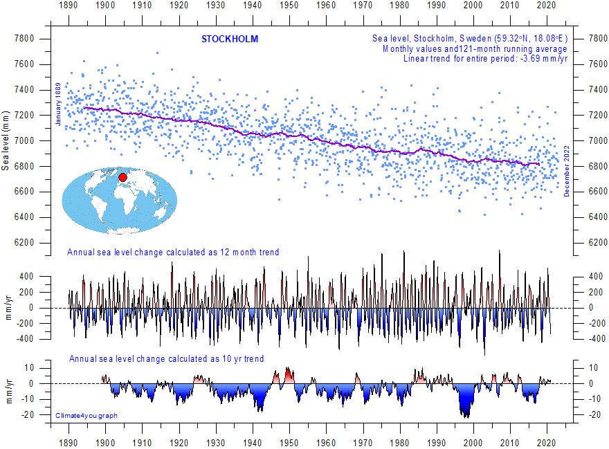
Stockholm (E Sweden) monthly tide gauge data from PSMSL Data Explorer. The blue dots are the individual monthly observations, and the purple line represents the running 121-month (ca. 10 yr) average. The two lower panels show the annual sea level change, calculated for 1 and 10 yr time windows, respectively. These values are plotted at the end of the interval considered. Last month shown: December 2022. Last diagram update: 13 November 2023.
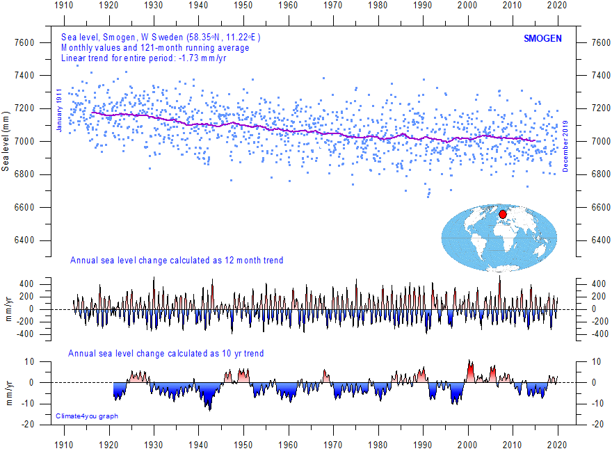
Smogen (W Sweden) monthly tide gauge data from PSMSL Data Explorer. The blue dots are the individual monthly observations, and the purple line represents the running 121-month (ca. 10 yr) average. The two lower panels show the annual sea level change, calculated for 1 and 10 yr time windows, respectively. These values are plotted at the end of the interval considered. Last month shown: December 2019. Last diagram update: October 6, 2020.
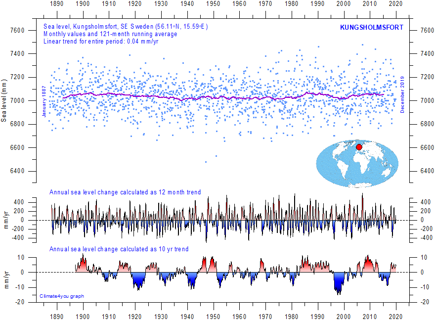
Kungsholmsfort (SE Sweden) monthly tide gauge data from PSMSL Data Explorer. The blue dots are the individual monthly observations, and the purple line represents the running 121-month (ca. 10 yr) average. The two lower panels show the annual sea level change, calculated for 1 and 10 yr time windows, respectively. These values are plotted at the end of the interval considered. Last month shown: December 2019. Last diagram update: October 6, 2020.
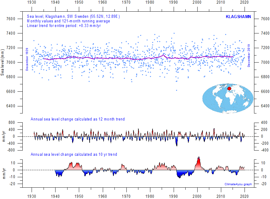
Klagshamn (SW Sweden) monthly tide gauge data from PSMSL Data Explorer. The blue dots are the individual monthly observations, and the purple line represents the running 121-month (ca. 10 yr) average. The two lower panels show the annual sea level change, calculated for 1 and 10 yr time windows, respectively. These values are plotted at the end of the interval considered. Last month shown: December 2017. Last diagram update: June 23, 2018.
OTHER REGIONS
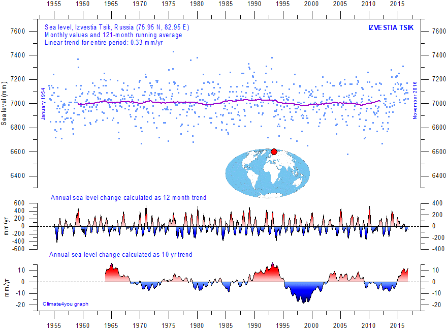
Investia Tsik (Russia) monthly tide gauge data from PSMSL Data Explorer. The blue dots are the individual monthly observations, and the purple line represents the running 121-month (ca. 10 yr) average. The two lower panels show the annual sea level change, calculated for 1 and 10 yr time windows, respectively. These values are plotted at the end of the interval considered. Last month shown: November 2016. Last diagram update: October 3, 2020.
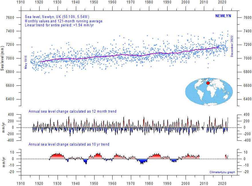
Newlyn (UK) monthly tide gauge data from PSMSL Data Explorer. The blue dots are the individual monthly observations, and the purple line represents the running 121-month (ca. 10 yr) average. The two lower panels show the annual sea level change, calculated for 1 and 10 yr time windows, respectively. These values are plotted at the end of the interval considered. Last month shown: December 2022. Last diagram update: 12 November 2023.
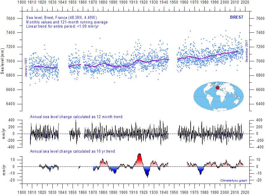
Brest (France) monthly tide gauge data from PSMSL Data Explorer. The blue dots are the individual monthly observations, and the purple line represents the running 121-month (ca. 10 yr) average. The two lower panels show the annual sea level change, calculated for 1 and 10 yr time windows, respectively. These values are plotted at the end of the interval considered. Last month shown: December 2017. Last diagram update: June 23, 2018.
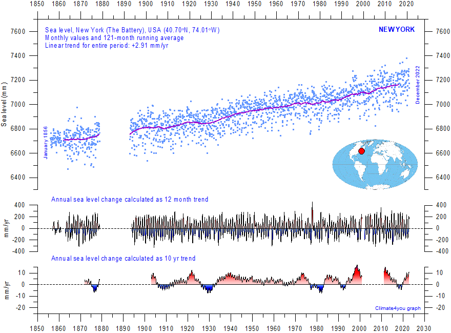
New York (USA) monthly tide gauge data from PSMSL Data Explorer. The blue dots are the individual monthly observations, and the purple line represents the running 121-month (ca. 10 yr) average. The two lower panels show the annual sea level change, calculated for 1 and 10 yr time windows, respectively. These values are plotted at the end of the interval considered. Last month shown: December 2022. Last diagram update: 13 November 2023.
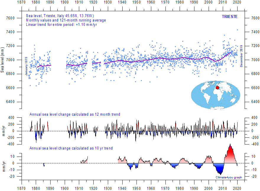
Trieste (Italy) monthly tide gauge data from PSMSL Data Explorer. The blue dots are the individual monthly observations, and the purple line represents the running 121-month (ca. 10 yr) average. The two lower panels show the annual sea level change, calculated for 1 and 10 yr time windows, respectively. These values are plotted at the end of the interval considered. Last month shown: December 2019. Last diagram update: February 3, 2020.
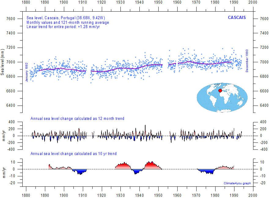
Cascais (Portugal) monthly tide gauge data from PSMSL Data Explorer. The blue dots are the individual monthly observations, and the purple line represents the running 121-month (ca. 10 yr) average. The two lower panels show the annual sea level change, calculated for 1 and 10 yr time windows, respectively. These values are plotted at the end of the interval considered. Last month shown: December 1993. Last diagram update: May 23, 2015.
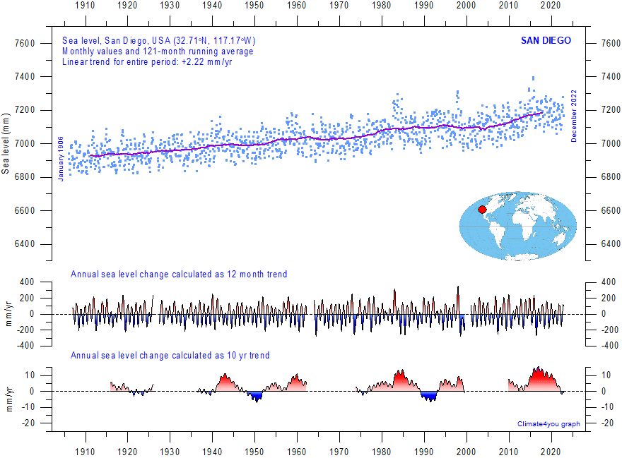
San Diego (USA) monthly tide gauge data from PSMSL Data Explorer. The blue dots are the individual monthly observations, and the purple line represents the running 121-month (ca. 10 yr) average. The two lower panels show the annual sea level change, calculated for 1 and 10 yr time windows, respectively. These values are plotted at the end of the interval considered. Last month shown: December 2022. Last diagram update: 13 November 2023 2022.
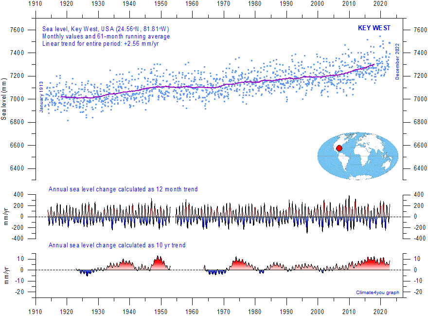
Key West (USA) monthly tide gauge data from PSMSL Data Explorer. The blue dots are the individual monthly observations, and the purple line represents the running 121-month (ca. 10 yr) average. The two lower panels show the annual sea level change, calculated for 1 and 10 yr time windows, respectively. These values are plotted at the end of the interval considered. Last month shown: December 2022. Last diagram update: 13 November 2023.
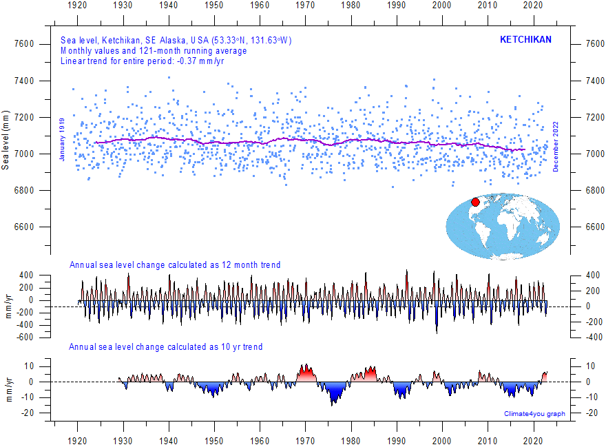
Ketchikan (SE Alaska, USA) monthly tide gauge data from PSMSL Data Explorer. The blue dots are the individual monthly observations, and the purple line represents the running 121-month (ca. 10 yr) average. The two lower panels show the annual sea level change, calculated for 1 and 10 yr time windows, respectively. These values are plotted at the end of the interval considered. Last month shown: December 2022. Last diagram update: 13 November 2023.
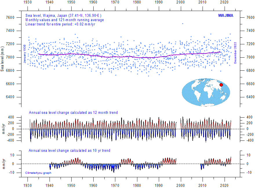
Wajima (Japan) monthly tide gauge data from PSMSL Data Explorer. The blue dots are the individual monthly observations, and the purple line represents the running 121-month (ca. 10 yr) average. The two lower panels show the annual sea level change, calculated for 1 and 10 yr time windows, respectively. These values are plotted at the end of the interval considered. Last month shown: December 2022. Last diagram update: 14 November 2023.
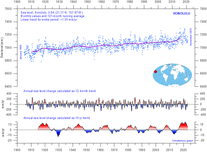
Honolulu (USA) monthly tide gauge data from PSMSL Data Explorer. The blue dots are the individual monthly observations, and the purple line represents the running 121-month (ca. 10 yr) average. The two lower panels show the annual sea level change, calculated for 1 and 10 yr time windows, respectively. These values are plotted at the end of the interval considered. Last month shown: December 2022. Last diagram update: 12 November 2023.
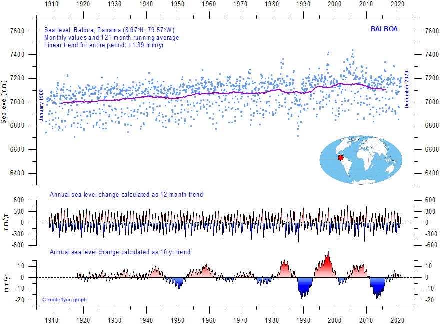
Balboa (Panama) monthly tide gauge data from PSMSL Data Explorer. The blue dots are the individual monthly observations, and the purple line represents the running 121-month (ca. 10 yr) average. The two lower panels show the annual sea level change, calculated for 1 and 10 yr time windows, respectively. These values are plotted at the end of the interval considered. Last month shown: December 2020. Last diagram update: 13 November 2023.
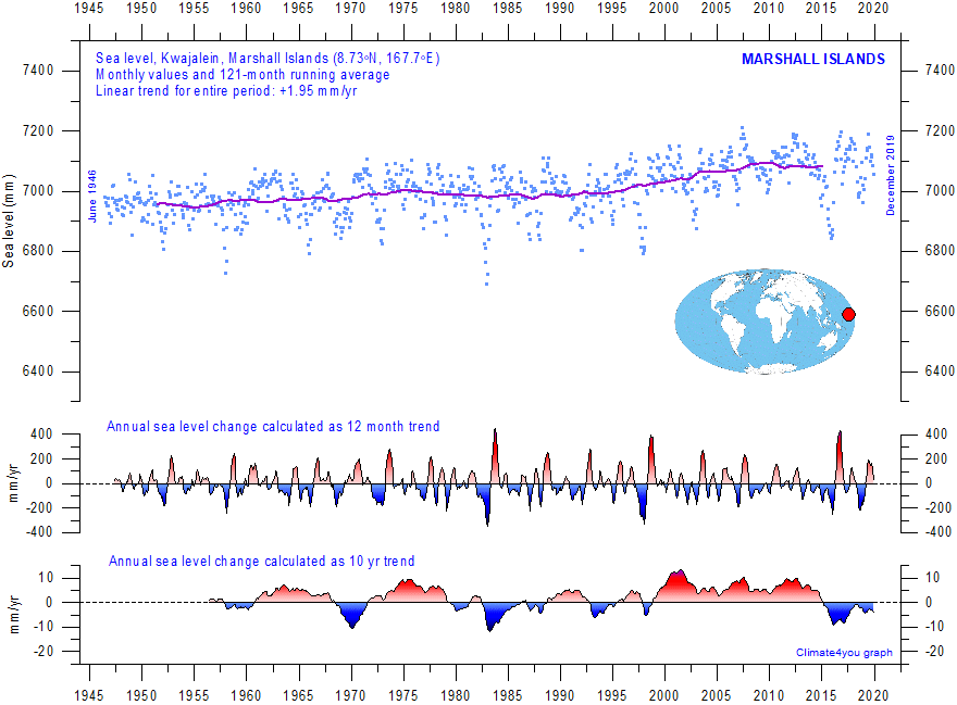
Kwajalein (Marshall Islands) monthly tide gauge data from PSMSL Data Explorer. The blue dots are the individual monthly observations, and the purple line represents the running 121-month (ca. 10 yr) average. The two lower panels show the annual sea level change, calculated for 1 and 10 yr time windows, respectively. These values are plotted at the end of the interval considered. Last month shown: December 2019. Last diagram update: November 15, 2020.
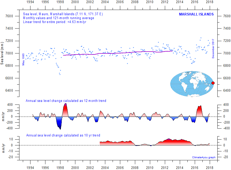
Mauro (Marshall Islands) monthly tide gauge data from PSMSL Data Explorer. The blue dots are the individual monthly observations, and the purple line represents the running 121-month (ca. 10 yr) average. The two lower panels show the annual sea level change, calculated for 1 and 10 yr time windows, respectively. These values are plotted at the end of the interval considered. Last month shown: December 2017. Last diagram update: June 23, 2018.
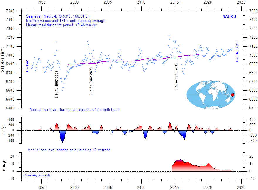
Nauru (Republic of Nauru) monthly tide gauge data from PSMSL Data Explorer. The blue dots are the individual monthly observations, and the purple line represents the running 121-month (ca. 10 yr) average. The two lower panels show the annual sea level change, calculated for 1 and 10 yr time windows, respectively. These values are plotted at the end of the interval considered. Last month shown: December 2023. Last diagram update: August 4, 2024.
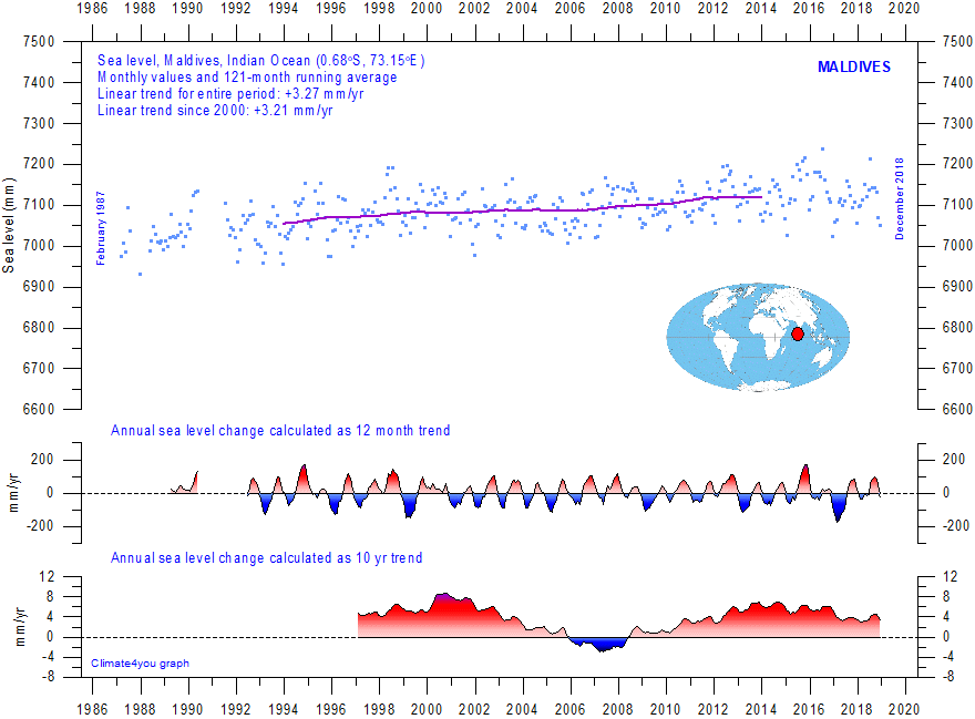
Maldives (Indian Ocean) monthly tide gauge data from PSMSL Data Explorer. The blue dots are the individual monthly observations, and the purple line represents the running 121-month (ca. 10 yr) average. The two lower panels show the annual sea level change, calculated for 1 and 10 yr time windows, respectively. These values are plotted at the end of the interval considered. Last month shown: December 2016. Last diagram update: June 23, 2018.
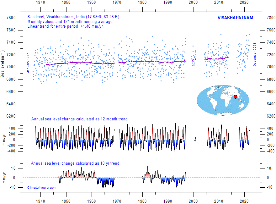
Visakhapatnam (India) monthly tide gauge data from PSMSL Data Explorer. The blue dots are the individual monthly observations, and the purple line represents the running 121-month (ca. 10 yr) average. The two lower panels show the annual sea level change, calculated for 1 and 10 yr time windows, respectively. These values are plotted at the end of the interval considered. Last month shown: December 2021. Last diagram update: 14 November 2023.
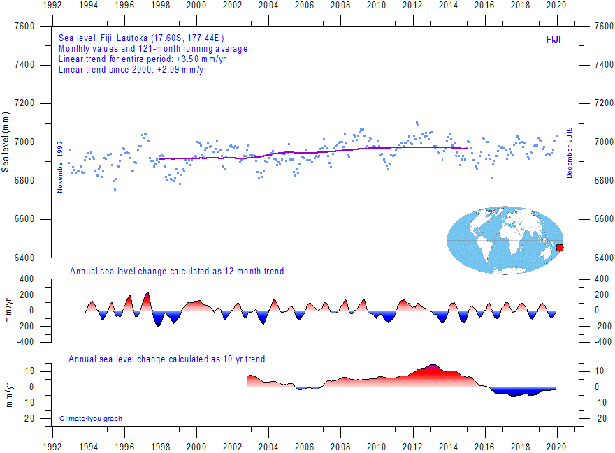
Lautoka (Fiji Islands, Pacific Ocean) monthly tide gauge data from PSMSL Data Explorer. The blue dots are the individual monthly observations, and the purple line represents the running 121-month (ca. 10 yr) average. The two lower panels show the annual sea level change, calculated for 1 and 10 yr time windows, respectively. These values are plotted at the end of the interval considered. Last month shown: December 2017. Last diagram update: June 23, 2018.
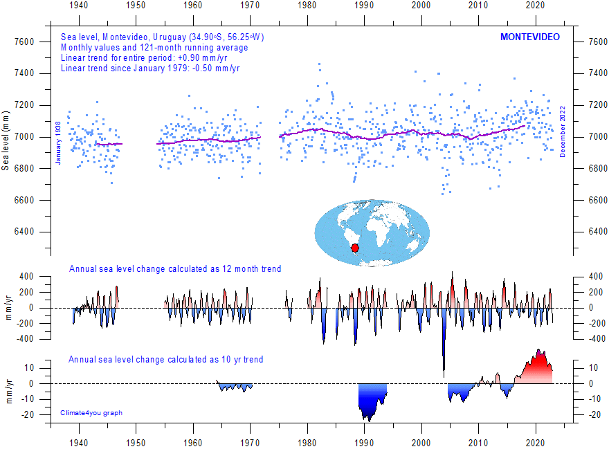
Montevideo (Uruguay) monthly tide gauge data from PSMSL Data Explorer. The blue dots are the individual monthly observations, and the purple line represents the running 121-month (ca. 10 yr) average. The two lower panels show the annual sea level change, calculated for 1 and 10 yr time windows, respectively. These values are plotted at the end of the interval considered. Last month shown: December 2022. Last diagram update: 14 November 2023.
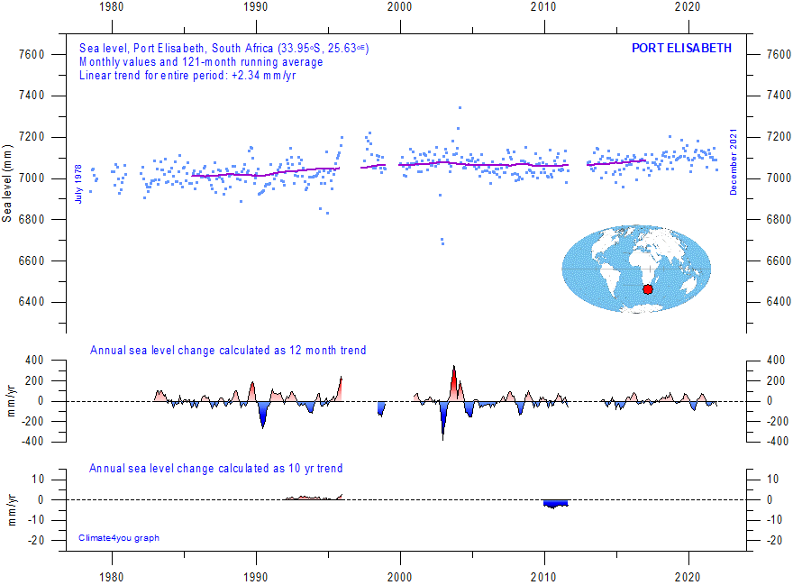
Port Elisabeth (South Africa) monthly tide gauge data from PSMSL Data Explorer. The blue dots are the individual monthly observations, and the purple line represents the running 121-month (ca. 10 yr) average. The two lower panels show the annual sea level change, calculated for 1 and 10 yr time windows, respectively. These values are plotted at the end of the interval considered. Last month shown: December 2021. Last diagram update: 14 November 2023.
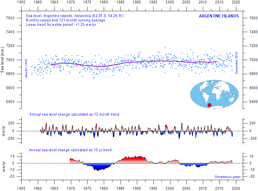
Argentine Islands (Antarctica) monthly tide gauge data from PSMSL Data Explorer. The blue dots are the individual monthly observations, and the purple line represents the running 121-month (ca. 10 yr) average. The two lower panels show the annual sea level change, calculated for 1 and 10 yr time windows, respectively. These values are plotted at the end of the interval considered. Last month shown: December 2018. Last diagram update: 14 November 2023.
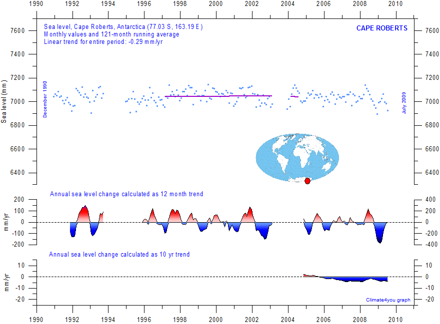
Cape Roberts (Antarctica) monthly tide gauge data from PSMSL Data Explorer. The blue dots are the individual monthly observations, and the purple line represents the running 121-month (ca. 10 yr) average. The two lower panels show the annual sea level change, calculated for 1 and 10 yr time windows, respectively. These values are plotted at the end of the interval considered. Last month shown: July 2009. Last diagram update: May 24, 2015.
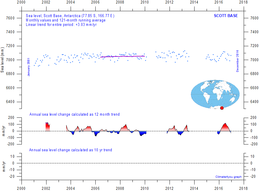
Cape Roberts (Antarctica) monthly tide gauge data from PSMSL Data Explorer. The blue dots are the individual monthly observations, and the purple line represents the running 121-month (ca. 10 yr) average. The two lower panels show the annual sea level change, calculated for 1 and 10 yr time windows, respectively. These values are plotted at the end of the interval considered. Last month shown: December 2016. Last diagram update: June 23, 2018.
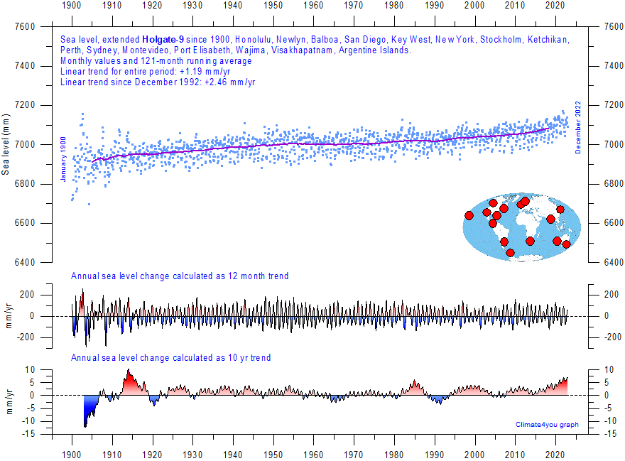
Extended Holgate-9 monthly tide gauge data from PSMSL Data Explorer. Holgate (2007) suggested 9 stations (Auckland, Trieste, Newlyn, Cascais, Honolulu, Balboa, San Diego, Key West, and New Yourk) to capture the global variability found in a larger number of stations over the last half century studied previously. However, some of the stations suggested by Holgate has not reported values for several years, leading to the southern hemisphere now being seriously underrepresented in his original data set. Therefore, in the above diagram several other long tide-gauge series have been included, to provide a more balanced representation of both hemispheres (15 stations in total). The blue dots are the individual average monthly observations, and the purple line represents the running 121-month (ca. 10 year) average. The two lower panels show the average annual sea level change, calculated for moving 1 and 10-year windows, respectively. These values are plotted at the end of the time window considered, month by month. Last month shown: December 2023. Last diagram update: 11 February 2025.
Click
here to jump back to list of contents.
Sea-level
from satellite altimetry
Satellite altimetry is a new and valuable type of measurement, providing unique insight into the detailed surface topography of the oceans, and changes of this over time. However, it is still not a highly precise tool for estimating changes in global sea level due to a number of assumptions made when interpreting the original satellite data. See also note below on using ground true data to correct satellite data.
One of the assumptions made during the interpretation of satellite altimetry data is the amount of correction made locally and regionally for Glacial Isostatic Adjustment (GIA). GIA relate to large-scale, long-term mass transfer from the oceans to the land, in the form of rhythmic waxing and waning of the large Quaternary ice sheets in North America and North Europe. This enormous mass transfer causes rhythmic changes in surface load, resulting in viscoelastic mantle flow and elastic effects in the upper crust. No single technique or observational network are able to give enough information on all aspects and consequences of GIA, wherefore the assumptions adopted for the interpretation of satellite altimetry data are difficult to verify. The GIA correction introduced in the interpretation of data from satellite altimetry depends upon the type of deglaciation model (for the last glaciation) and upon the type of crust-mantle model that is assumed. As a consequence of this (and additional factors), interpretations on modern global sea level change based on satellite altimetry vary across a range. Most estimates based on satellite altimetry, however, is higher than 3.0 mm/yr.
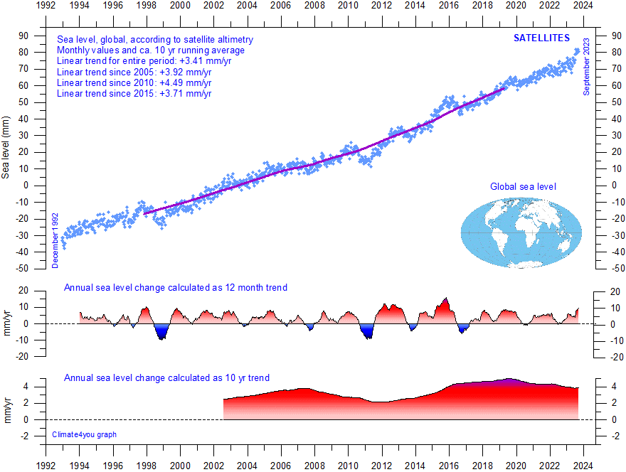
Global sea level since December 1992 according to the Colorado Center for Astrodynamics Research at University of Colorado at Boulder. The blue dots are the individual observations (with estimated GIA effect removed), and the purple line represents the running 121-month (ca. 10 yr) average. The two lower panels show the annual sea level change, calculated for 1 and 10 yr time windows, respectively. These values are plotted at the end of the interval considered. Last month shown: September 2023. Last diagram update: 12 November 2023.
-
Click here to download the entire data series since 1992.
-
Click here to read about details of calibration.
-
Click here to read about data smoothing.
Ground
truth is a term used in various fields to refer to information provided by
direct observation as opposed to information provided by inference.
For satellite observations on sea level ground true data are provided by the classical tide-gauges (see section above), that measures the local sea level many places distributed along the coastlines on the surface of the planet. It appears, however, that this opportunity is not being widely used in the interpretation of sea level data obtained by satellites.
|
Data from tide-gauges suggest an average global sea-level rise of 1-1.5 mm/yr, while satellite-derived records suggest a rise of more than 3 mm/yr. The difference between the two data sets has still no broadly accepted explanation, but some of the difference is likely due to administrative changes introduced into the raw data obtained by satellites. Se the paragraph below on temporal stability of the satellite-derived data. Another factor that may explain some of the difference between tide-gauge and satellite data is probably that while any temperature-driven volume expansion is recorded by the satellites, this change is not to the same degree affecting tide-gauges at coastal locations, as the water depth here is much smaller, decreasing towards zero. |
TEMPORAL STABILITY OF SATELLITE-DERIVED SEA-LEVEL DATA
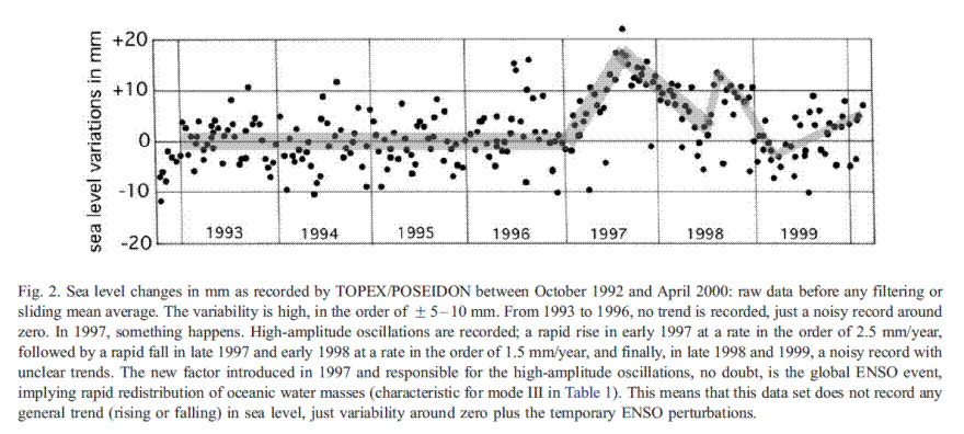
Figure 2 from Mörner 2004, showing raw satellite altimetry data of global sea level until April 2000. Compare with the diagram below (1992-2000).
Click here to jump back to list of contents.