Global temperatures
-
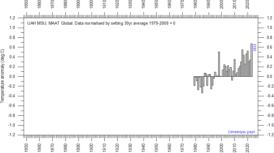
Quality class 1: Satellite record of recent global air temperature change
-
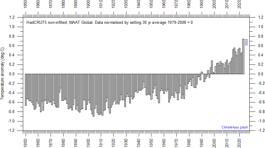
Quality class 2: HadCRUT surface record of recent global air temperature change
-
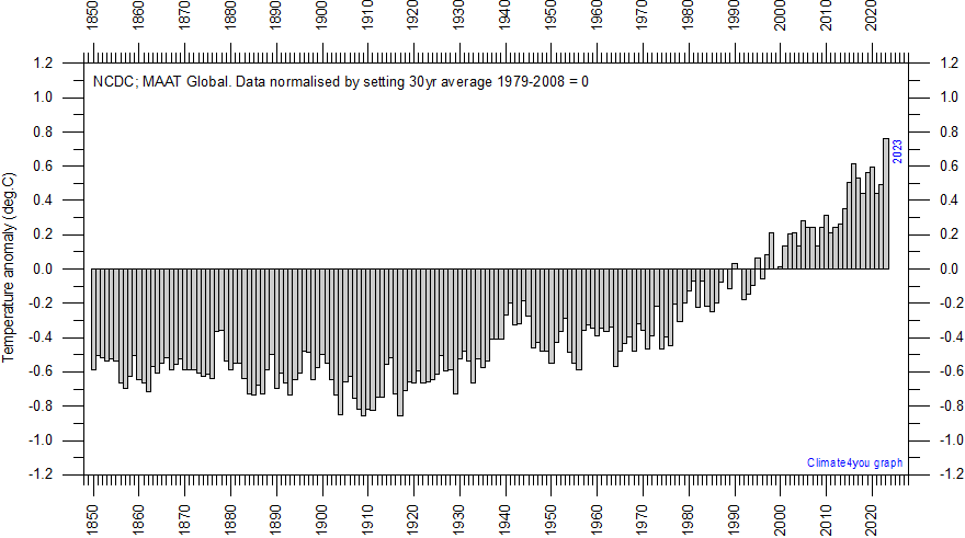
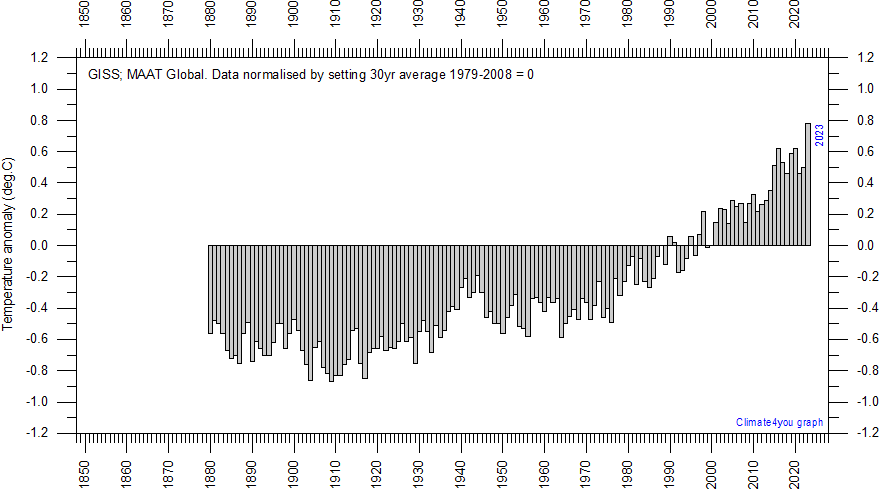
Quality class 3: NCDC and GISS surface records of recent global air temperature change
-
Monthly surface air temperature anomalies versus average 1998-2006 in areas between 72N and 60S
-
Vertical temperature profile of the atmosphere; weather balloons
Open Climate4you homepage
An overview to get things into perspective
Several of the temperature diagrams on this site begin in the year 1979, where the fine satellite record begins. This is chosen as a general start date to make comparison between different data sources (satellite, surface, etc.) easy. On the other hand, this approach may conceal the fact that Earth's climate record is much longer. It is the purpose of the present short paragraph to introduce modern climate change to this longer time perspective.
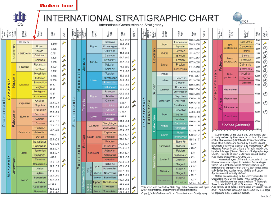
Fig.1. Geological stratigraphic chart for the entire geological history of planet Earth. Modern time is indicated by the thin red line at the top of the left column. Please note that the time scale is highly compressed, and increasing so towards higher ages. The left hand column fits on top of the next column to the right, column no 2 on top of no 3, and the right hand column should be at the bottom.
Planet Earth has an age of about 4600 million years. The diagram above (Subcommission for Stratigraphic Information) shows a geological stratigraphic chart for the entire geological history, subdivided into a vast number of epochs, each consisting of a number of stages. Most (if not all) of these geological divisions are based on the recognition of environmental changes affecting the entire planet; that is, past global climate changes. In other words, global climate change has been the rule for the entire history of Earth, not the exception.
If each year in the time scale above (Fig.1) was represented by one millimetre, the entire stratigraphic chart would be about 4600 km (2858 miles) long. In Europe, this corresponds roughly to the distance between Madrid (Spain) to Sverdlovsk in the Ural Mountains (Russia). In North America 4600 km roughly corresponds to the distance between San Francisco (USA) and Quebec (Canada). On this scale modern humans would appear within the last 200 m, the Polar Bear within the last 150 m, and the entire global meteorological record since about 1850 would take up the last 16 cm. The period with satellite observations would fit into the final 3 cm.
From time to time the planet has been affected by millions of years with relatively cold climate, each such period leading to a long succession of glacial and interglacial periods. During the last couple of millions of years, planet Earth has been in such a cold stage. The last (until now) ice age ended around 11,600 years ago, and we are for the time living in a so-called interglacial period, until the next ice age will begin some time into the future.
The last four glacial periods and interglacial periods are shown in the diagram below (Fig.2), covering the last 420,000 years in Earth's climatic history.
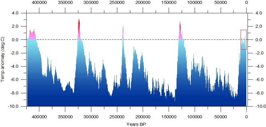
Fig.2. Reconstructed global temperature over the past 420,000 years based on the Vostok ice core from the Antarctica (Petit et al. 2001). The record spans over four glacial periods and five interglacials, including the present. The horizontal line indicates the modern temperature. The red square to the right indicates the time interval shown in greater detail in the following figure.
The diagram above (Fig.2) shows a reconstruction of global temperature based on ice core analysis from the Antarctica. The present interglacial period (the Holocene) is seen to the right (red square). The preceding four interglacials are seen at about 125,000, 280,000, 325,000 and 415,000 years before now, with much longer glacial periods in between. All four previous interglacials are seen to be warmer (1-3oC) than the present. The typical length of a glacial period is about 100,000 years, while an interglacial period typical lasts for about 10-15,000 years. The present interglacial period has now lasted about 11,600 years.
According to ice core analysis, the atmospheric CO2 concentrations during all four prior interglacials never rose above approximately 290 ppm; whereas the atmospheric CO2 concentration today stands above 400 ppm (by volume or molecular fraction, as of 2018). The present interglacial is about 2oC colder than the previous interglacial, even though the atmospheric CO2 concentration now is about 100 ppm higher.
The last 11,000 years (red square in diagram above) of this climatic development is shown in greater detail in the diagram below (Fig.3), representing the main part of the present interglacial period.
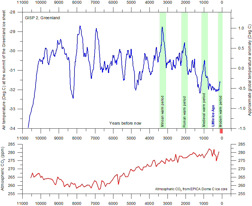
Fig.3. The upper panel shows the air temperature at the summit of the Greenland Ice Sheet, reconstructed by Alley (2000) from GISP2 ice core data. The time scale shows years before modern time. The rapid temperature rise to the left indicate the final part of the even more pronounced temperature increase following the last ice age. The temperature scale at the right hand side of the upper panel suggests a very approximate comparison with the global average temperature (see comment below). The GISP2 record ends around 1854, and the two graphs therefore ends here. There has since been an temperature increase to about the same level as during the Medieval Warm Period and to about 395 ppm for CO2. The small reddish bar in the lower right indicate the extension of the longest global temperature record (since 1850), based on meteorological observations (HadCRUT3). The lower panel shows the past atmospheric CO2 content, as found from the EPICA Dome C Ice Core in the Antarctic (Monnin et al. 2004). The Dome C atmospheric CO2 record ends in the year 1777.
The diagram above (Fig.3) shows the major part of the present interglacial period, the Holocene, as seen from the summit of the Greenland Ice cap. The approximate positions of some warm historical periods are shown by the green bars, with intervening cold periods.
Clearly Central Greenland temperature changes are not identical to global temperature changes. However, they do tend to reflect global temperature changes with a decadal-scale delay (Box et al. 2009), with the notable exception of the Antarctic region and adjoining parts of the Southern Hemisphere, which is more or less in opposite phase (Chylek et al. 2010) for variations shorter than ice-age cycles (Alley 2003). This is the background for the very approximate global temperature scale at the right hand side of the upper panel. Please also note that the temperature record ends in 1854 AD, and for that reason is not showing the post Little Ice Age temperature increase. In the younger part of the GISP2 temperature reconstruction the time resolution is around 10 years. Any comparison with measured temperatures should therefore be made done using averages over periods of similar lengths.
During especially the last 4000 years the Greenland record is dominated by a trend towards gradually lower temperatures, presumably indicating the early stages of the coming ice age (Fig.3). In addition to this overall temperature decline, the development has also been characterised by a number of temperature peaks, with about 950-1000 year intervals. It may even be speculated if the present warm period fits into this overall scheme of natural variations?
The past temperature changes show little (if any) relation to the past atmospheric CO2 content as shown in the lower panel of figure 3. Initially, until around 7000 yr before now, temperatures generally increase, even though the amount of atmospheric CO2 decreases. For the last 7000 years the temperature generally has been decreasing, even though the CO2 record now display an increasing trend. Neither is any of the marked 950-1000 year periodic temperature peaks associated with a corresponding CO2 increase. The general concentration of CO2 is low, wherefore the theoretical temperature response to changes in CO2 should be more pronounced than at higher concentrations, as the CO2 forcing on temperature is decreasing logarithmic with concentration. Nevertheless, no net effect of CO2 on temperature can be identified from the above diagram, and it is therefore obvious that significant climatic changes can occur without being controlled by atmospheric CO2. Other phenomena than atmospheric CO2 must have had the main control on global temperature for the last 11,000 years.
The following diagram shows the period since 1850 (indicated by the reddish bar in the diagram above), where it is possible to estimate global temperature changes from meteorological observations (Fig.4).
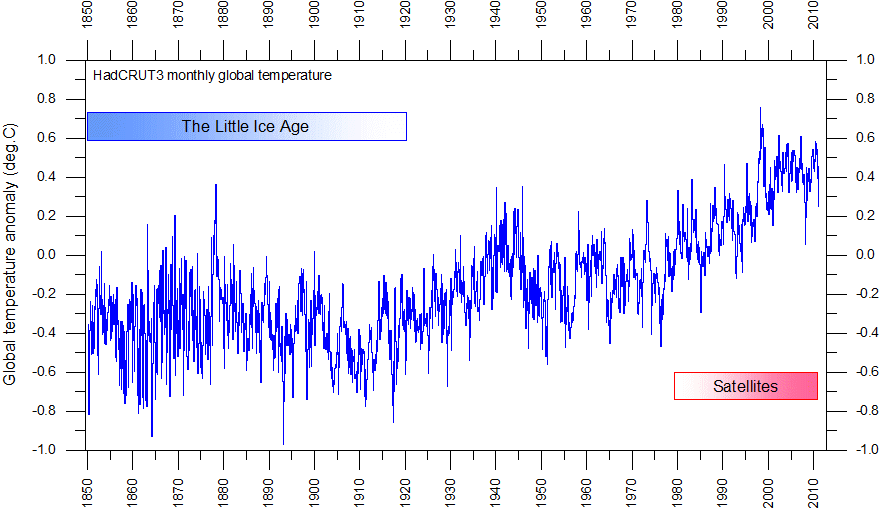
Fig.4. Global monthly average surface air temperature since 1850 according to Hadley CRUT, a cooperative effort between the Hadley Centre for Climate Prediction and Research and the University of East Anglia's Climatic Research Unit (CRU), UK. The blue line represents the monthly values. An introduction to the dataset has been published by Brohan et al. (2005). Base period: 1961-1990. Last month shown: December 2010. Last diagram update: 3 January 2011.
-
Click here to download the entire series of estimated HadCRUT3 global monthly surface air temperatures since 1850.
-
Click here to read a description of the data file format.
From figure 3 it is obvious that the global meteorological record (Fig.4) begins in the final part of the Little Ice Age, and thereby documents the following temperature increase, especially clear since about 1915. In other words, the temperature increase documented by meteorological records represents the temperature recovery following the cold Little Ice Age. The ongoing climate debate is essentially about this being mainly a natural temperature recovery, or caused by atmospheric CO2, especially for the time after 1975? It can, however, from figures 2, 3 and 4 be concluded that the temperature increase 1975-2000 is not unique when compared with past records, and that the net effect on temperature by atmospheric CO2 has been small or even absent (Fig.3).
From all diagrams shown above the still very short time period covered by the fine satellite observations is obvious. The period since 1979 only covers the most recent example of global warming (ca.1977-2001), but no examples of the many previous periods of warming or cooling. This should prudently be borne in mind when interpreting the temperature record since 1979 only, such as shown in several of the diagrams found on this website. As mentioned above the time since 1979 would only take up the final 3 cm of the entire 4600 km long geological climatic record, if each year is represented by one millimetre.
Click here to jump back to the list of contents.
Recent global satellite temperature
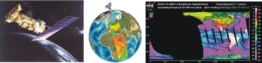
Click here to view the recent (daily) global satellite temperature (AMSU-A) at various altitudes in the atmosphere.
-
Indicate which level in the atmosphere you want to see
-
Indicate your preference as to oC or oF
-
Then click 'Draw graph'
You will need to have a recent version of JAVATM installed on your computer to make use of this facility kindly made available by Dr. Roy Spencer and Dr. Danny Braswell. If you receive an error message after clicking 'Draw graph', try downloading the latest version (free) of Java from java.com.
Click here to jump back to the list of contents.
Recent land surface temperature
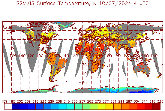
Land surface temperature 30 November 2024 (degrees K = degrees C + 273.15). White areas are oceans or land areas without data. Map source: NOAA. Please use this link if you want to see the original diagrams (NOAA 18) or want to check for more recent updates than shown above.
Click here to see the recent sea surface temperatures.
Click here to jump back to the list of contents.
Recent
global air temperature change, an overview
All
temperature diagrams shown below have 1979 as starting year. This roughly marks
the beginning of the recent period of global warming, after termination of the
previous period of global cooling from about 1940. In addition, the year 1979
also represents the starting date for the satellite-based global temperature
estimates (UAH and RSS).
For
the three surface air temperature estimates shown (HadCRUT, NCDC and GISS) the
reference period differs. HadCRUT refers to the official “normal” WMO period
1961-1990, while NCDC and GISS as reference instead uses 1901-2000 and
1951-1980, respectively, which results in higher positive temperature anomalies.
For
all three surface air temperature records, but especially NCDC and GISS, administrative
changes to anomaly values are quite often introduced, even for observations
several years back in time. Some changes may be due to the delayed addition of
new station data, while others probably have their origin in a change of
technique to calculate average values. It is clearly impossible to evaluate the
validity of such administrative changes for the outside user of these records.
In addition, the three surface records represent a blend of sea surface data
collected moving ships or by other means, plus data from land stations of partly
unknown quality and unknown degree of representativeness for their region. Many
of the land stations have also moved geographically during their existence, and
their instrumentation changed.
The satellite temperature records also have
their problems, but these are generally of a more technical nature and therefore
correctable. In addition, the temperature sampling by satellites is more regular
and complete on a global basis than that represented by the surface records.
It
therefore is realistic to recognise that the temperature records are not of
equal scientific quality. At the same time the big efforts being put into all
five temperature databases should be gratefully acknowledged by all interested
in climate science.
On
this background, the present website has decided to operate with three quality
classes (1-3) for global temperature records, with 1 representing the highest
quality level:
Quality
class 1: The satellite records
(UAH and RSS).
Quality
class 2: The HadCRUT surface
record.
Quality
class 3: The NCDC and GISS
surface records.
The
main reasons for discriminating between the three surface records are the
following:
1)
While both NCDC and GISS often experience quite
large administrative changes, and therefore essentially must be considered
unstable records, the changes introduced to HadCRUT are fewer and smaller.
2)
A comparison with the superior Argo float sea surface temperature record shows
that while HadCRUT uses a sea surface record (HadSST3) nicely in
concert with the Argo record, a comparison between Argo and NCDC and GISS
data shows a marked discrepancy.
The differences between the individual diagrams shown below demonstrate the difficulties associated with calculating a correct average global temperature. Essex et al. (2006) have an interesting discussion of the whole concept of calculating an average global temperature. In addition, global surface air temperatures should only be considered a poor indicator of global climate heat changes, as air has relatively little mass associated with it. Ocean heat changes remain the dominant factor for global heat changes. Global air temperatures, however, continues to attract widespread interest, and many scientist assume that the air temperature at least may be considered a useful proxy for the present state of the global climate system.
In the temperature diagrams below, the thick line represents the running 37 month average and the thin line the monthly temperature. Both values are the result of a number of mathematical manipulations with the original temperature data, and especially so the running average. In the text below each diagram you will find a link enabling you to download and analyze the data yourself. All diagrams below are using the same temperature scale, to enable easy visual comparison.
Click
here to jump back to the list of contents.
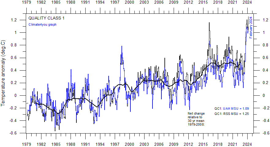
Quality
class 1: Satellite record of recent global air temperature change
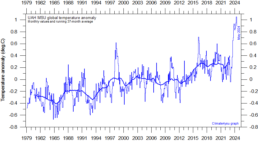
Global monthly average lower troposphere temperature since 1979 according to University of Alabama at Huntsville (UAH), USA. This graph uses data obtained by the National Oceanographic and Atmospheric Administration (NOAA) TIROS-N satellite, interpreted by Dr. Roy Spencer and Dr. John Christy, both at Global Hydrology and Climate Center, University of Alabama at Huntsville, USA. The thick line is the simple running 37 month average, nearly corresponding to a running 3 yr average. The cooling and warming periods directly influenced by the 1991 Mt. Pinatubo volcanic eruption and the 1998 El Niño, respectively, are clearly visible. Reference period 1991-2020. Last month shown: April 2025. Last diagram update: 21 May 2025.
-
Click here to see the latest UAH MSU global monthly lower troposphere temperature anomaly with comments.
-
Click here to download the series of UAH MSU global monthly lower troposphere temperature anomalies since December 1978.
-
Click here to see a maturity diagram for the MSU UAH data series.
-
Click here to see a map representation of the latest MSU UAH data series.
-
Click here to read about data smoothing.
-
Click here to read about the latest version (6.0) of the UAH Temperature Dataset (April 28, 2015).
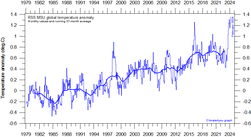
Global
monthly average lower troposphere temperature since 1979 according to
Remote Sensing Systems (RSS). This graph uses data obtained by the National Oceanographic and
Atmospheric Administration (NOAA) TIROS-N satellite, and interpreted by Dr. Carl Mears
(RSS). The thick line is the simple running 37 month
average, nearly
corresponding to a running 3 yr average. The cooling and warming periods directly influenced by the
1991 Mt. Pinatubo volcanic eruption and the 1998 El Niño, respectively, are
clearly visible. Click
here for a description of RSS MSU data products. Last
month shown: February 2024. Last diagram update: 20 March 2025.
-
Click here to download the series of RSS MSU global monthly lower troposphere temperature anomalies since January 1979.
-
Click here to see a maturity diagram for the MSU RSS data series.
-
Click here to read about data smoothing.
-
Click here to read a description of the MSU products.
NOTE: Since the latest (2015) adjustment of the RSS dataseries, there is a noteworthy difference to the UAH dataseries (compare the two diagrams above). The main reason for the difference appears to be that RSS retain the warming of NOAA-14 relative to NOAA-15, which lifts the RSS series towards higher values. See details of this in Christie et al. 2018: Examination of space-based bulk atmospheric temperatures used in climate research.
Click
here to jump back to the list of contents.
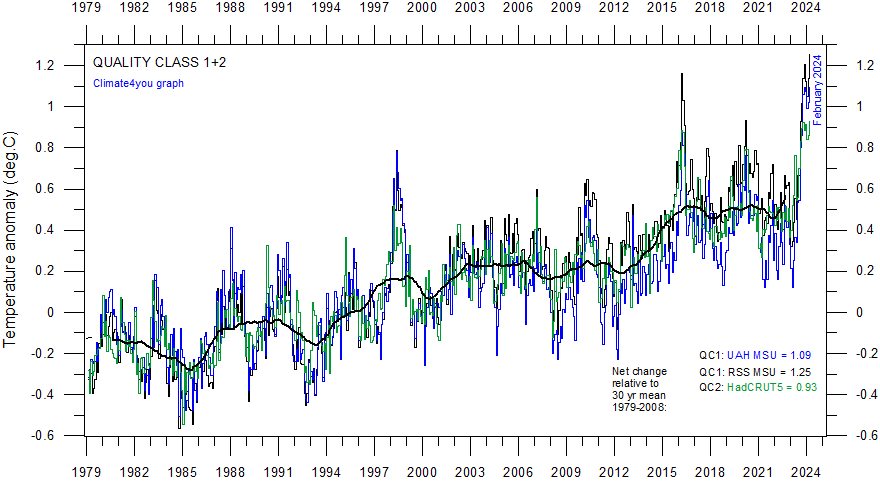
Quality class 2: HadCRUT surface record of recent global air temperature change
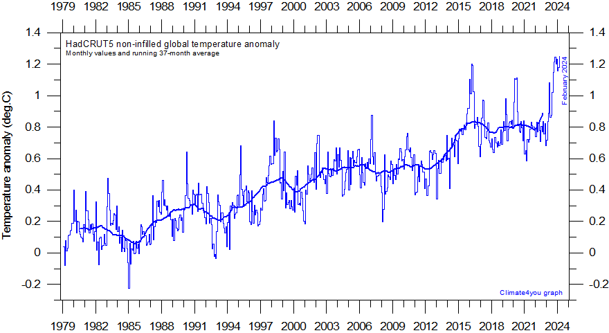
Global monthly average surface air temperature since 1979 according to Hadley CRUT, a cooperative effort between the Hadley Centre for Climate Prediction and Research and the University of East Anglia's Climatic Research Unit (CRU), UK. The thin line represents the monthly values, while the thick line is the simple running 37 month average, nearly corresponding to a running 3 yr average. An introduction to the dataset has been published by Brohan et al. (2005). Lower down the present page you will find a graph showing the entire series since 1850. Base period: 1961-1990. Last month shown: February 2025. Last diagram update: 13 May 2025.
-
Click here or here to download the series of estimated HadCRUT5 global monthly surface air temperature anomalies since 1850.
-
Click here to read a description of the data file format.
-
Click here to see a maturity diagram for the HadCRUT data series.
-
Click here to read about data smoothing.
-
Click here to open a web interface to all the weather station data used by the Hadley Centre, a very useful facility developed by Clive Best, also known for his blog. Please note that the stations are split into 3 groups. 1) those going back to before 1860 2) Those going back to between 1860 and 1930 3) Those with data going back later than 1930. The last option is all stations together - but is very slow to load (>5000 stations). Drag a rectangle to zoom in. Click on a station to see the graph of temperatures and anomalies.
October 2, 2014: Please note that HadCRUT4 was released in a new version (HadCRUT.4.3.0.0). The main changes introduced by this new version is a decrease of temperatures 1850-1875 and an increase affecting observations since 2005. For further details of this version change click here.
Click
here to jump back to the list of contents.
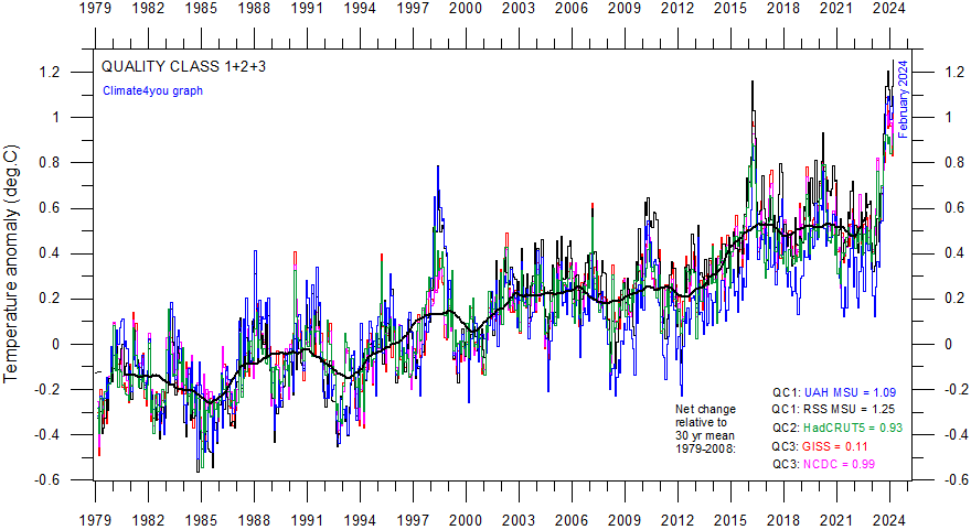
Quality class 3: NCDC and GISS surface records of recent global air temperature change
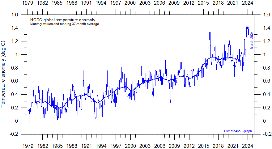
Global
monthly average surface air temperature since 1979 according to
the National
Climatic Data Center (NCDC), USA. This time series is calculated using land
surface data from the Global
Historical Climatology Network (Version 2) and sea surface temperature
anomalies from the
-
Click here to download the series of the NCDC global monthly surface air temperature anomalies since 1880.
-
Click here to see a maturity diagram for the NCDC data series.
-
Click here to read about data smoothing.
June 18, 2015: NCDC has introduced a number of rather large administrative changes to their sea surface temperature record. The overall result is to produce a record giving the impression of a continuous temperature increase, also in the 21st century. As the oceans cover about 71% of the entire surface of planet Earth, the effect of this administrative change is clearly seen in the NCDC record for global surface air temperature above.
May 2, 2011: NCDC transitioned to GHCN-M version 3 as the official land component of its global temperature monitoring efforts. GHCN-M version 2 mean temperature dataset will continue to be updated through May 30, 2011, but no support for this version of the dataset will be provided. The global anomalies using GHCN-M version 2 can be accessed here: GHCN-M v2. The net effect of the change from version 2 to 3 can be seen here.
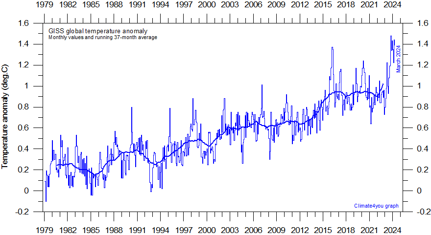
Global
monthly average surface air temperature since 1979 according to
the Goddard
Institute for Space Studies (GISS), at
-
Click here to download the series of the GISS global monthly surface air temperature anomalies since 1880.
-
Click here to see a maturity diagram for the GISS data series.
-
Click here to read about data smoothing.
-
Click here to download pre-version 3 (v.2) individual GISS station data.
Click
here to jump back to the list of contents.
Temporal stability of global air temperature estimates
It is interesting to compare the various global air temperature estimates as to their internal degree of stability for the whole temperature record as such. Especially for surface air temperature estimates, a certain degree of change over time affecting especially the last few months is to be expected, as additional station data may be reported and incorporated in the database. But for the older part of the temperature record numerical stability over time would be expected, provided that the mathematical procedure used for estimating the global temperature is considered mature by the research team preparing the data series considered. In this context, maturity would imply that, for example, the November 1985 temperature reported by a certain database in February 2009 would be identical to the November 1985 value reported previously by the same database.
Below a series of diagrams is shown to illustrate the degree of maturity, calculated for various databases by plotting the net change in their global temperature record since May 2008 (or February 2009). May 2008 (or February 2008) has been chosen as start date for this test as this represents the oldest version of the individual temperature records available to the webmaster. All diagrams below are using the same temperature scale, to enable easy visual comparison. A fine study of temporal instability can be inspected here (in Norwegian).
MSU UAH
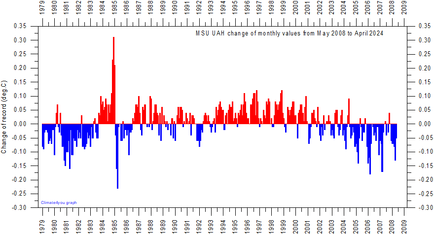
Maturity diagram showing net change since 8 May 2008 in the global monthly lower troposphere temperature record prepared by the University of Alabama at Huntsville, USA. This temperature estimate extends back to December 1978. Click here to see a graph showing the most recent version of the UAH MSU global temperature estimate. Click here to download the entire series of UAH MSU global monthly lower troposphere temperatures since December 1978. Click here for explanation of temporal stability. Last diagram update: 21 May 2025.
-
Click here to download the most recent version of UAH MSU global monthly lower troposphere temperature anomalies since December 1978.
-
Click here to read about UAH version 6.0 change April 2012.
MSU RSS
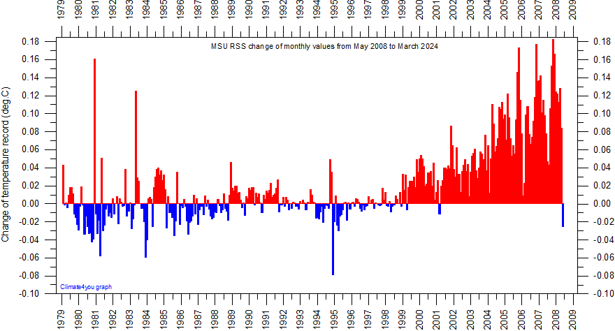
Maturity
diagram showing net change since 8 May 2008 in the global
monthly lower troposphere temperature record prepared by the
Remote Sensing Systems (RSS). This temperature estimate extends back to
January 1979. Click here to see a graph
showing the most recent version of the RSS MSU global temperature estimate. Please
note that RSS January 2011 changed from Version 3.2 to Version 3.3 of their MSU/AMSU
lower tropospheric (TLT) temperature product. Click
here to read a description of the change from version 3.2 to 3.3, and
previous changes. Click
here to download the entire series of
RSS MSU global monthly lower troposphere temperatures since January 1979. Click
here for explanation of temporal stability. Last
diagram update: 20
March 2025.
-
Click here to download the most recent version of RSS MSU global monthly lower troposphere temperature anomalies since January 1979.
-
Click here to download the May 2008 version of RSS MSU global monthly lower troposphere temperature anomalies since January 1979.
HadCRUT
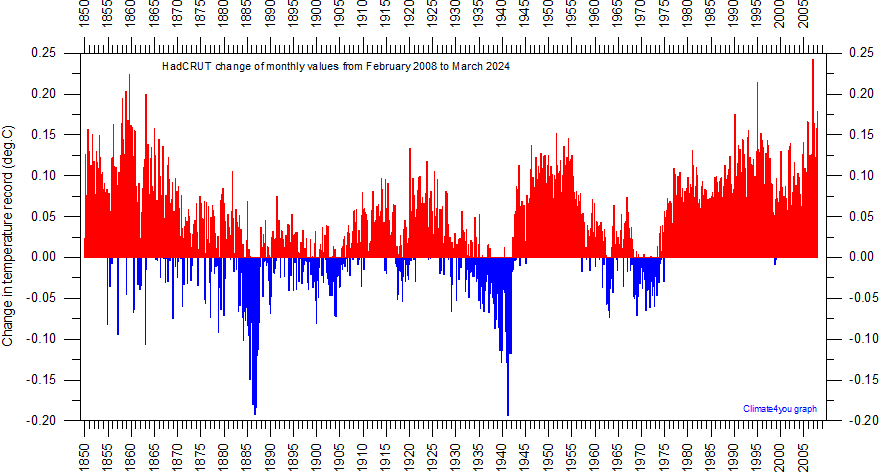
Maturity diagram showing net change since 25 February 2008 in the global monthly surface air temperature record prepared by the Hadley Centre for Climate Prediction and Research and the University of East Anglia's Climatic Research Unit (CRU), UK. This temperature estimate extends back to January 1850. Click here to see a graph showing the most recent version of the HadCRUT3 and 4 global temperature estimate. Click here for an explanation of temporal stability. Last diagram update: 13 May 2025.
-
Click here to download the series of estimated HadCRUT4 global monthly surface air temperature anomalies since 1850.
-
Click here or here to download the series of estimated HadCRUT3 global monthly surface air temperature anomalies since 1850.
-
Click here to download the February 2008 version of estimated HadCRUT3 global monthly surface air temperature anomalies since 1850.
It is interesting to note that the overall net adjustment shown by the HadCRUT surface temperature record since February 2008 (see figure above) is that of more or less equal warming for the entire record since 1850. This is in contrast to the net adjustment of the two other surface records, NCDC and GISS, which both display a net cooling adjustment before 1950-60, and a net warming adjustment for the more recent part of the record, resulting in an overall increasing temperature increase since 1880.
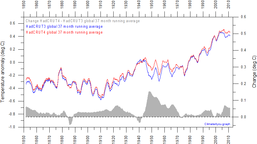
Diagram showing the global 37 month running average for HadCRUT3 (blue) and HadCRUT4 (red), and the difference between these averages (lower panel; use scale to the right). One of the most important effects of the version change is a reduction of the post 1940 cooling. Last diagram update: 10 May 2013.
-
Click here or here to download the series of estimated HadCRUT3 global monthly surface air temperature anomalies since 1850.
-
Click here to download the series of estimated HadCRUT4 global monthly surface air temperature anomalies since 1850.
-
Click here to read about data smoothing.
NCDC
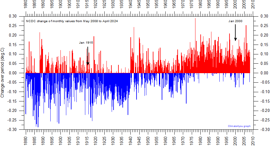
Maturity diagram showing net change since 17 May 2008 in the global monthly surface air temperature record prepared by the National Climatic Data Center (NCDC), USA. The net result of the adjustments made are becoming substantial, and adjustments since May 2006 occasionally exceeds 0.1oC. Before 1945 global temperatures are generally changed toward lower values, and toward higher values after 1945, resulting in a more pronounced 20th century warming (about 0.15oC) compared to the NCDC temperature record published in May 2008. Arrows indicate two months where the adjustments over time are illustrated in the figure below. Last diagram update: 14 May 2025.
-
Click here to download the most recent version of the NCDC global monthly surface air temperature anomalies since 1880.
-
Click here to download the May 2008 version of the NCDC global monthly surface air temperature anomalies since 1880.
-
Click here for a summary of the July 2009 (Smith et al. 2008) methodological changes in the land-ocean NCDC temperature analyses.
-
Click here for information about the November 2011 version change (GHCN-M version 3.1.0 replaced GHCN-M version 3).
-
Click here and here for information about the September 2012 version change (GHCN-M version 3.2.0 replaced GHCN-M version 3.1.0).
-
Click here for an explanation of temporal stability.
-
The two arrows in the diagram above indicate two months for which the adjustments over time is shown below.
On May 2, 2011, NCDC transitioned to GHCN-M version 3 as the official land component of its global temperature monitoring efforts. GHCN-M version 2 mean temperature dataset will continue to be updated through May 30, 2011, but no further support for this version of the dataset will be provided. In November 2011, the GHCN-M version 3.1.0 replaced the GHCN-M version 3. For more information about the GHCN-M version 3.1.0. The overall net effect of the transition from GHCN-M version 2 to version 3 is to increase global temperatures before 1900, to decrease them between 1900 and 1950, and to increase temperatures after 1950.
The diagram below exemplify adjustments made by NCDC since May 2008 for two months (see arrows in diagram above); January 1915 and January 2000.
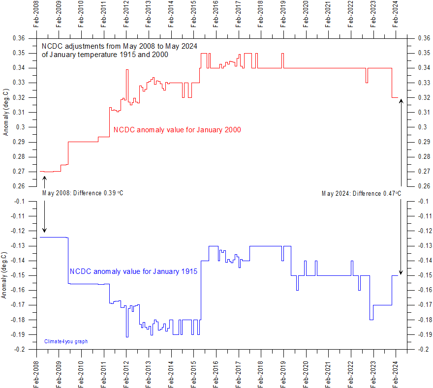
Diagram showing the adjustment made since May 2008 by the National Climatic Data Center (NCDC) in the anomaly values for the two months January 1915 and January 2000. See also this diagram. Last diagram update: 14 May 2025.
GISS
Maturity
diagram showing net change since 17 May 2008 in the global
monthly surface air temperature record prepared by the Goddard
Institute for Space Studies (GISS), at
-
Click here to download the most recent version of the GISS global monthly surface air temperature anomalies since 1880.
-
Click here to download the May 2008 version of the GISS global monthly surface air temperature anomalies since 1880.
-
Click here to see a fine study of GISS temporal instability (in Norwegian).
-
Click here for explanation of temporal stability.
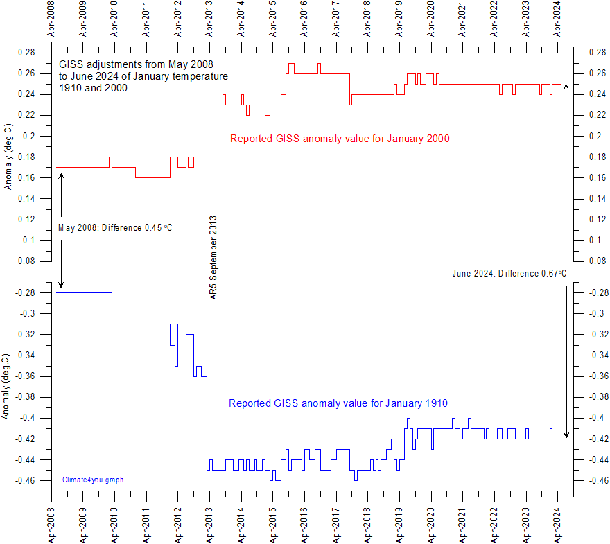
Diagram showing the adjustment made since May 2008 by the Goddard Institute for Space Studies (GISS) in anomaly values for the months January 1910 and January 2000. See also this diagram. AR5 indicates timing of publication of IPCC report AR5 Climate Change 2013: The Physical Science Basis. Last diagram update: 18 May 2025.
Note added 15 (+17) September 2012:
Unless there is an error in the GISS temperature anomaly values downloaded on 15 September 2012 (or 15 August 2012), a major change appears to have taken place since 15 August 2012. The GISS maturity diagram below show the status per 15 August 2012, and should be compared with the diagram above from 15 September 2012. Apparently the change may reflect the September 2012 NCDC change from GHCN-M version 3.1.0 to GHCN-M version 3.2.0. Click here and here for more information on this.
GISS Maturity diagram per 15 August 2012. Compare with the diagram per 15 September 2012.
Based on the above it is not possible to conclude which of the above five databases represents the best estimate on global temperature variations. The answer to this question remains elusive. All five databases are the result of much painstaking work, and they all represent admirable attempts towards establishing an estimate of recent global temperature changes. At the same time it should however be noted, that a temperature record which keeps on changing the past hardly can qualify as being correct. With this in mind, it is interesting that none of the global temperature records shown above are characterised by high temporal stability. Presumably this illustrates how difficult it is to calculate a meaningful global average temperature. A re-read of Essex et al. 2006 might be worthwhile. In addition to this, surface air temperature remains a poor indicator of global climate heat changes, as air has relatively little mass associated with it. Ocean heat changes are the dominant factor for global heat changes.
Click
here to jump back to the list of contents.
Comparing global air temperature estimates
In order to enable a visual comparison of the five different global temperature estimates shown above, the diagrams below show some or all series superimposed. As the base period differs for the different temperature estimates (see above), they are not directly comparable. All data series were therefore normalised by setting the average value of the initial 30 years from January 1979 to December 2008 equal to zero, before inclusion in the diagram below. In addition to the visual analysis below, the reader might also find it useful to inspect the maturity analysis presented above.
Superimposed plot of Quality Class 1 global monthly temperature estimates. As the base period differs for the different temperature estimates, they have all been normalised by comparing to the average value of 30 years from January 1979 to December 2008. The heavy black line represents the simple running 37 month (c. 3 year) mean of the average of both temperature records. The numbers shown in the lower right corner represent the temperature anomaly relative to the above average. Values are rounded off to the nearest two decimals, even though some of the original data series come with more than two decimals. Last month shown: February 2025. Last diagram update: 13 May 2025.
Superimposed plot of Quality Class 1 and Quality Class 2 global monthly temperature estimates. As the base period differs for the different temperature estimates, they have all been normalised by comparing to the average value of 30 years from January 1979 to December 2008. The heavy black line represents the simple running 37 month (c. 3 year) mean of the average of all three temperature records. The numbers shown in the lower right corner represent the temperature anomaly relative to the above average. Values are rounded off to the nearest two decimals, even though some of the original data series come with more than two decimals. Last month shown: February 2025. Last diagram update: 13 May 2025.
Superimposed plot of Quality Class 1 and Quality Class 2 and Quality Class 3 global monthly temperature estimates. As the base period differs for the different temperature estimates, they have all been normalised by comparing to the average value of 30 years from January 1979 to December 2008. The heavy black line represents the simple running 37 month (c. 3 year) mean of the average of all five temperature records. The numbers shown in the lower right corner represent the temperature anomaly relative to the above average. Values are rounded off to the nearest two decimals, even though some of the original data series come with more than two decimals. Last month shown: February 2025. Last diagram update: 13 May 2025.
It should be kept in mind that satellite- and surface-based temperature estimates are derived from different types of measurements, and that comparing them directly as done in the diagram above therefore in principle is problematical. For that reason, in the analysis below these two different types of global temperature estimates are compared to each other. However, as both types of estimate often are discussed together, the above diagram may nevertheless be of interest. In fact, the different types of temperature estimates appear to agree quite well as to the overall temperature variations on a 2-3 year scale, although on a short term scale there may be considerable differences.
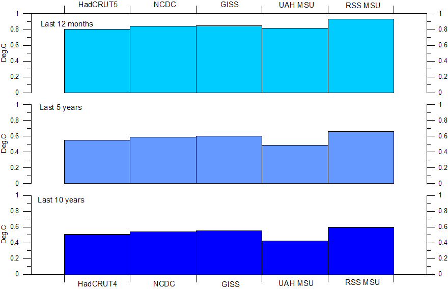
Diagram showing the average global temperature change (anomaly) during the satellite observational period (since January 1979), according to five global temperature estimates shown above. The upper panel show the average anomalies for the last 12 months, the mid panel show the average anomalies for the last 5 years, while the lower panel show the average anomalies for the last 10 years. As the base period differs for the different temperature estimates, they have all been normalised by comparing to the average value of 30 years from January 1979 to December 2008. Last month included in analysis: February 2025. Last diagram update: 13 May 2025.
Usually modern surface air temperatures are compared to the so-called normal temperature, representing the so-called normal climate. This 'normal' temperature is calculated as the average for values recorded during a 30-year period. The period 1961-1990 is the official World Meteorological Organisation (WMO) normal period, and is therefore often the time period referred to. Another 30-year period used as reference for comparisons is 1951-1980. This is partly because the total number of meteorological stations during this period reached a maximum, and since has undergone a marked reduction in number.
Unfortunately, both these periods are dominated by the cold period 1945-1980, and almost any comparison with such a low average value will therefore appear as high or warm. This makes it difficult to decide if surface air temperatures at present are increasing or decreasing? The only thing that will be clear is that modern temperatures are higher than back in this cold period. Click here to see a diagram showing the entire global temperature series (HadCRUT4) since 1850 with the 1945-1980 cold period and the WMO normal period indicated on the time line.
Click here to jump back to the list of contents.
Comparing surface and satellite temperature estimates
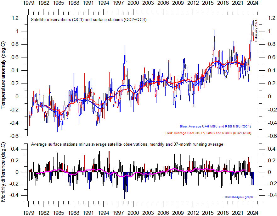
Plot showing the average of monthly global surface air temperature estimates (HadCRUT5, GISS and NCDC) and satellite-based temperature estimates (RSS MSU and UAH MSU). The thin lines indicate the monthly value, while the thick lines represent the simple running 37 month average, nearly corresponding to a running 3 yr average. The lower panel shows the monthly difference between surface air temperature and satelitte temperatures. As the base period differs for the different temperature estimates, they have all been normalised by comparing to the average value of 30 years from January 1979 to December 2008. Last month included in analysis: February 2025. Last diagram update: 13 May 2025.
As
is shown by the diagram above, the average of surface based temperature
estimates is not identical to that obtained by satellites. In general, however,
the visual agreement is quite good on a time scale of few months. However, since
about 2003, the average
global surface air temperature is drifting away in positive direction from the
average satellite temperature, meaning that the surface records show warming in
relation to the troposphere records. The reasons for this is not clear, but is
probably at least partly a result of the recurrent administrative changes of the
surface records, see here, here
and here.
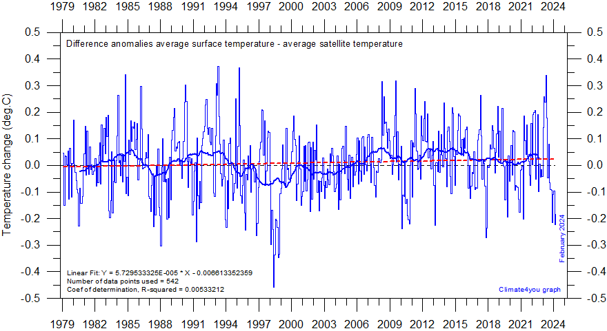
Global monthly average surface air temperature (HadCRUT5, NCDC, GISS) minus global monthly average lower troposphere temperature (UAH MSU, RSS MSU) since 1979. The thin blue line shows the monthly temperature difference between anomalies calculated for surface and lower troposphere observations, respectively. The thick blue line is the simple running 37 month average, nearly corresponding to a running 3 yr average. The dotted red line is the linear fit line, statistics of which is presented in the lower right corner of the diagram. As the five data series are using different reference (normal) periods, they have all been normalised by comparing to the average value of 30 years from January 1979 to December 2008. Last month included in analysis: February 2025. Last diagram update: 13 May 2025.
-
Please note that the linear regression is done by month, not year
-
Click here to see the HadCRUT5 temperature anomaly diagram since 1979.
-
Click here to see the NCDC temperature anomaly diagram since 1979.
-
Click here to see the GISS temperature anomaly diagram since 1979.
-
Click here to see the UAH MSU temperature anomaly diagram since 1979.
-
Click here to see the RSS MSU temperature anomaly diagram since 1979.
According to the above temperature records, the surface air temperature have been rising more rapid than the temperature in the lower troposphere since January 1979, about 0.1oC.
Click here to jump back to the list of contents.

Diagram showing the latest 5, 10, 20 and 30 yr linear annual global temperature trend, calculated as the slope of the linear regression line through the data points, for two satellite-based temperature estimates (UAH MSU and RSS MSU), the Quality Class 1 series. Last month included in analysis: February 2025. Last diagram update: 13 May 2025.
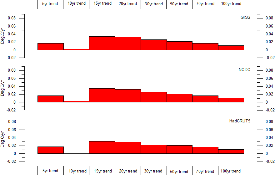
Diagram showing the latest 5, 10, 20, 30, 50, 70 and 100 yr linear annual global temperature trend, calculated as the slope of the linear regression line through the data points, for three surface-based temperature estimates (HadCRUT5 and GISS + NCDC), the Quality Class 2 and 3 series, respectively. Last month included in analysis: February 2025. Last diagram update: 13 May 2025.
The
two diagrams above show the calculated linear annual global temperature trend (calculated
as the slope of the linear regression line through the data points)
for the last 5, 10, 20, 30, 50, 70 or 100 yr period. The
difference between satellite- and surface-based temperatures is clear.
Linear trends depend on the length of the time period considered. The shorter the period considered, the more variable the calculated trend will be as new monthly data are added to the data series. In addition, linear trends calculated for short periods often have higher numerical values than trends calculated for longer periods. When comparing linear temperature trends, is is therefore important always to use time periods of similar length. As an visual example of this effect, the diagrams below show trends calculated for the last 20, 15, 10 and 5 years, using the combined Quality Class 1 series.
Linear trend analyses represent a relatively crude way of numerical analysis, and often a better approximation to the original data may be obtained by using other data models, e.g., polynomial, as shown in the diagrams below. The R2 value may be considered an indicator of the degree of success of the data model adopted, but the number of data must also be considered. It should also be emphasized, that linear trend analyses are sensitive to values near the ends points of the data series considered, and especially for short series. Finally, any trend calculated only informs about past behaviour, and not about the future.
Before attempting any linear trend (or any other) analysis of time series, a proper statistical model should be chooosen, based on statistical justification. For temperature time series there is no a priori physical reason why the long-term trend should be linear in time. In fact, climatic time series often have trends for which a straight line is not a good approximation, as is clearly seen from several of the diagrams above and below. For a clear description of the problem encountered by many temperature time series analyses, please see Keenan, D.J. 2014: Statistical Analyses of Surface Temperatures in the IPCC Fifth Assessment Report.
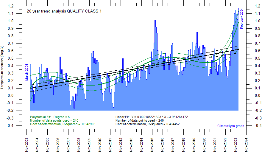
Last 20 years global monthly average surface air temperature according to the two satellite-based temperature estimates (UAH MSU and RSS MSU), Quality Class 1. The thin blue line represents the monthly values. The thick black line is the linear fit, with 95% confidence intervals indicated by the two thin black lines. The thick green line represents a 5-degree polynomial fit, with 95% confidence intervals indicated by the two thin green lines. A few key statistics is given in the lower part of the diagram (note that the linear trend is the monthly trend). Last month included in analysis: February 2025. Last diagram update: 21 March 2025.
-
Please note that the linear regression is done by month, not by year
-
Click here to download the series of UAH MSU global monthly lower troposphere temperature anomalies since December 1978.
-
Click here to download the series of RSS MSU global monthly lower troposphere temperature anomalies since January 1979.
-
Fits (linear as well as polynomial) only attempt to describe the past, and have little or no predictive power.
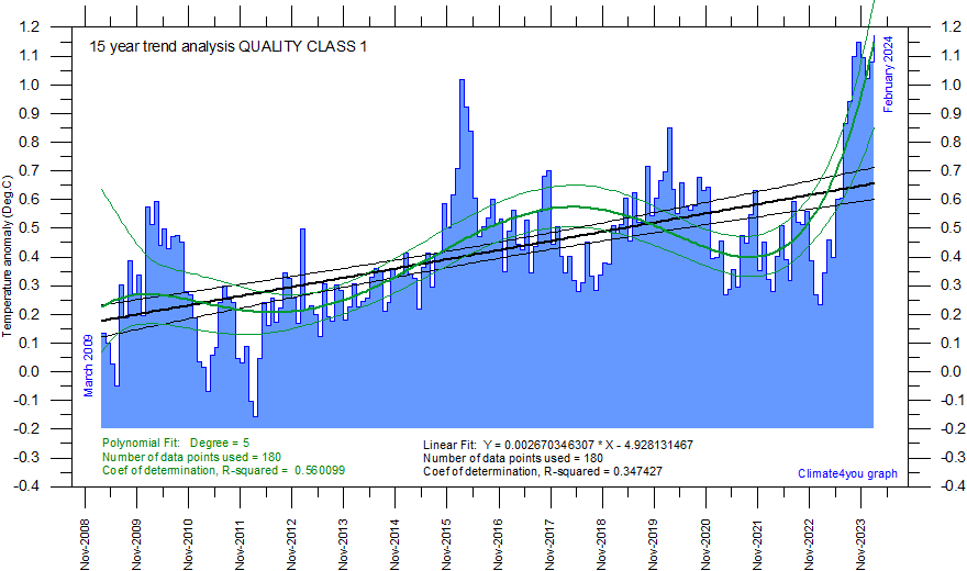
Last 15 years global monthly average surface air temperature according to the two satellite-based temperature estimates (UAH MSU and RSS MSU), Quality Class 1. The thin blue line represents the monthly values. The thick black line is the linear fit, with 95% confidence intervals indicated by the two thin black lines. The thick green line represents a 5-degree polynomial fit, with 95% confidence intervals indicated by the two thin green lines. A few key statistics is given in the lower part of the diagram (note that the linear trend is the monthly trend). Last month included in analysis: February 2025. Last diagram update: 21 March 2025.
-
Please note that the linear regression is done by month, not by year
-
Click here to download the series of UAH MSU global monthly lower troposphere temperature anomalies since December 1978.
-
Click here to download the series of RSS MSU global monthly lower troposphere temperature anomalies since January 1979.
-
Fits (linear as well as polynomial) only attempt to describe the past, and have little or no predictive power.
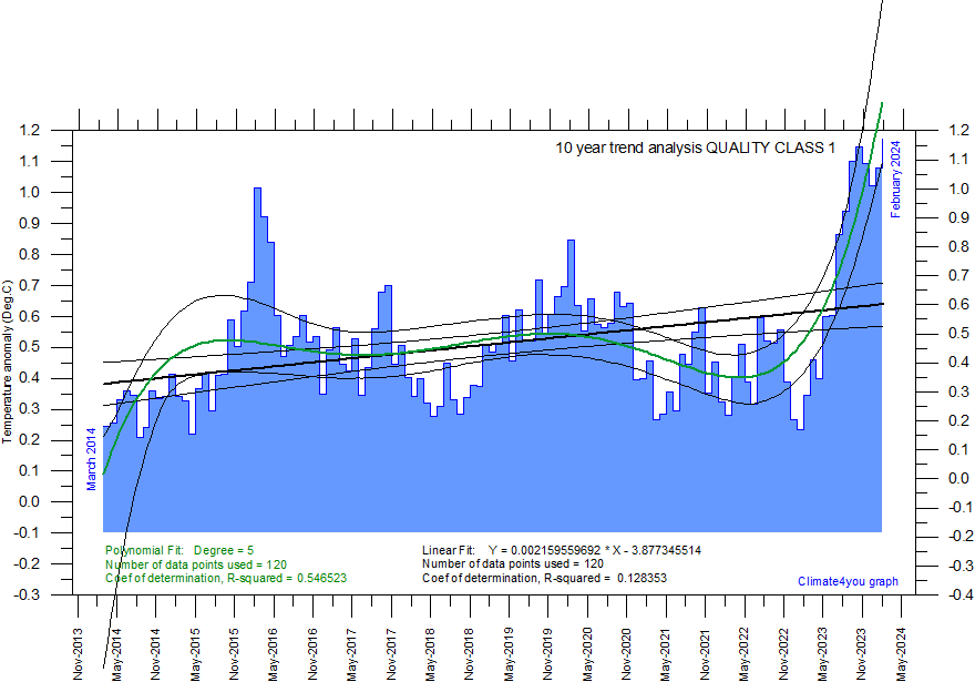
Last 10 years global monthly average surface air temperature according to the two satellite-based temperature estimates (UAH MSU and RSS MSU), Quality Class 1. The thin blue line represents the monthly values. The thick black line is the linear fit, with 95% confidence intervals indicated by the two thin black lines. The thick green line represents a 5-degree polynomial fit, with 95% confidence intervals indicated by the two thin green lines. A few key statistics is given in the lower part of the diagram (note that the linear trend is the monthly trend). Last month included in analysis: February 2025. Last diagram update: 21 March 2025.
-
Please note that the linear regression is done by month, not by year
-
Click here to download the series of UAH MSU global monthly lower troposphere temperature anomalies since December 1978.
-
Click here to download the series of RSS MSU global monthly lower troposphere temperature anomalies since January 1979.
-
Fits (linear as well as polynomial) only attempt to describe the past, and have little or no predictive power.
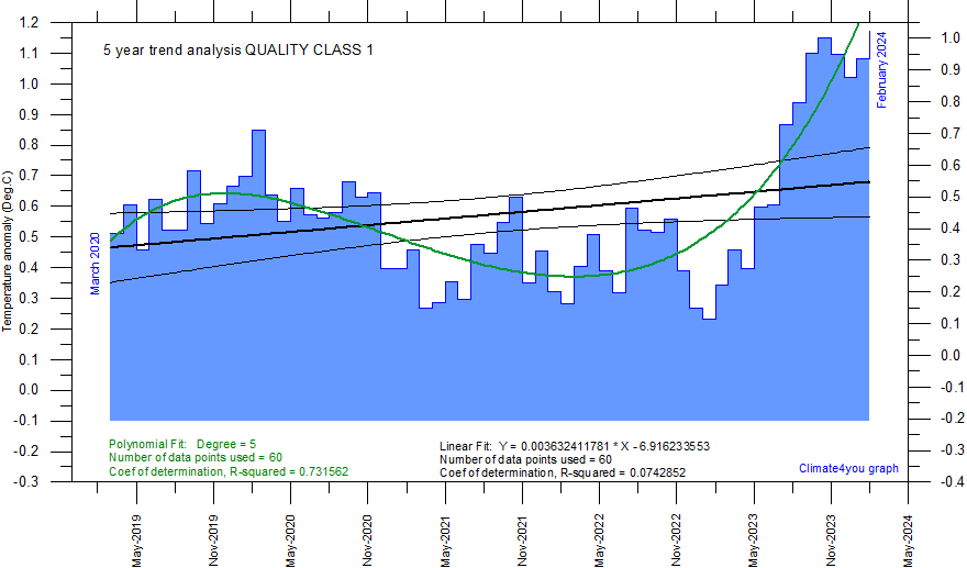
Last 5 years global monthly average surface air temperature according to the two satellite-based temperature estimates (UAH MSU and RSS MSU), Quality Class 1. The thin blue line represents the monthly values. The thick black line is the linear fit, with 95% confidence intervals indicated by the two thin black lines. The thick green line represents a 5-degree polynomial fit, with 95% confidence intervals indicated by the two thin green lines. A few key statistics is given in the lower part of the diagram (note that the linear trend is the monthly trend). Last month included in analysis: February 2025. Last diagram update: 21 March 2025.
-
Please note that the linear regression is done by month, not by year
-
Click here to download the series of UAH MSU global monthly lower troposphere temperature anomalies since December 1978.
-
Click here to download the series of RSS MSU global monthly lower troposphere temperature anomalies since January 1979.
-
Fits (linear as well as polynomial) only attempt to describe the past, and have little or no predictive power.
Click here to jump back to the list of contents.
Cyclic air temperature changes
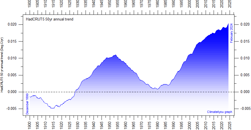
Running 50 year linear annual temperature trend calculated from monthly global average surface air temperature anomaly provided by to Hadley CRUT, a cooperative effort between the Hadley Centre for Climate Prediction and Research and the University of East Anglia's Climatic Research Unit (CRU), UK. The blue line represents the 50x12 month linear trend, plotted at the last month included in the analysis. As the HadCRUT3 record begins in January 1850, the first 50 yr plot is for December 1899. Last month included in analysis: February 2025. Last diagram update: 13 May 2025.
-
Click here to download the series of estimated HadCRUT5 global monthly surface air temperature anomalies since 1850.
-
The variation shown by the moving 50 yr linear global temperature trend suggests the existence of an 60-65 yr long periodic natural temperature variation.
-
The diagram was kindly suggested by a visitor to this web site.
Click here and here to see two other examples of apparent cyclic natural climate variations, relating to sea surface temperature and atmospheric pressure, respectively .
Click here to jump back to the list of contents.
Central England air temperature since 1659
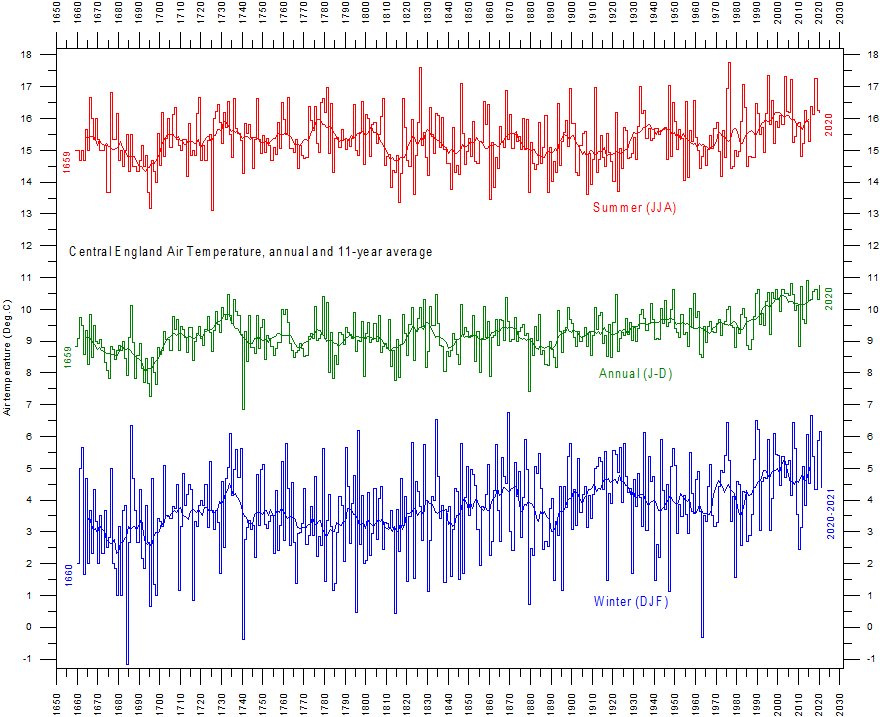
The Central England surface air temperature series is the longest existing meteorological record. Thin lines = annual values. Thick lines = running 11 yr average. The above graphs for annual, summer and winter temperatures have been prepared using the composite monthly meteorological series originally painstakingly homogenized and published by the late professor Gordon Manley (1974). The data series is now updated by the Hadley Centre. Last diagram update: 17 April 2021.
-
Click here to see a larger version of the above diagram.
-
Click here for the Met Office UK year to date plot.
-
Click here to download the entire Central England data series since 1659 (shown above)
-
Click here to see several data download options.
Click here to jump back to the list of contents.
Zonal surface air temperature changes

Global monthly average lower troposphere temperature since 1979 for the tropics and the northern and southern extratropics, according to University of Alabama at Huntsville, USA. This graph uses data obtained by the National Oceanographic and Atmospheric Administration (NOAA) TIROS-N satellite, interpreted by Dr. Roy Spencer and Dr. John Christy, both at Global Hydrology and Climate Center, University of Alabama at Huntsville, USA. Thick lines are the simple running 37 month average, nearly corresponding to a running 3 yr average. The cooling and warming periods directly influenced by the 1991 Mt. Pinatubo volcanic eruption and the 1998 El Niño, respectively, are clearly visible, especially in the tropics and the northern extratropics. Reference period 1991-2020. Last month shown: April 2025. Last diagram update: 21 May 2025.
-
Click here to download the entire series of UAH MSU global monthly lower troposphere temperatures since December 1978.
-
Click here to read about data smoothing.
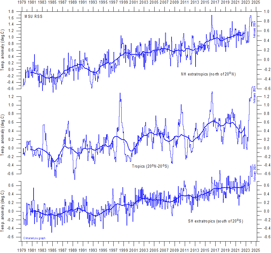
Global
monthly average lower troposphere temperature since 1979 for the tropics and the
northern and southern extratropics, according to Remote Sensing Systems
(RSS). These graphs uses data obtained by the National Oceanographic and
Atmospheric Administration (NOAA) TIROS-N satellite, and interpreted by Dr. Carl Mears
(RSS). Thick lines are the simple running 37 month
average, nearly
corresponding to a running 3 yr average. Click
here for a description of RSS MSU data products. Please
note that RSS January 2011 changed from Version 3.2 to Version 3.3 of their MSU/AMSU
lower tropospheric (TLT) temperature product. Click
here to read a description of the change from version 3.2 to 3.3, and
previous changes. Last
month shown: February 2024. Last diagram update: 20 March 2025.
-
Click here to download the entire series of RSS MSU global monthly lower troposphere temperatures since January 1979.
-
Click here to read about data smoothing.
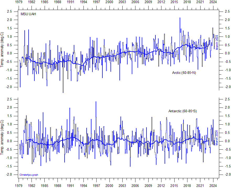
Global monthly average lower troposphere temperature since 1979 for the North Pole and South Pole regions, according to University of Alabama at Huntsville, USA. This graph uses data obtained by the National Oceanographic and Atmospheric Administration (NOAA) TIROS-N satellite, interpreted by Dr. Roy Spencer and Dr. John Christy, both at Global Hydrology and Climate Center, University of Alabama at Huntsville, USA. Thick lines are the simple running 37 month average, nearly corresponding to a running 3 yr average. Reference period 1991-2020. Last month shown: April 2025. Last diagram update: 21 May 2025.
-
Click here to download the entire series of UAH MSU global monthly lower troposphere temperatures since December 1978.
-
Click here to read about data smoothing.
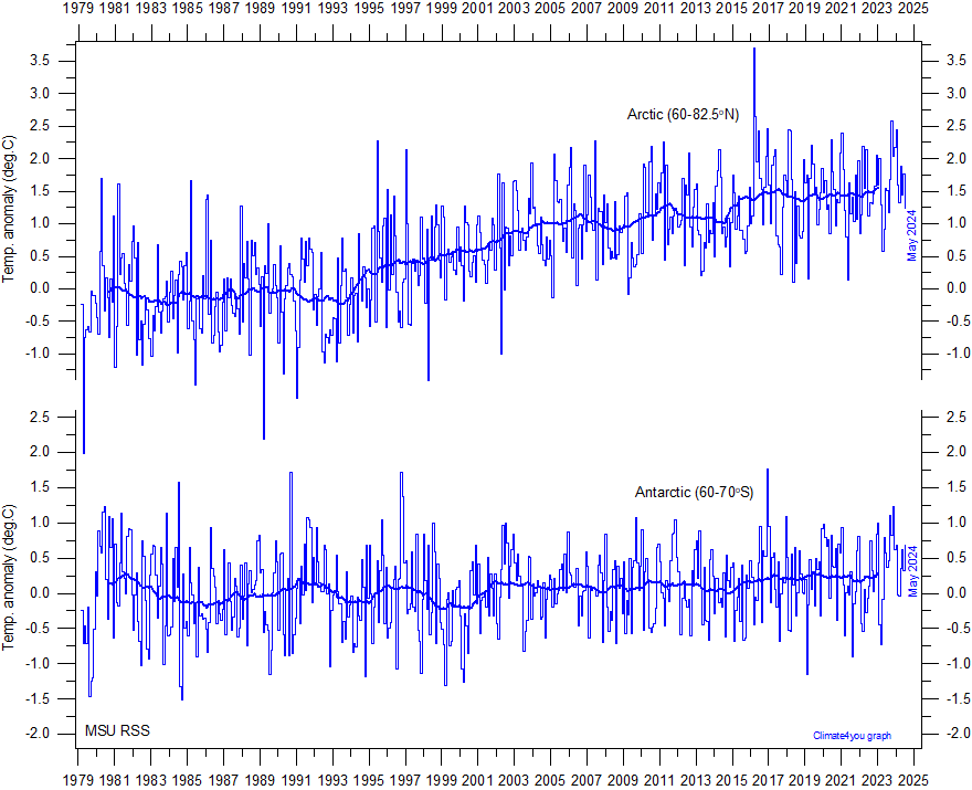
Global
monthly average lower troposphere temperature since 1979 for the northern (60-82.5N) and southern
(60-70S) polar regions, according to
Remote Sensing Systems (RSS). These graphs uses data obtained by the National Oceanographic and
Atmospheric Administration (NOAA) TIROS-N satellite, and interpreted by Dr. Carl Mears
(RSS). Thick lines are the simple running 37 month
average, nearly
corresponding to a running 3 yr average. Click
here for a description of RSS MSU data products. Please
note that RSS January 2011 changed from Version 3.2 to Version 3.3 of their MSU/AMSU
lower tropospheric (TLT) temperature product. Click
here to read a description of the change from version 3.2 to 3.3, and
previous changes. Last
month shown: February 2024. Last diagram update: 20 March 2025.
-
Click here to download the entire series of RSS MSU global monthly lower troposphere temperatures since January 1979.
-
Click here to read about data smoothing.
Click here to jump back to list of contents.
Temperature over land versus over oceans
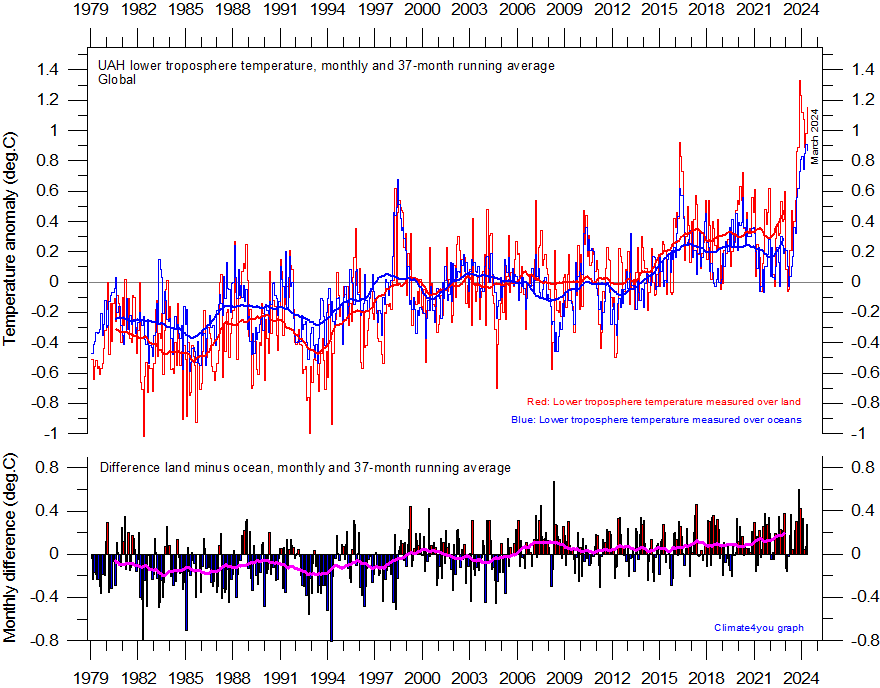
Global monthly average lower troposphere temperature since 1979 measured over land and oceans, respectively, according to University of Alabama at Huntsville, USA. This diagram uses data obtained by the National Oceanographic and Atmospheric Administration (NOAA) TIROS-N satellite, interpreted by Dr. Roy Spencer and Dr. John Christy, both at Global Hydrology and Climate Center, University of Alabama at Huntsville, USA. Thick lines are the simple running 37 month average, nearly corresponding to a running 3 yr average. Reference period 1991-2020. Last month shown: April 2025. Last diagram update: 21 May 2025.
-
Click here to download the entire series of UAH MSU global monthly lower troposphere temperatures since December 1978.
-
Click here to read about data smoothing.
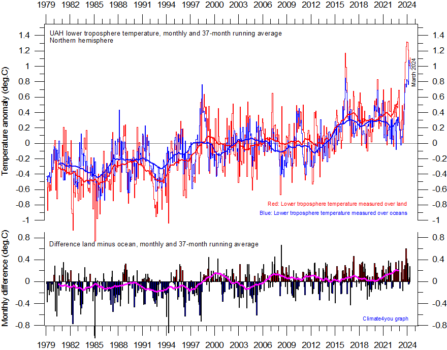
Northern hemisphere monthly average lower troposphere temperature since 1979 measured over land and oceans, respectively, according to University of Alabama at Huntsville, USA. This diagram uses data obtained by the National Oceanographic and Atmospheric Administration (NOAA) TIROS-N satellite, interpreted by Dr. Roy Spencer and Dr. John Christy, both at Global Hydrology and Climate Center, University of Alabama at Huntsville, USA. Thick lines are the simple running 37 month average, nearly corresponding to a running 3 yr average. Reference period 1991-2020. Last month shown: April 2025. Last diagram update: 21 May 2025.
-
Click here to download the entire series of UAH MSU global monthly lower troposphere temperatures since December 1978.
-
Click here to read about data smoothing.
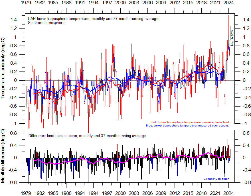
Southern hemisphere monthly average lower troposphere temperature since 1979 measured over land and oceans, respectively, according to University of Alabama at Huntsville, USA. This diagram uses data obtained by the National Oceanographic and Atmospheric Administration (NOAA) TIROS-N satellite, interpreted by Dr. Roy Spencer and Dr. John Christy, both at Global Hydrology and Climate Center, University of Alabama at Huntsville, USA. Thick lines are the simple running 37 month average, nearly corresponding to a running 3 yr average. Reference period 1991-2020. Last month shown: April 2025. Last diagram update: 21 May 2025.
-
Click here to download the entire series of UAH MSU global monthly lower troposphere temperatures since December 1978.
-
Click here to read about data smoothing.
Click here to jump back to list of contents.
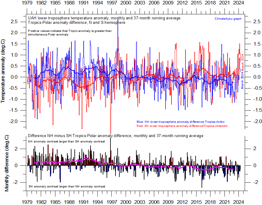
Tropics-Polar monthly anomaly difference from average lower troposphere temperatures since 1979, according to University of Alabama at Huntsville, USA. This diagram uses data obtained by the National Oceanographic and Atmospheric Administration (NOAA) TIROS-N satellite, interpreted by Dr. Roy Spencer and Dr. John Christy, both at Global Hydrology and Climate Center, University of Alabama at Huntsville, USA. Thick lines are the simple running 37 month average, nearly corresponding to a running 3 yr average. Reference period 1991-2020. Last month shown: April 2025. Last diagram update: 21 May 2025.
-
Click here to download the entire series of UAH MSU global monthly lower troposphere temperatures since December 1978.
-
Click here to read about data smoothing.
Click here to jump back to list of content
Monthly surface air temperature anomalies versus average 1998-2006 in areas between 72oN and 60oS
The diagram table below contains clickable monthly spatial temperature diagrams since 2005, to illustrate the changeable geographical pattern of surface air temperature variations, integrated by graphs like that above. These diagrams are geographical asymmetrical to cover most of the planets land areas, ranging from 72oN to 60oS.
| YEAR | JAN | FEB | MAR | APR | MAY | JUN | JUL | AUG | SEP | OCT | NOV | DEC | ANNUAL |
| 2025 | |||||||||||||
| 2024 | |||||||||||||
| 2023 | |||||||||||||
| 2022 | |||||||||||||
| 2021 | |||||||||||||
| 2020 | |||||||||||||
| 2019 | |||||||||||||
| 2018 | |||||||||||||
| 2017 | |||||||||||||
| 2016 | |||||||||||||
| 2015 | |||||||||||||
| 2014 | |||||||||||||
| 2013 | |||||||||||||
| 2012 | |||||||||||||
| 2011 | |||||||||||||
| 2010 | |||||||||||||
| 2009 | |||||||||||||
| 2008 |
|
|
|
|
|
|
|
|
|
|
|||
| 2007 | |||||||||||||
| 2006 | |||||||||||||
| 2005 |
Spatial distribution of monthly
surface air temperature
deviation between 72oN and 60oS in relation to the average
for the period 1998-2006. Warm colours indicates areas
with higher temperature than the average, while blue colours indicate lower than average
temperatures.
It
is important to note that the map projection used above is of the type Mercator. This is a useful
cylindrical map projection that preserves angles at all locations, but scale
varies from place to place, distorting the size of land areas. In particular,
areas closer to the poles are more affected, making land areas of similar size
looking increasingly oversized towards the poles. To exemplify this effect, the
areas of
To monitor the present global temperature trend, up or
down, it is not efficient to compare with some past period like, e.g., 1961-1990,
even though this is what is frequently done. This will not inform about
the current temperature trend. It seems to make more sense to compare with a more recent
period.
All the diagrams in the table above were prepared using gridded data downloaded from the public domain NASA Goddard Institute for Space Studies (GISS) web page. For surface interpolation of the gridded data a kriging algorithm was used, plotting all data in a polar projection map. The kriging procedure attempts to express trends and is widely considered one of the more flexible interpolation methods, producing a smooth map with few ‘bull eyes’. It is usually recommended for gridding almost any type of data set, especially data sets with a heterogeneous point distribution, such as characterising the present data set. It should be noted that the observation network within the two regions considered is not of equal density or quality all over the geographical regions covered by the diagrams.
Click here to jump back to the list of contents.
Annual surface air temperatures global
Anomalies of global annual surface air temperature (MAAT) since 1850 according to Hadley CRUT, a cooperative effort between the Hadley Centre for Climate Prediction and Research and the University of East Anglia's Climatic Research Unit (CRU), UK. The average for 1979-2008 (30 yrs) has been set to zero, to make comparison with other temperature data series (above and below) easy. Last year shown: 2024. Last figure update: 22 January 2025.
-
Click here or here to download the series of estimated HadCRUT5 global monthly surface air temperature anomalies since 1850.
-
Click here to read about data smoothing.
-
Click here to open a web interface to all the weather station data used by the Hadley Centre, a very useful facility developed by Clive Best, also known for his blog. Please note that the stations are split into 3 groups. 1) those going back to before 1860 2) Those going back to between 1860 and 1930 3) Those with data going back later than 1930. The last option is all stations together - but is very slow to load (>5000 stations). Drag a rectangle to zoom in. Click on a station to see the graph of temperatures and anomalies.
Anomalies
of global annual surface air temperature (MAAT) since 1880 according to
the National
Climatic Data Center (NCDC), USA. This time series is calculated using land
surface data from the Global
Historical Climatology Network (Version 2) and sea surface temperature
anomalies from the
-
Click here to download the entire series of the NCDC global annual surface air temperatures since 1850
-
Click here to read about data smoothing.
Anomalies
of global annual surface air temperature (MAAT) since 1880 according to
the Goddard
Institute for Space Studies (GISS), at
-
Click here to download the entire series of the GISS global monthly surface air temperatures since 1880.
-
Click here to read about data smoothing.
Anomalies of global annual surface air temperature (MAAT) since 1979 according to the University of Alabama at Huntsville, USA. This graph uses data obtained by the National Oceanographic and Atmospheric Administration (NOAA) TIROS-N satellite, interpreted by Dr. Roy Spencer and Dr. John Christy, both at Global Hydrology and Climate Center, University of Alabama at Huntsville, USA. The average for 1979-2008 (30 yrs) has been set to zero, to make comparison with other temperature data series (above and below) easy. Last year shown: 2024. Last figure update: 25 January 2025.
-
Click here to download the entire series of UAH MSU global monthly lower troposphere temperatures since December 1978.
-
Click here to read about data smoothing.
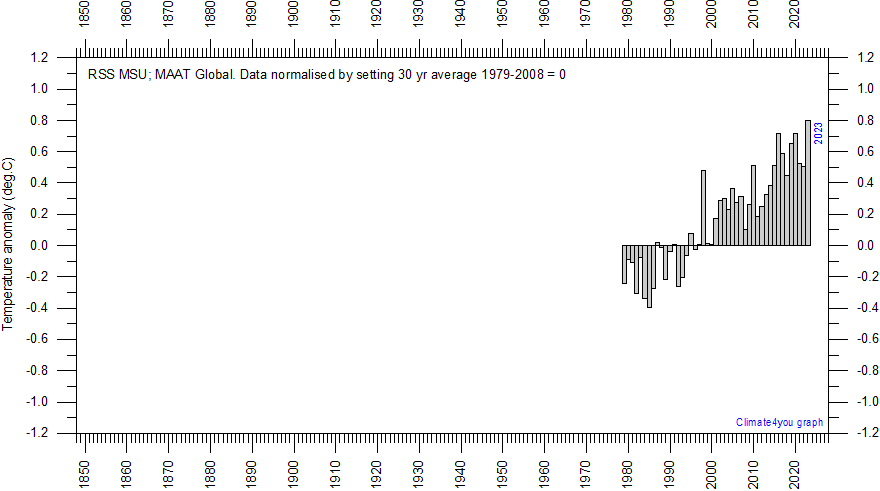
Anomalies of global annual surface air temperature (MAAT) since 1979 according to the Remote Sensing Systems (RSS). This graph uses data obtained by the National Oceanographic and Atmospheric Administration (NOAA) TIROS-N satellite, and interpreted by Dr. Carl Mears (RSS). The average for 1979-2008 (30 yrs) has been set to zero, to make comparison with other temperature data series (above and below) easy. Last year shown: 2024. Last figure update: 25 January 2025.
-
Click here to download the entire series of RSS MSU global monthly lower troposphere temperatures since January 1979.
-
Click here to read about data smoothing.
Click here to jump back to the list of contents.
Annual surface air temperature northern hemisphere
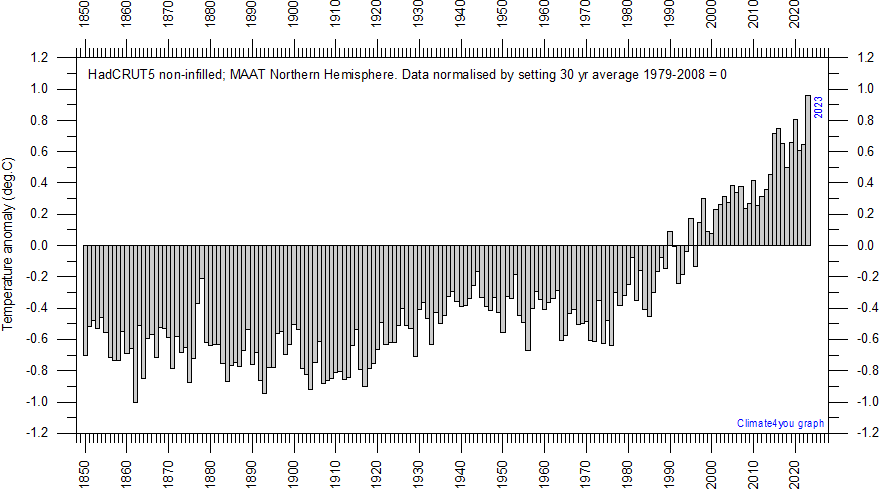
Anomalies of Northern Hemisphere annual surface air temperature (MAAT) since 1850 according to Hadley CRUT, a cooperative effort between the Hadley Centre for Climate Prediction and Research and the University of East Anglia's Climatic Research Unit (CRU), UK. The average for 1979-2008 (30 yrs) has been set to zero, to make comparison with other temperature data series (above and below) easy. Last year shown: 2024. Last figure update: 22 January 2025.
-
Click here to download the series of estimated HadCRUT5 monthly surface air temperature anomalies since 1850.
-
Click here to read about data smoothing.
-
Click here to open a web interface to all the weather station data used by the Hadley Centre, a very useful facility developed by Clive Best, also known for his blog. Please note that the stations are split into 3 groups. 1) those going back to before 1860 2) Those going back to between 1860 and 1930 3) Those with data going back later than 1930. The last option is all stations together - but is very slow to load (>5000 stations). Drag a rectangle to zoom in. Click on a station to see the graph of temperatures and anomalies.
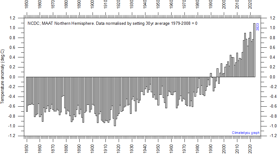
Anomalies
of Northern Hemisphere annual surface air temperature (MAAT) since 1880 according to
the National
Climatic Data Center (NCDC), USA. This time series is calculated using land
surface data from the Global
Historical Climatology Network (Version 2) and sea surface temperature
anomalies from the
-
Click here to download the entire series of the NCDC global annual surface air temperatures since 1850
-
Click here to read about data smoothing.
-
Please note that the early part of the NCDC record has now been changed so much towards lower values than just a few years ago, that the graph now extents below the x-axis. Click here for further details on temporal instability of the NCDC temperature record.
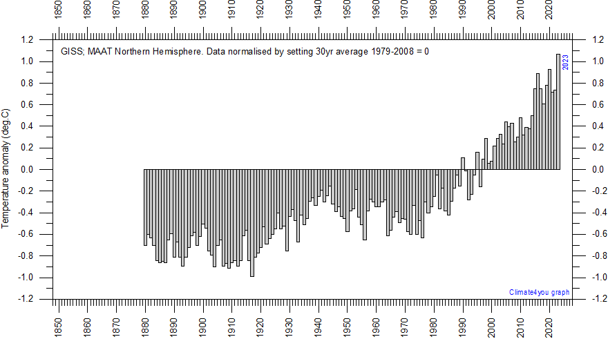
Anomalies
of Northern Hemisphere annual surface air temperature (MAAT) since 1880 according to
the Goddard
Institute for Space Studies (GISS), at
-
Click here to download the entire series of the GISS global monthly surface air temperatures since 1880.
-
Click here to read about data smoothing.
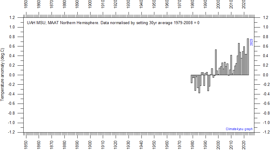
Anomalies of Northern Hemisphere annual surface air temperature (MAAT) since 1979 according to the University of Alabama at Huntsville, USA. This graph uses data obtained by the National Oceanographic and Atmospheric Administration (NOAA) TIROS-N satellite, interpreted by Dr. Roy Spencer and Dr. John Christy, both at Global Hydrology and Climate Center, University of Alabama at Huntsville, USA. The average for 1979-2008 (30 yrs) has been set to zero, to make comparison with other temperature data series (above and below) easy. Last year shown: 2024. Last figure update: 25 January 2025.
-
Click here to download the entire series of UAH MSU global monthly lower troposphere temperatures since December 1978.
-
Click here to read about data smoothing.
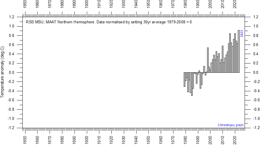
Anomalies of Northern Hemisphere annual surface air temperature (MAAT) since 1979 according to the Remote Sensing Systems (RSS). This graph uses data obtained by the National Oceanographic and Atmospheric Administration (NOAA) TIROS-N satellite, and interpreted by Dr. Carl Mears (RSS). The average for 1979-2008 (30 yrs) has been set to zero, to make comparison with other temperature data series (above and below) easy. Last year shown: 2024. Last figure update: 25 January 2025.
-
Click here to download the entire series of RSS MSU global monthly lower troposphere temperatures since January 1979.
-
Click here to read about data smoothing.
Click here to jump back to the list of contents.
Annual surface air temperature southern hemisphere
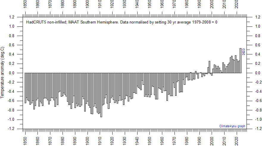
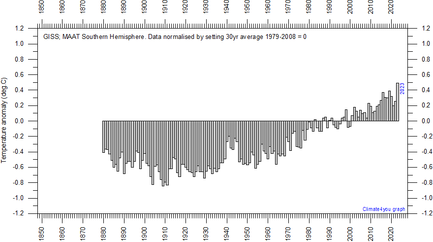
Anomalies of Southern Hemisphere annual surface air temperature (MAAT) since 1850 according to Hadley CRUT, a cooperative effort between the Hadley Centre for Climate Prediction and Research and the University of East Anglia's Climatic Research Unit (CRU), UK. The average for 1979-2008 (30 yrs) has been set to zero, to make comparison with other temperature data series (above and below) easy. Last year shown: 2024. Last figure update: 22 January 2025.
-
Click here to download the series of estimated HadCRUT5 monthly surface air temperature anomalies since 1850.
-
Click here to read about data smoothing.
-
Click here to open a web interface to all the weather station data used by the Hadley Centre, a very useful facility developed by Clive Best, also known for his blog. Please note that the stations are split into 3 groups. 1) those going back to before 1860 2) Those going back to between 1860 and 1930 3) Those with data going back later than 1930. The last option is all stations together - but is very slow to load (>5000 stations). Drag a rectangle to zoom in. Click on a station to see the graph of temperatures and anomalies.
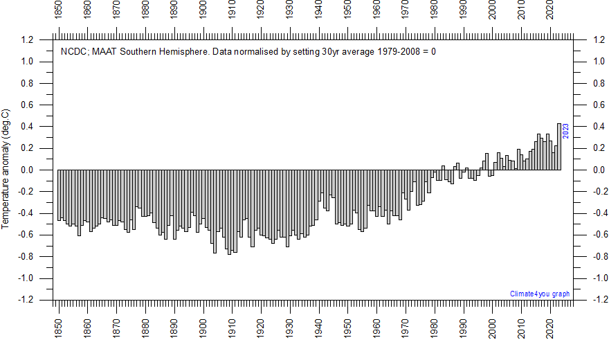
Anomalies
of Southern Hemisphere annual surface air temperature (MAAT) since 1880 according to
the National
Climatic Data Center (NCDC), USA. This time series is calculated using land
surface data from the Global
Historical Climatology Network (Version 2) and sea surface temperature
anomalies from the
-
Click here to download the entire series of the NCDC global annual surface air temperatures since 1850
-
Click here to read about data smoothing.
Anomalies
of Southern Hemisphere annual surface air temperature (MAAT) since 1880 according to
the Goddard
Institute for Space Studies (GISS), at
-
Click here to download the entire series of the GISS global monthly surface air temperatures since 1880.
-
Click here to read about data smoothing.
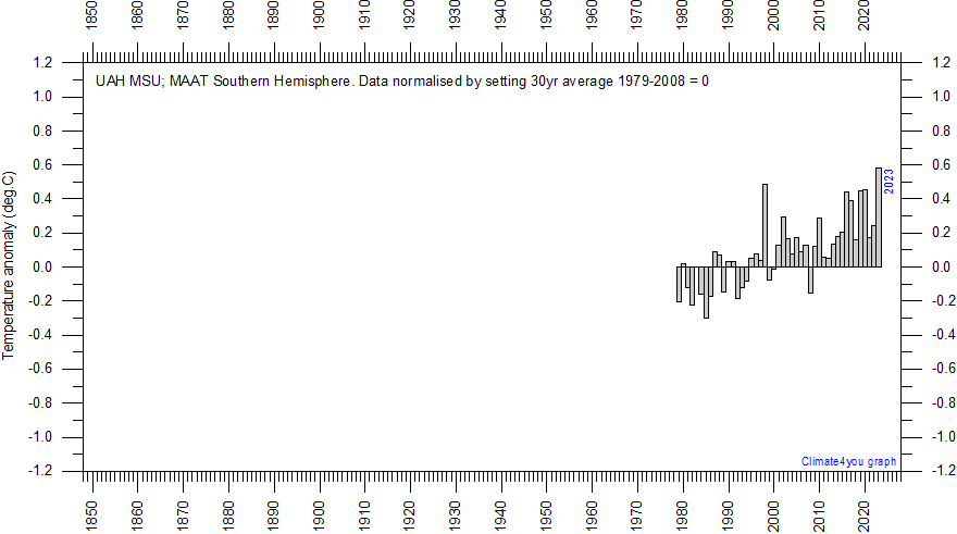
Anomalies of Southern Hemisphere annual surface air temperature (MAAT) since 1979 according to the University of Alabama at Huntsville, USA. This graph uses data obtained by the National Oceanographic and Atmospheric Administration (NOAA) TIROS-N satellite, interpreted by Dr. Roy Spencer and Dr. John Christy, both at Global Hydrology and Climate Center, University of Alabama at Huntsville, USA. The average for 1979-2008 (30 yrs) has been set to zero, to make comparison with other temperature data series (above and below) easy. Last year shown: 2024. Last figure update: 25 January 2025.
-
Click here to download the entire series of UAH MSU global monthly lower troposphere temperatures since December 1978.
-
Click here to read about data smoothing.
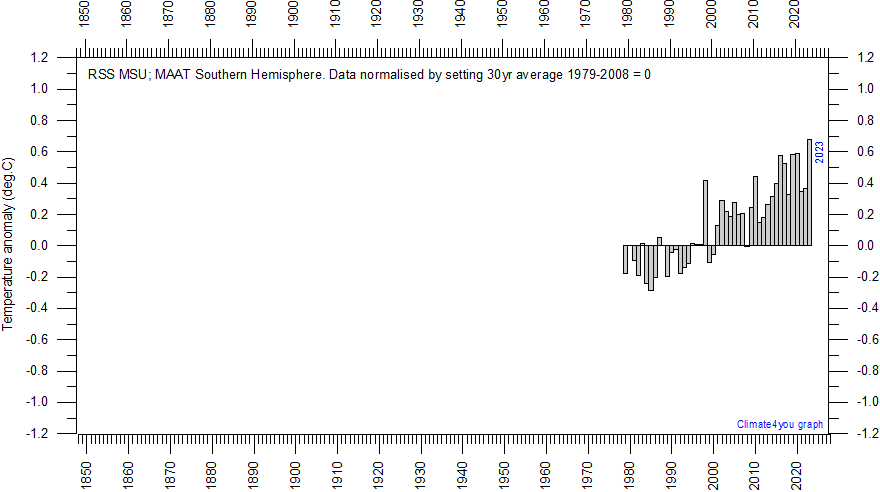
Anomalies of Southern Hemisphere annual surface air temperature (MAAT) since 1979 according to the Remote Sensing Systems (RSS). This graph uses data obtained by the National Oceanographic and Atmospheric Administration (NOAA) TIROS-N satellite, and interpreted by Dr. Carl Mears (RSS). The average for 1979-2008 (30 yrs) has been set to zero, to make comparison with other temperature data series (above and below) easy. Last year shown: 2024. Last figure update: 25 January 2025.
-
Click here to download the entire series of RSS MSU global monthly lower troposphere temperatures since January 1979.
-
Click here to read about data smoothing.
Click here to jump back to the list of contents.
Vertical temperature profile of the atmosphere; satellites
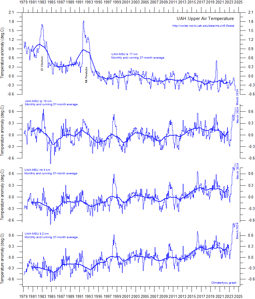
Global monthly average temperature in different altitudes according to University of Alabama at Huntsville (UAH). The thin lines represent the monthly average, and the thick line the simple running 37 month average, nearly corresponding to a running 3 yr average. Reference period 1991-2020. Last month shown: April 2025. Last diagram update: 21 May 2025.
-
Click here, here, here and here to download the series of UAH MSU global monthly atmosphere temperature anomalies since December 1978.
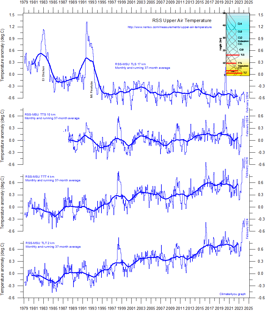
Global monthly average temperature in different altitudes according to Remote Sensing Systems (RSS). The thin lines represent the monthly average, and the thick line the simple running 37 month average, nearly corresponding to a running 3 yr average. Last month shown: February 2024. Last diagram update: 20 March 2025.
-
Click here to download the series of RSS MSU global monthly atmosphere temperature anomalies since January 1979.
-
Click here to read a description of the MSU products.
Vertical temperature profile of the atmosphere; weather balloons
Radiosonde Atmospheric Temperature Products for Assessing Climate (RATPAC)
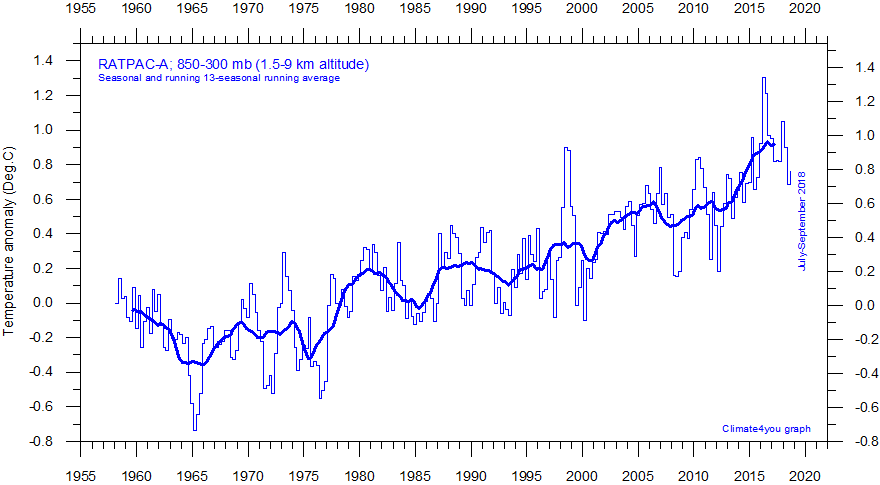
Seasonal global upper air temperature anomalies at 850-300 mb according to RATPAC-A Version 2. The thin lines represent the seasonal (3-month) average, and the thick line the simple running 13-season average, nearly corresponding to a running 3 yr average. Last season shown: July-September 2018. Last diagram update: 28 October 2018.
-
Click here to download the series of RATPAC-A version 2 seasonal global upper air temperature anomalies since January 1958.
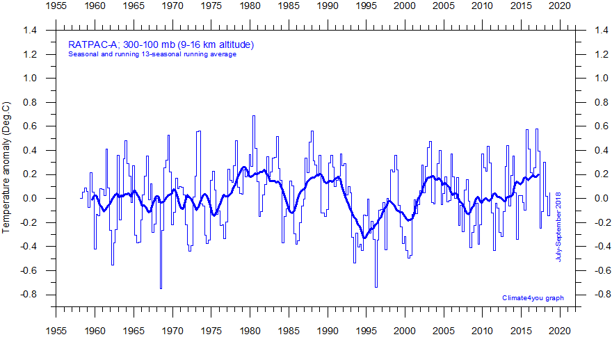
Seasonal global upper air temperature anomalies at 300-100 mb according to RATPAC-A Version 2. The thin lines represent the seasonal (3-month) average, and the thick line the simple running 13-season average, nearly corresponding to a running 3 yr average. Last season shown: July-September 2018. Last diagram update: 28 October 2018.
-
Click here to download the series of RATPAC-A version 2 seasonal global upper air temperature anomalies since January 1958.
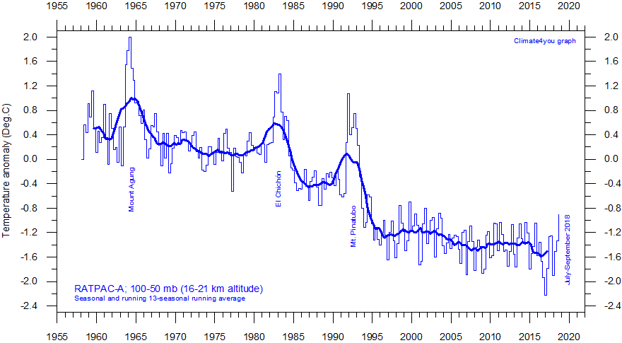
Seasonal global upper air temperature anomalies at 100-50 mb according to RATPAC-A Version 2. The thin lines represent the seasonal (3-month) average, and the thick line the simple running 13-season average, nearly corresponding to a running 3 yr average. Last season shown: July-September 2018. Last diagram update: 28 October 2018.
-
Click here to download the series of RATPAC-A version 2 seasonal global upper air temperature anomalies since January 1958.
Click here to jump back to the list of contents.
Temperature change above Equator
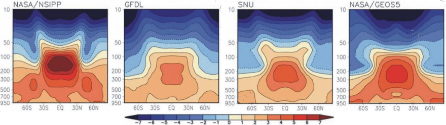
Modelled zonally averaged, equilibrated temperature change with altitude associated with doubling atmospheric CO2 (Lee et al. 2007). Units for modelled temperature change are given in degrees Celcius. The horizontal axis begins at 90oN to the left, and ends at 90oS to the right. The vertical axis begins at the planet surface and extends to 10 hPA (ca. 16 km height). For the 200, 300 and 1000 hPa levels (ca. 12, 9 and 0 km altitude, respectively) the observed temperature change since 1979 is shown in the diagrams below.
Lindzen
(1999 and 2007)
argued that the surface temperature anomalies are not the best way of
identifying the effect of an atmospheric CO2 increase. He stressed that the
radiation in the energy flux balance relations can be thought of as coming mainly from the atmospheric layer where the infrared optical depth is near 1.
This characteristic emission layer is high above the surface and is typically
located at an altitude somewhat below the tropopause.
The
height of the tropopause varies with latitude. In the tropics, the tropopause
height is about 16-17 km, near 30° latitude about
12 km, and near the poles the tropopause height is around 8 km above the surface.
The
diagrams above shows how temperature changes when CO2 is doubled in 4
different General Circulation Models (Lee et al.
2007). These model runs differ
from those that were run for the IPCC in that the models were simplified to
isolate the effects of CO2 forcing and climate feedbacks (Lindzen
2007). Also
the models were run until equilibrium was established rather than run in a
transient
mode in order to simulate the past. Thus, they tend to isolate greenhouse
warming from other things that might be going on.
The
model runs shown in the above diagrams
all suggest warming due to CO2 doubling to
peak not at the surface in the tropics, but in the troposphere near the 200-300
hPa level, roughly corresponding to 12-9 km altitude. The
main reason for the inter-model variation is that the amount of water vapour differs among the
models. The expected warming above the tropics is 2-3 times larger than near the surface, regardless of the sensitivity of the
particular model. This is, in fact, the very signature of greenhouse warming (cf.
Lindzen 2007).
In the diagrams below the temperature change at and above Equator is shown, using the Hadley Centre's radiosonde temperature product HadAT (200 and 300 hPa), and HadCRUT3 meteorological surface data. HadAT consists of temperature anomaly time series on 9 standard reporting pressure levels (850hPa to 30hPa), and is derived from 676 individual radiosonde stations with long-term records. Data uncertainties and limitations are described here. The latitudinal band used in the diagrams below is from 20oN to 20oS. To enable easy comparison with the global temperature changes shown higher up this page, 1979 has been chosen as start year. The full HadAT data series, however, goes back to 1958. Please note that the temperature scale in these diagrams are different from the scale used above, to accommodate the larger temperature variations at height. All data series were normalised by setting their starting value in January 1979 = 0, before inclusion in the diagrams below.
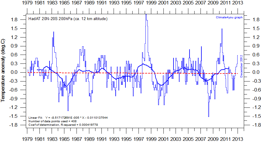
Temperature change at 200hPa (c. 12 km height) between 20oN and 20oS since 1979, according to HadAT. The thin blue line shows the monthly values, while the thick blue line represents the simple running 37 month average, nearly corresponding to a running 3 yr average. The stippled red line shows the linear fit for the period shown, with basic statistics shown in the upper left corner of the diagram. The data were normalised by setting the average of their initial 120 months (10 years) from January 1979 to December 1988 = 0. Last month shown: December 2012. Last diagram update: 4 May 2013.
-
Please note that the linear regression is done by month, not year
-
Click here to download the entire HadAT series since 1958.
-
Click here to read about data smoothing.
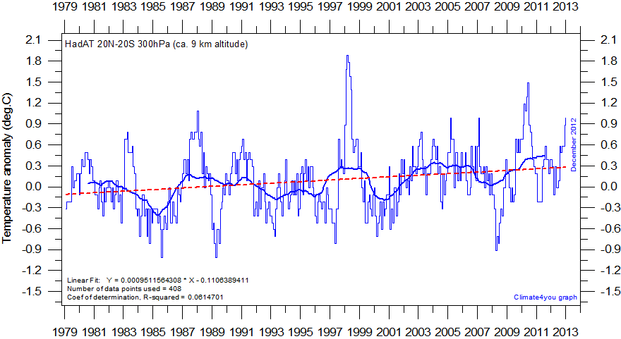
Temperature change at 300hPa (c. 9 km height) between 20oN and 20oS since 1979, according to HadAT. The thin blue line shows the monthly values, while the thick blue line represents the simple running 37 month average, nearly corresponding to a running 3 yr average. The stippled red line shows the linear fit for the period shown, with basic statistics shown in the upper left corner of the diagram. The data were normalised by setting the average of their initial 120 months (10 years) from January 1979 to December 1988 = 0. Last month shown: December 2012. Last diagram update: 4 May 2013.
-
Please note that the linear regression is done by month, not year
-
Click here to download the entire HadAT series since 1958.
-
Click here to read about data smoothing.
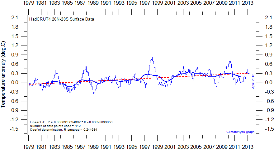
Temperature change at surface between 20oN and 20oS since 1979, according to HadCRUT4. The thin blue line shows the monthly values, while the thick blue line represents the simple running 37 month average, nearly corresponding to a running 3 yr average. The stippled red line shows the linear fit for the period shown, with basic statistics shown in the upper left corner of the diagram. The data were normalised by setting the average of the initial 120 months (10 years) from January 1979 to December 1988 = 0. Last month shown: April 2013. Last diagram update: 8 June 2013.
-
Please note that the linear regression is done by month, not year
-
Click here to download the entire HadCRUT3 series since 1850.
-
Click here to read about data smoothing.
The initial versions of satellite and radiosonde datasets suggested that the tropical surface had warmed more than the troposphere, while climate models consistently showed tropospheric amplification of surface warming in response to human-caused increases in well-mixed greenhouse gases, as shown by the diagrams above. This observation gave rise to deep concern, and resulted in a number of studies (e.g. NRC 2000) where strong attempts were made to find warming in the troposphere. As new data sets have been made available and new corrections introduced, the scientific literature have witnessed a number of attempts of reconciling the modelled and the observed atmospheric warming pattern. Conflicting conclusions have, however, been reached. Some scientists conclude that a discrepancy between modelled and observed trends in tropical lapse rates still exists, while other argue that there is no longer a serious discrepancy. A few key references on this debate are represented by Lindzen 1999 and 2007, NRC 2000, Douglass et al 2007, and Santer et al 2008. Ongoing web-based discussions can be followed here and here. This debate reflects the importance of the point raised by Lindzen (1999) on monitoring temperature changes at the height in the troposphere corresponding to an infrared optical depth near 1.
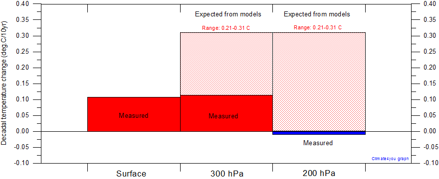
Diagram showing observed linear decadal temperature change at surface, 300 hPa and 200 hPa, between 20oN and 20oS, since January 1979. Data source: HadAT and HadCRUT4. Click here to compare with modelled altitudinal temperature change pattern for doubling atmospheric CO2. Last month included in analysis: December 2012. Last diagram update: 4 May 2013.
The three diagrams above (using data from HadAT and HadCRUT4) show the linear trend of the temperature change since 1979 between 20oN and 20oS to be ca. 0.00089oC/month at the surface, 0.00095oC/month at 300 hPa, and -0.00009oC/month at 200 hPa, corresponding to 0.10698, 0.11414 and -0.01022oC/decade, respectively (see bar chart above).
Thus, these radiosonde and surface meteorological data from the Equatorial region do not at the moment display the signature of enhanced greenhouse warming. With the observed warming rate of about 0.10698oC/decade at the surface, a warming rate of about 0.21-0.31oC/decade would have been expected at the 200 and 300 hPa levels to comply with the prognosis on this derived from the CO2 hypothesis.
Click here to jump back to the list of contents.
Outgoing longwave radiation global

Weekly absolute (above) and anomaly (below) outgoing long wave radiation (OLR) at the top of the atmosphere 26 May-1 June 2025. Base period January 1981 - December 2010. Source: National Oceanographic and Atmospheric Administration (NOAA) Earth System Research Laboratory (ESRL). Last diagram update: 3 June 2025.
-
Click here to see the original ESRL diagram showing OLR absolute values, or to check for a more recent diagram.
-
Click here to see the original ESRL diagram showing OLR anomaly values, or to check for a more recent diagram.
First of all, it should be noted that the above maps are Mercator projection maps, whereby the polar regions are visually highly exaggerated as to their apparent surface area. In reality, it is the regions near Equator which are important as to the real surface area. The general long wave (infrared) pattern is characterised by a gradient towards relatively low values at high latitudes, and higher values near the Equator (upper panel). This zone of relative high long wave radiation follows the sun throughout the seasons, being displaced north during the Northern Hemisphere summer, and vice versa during the Northern Hemisphere winter. The strongest contrast within latitudinal belts exist in the low latitudes, where the high outgoing radiation of the subtropical anticyclones (high pressure zones) and other dry zones contrast sharply with the low outgoing radiation of the major cloudy regions of the tropics. Also at middle latitudes there may be substantial longitudinal variations, particular in the Northern Hemisphere. Such variations are often caused by massive penetration of cold air from the polar regions to middle latitudes, associated with strong blocking patterns in higher latitudes (Gruber and Winston 1978), and are most frequently observed in the Northern Hemisphere during Northern Hemisphere winter.
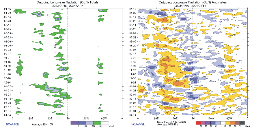
Average total (left) and anomaly (right) outgoing long wave radiation (OLR) between 10oN and 10oS at the top of the atmosphere, since 2 June 2024 (top of diagram). Base period January 1981 - December 2010. Source: National Oceanographic and Atmospheric Administration (NOAA) Earth System Research Laboratory (ESRL). Last day shown: 1 June 2025 (bottom of diagram). Last diagram update: 3 June 2025.
-
Click here to see the original ESRL diagram showing OLR absolute values, or to check for a more recent diagram.
-
Click here to see the original ESRL diagram showing OLR anomaly values, or to check for a more recent diagram.
The region near the Equator is of high importance because of the huge surface areas involved. Variations are seen to be especially large within the region 60oE-120oW, covering the Indian Ocean, Indonesia and most of the Pacific Ocean between 10oN and 10oS.
![]()
The red area of the Sun's spectrum (upper panel in figure above) is absorbed by the atmosphere and the Earth's surface. The warmed surface emits infrared radiation as indicated by the white areas on the individual molecule's spectrum (lower panels). The grey bits are the parts of the spectra that are absorbed by the atmosphere. The blue area on the Earth's emission spectrum (upper panel) is known as the infrared window through which most of the Earth's radiation passes to space unhindered by being absorbed by any of the greenhouse gases. This short text is from Barett Bellamy Climate, where a more thorough description of the greenhouse effect is provided. The diagrams below all show infrared radiation within this window.
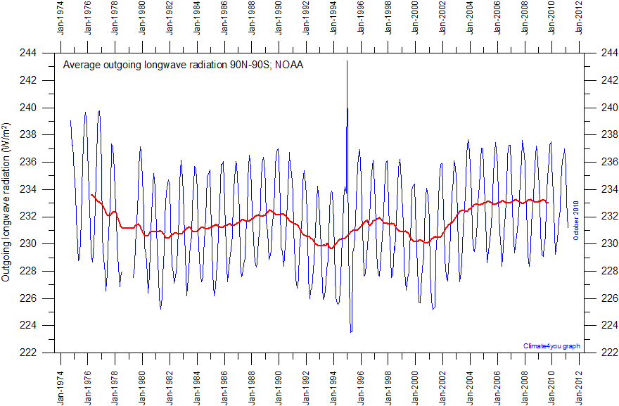
Outgoing longwave radiation (OLR) at the top of the atmosphere between 180oW and 179oE (0oE and 359.5oE) and 90oN and 90oS since June 1974 according to the National Oceanographic and Atmospheric Administration (NOAA). The thin blue line represents the monthly value, while the thick red line is the simple running 37 month average, nearly corresponding to the running 3 yr average. The infrared wavelength covered is 10.5-12.5 µm (Gruber and Winston 1978) and covers the main part of the atmospheric infrared window. Last month shown: October 2010. Last diagram update: 13 February 2011.
-
Click here to download the entire series of NOAA monthly OLR-values since June 1974. Choose first 'OLR' then 'Select field'.
-
Click here to read about data smoothing.
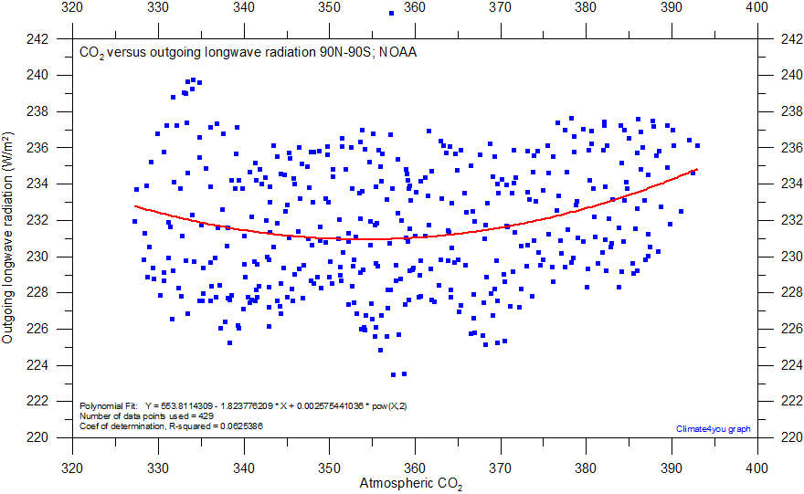
Scatter plot showing outgoing longwave radiation (OLR) at the top of the atmosphere between 180oW and 179oE (0oE and 359.5oE) and 90oN and 90oS since June 1974, as function of atmospheric CO2. OLR data from the National Oceanographic and Atmospheric Administration (NOAA). CO2 data measured at the Mauna Loa Observatory, Hawaii, reported as a dry mole fraction defined as the number of molecules of carbon dioxide divided by the number of molecules of dry air (water vapour removed), multiplied by one million (ppm). The red line represent a two-degree polynomial fit, specified in the lower left corner of the diagram. As the amount of atmospheric CO2 has been increasing over the entire period (ignoring annual variations), the x-axis can be seen as as rough timeline from 1974 (left) to 2010 (right). The infrared wavelength covered is 10.5-12.5 µm (Gruber and Winston 1978) and covers the main part of the atmospheric infrared window. Last month shown: October 2010. Last diagram update: 13 February 2011.
-
Click here to download the entire series of NOAA monthly OLR-values since June 1974. Choose first 'OLR' then 'Select field'.
-
Click here to download the entire series of monthly CO2 values since March 1958.
-
Click here to read about data smoothing.

Diagram showing outgoing longwave radiation (OLR) at the top of the atmosphere between 180oW and 179oE (0oE and 359.5oE) and 90oN and 90oS since December 1978 ( red line; National Oceanographic and Atmospheric Administration (NOAA), and the global monthly average lower troposphere temperature (blue line; University of Alabama at Huntsville, USA). The thin lines represent the monthly values, while the thick lines are the simple running 37 month averages, nearly corresponding to running 3 yr averages. The infrared wavelength covered is 10.5-12.5 µm (Gruber and Winston 1978) and covers the main part of the atmospheric infrared window. Last month shown: October 2010 (OLR) and January 2011 (UAH). Last diagram update: 13 February 2011.
-
Click here to download the entire series of NOAA monthly OLR-values since June 1974. Choose first 'OLR' then 'Select field'.
-
Click here to download the entire series of UAH MSU global monthly lower troposphere temperatures since December 1978.
-
Click here to read about data smoothing.
Click here to jump back to the list of contents.
Outgoing longwave radiation above Equator
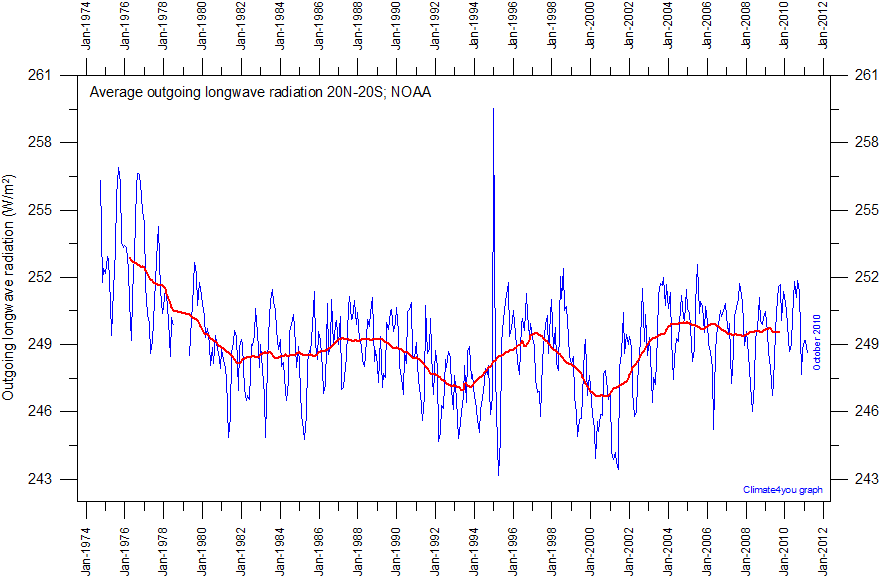
Outgoing longwave radiation (OLR) at the top of the atmosphere between 180oW and 179oE (0oE and 359.5oE) and 20oN and 20oS since June 1974 according to the National Oceanographic and Atmospheric Administration (NOAA). The thin blue line represents the monthly value, while the thick red line is the simple running 37 month average, nearly corresponding to the running 3 yr average. The infrared wavelength covered is 10.5-12.5 µm (Gruber and Winston 1978) and covers the main part of the atmospheric infrared window. Last month shown: October 2010. Last diagram update: 13 February 2011.
-
Click here to download the entire series of NOAA monthly OLR-values since June 1974. Choose first 'OLR' then 'Select field'.
-
Click here to read about data smoothing.
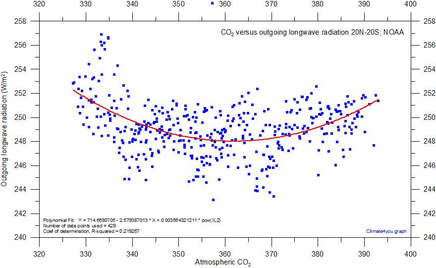
Scatter plot showing outgoing longwave radiation (OLR) at the top of the atmosphere between 180oW and 179oE (0oE and 359.5oE) and 20oN and 20oS since June 1974, as function of atmospheric CO2. OLR data from the National Oceanographic and Atmospheric Administration (NOAA). CO2 data measured at the Mauna Loa Observatory, Hawaii, reported as a dry mole fraction defined as the number of molecules of carbon dioxide divided by the number of molecules of dry air (water vapour removed), multiplied by one million (ppm). The red line represent a two-degree polynomial fit, specified in the lower left corner of the diagram. As the amount of atmospheric CO2 has been increasing over the entire period (ignoring annual variations), the x-axis can be seen as as rough timeline from 1974 (left) to 2010 (right). The infrared wavelength covered is 10.5-12.5 µm (Gruber and Winston 1978) and covers the main part of the atmospheric infrared window. Last month shown: October 2010. Last diagram update: 13 February 2011.
-
Click here to download the entire series of NOAA monthly OLR-values since June 1974. Choose first 'OLR' then 'Select field'.
-
Click here to download the entire series of monthly CO2 values since March 1958.
-
Click here to read about data smoothing.
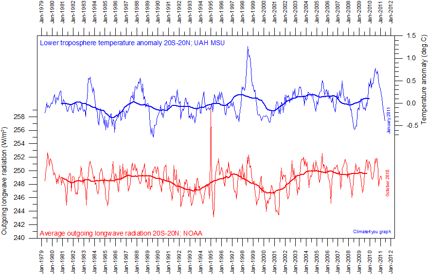
Diagram showing outgoing longwave radiation (OLR) at the top of the atmosphere between 180oW and 179oE (0oE and 359.5oE) and 20oN and 20oS since December 1978 ( red line; National Oceanographic and Atmospheric Administration (NOAA), and the global monthly average lower troposphere temperature (blue line; University of Alabama at Huntsville, USA). The thin lines represent the monthly values, while the thick lines are the simple running 37 month averages, nearly corresponding to running 3 yr averages. The infrared wavelength covered is 10.5-12.5 µm (Gruber and Winston 1978) and covers the main part of the atmospheric infrared window. Last month shown: October 2010 (OLR) and January 2011 (UAH). Last diagram update: 13 February 2011.
-
Click here to download the entire series of NOAA monthly OLR-values since June 1974. Choose first 'OLR' then 'Select field'.
-
Click here to download the entire series of UAH MSU global monthly lower troposphere temperatures since December 1978.
-
Click here to read about data smoothing.
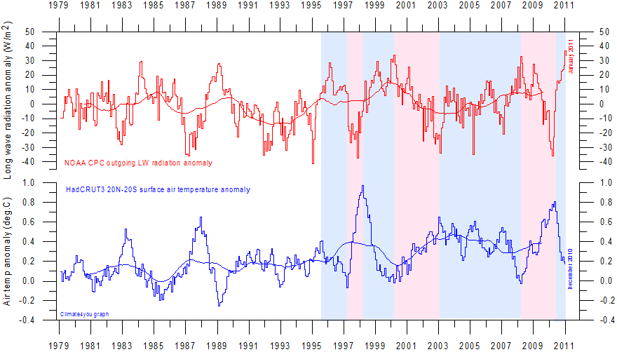
Outgoing longwave radiation (OLR; red graph) anomaly at the top of the atmosphere above Equator between 160oE and 160oW since 1979 according to the National Oceanographic and Atmospheric Administration (NOAA) Climate Prediction Center (CPC). Base period: 1979-1995. Surface air temperature change (blue graph) between 20oN and 20oS since 1979, according to HadCRUT3. The thin lines represent the monthly values, while the thick lines is simple running 37 month averages, nearly corresponding to running 3 yr averages. Within the time period 1996-2009, light blue areas indicate periods of surface cooling, and light red areas indicate surface warming. The entire OLR data series goes back to June 1974, but is here shown from January 1979 to enable easy comparison with the temperature diagrams shown above. The infrared wavelength covered is 10.5-12.5 µm (Gruber and Winston 1978) and covers the main part of the atmospheric infrared window. Last month shown: January 2011 (OLR) and December 2010 (HadCRUT3). Last diagram update: 12 February 2011.
-
Click here to download the entire series of NOAA monthly OLR-values since June 1974.
-
Click here to download the entire HadCRUT3 series since 1850.
-
Click here to read about data smoothing.
For the equatorial region, the diagram above suggests a certain chain of events, indicating the existence of a mechanism regulating the surface temperature: Periods of surface warming appears initially to be associated with decreasing outgoing longwave radiation (OLR). After some surface warming, OLR then stops decreasing and instead begins to increase, and after a while, surface air temperature then begins to decrease, etc. This chain of events is clearly illustrated by, e.g., the time period around the 1998 El Niño event (diagram above).
Part of the explanation of the above succession of events might be that tropical surface warming leads to enhanced atmospheric convectional transport of heat to high levels of the atmosphere above the Equator, resulting in enhanced longwave radiation at the top of the atmosphere. This, in turn, eventually leads to surface cooling, which results in reduced atmospheric convection, etc. Also the potential connection to variations in tropical sea surface temperatures and the tropical cloud cover is interesting, and should be considered in a more detailed analysis.
Click here to jump back to the list of contents.
Outgoing longwave radiation above the Arctic
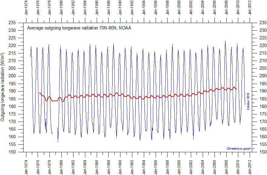
Outgoing longwave radiation (OLR) at the top of the atmosphere between 180oW and 179oE (0oE and 359.5oE) and 70oN and 90oN since June 1974 according to the National Oceanographic and Atmospheric Administration (NOAA). The thin blue line represents the monthly value, while the thick red line is the simple running 37 month average, nearly corresponding to the running 3 yr average. The infrared wavelength covered is 10.5-12.5 µm (Gruber and Winston 1978) and covers the main part of the atmospheric infrared window. Last month shown: October 2010. Last diagram update: 13 February 2011.
-
Click here to download the entire series of NOAA monthly OLR-values since June 1974. Choose first 'OLR' then 'Select field'.
-
Click here to read about data smoothing.
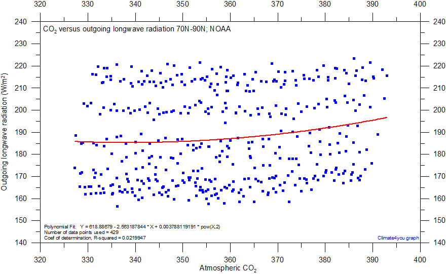
Scatter plot showing outgoing longwave radiation (OLR) at the top of the atmosphere between 180oW and 179oE (0oE and 359.5oE) and 70oN and 90oN since June 1974, as function of atmospheric CO2. OLR data from the National Oceanographic and Atmospheric Administration (NOAA). CO2 data measured at the Mauna Loa Observatory, Hawaii, reported as a dry mole fraction defined as the number of molecules of carbon dioxide divided by the number of molecules of dry air (water vapour removed), multiplied by one million (ppm). The red line represent a two-degree polynomial fit, specified in the lower left corner of the diagram. As the amount of atmospheric CO2 has been increasing over the entire period (ignoring annual variations), the x-axis can be seen as as rough timeline from 1974 (left) to 2010 (right). The infrared wavelength covered is 10.5-12.5 µm (Gruber and Winston 1978) and covers the main part of the atmospheric infrared window. Last month shown: October 2010. Last diagram update: 13 February 2011.
-
Click here to download the entire series of NOAA monthly OLR-values since June 1974. Choose first 'OLR' then 'Select field'.
-
Click here to download the entire series of monthly CO2 values since March 1958.
-
Click here to read about data smoothing.
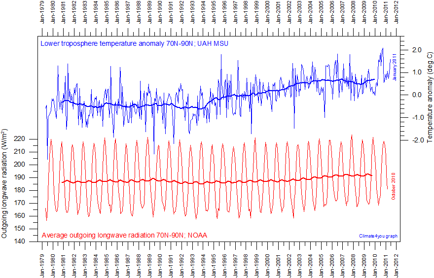
Diagram showing outgoing longwave radiation (OLR) at the top of the atmosphere between 180oW and 179oE (0oE and 359.5oE) and 70oN and 90oN since December 1978 ( red line; National Oceanographic and Atmospheric Administration (NOAA), and the global monthly average lower troposphere temperature (blue line; University of Alabama at Huntsville, USA). The thin lines represent the monthly values, while the thick lines are the simple running 37 month averages, nearly corresponding to running 3 yr averages. The infrared wavelength covered is 10.5-12.5 µm (Gruber and Winston 1978) and covers the main part of the atmospheric infrared window. Last month shown: October 2010 (OLR) and January 2011 (UAH). Last diagram update: 13 February 2011.
-
Click here to download the entire series of NOAA monthly OLR-values since June 1974. Choose first 'OLR' then 'Select field'.
-
Click here to download the entire series of UAH MSU global monthly lower troposphere temperatures since December 1978.
-
Click here to read about data smoothing.
Click here to jump back to the list of contents.
Outgoing longwave radiation above Antarctica
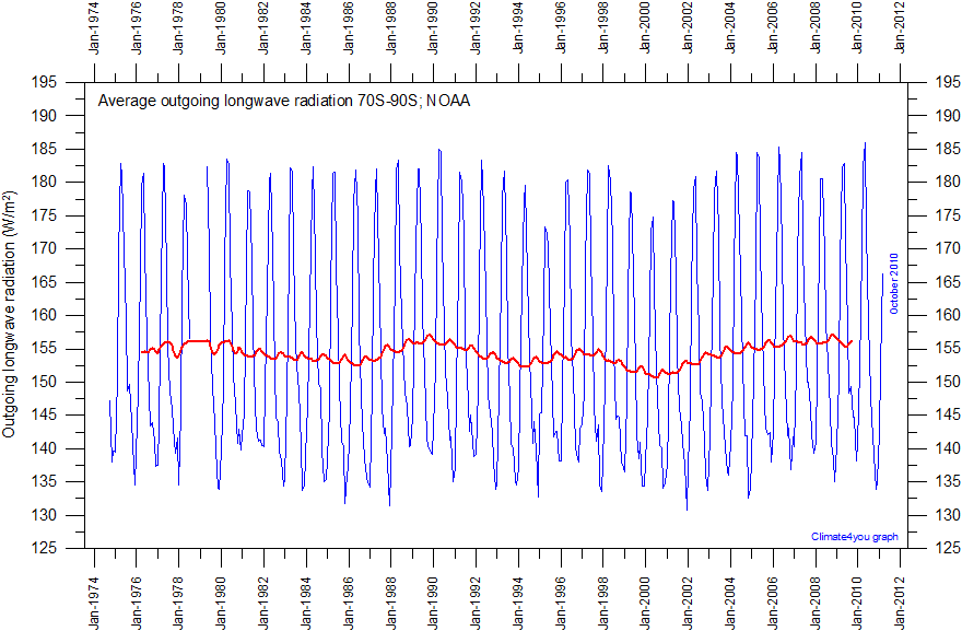
Outgoing longwave radiation (OLR) at the top of the atmosphere between 180oW and 179oE (0oE and 359.5oE) and 70oS and 90oS since June 1974 according to the National Oceanographic and Atmospheric Administration (NOAA). The thin blue line represents the monthly value, while the thick red line is the simple running 37 month average, nearly corresponding to the running 3 yr average. The infrared wavelength covered is 10.5-12.5 µm (Gruber and Winston 1978) and covers the main part of the atmospheric infrared window. Last month shown: October 2010. Last diagram update: 13 February 2010.
-
Click here to download the entire series of NOAA monthly OLR-values since June 1974. Choose first 'OLR' then 'Select field'.
-
Click here to read about data smoothing.
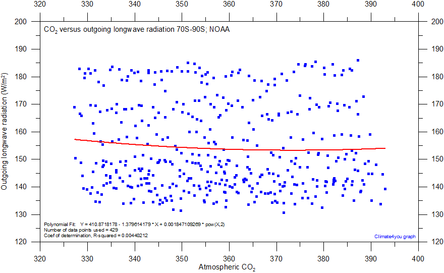
Scatter plot showing outgoing longwave radiation (OLR) at the top of the atmosphere between 180oW and 179oE (0oE and 359.5oE) and 70oS and 90oS since June 1974, as function of atmospheric CO2. OLR data from the National Oceanographic and Atmospheric Administration (NOAA). CO2 data measured at the Mauna Loa Observatory, Hawaii, reported as a dry mole fraction defined as the number of molecules of carbon dioxide divided by the number of molecules of dry air (water vapour removed), multiplied by one million (ppm). The red line represent a two-degree polynomial fit, specified in the lower left corner of the diagram. As the amount of atmospheric CO2 has been increasing over the entire period (ignoring annual variations), the x-axis can be seen as as rough timeline from 1974 (left) to 2010 (right). The infrared wavelength covered is 10.5-12.5 µm (Gruber and Winston 1978) and covers the main part of the atmospheric infrared window. Last month shown: October 2010. Last diagram update: 13 February 2011.
-
Click here to download the entire series of NOAA monthly OLR-values since June 1974. Choose first 'OLR' then 'Select field'.
-
Click here to download the entire series of monthly CO2 values since March 1958.
-
Click here to read about data smoothing.

Diagram showing outgoing longwave radiation (OLR) at the top of the atmosphere between 180oW and 179oE (0oE and 359.5oE) and 70oS and 90oS since December 1978 ( red line; National Oceanographic and Atmospheric Administration (NOAA), and the global monthly average lower troposphere temperature (blue line; University of Alabama at Huntsville, USA). The thin lines represent the monthly values, while the thick lines are the simple running 37 month averages, nearly corresponding to running 3 yr averages. The infrared wavelength covered is 10.5-12.5 µm (Gruber and Winston 1978) and covers the main part of the atmospheric infrared window. Last month shown: October 2010 (OLR) and January 2011 (UAH). Last diagram update: 13 February 2011.
-
Click here to download the entire series of NOAA monthly OLR-values since June 1974. Choose first 'OLR' then 'Select field'.
-
Click here to download the entire series of UAH MSU global monthly lower troposphere temperatures since December 1978.
-
Click here to read about data smoothing.
Click here to jump back to the list of contents.
Earths rotation and global temperature
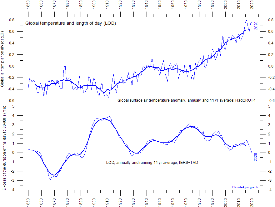
Diagram showing the HadCRUT4 estimate for the global annual surface temperature anomaly since 1885, and the average annual excess of duration of the day, defined as the difference between the astronomically determined duration of the day and 86400 seconds, and also called the length of day (LOD). The thin lines are showing the annual values, and the thick lines are the running 11 yr average. Temperature data source: the Hadley Centre for Climate Prediction and Research and the University of East Anglia's Climatic Research Unit (CRU), UK. LOD data source: International Earth Rotation and Reference Systems Service (IERS), and TimeAndDate (TAD). Last year shown: 2020. Last diagram update: 17 April 2020.
-
Click here to download the entire series of HadCRUT4 global monthly surface air temperature anomaly data since 1850.
-
Click here or here to download the annual LOD data from the International Earth Rotation and Reference Systems Service.
-
Click here to read more about how to measure the irregularities of planet Earths rotation.
-
Click here to read about data smoothing.
The speed of the Earth's rotation varies from day to day, controlled by several factors. One of the main factors are the celestial bodies surrounding us. For example, the Moon's gravitational pull causes tides and changes the Earth's shape, ultimately resulting in a lower rotational speed. The distance between Earth and Moon changes constantly, which makes for daily variations in the speed our planet rotates around its axis.
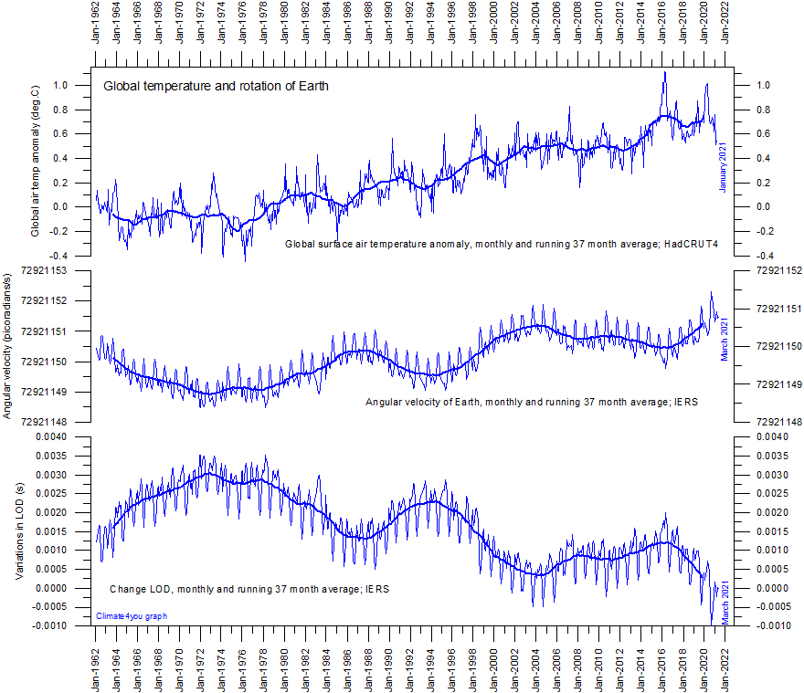
Diagram showing the monthly HadCRUT4 estimate for the global surface temperature anomaly since January 1962 (upper panel), the average angular velocity of Earth (mid panel), and the average monthly excess of duration of the day (lower panel). The excess duration of the day (LOD) is defined as the difference between the astronomically determined duration of the day and 86400 seconds. The thin lines are representing the monthly values, and the thick lines are the running 37 month average (about 3 yr). Temperature data source: the Hadley Centre for Climate Prediction and Research and the University of East Anglia's Climatic Research Unit (CRU), UK. Angular velocity and LOD data source: International Earth Rotation and Reference Systems Service (IERS). Last month shown: March 2021. Last diagram update: 17 April 2021.
-
Click here to download the entire series of HadCRUT4 global monthly surface air temperature anomaly data since 1850.
-
Click here or here or here to download the LOD data from the International Earth Rotation and Reference Systems Service.
-
Click here to read more about how to measure the irregularities of planet Earths rotation.
-
Click here to read about data smoothing.
The length of day (LOD) as shown above are subject to variations due to variations in oceanic tides (smaller than 0.03 ms in absolute value), variations in the atmospheric circulation, and to internal effects and to transfer of angular momentum to the Moon orbital motion. Also the dynamical influence of the liquid core of the earth may account for slow variations, but then generally expressed as overall long-term trends (Akoi et al. 1982). Zatman and Bloxham (1997) found that torsional oscillations have their sources at the outer-inner core boundary of earth. Duhau and de Jager (2012) found semi-secular (40-60 yr) oscillations in LOD to be linearly related to cycles in solar orbital parameters, and that the semi-secular LOD oscillations presumably are exited by planetary orbital motions, especially Jupiter and Saturn.
The above diagrams show that periods with relatively high planetary rotation velocity (and low LOD) tend to be associated with relatively warm periods, and vice versa. Good examples are the peak of LOD in the early 20th century, concurrent with the last cold spell of The Little Ice Age and the loss of Titanic. Also the cold period 1965-1977 was associated with long day length (high LOD) and low planetary angular velocity. The generally increasing rotation velocity of Earth (and decreasing LOD) since then has taken place along with the period of late 20th century warming. Variations in LOD has also been associated with the Atmospheric Circulation Index (ACI) and variations in commercial catches of different fish species. Some of these associations are thoroughly described and discussed by Klyashtorin and Lyubushin (2007).
Click here to jump back to the list of contents.