Temperature in Polar regions: Arctic and Antarctic
Open Climate4you homepage
The two polar regions are frequently referred to as key regions for monitoring ongoing global climate change, because the surface air temperature is expected to increase especially rapid in these two regions along with the ongoing increase of atmospheric CO2. Below we therefore focus on past and climate change in both polar regions during the period with meteorological observations; first of all illustrated by observed changes in mean annual surface air temperature for regions north of 70oN and south of 70oS, respectively.
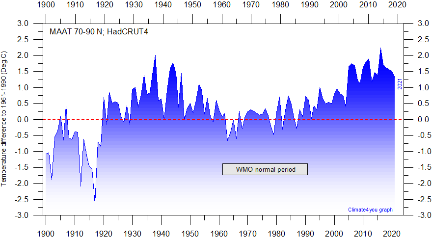
Mean annual surface air temperature (MAAT) anomaly 70-90oN compared to the WMO normal period 1961-1990, as estimated by Hadley CRUT. HadCRUT4 temperature data from the Climatic Research Unit (CRU) has been used to prepare the diagram. The number of high latitude meteorological stations is low in the early part of the 20th century, but increased from 1923 and especially 1933. Last year shown: 2021. Latest update: 15 March 2022.
Please note: HadCRUT4 has improved data coverage in the Arctic, compared to the previous version HadCRUT3. As the planetary circumference changes rapidly with increasing latitude, each 5ox5o grid cell has been area corrected before calculating the annual mean. This is in contrast to the procedure followed by Gillet et al. 2008, who gave equal weight to data in each 5ox5o grid cell when calculating means, with no consideration to the area effect of increasing latitude.

Mean annual surface air temperature (MAAT) anomaly 70-90oS compared to the WMO normal period 1961-1990, as estimated by Hadley CRUT. The international geophysical year 1957 marks the initiation of widespread meteorological observations in the Antarctic. HadCRUT4 temperature data from the Climatic Research Unit (CRU) has been used to prepare the diagram. Last year shown: 2021. Latest update: 15 March 2022.
Please note: HadCRUT4 has improved data coverage in the Arctic, compared to the previous version HadCRUT3. As the planetary circumference changes rapidly with increasing latitude, each 5ox5o grid cell has been area corrected before calculating the annual mean. This is in contrast to the procedure followed by Gillet et al. 2008, who gave equal weight to data in each 5ox5o grid cell when calculating means, with no consideration to the area effect of increasing latitude.
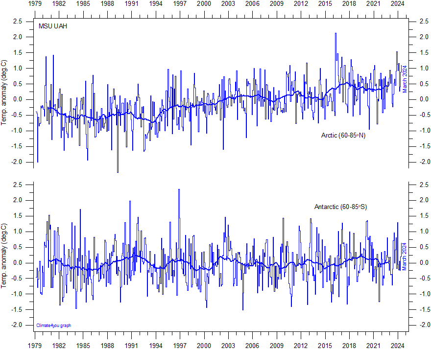
Global monthly average lower troposphere temperature since 1979 for the North Pole and South Pole regions, based on satellite observations (University of Alabama at Huntsville, USA). This graph uses data obtained by the National Oceanographic and Atmospheric Administration (NOAA) TIROS-N satellite, interpreted by Dr. Roy Spencer and Dr. John Christy, both at Global Hydrology and Climate Center, University of Alabama at Huntsville, USA. Thick lines are the simple running 37 month average, nearly corresponding to a running 3 yr average. Click here to read about data smoothing. Click here to download the entire series of UAH MSU global monthly lower troposphere temperatures since December 1978. Reference period 1991-2020. Last month shown: March 2025. Last diagram update: 19 April 2025.
-
Click here to download the entire series of UAH MSU global monthly lower troposphere temperatures since December 1978.
-
Click here to read about data smoothing.
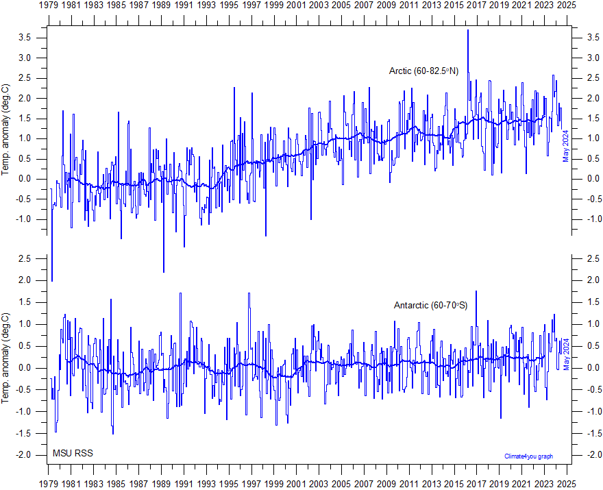
Global
monthly average lower troposphere temperature since 1979 for the northern
(60-82.5N) and southern (60-70S) polar regions, according to
Remote Sensing Systems (RSS). These graphs uses data obtained by the National Oceanographic and
Atmospheric Administration (NOAA) TIROS-N satellite, and interpreted by Dr. Carl Mears
(RSS). Thick lines are the simple running 37 month
average, nearly
corresponding to a running 3 yr average. Click
here for a description of RSS MSU data products. Please
note that RSS January 2011 changed from Version 3.2 to Version 3.3 of their MSU/AMSU
lower tropospheric (TLT) temperature product. Click
here to read a description of the change from version 3.2 to 3.3, and
previous changes. Last
month shown: April 2025. Last diagram update: 21 May 2025.
-
Click here to download the entire series of RSS MSU global monthly lower troposphere temperatures since January 1979.
-
Click here to read about data smoothing.
Click here to jump back to the list of contents.
Recent temperature changes in the two polar regions
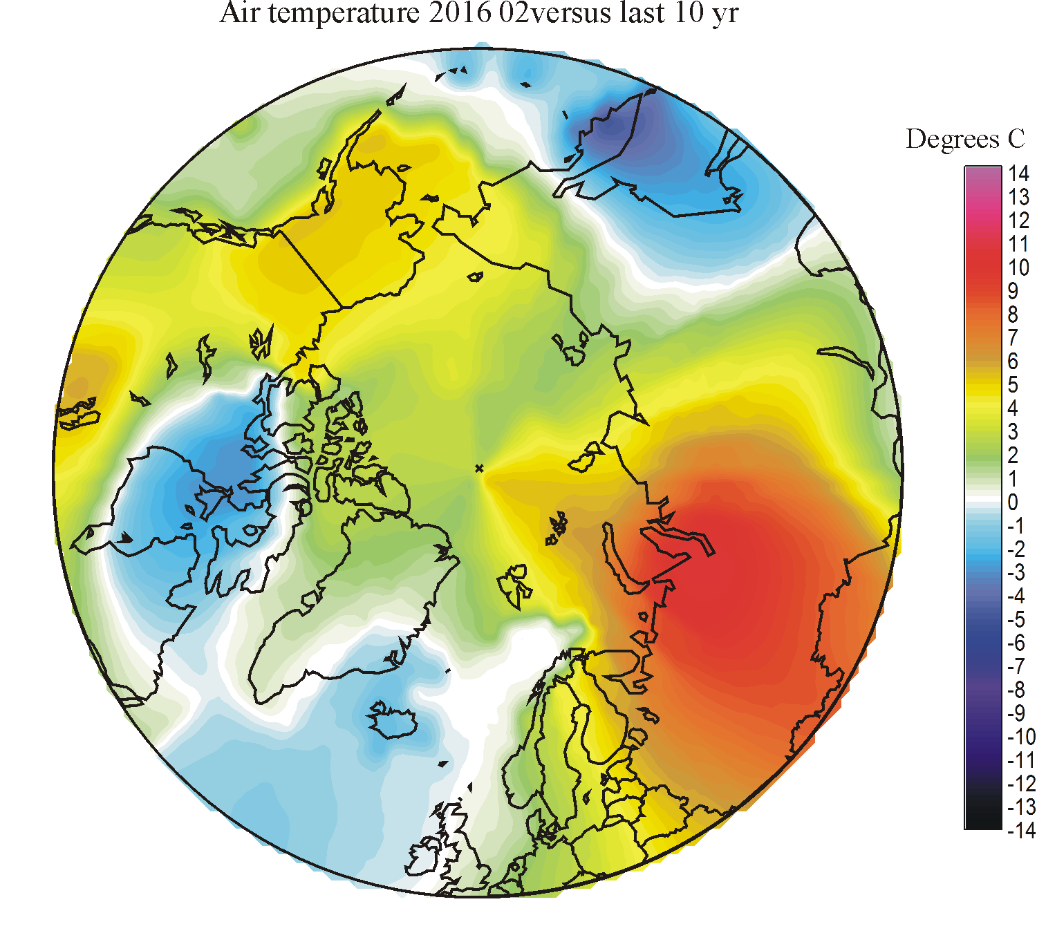
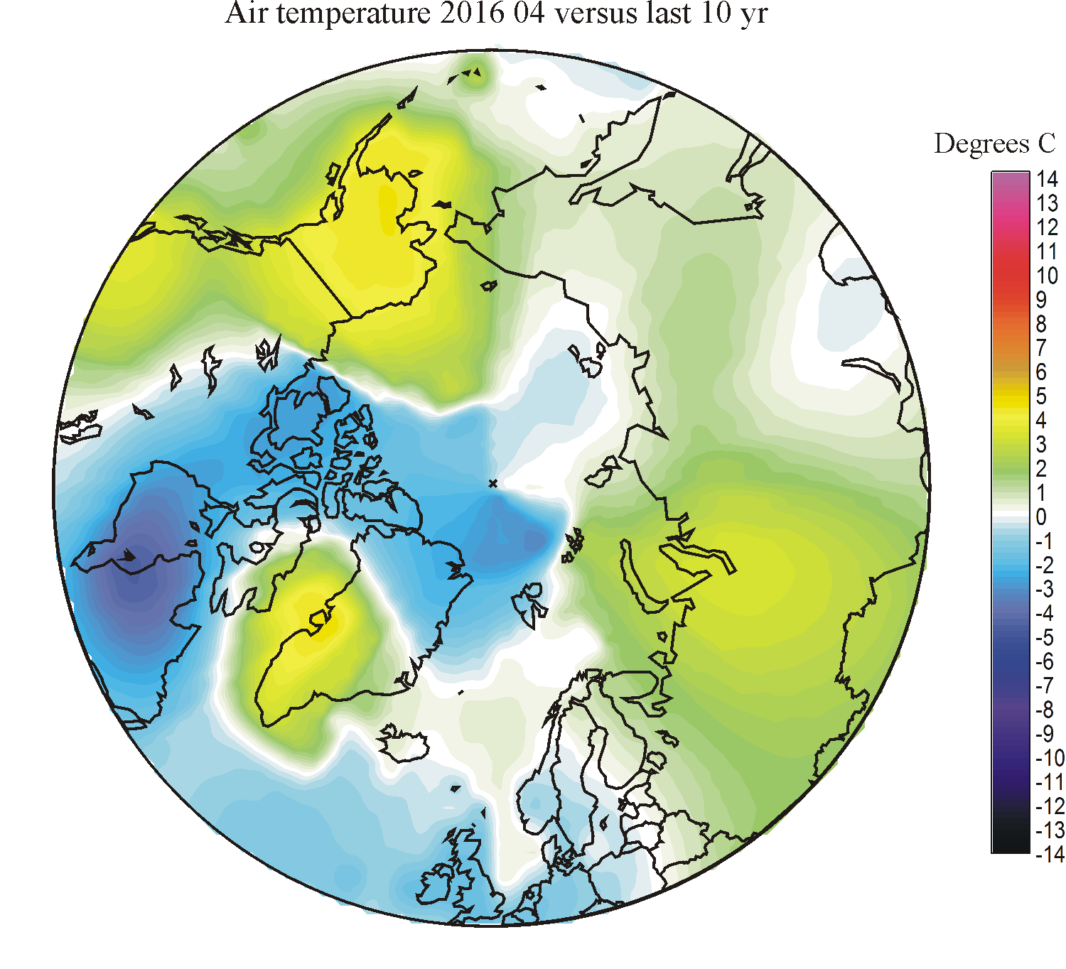
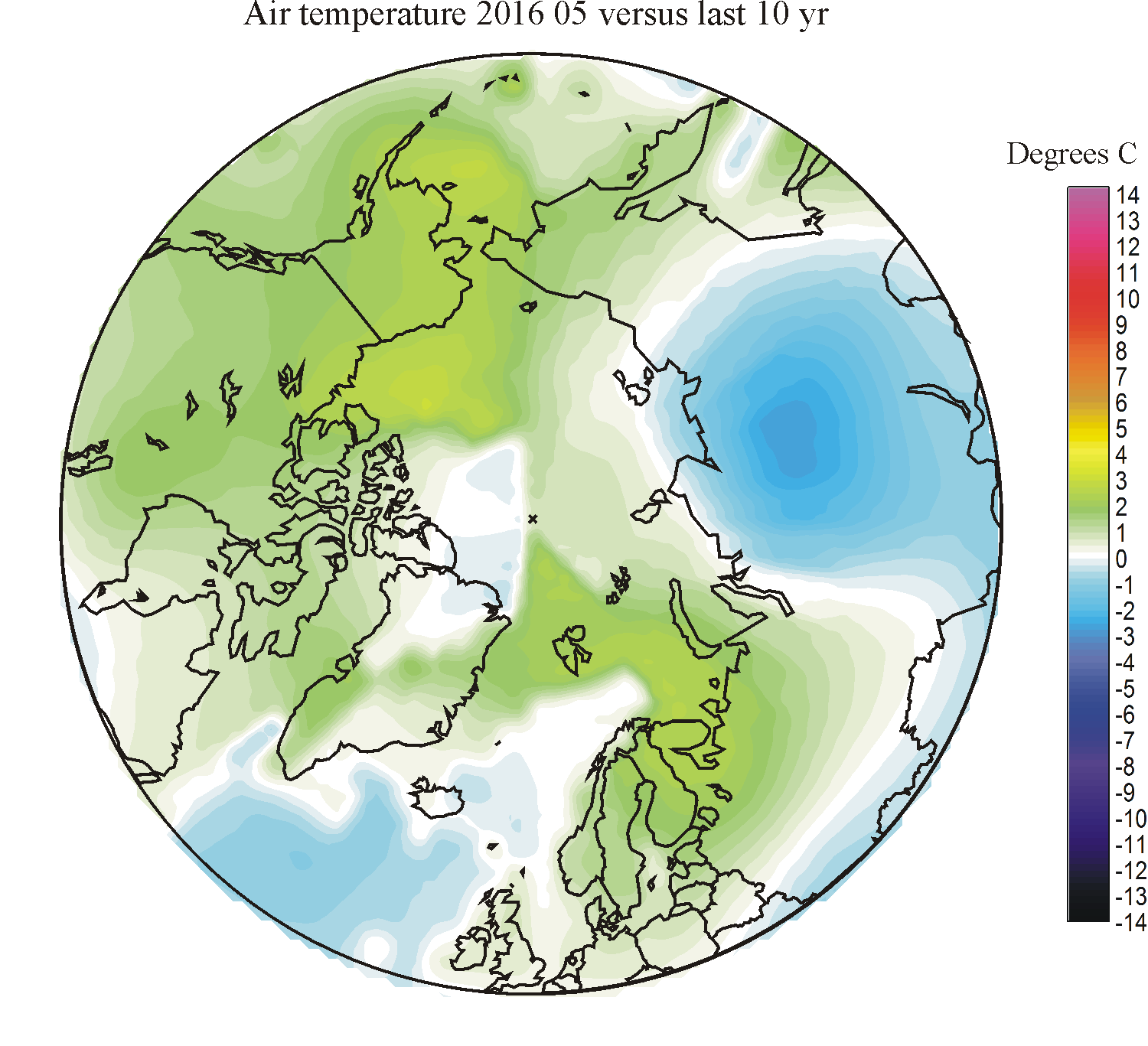
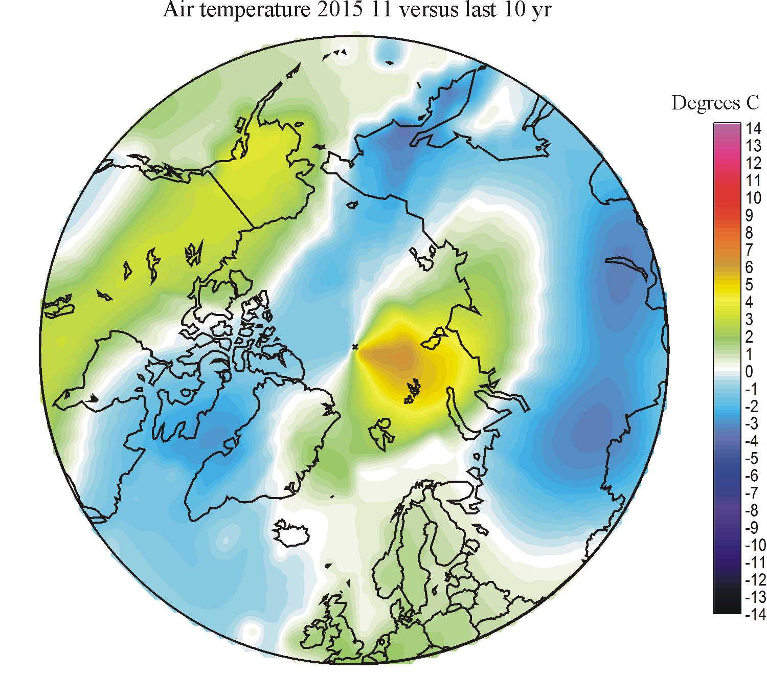
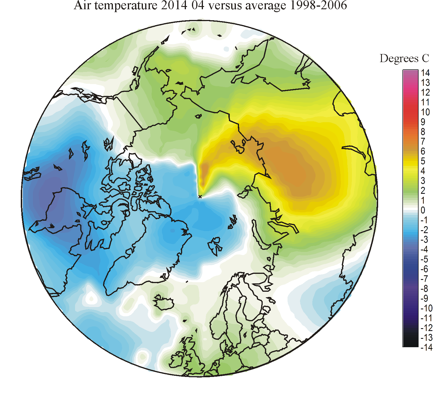
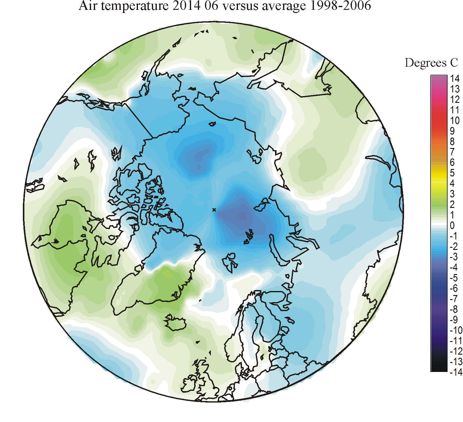
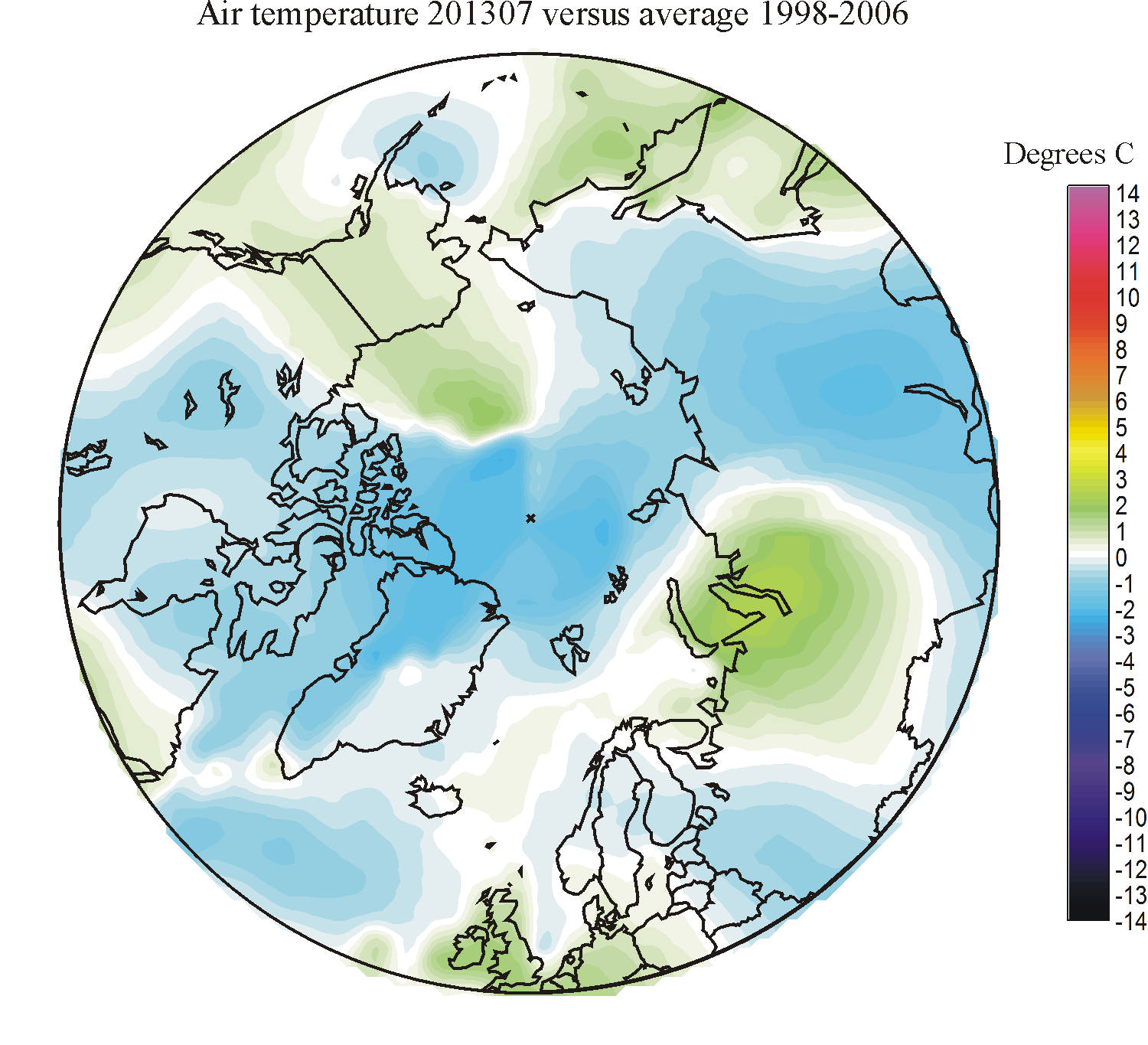
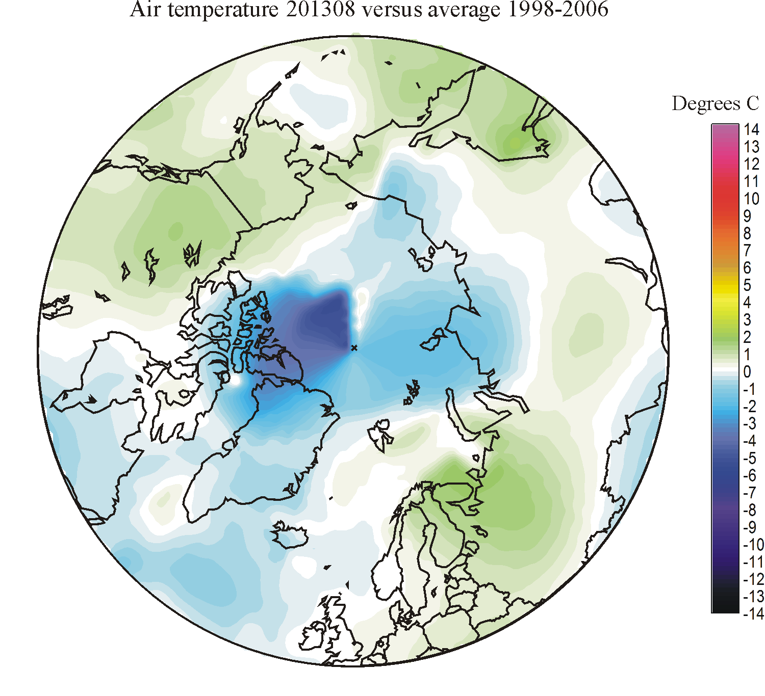
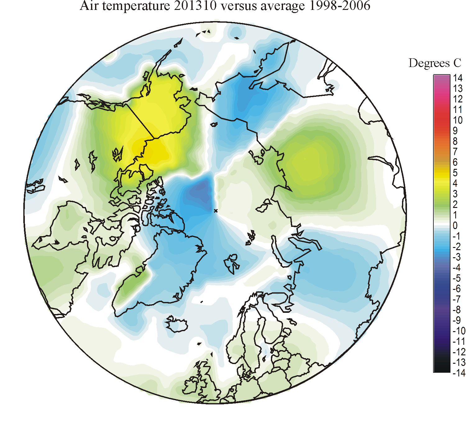
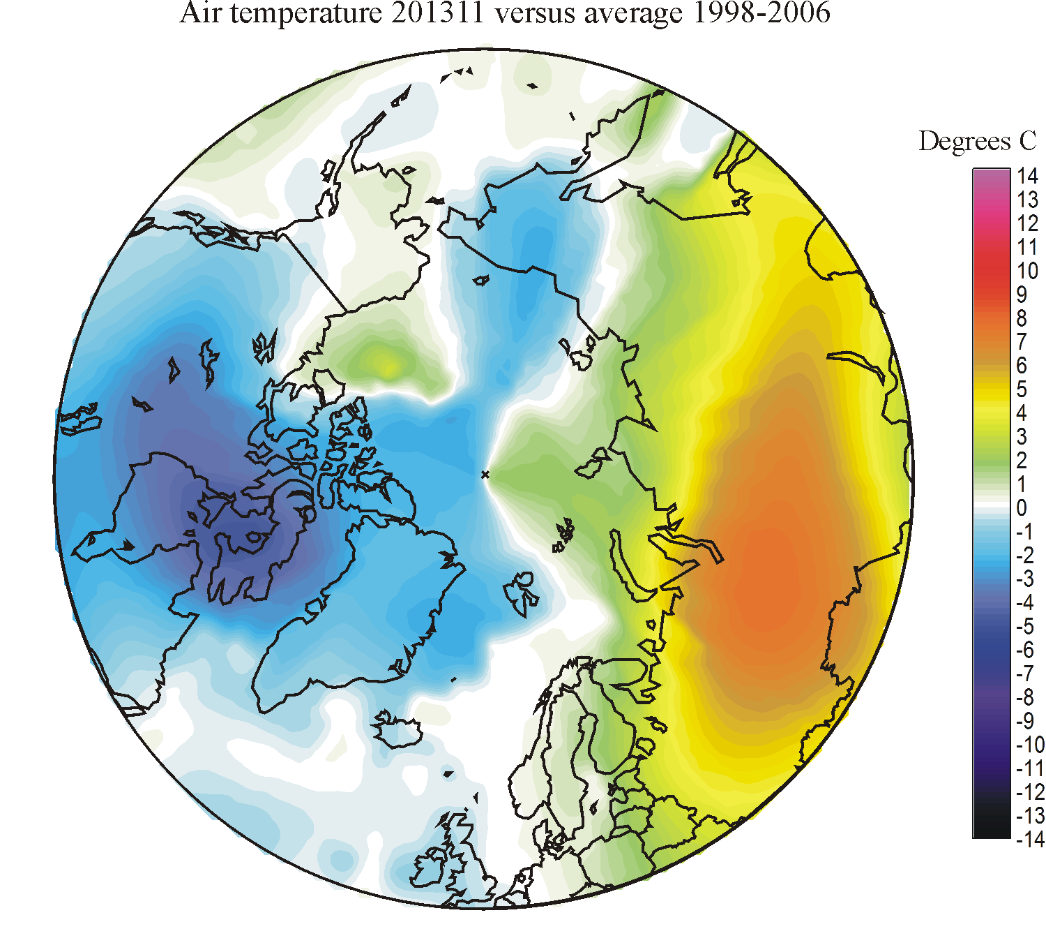
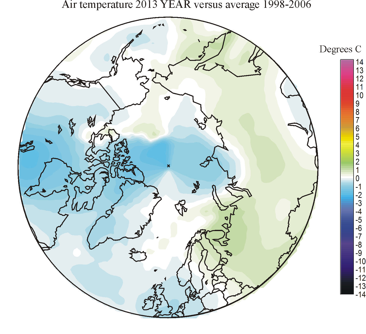
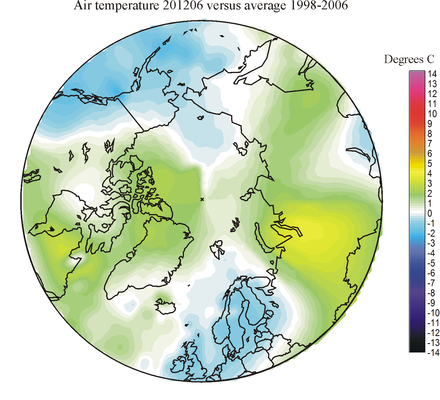
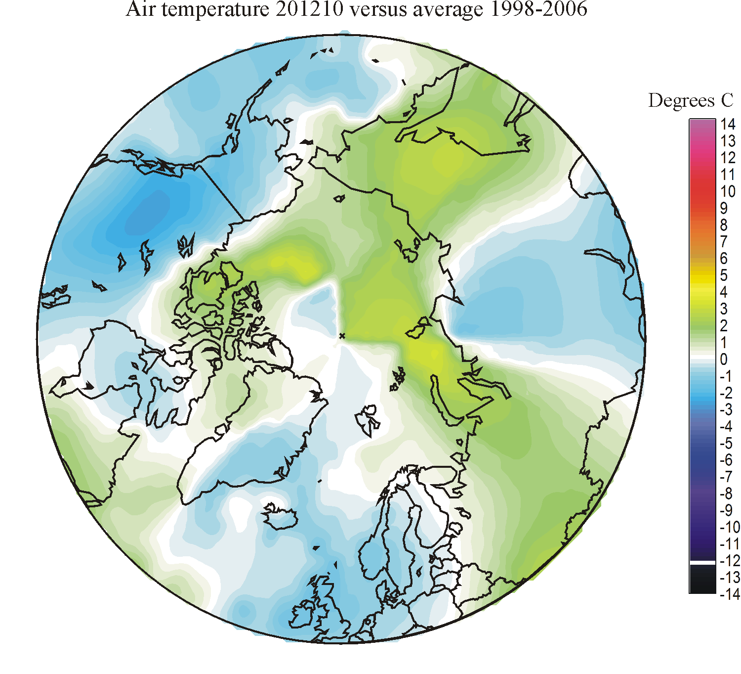
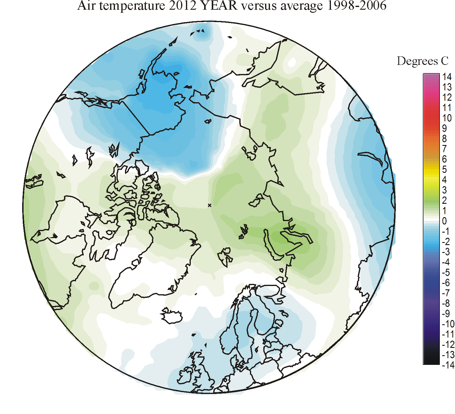
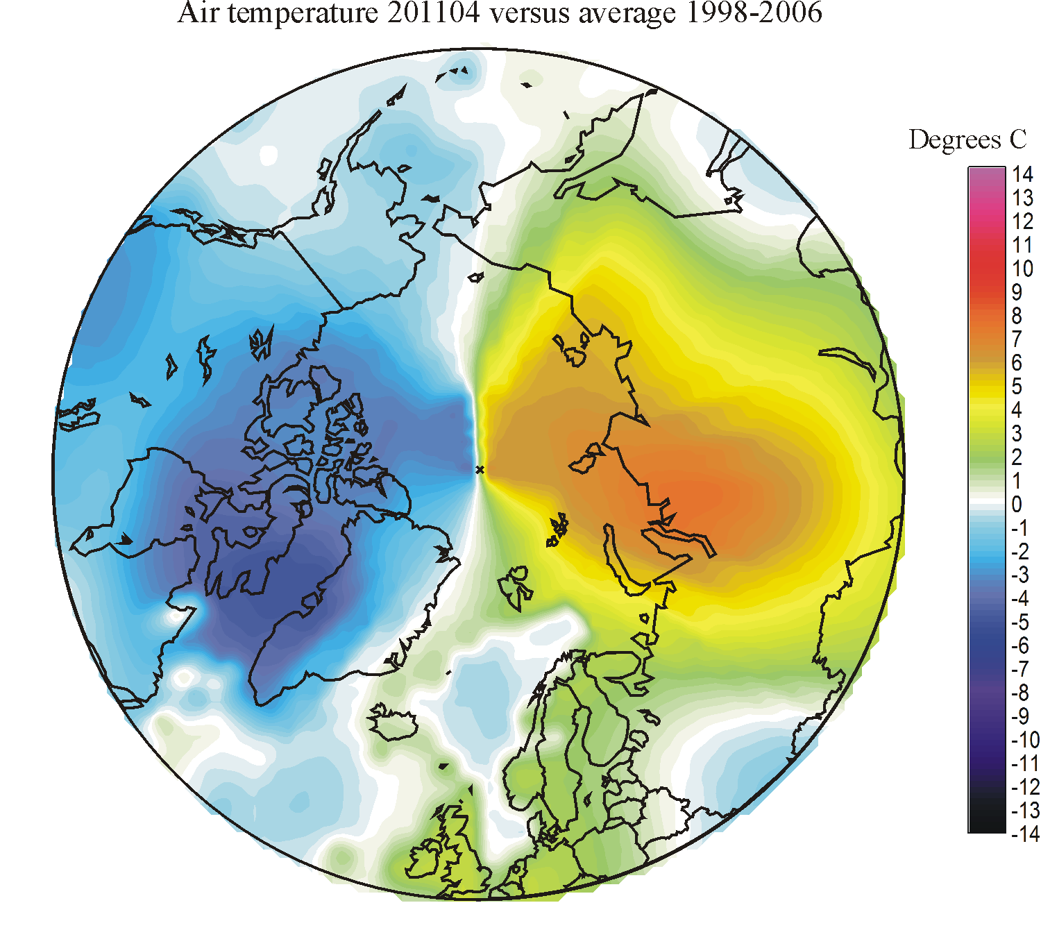
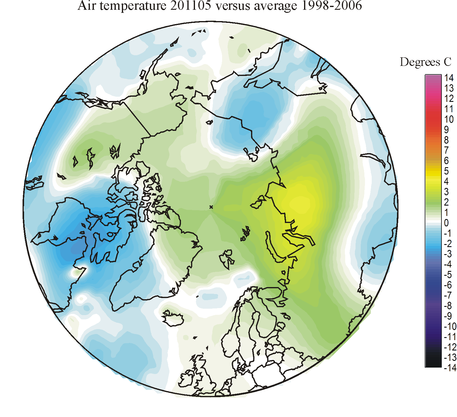
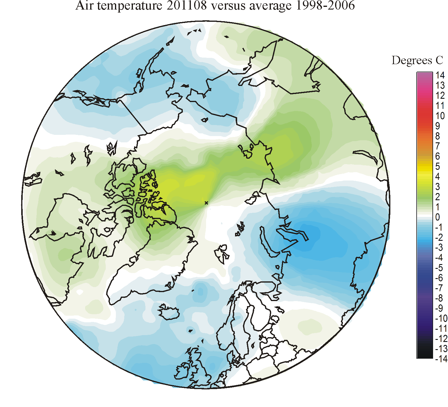
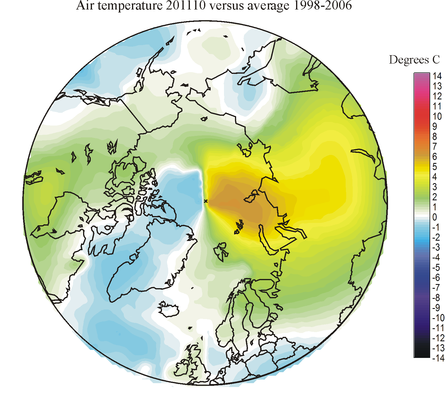
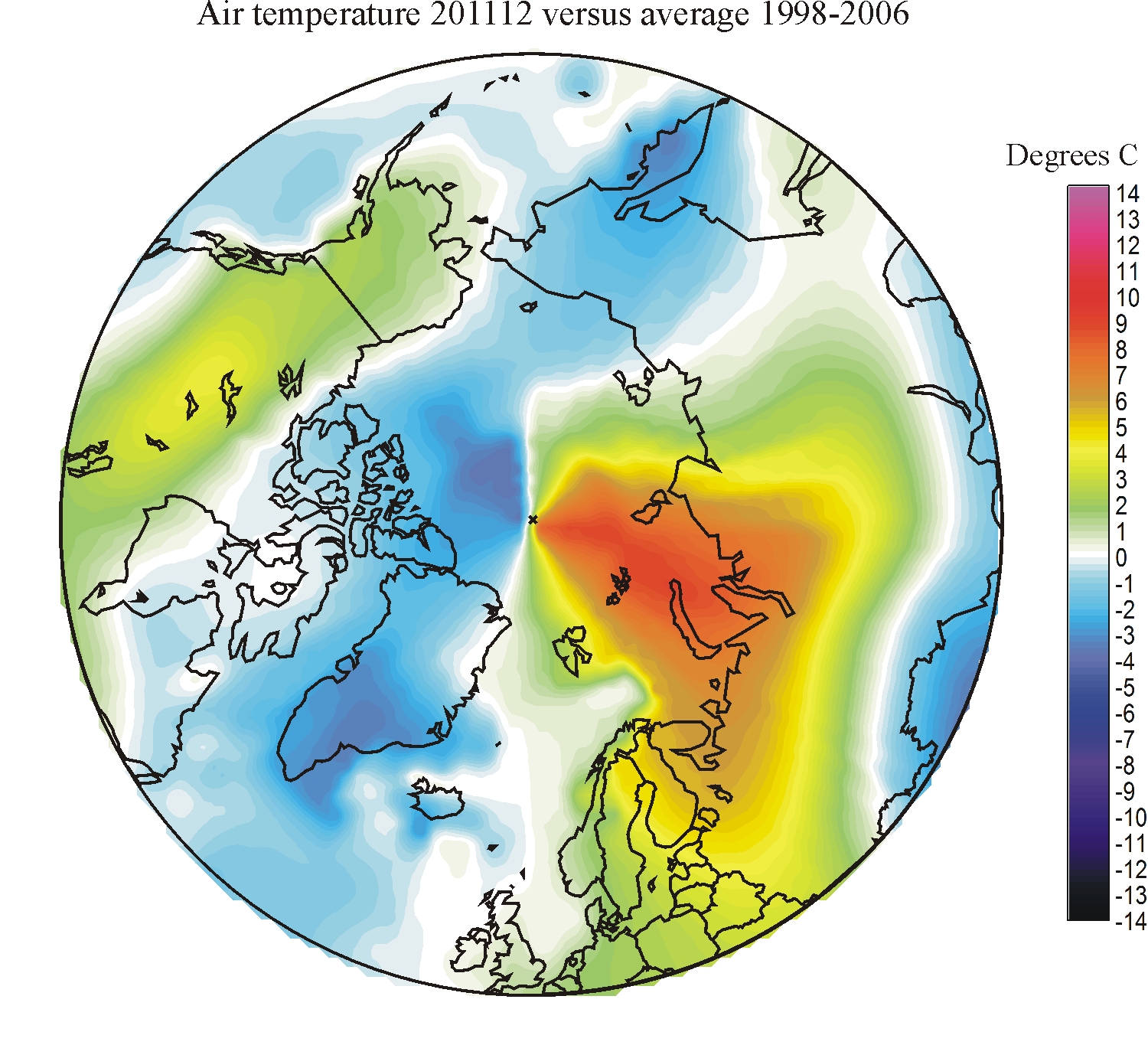
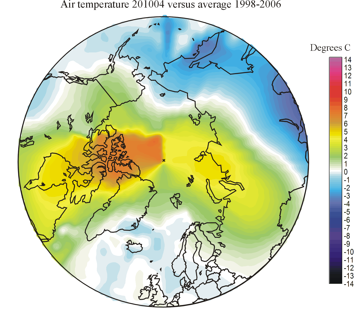
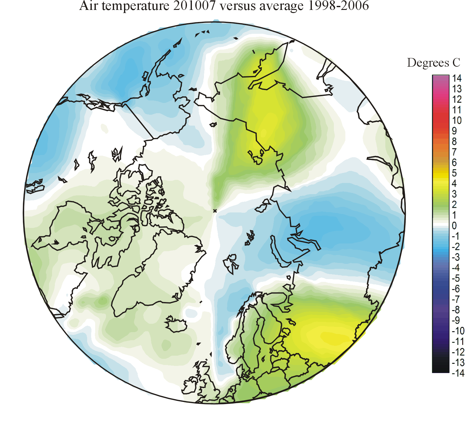
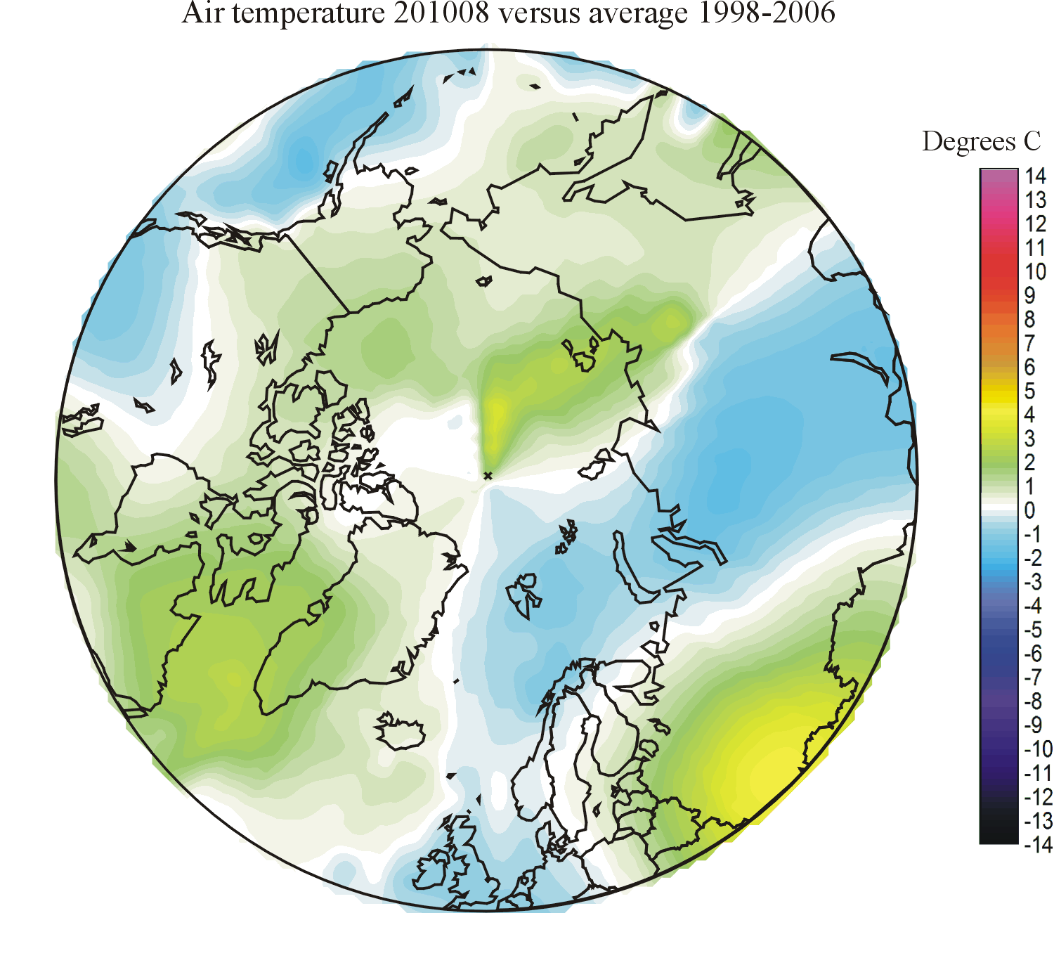
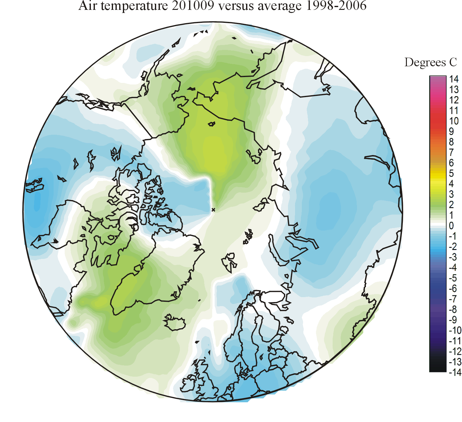
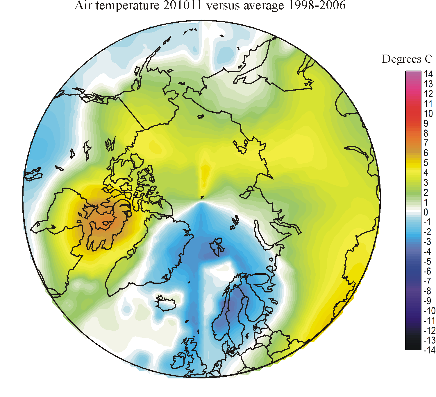
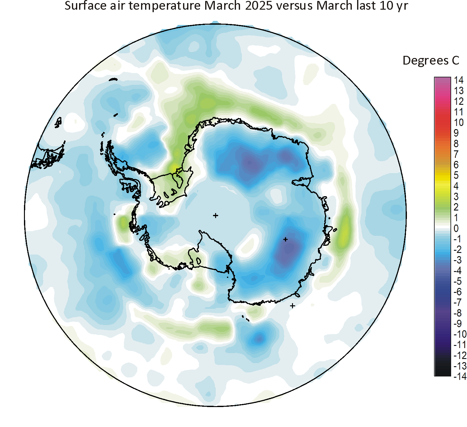
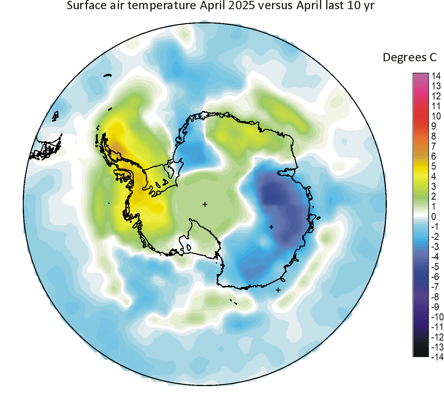
The above diagrams show changes of average temperatures only. To enable a more detailed analysis of recent spatial surface air temperature changes in the two polar and adjoining regions, you will find two tables below, representing areas north of 50oN and south of 50oS, respectively. In these tables recent monthly surface air temperatures are compared with the average temperature for the period 1998-2006, to monitor any general recent change of temperature, up or down. As mentioned above, global climate models forecast that surface air temperatures should increase rapidly now and in the future due to increasing atmospheric CO2, especially in the two polar regions.
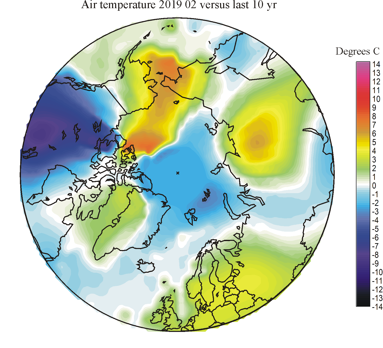
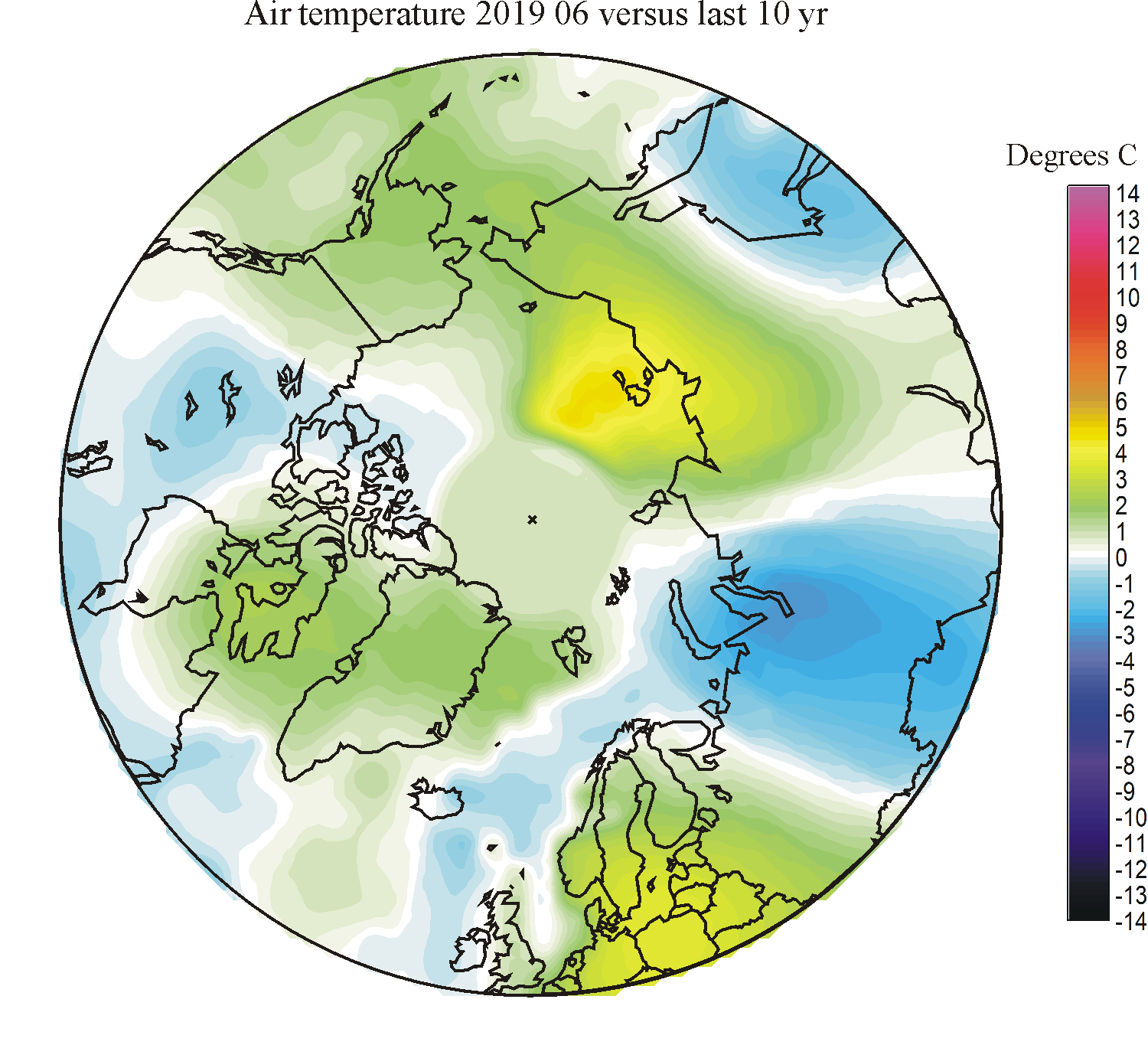
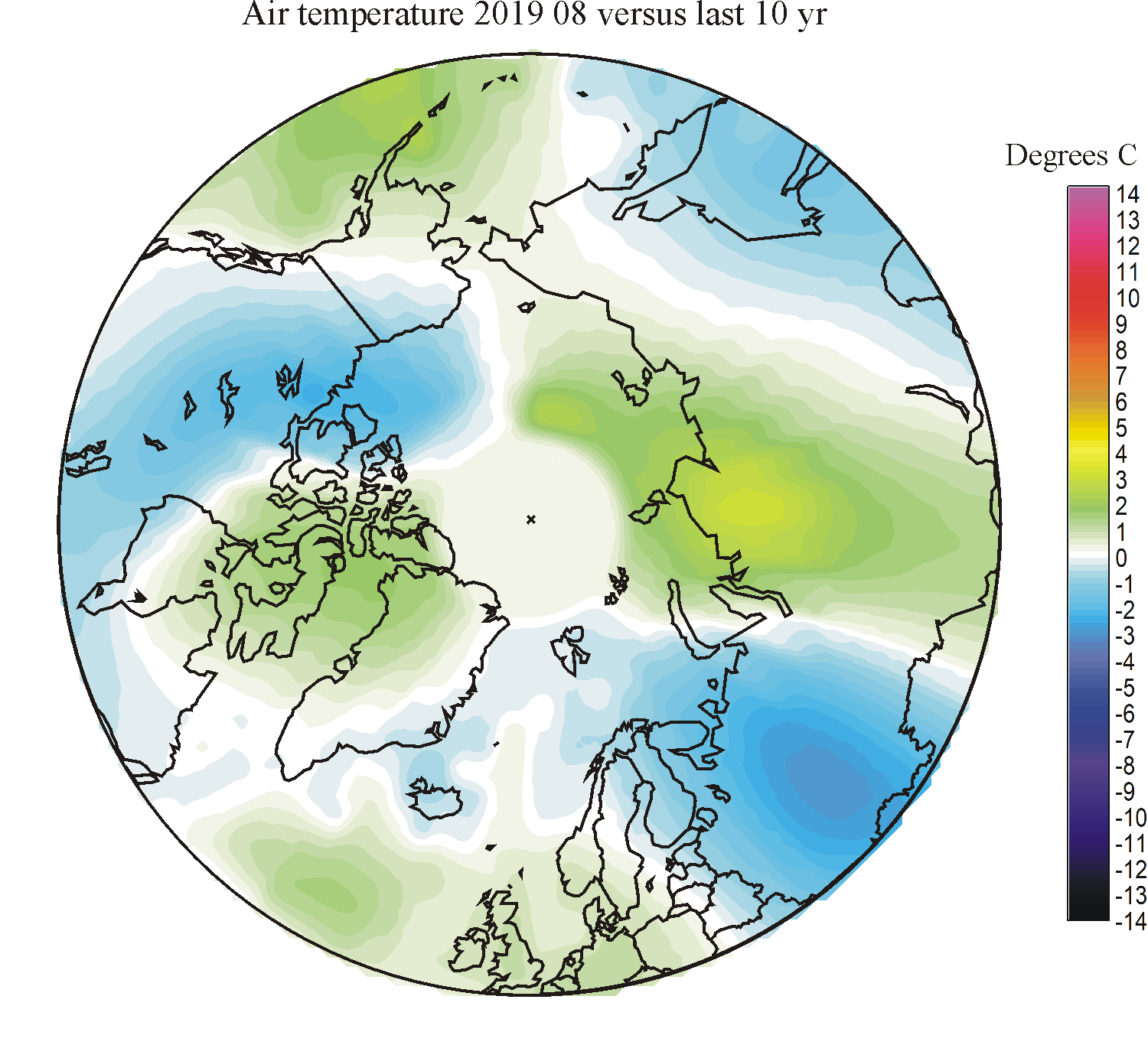
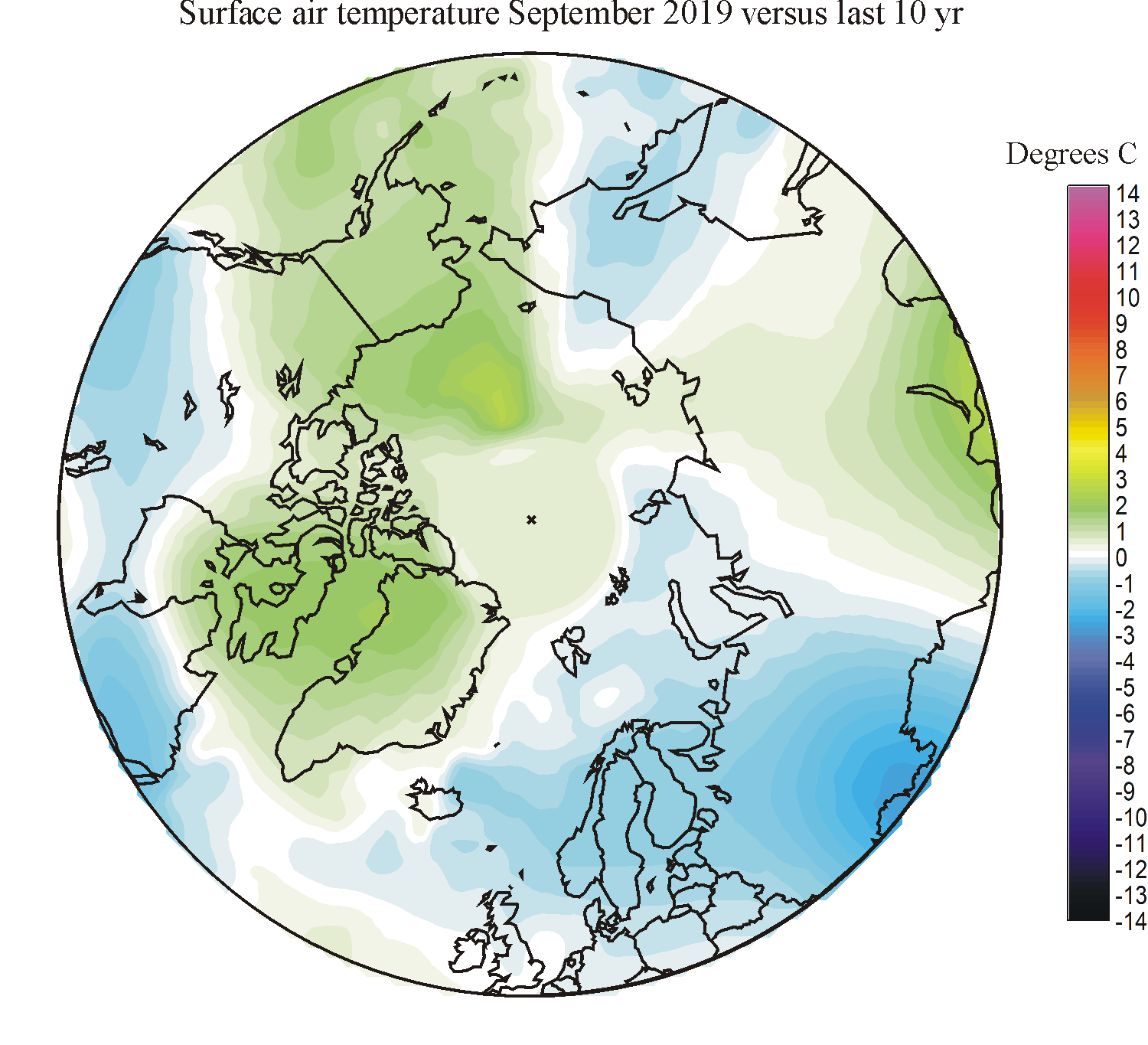
Click on one of the
small maps, and a larger map in
polar projection will open in a new window, showing the temperature difference between the month chosen
and the monthly average for the reference period 1998-2006.
Click here to jump back to the list of contents.
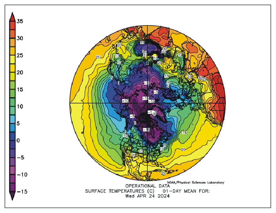
Recent surface temperatures north of 15oN according to the Earth System Research Laboratory at NOAA. Temperatures are given in degrees Celsius (scale to the left). Click here to see the original diagram or to check for a more recent update than shown above. Date: 26 April 2025.
Click here to jump back to the list of contents.
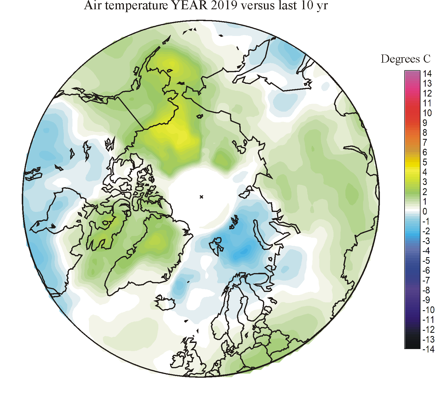
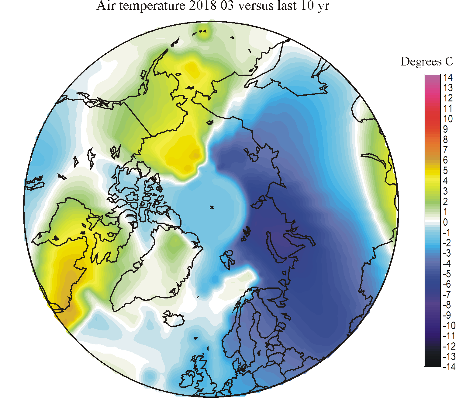
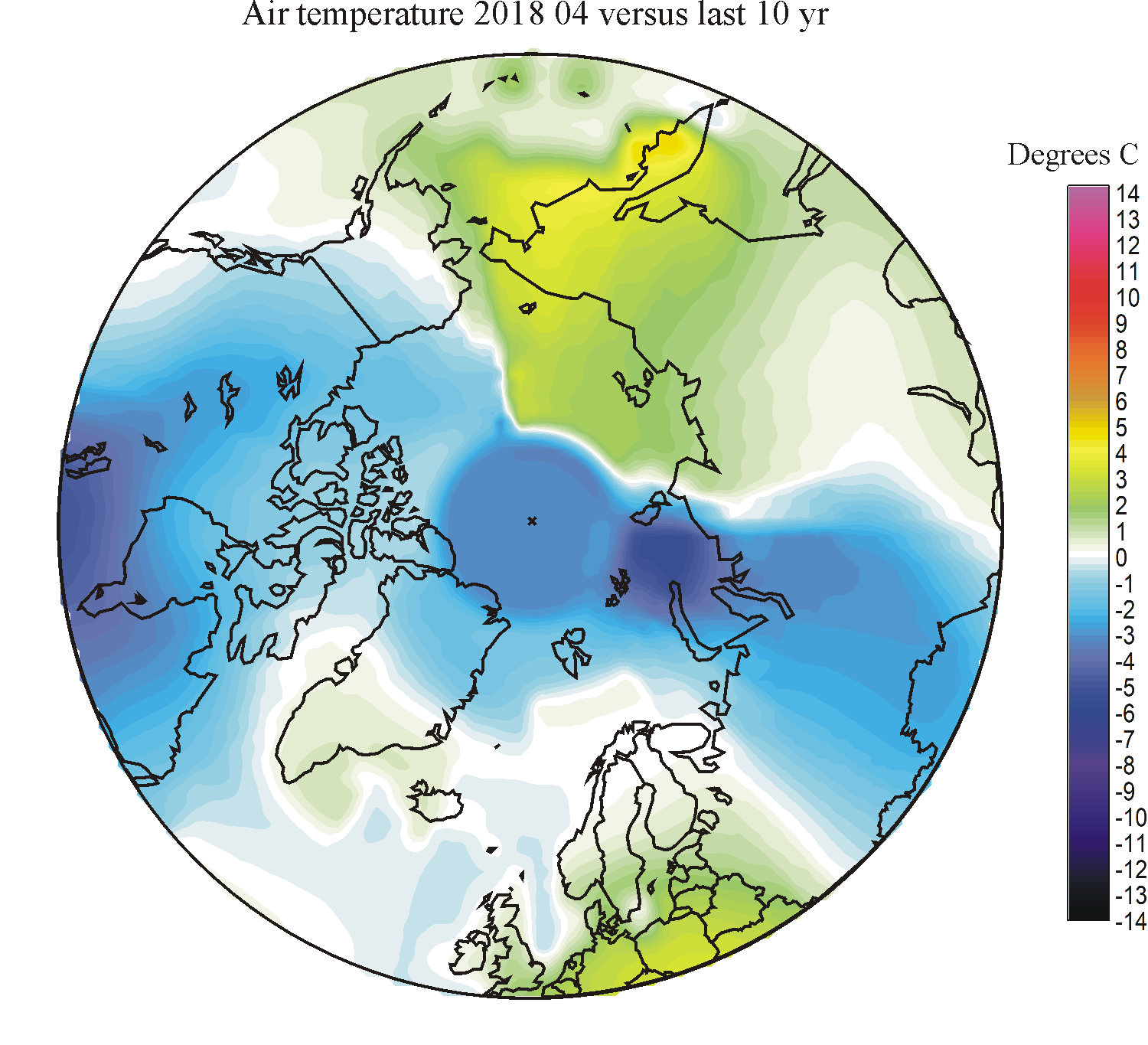
Arctic monthly surface air temperature anomalies versus average 1998-2006 north of 50oN
| YEAR | JAN | FEB | MAR | APR | MAY | JUN | JUL | AUG | SEP | OCT | NOV | DEC | ANNUAL |
| 2025 | |||||||||||||
| 2024 | |||||||||||||
| 2023 | |||||||||||||
| 2022 | 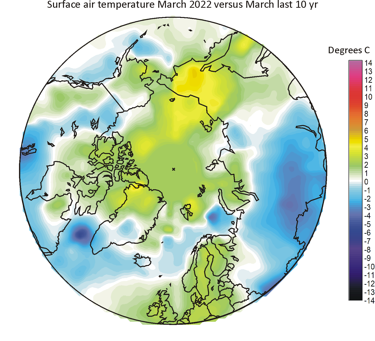
|
|
|||||||||||
| 2021 | 
|
||||||||||||
| 2020 | 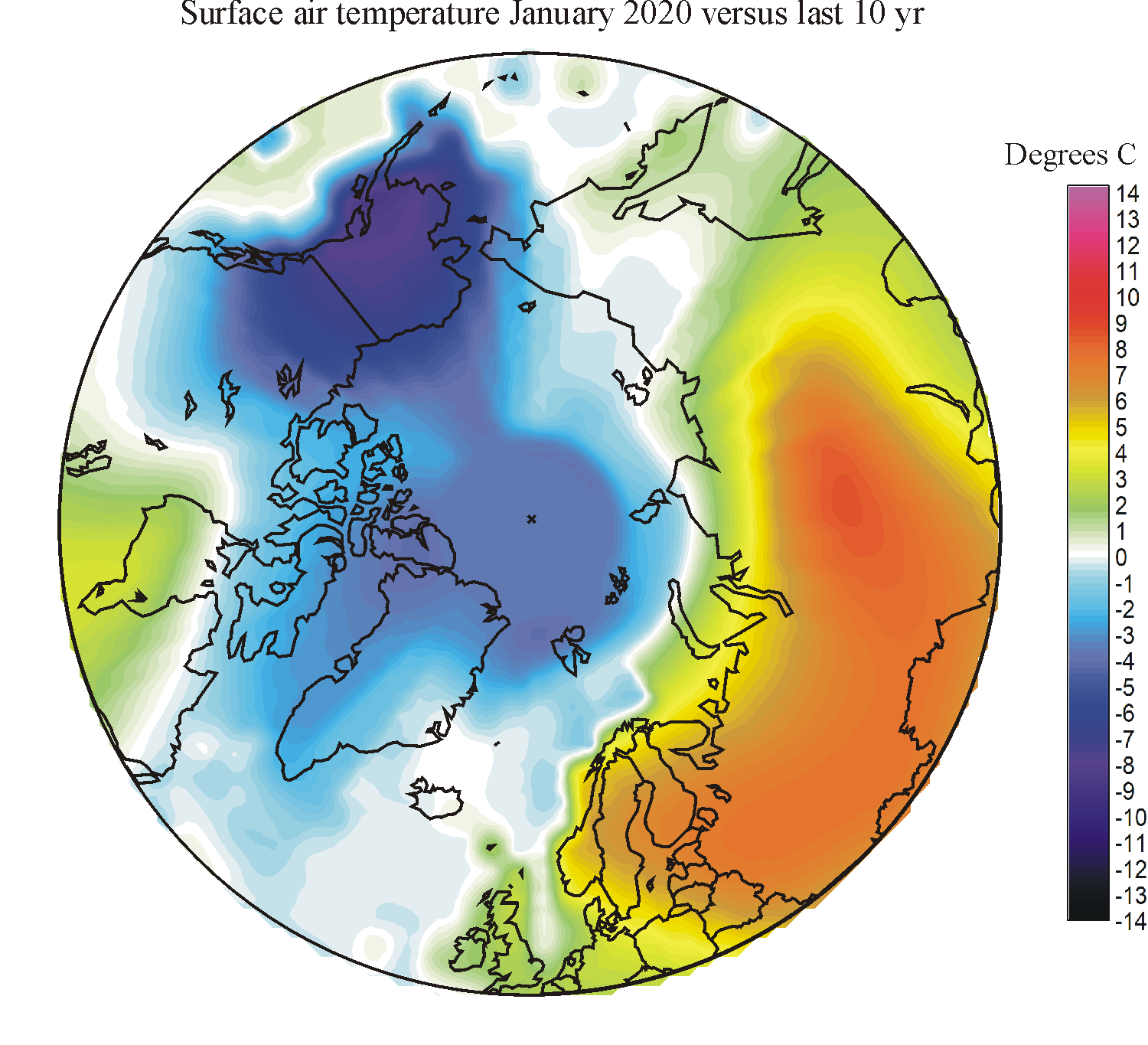
|
|
|
|
|
|
|

|
|

|
|
||
| 2019 | 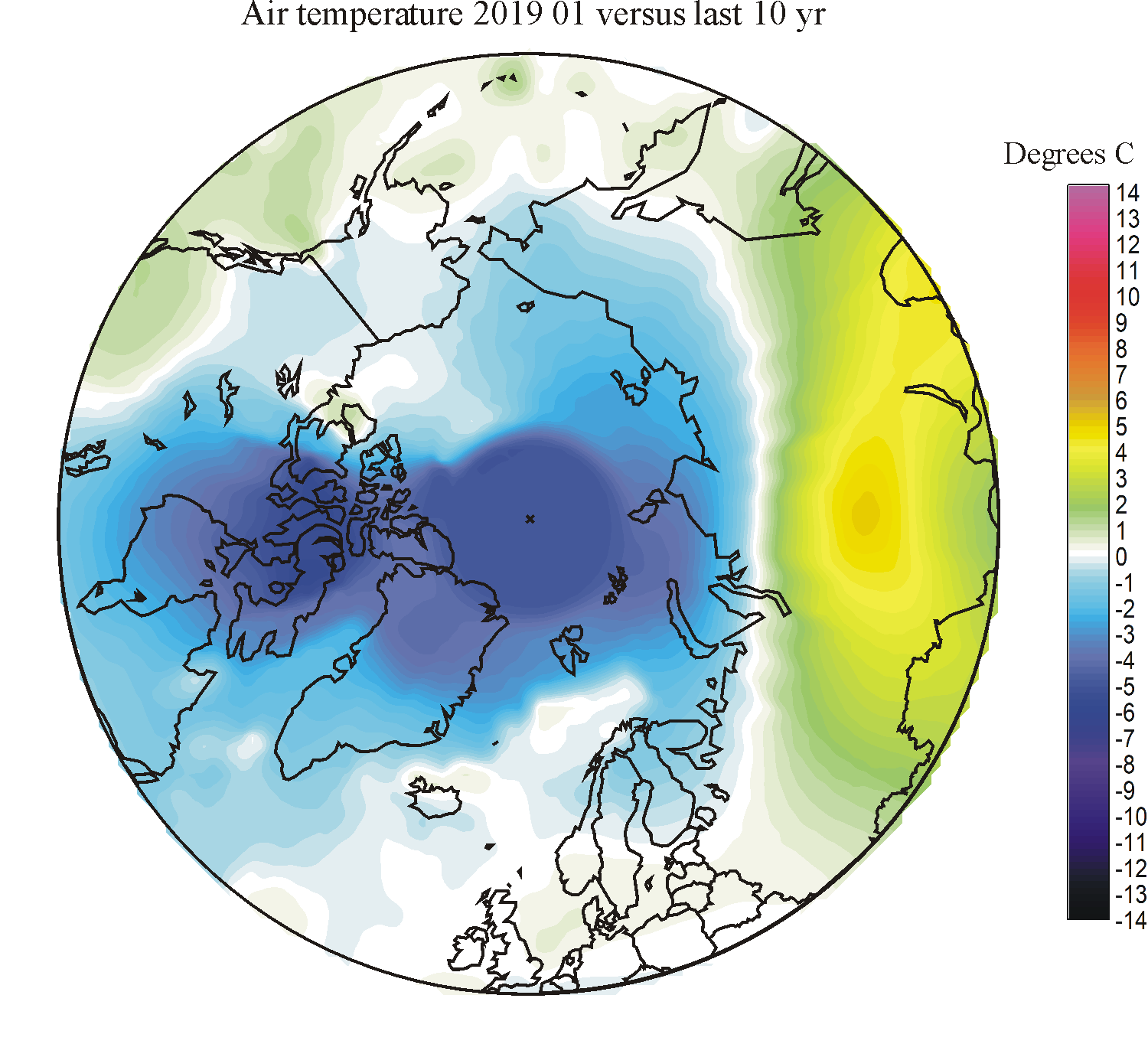
|
|
|
|
|
|
|||||||
| 2018 | 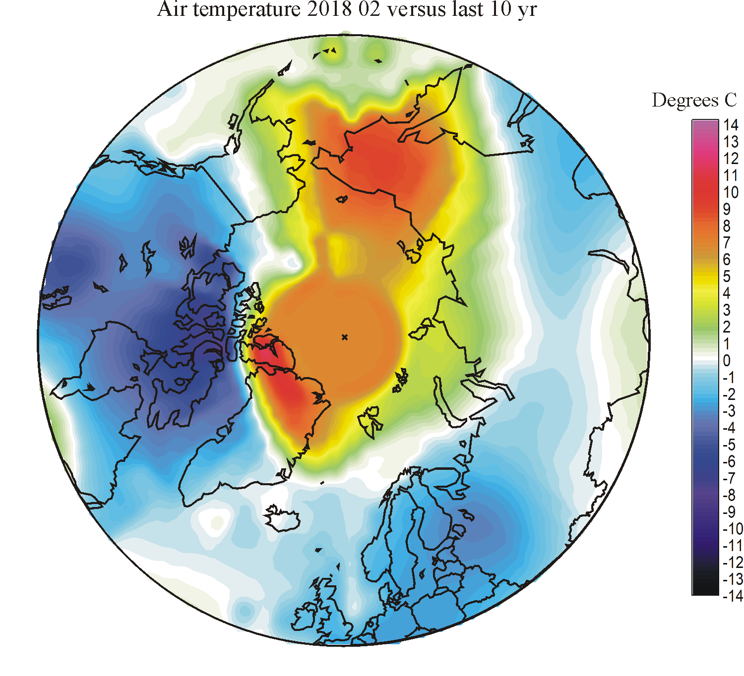
|
|
|
|
|
|
|
|
|
||||
| 2017 | 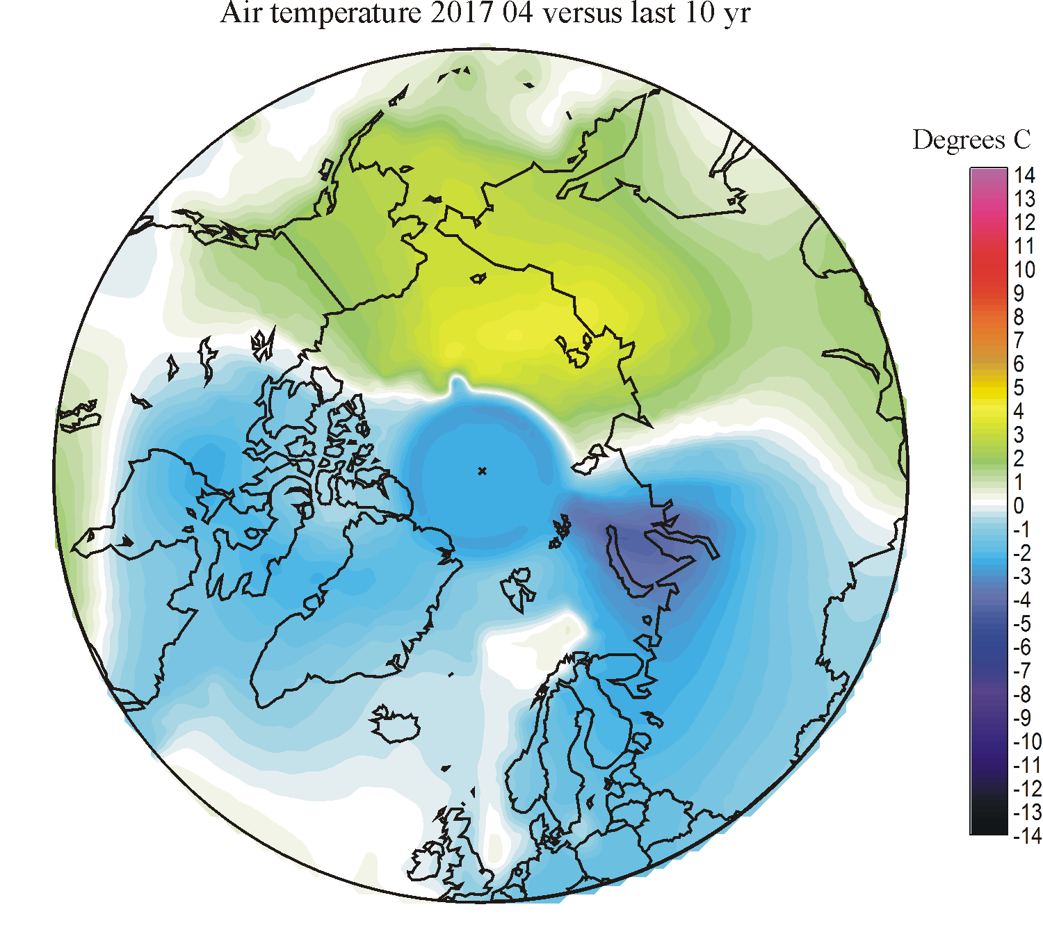
|
|
|
|
|
|
|||||||
| 2016 | 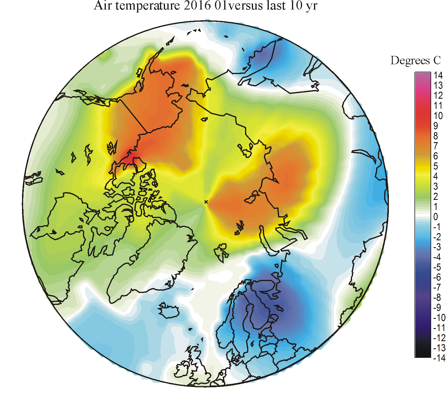
|
|
|
|

|
|
|
|
|
|
|
|
|
| 2015 | 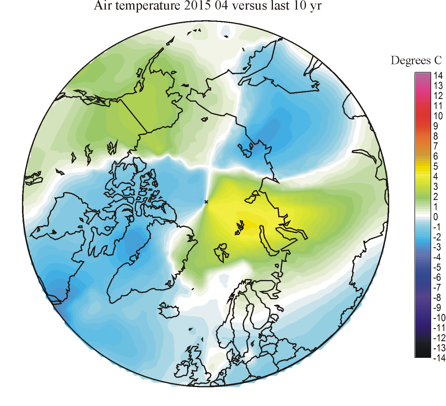
|

|
|
|
|
|
|
||||||
| 2014 | 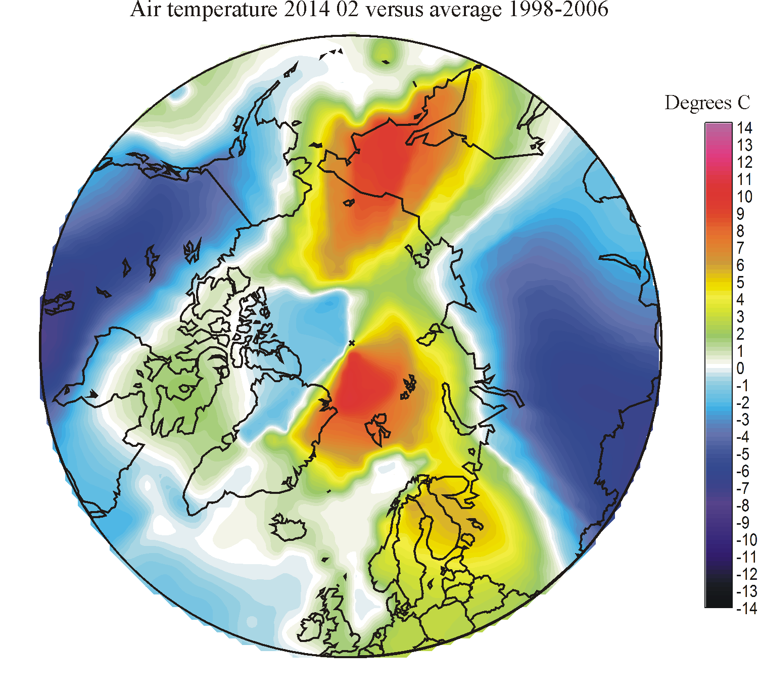
|
|
|
|
|
||||||||
| 2013 | 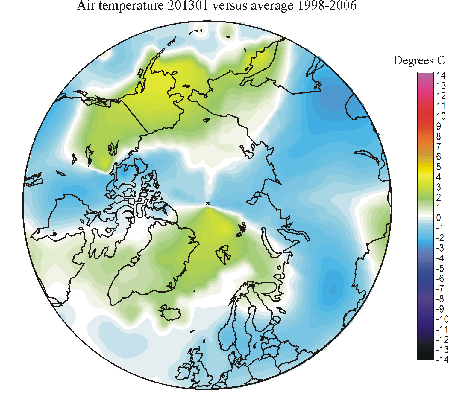
|

|
|
|
|
|
|
|
|||||
| 2012 | 
|
|

|
|
|
||||||||
| 2011 | 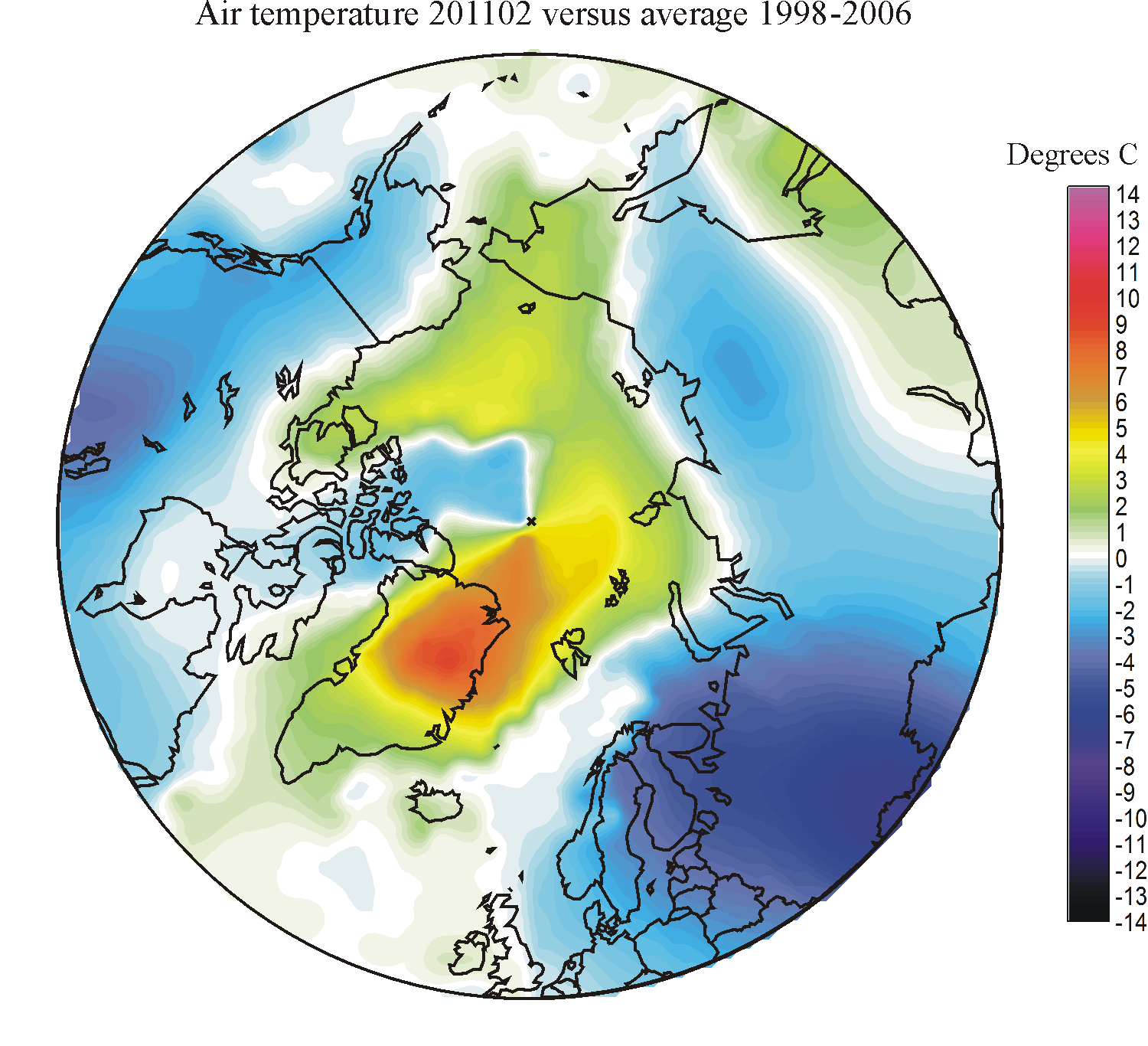
|
|
|

|
|

|
|
|
|||||
| 2010 | 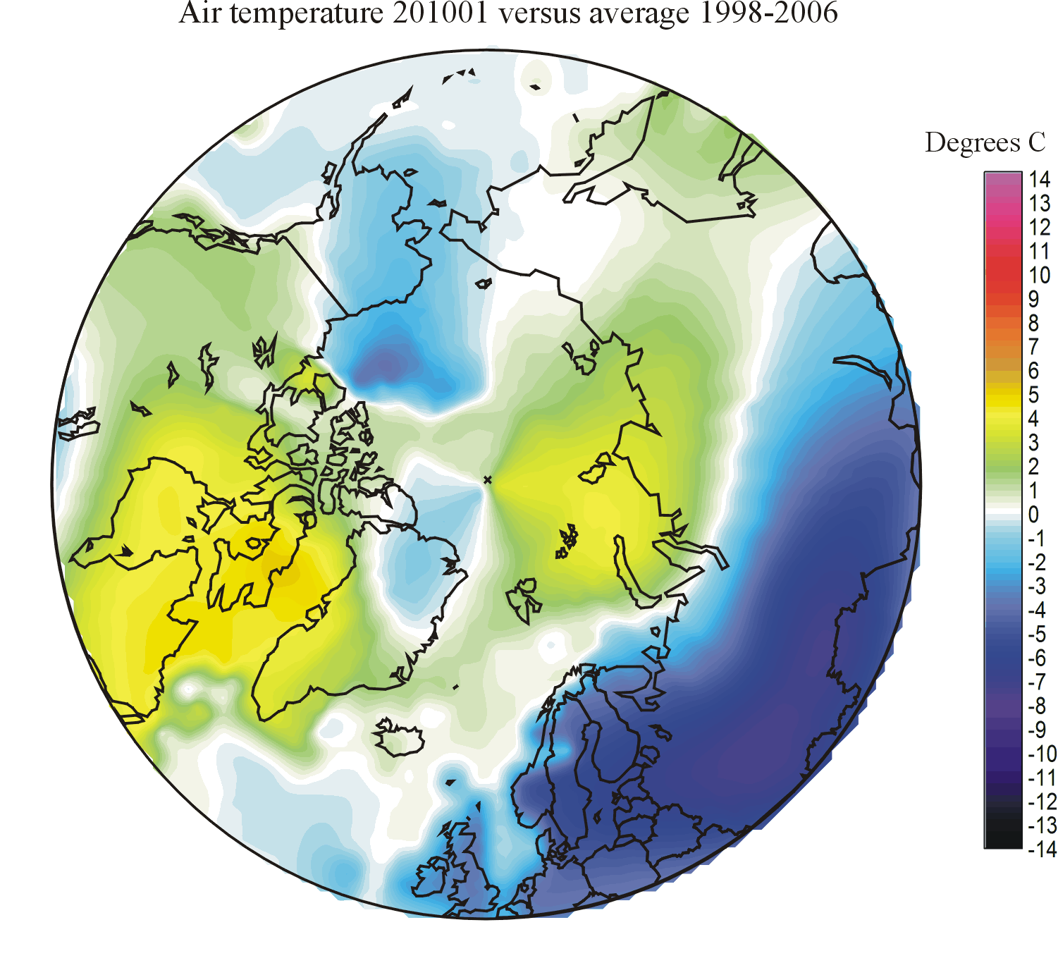
|
|
|
|
|
|
|
||||||
| 2009 | 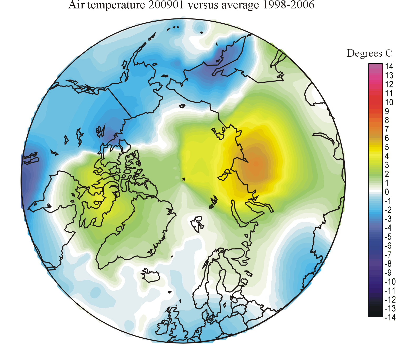
|
|

|
|
|

|
|
|
|
||||
| 2008 | 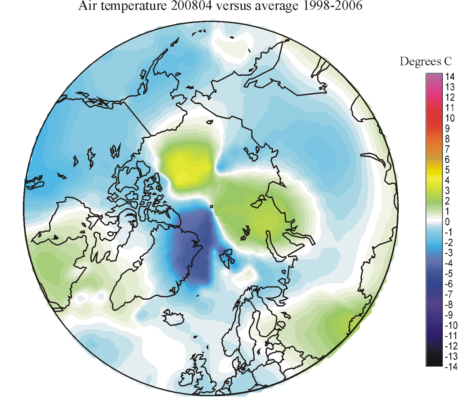
|
|

|
|
|
|
|||||||
| 2007 |
|
|
|
|
|
|
|
|
|
|
|||
| 2006 |
|
|
|
||||||||||
| 2005 |
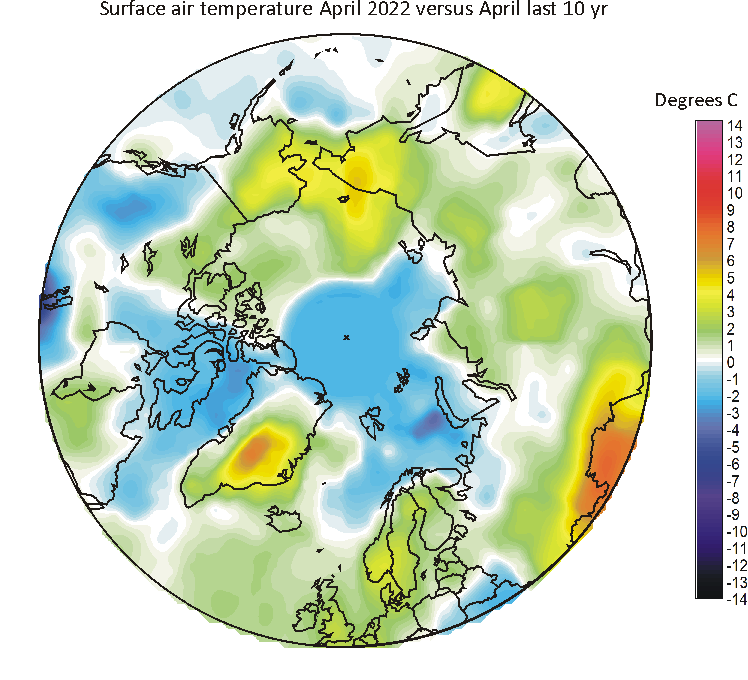
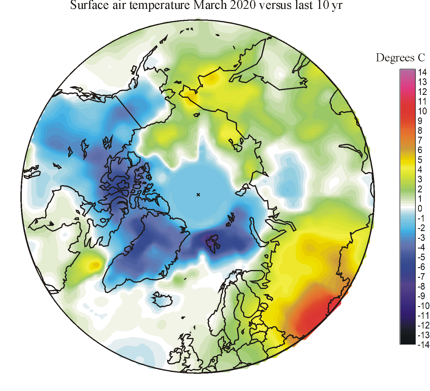
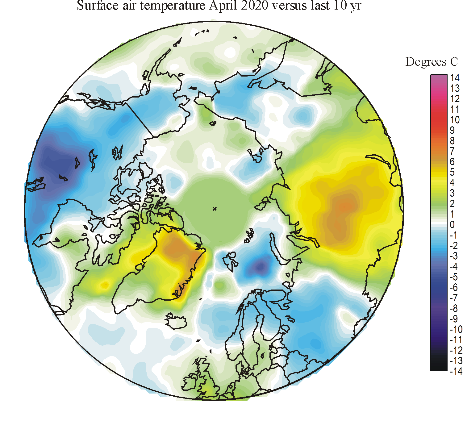
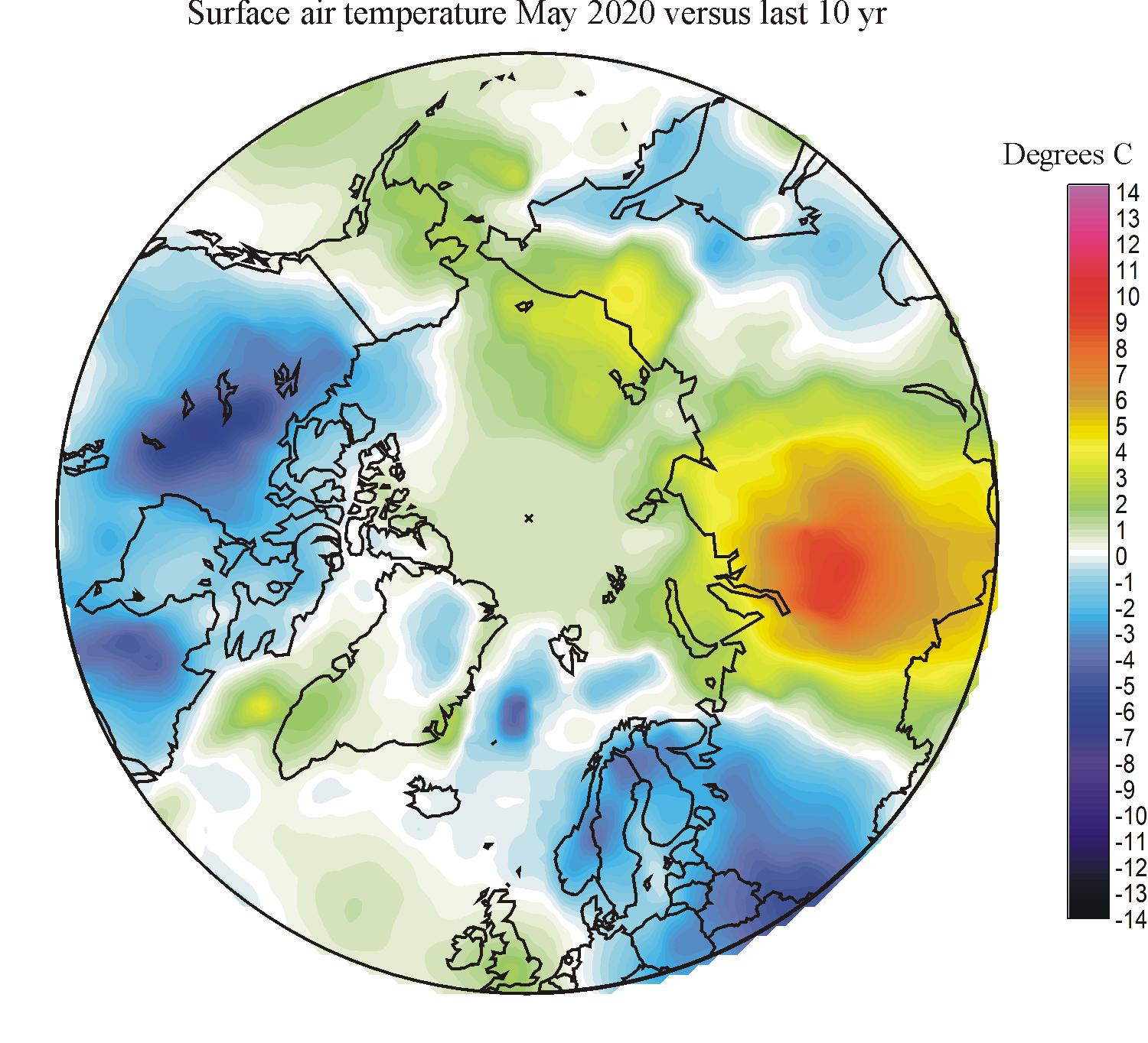
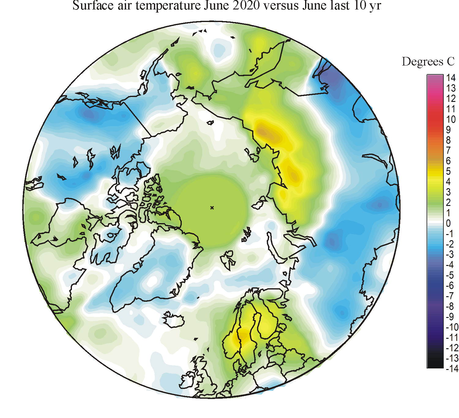
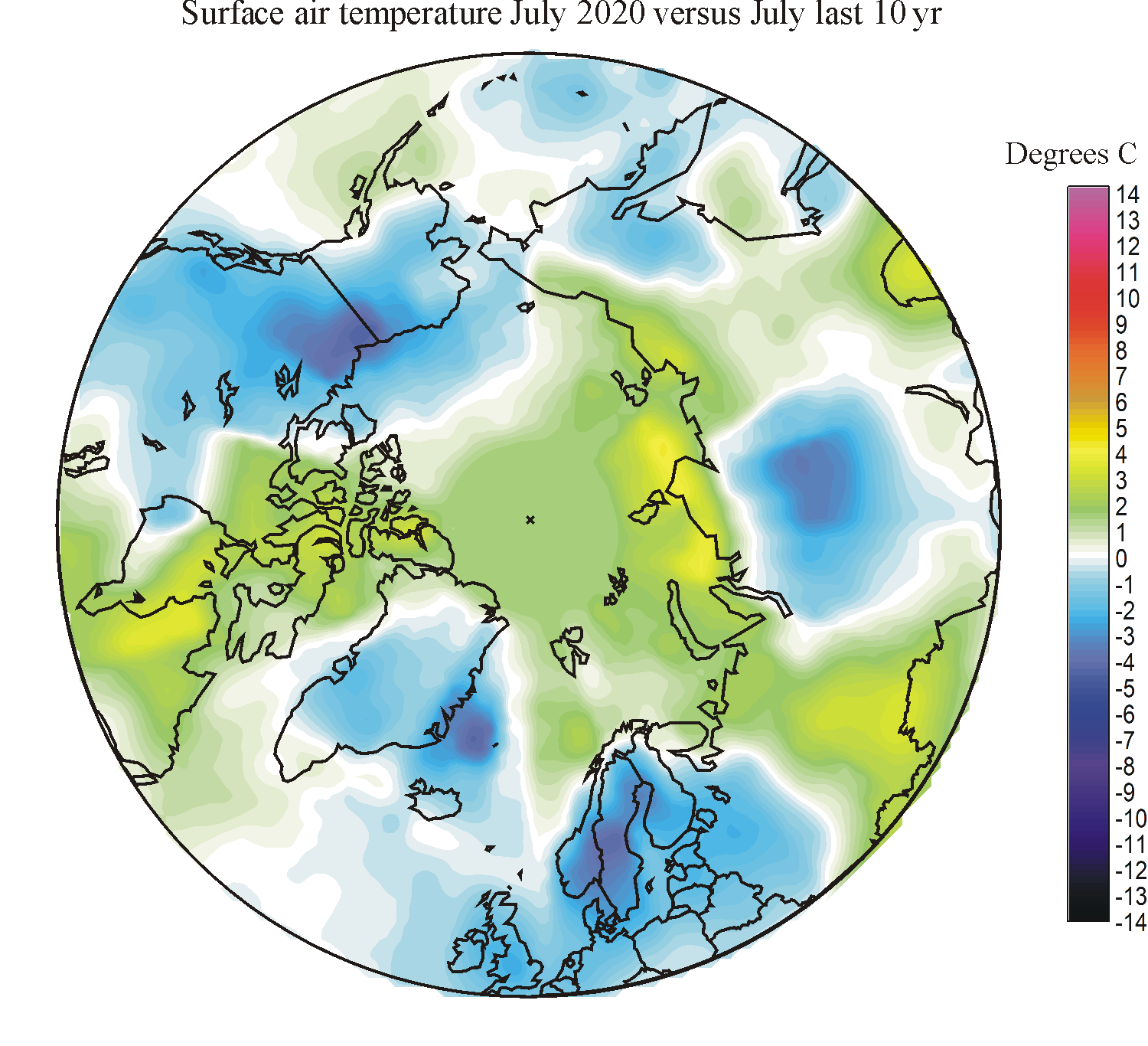
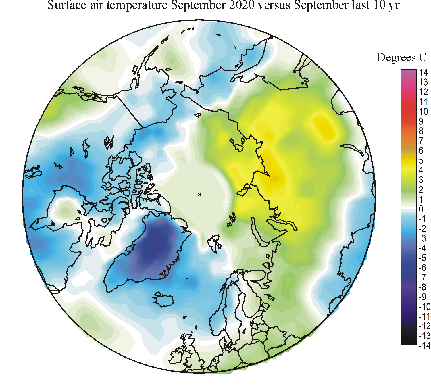
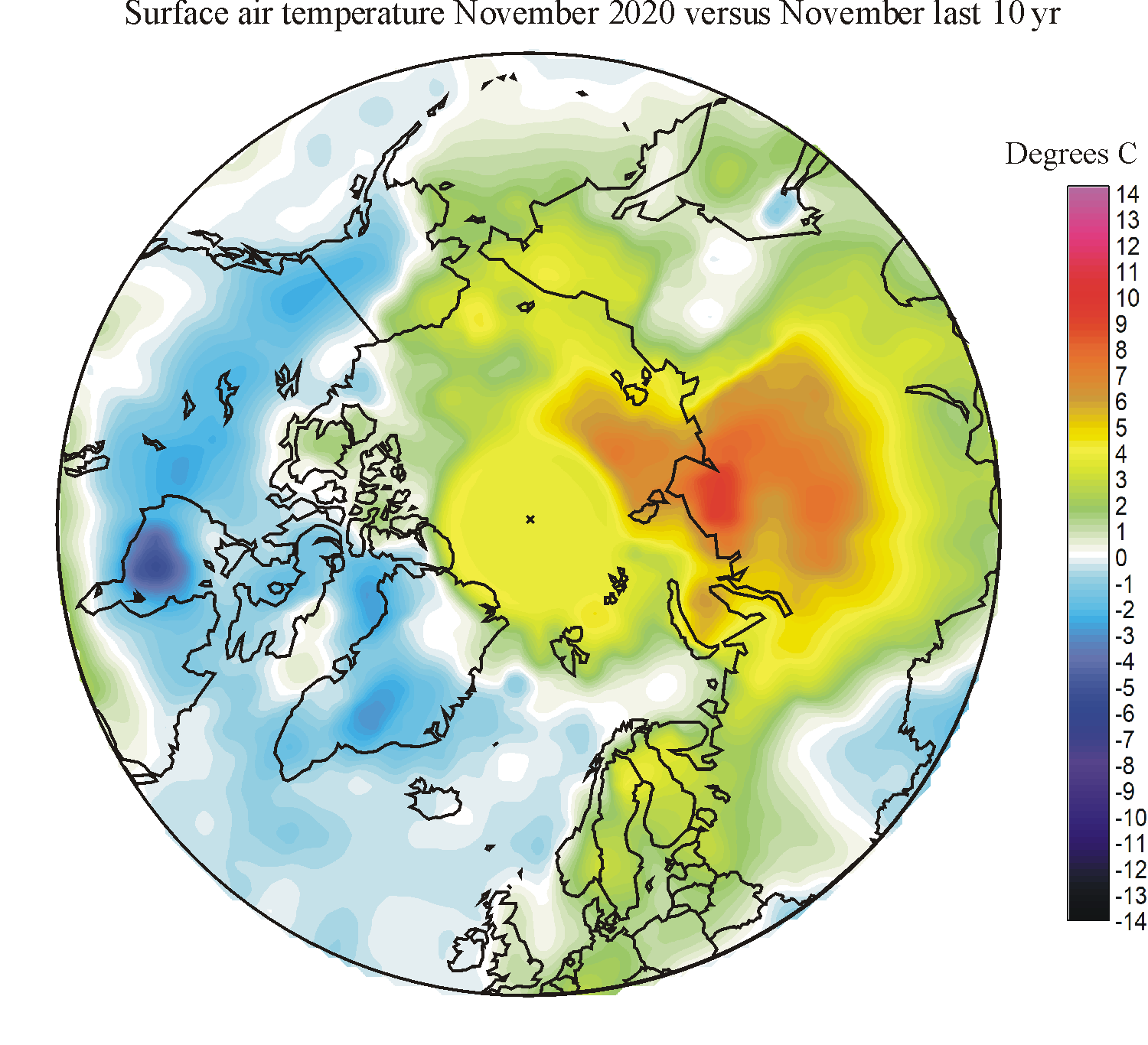
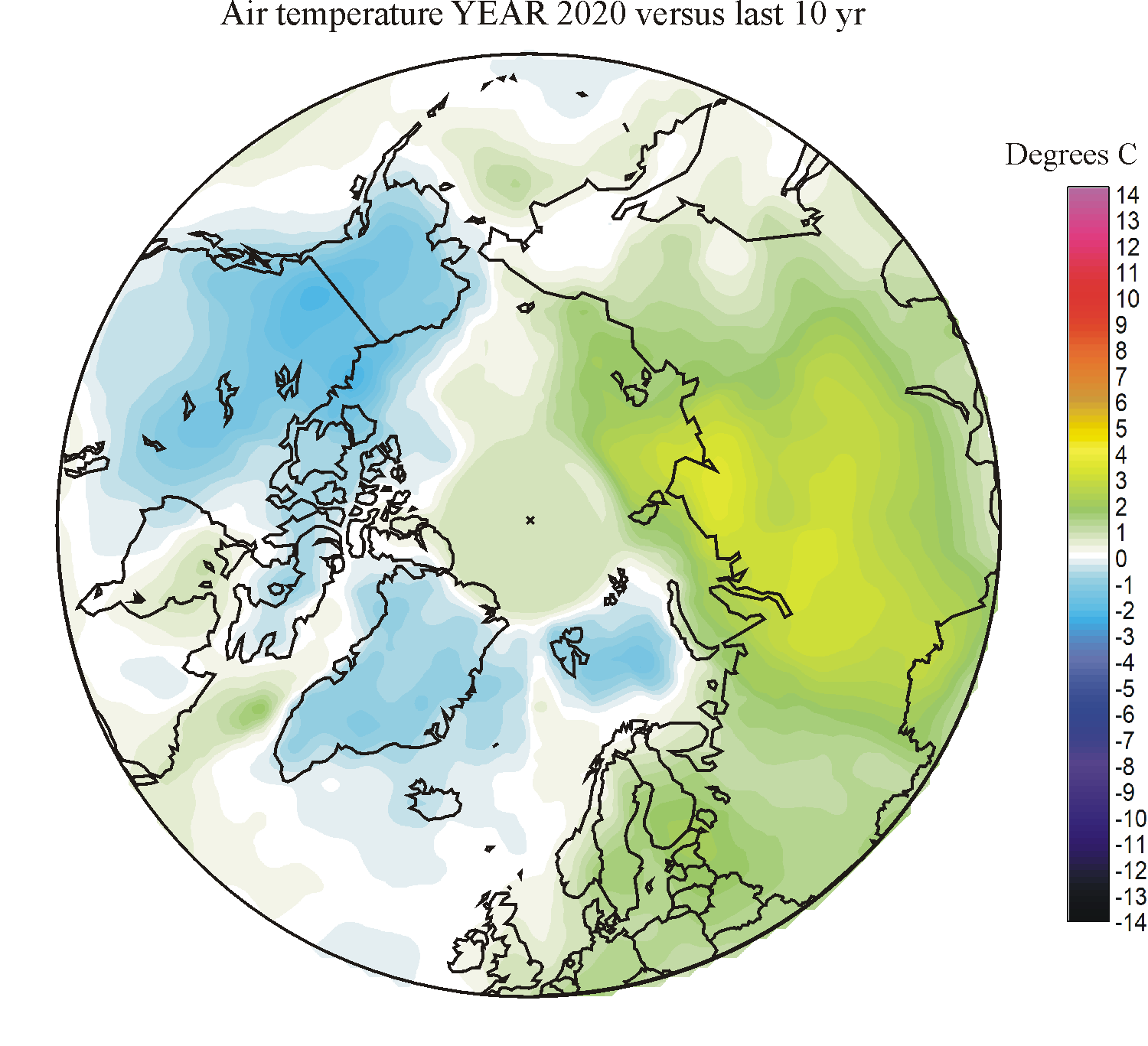
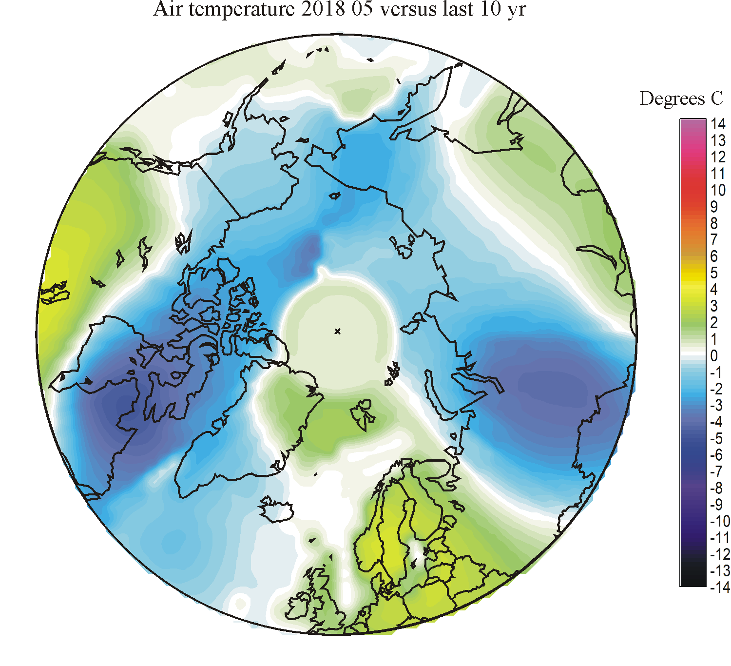
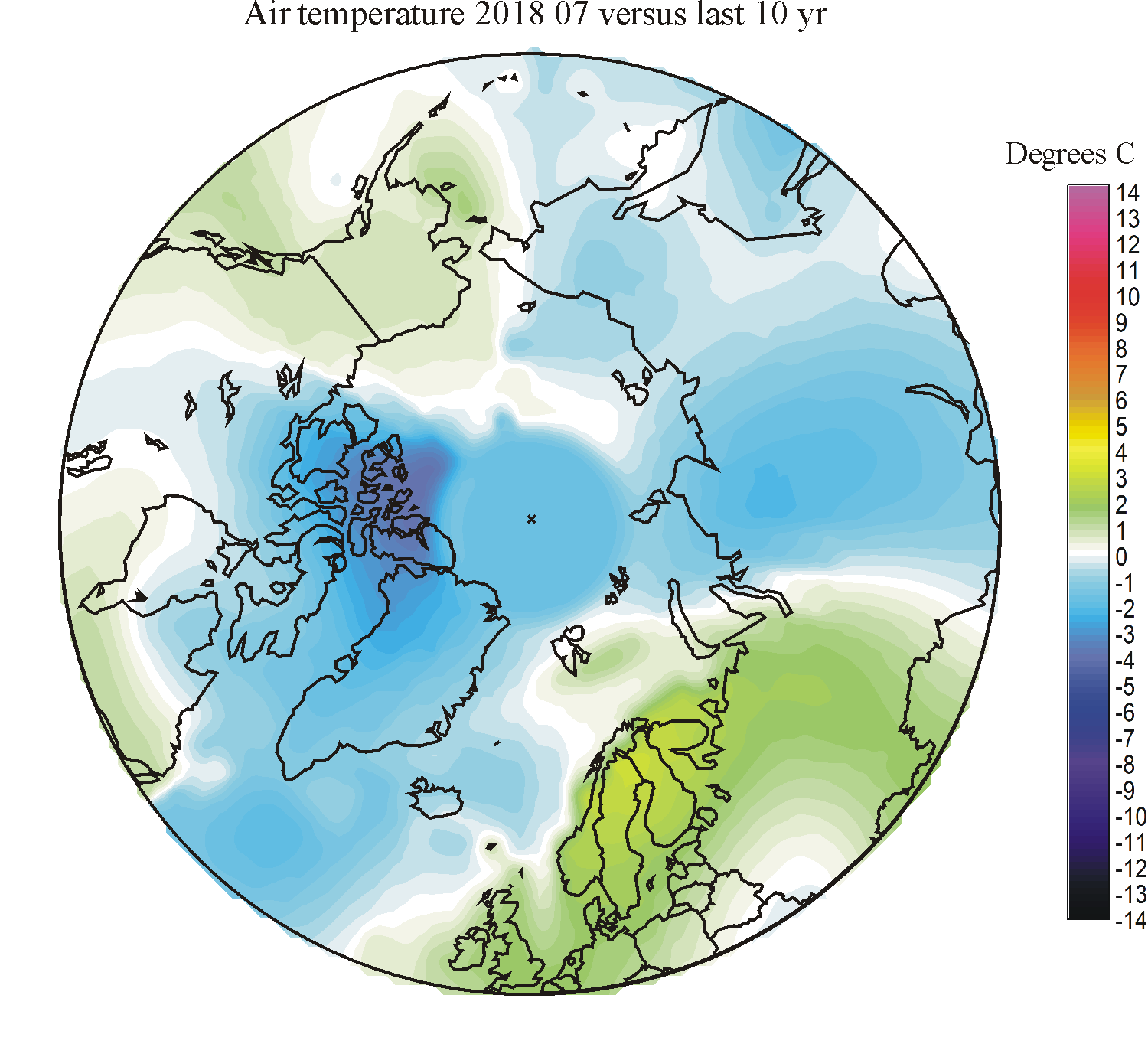
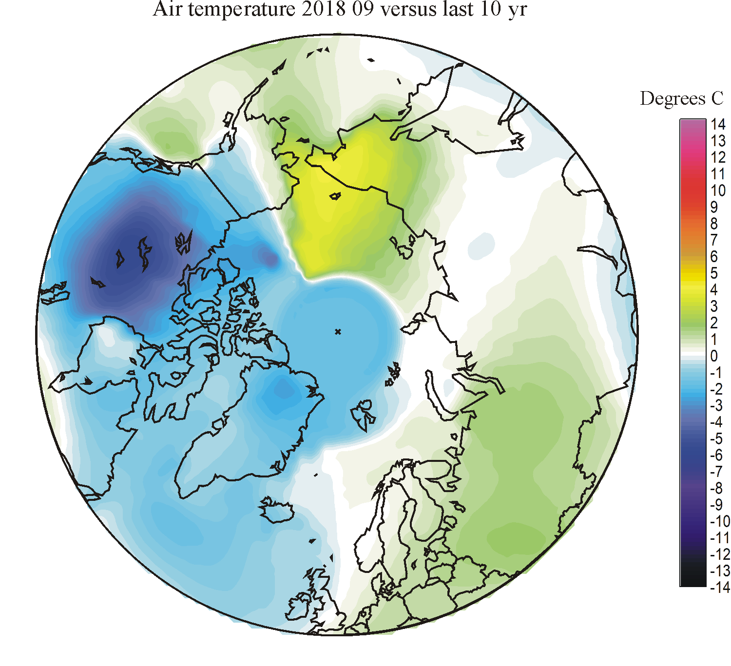
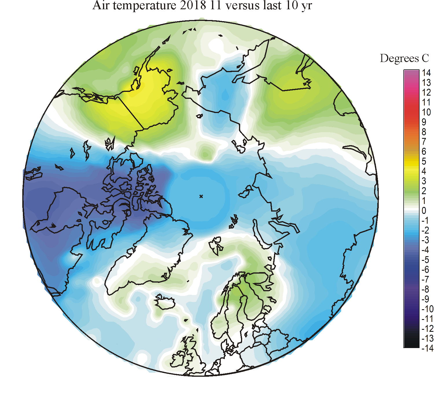
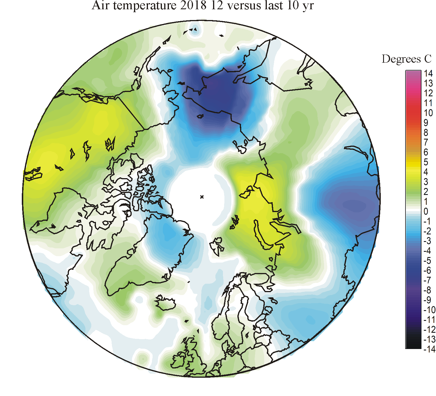
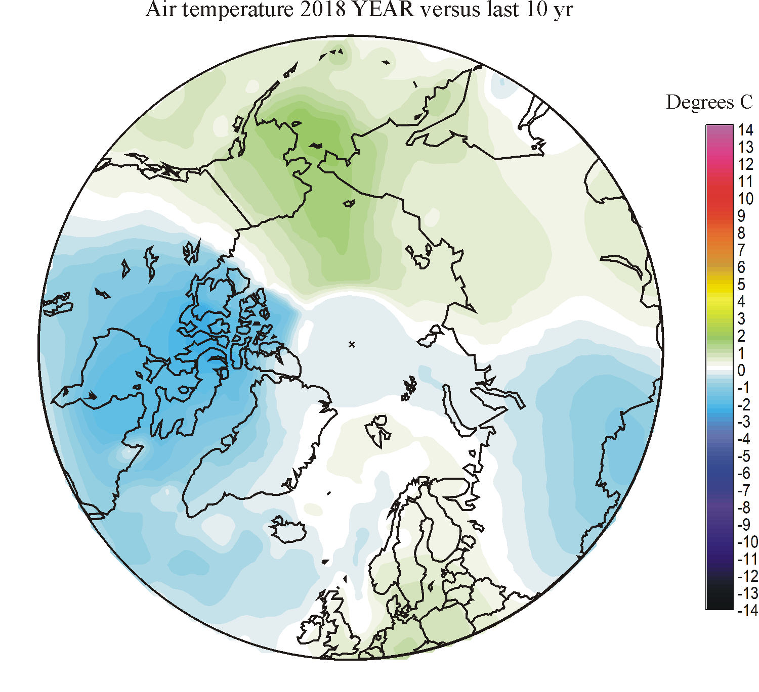
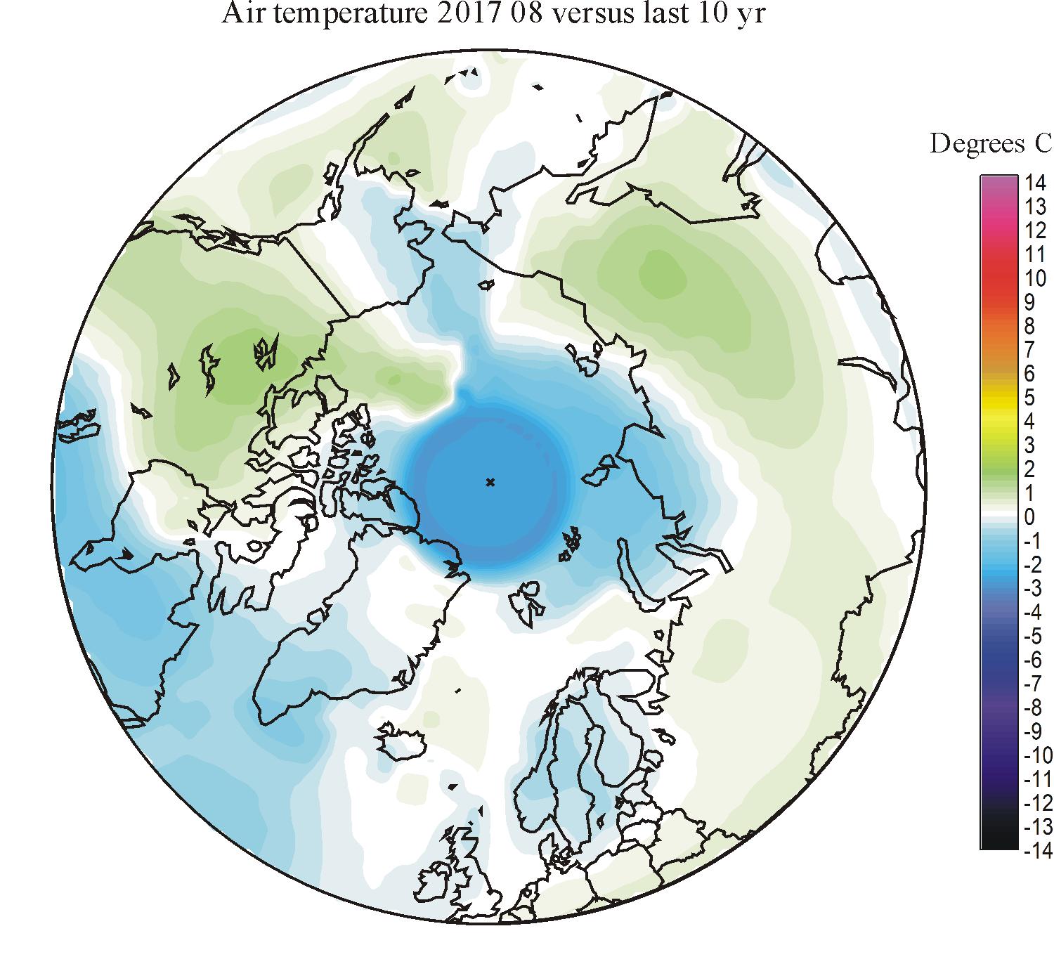
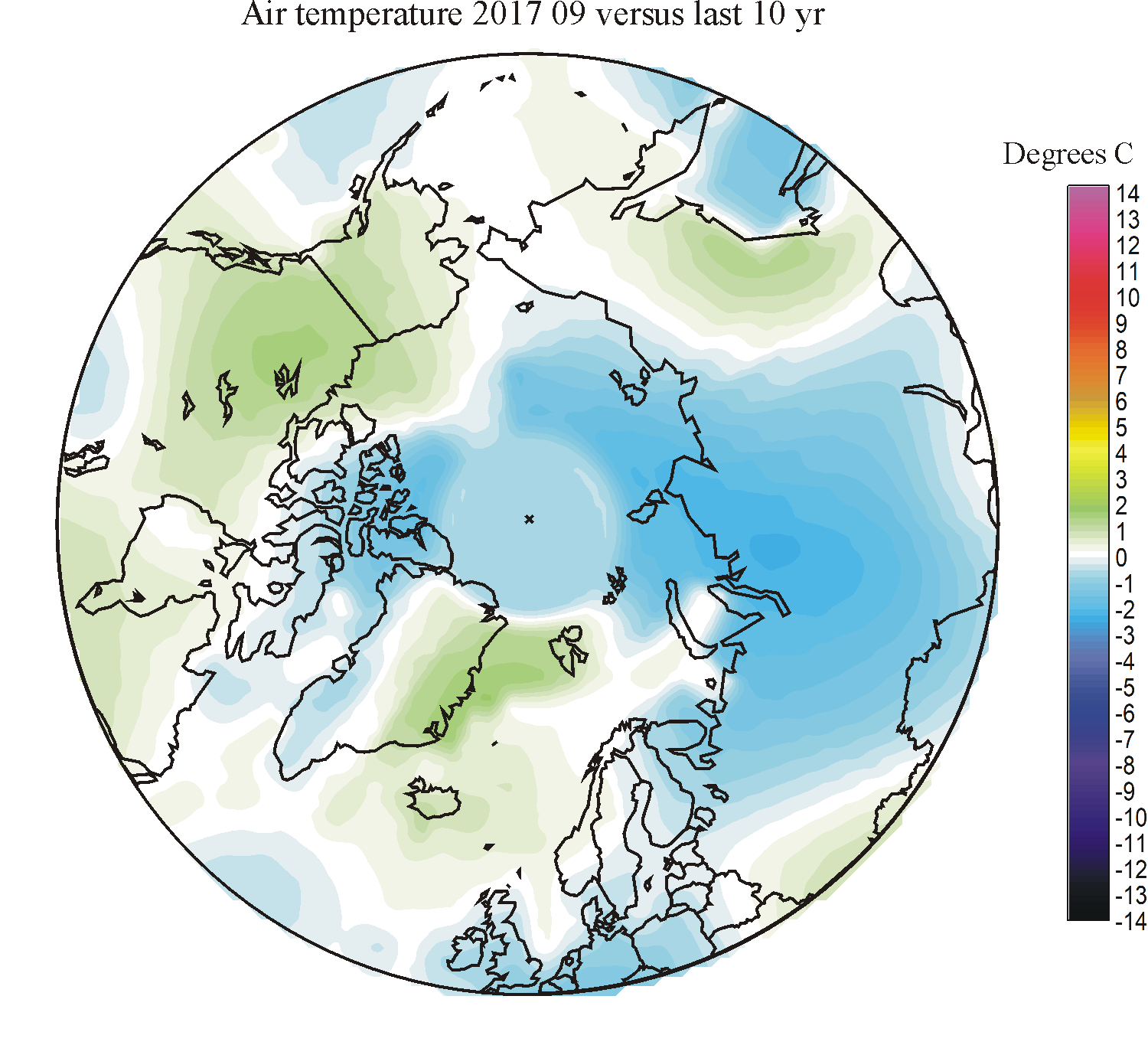
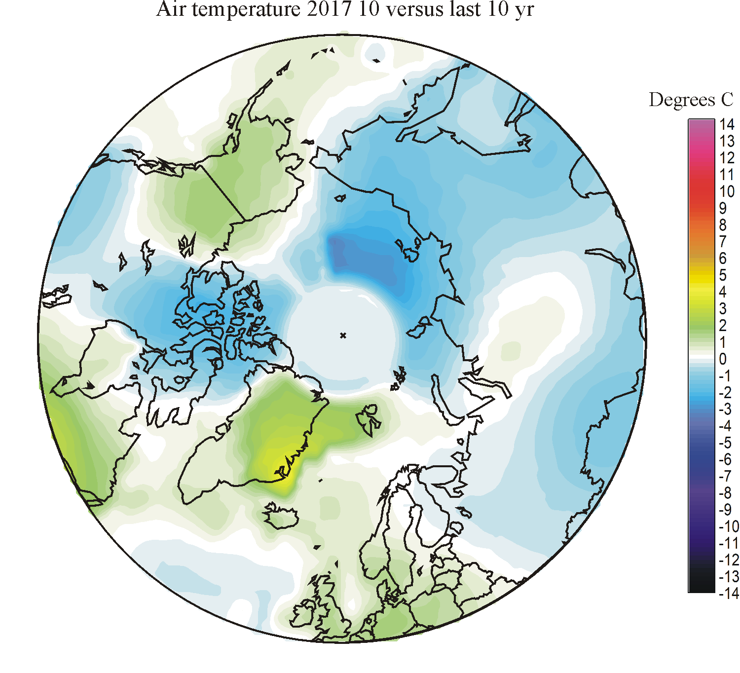
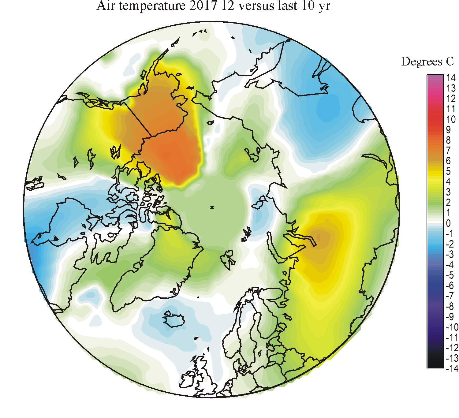
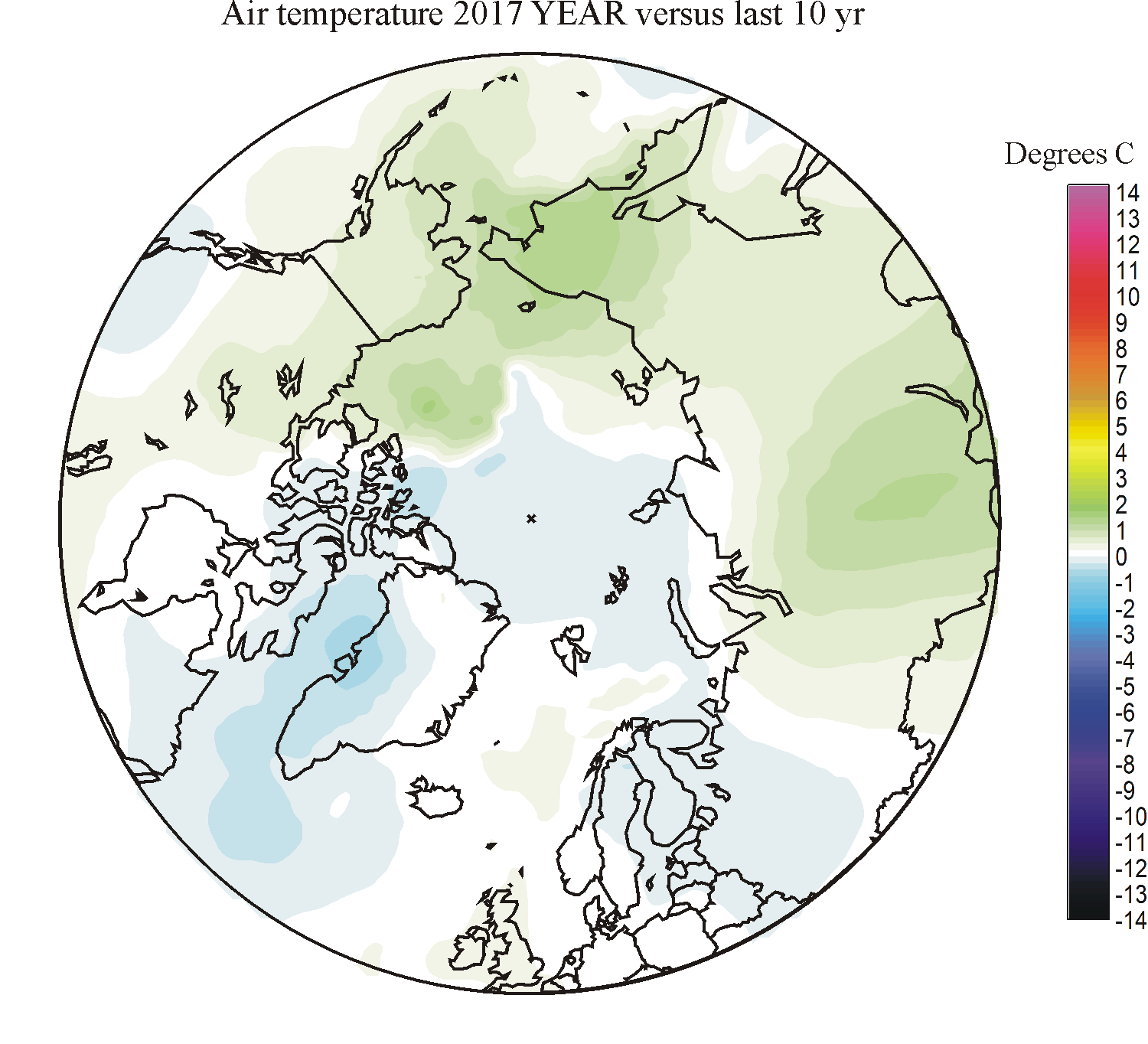
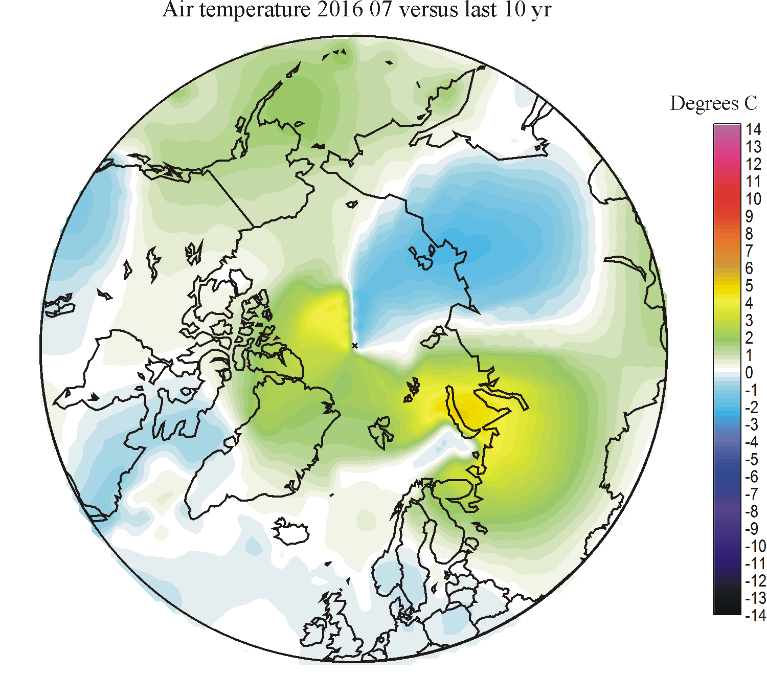
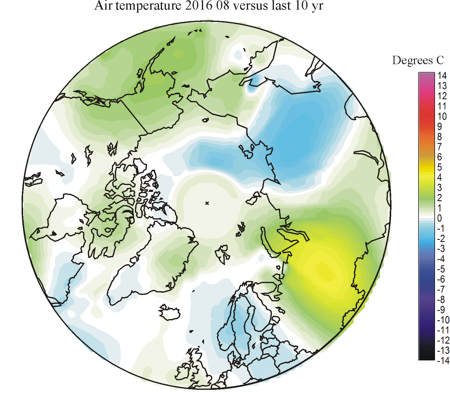
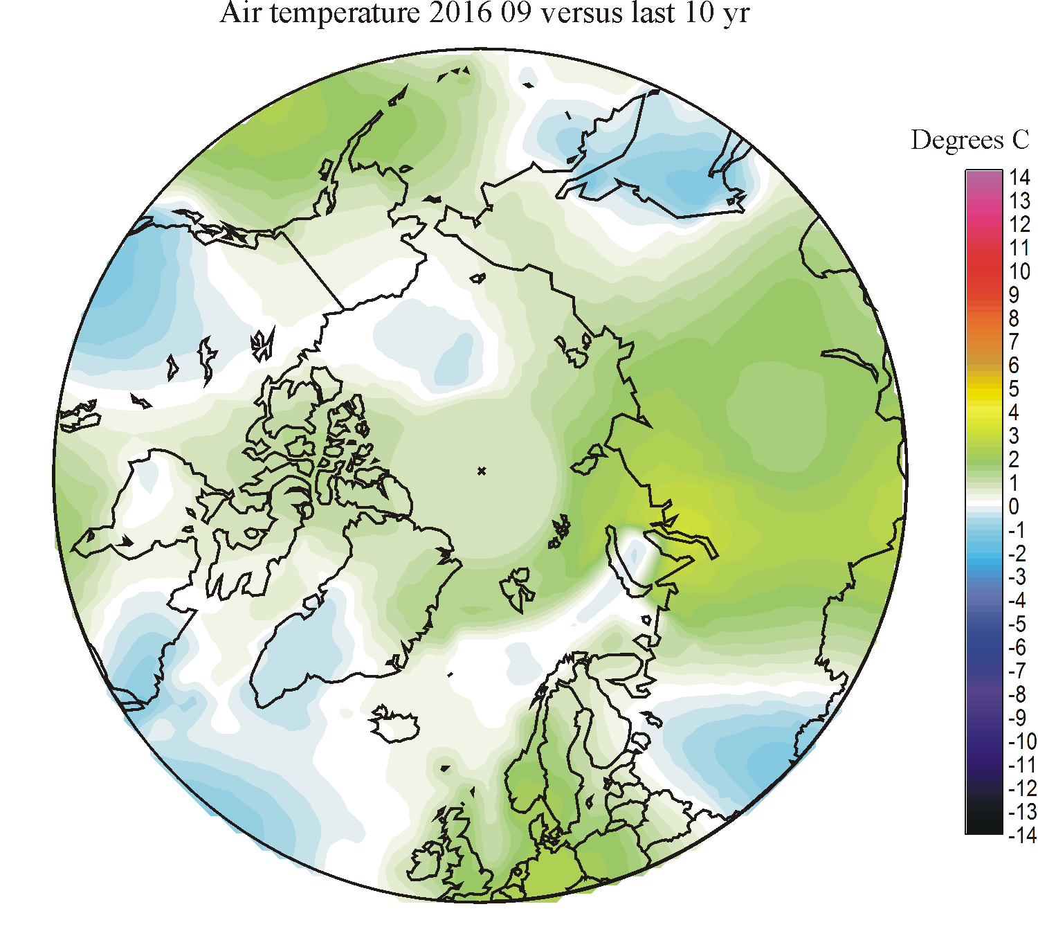
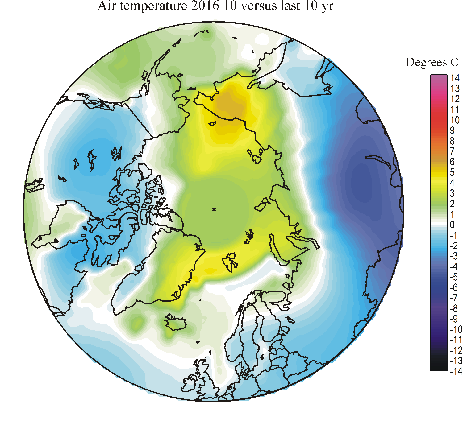
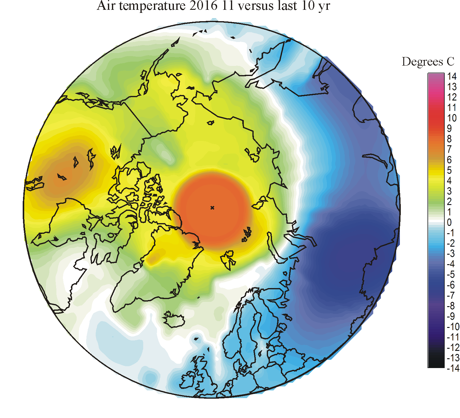
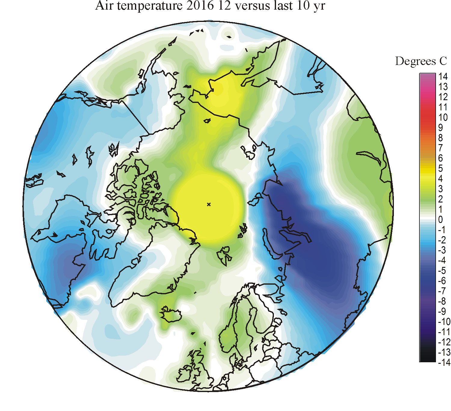
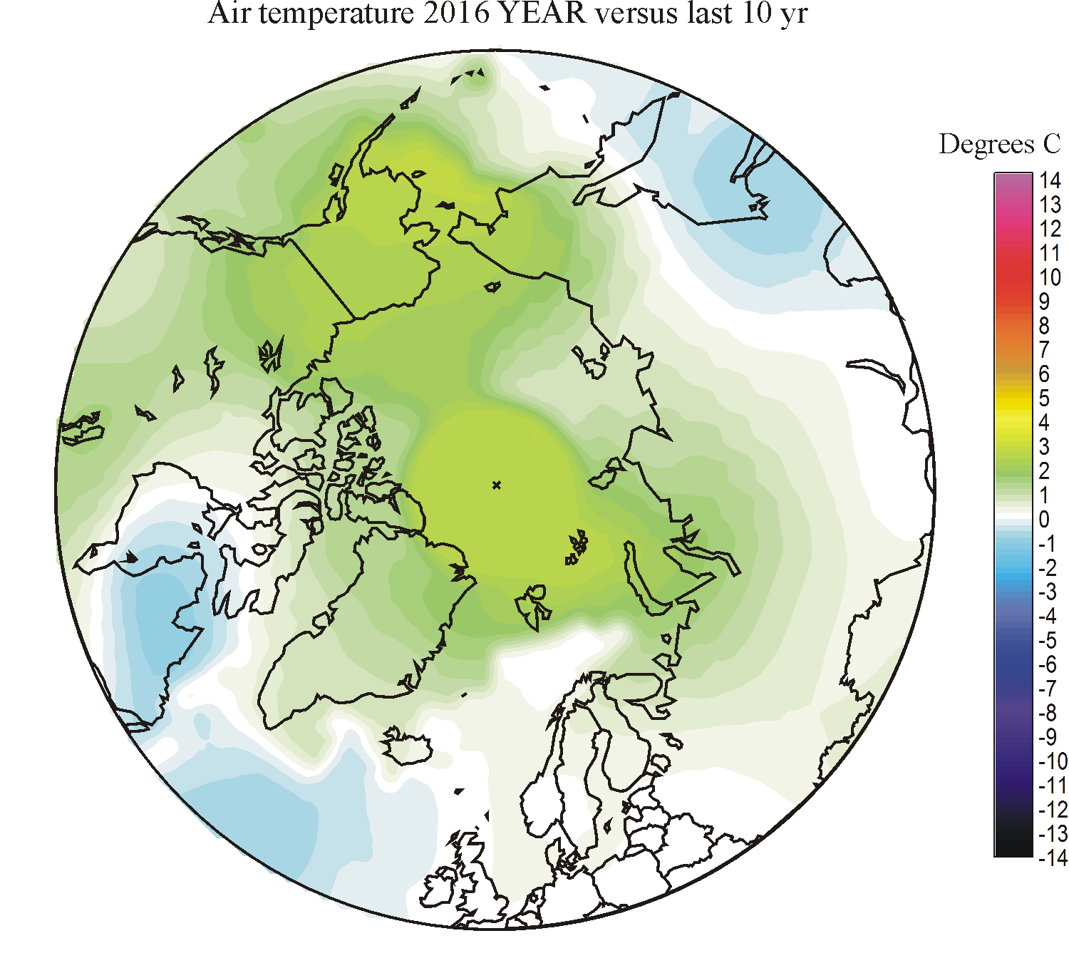
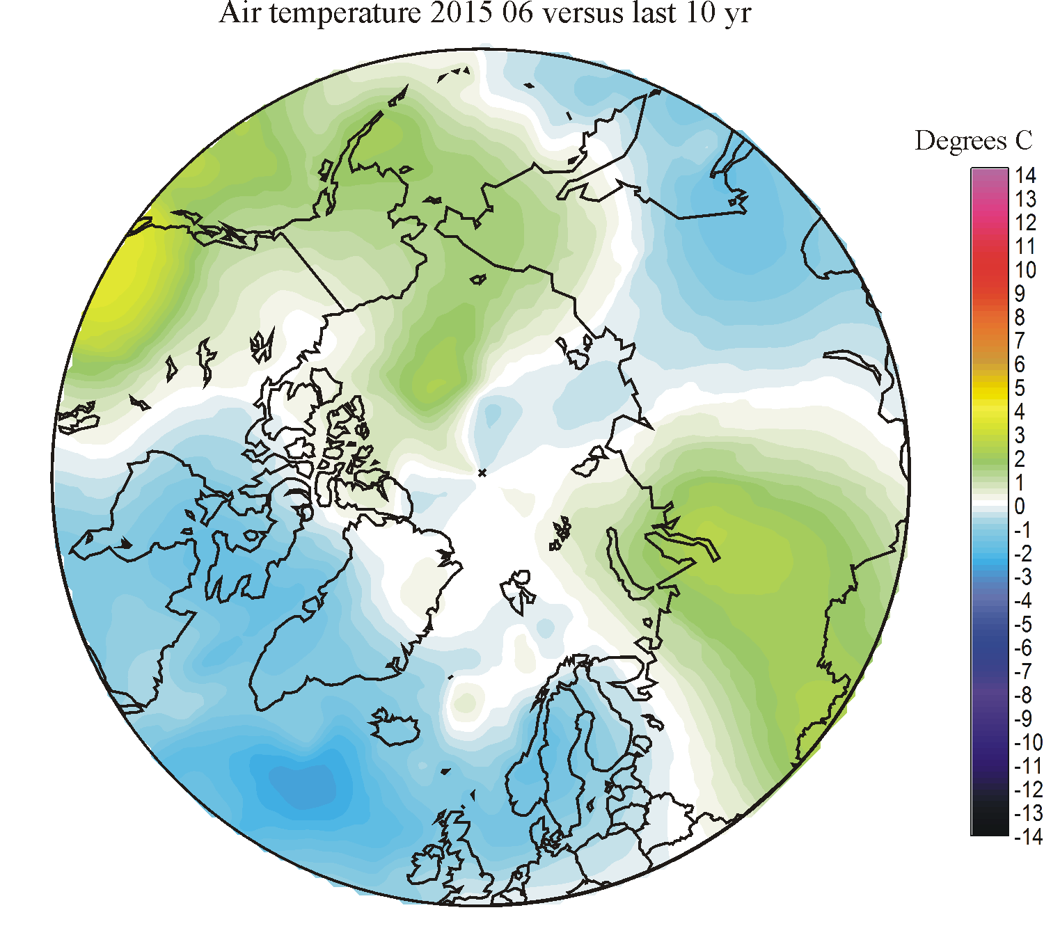
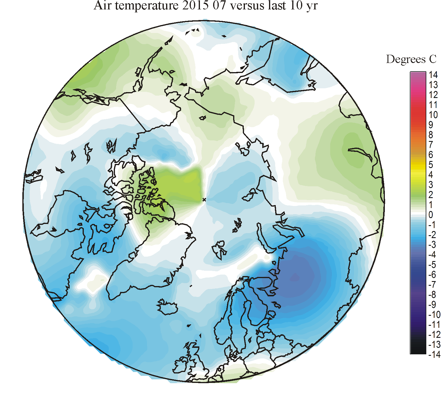
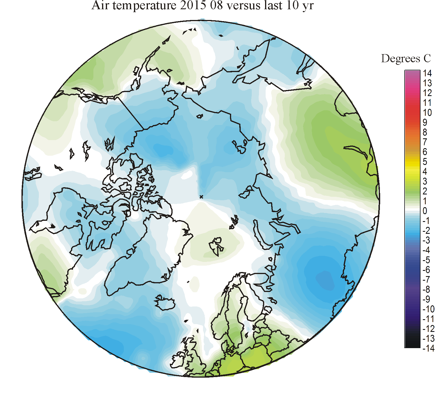
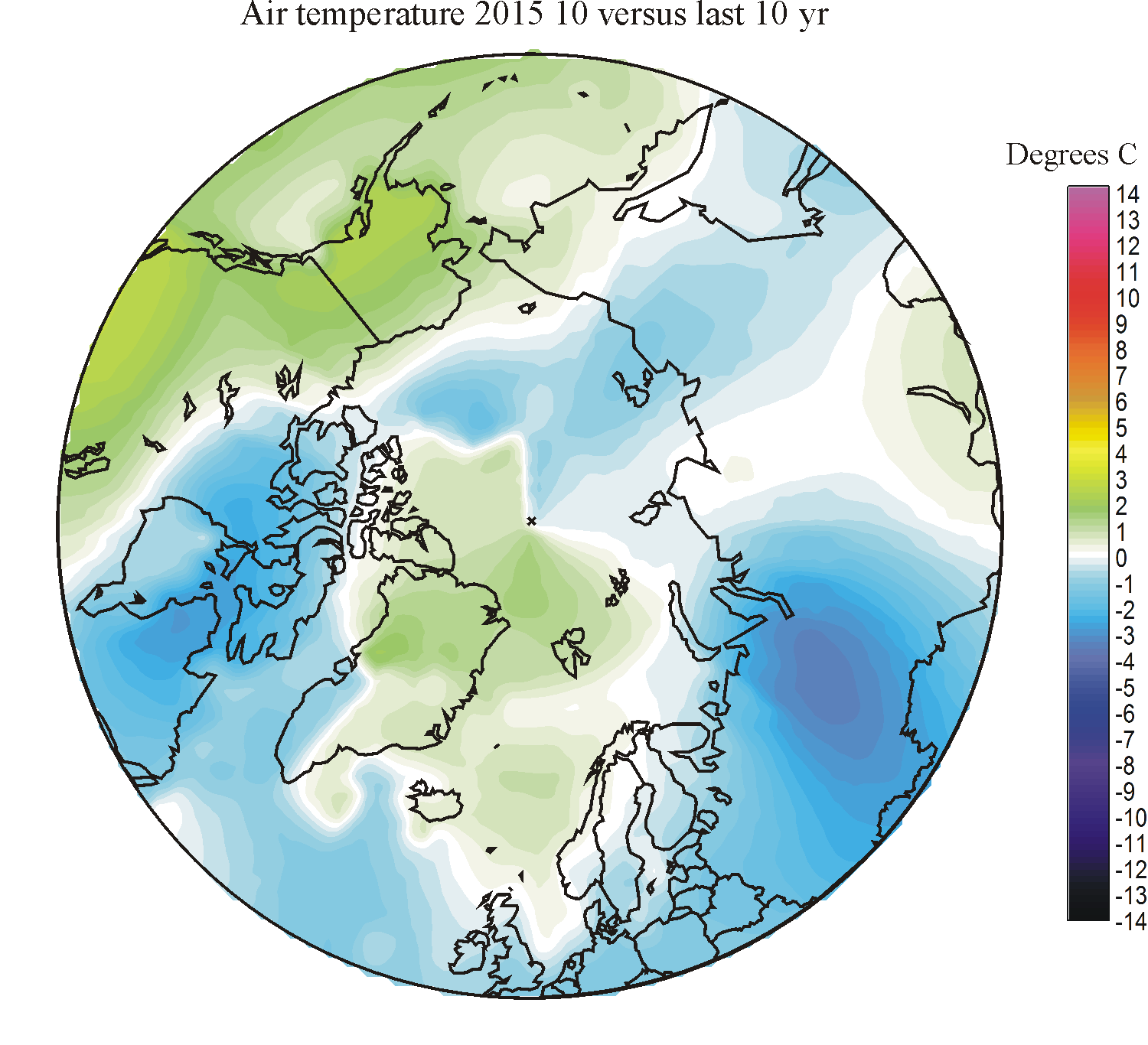
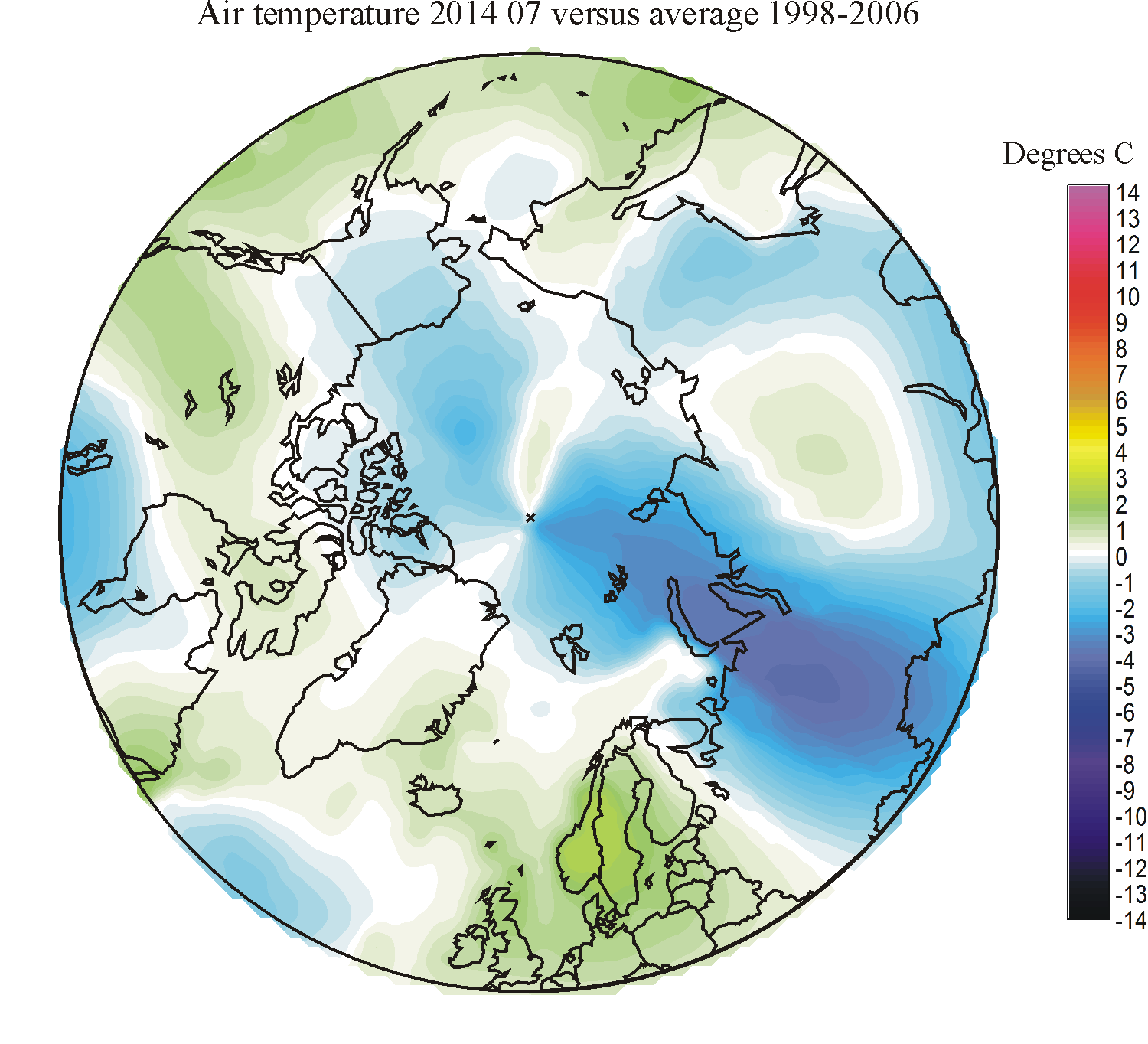
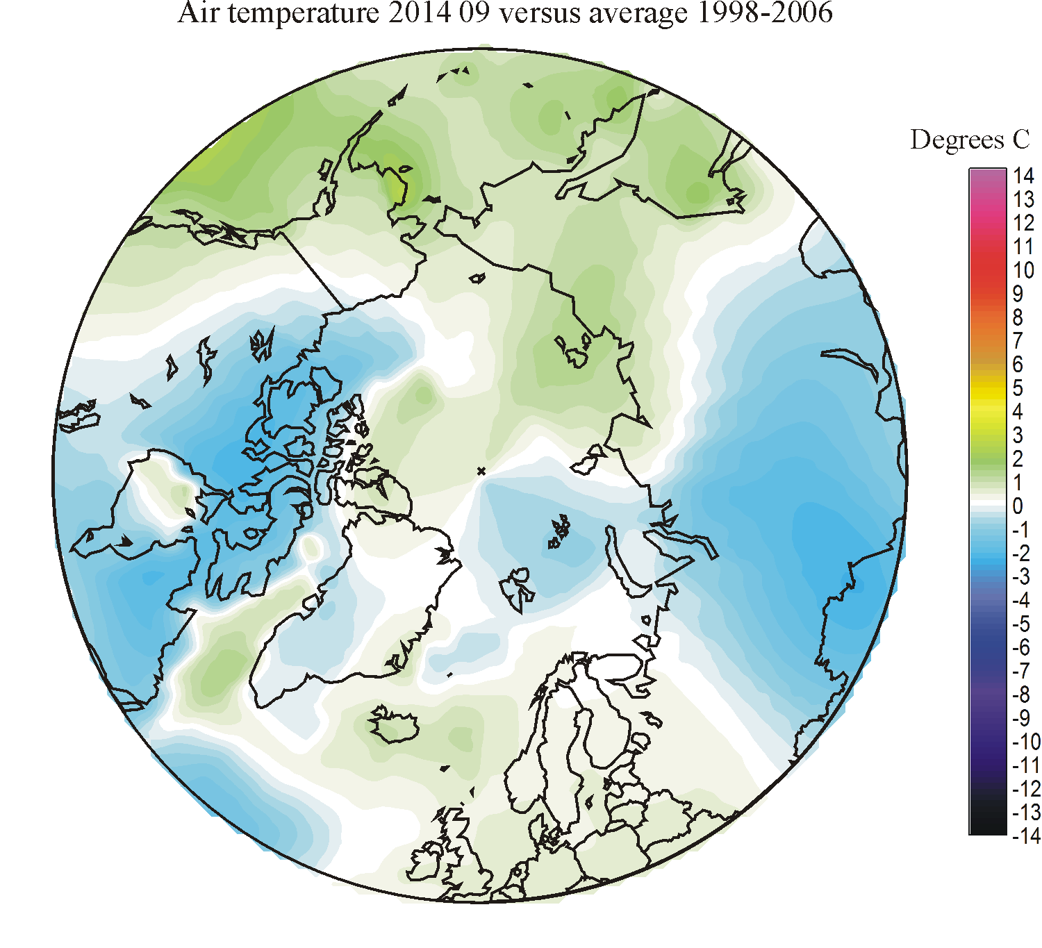
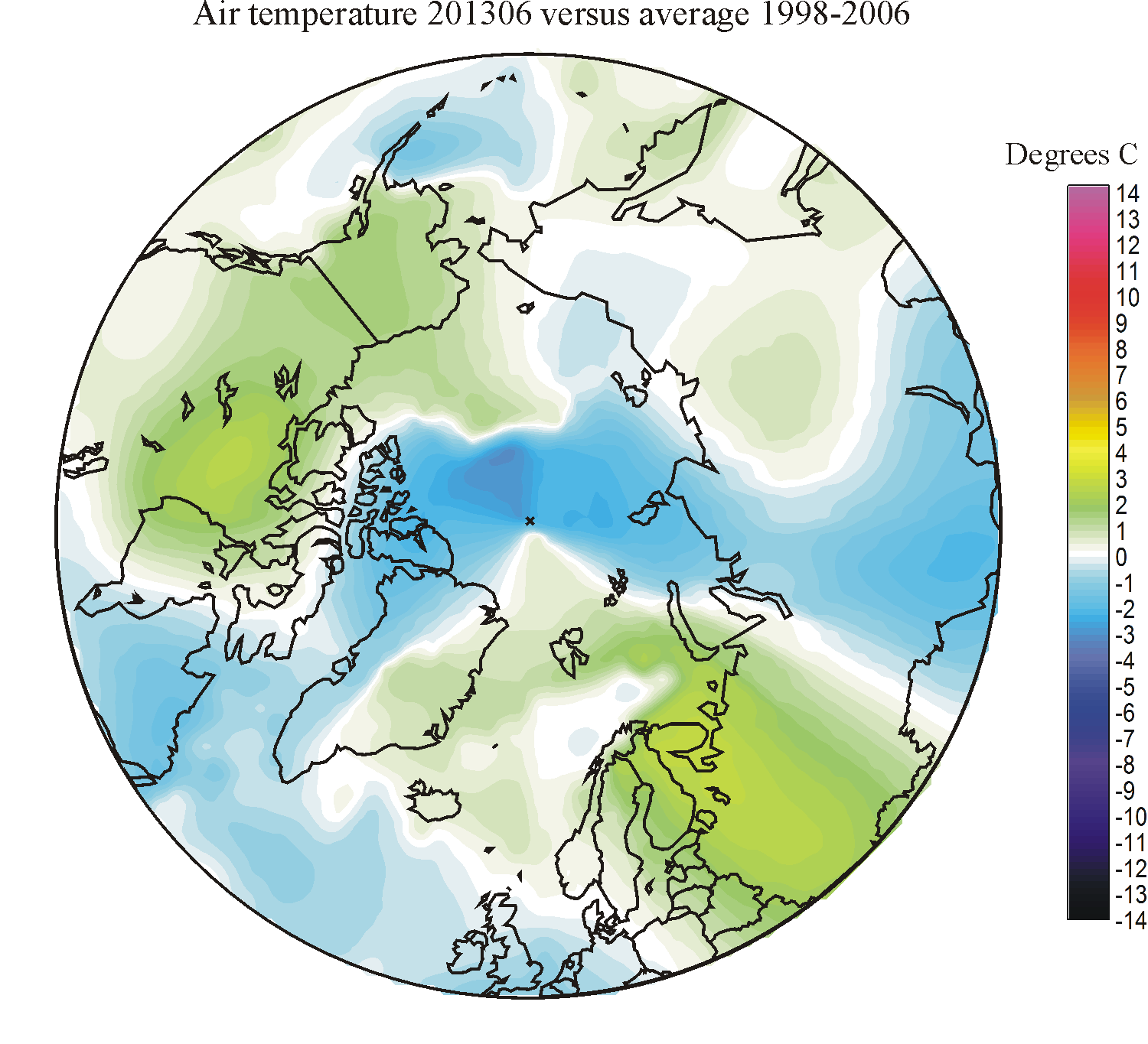
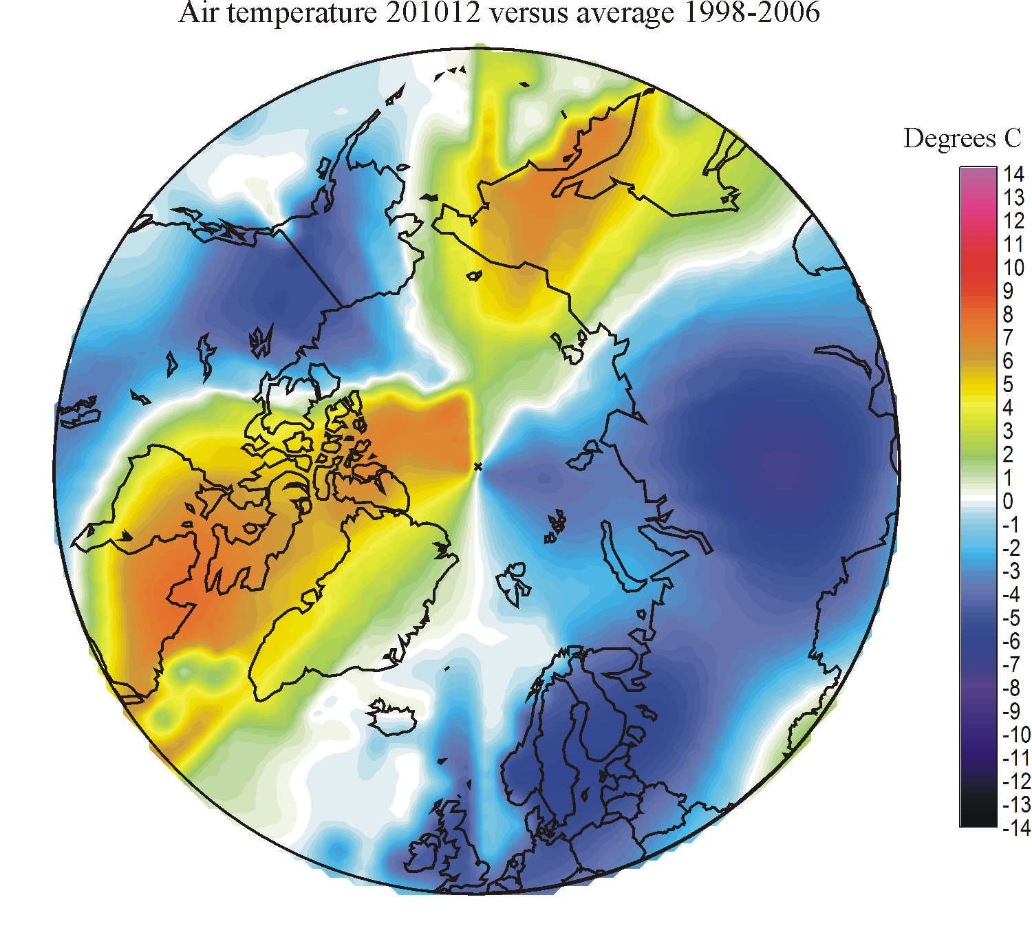
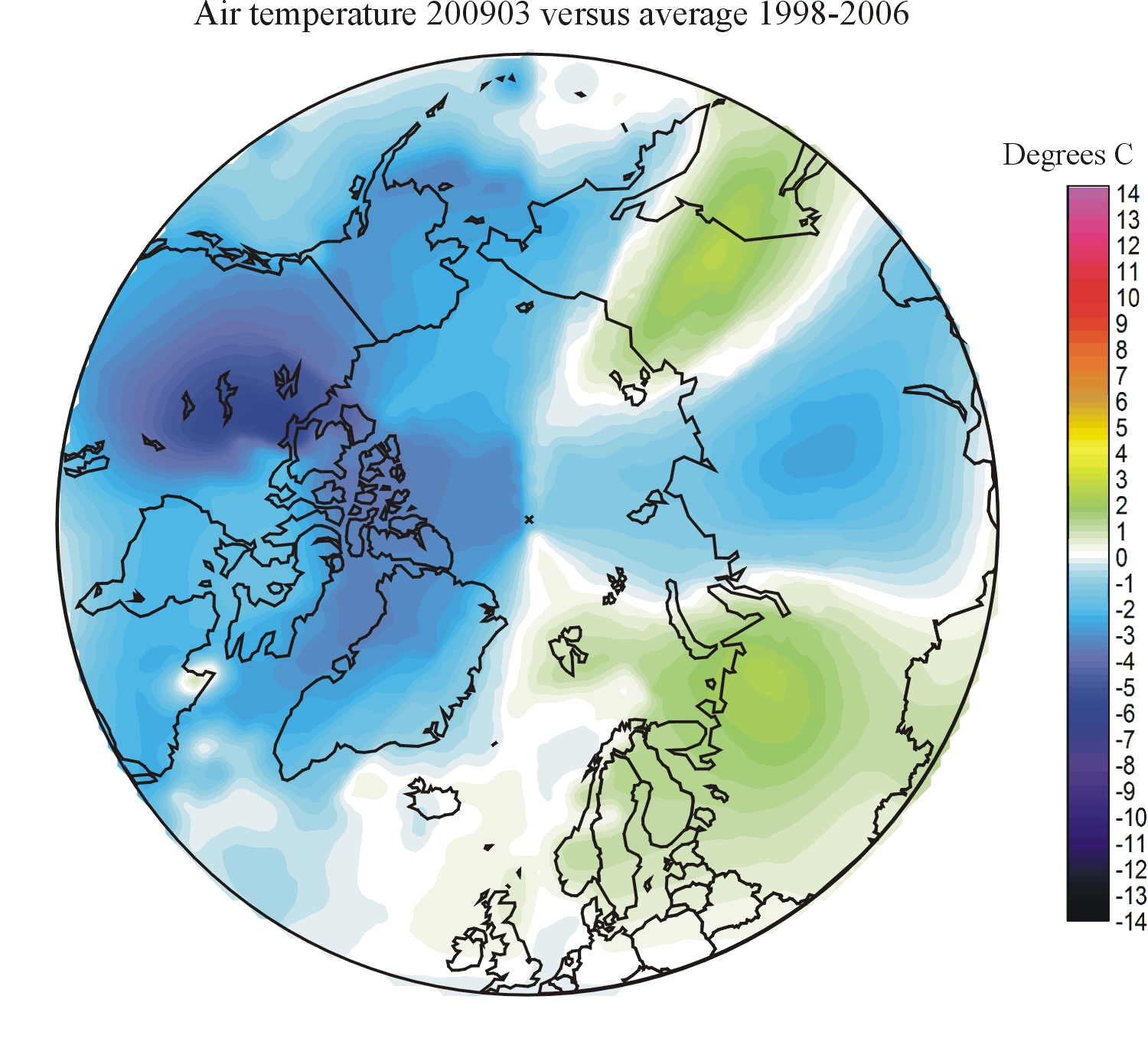
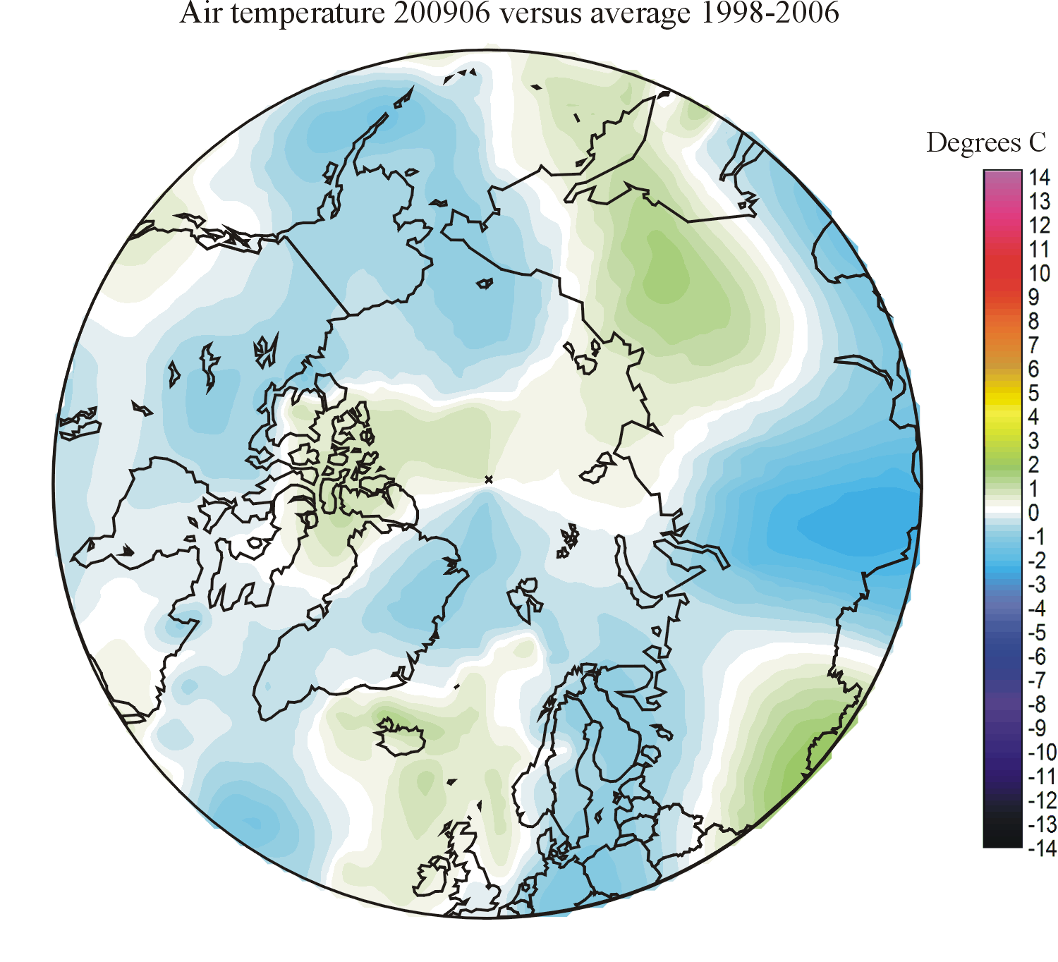
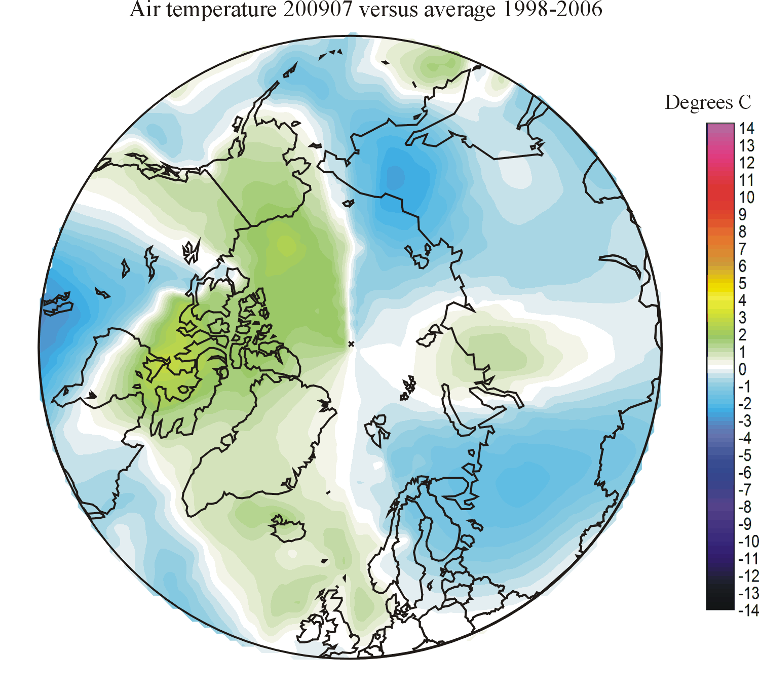
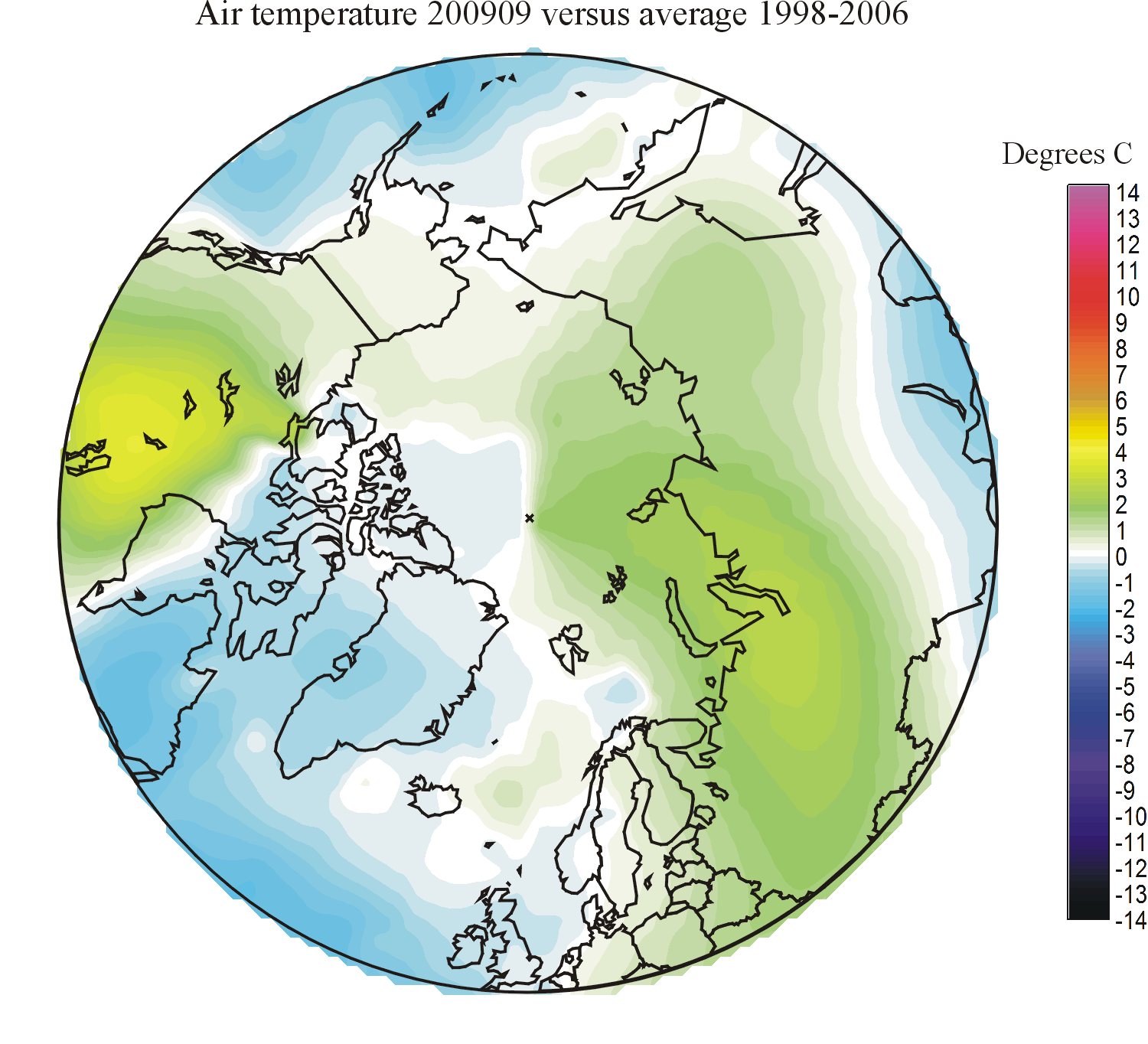
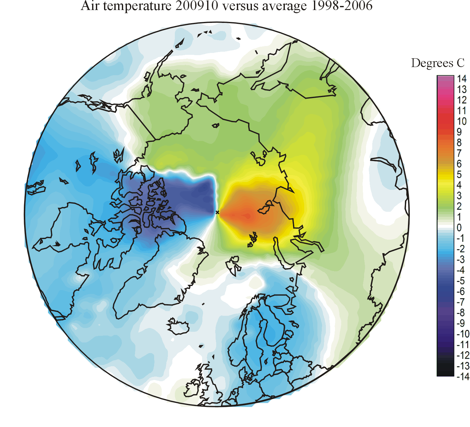
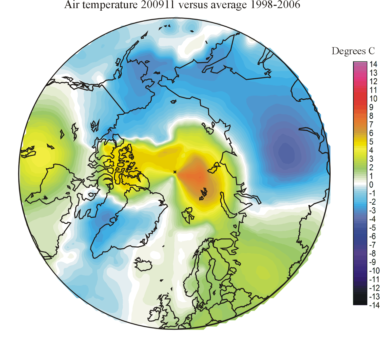
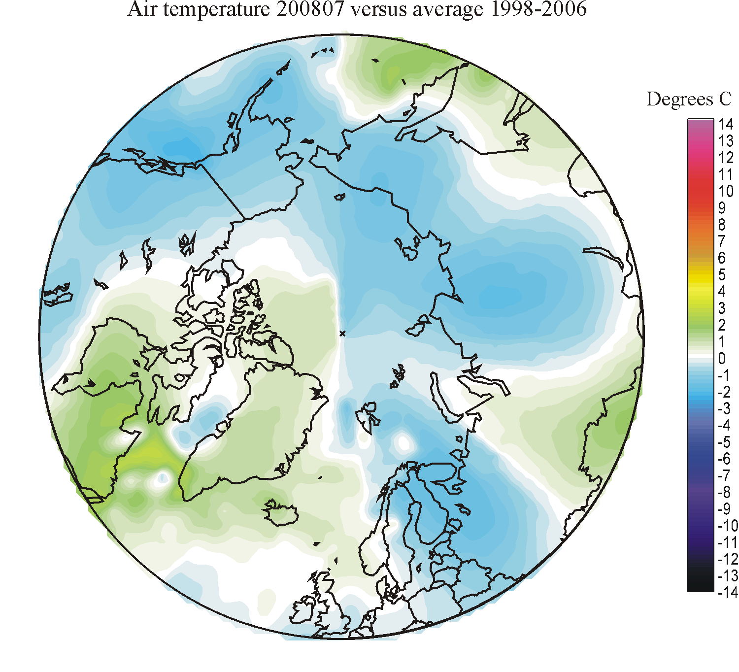
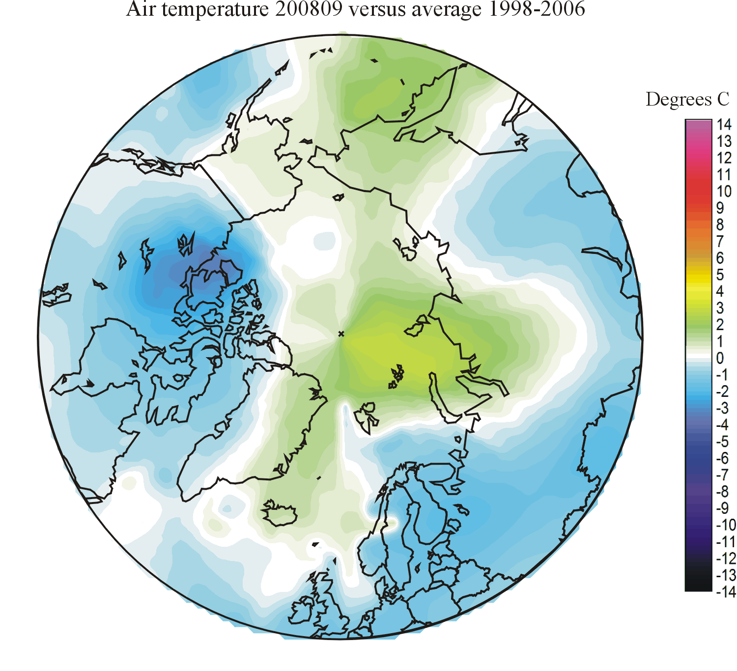
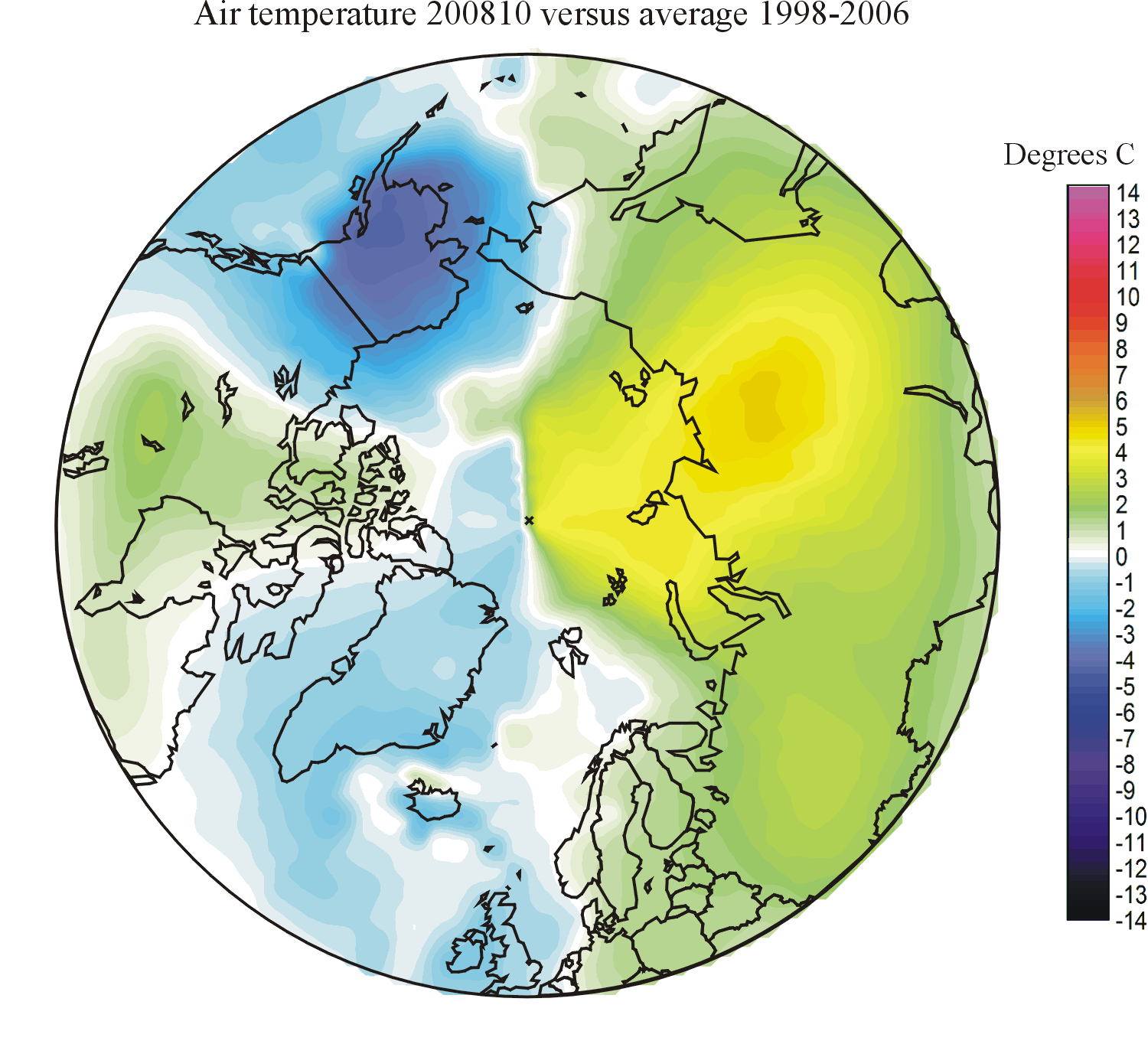
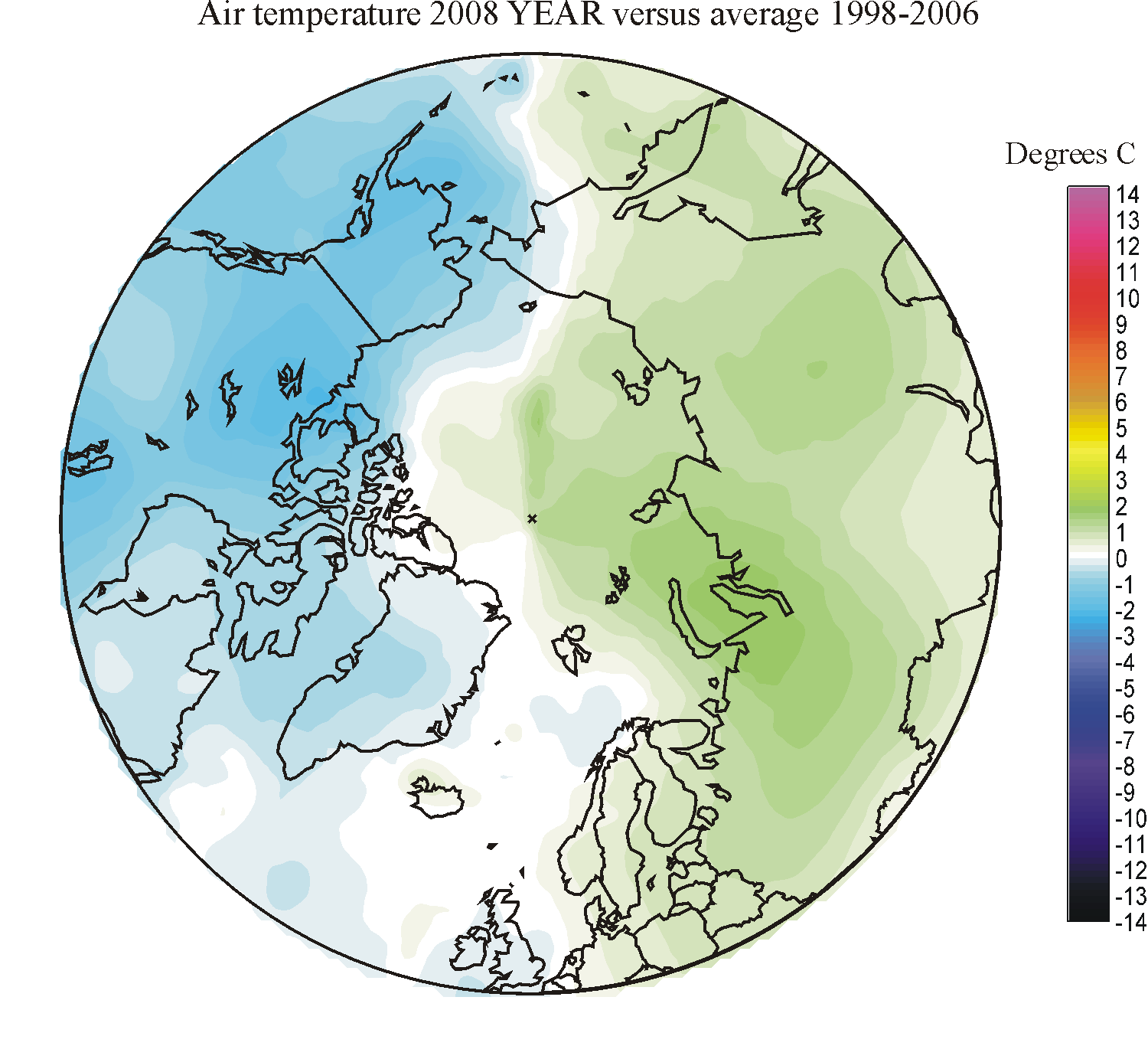
Spatial distribution of monthly
surface air temperature
deviation north of 50oN in relation to the average
for the period 1998-2006. Warm colours indicates areas
with higher temperature than the 1998-2006 average, while blue colours indicate lower than average temperatures.
Click here to jump back to the list of contents.
Arctic monthly surface air temperatures north of 70N
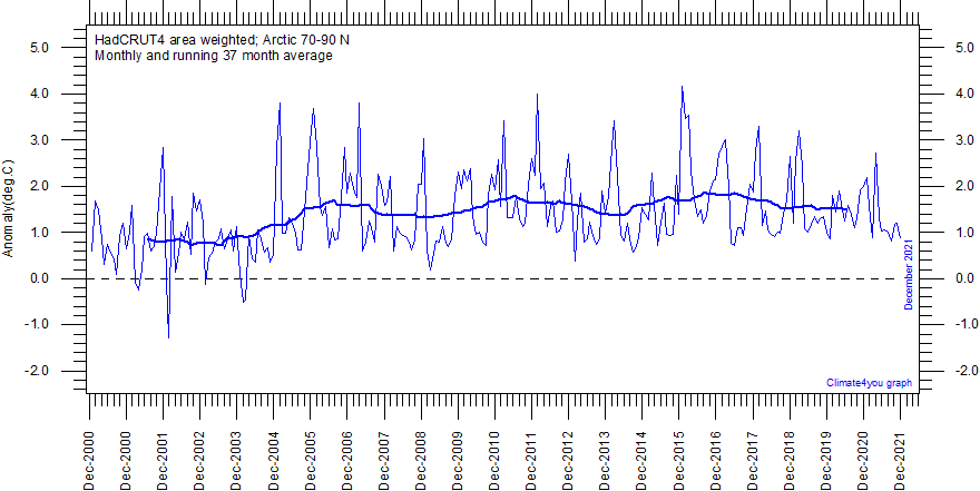
Diagram showing area weighted Arctic (70-90oN) monthly surface air temperature anomalies (HadCRUT4) since January 2000, in relation to the WMO normal period 1961-1990. The thin blue line shows the monthly temperature anomaly, while the thicker red line shows the running 37 month (c.3 yr) average. Last month shown: December 2021. Last diagram update: 15 March 2022.
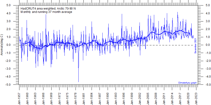
Diagram showing area weighted Arctic (70-90oN) monthly surface air temperature anomalies (HadCRUT4) since January 1957, in relation to the WMO normal period 1961-1990. The thin blue line shows the monthly temperature anomaly, while the thicker red line shows the running 37 month (c.3 yr) average. Last month shown: December 2021. Last diagram update: 15 March 2022.
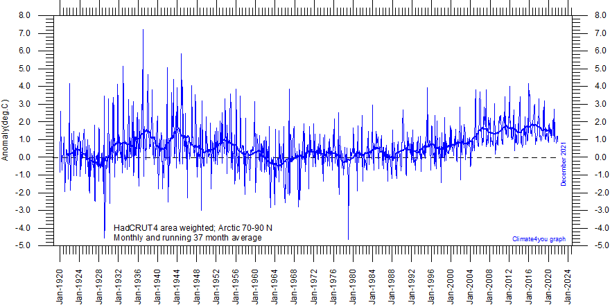
Diagram showing area weighted Arctic (70-90oN) monthly surface air temperature anomalies (HadCRUT4) since January 1920, in relation to the WMO normal period 1961-1990. The thin blue line shows the monthly temperature anomaly, while the thicker red line shows the running 37 month (c.3 yr) average. Because of the relatively small number of Arctic stations before 1930, month-to-month variations in the early part of the temperature record are larger than later. The period from about 1930 saw the establishment of many new Arctic meteorological stations, first in Russia and Siberia, and following the 2nd World War, also in North America. The period since 2000 is warm, about as warm as the period 1930-1940. Last month shown: December 2021. Last diagram update: 15 March 2022.
Note
to the three Arctic temperature diagrams above: As the HadCRUT4 data series has
improved high latitude data coverage (compared to the HadCRUT3 series) the individual 5ox5o
grid cells has been weighted according to their surface area. This is in
contrast to Gillet et al.
2008 which calculated a simple average,
with no correction for the significant surface area effect of latitude in polar
regions.
Click here to jump back to the list of contents.
Arctic daily surface air temperatures north of 80N
Click here to see daily mean temperature north of 80oN, as a function of the day of year. Source: The Danish Meteorological Institute (DMI), Centre for Ocean and Ice.
Click here to jump back to the list of contents.
Arctic long meteorological data series
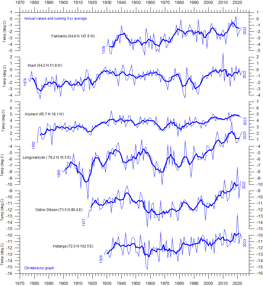
Long Arctic surface annual air temperature series: Fairbanks (Alaska), Nuuk (Greenland), Akureyri (Iceland), Svalbard (Norway), Ostrov Dikson (Siberia), and Hatanga (Siberia). Annual values were calculated from monthly average temperatures. Almost unavoidably, some missing monthly data were encountered in some of the series. In such cases, the missing values were generated as either 1) the average of the preceding and following monthly values, or 2) the average for the month registered the preceding year and the following year. The thin blue line represents the mean annual air temperature, and the thick blue line is the running 5 year average. Click here to read about data smoothing. Data source: NASA Goddard Institute for Space Studies (GISS) and Rimfrost. Last year shown: 2024. Last figure update 7 February 2025.
For the Arctic, a major focus has been the Arctic Climate Impact Assessment. Based on the results from an average of the output from five climate models, which were also used for the IPCC, temperature projections were produced for the next century. The models all predicted a steady rise in annual mean surface air temperature with, on average, temperatures being 4oC higher by 2100, corresponding to an average decadal temperature increase of 0.4oC (World Meteorological Organization 2007).
Click here to jump back to the list of contents.
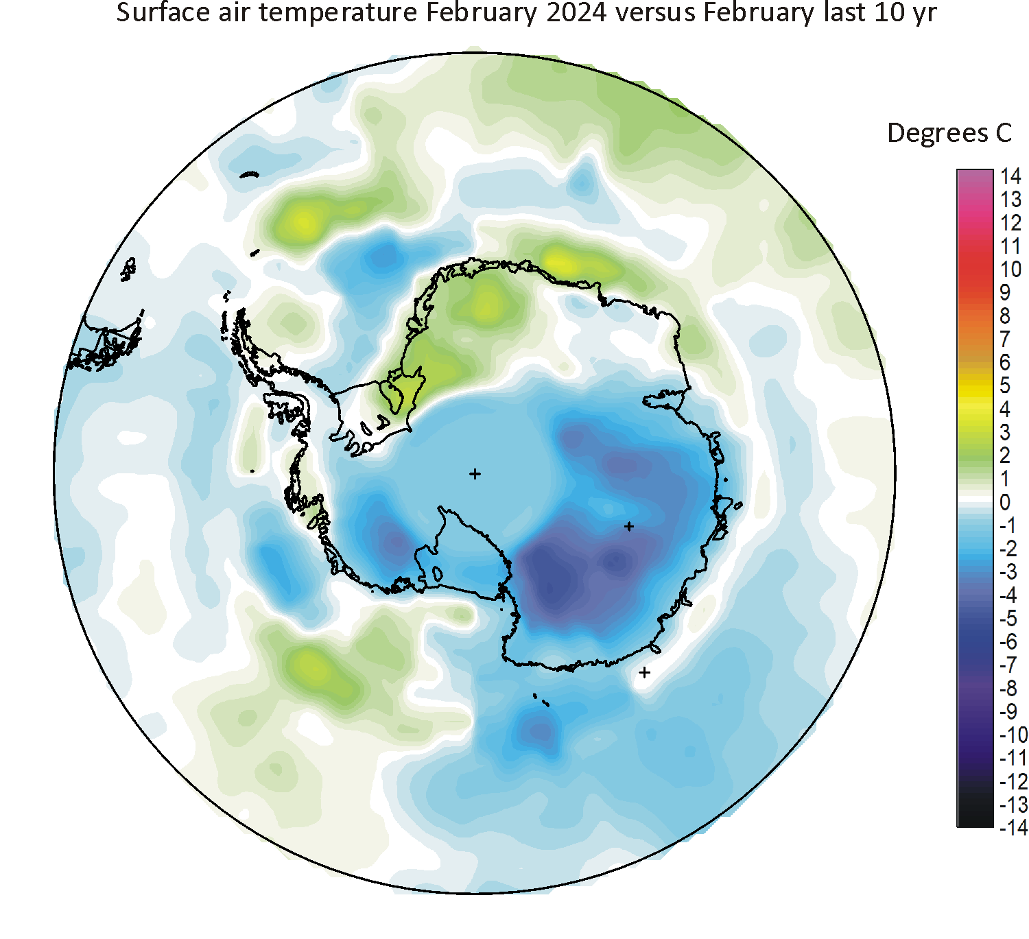
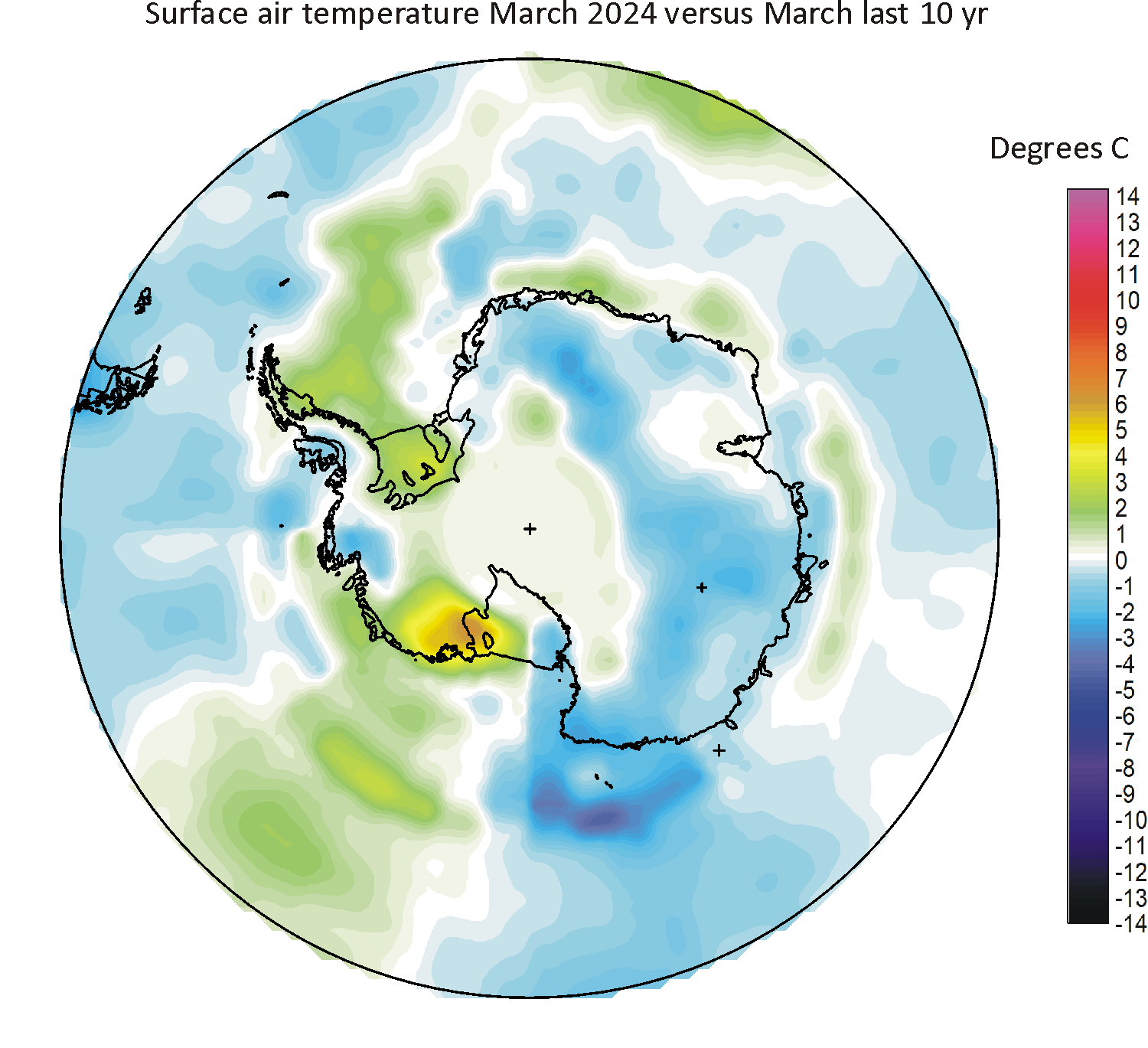
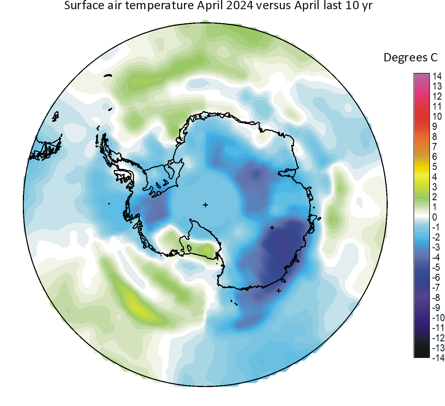
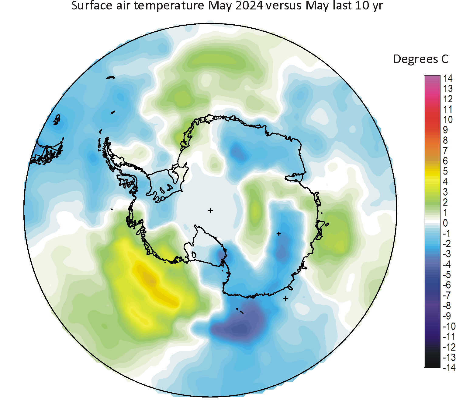
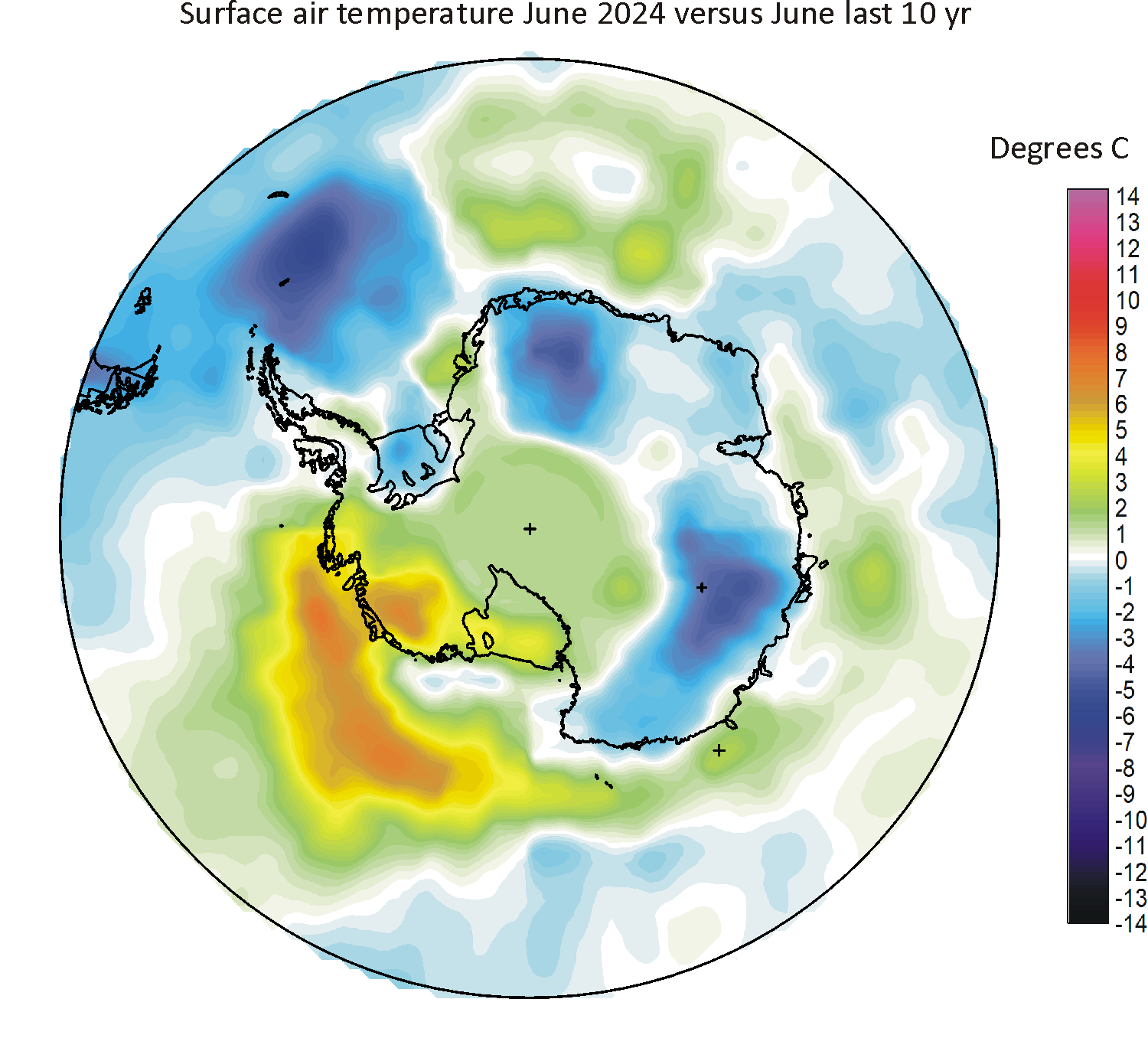
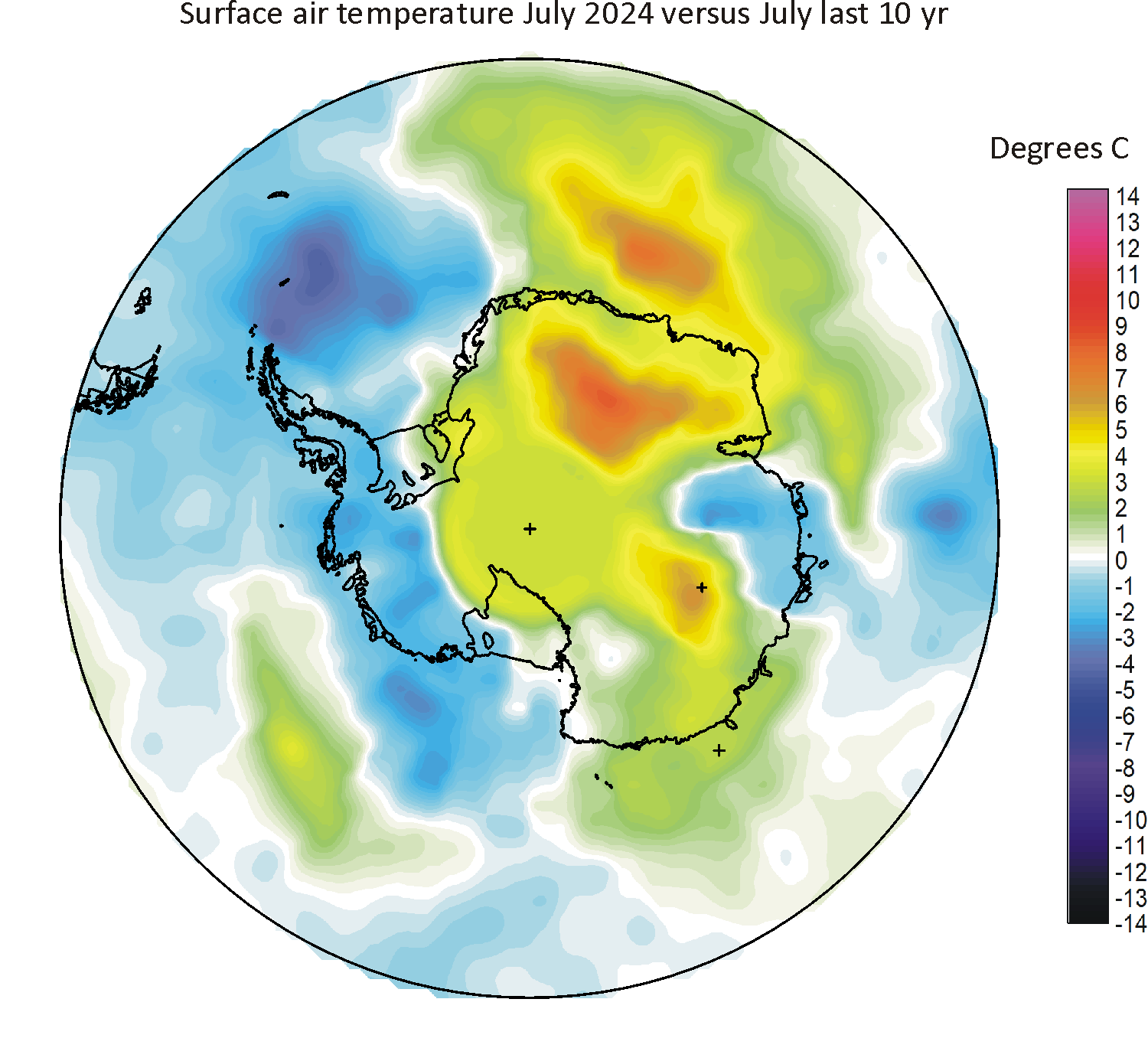
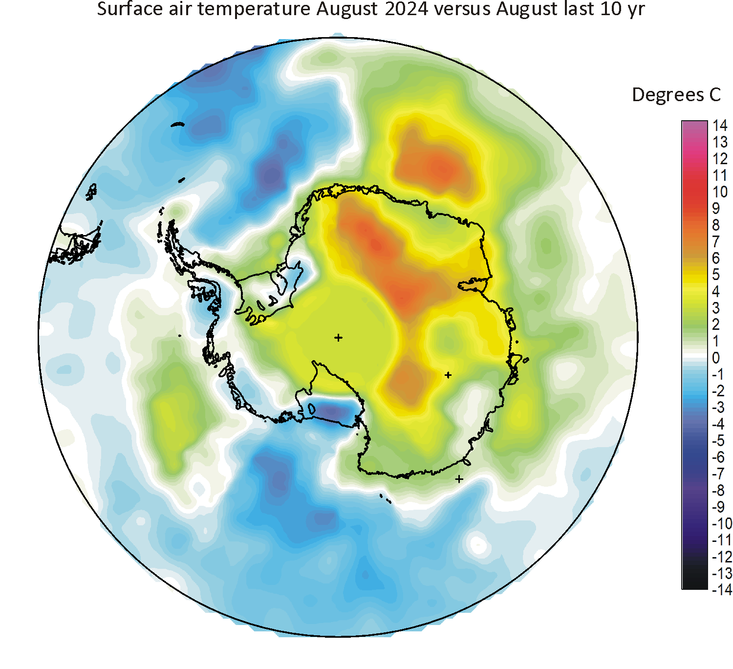
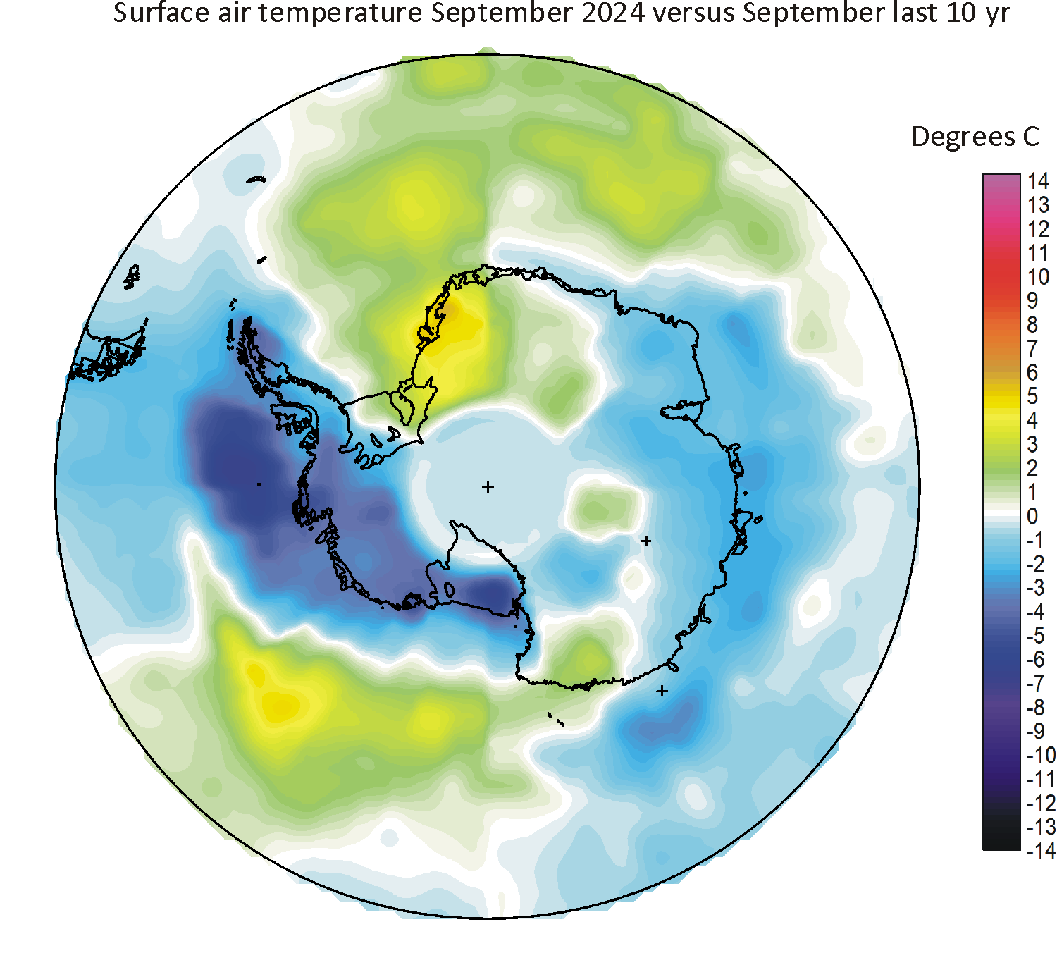
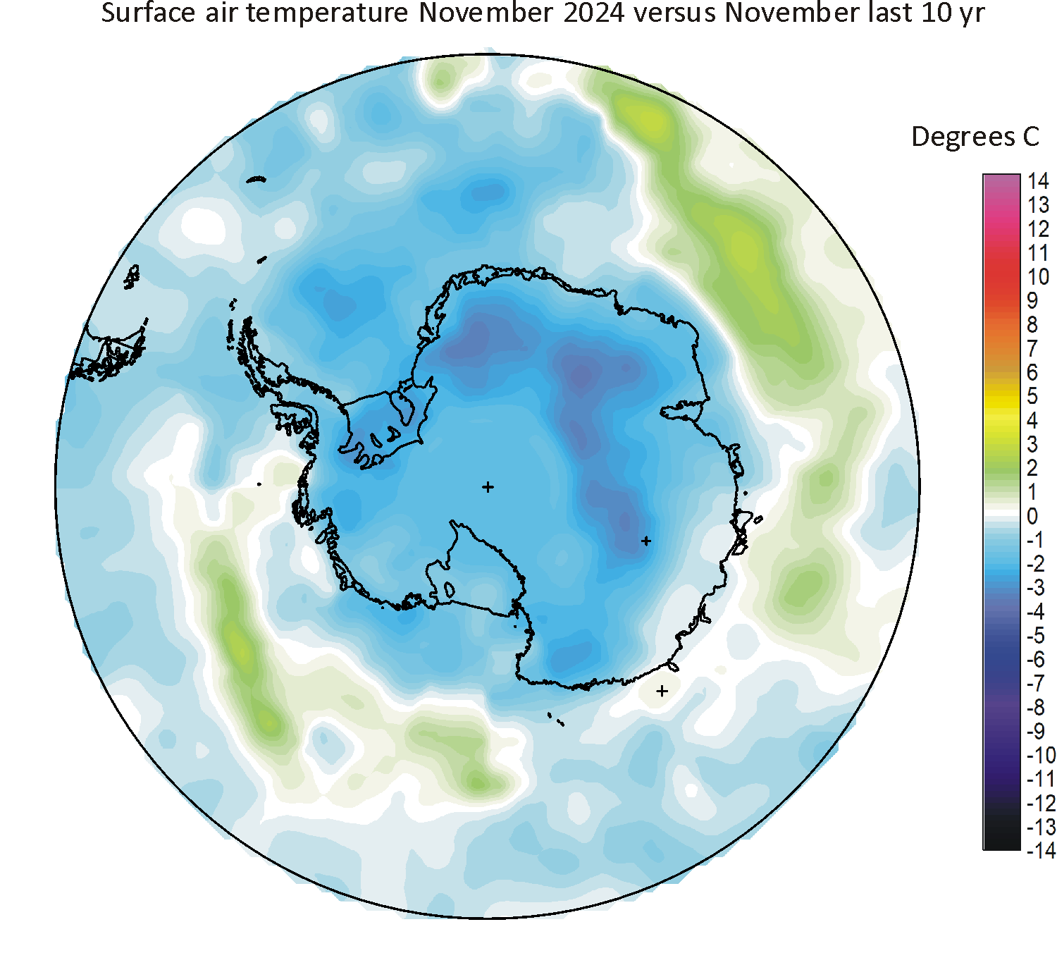
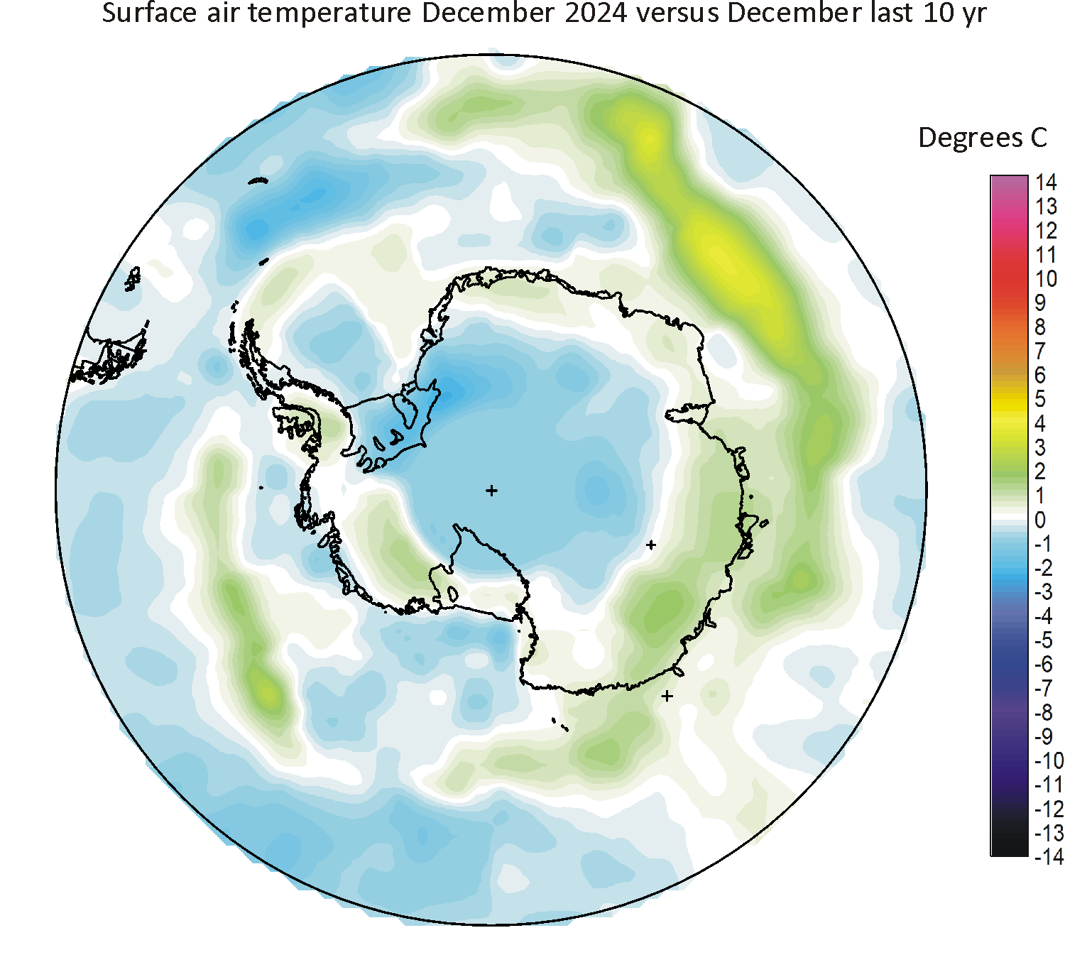
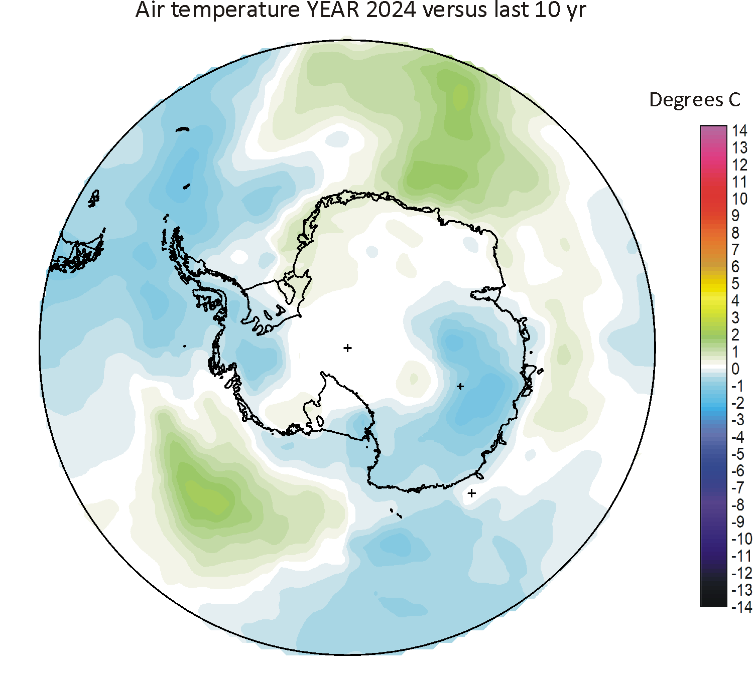
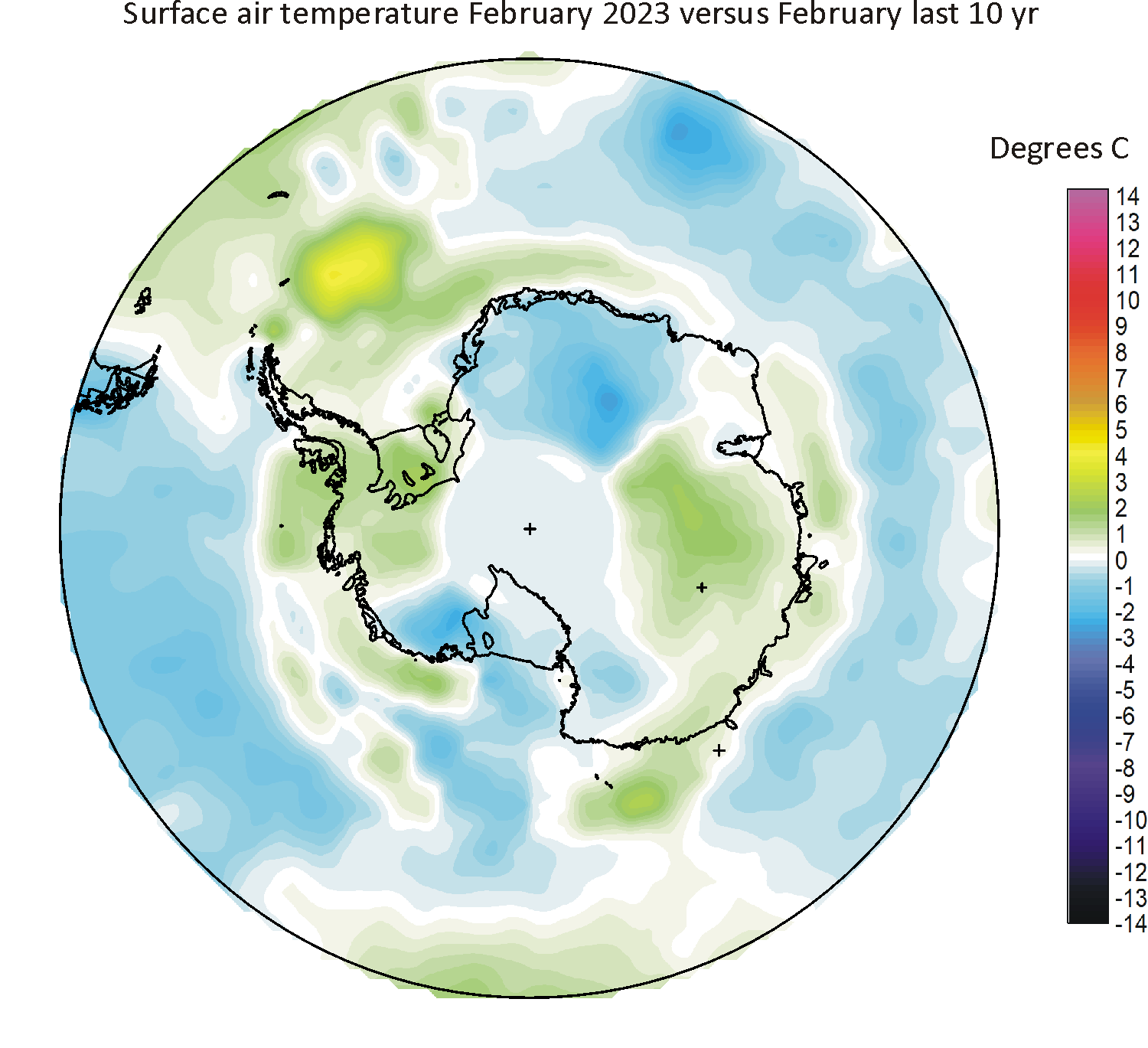
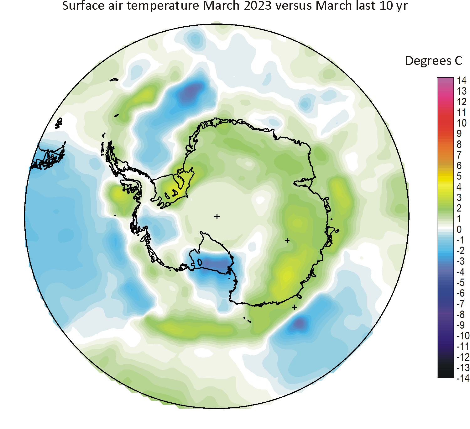
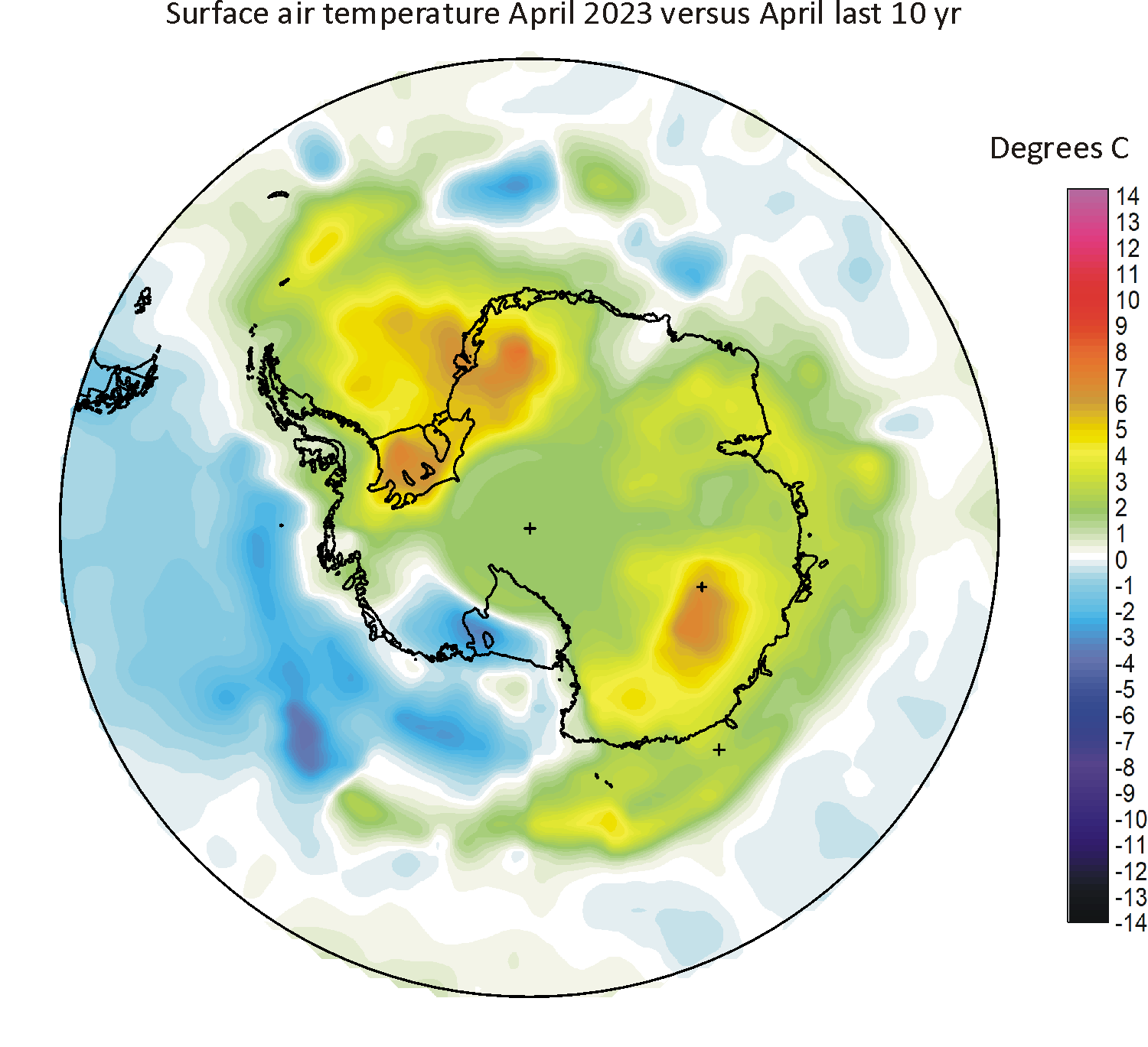
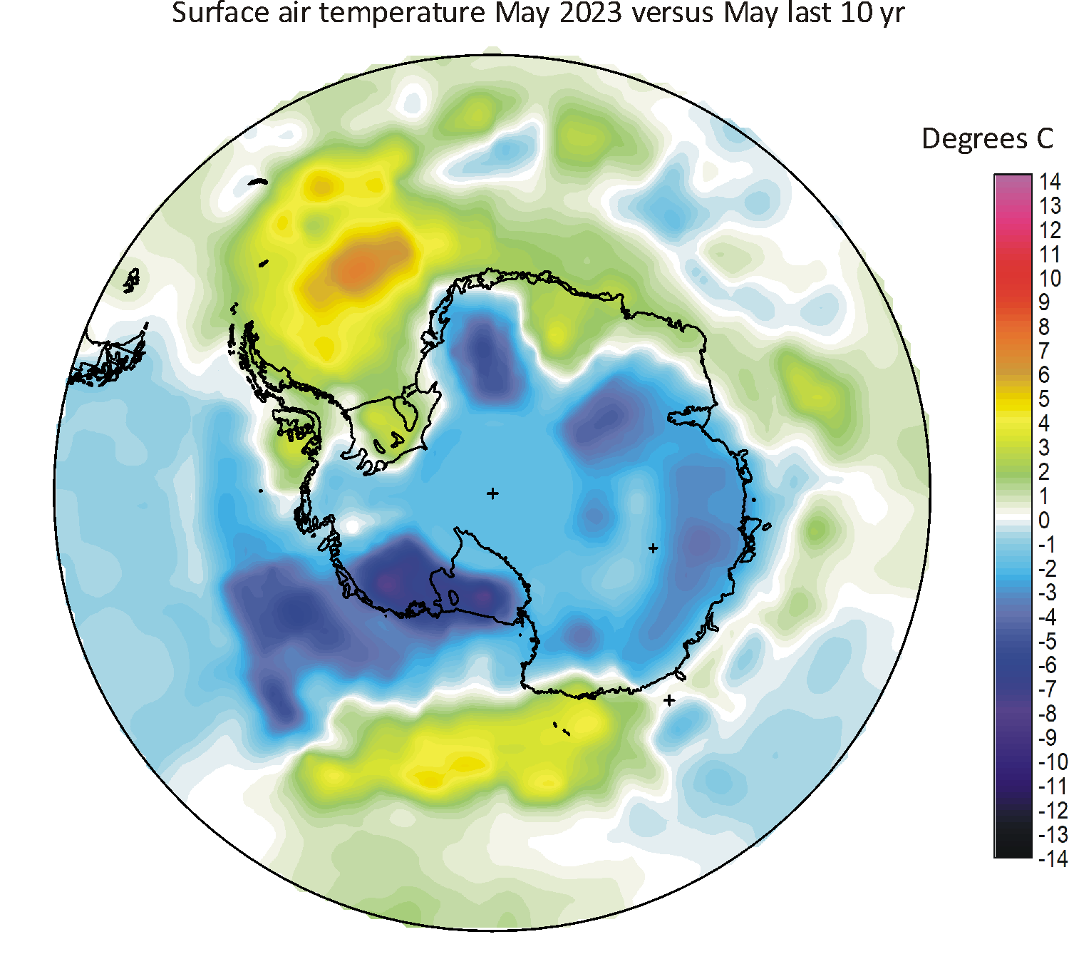
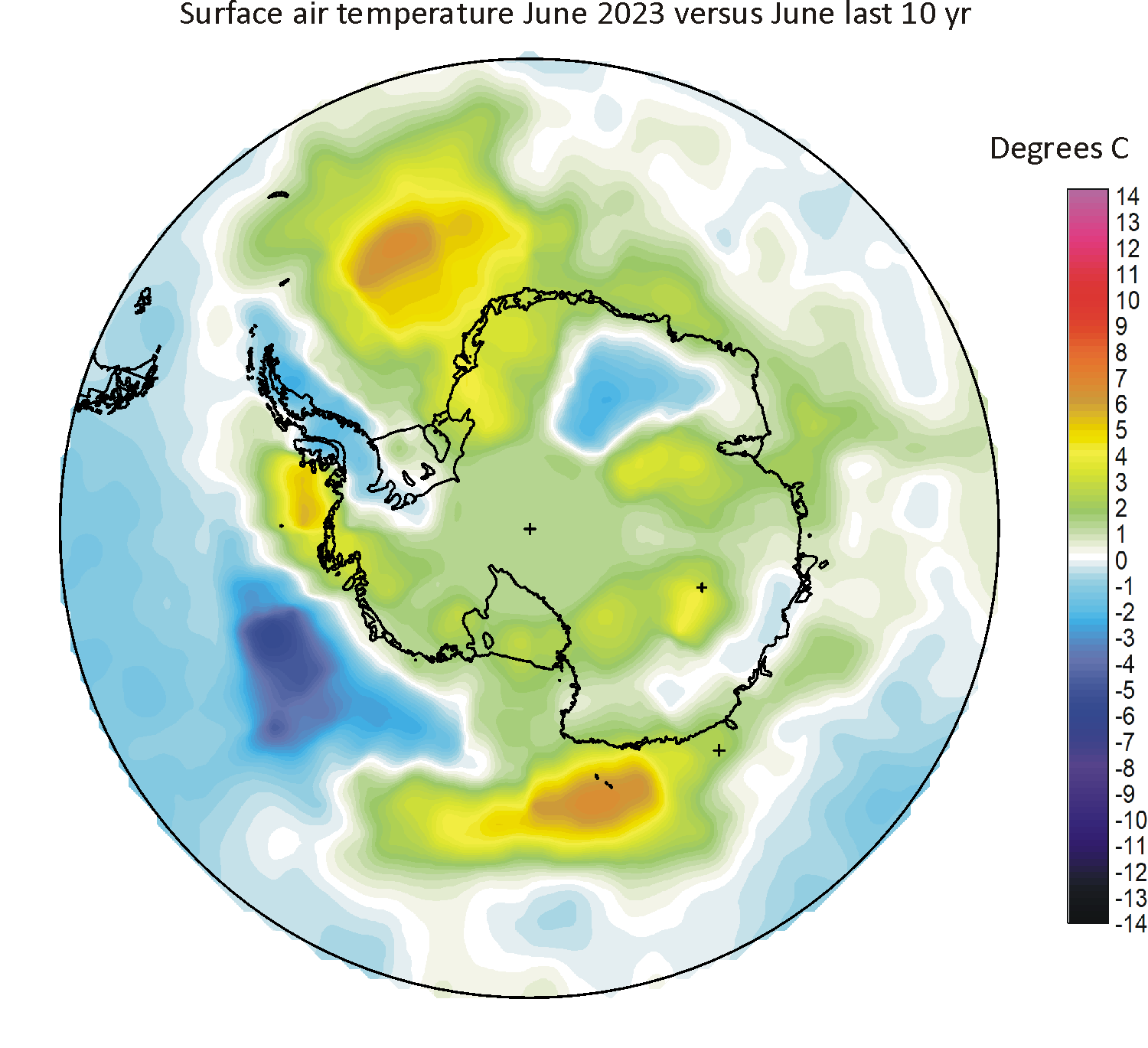
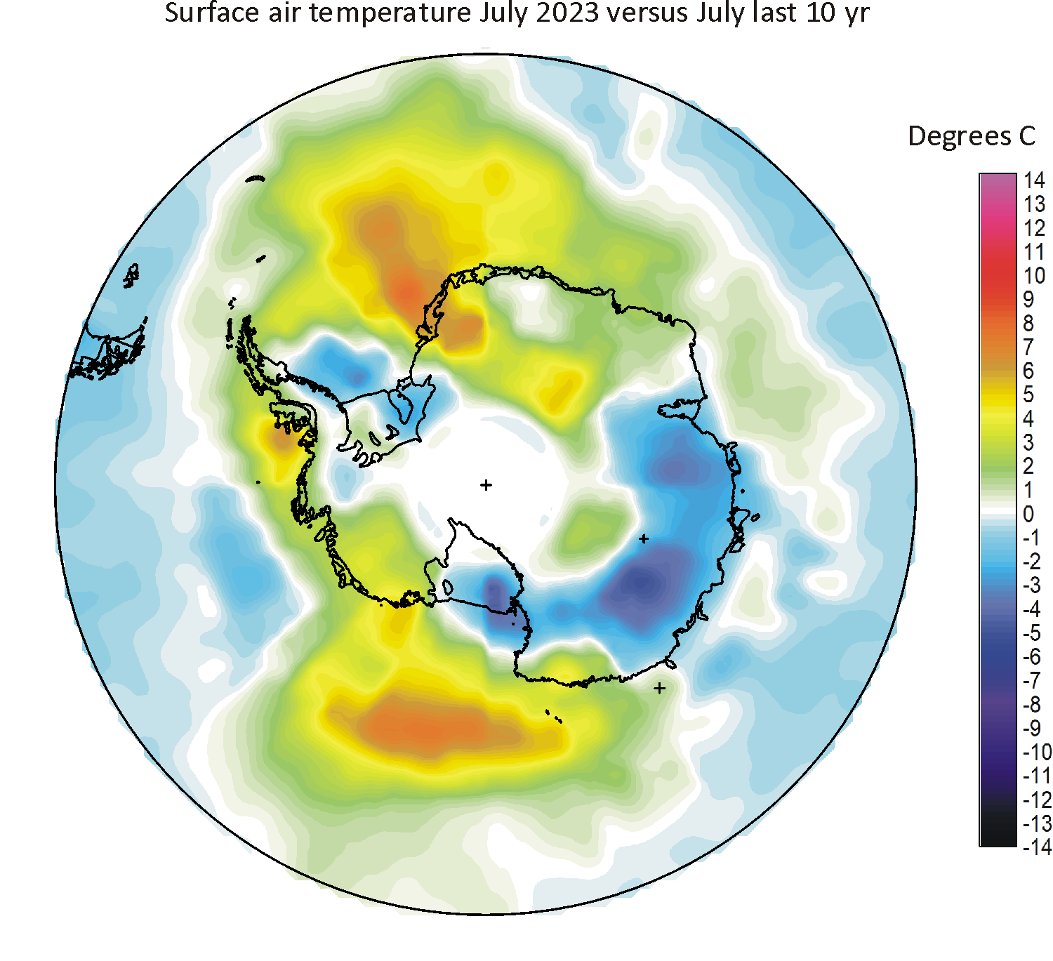
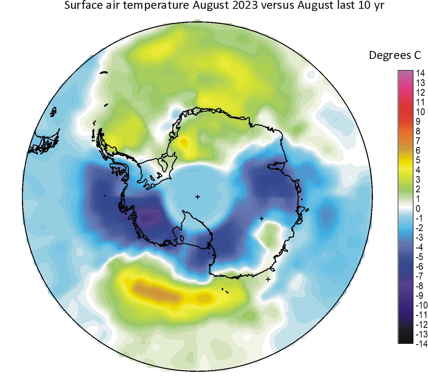
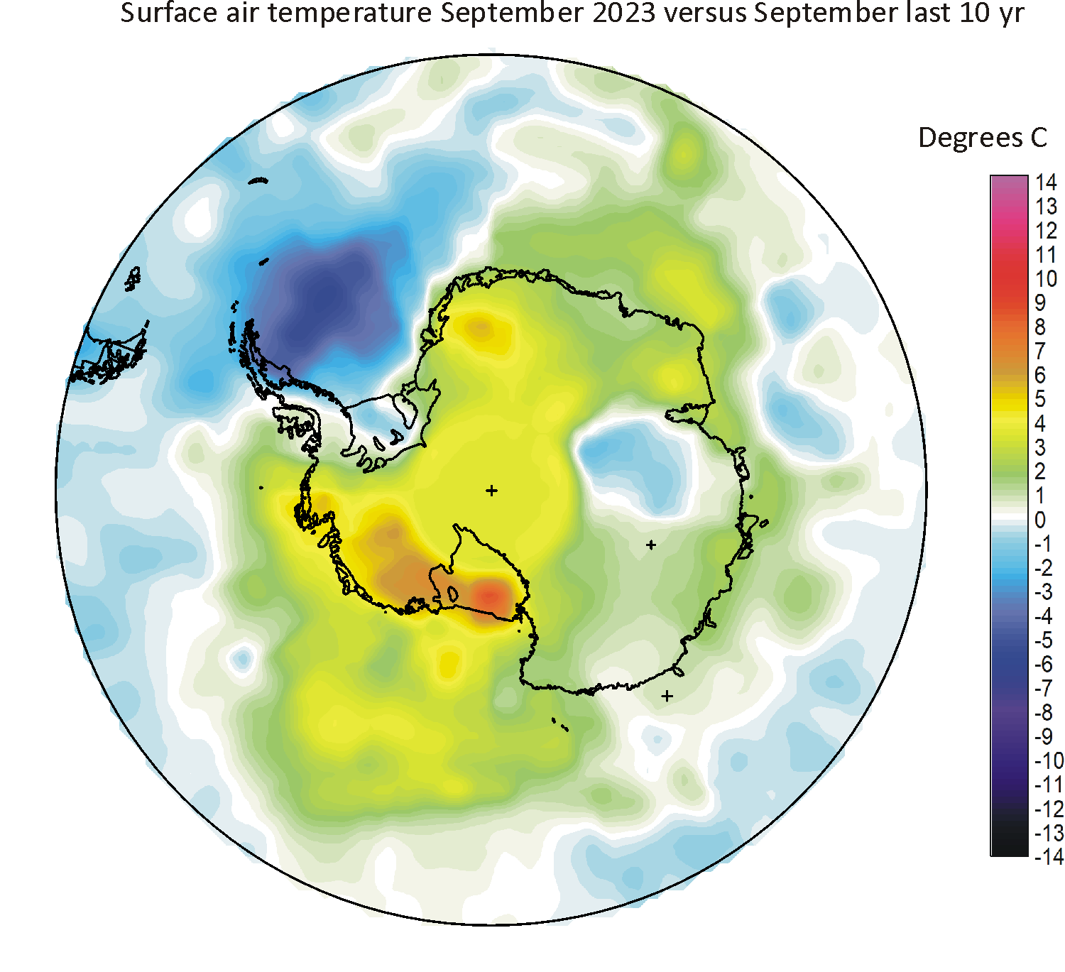
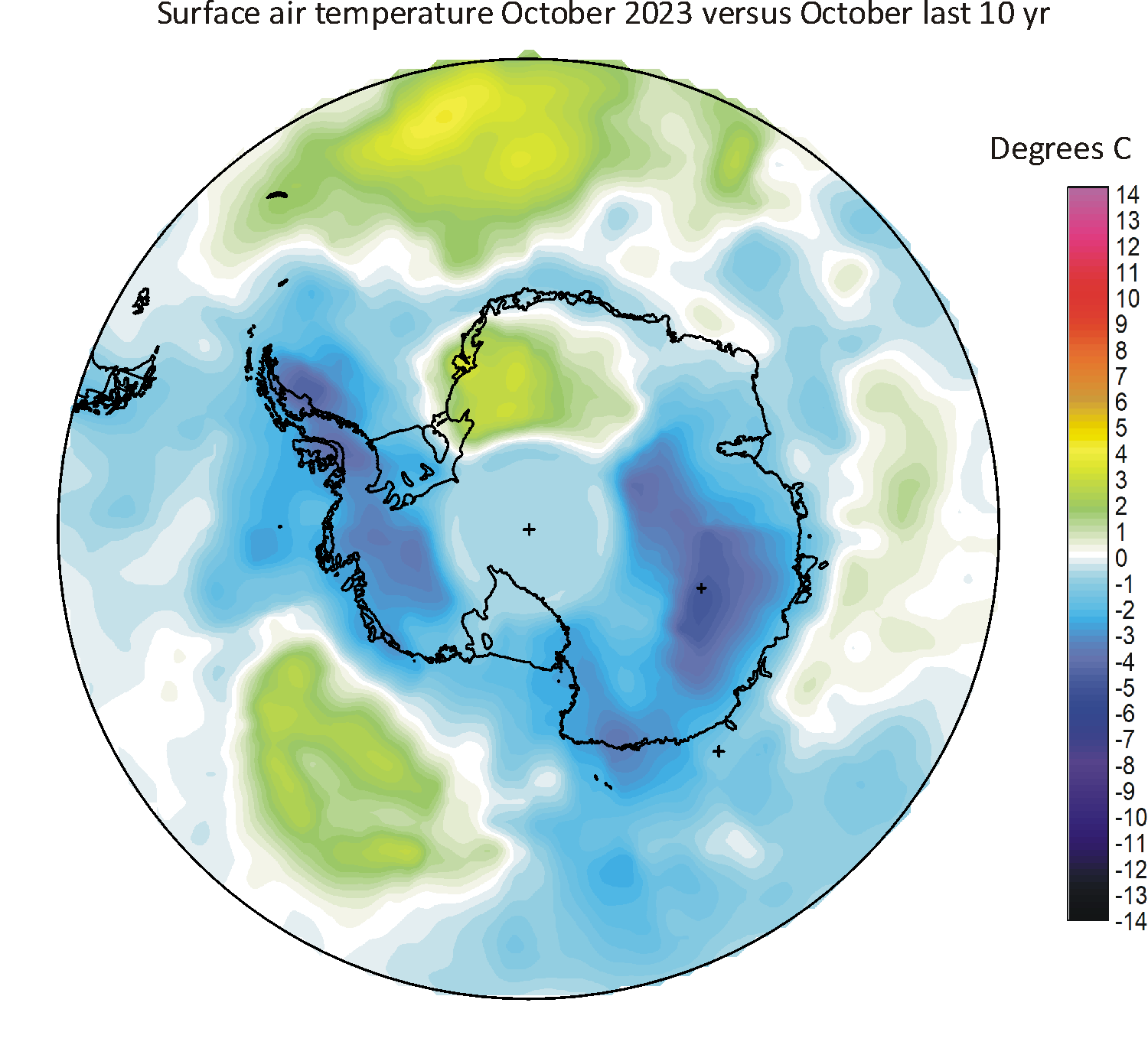
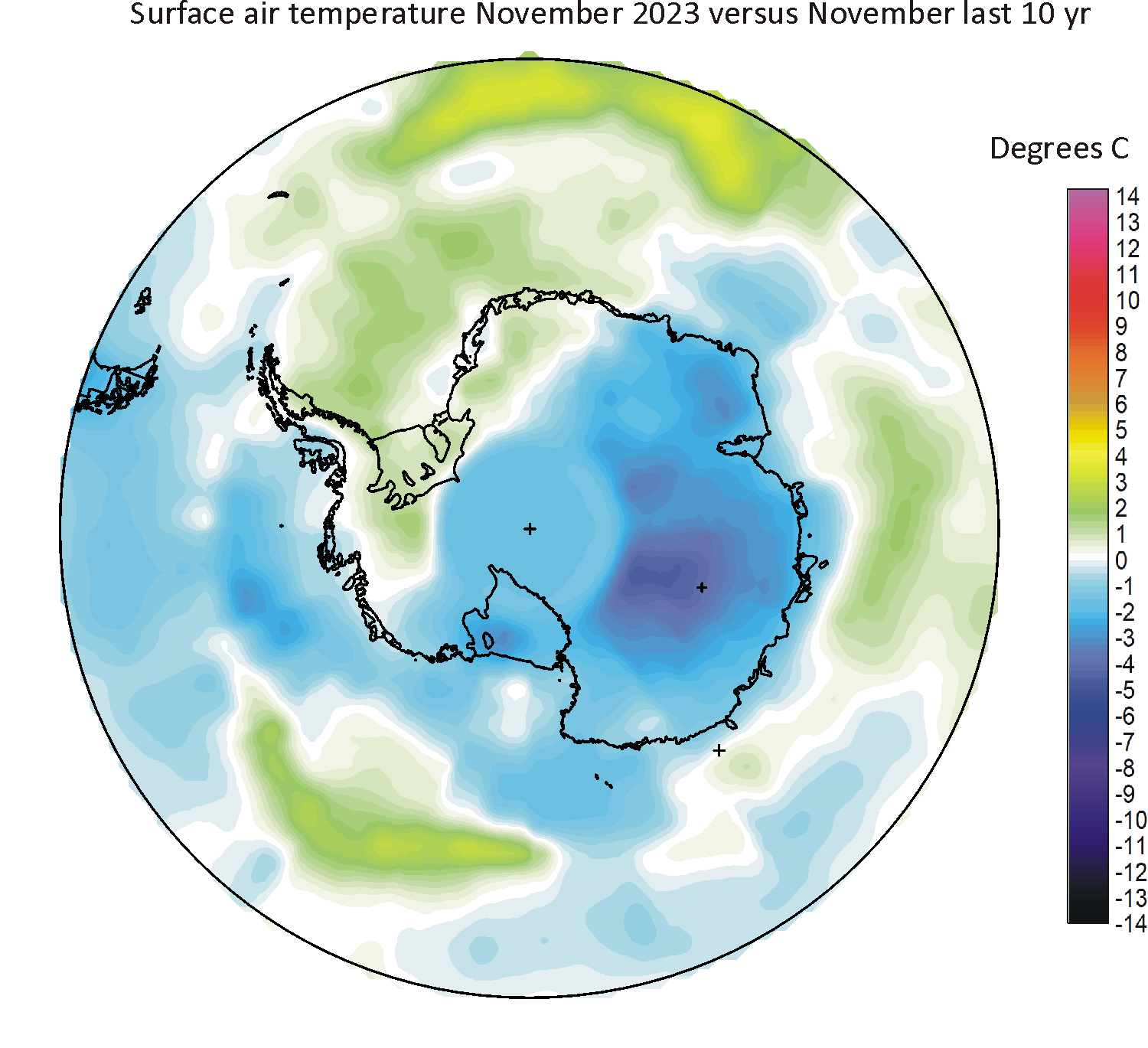
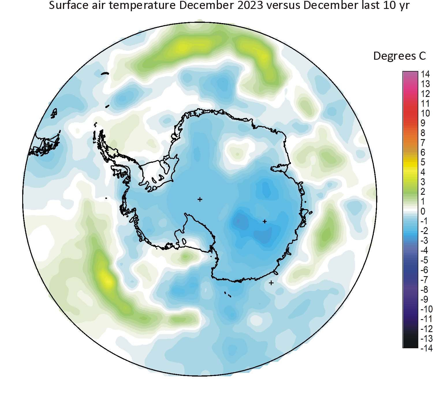
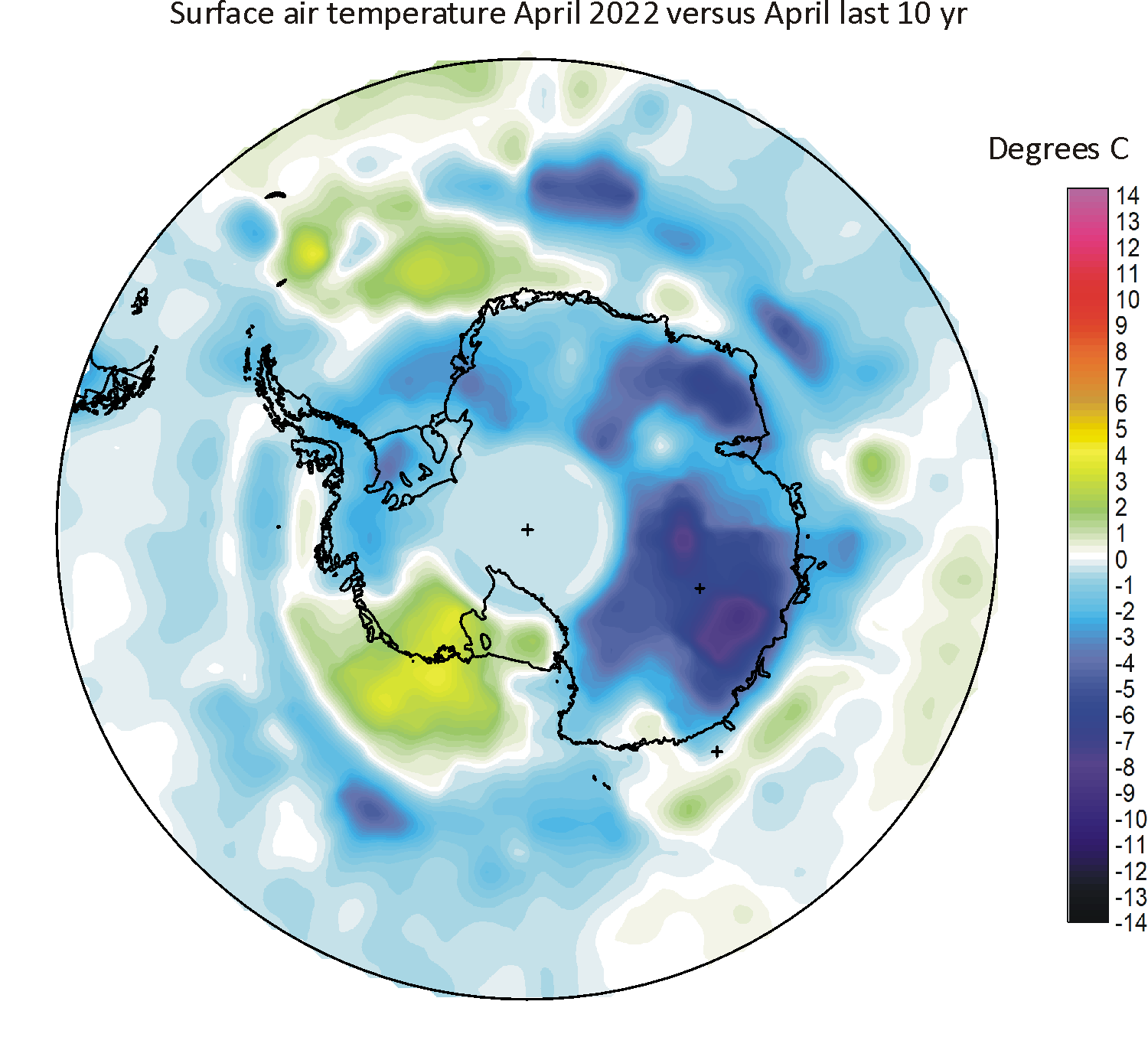
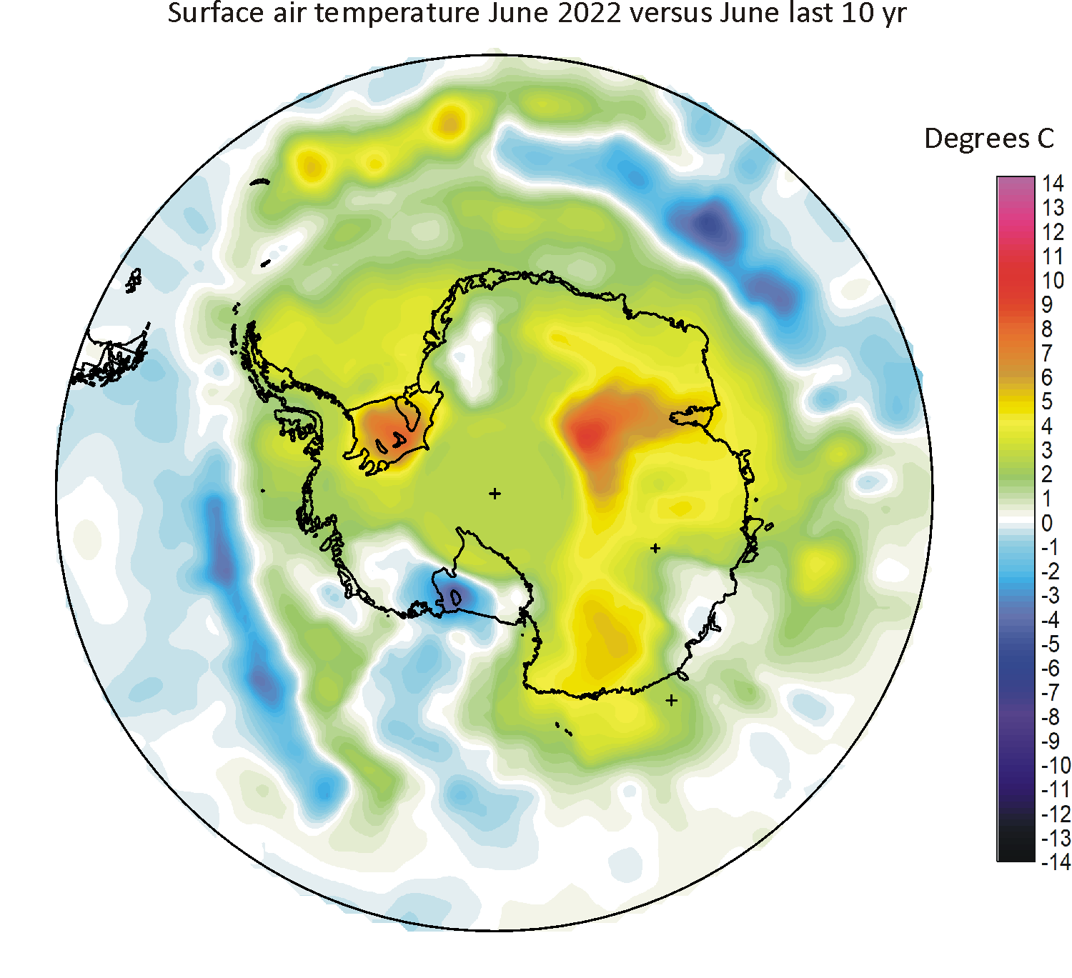
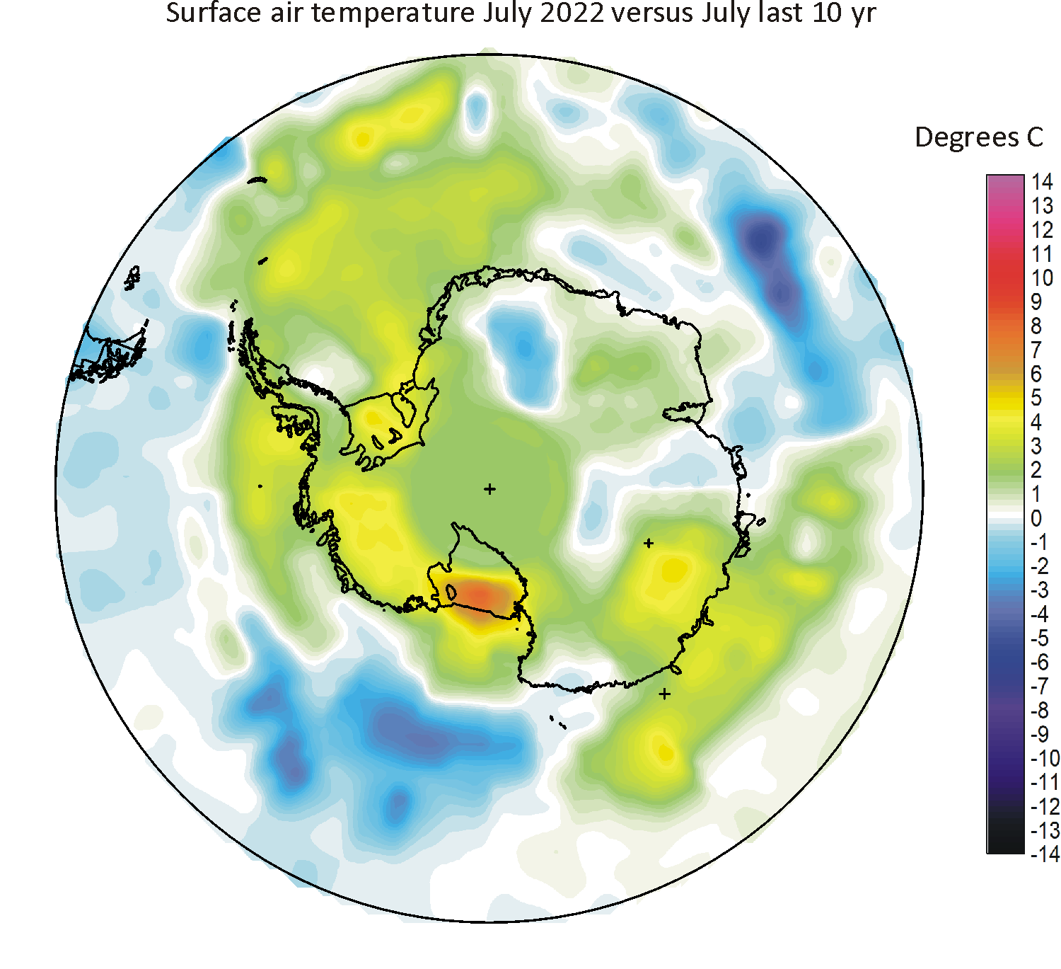
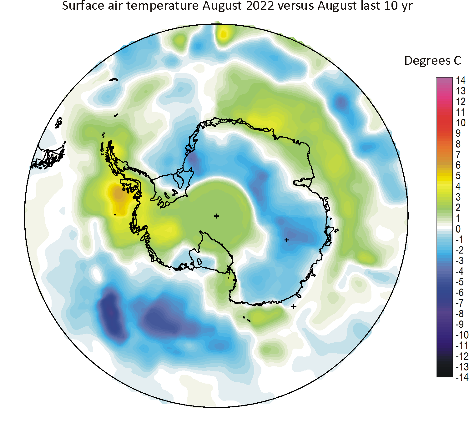
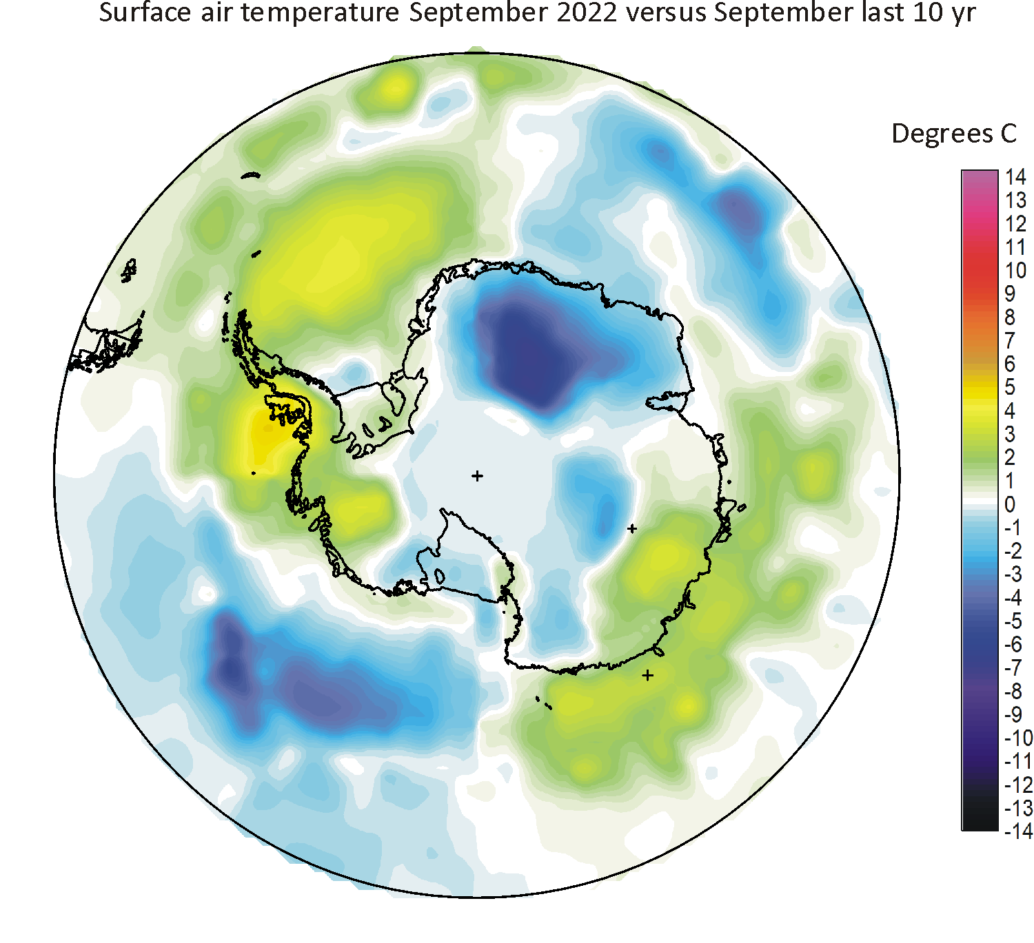
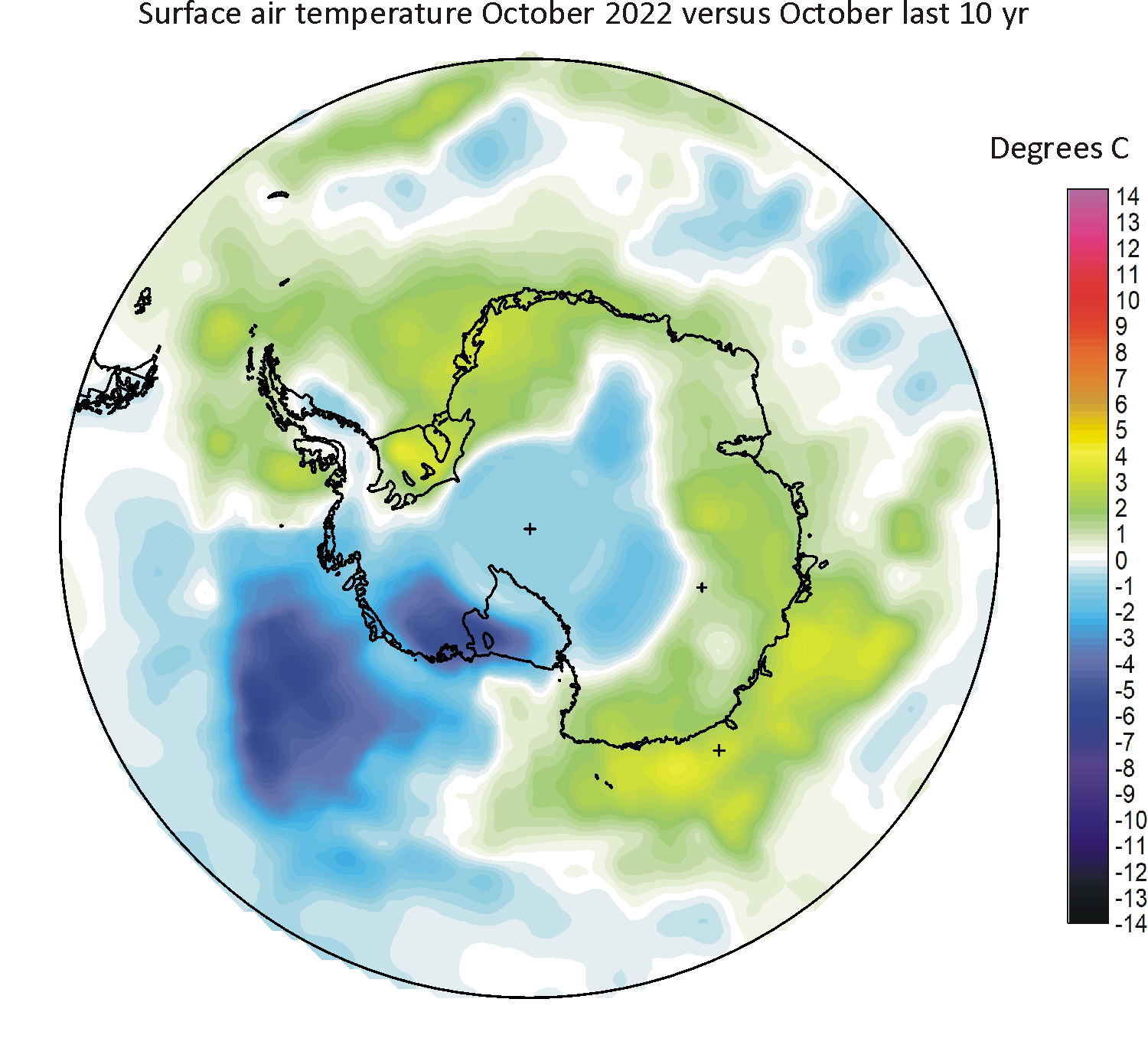
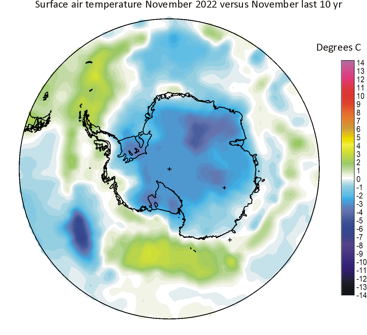
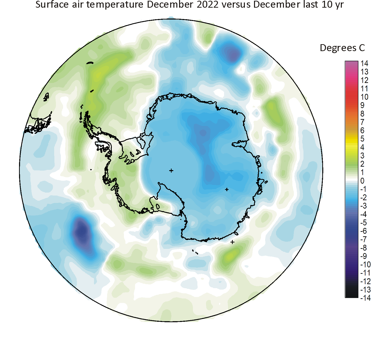
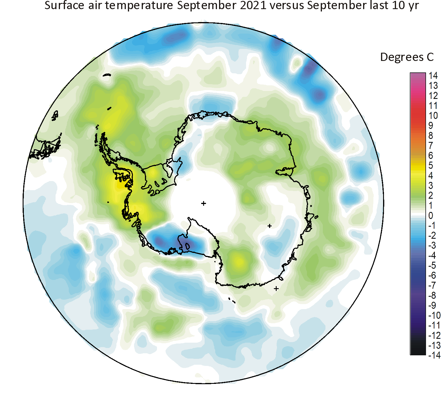
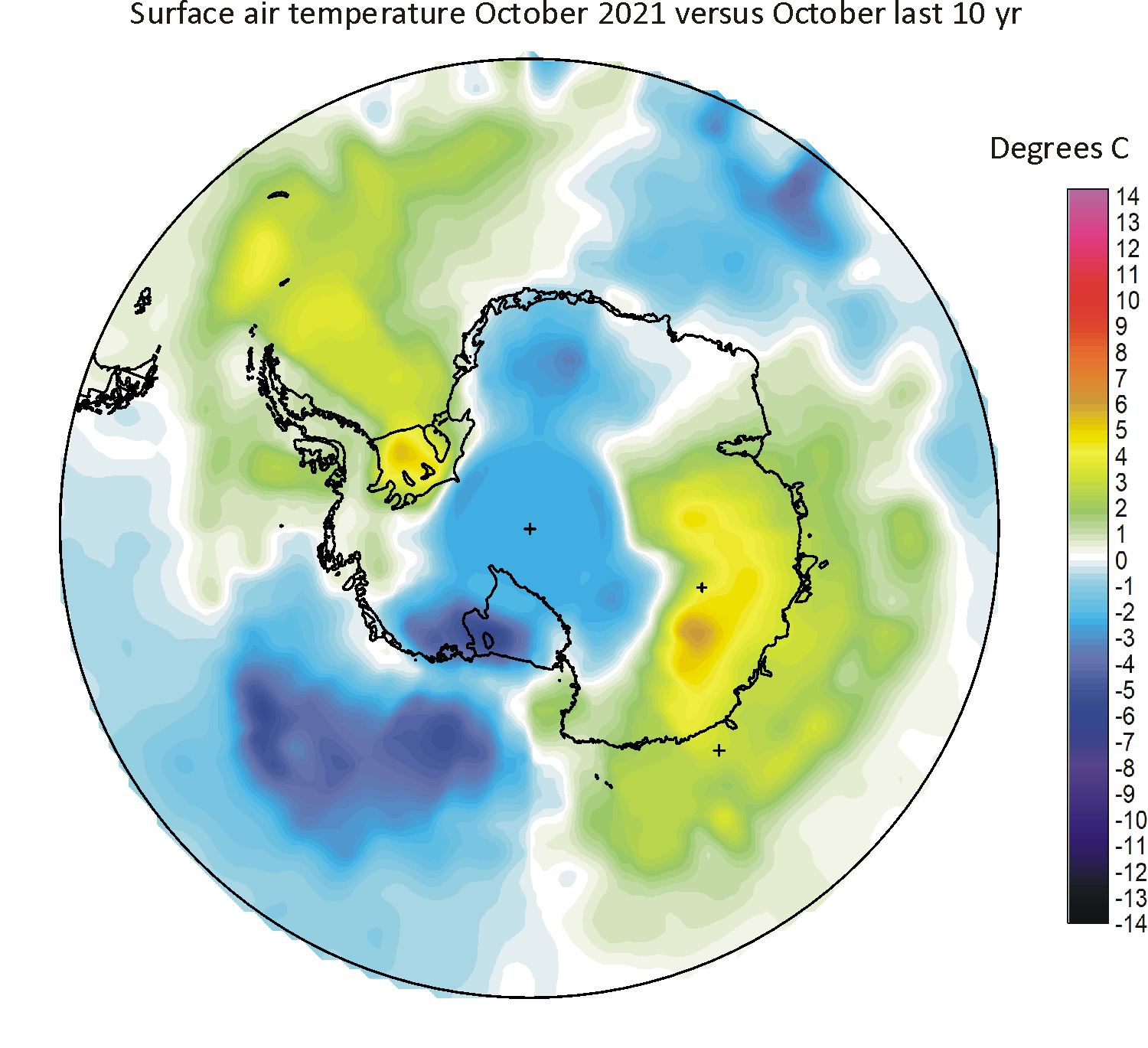
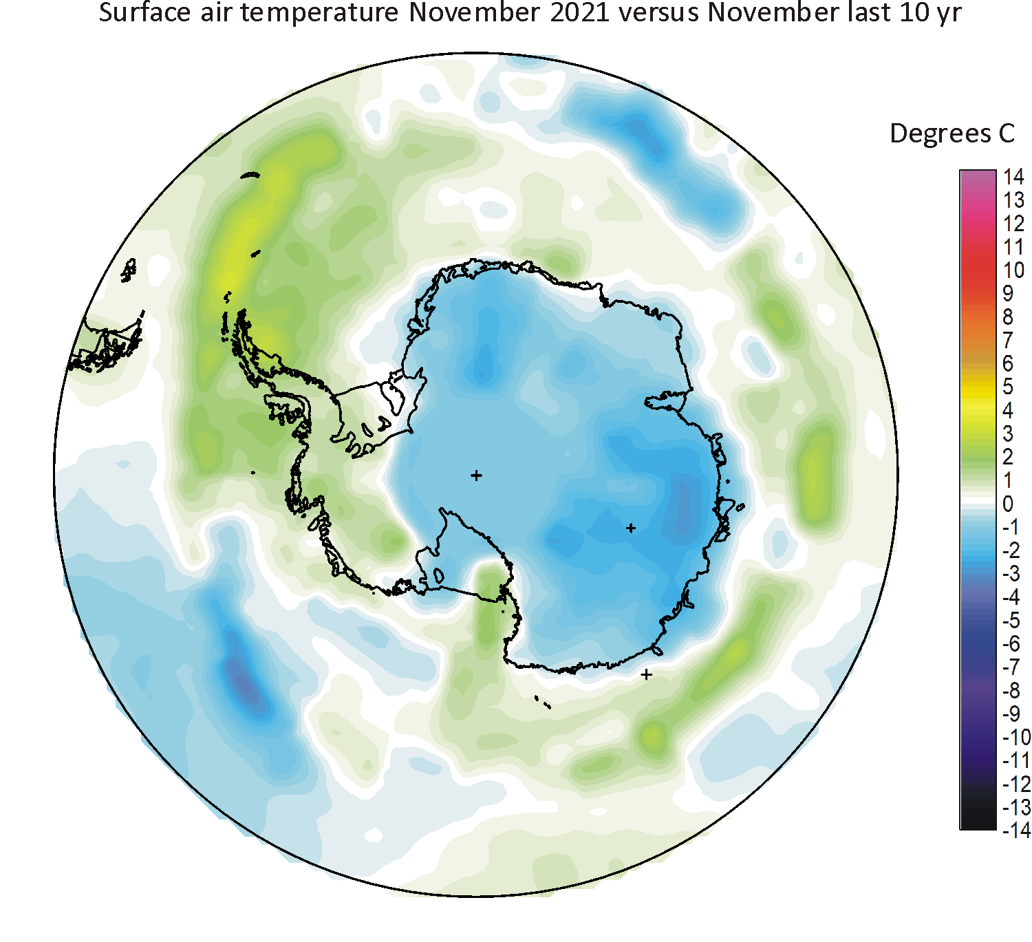
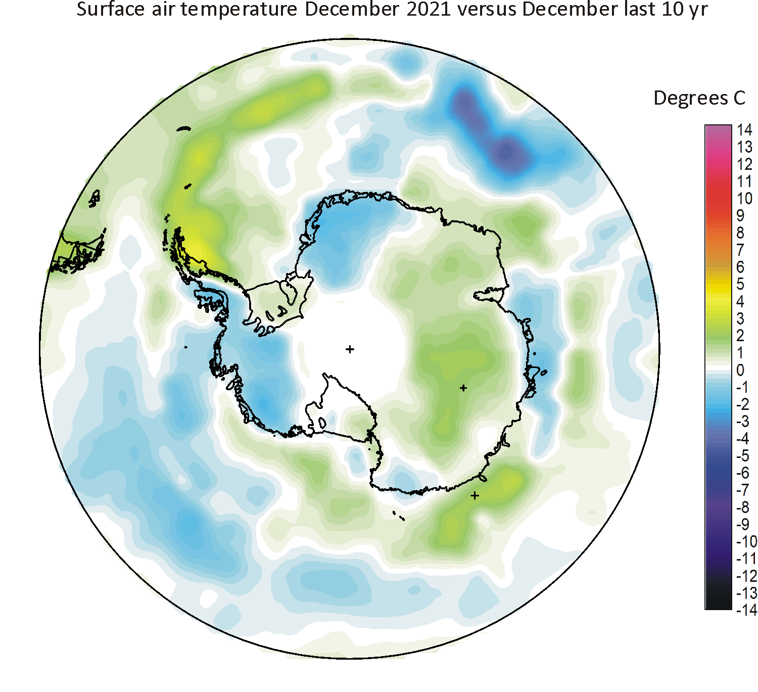
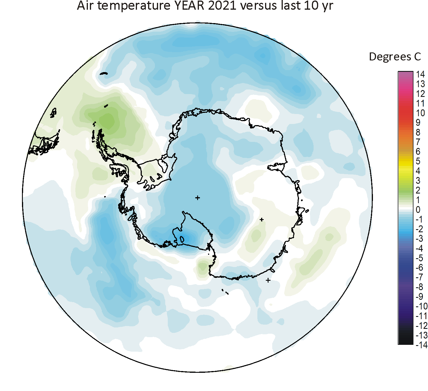
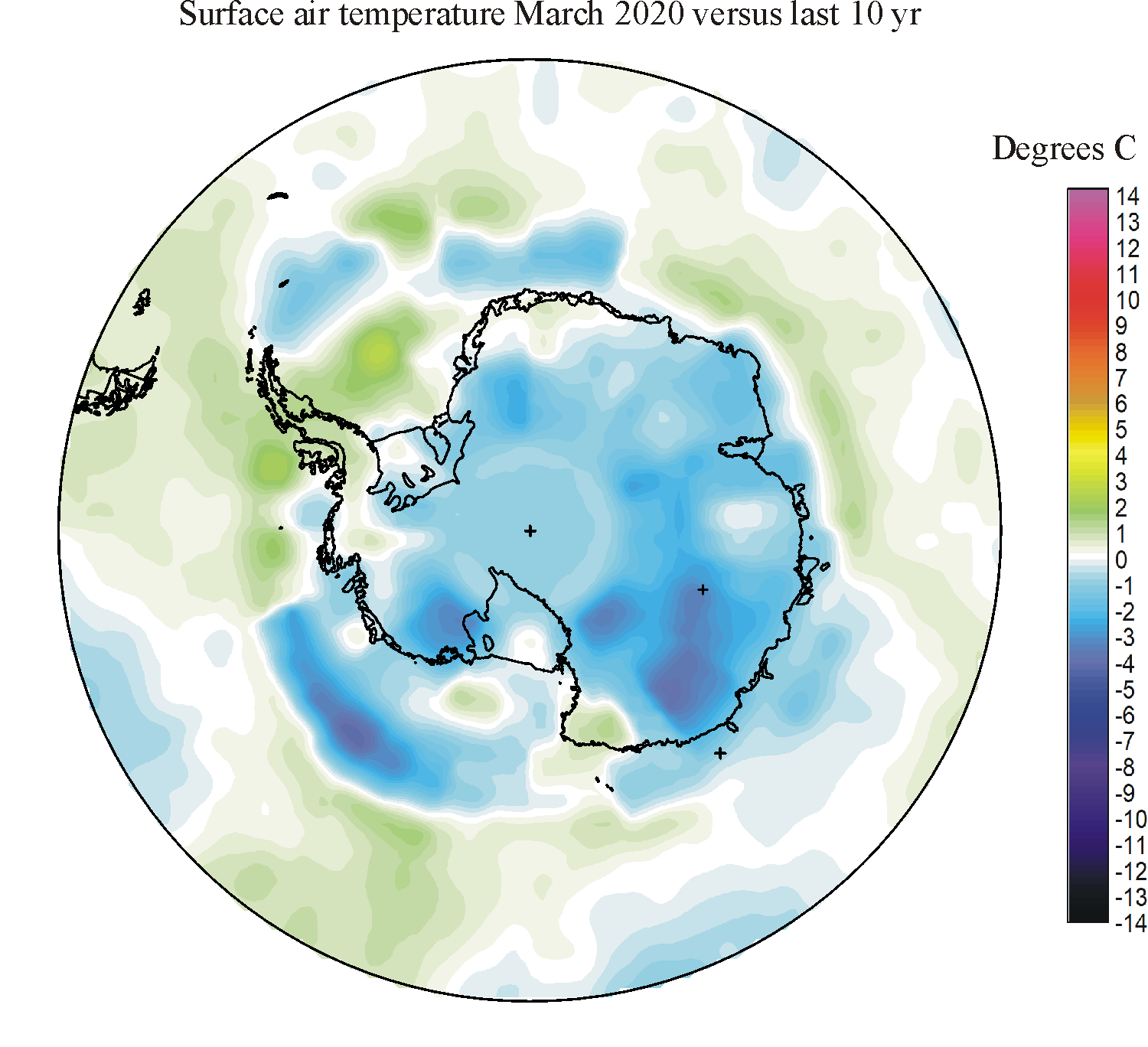
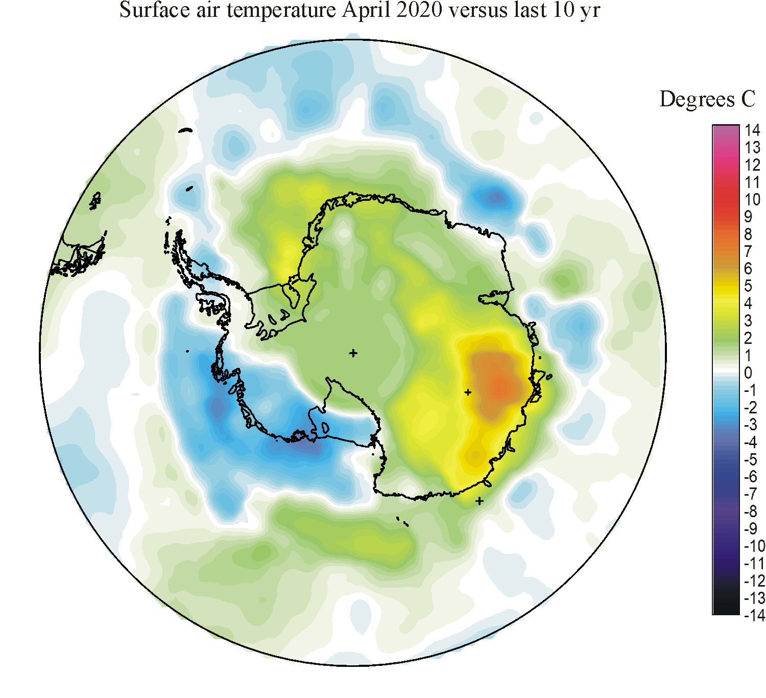
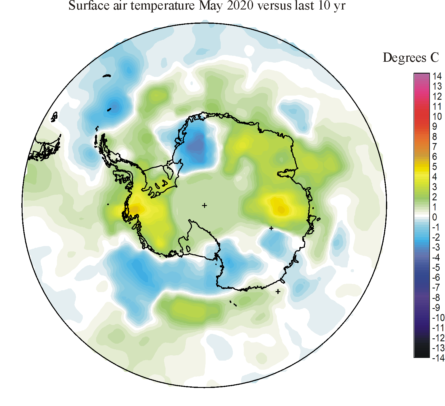
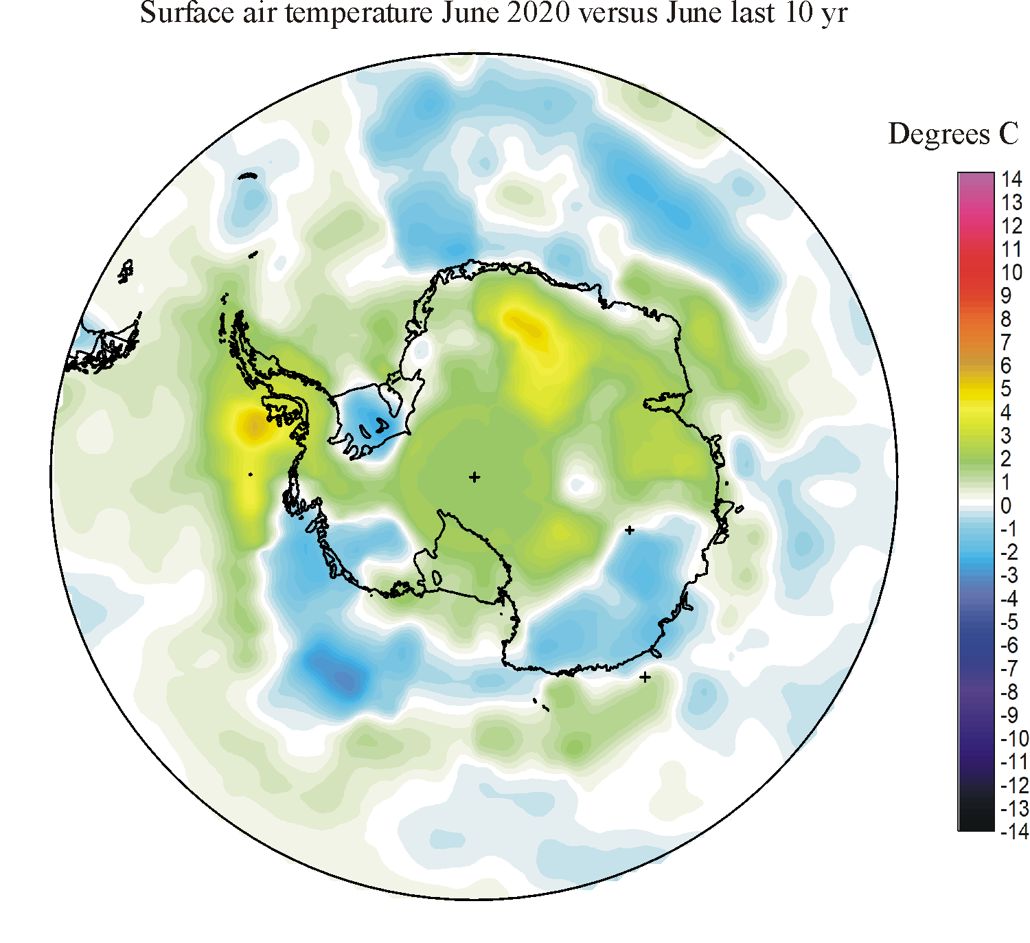
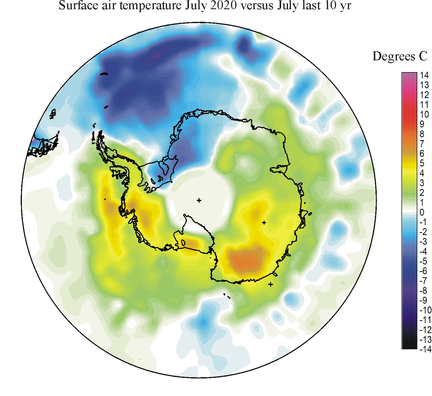
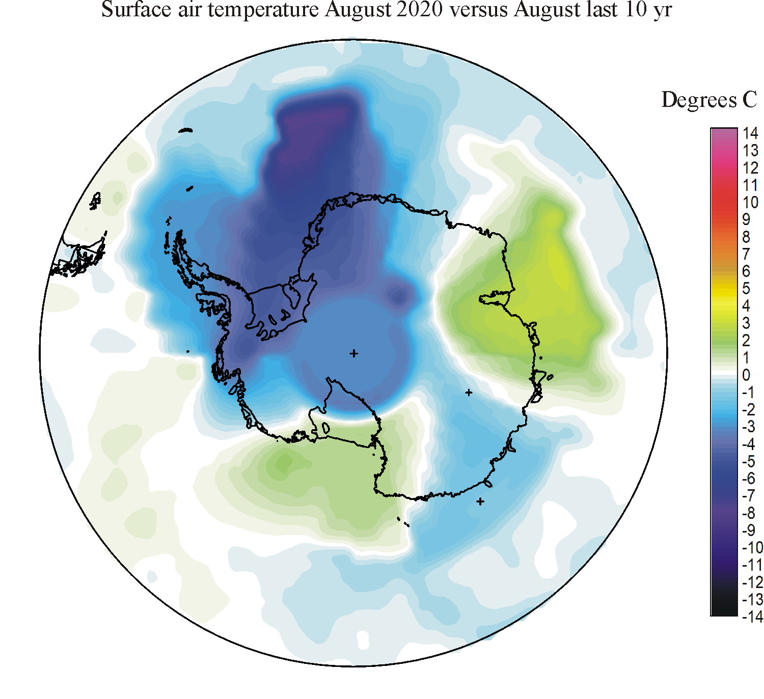
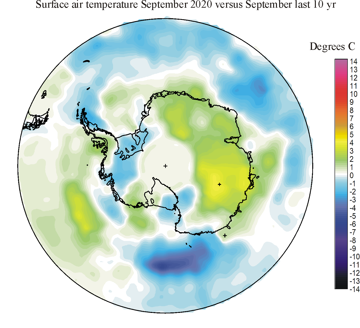
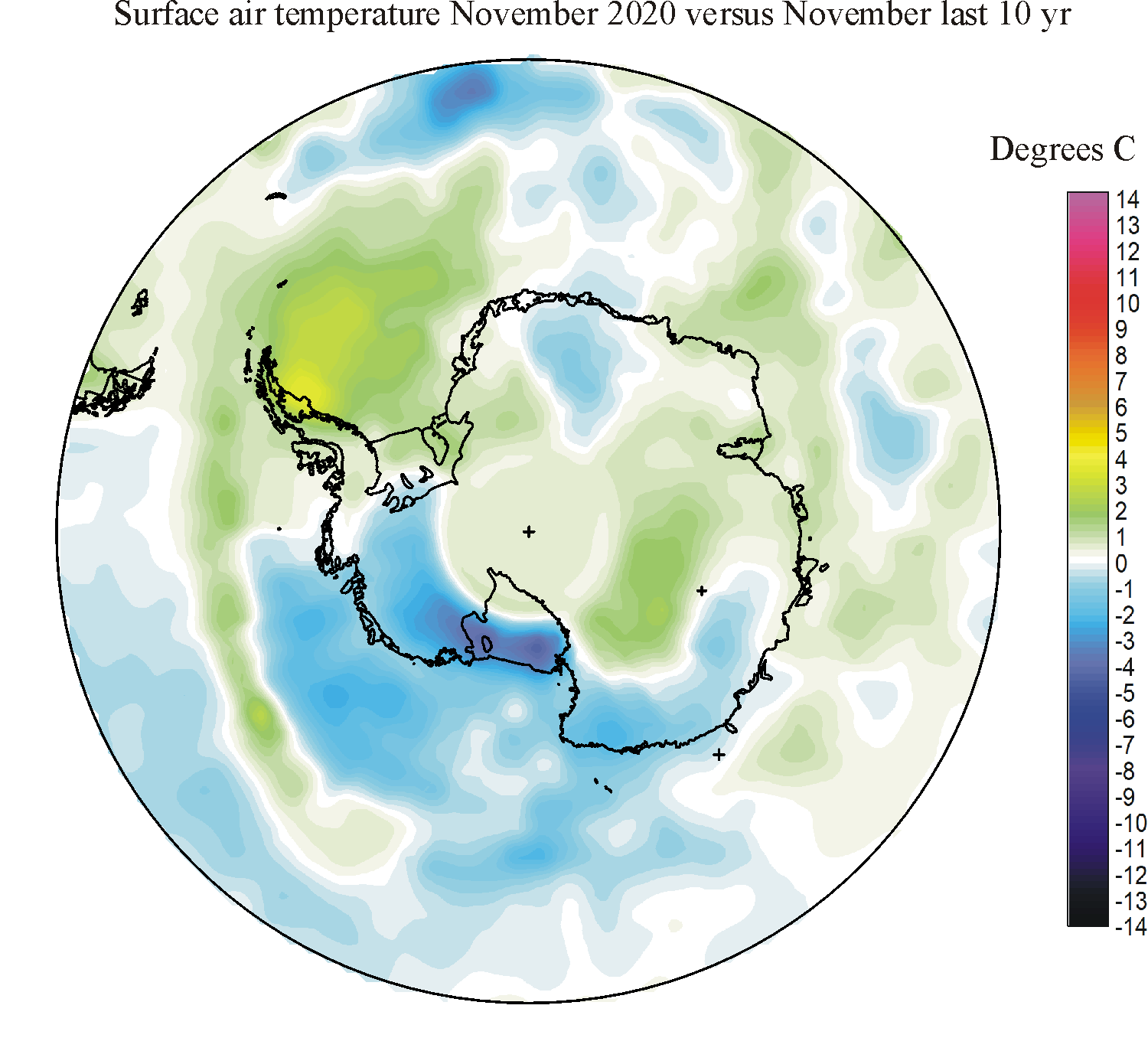
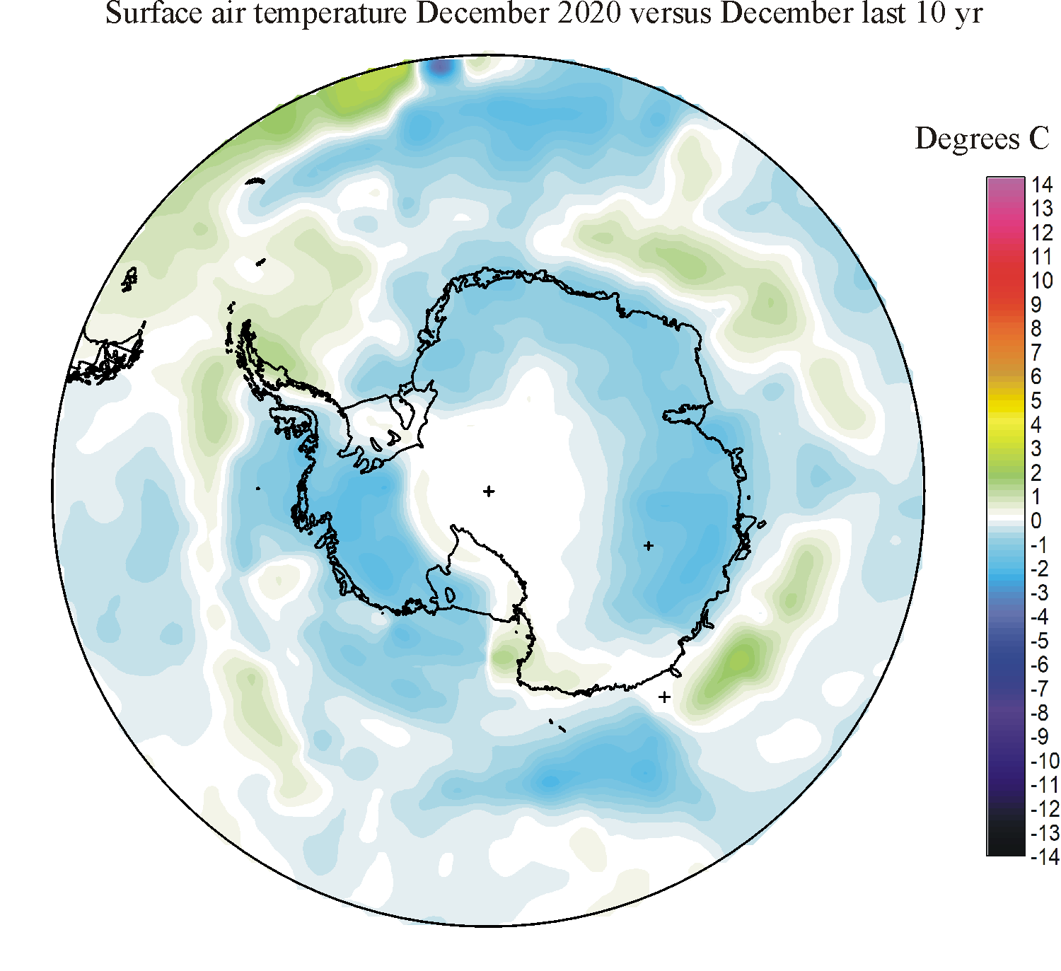
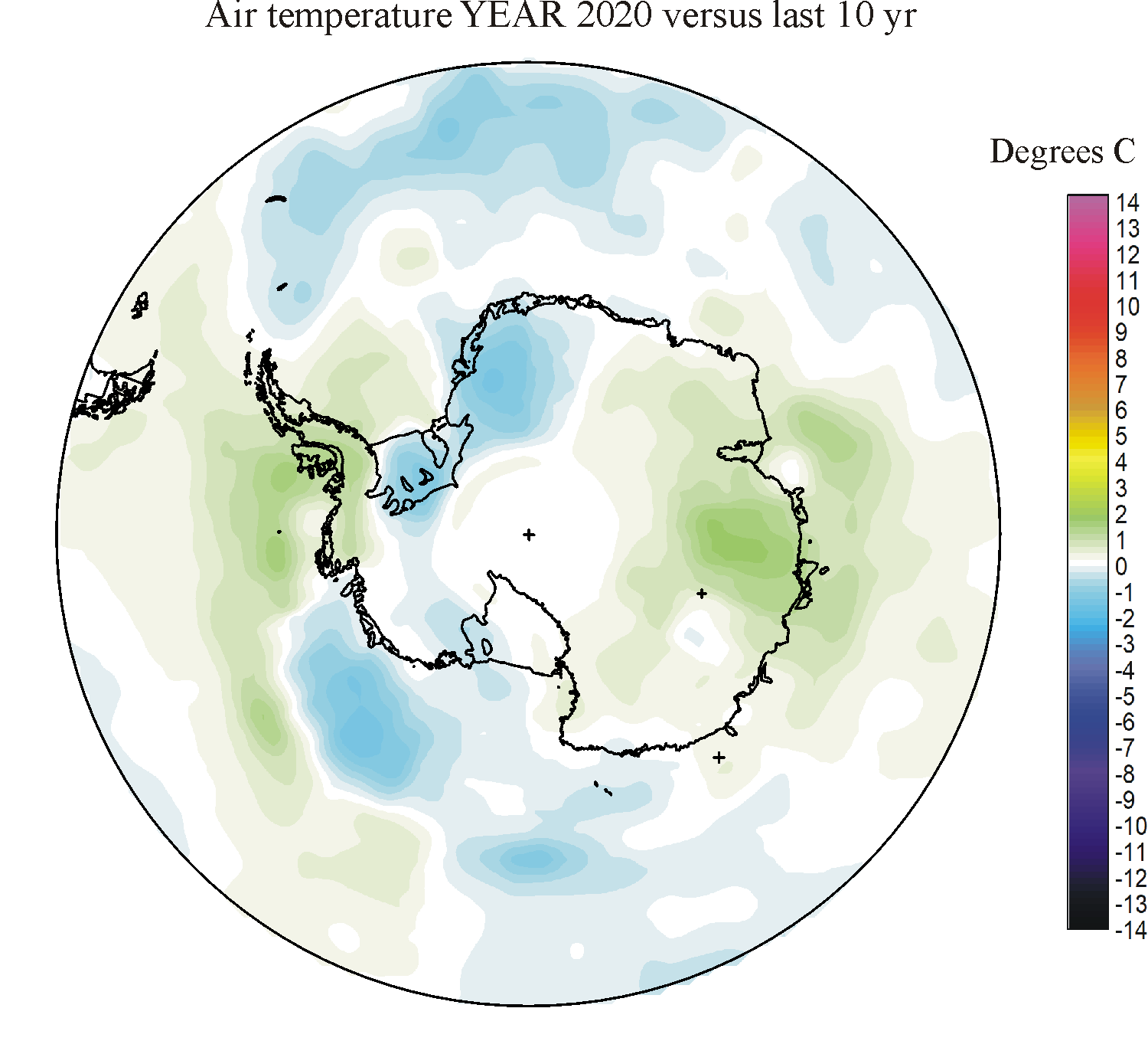
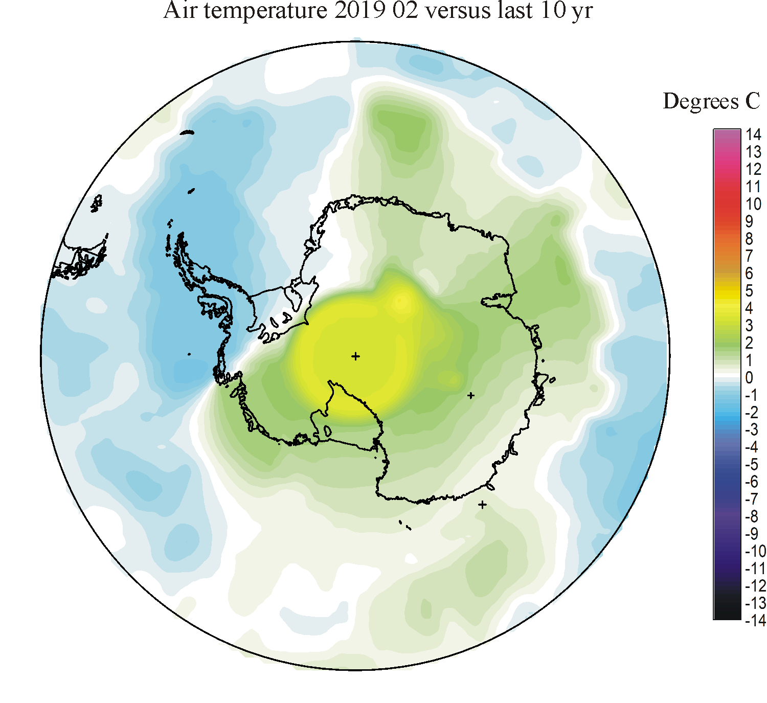
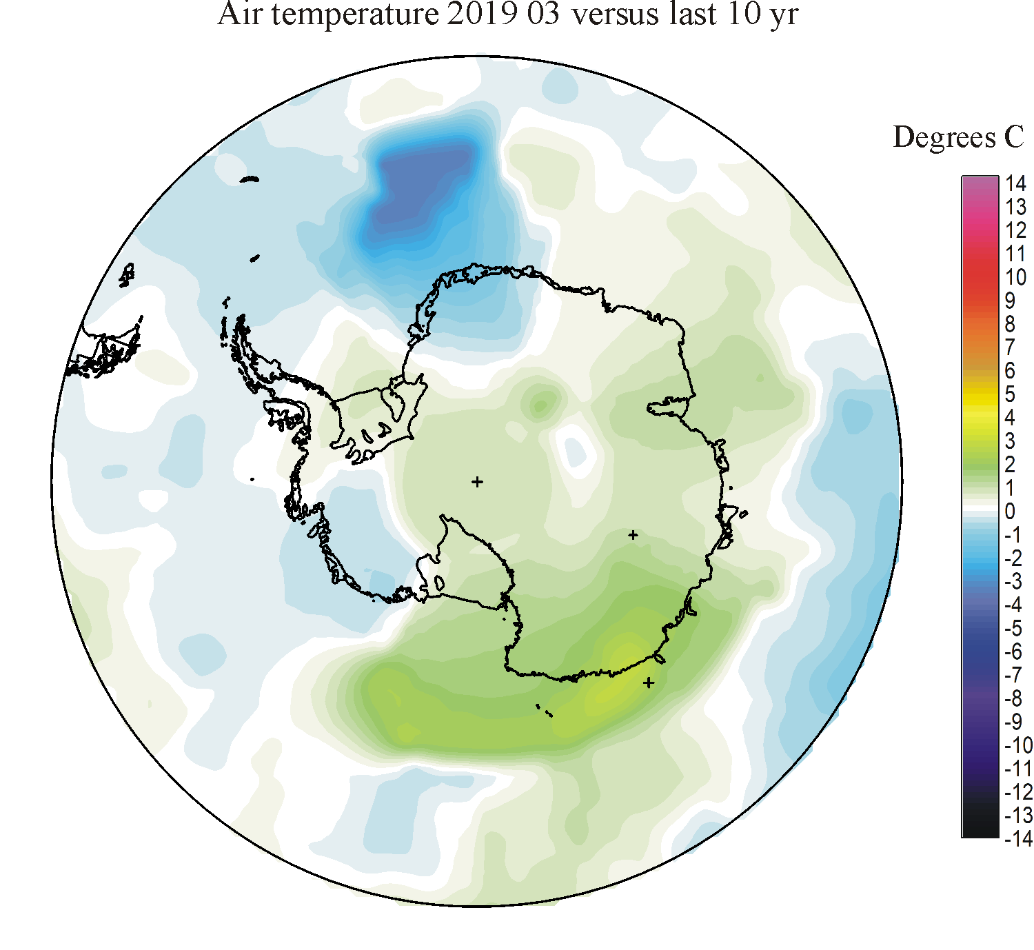
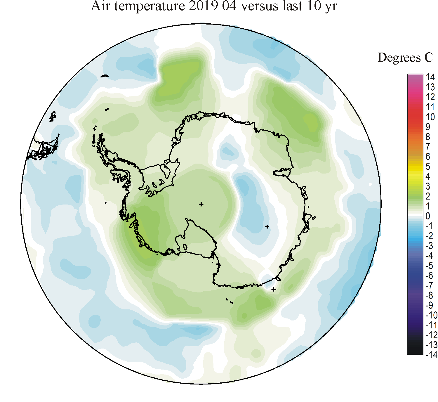
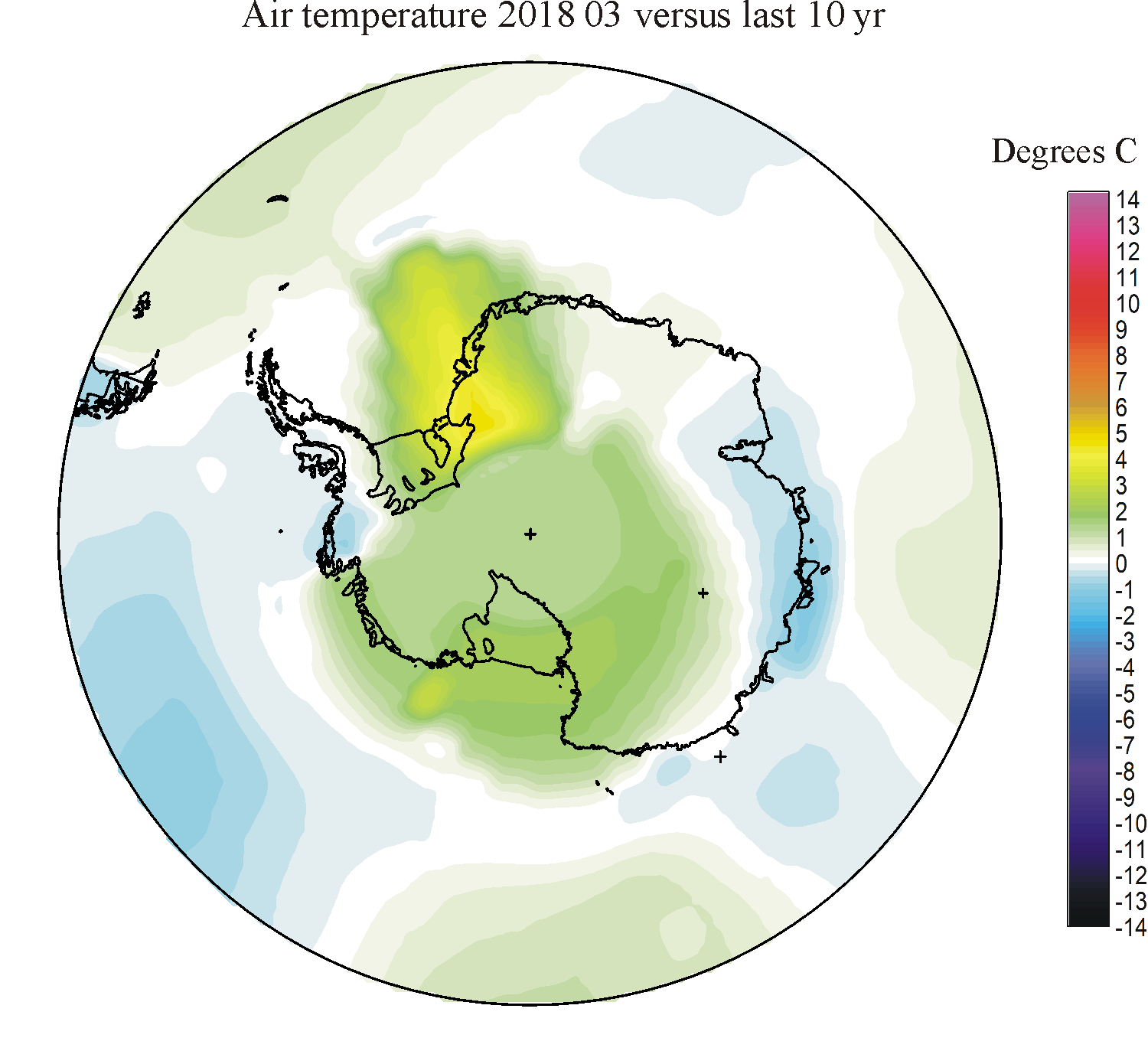
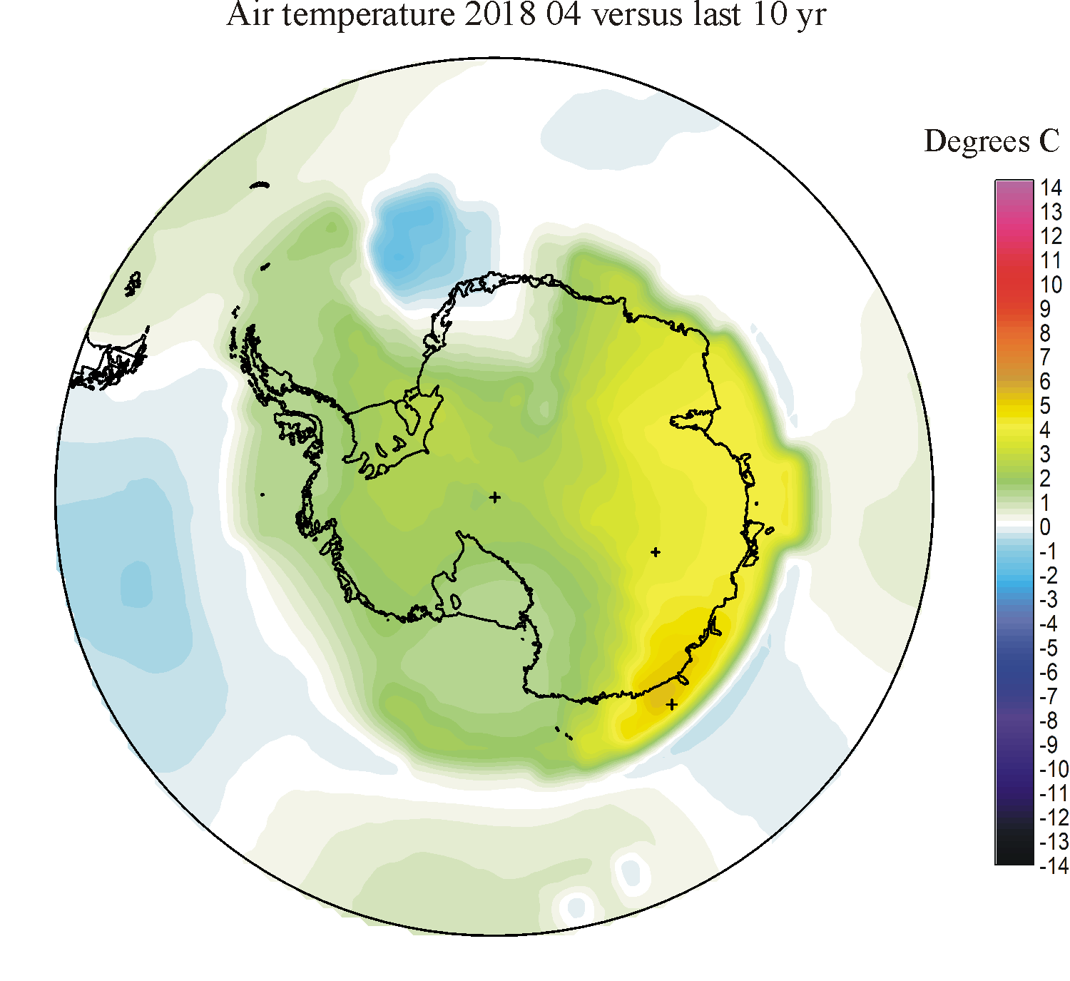
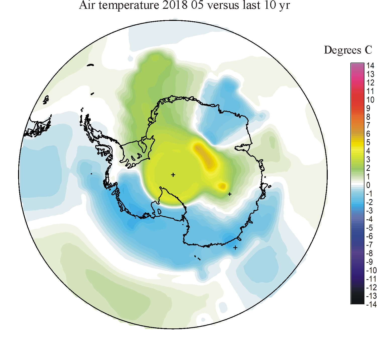
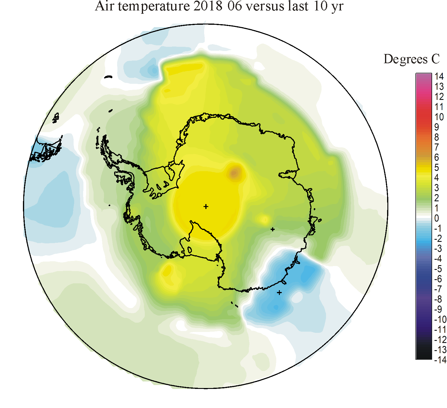
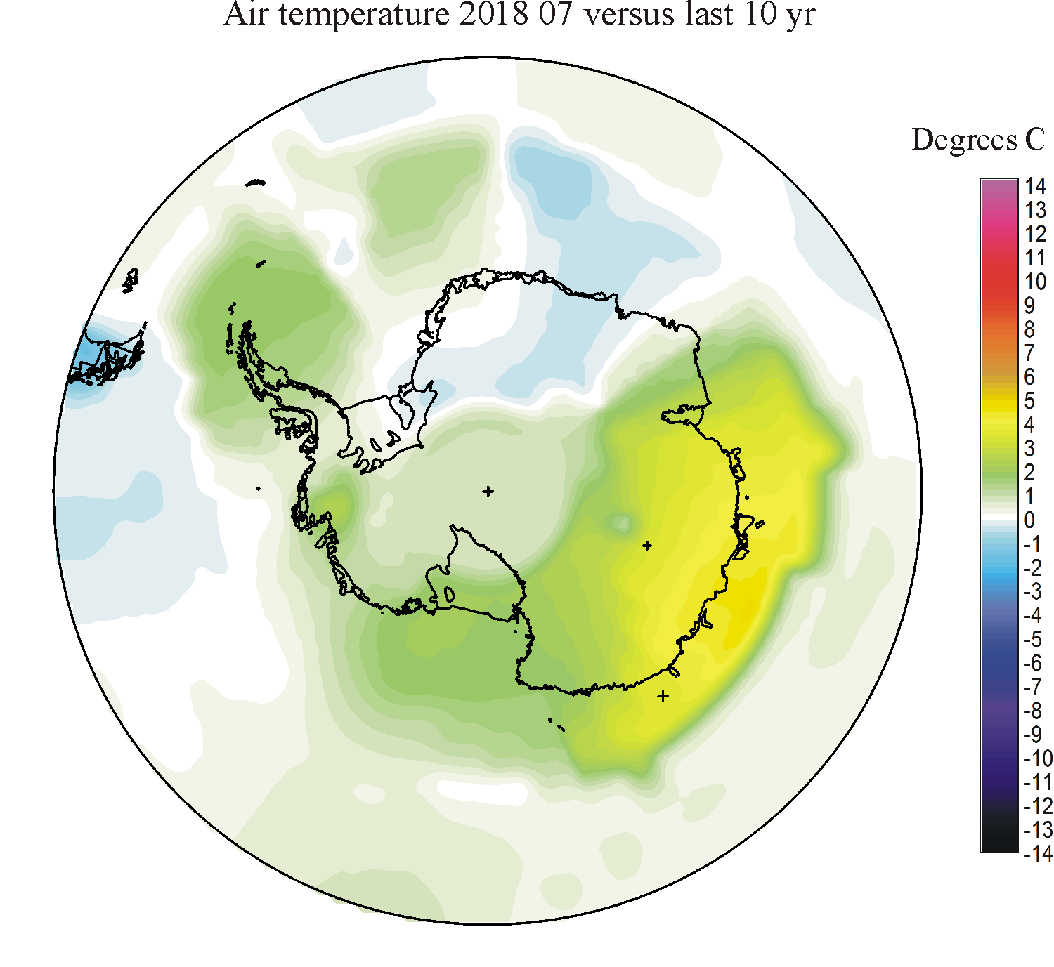
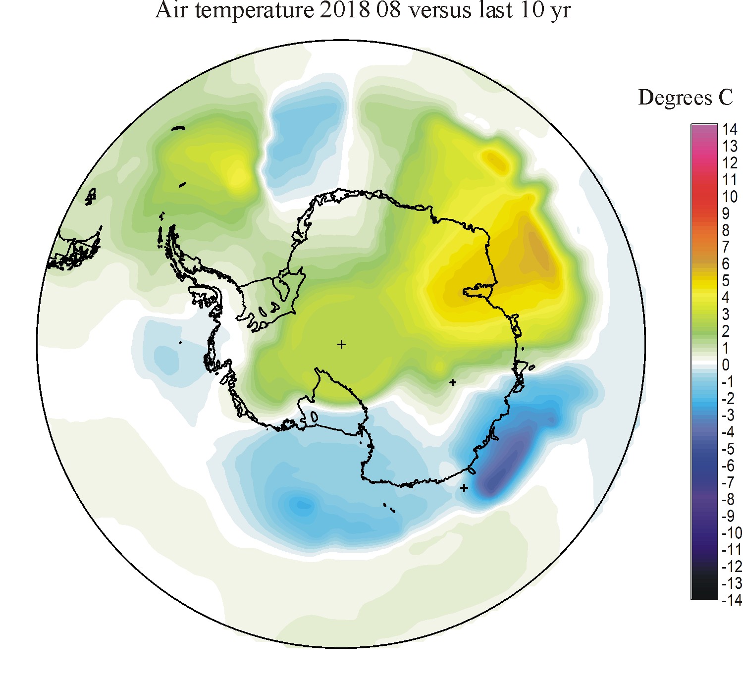
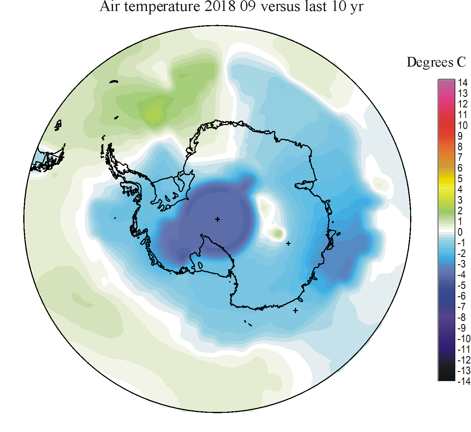
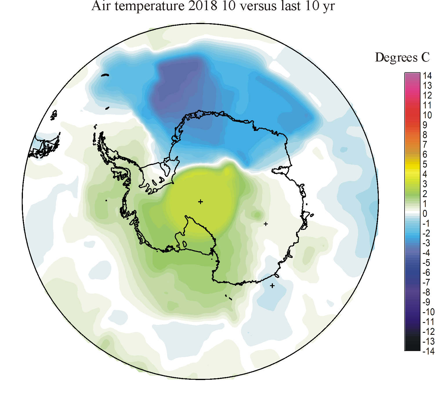
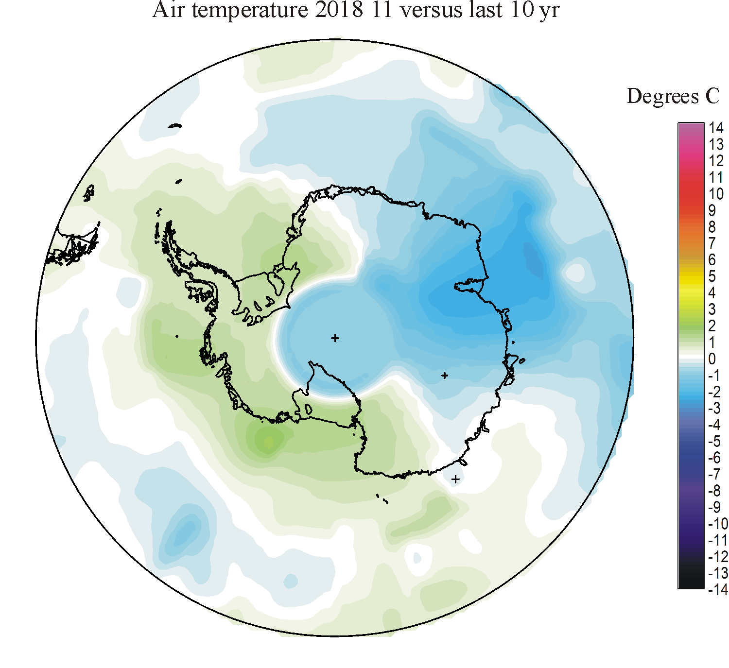
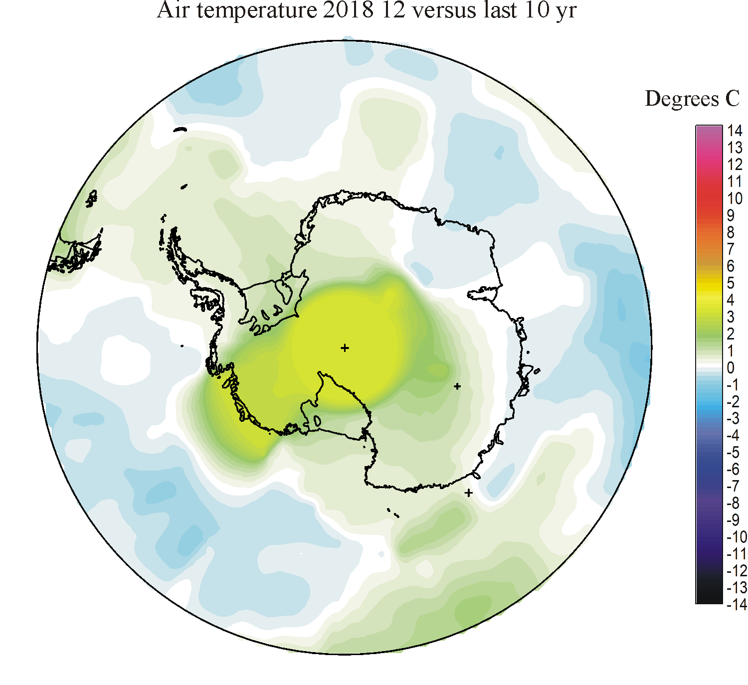
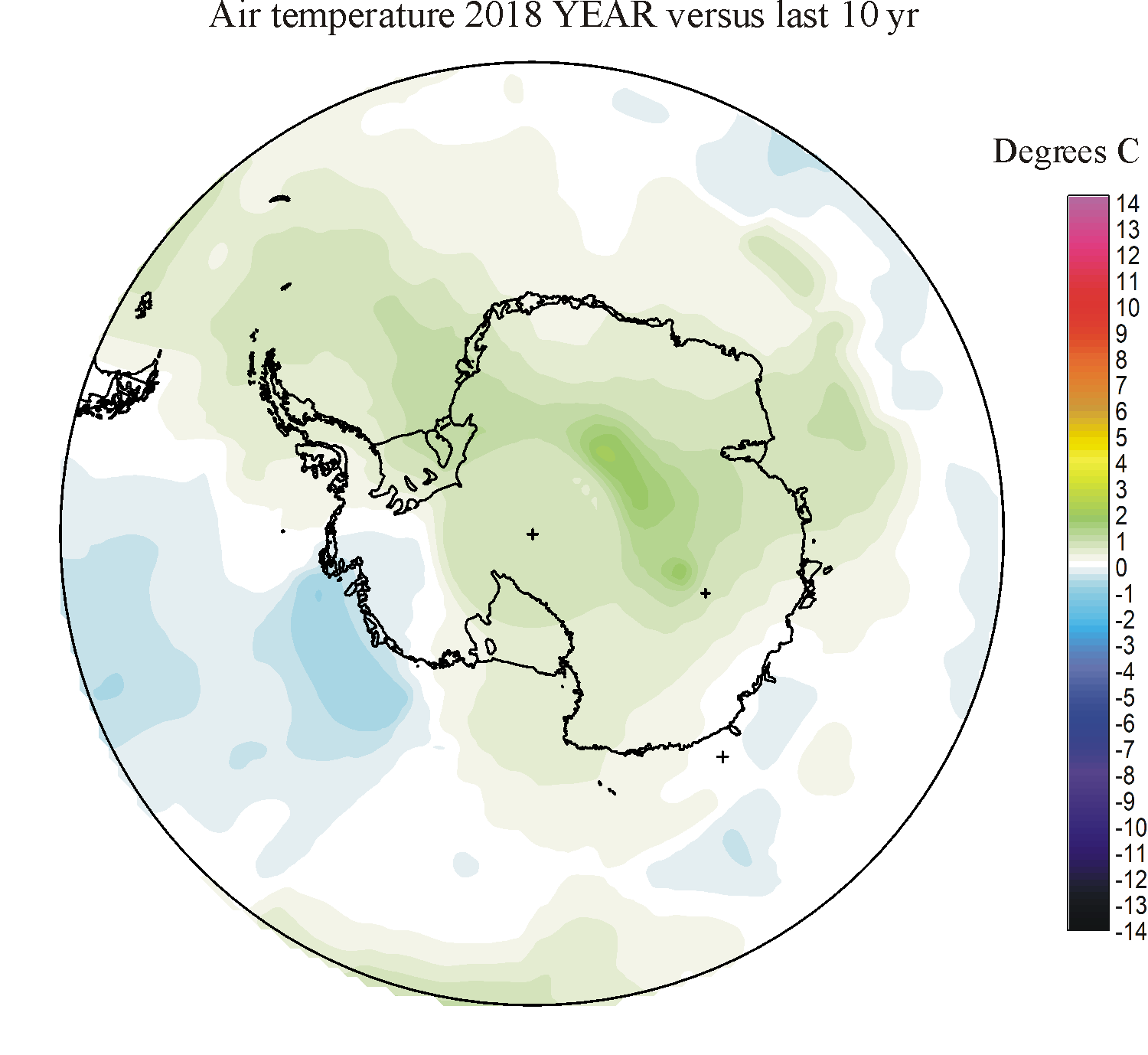
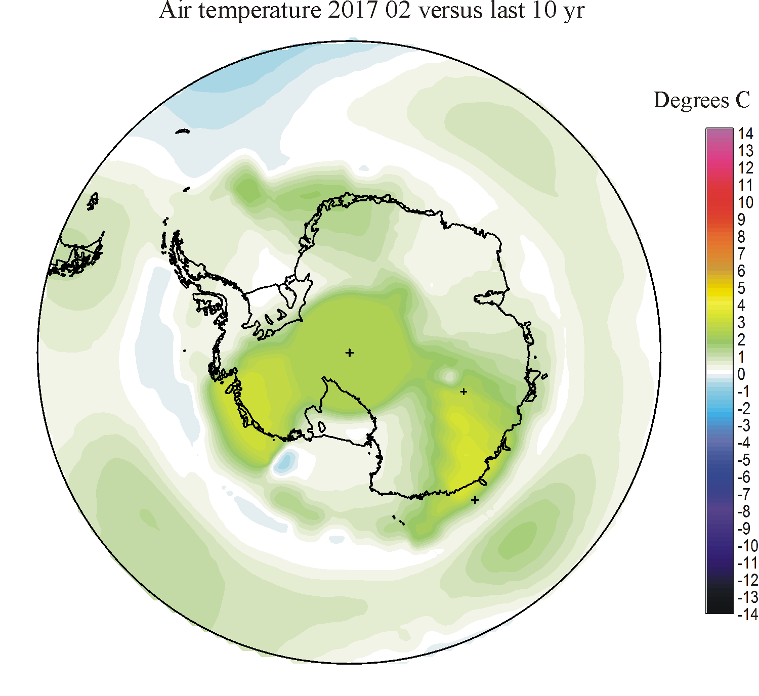
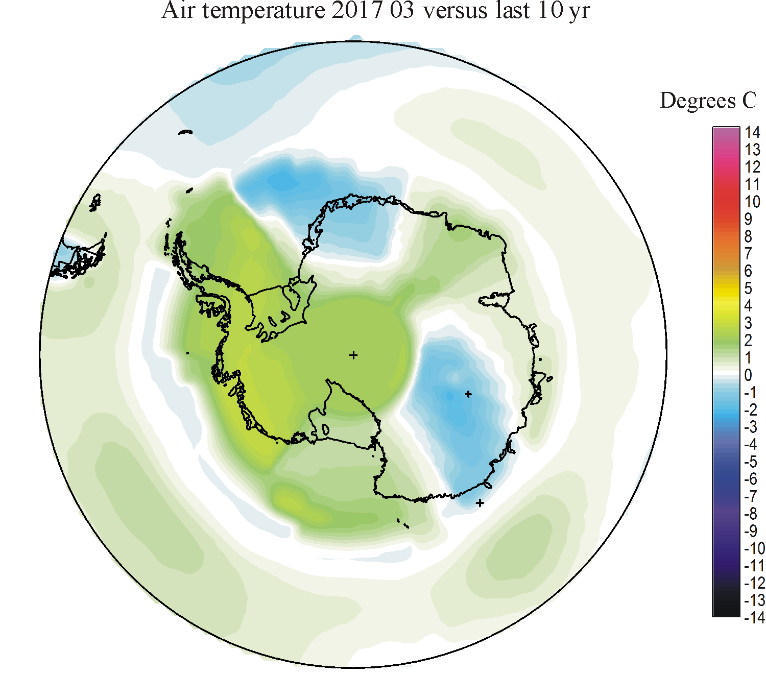
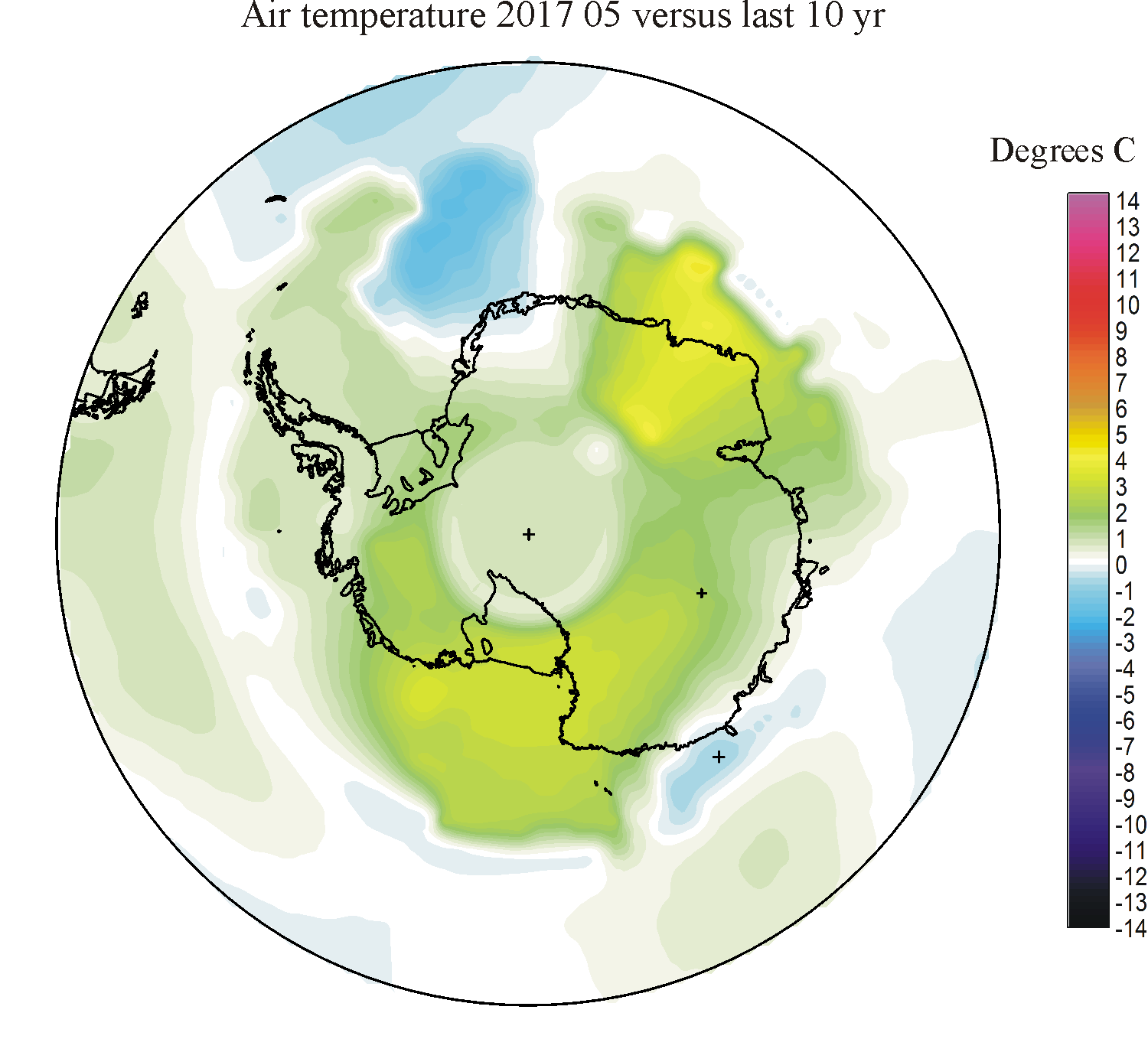
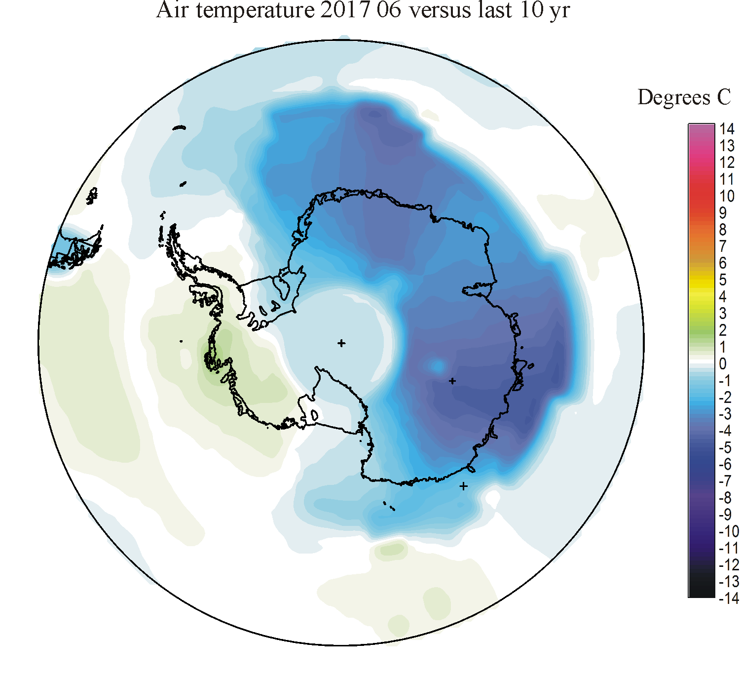
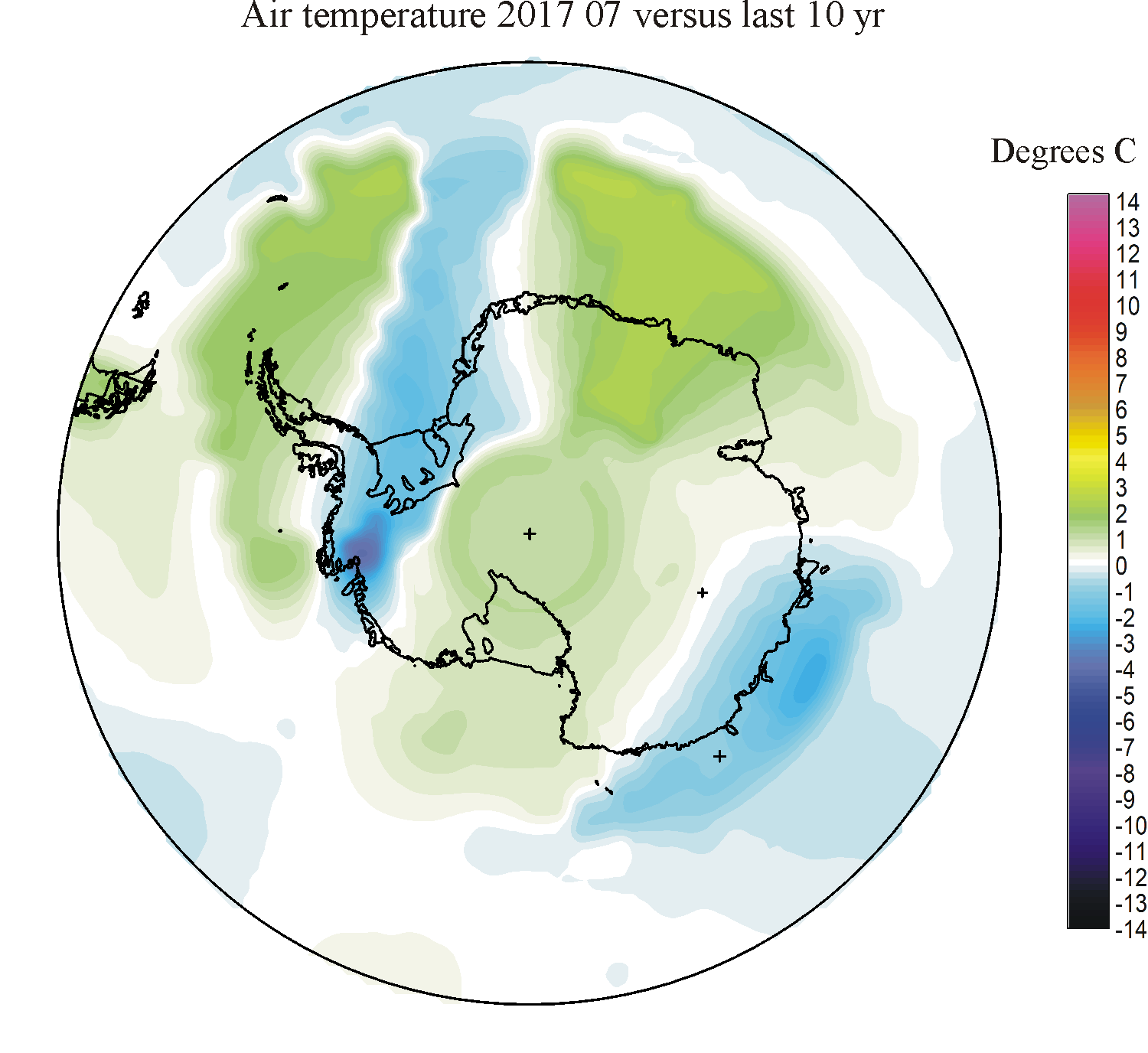
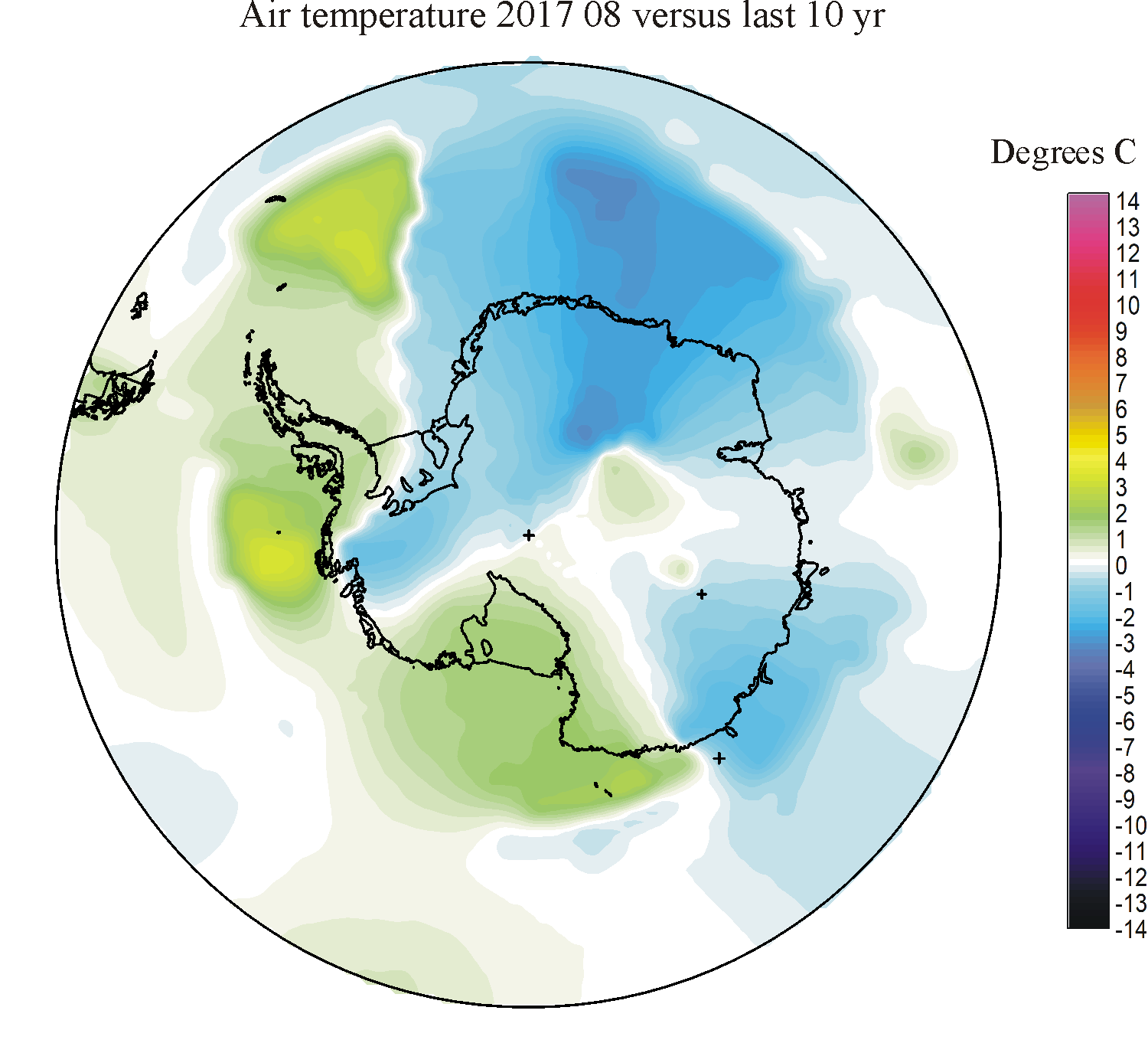
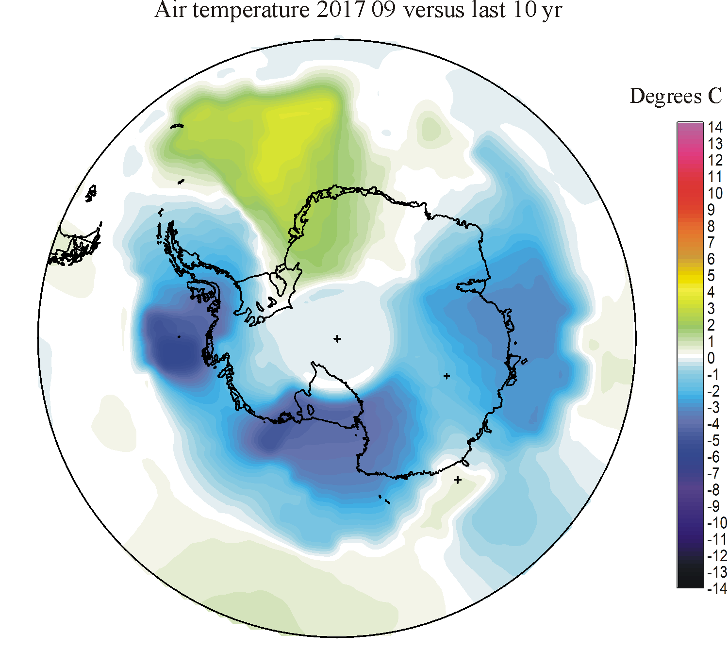
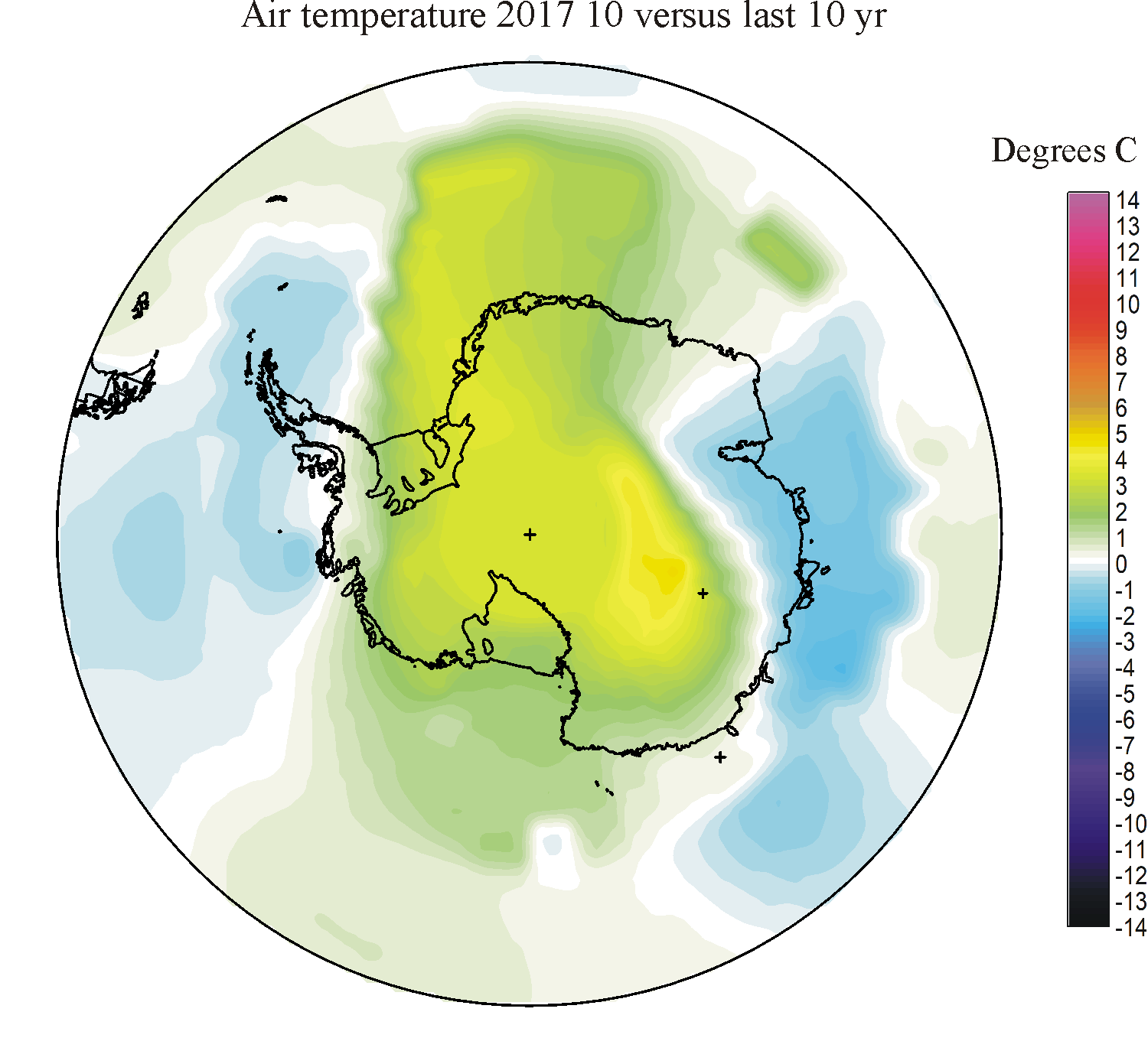
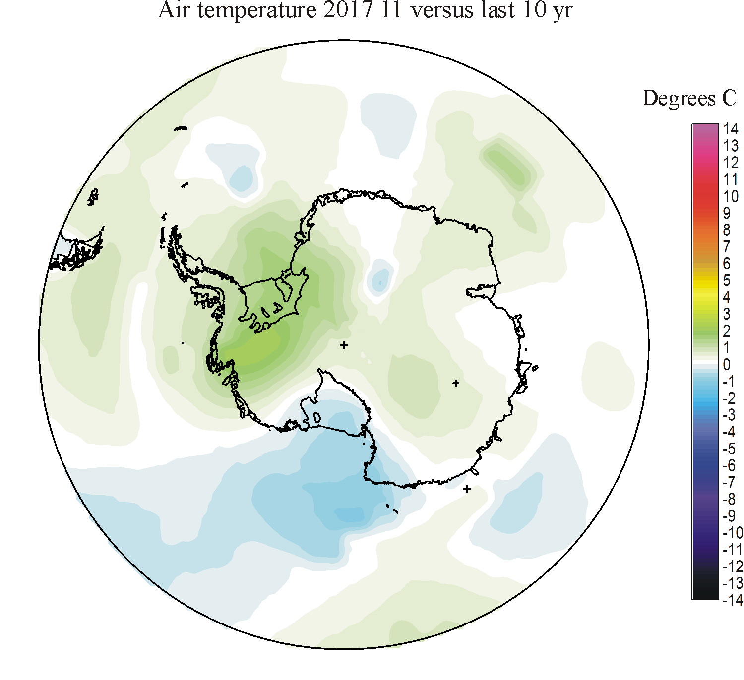
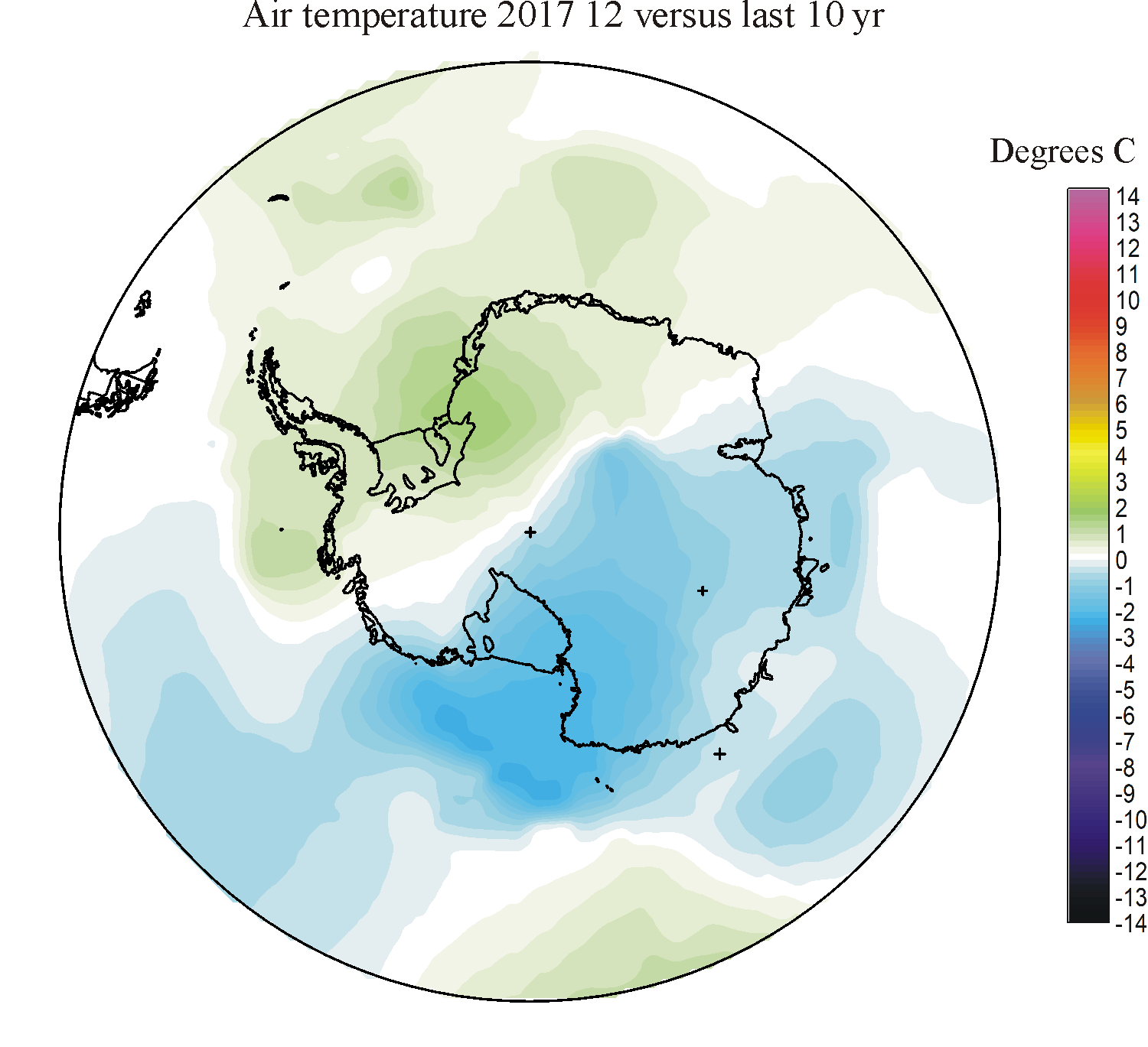
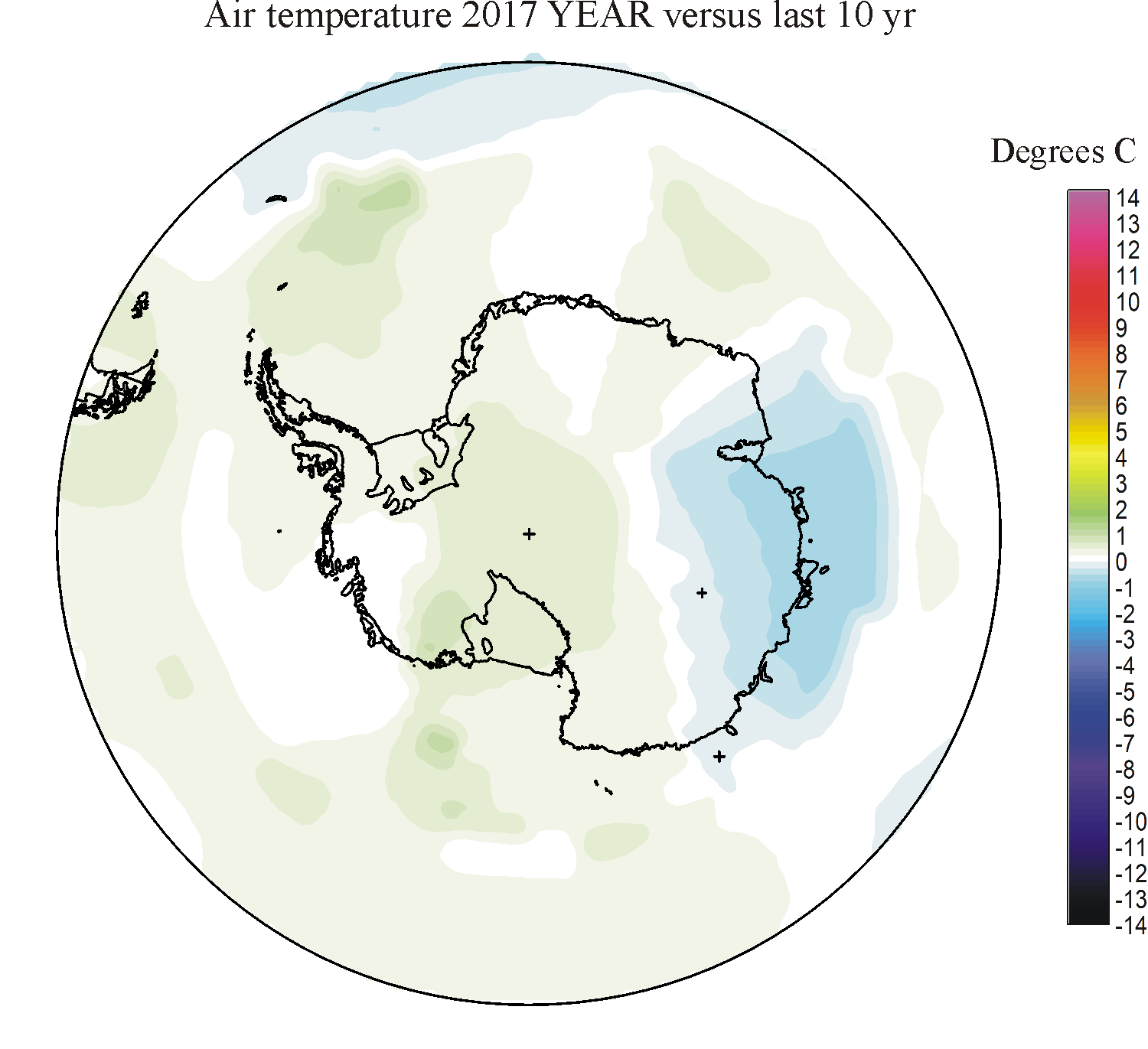
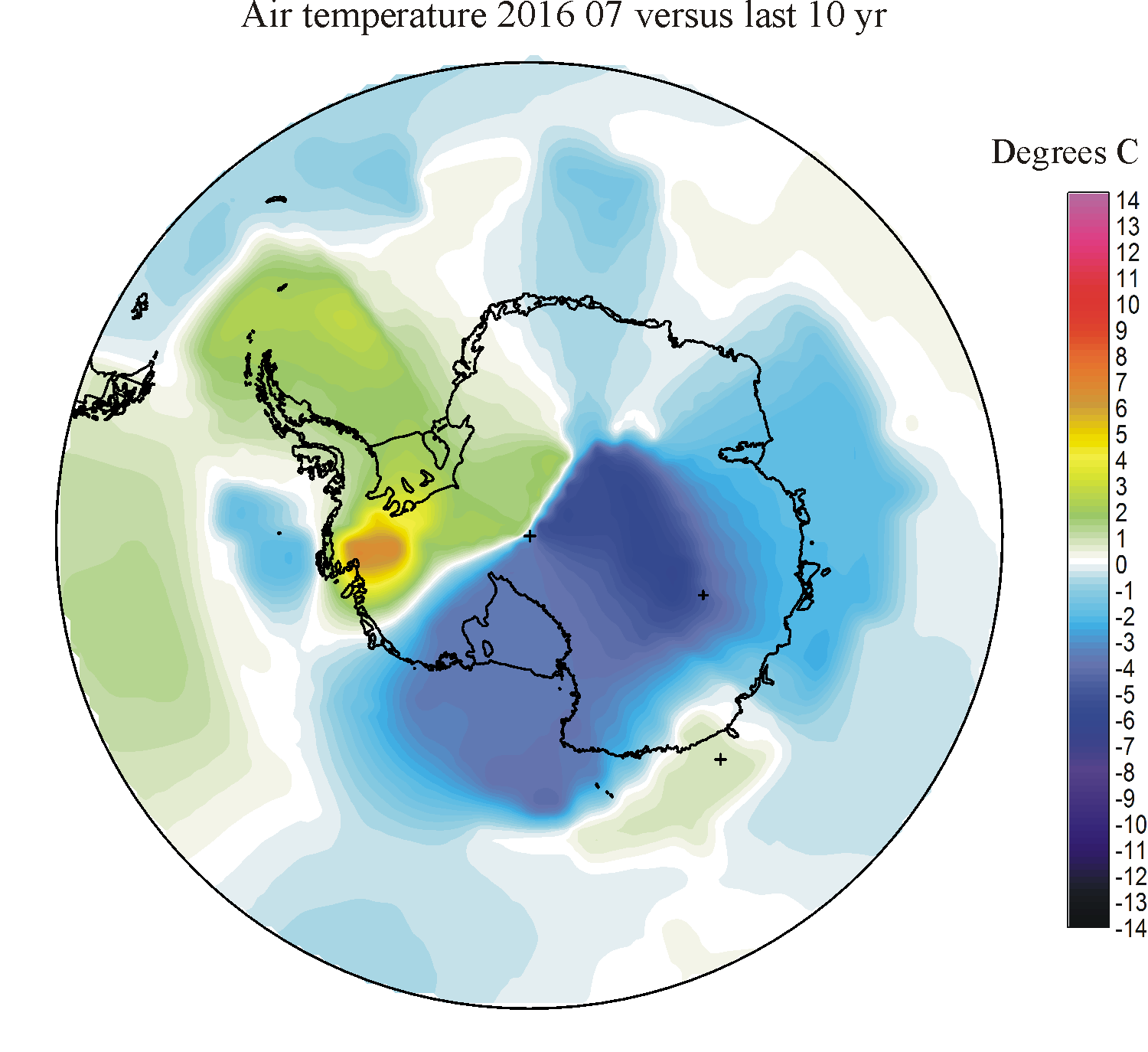
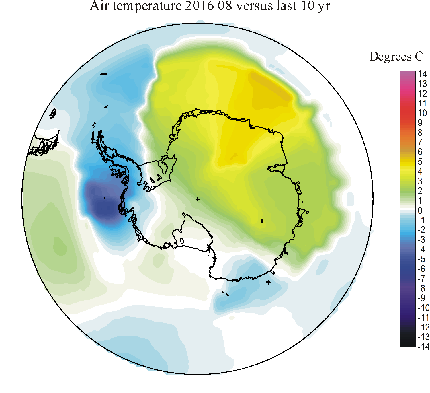
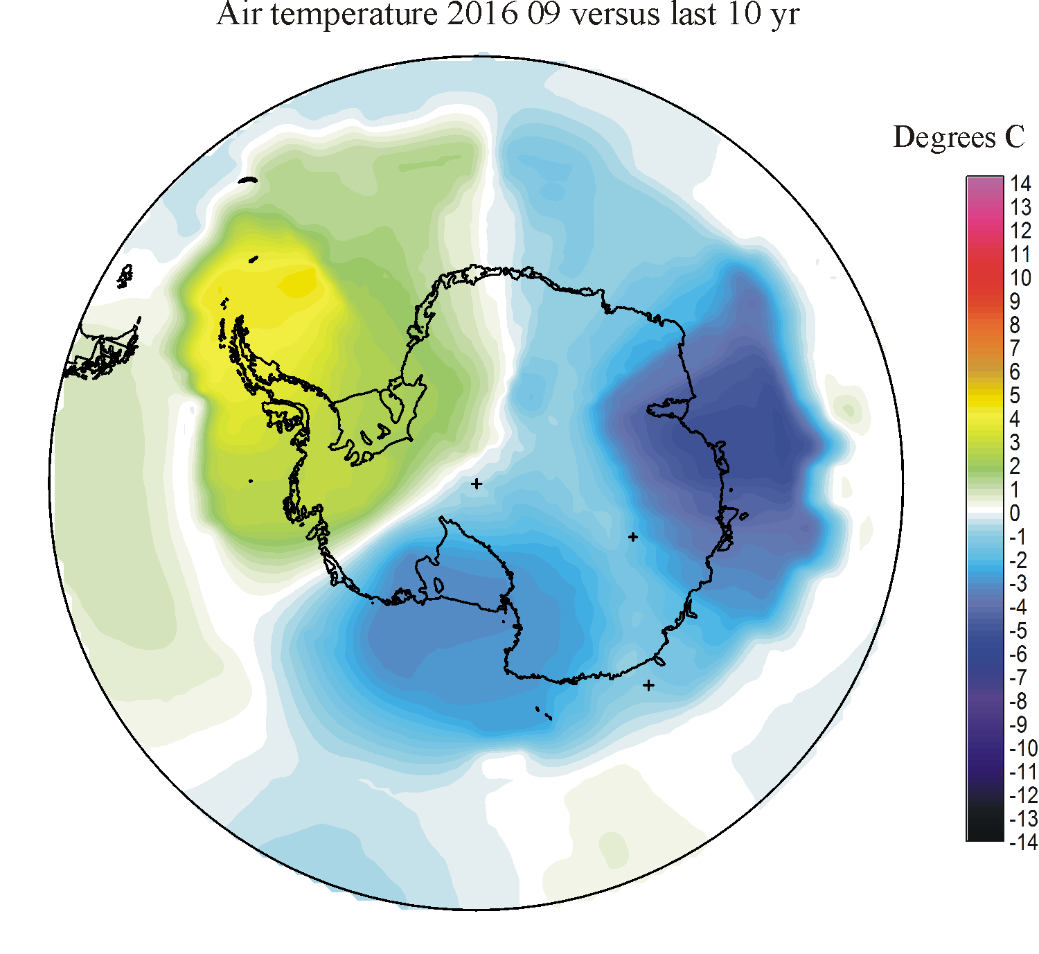
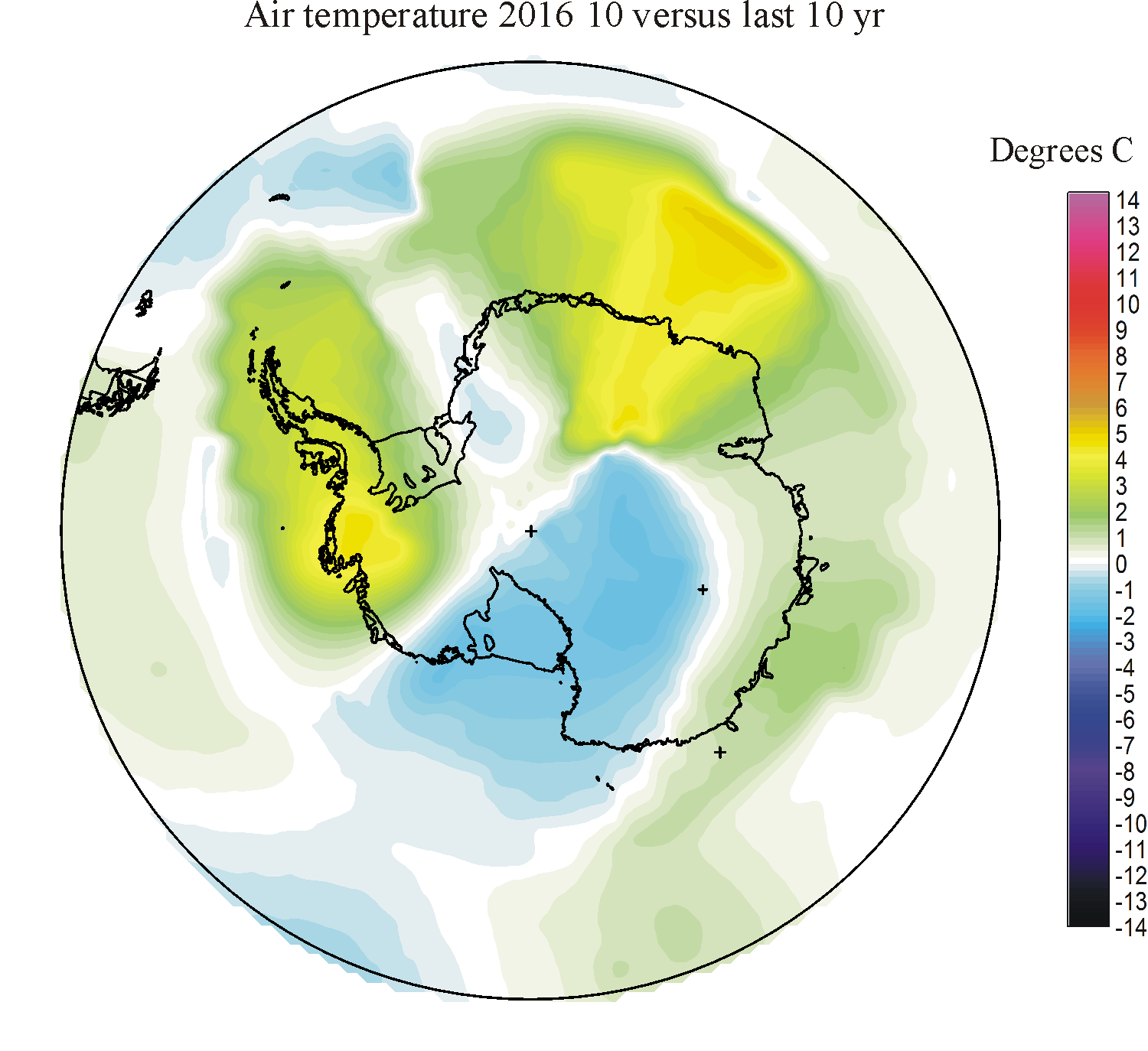
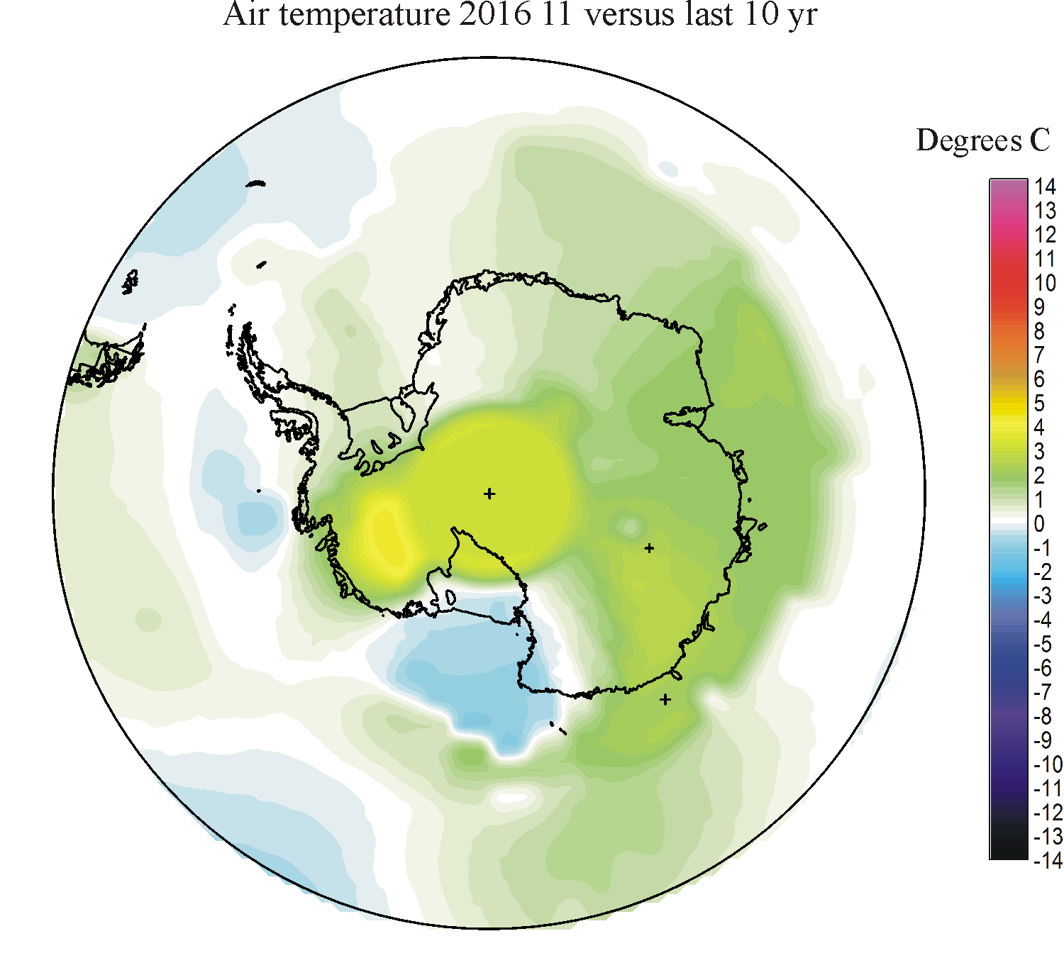
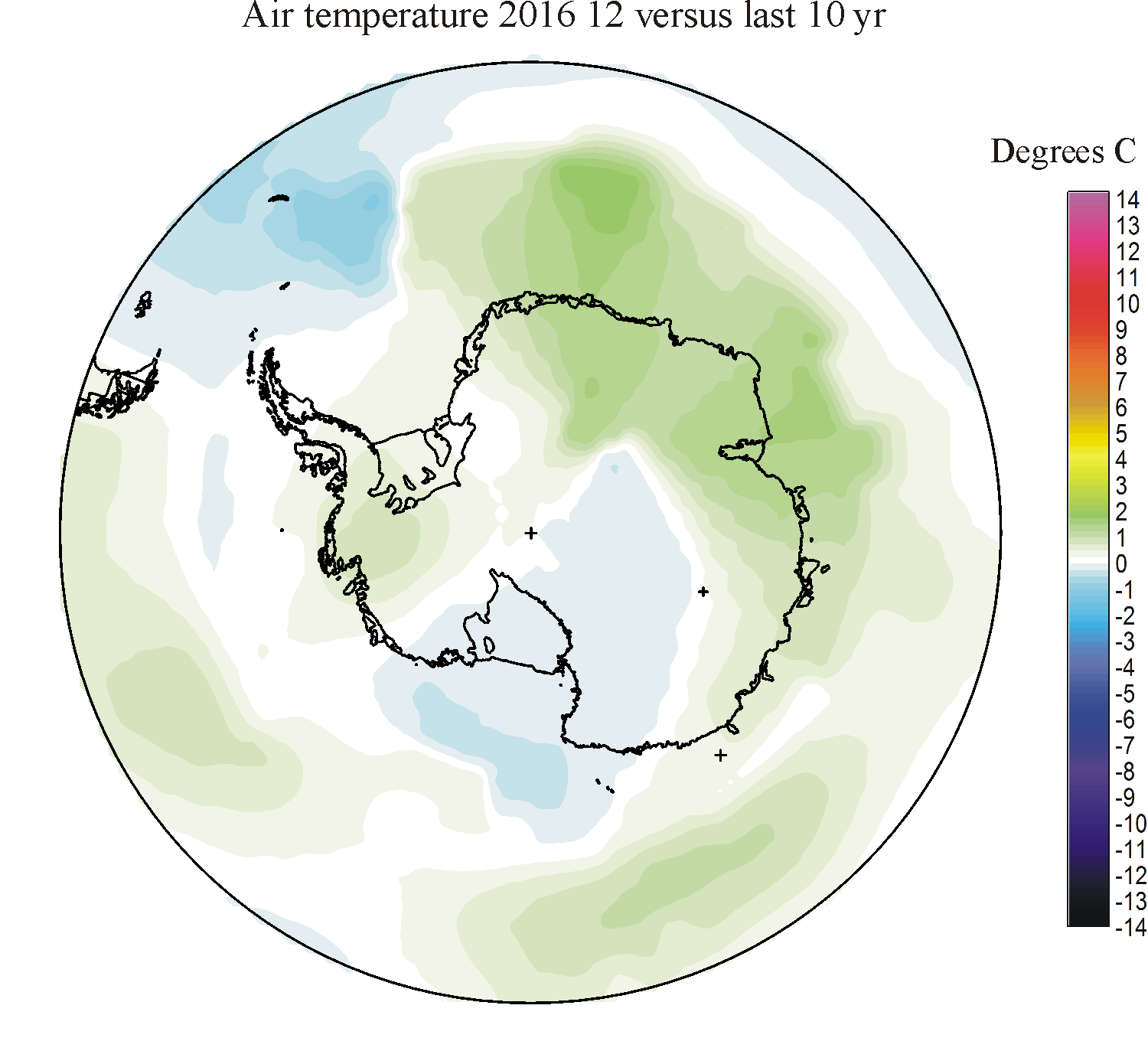
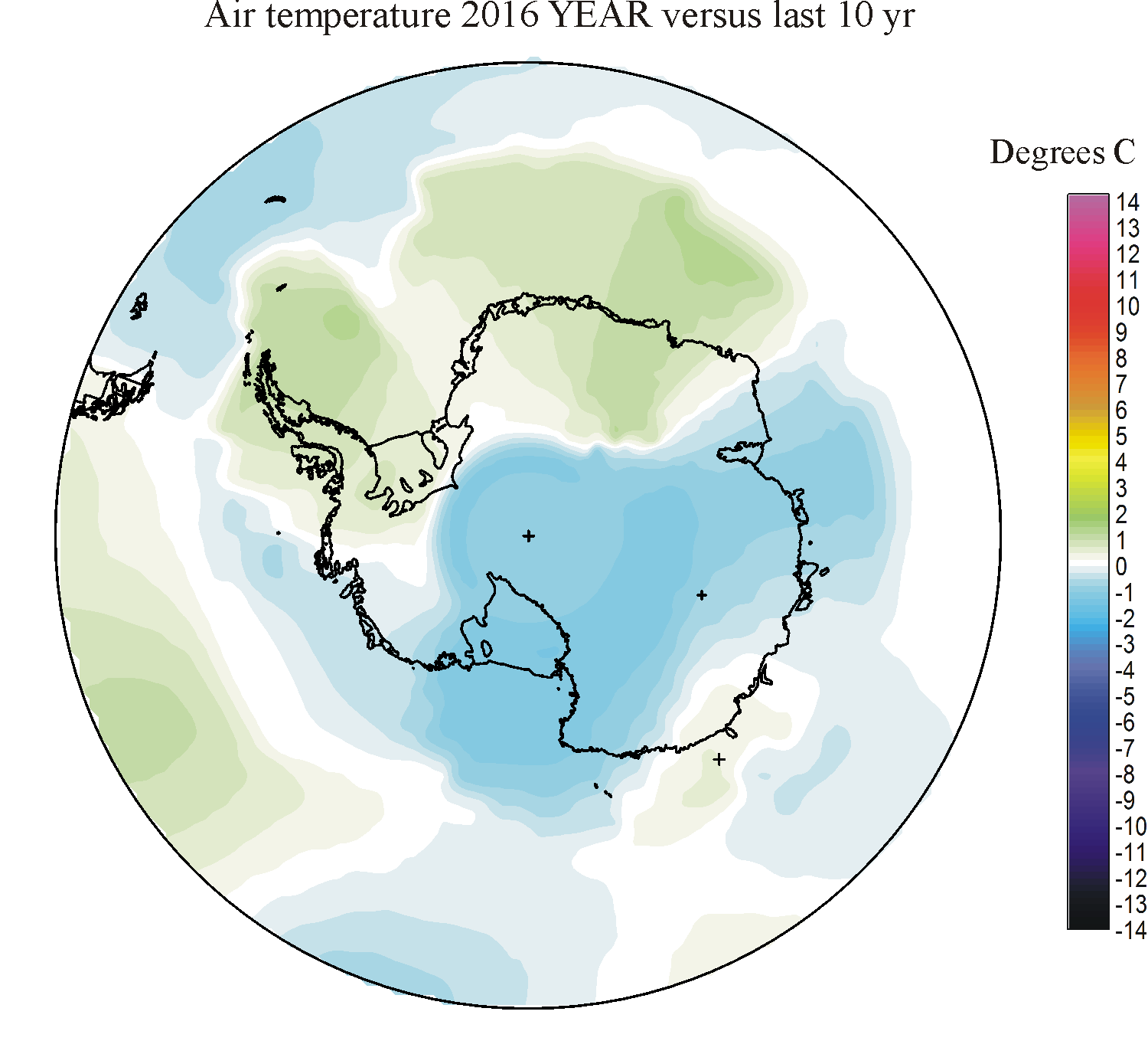
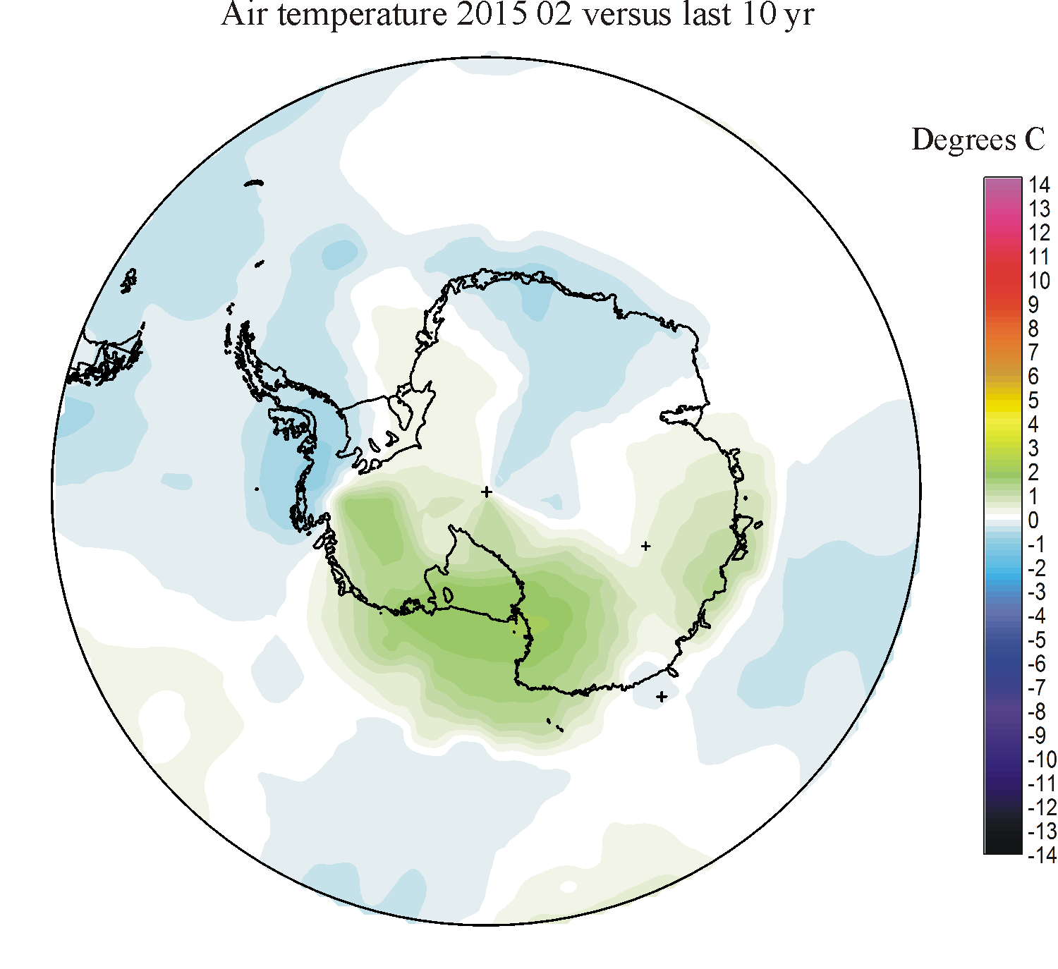
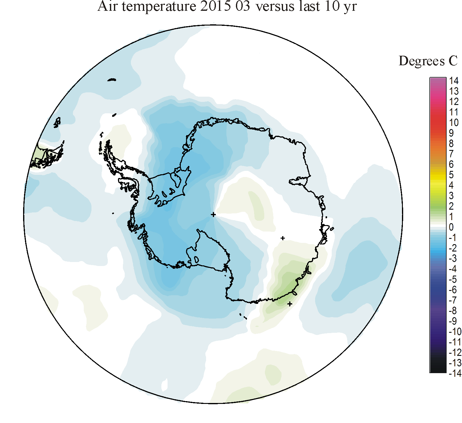
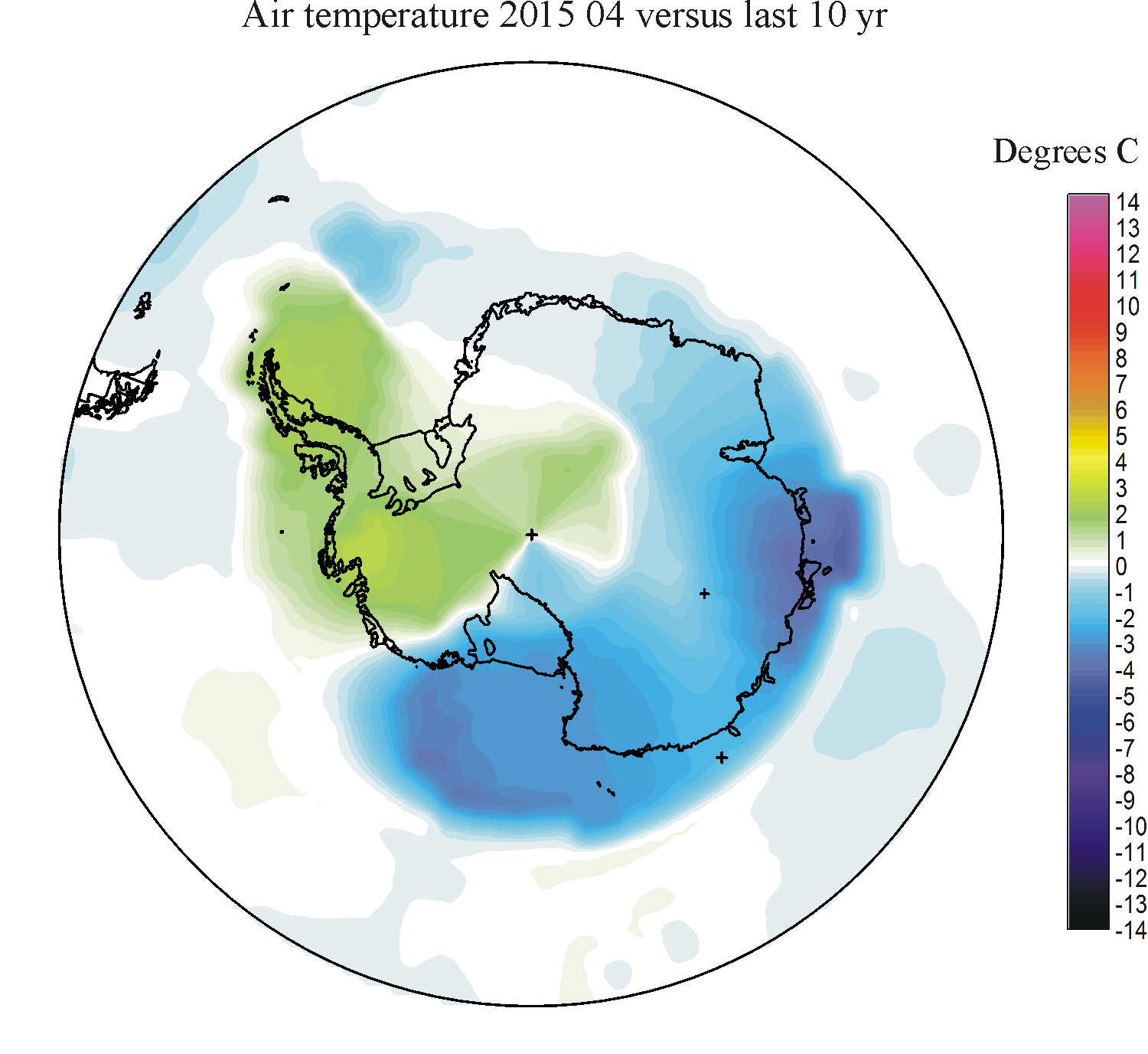
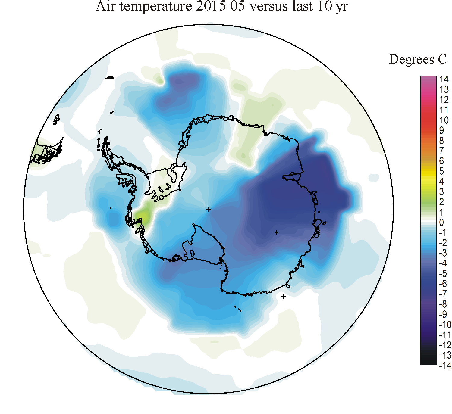
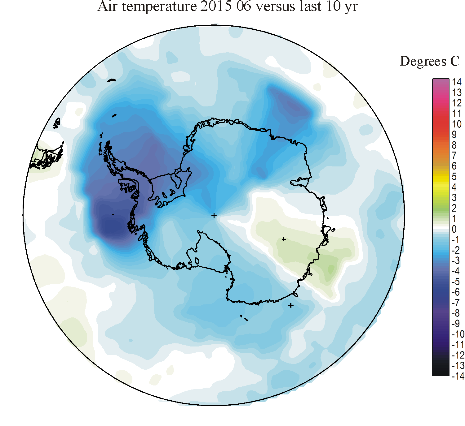
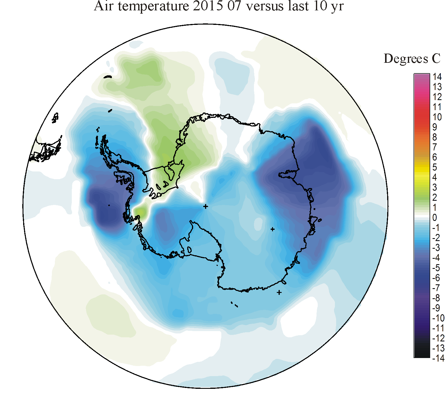
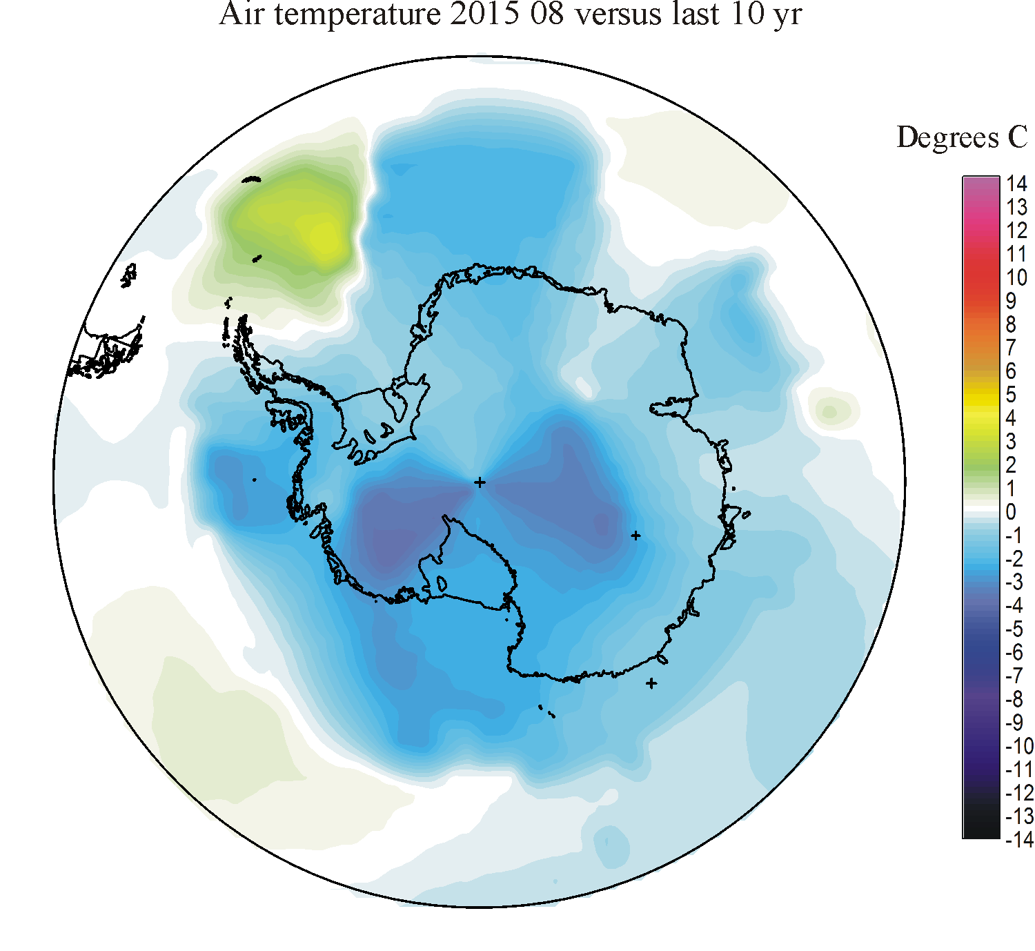
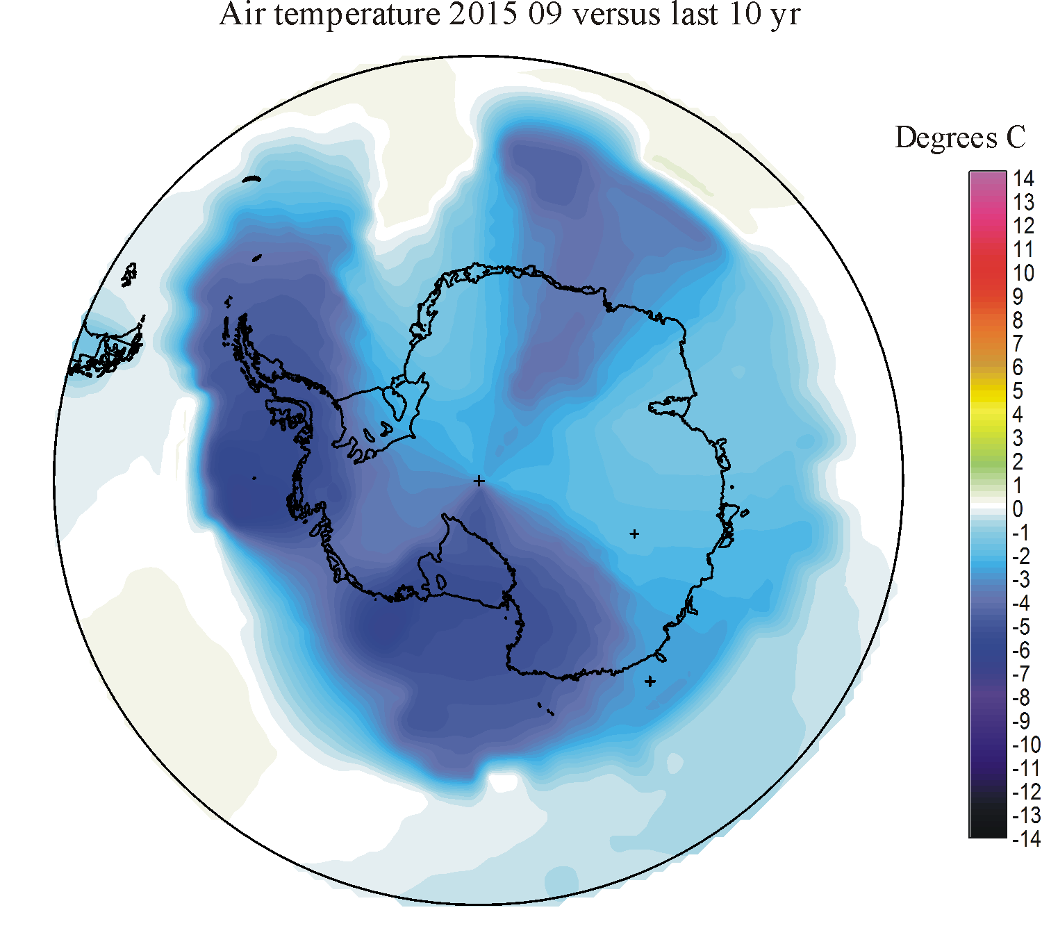
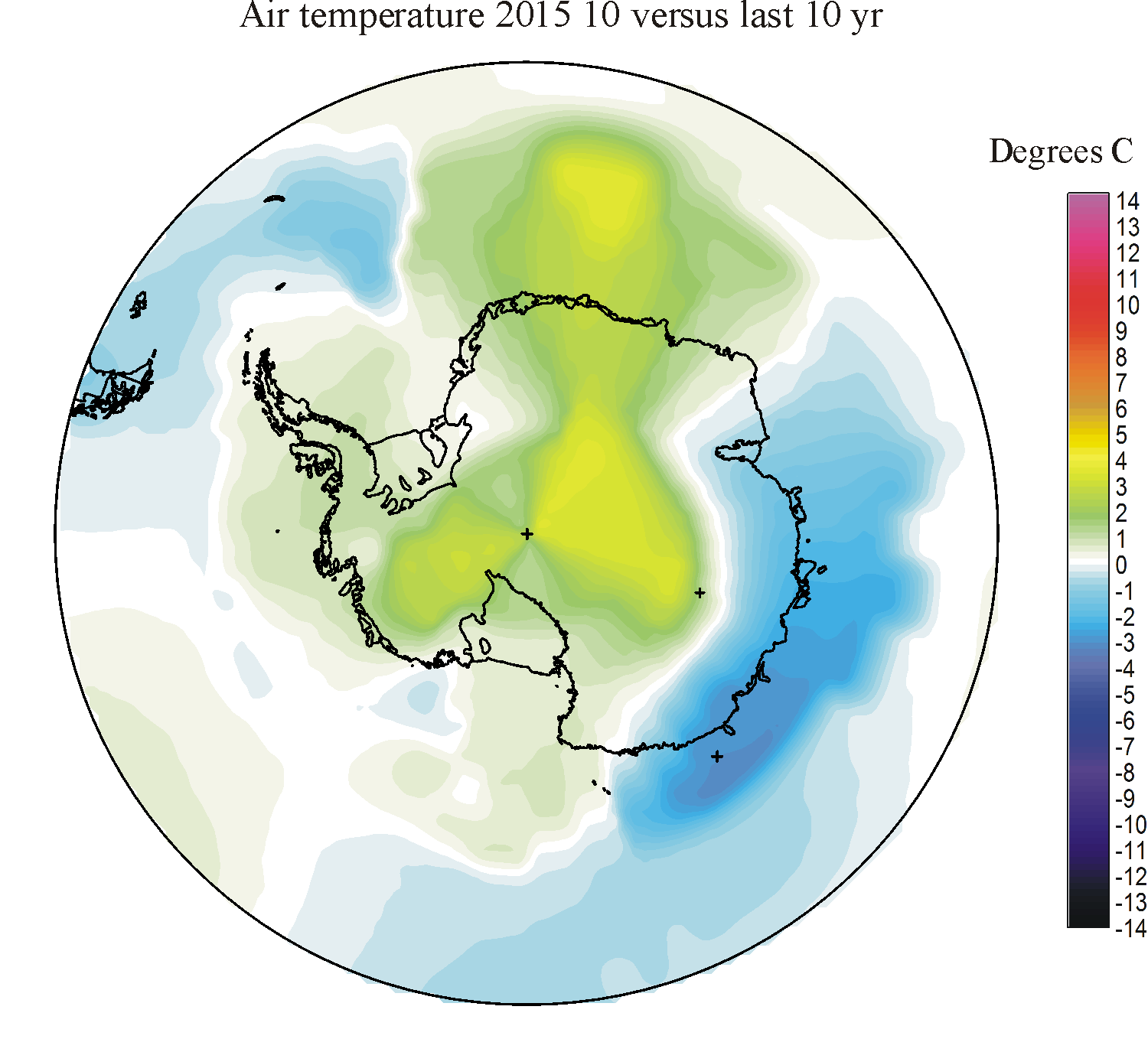
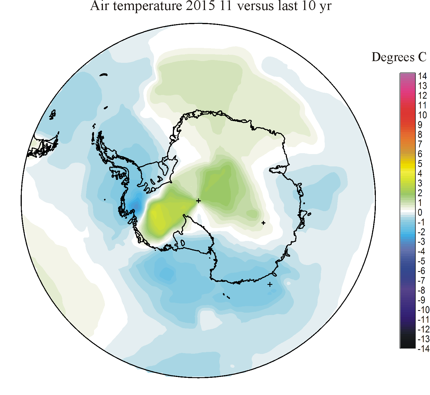
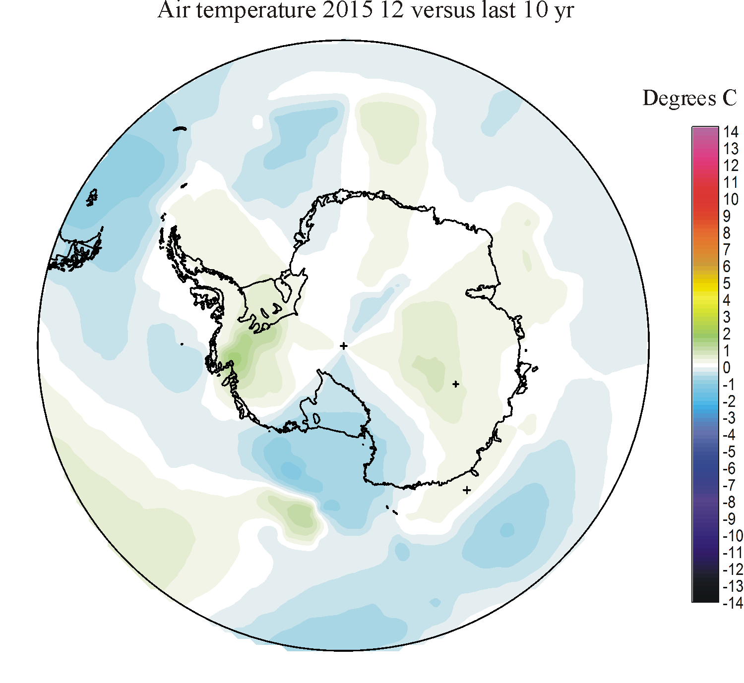
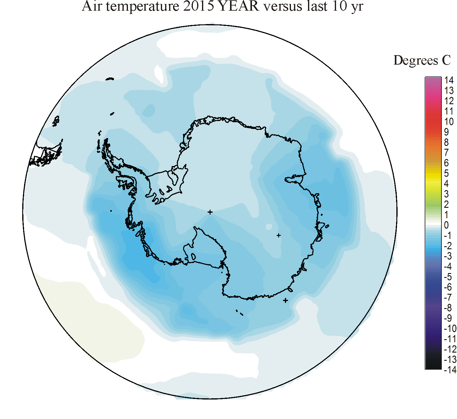
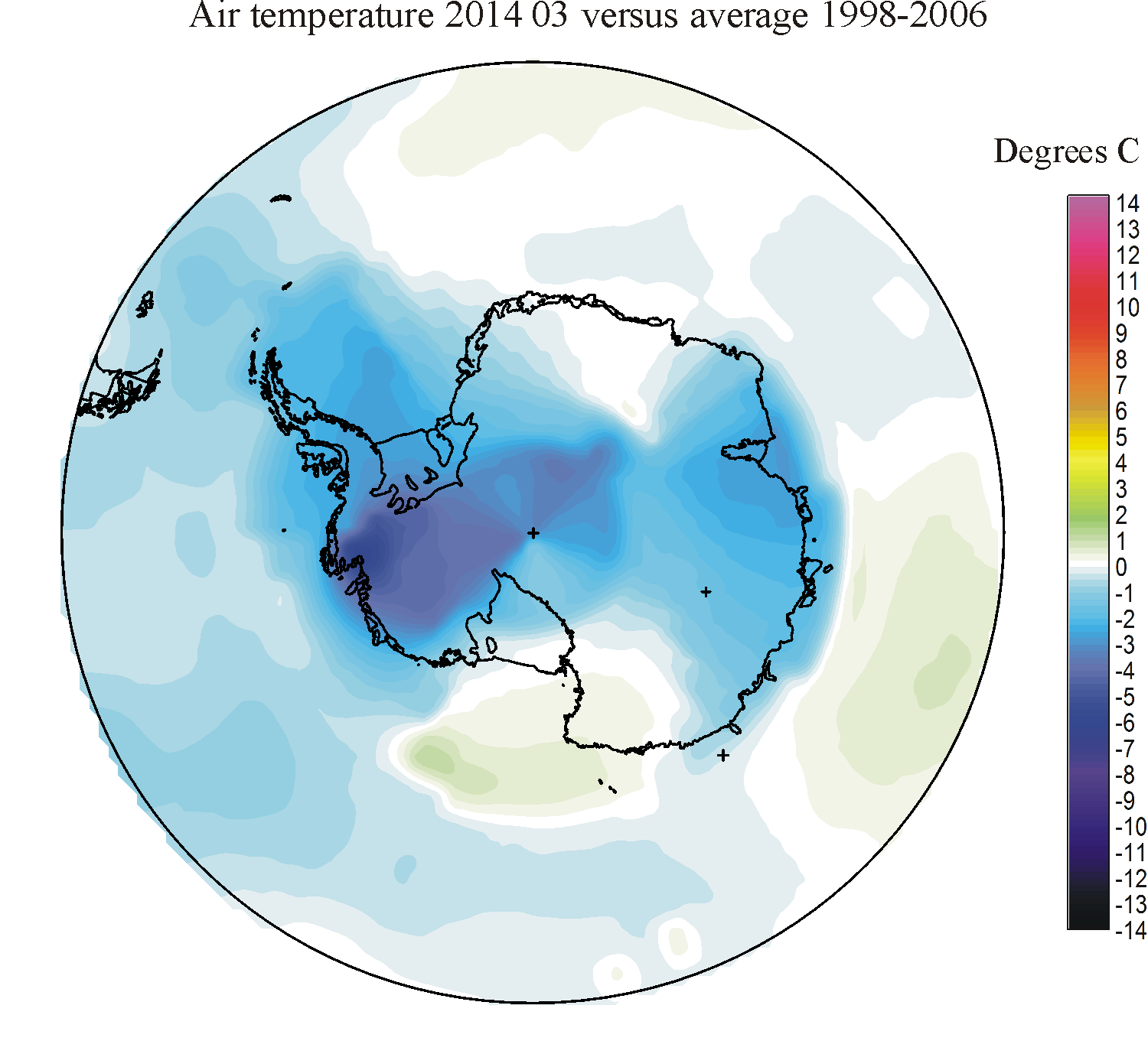
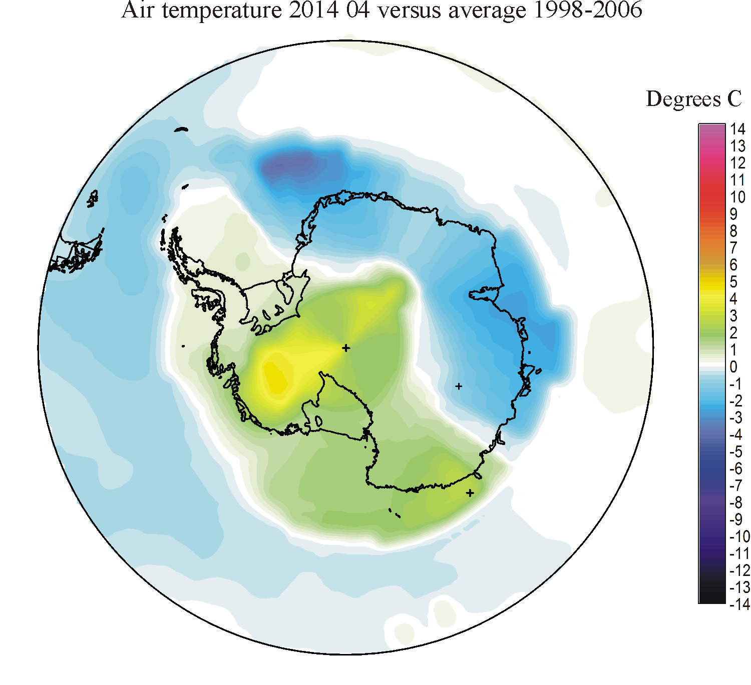
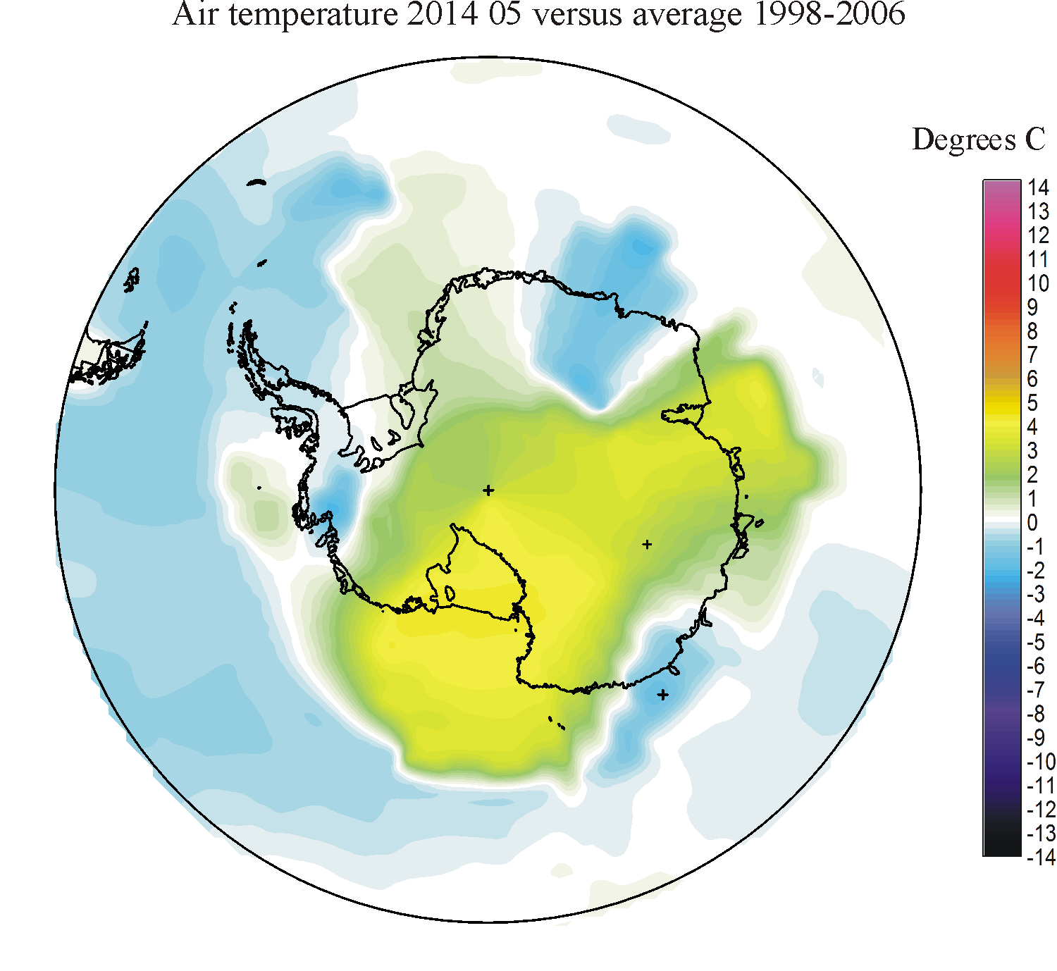
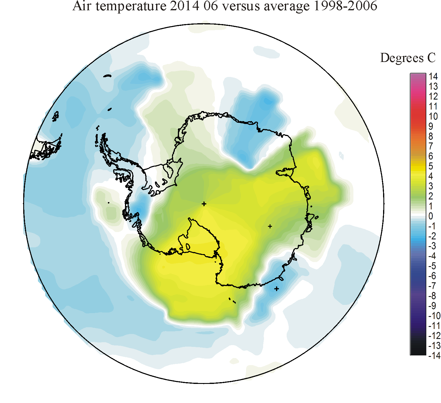
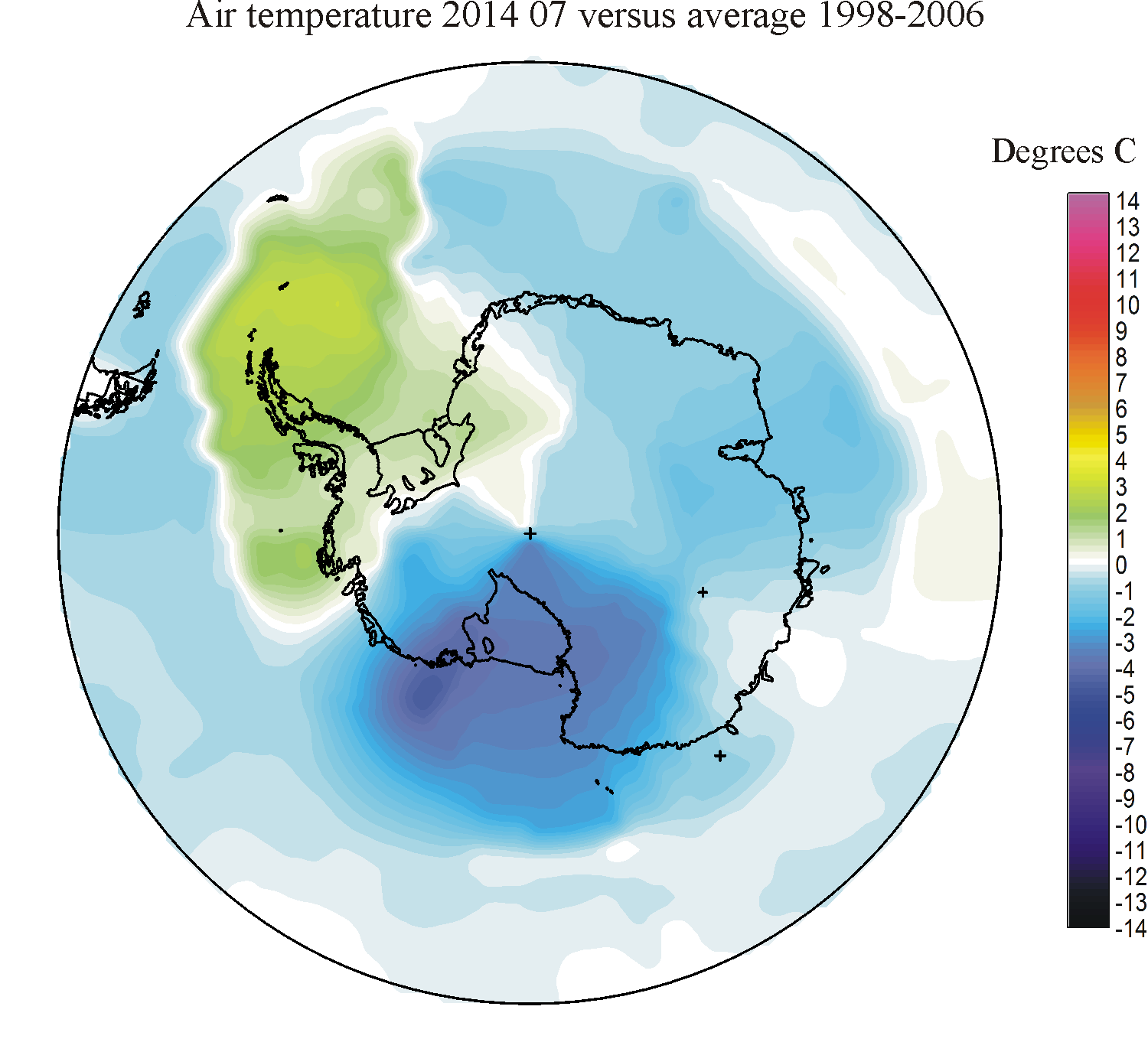
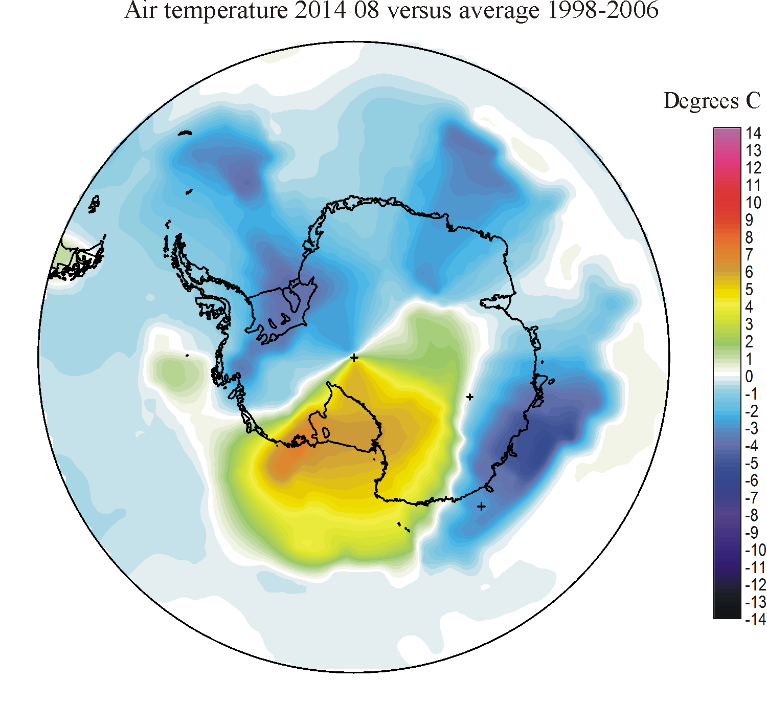
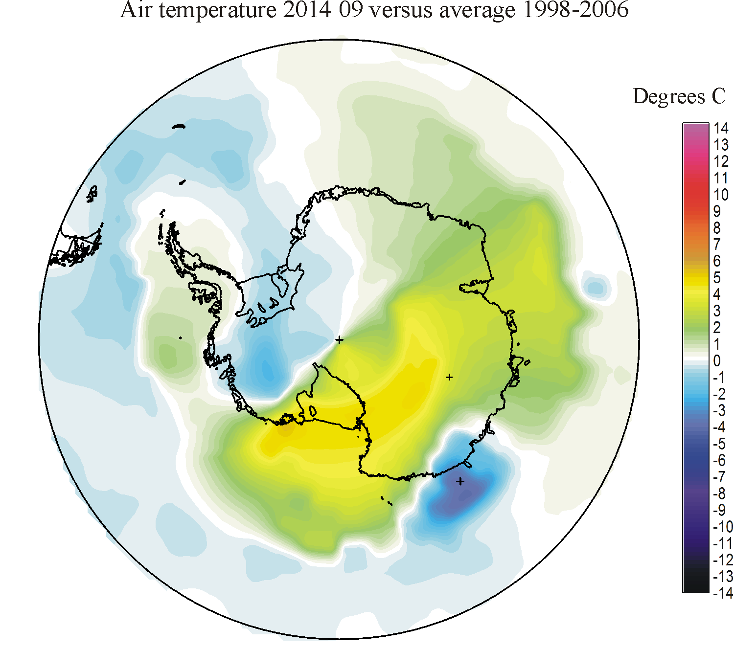
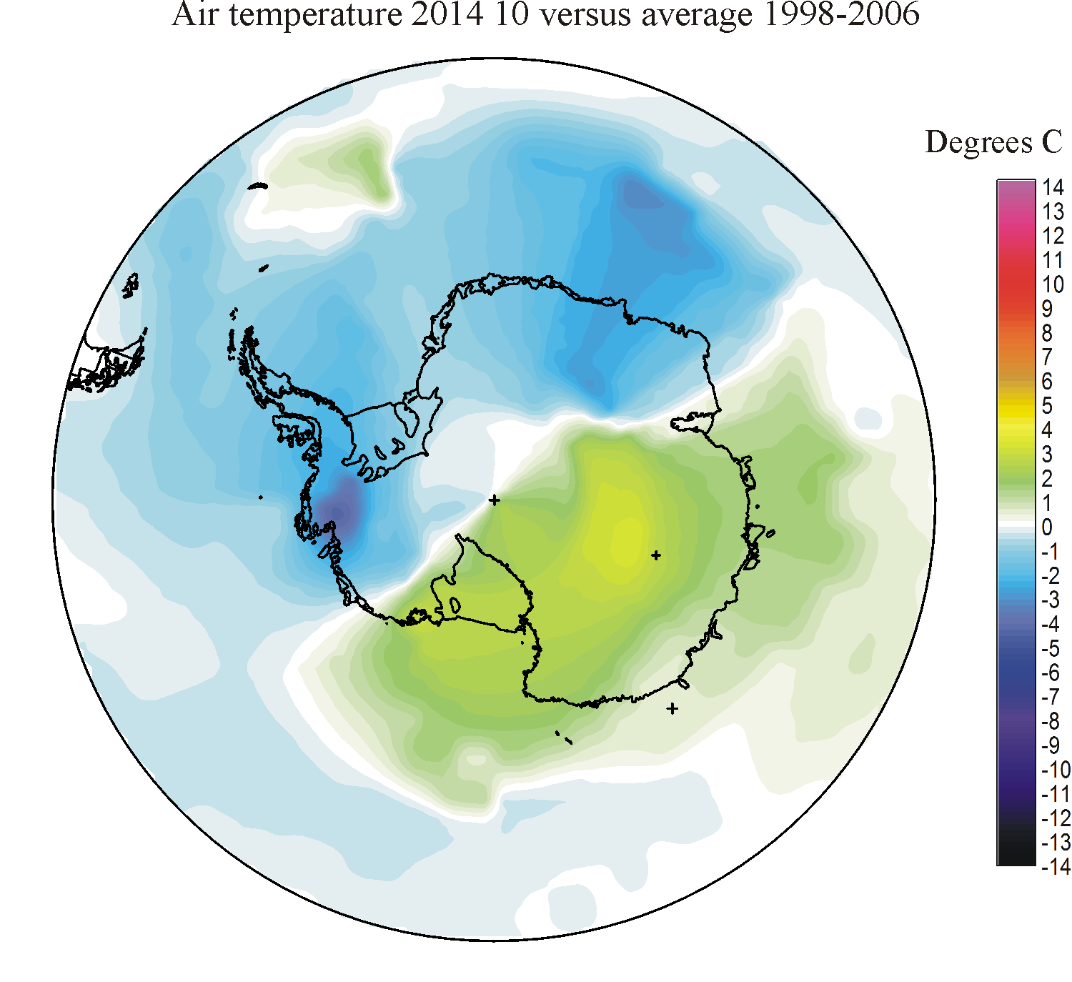
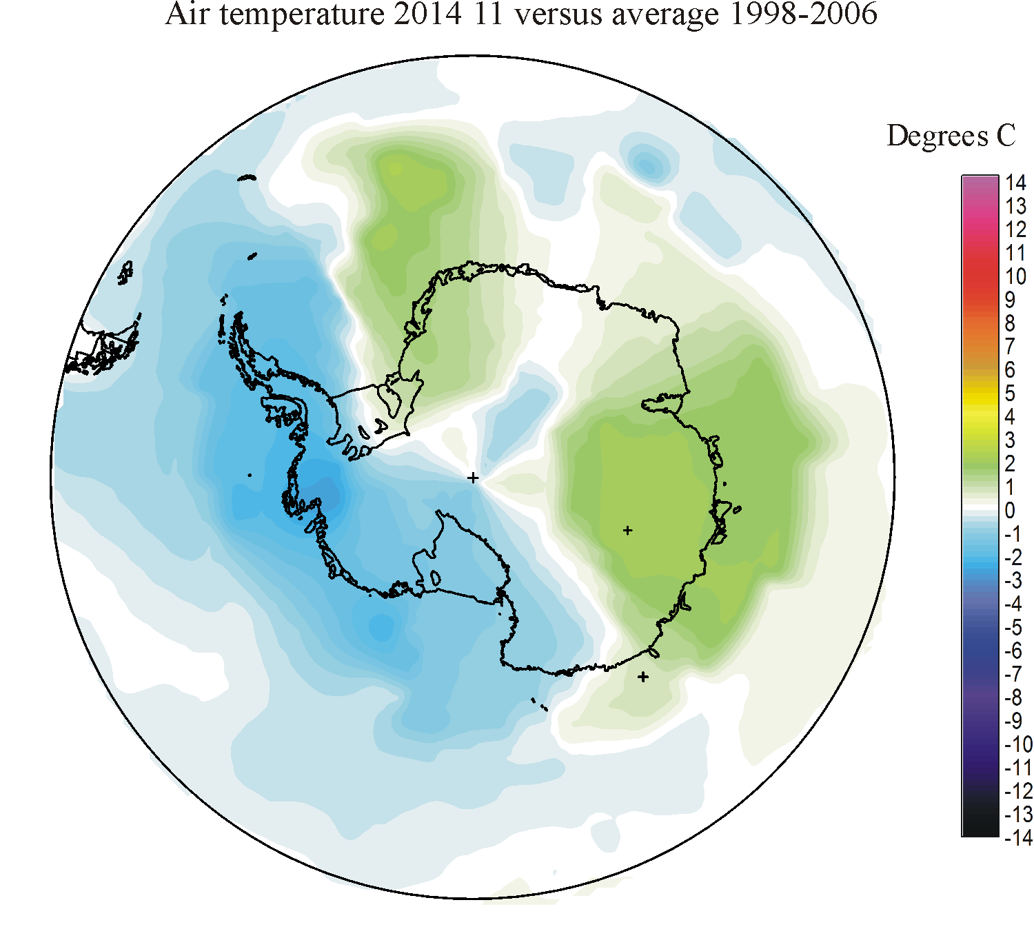
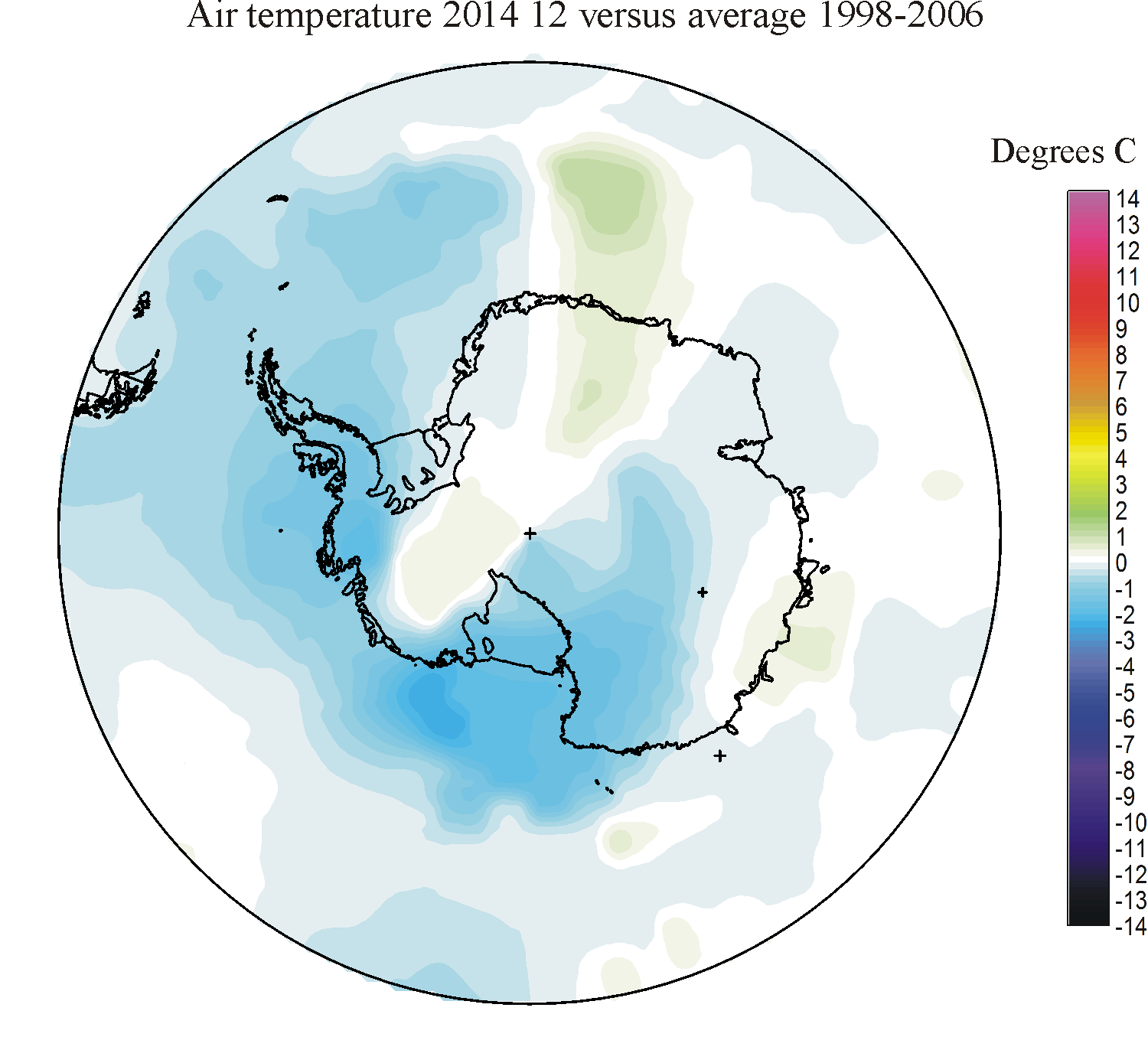
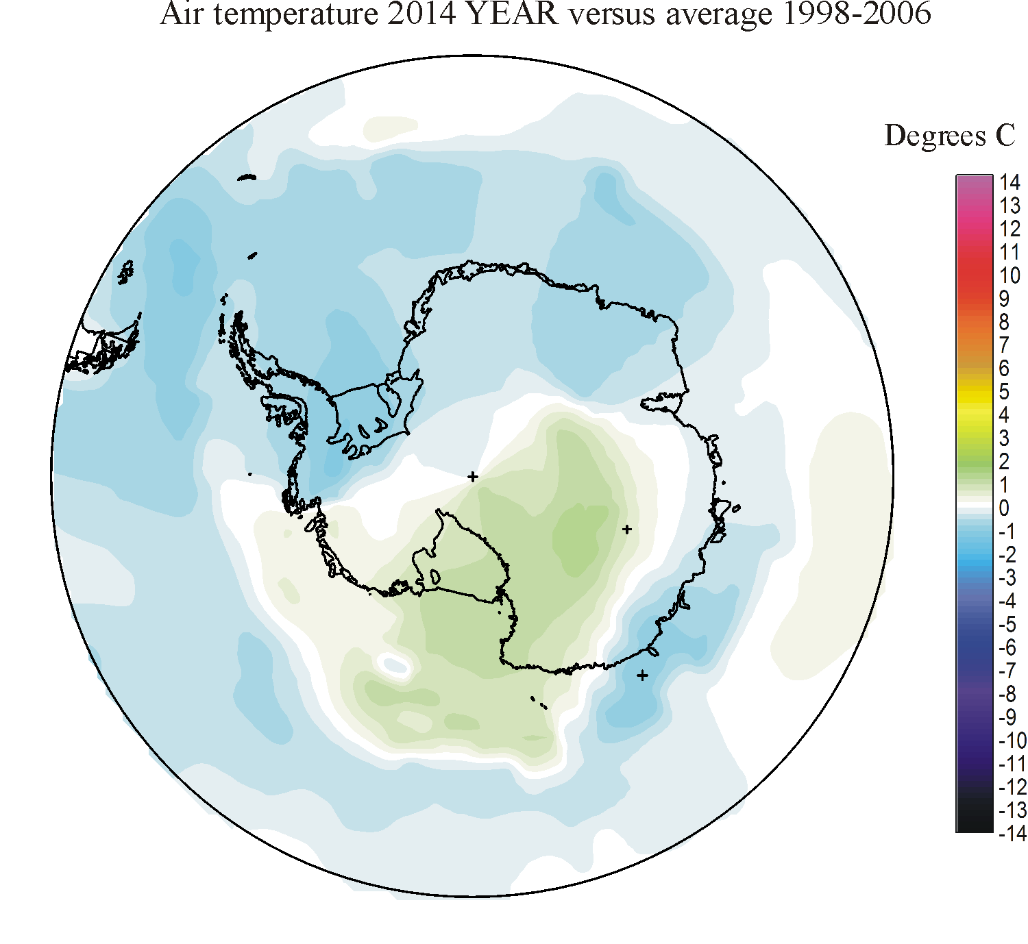
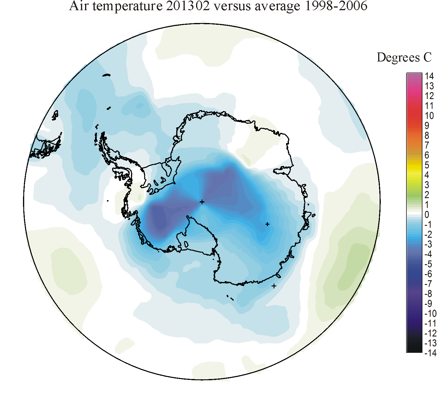
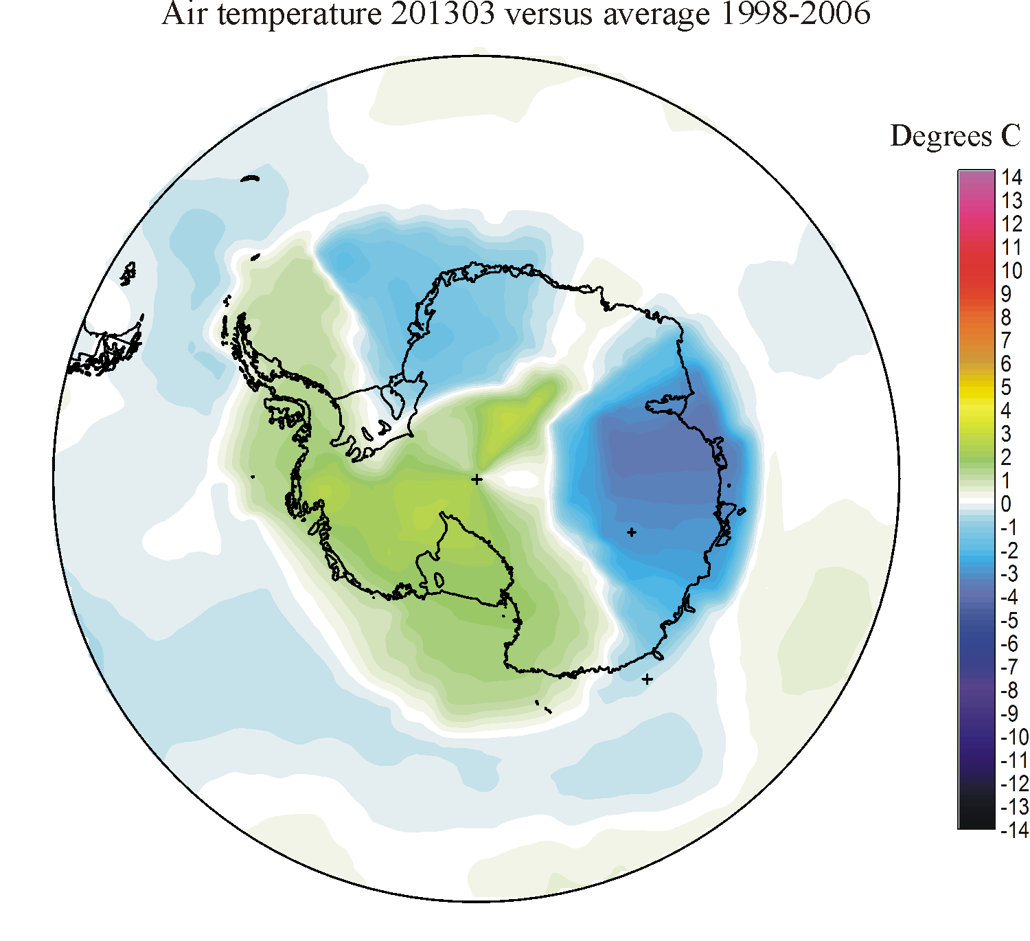
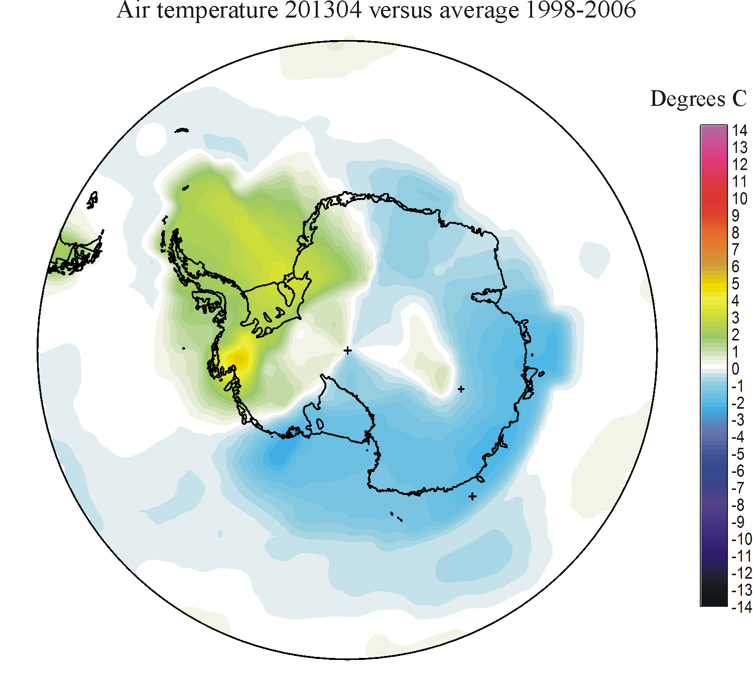
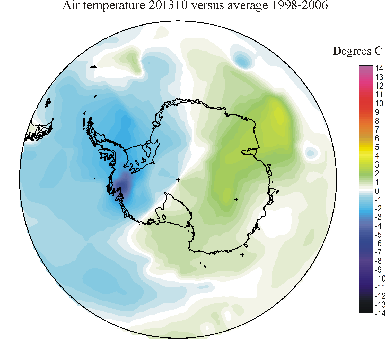
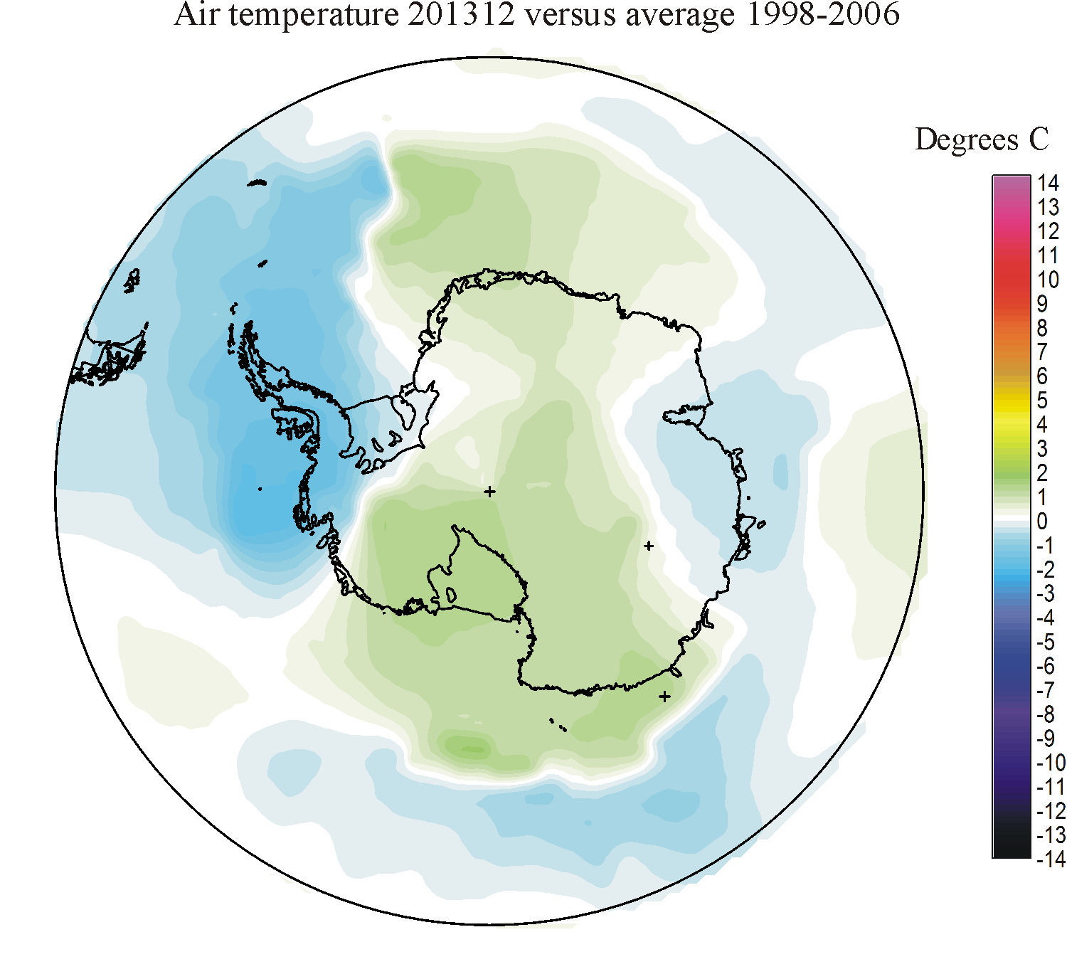
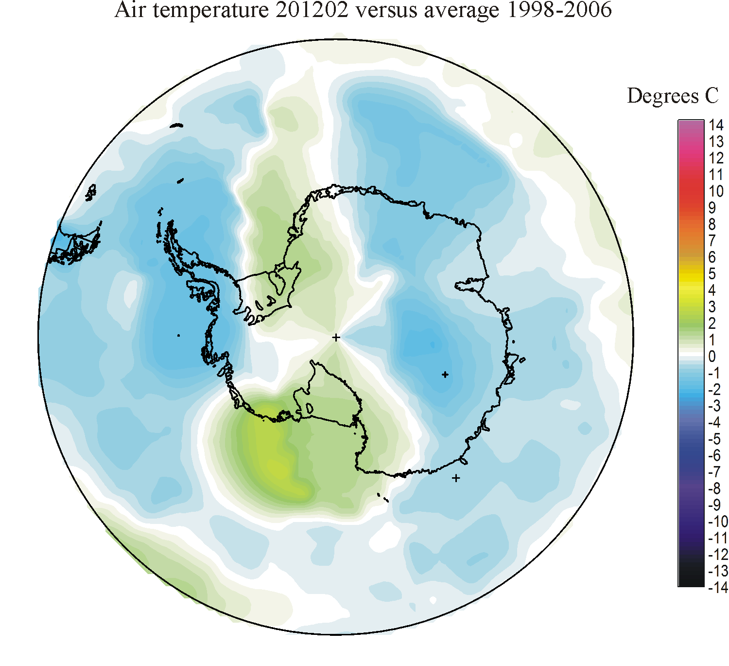
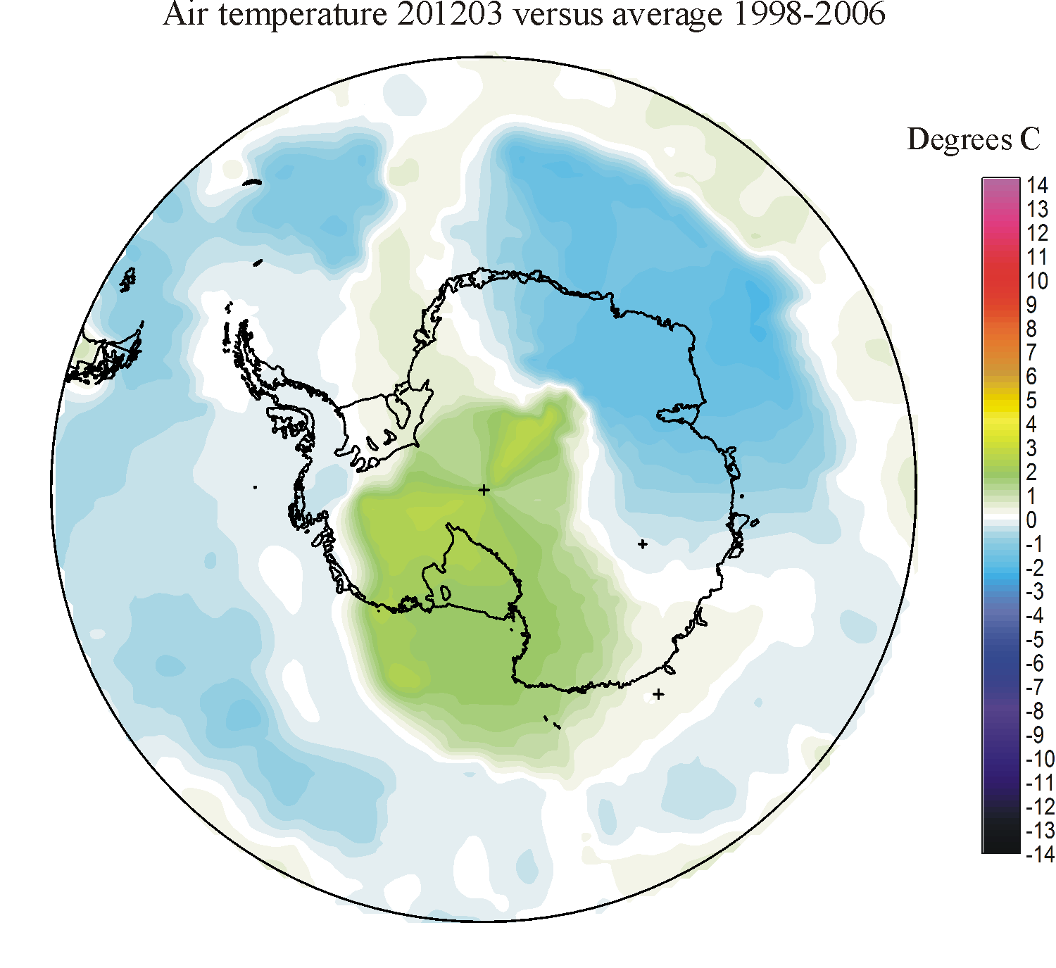
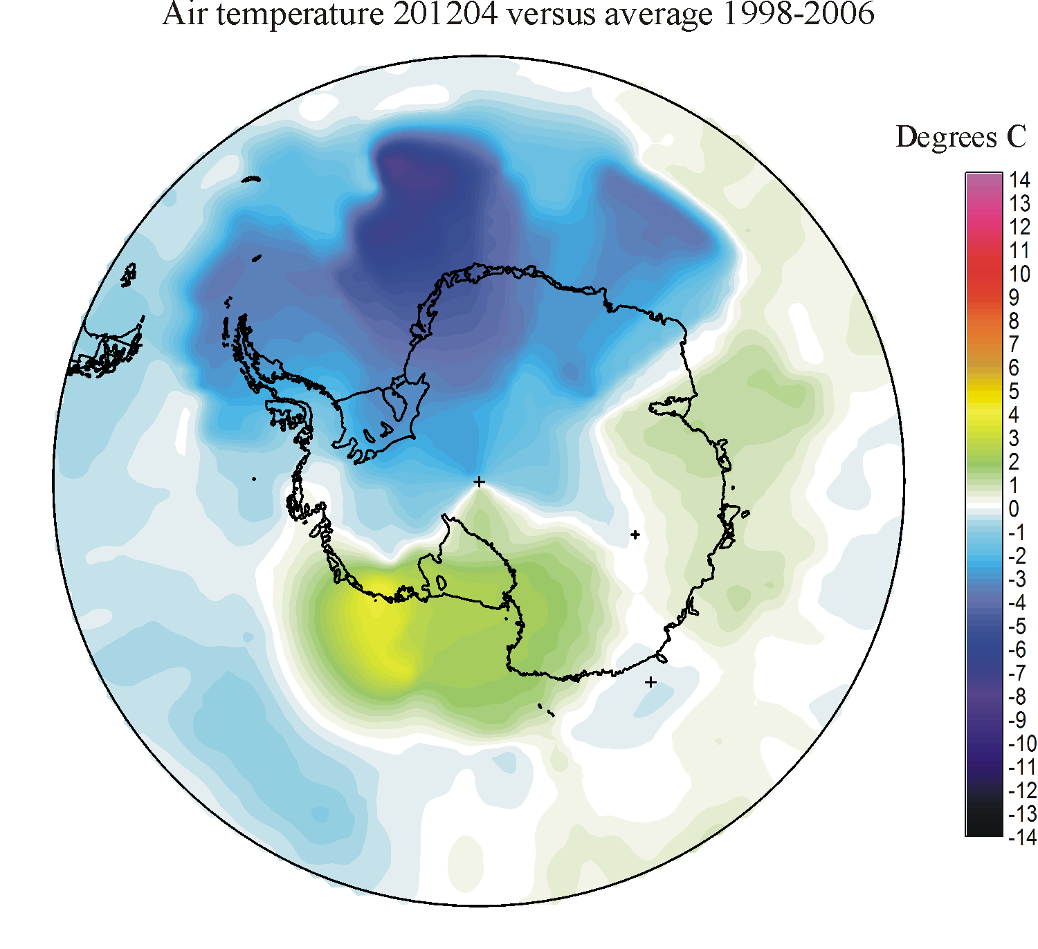
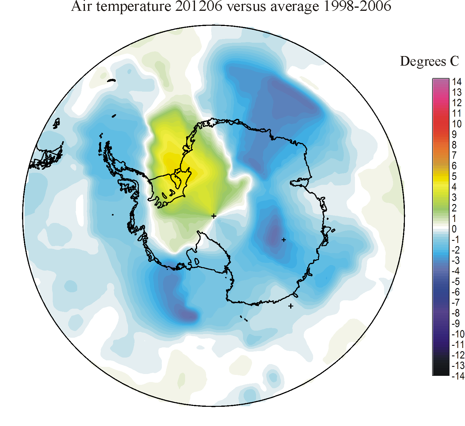
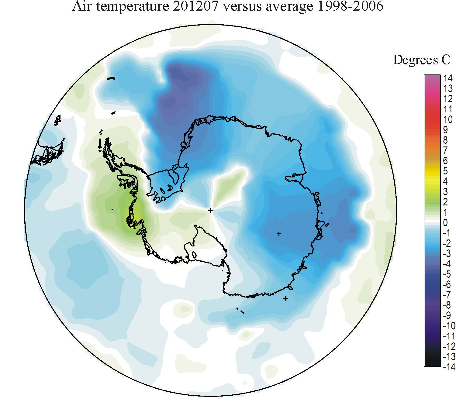
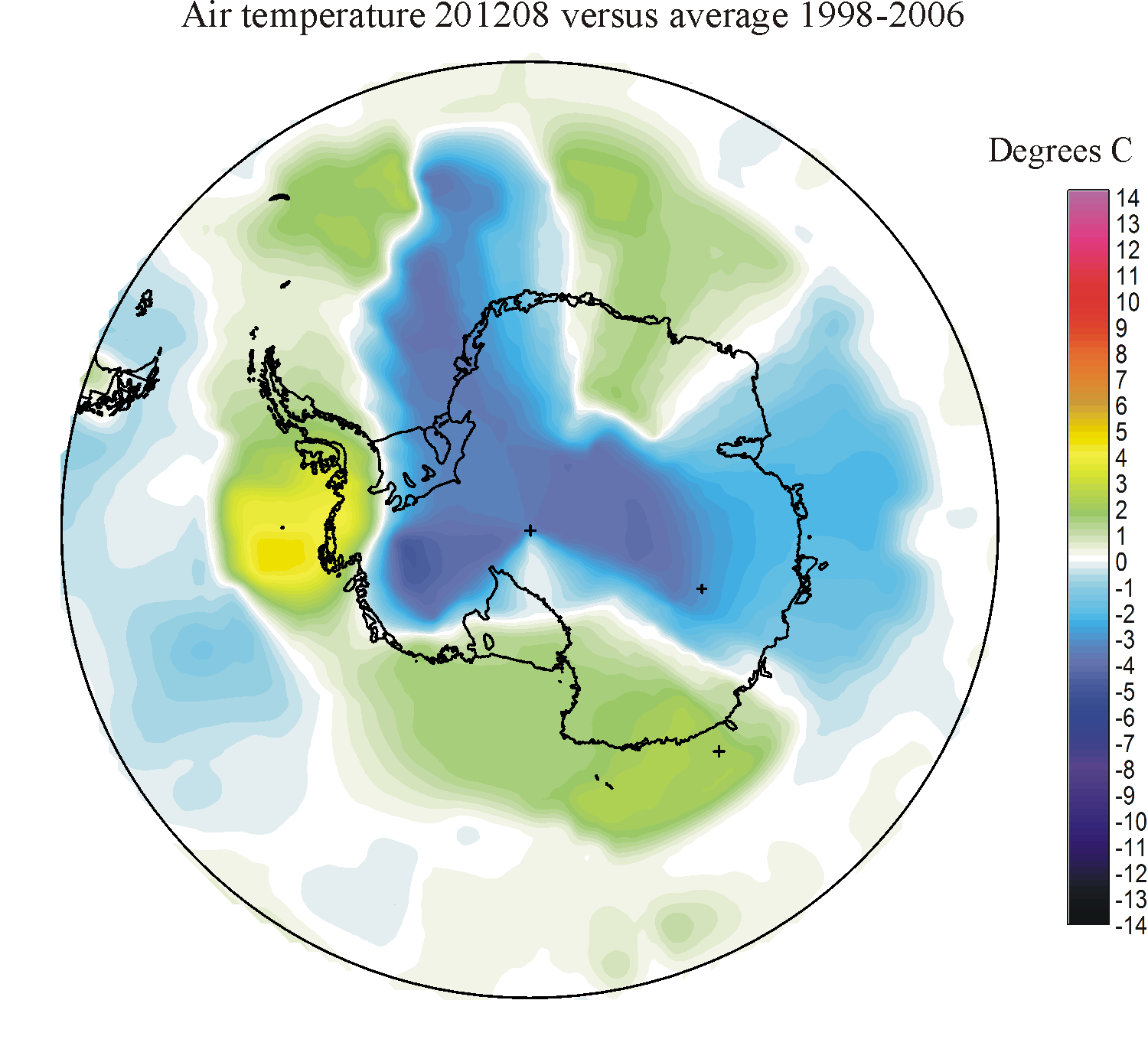
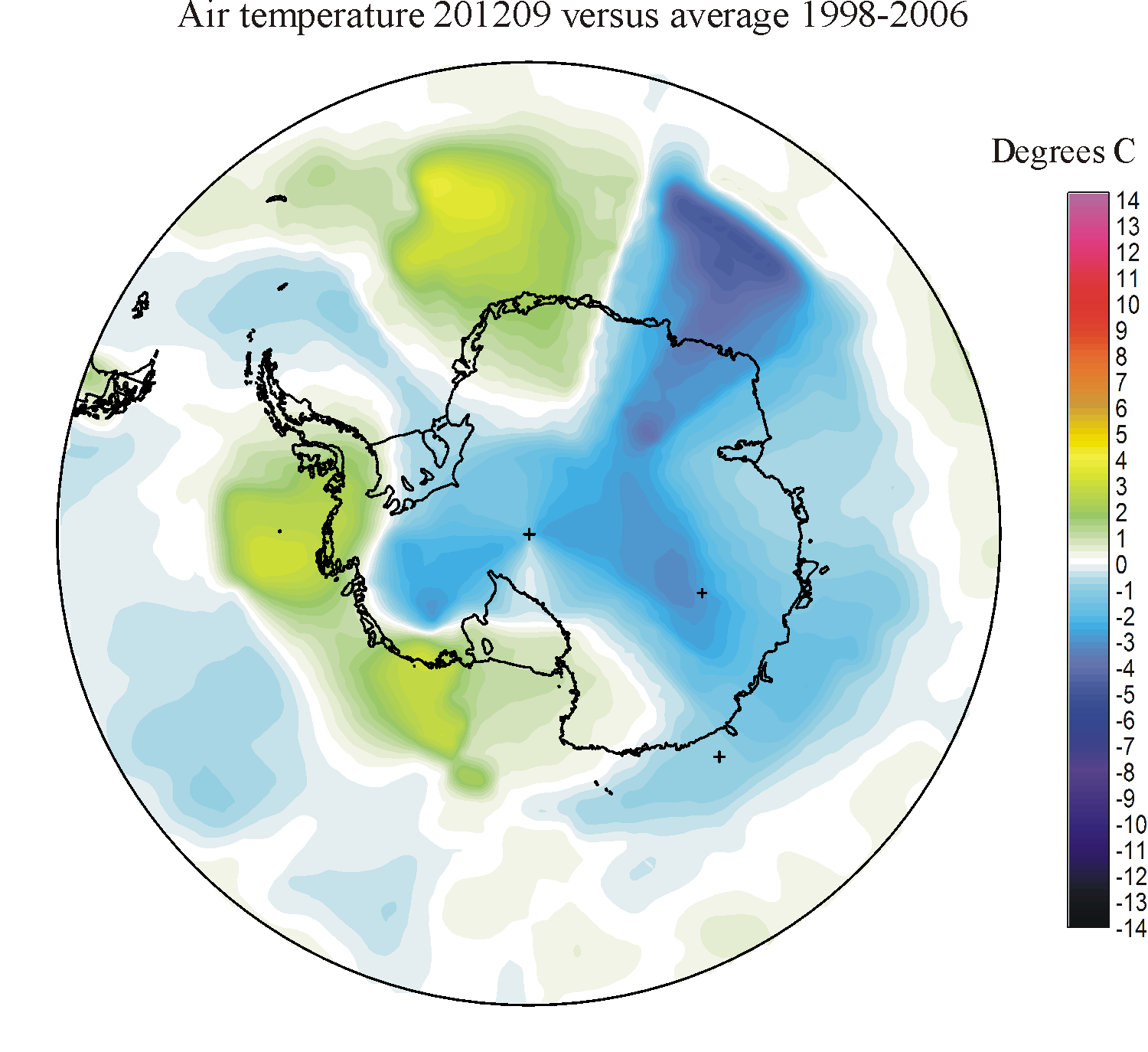
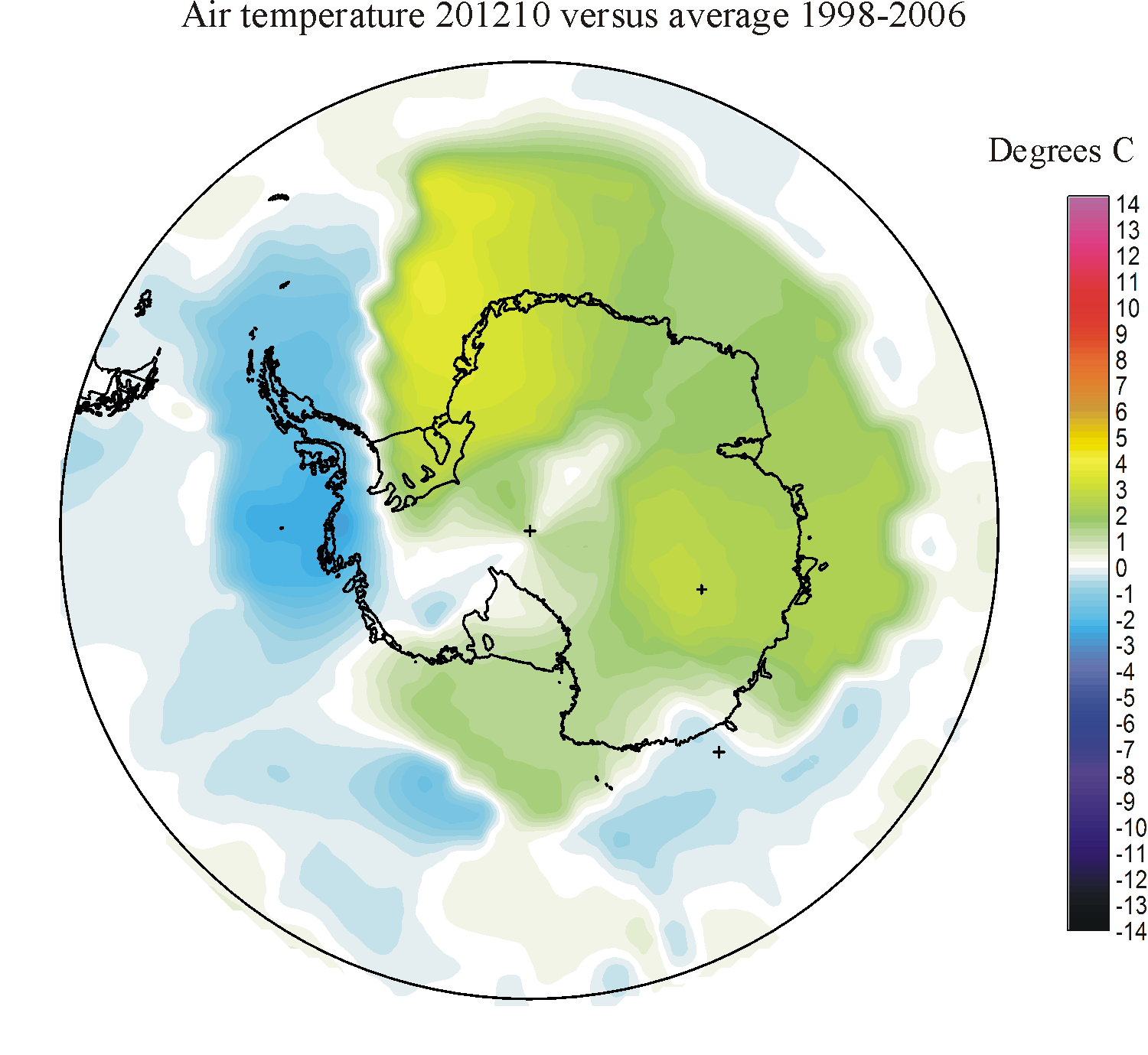
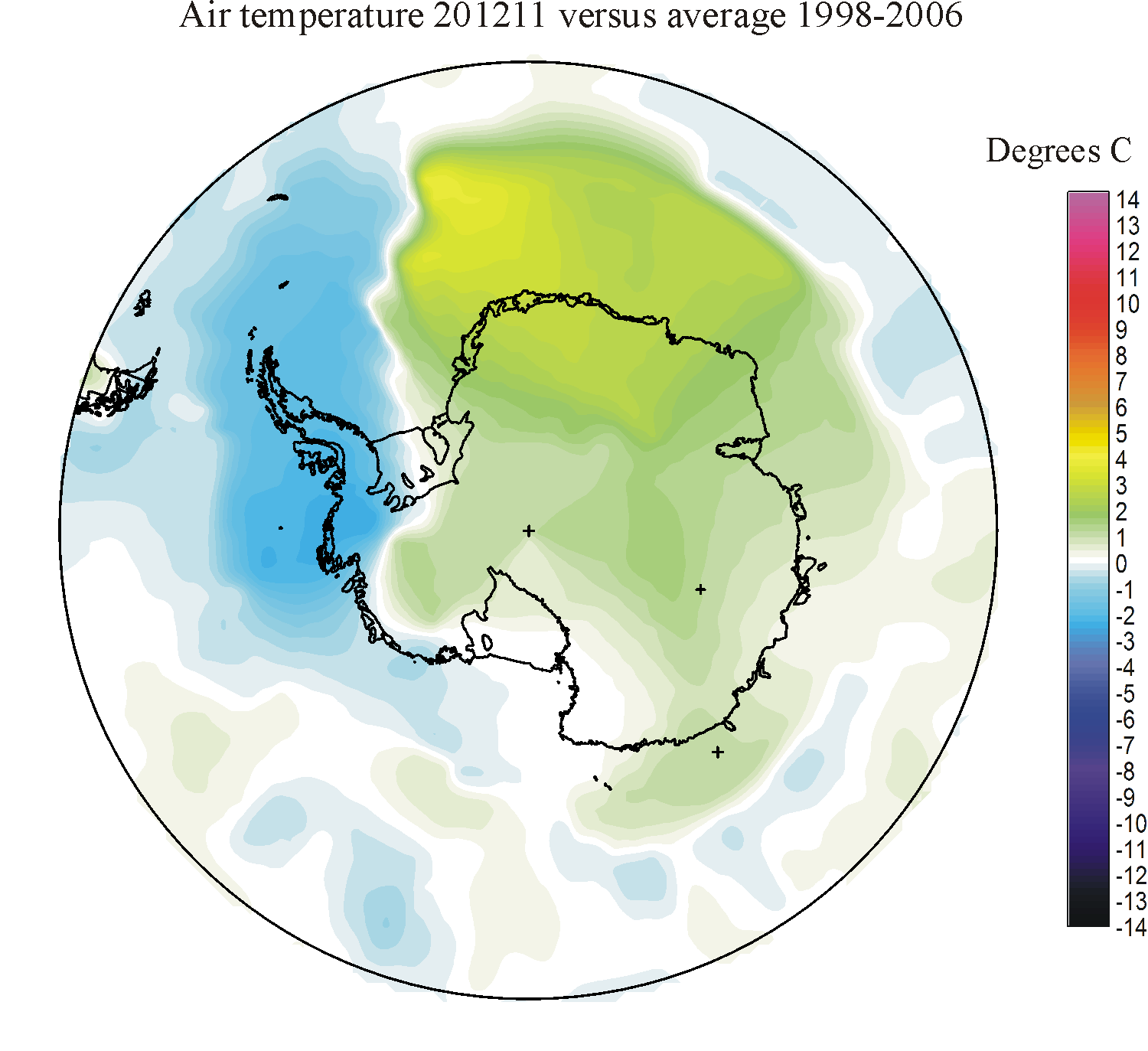
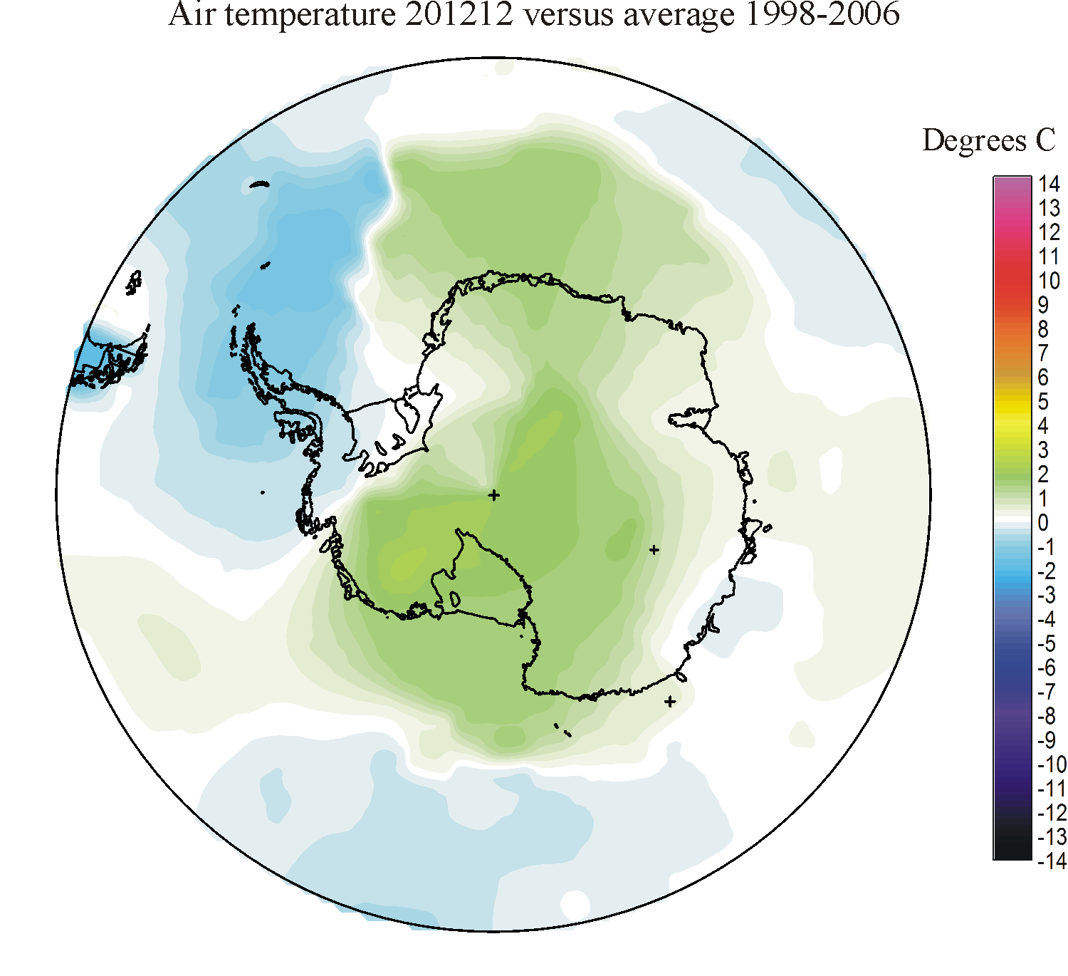
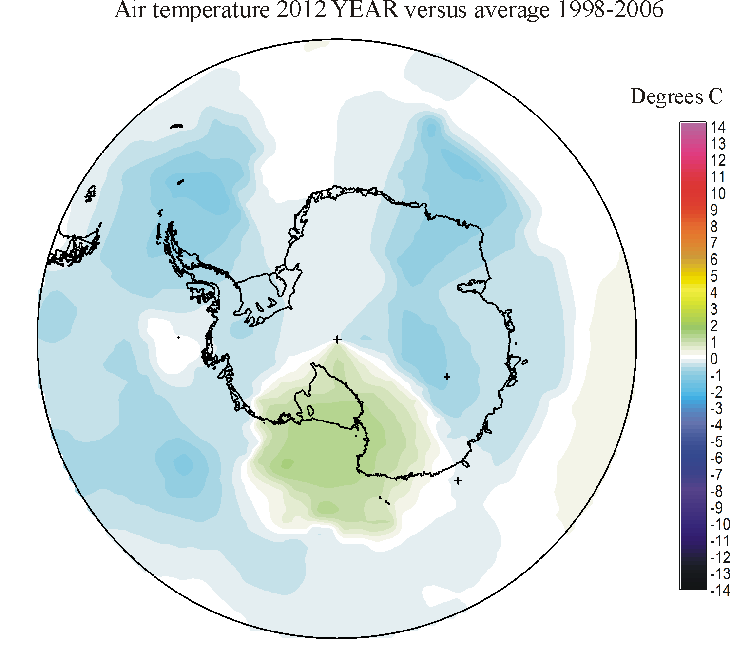
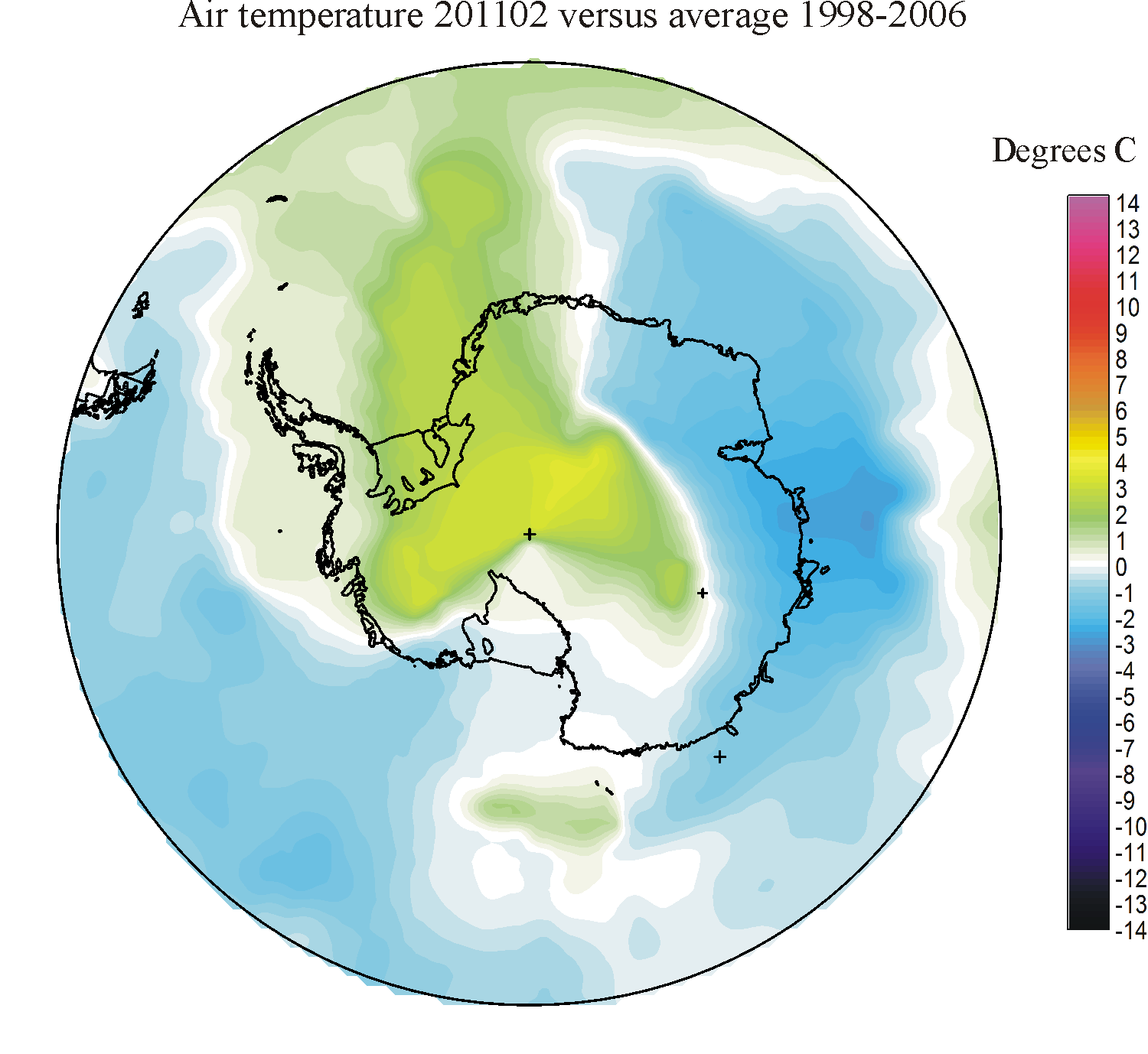
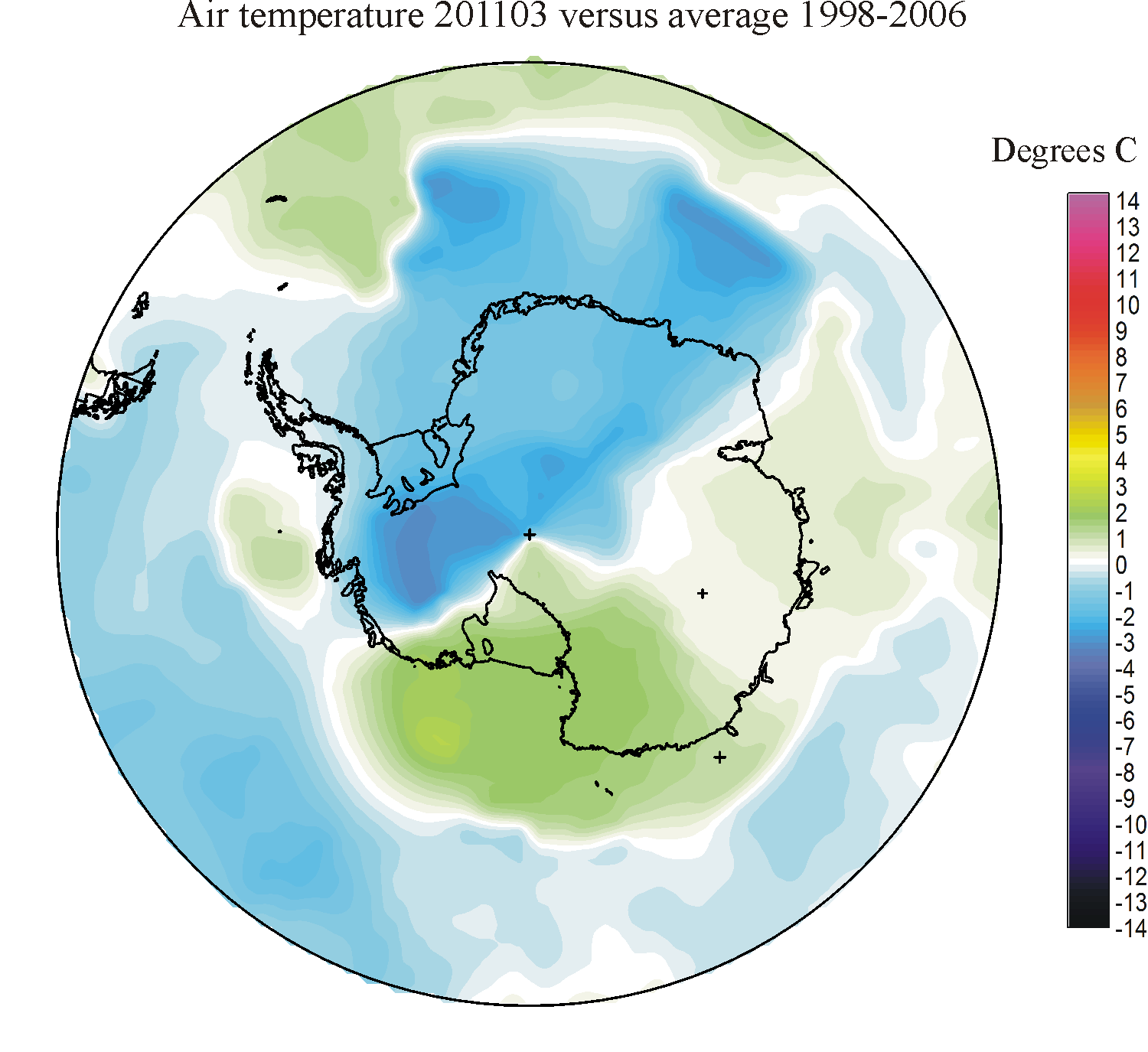
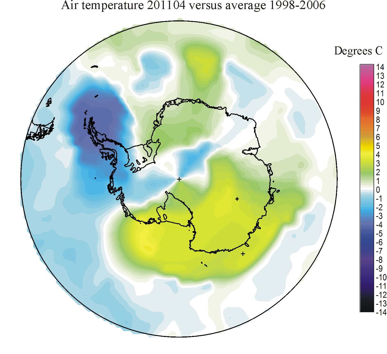
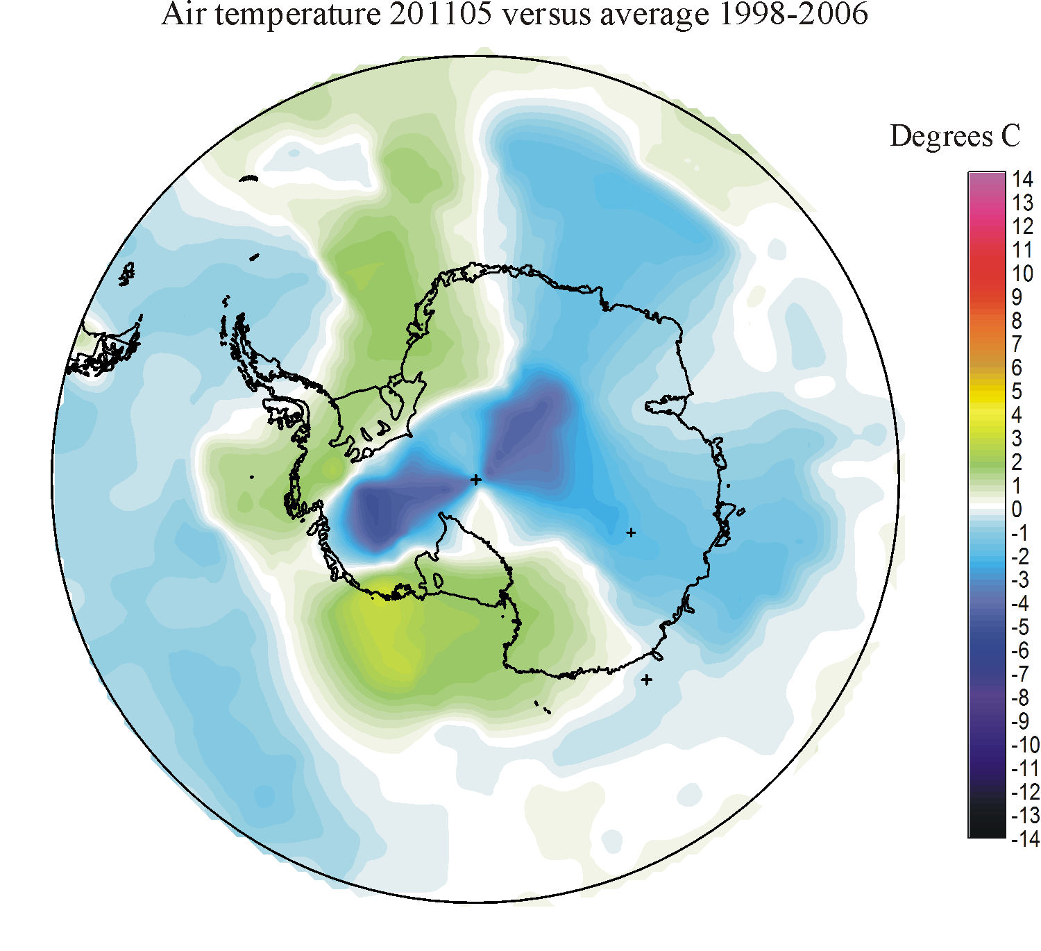
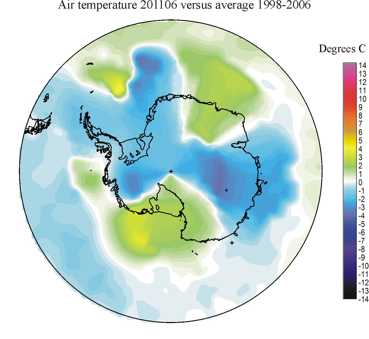
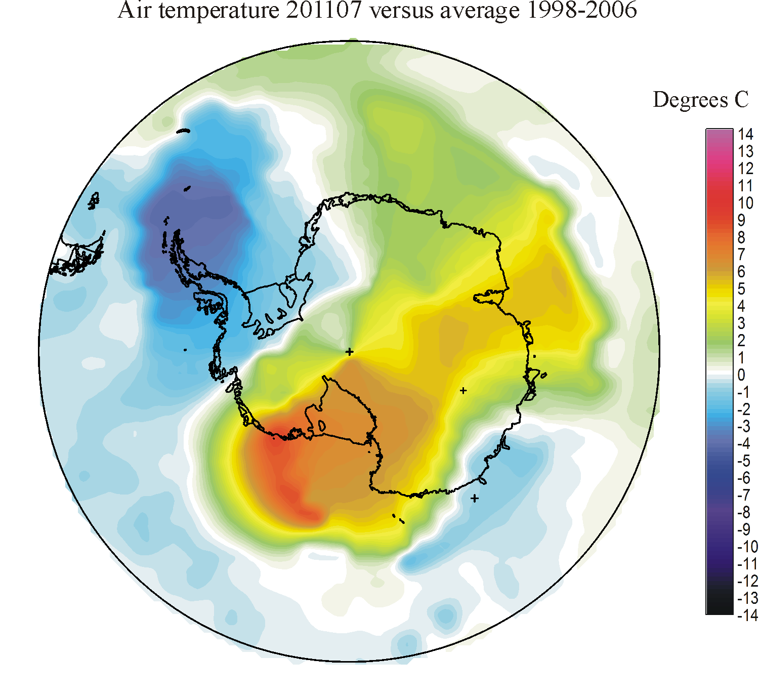
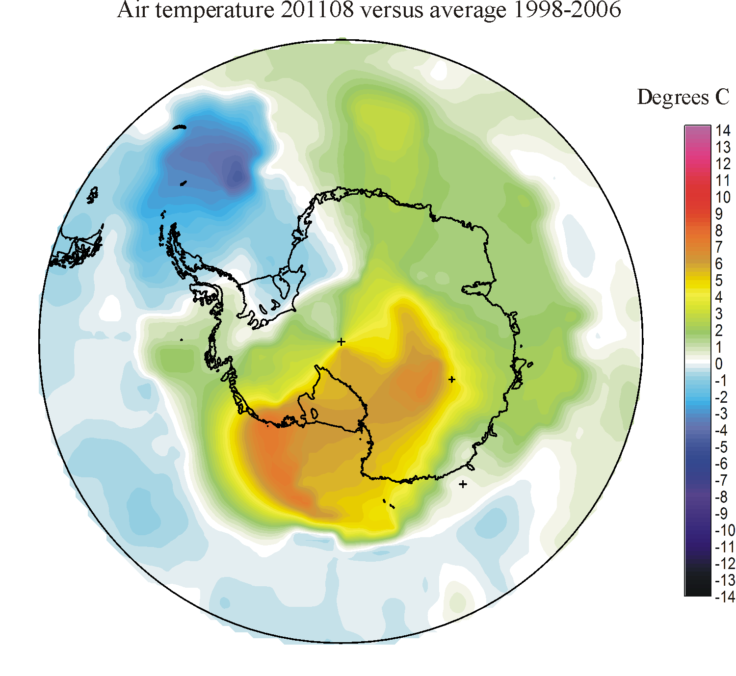
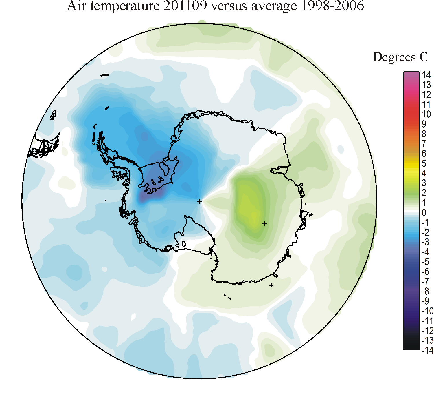
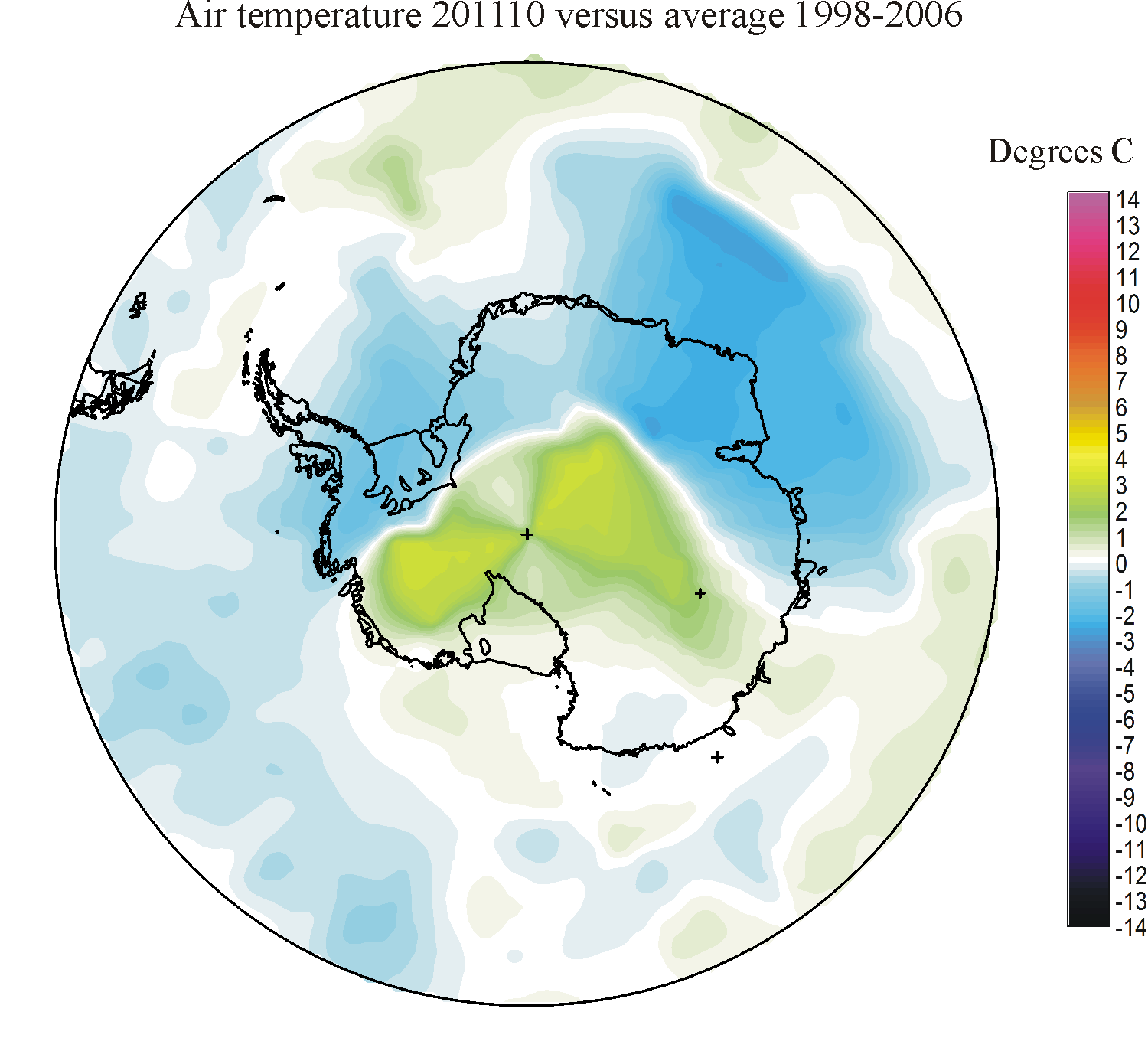
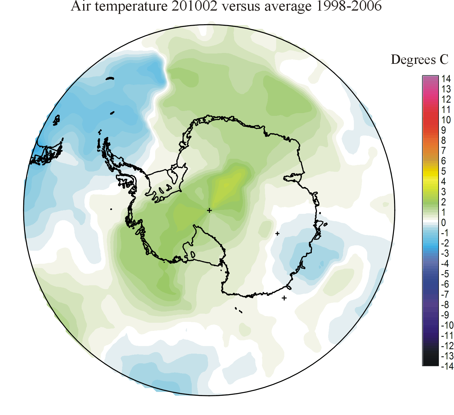
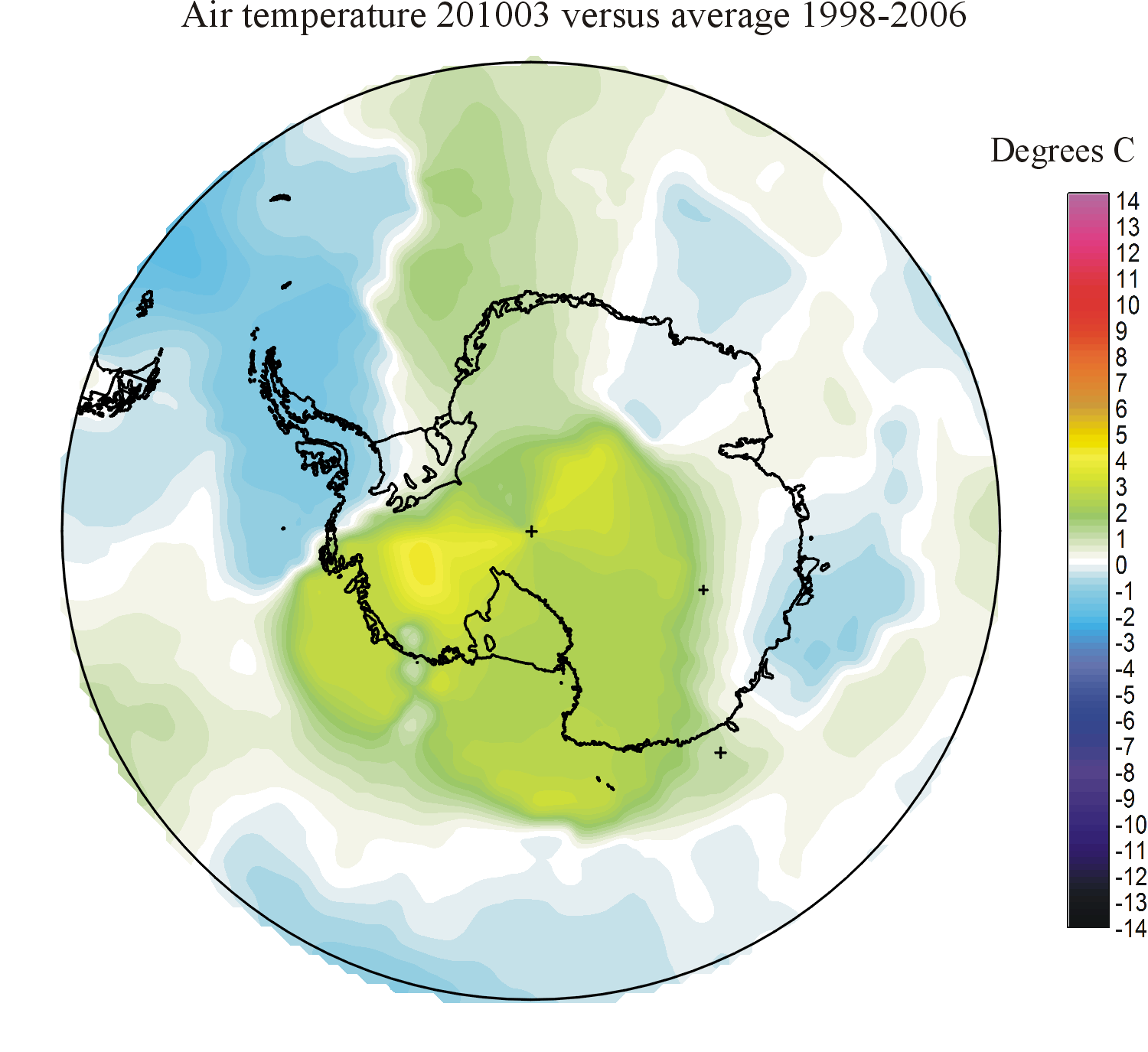
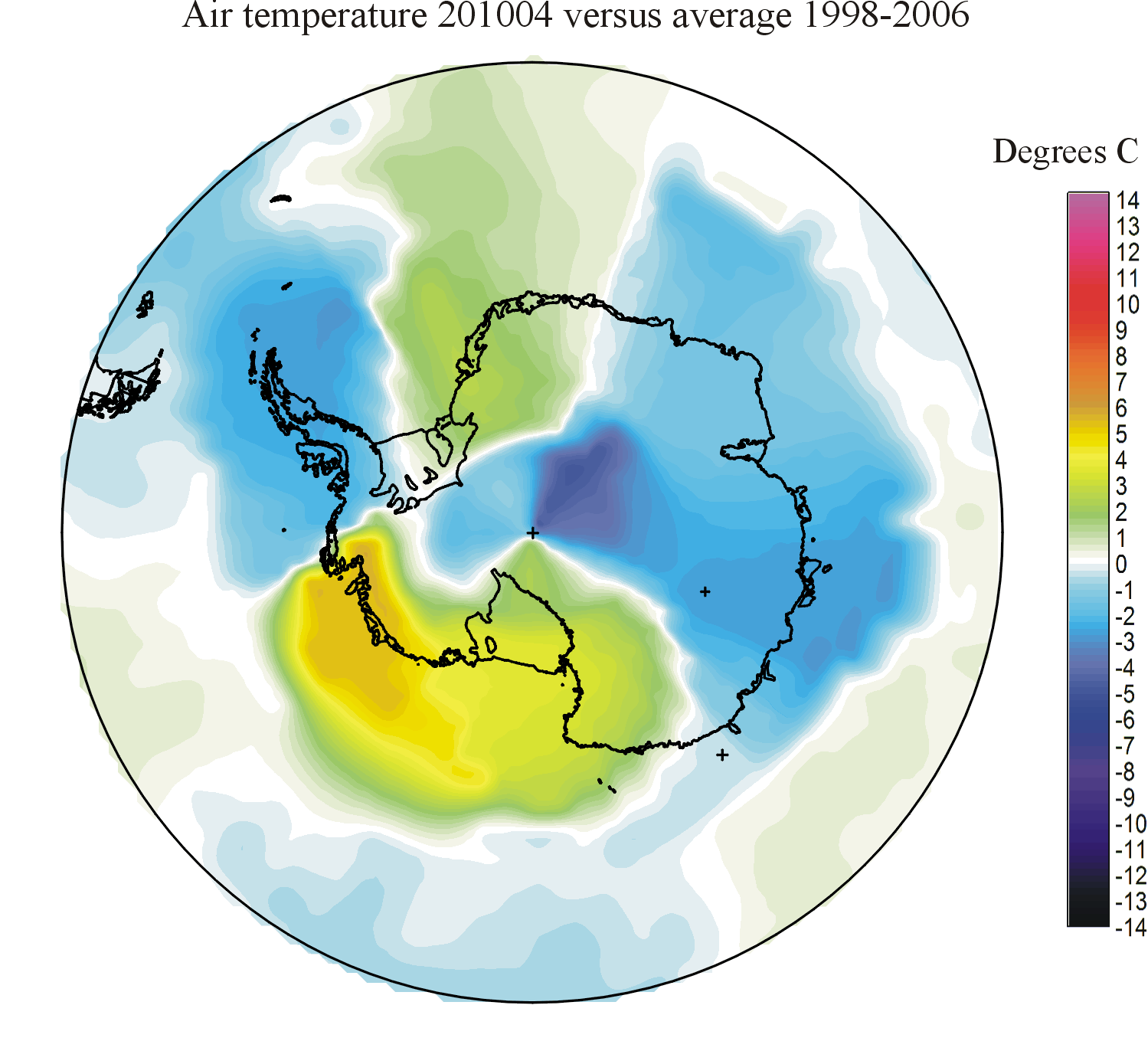
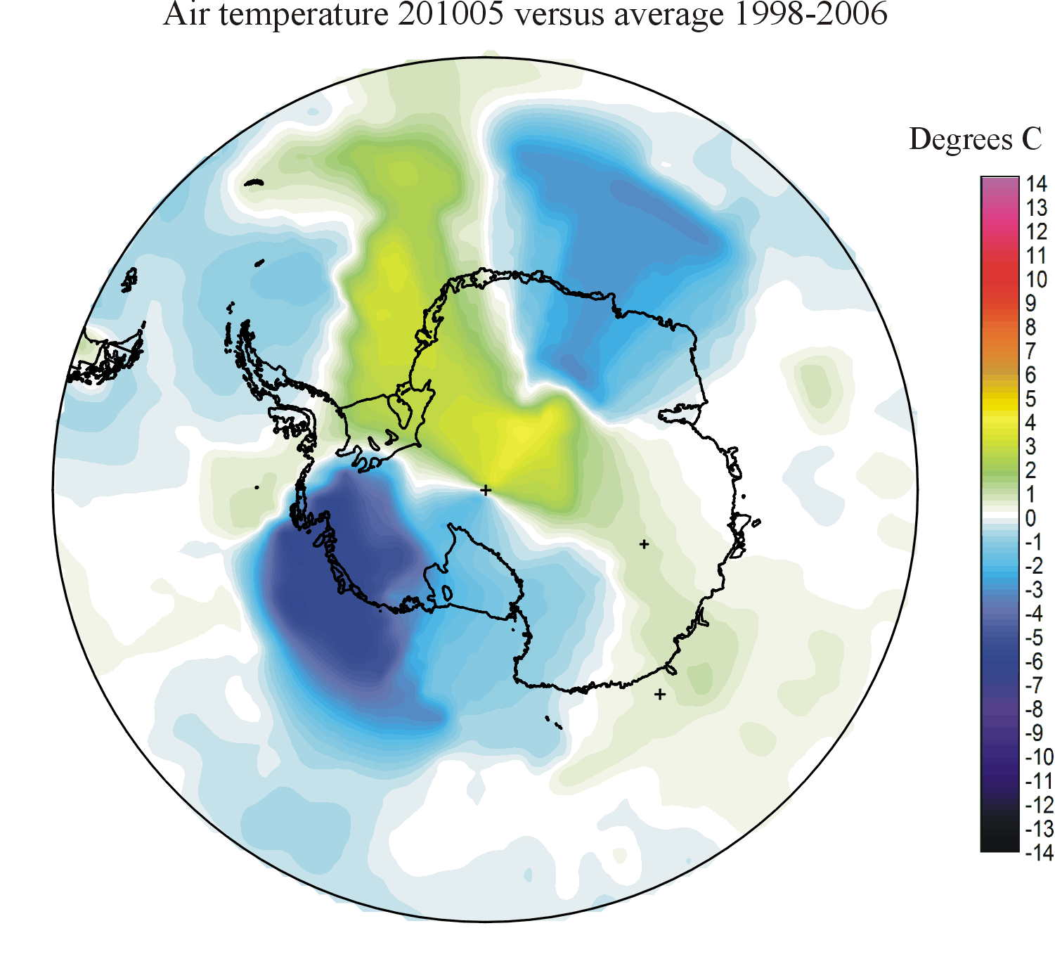
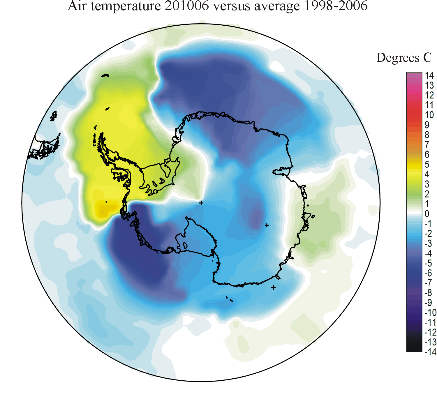
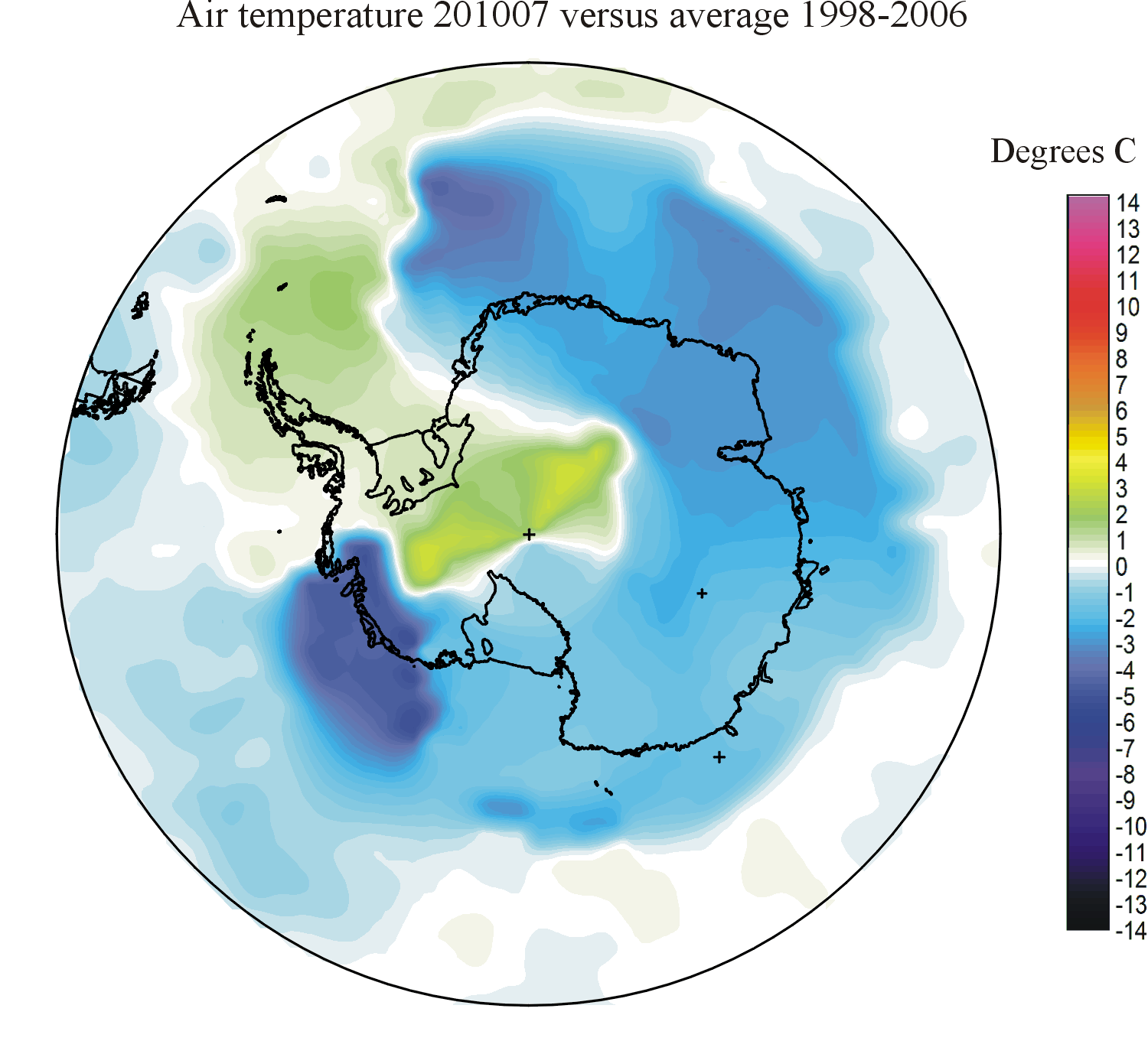
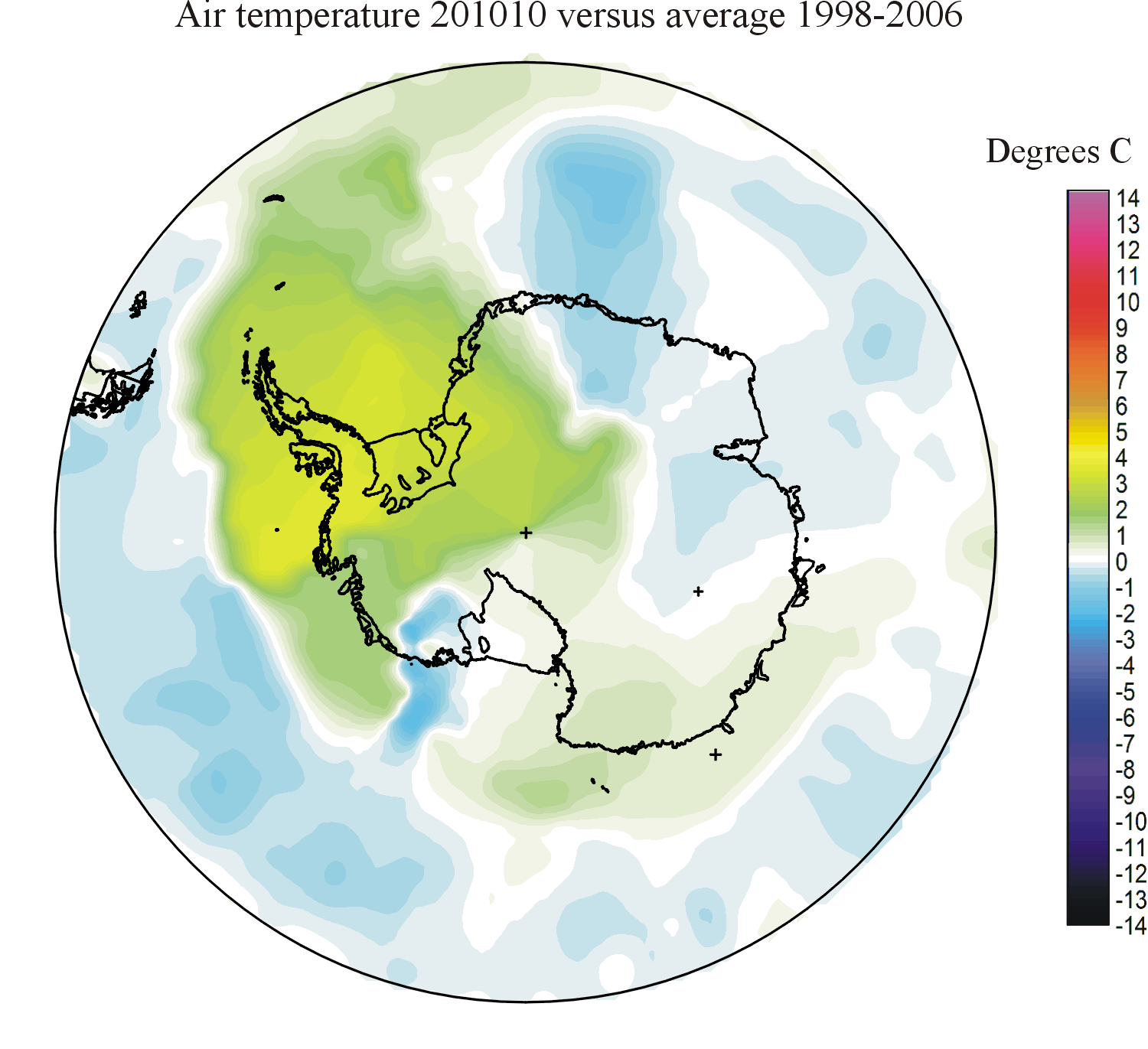
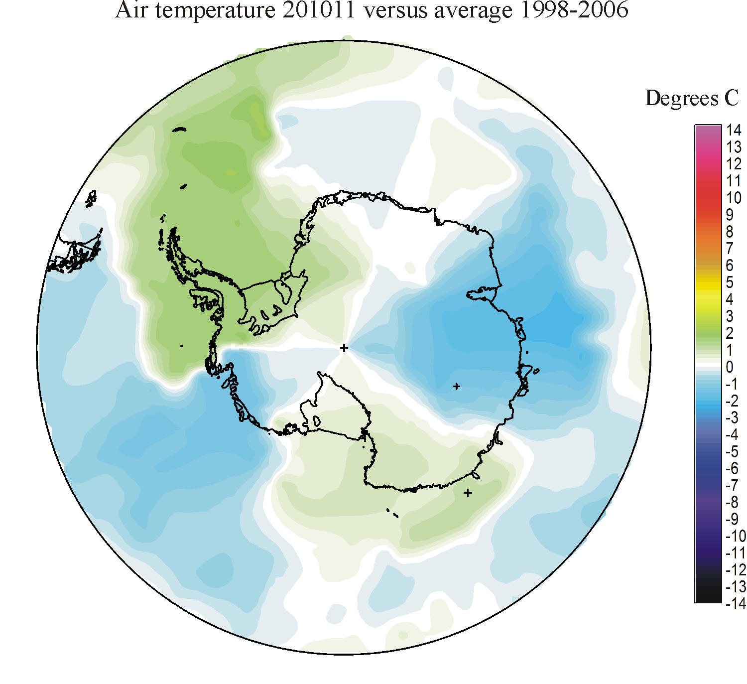
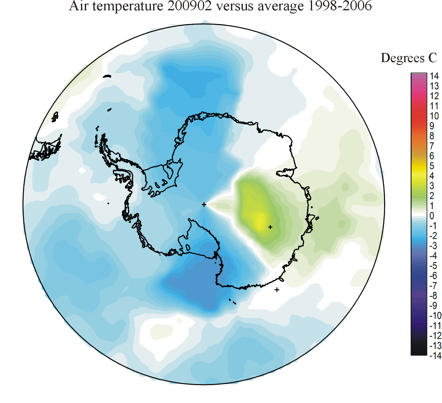
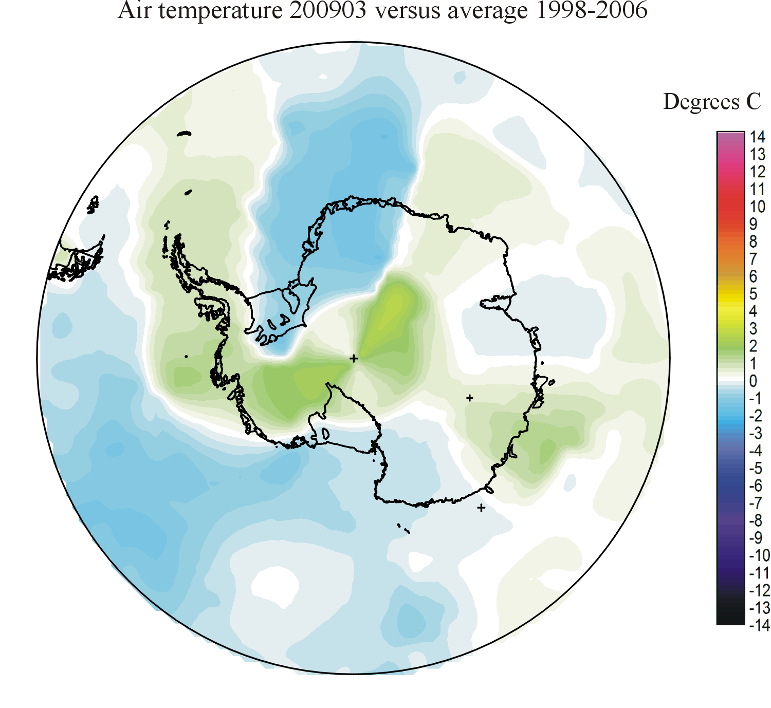
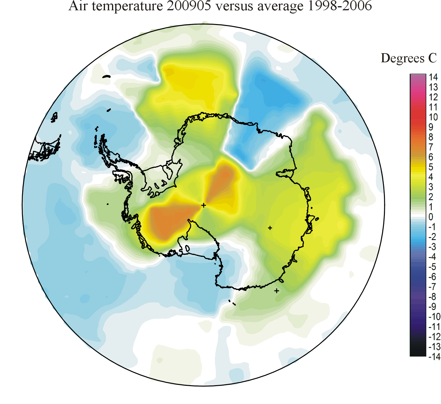
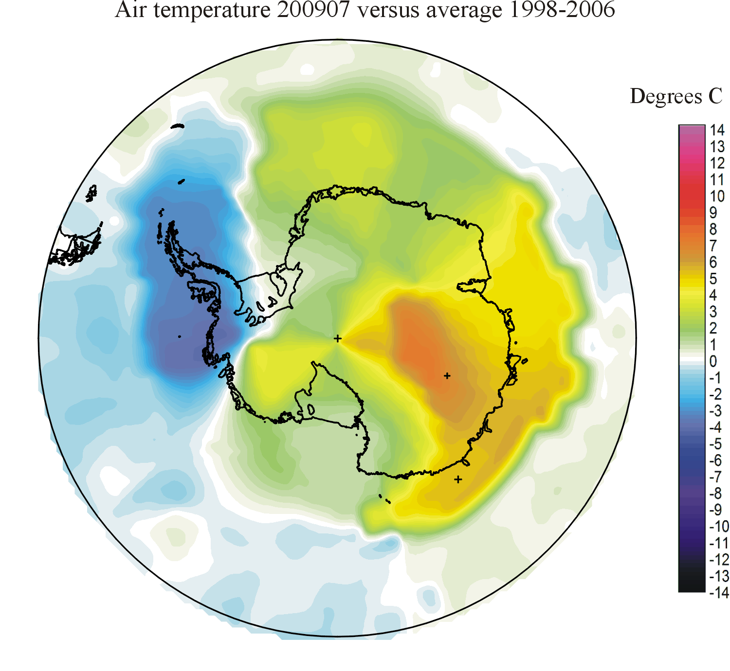
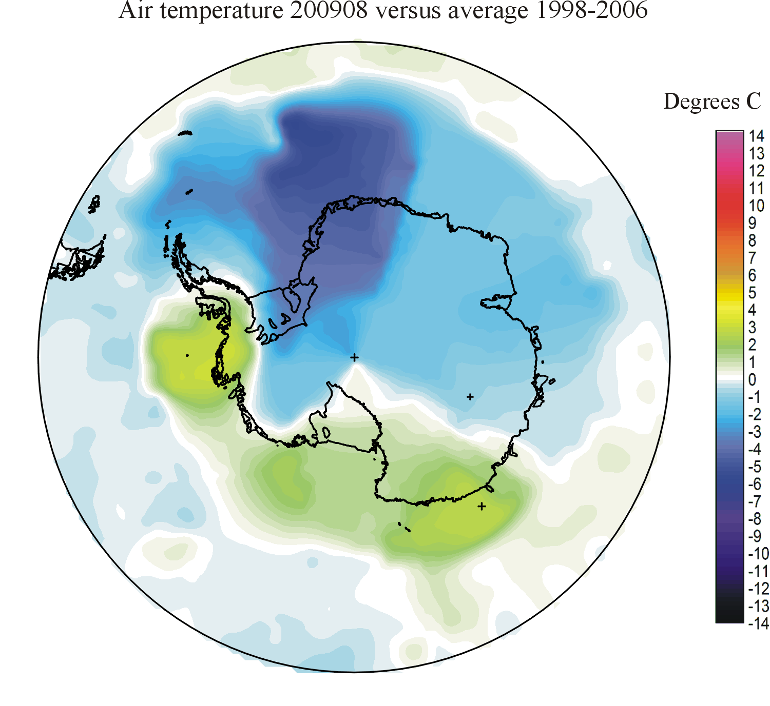
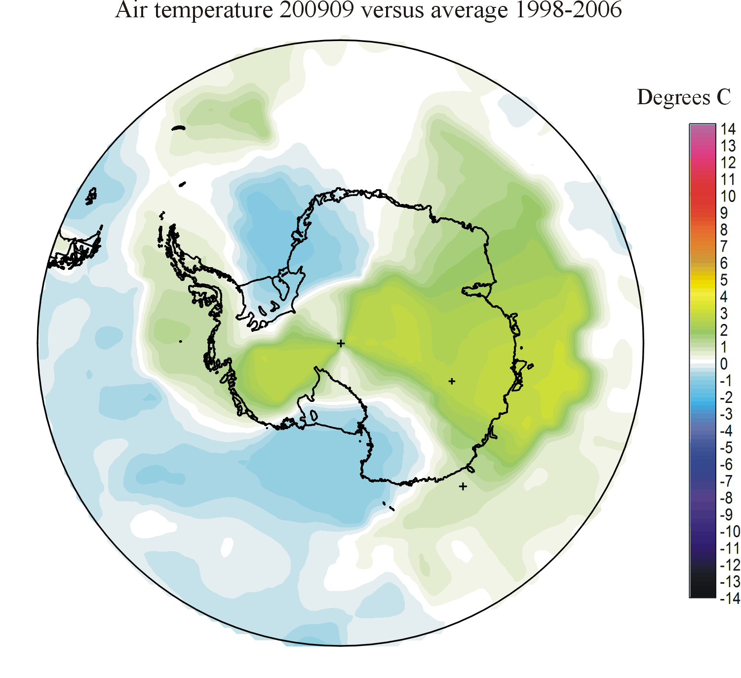
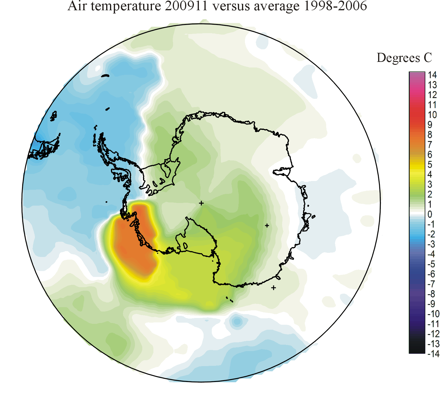
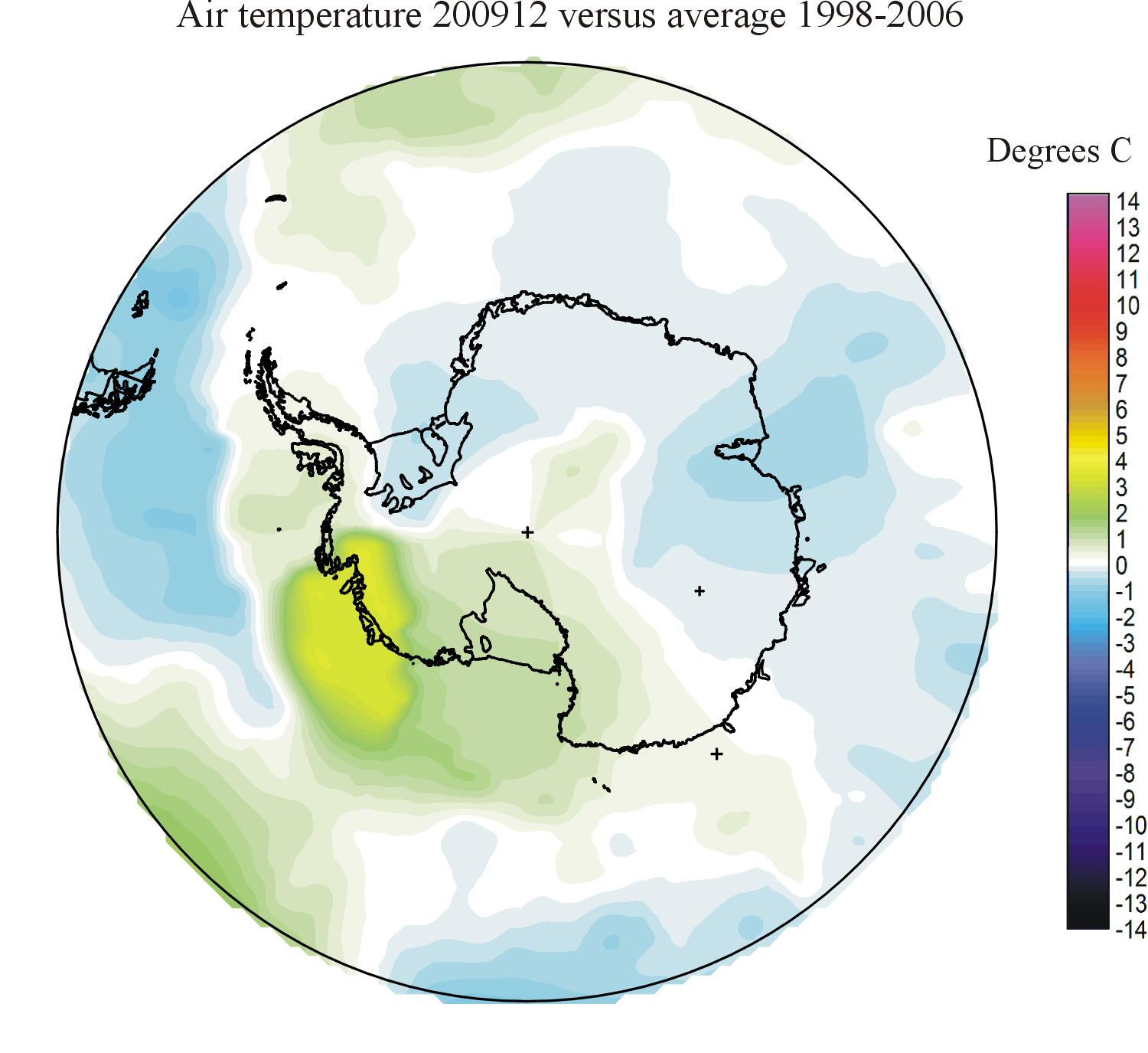
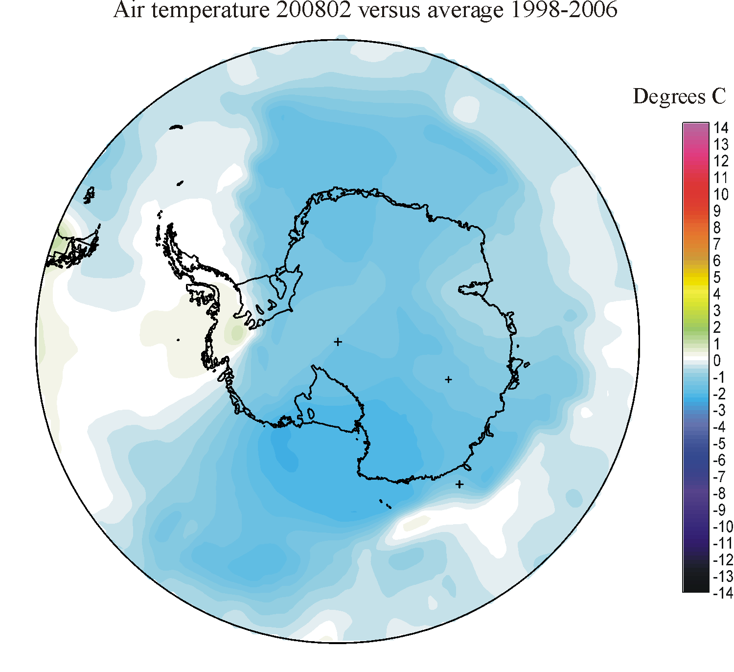
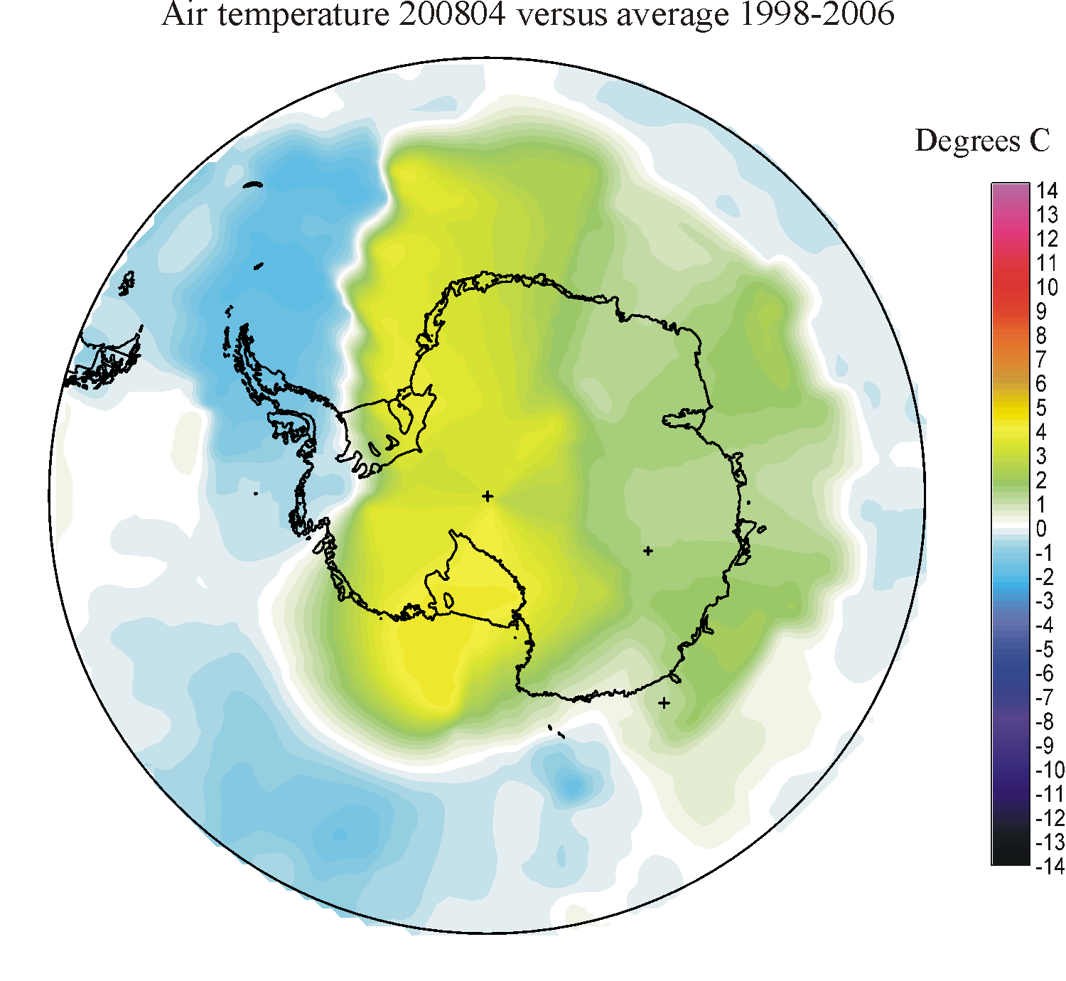
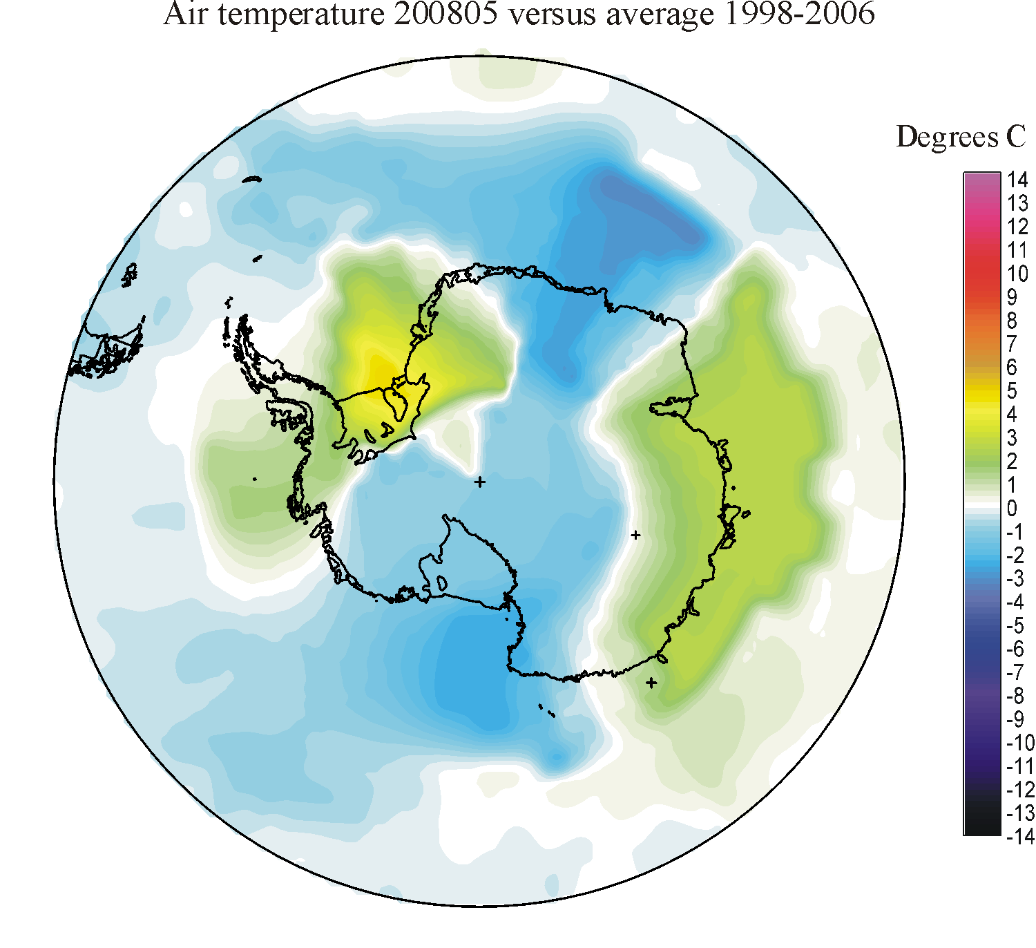
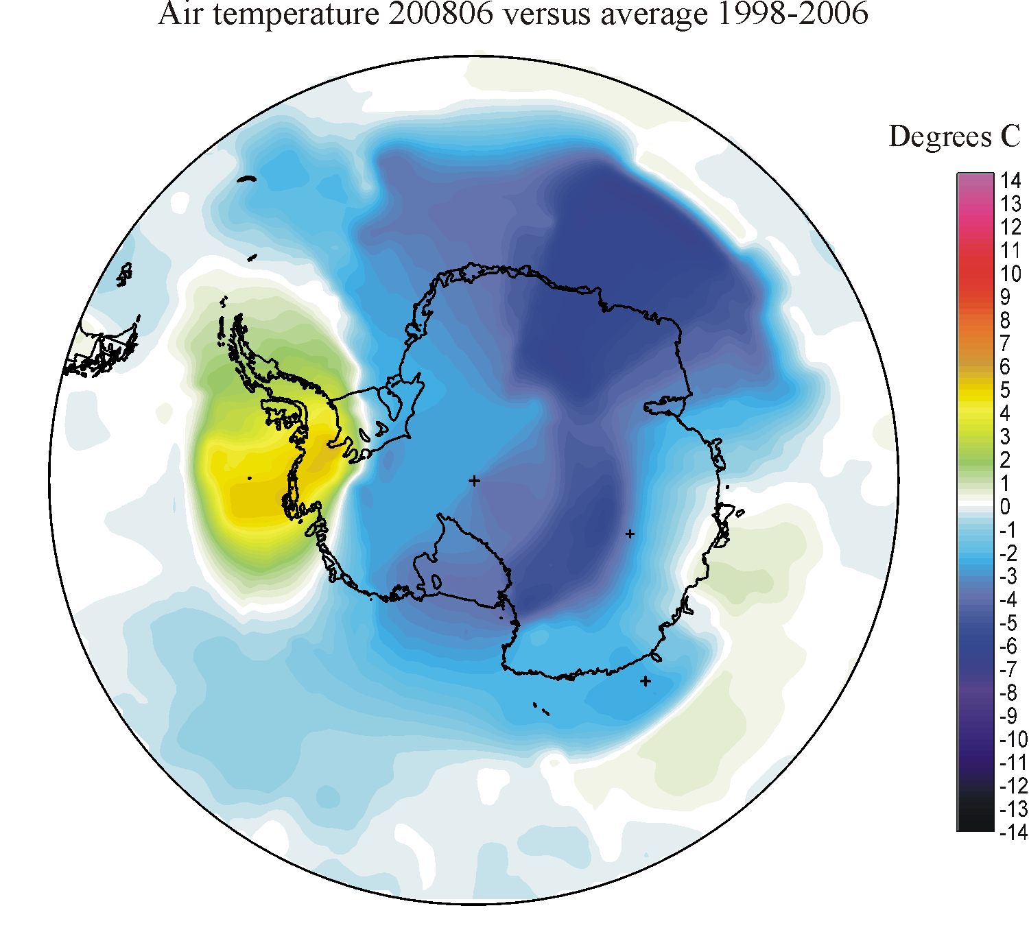
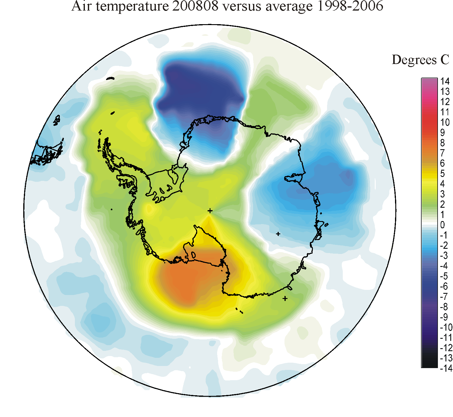
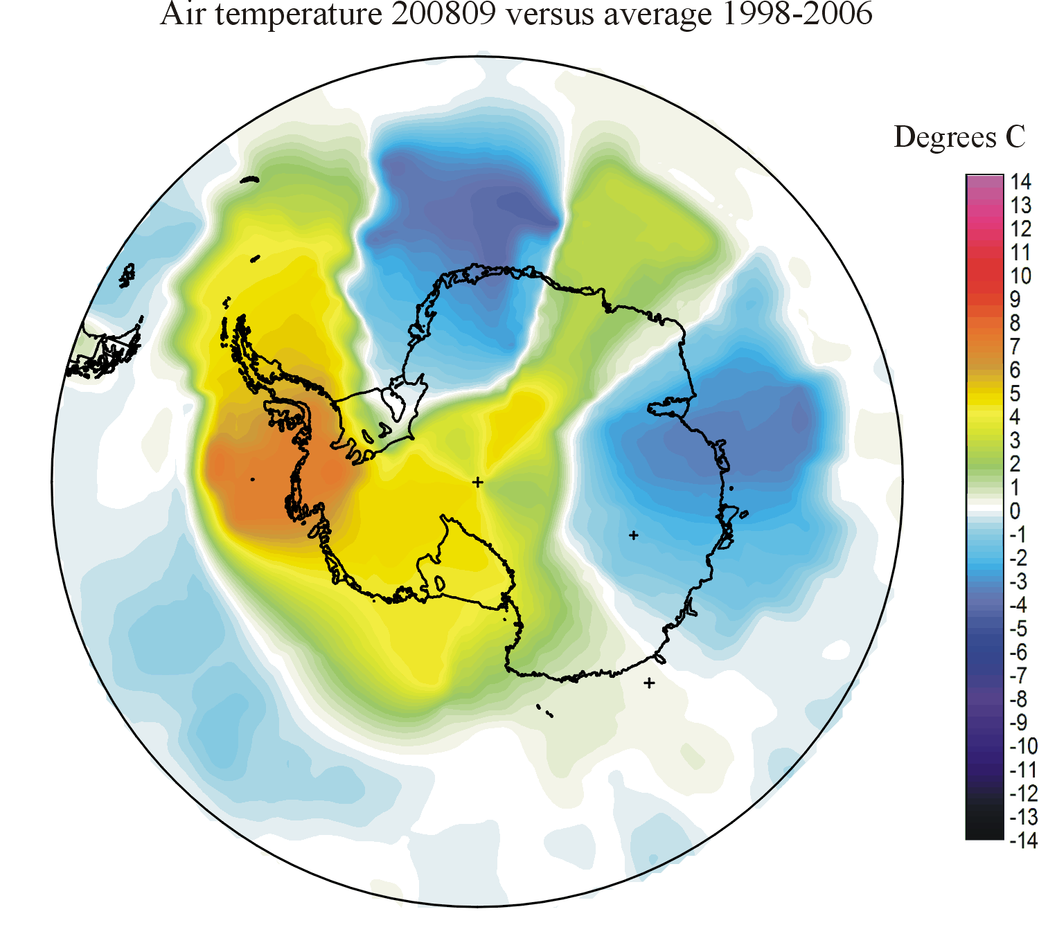
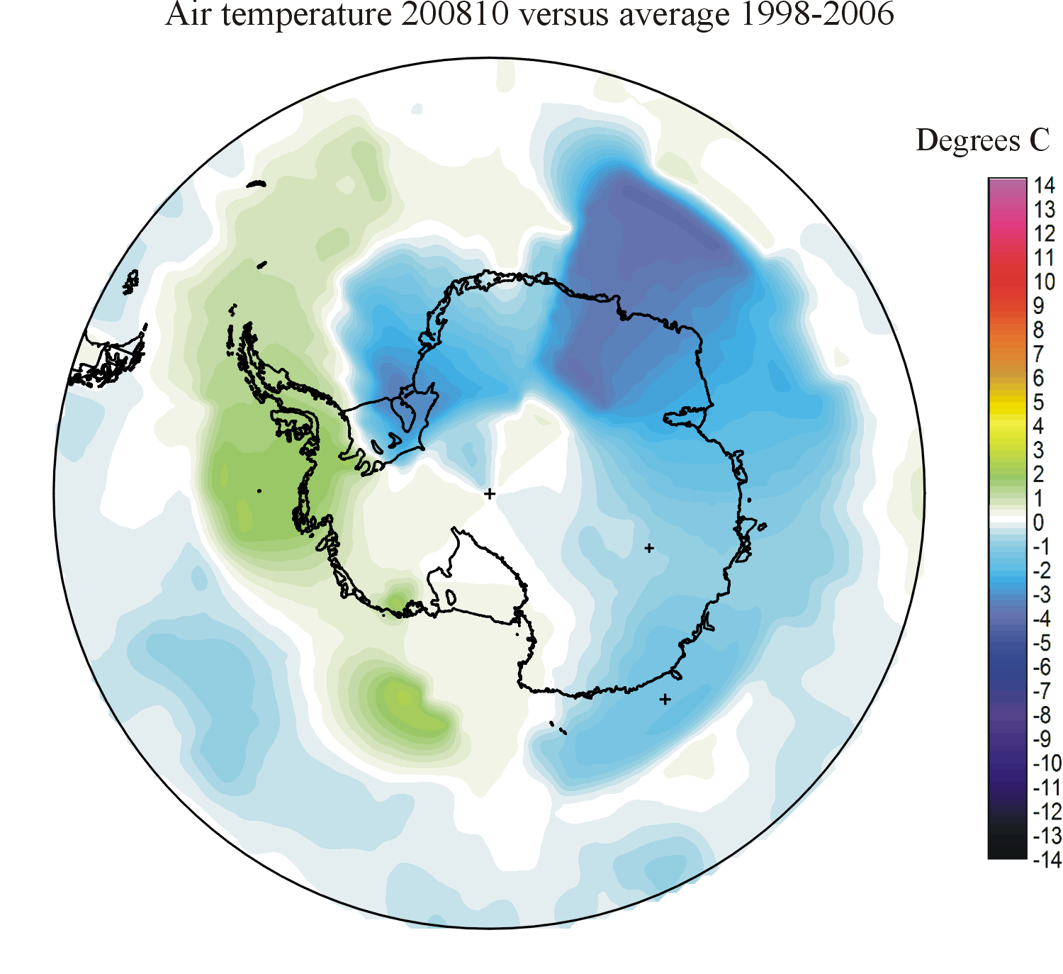
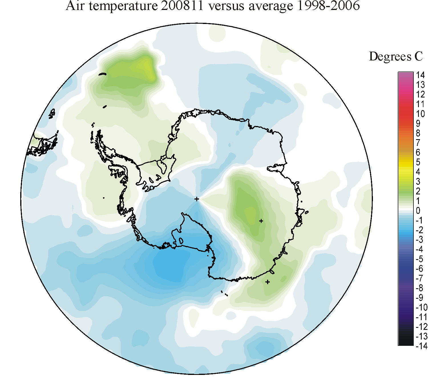
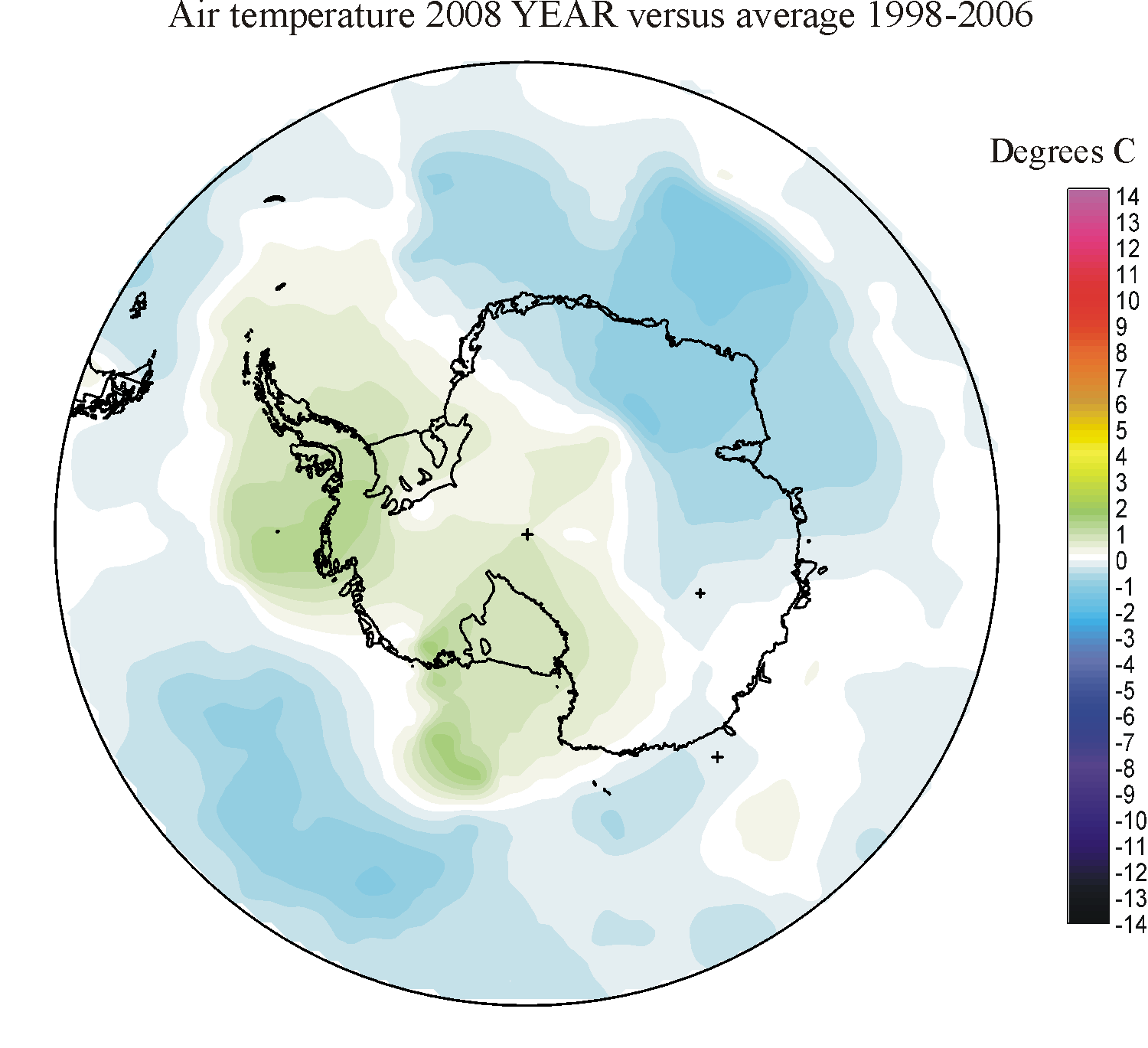
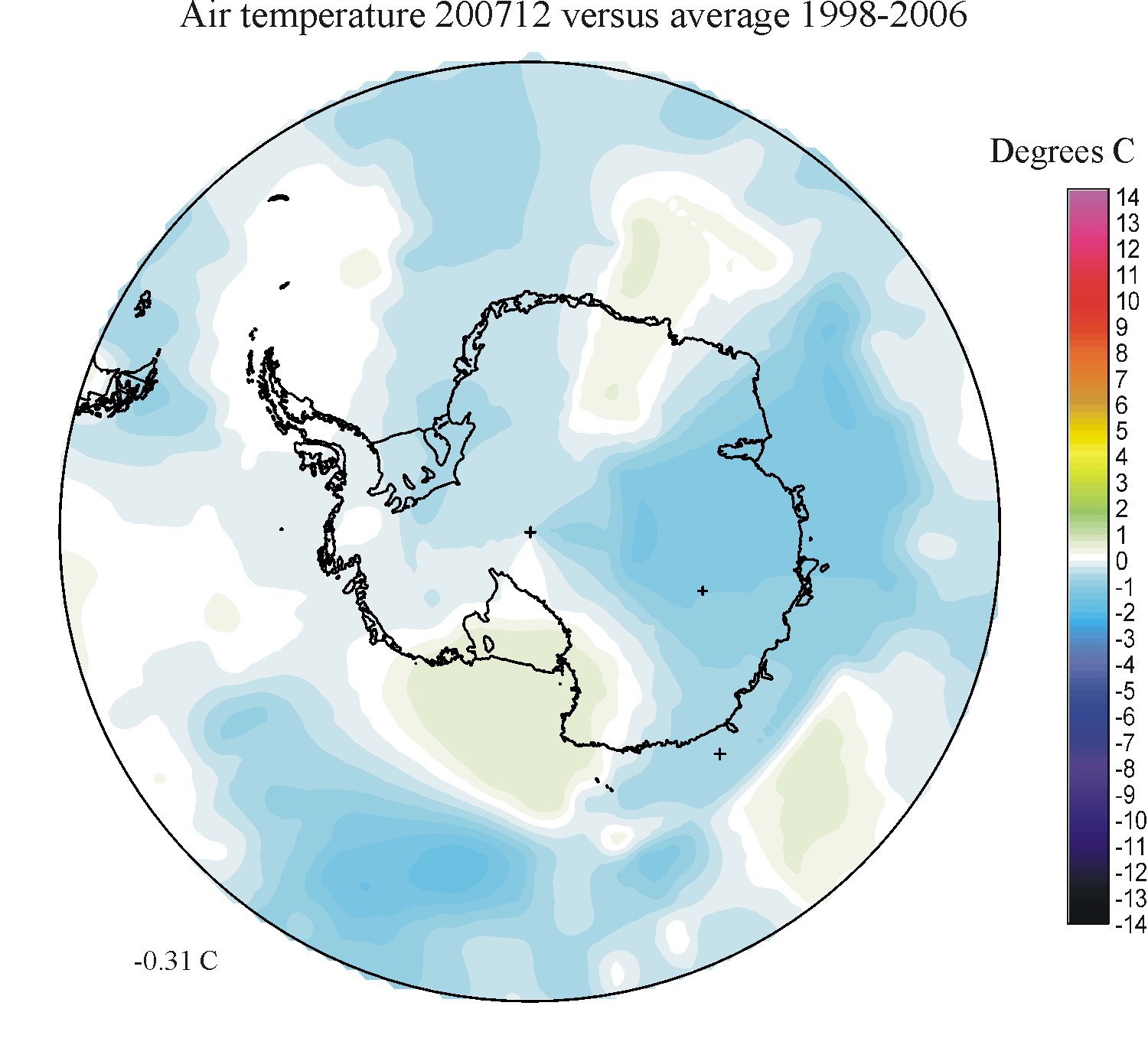
Antarctic monthly surface air temperature anomalies versus average 1998-2006 south of 50oS
| YEAR | JAN | FEB | MAR | APR | MAY | JUN | JUL | AUG | SEP | OCT | NOV | DEC | ANNUAL |
| 2025 | 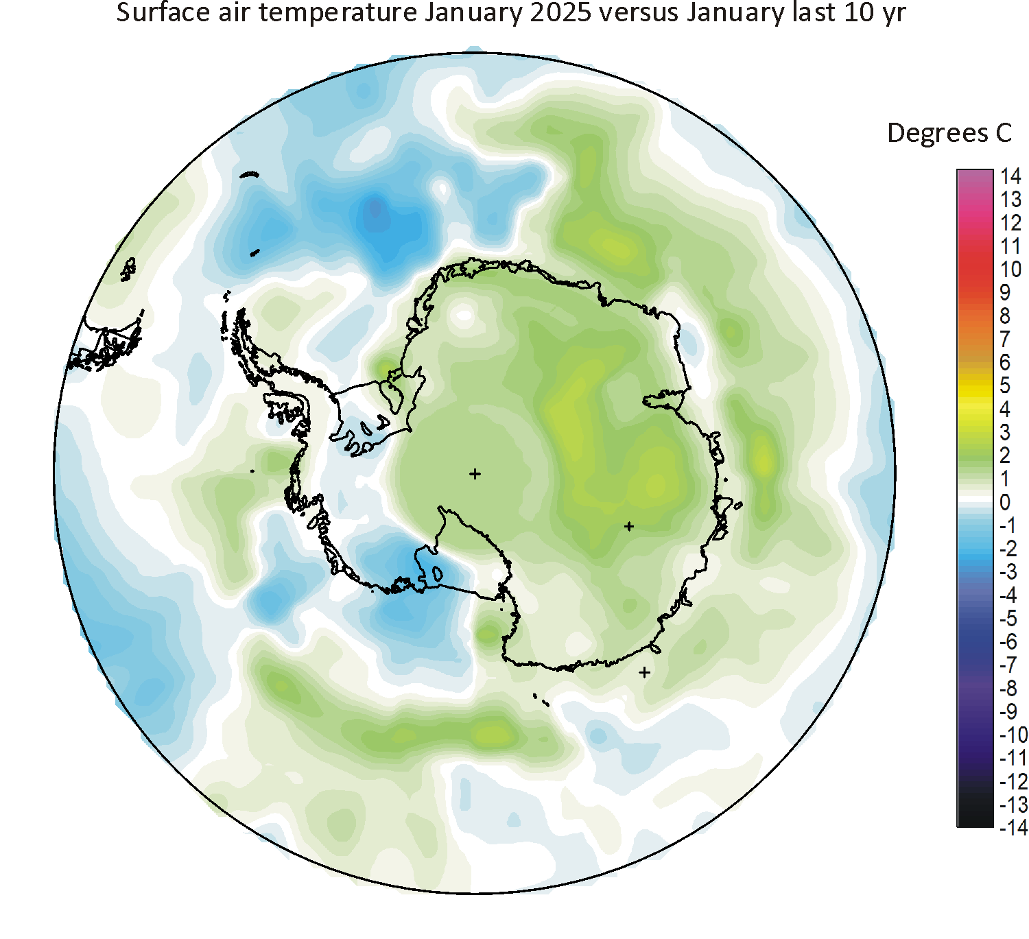
|

|
|
|
|||||||||
| 2024 | 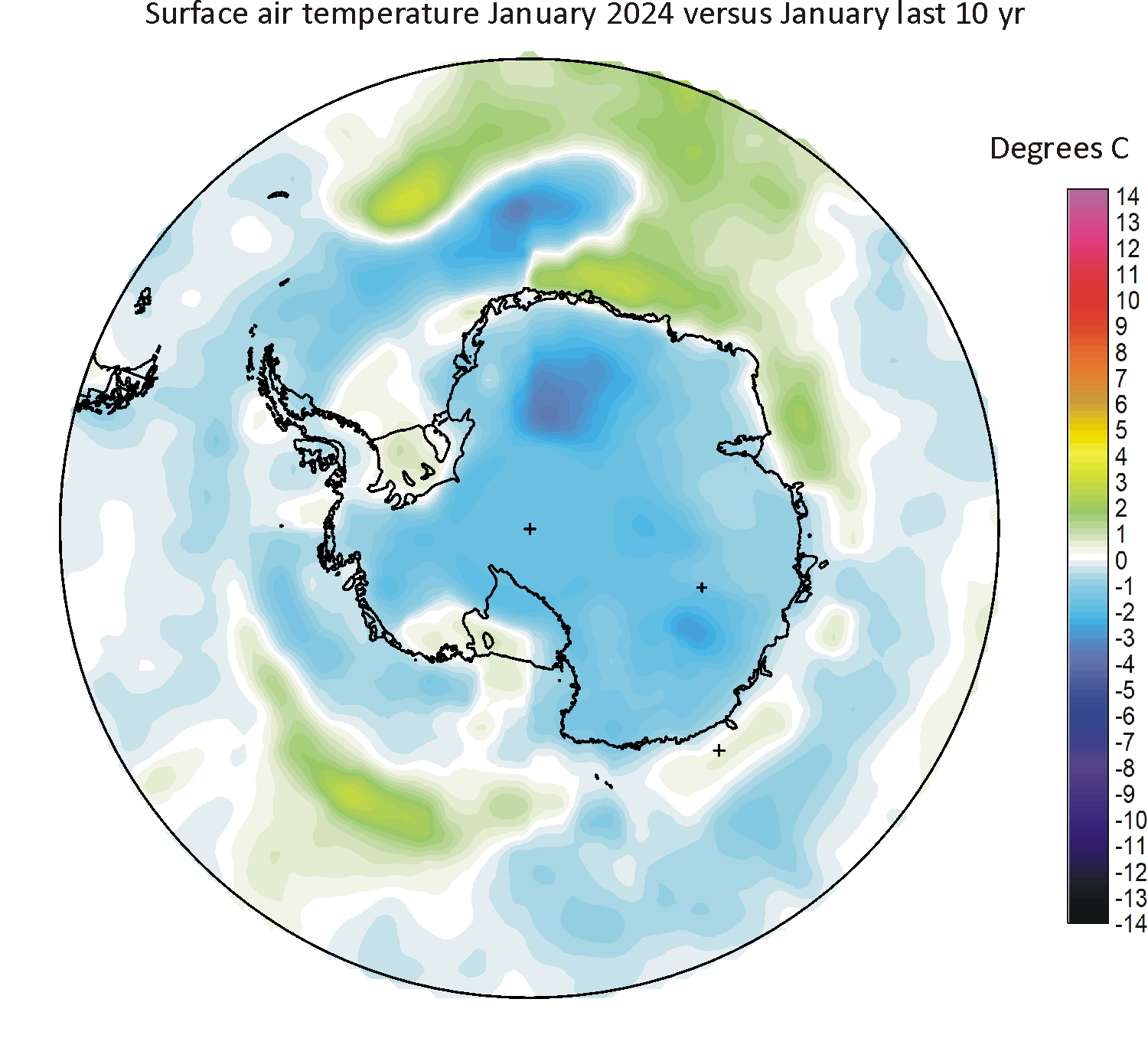
|
|
|
|
|
|
|
|
|

|
|
|
|
| 2023 | 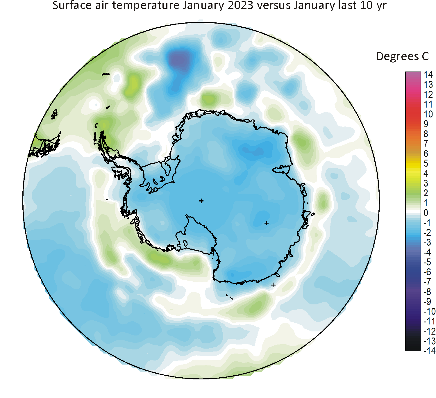
|
|
|
|
|
|
|
|
|
|
|
|
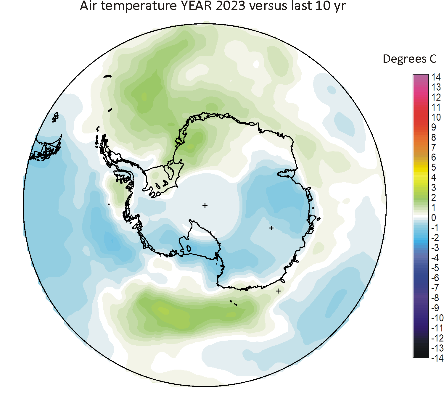
|
| 2022 | 
|
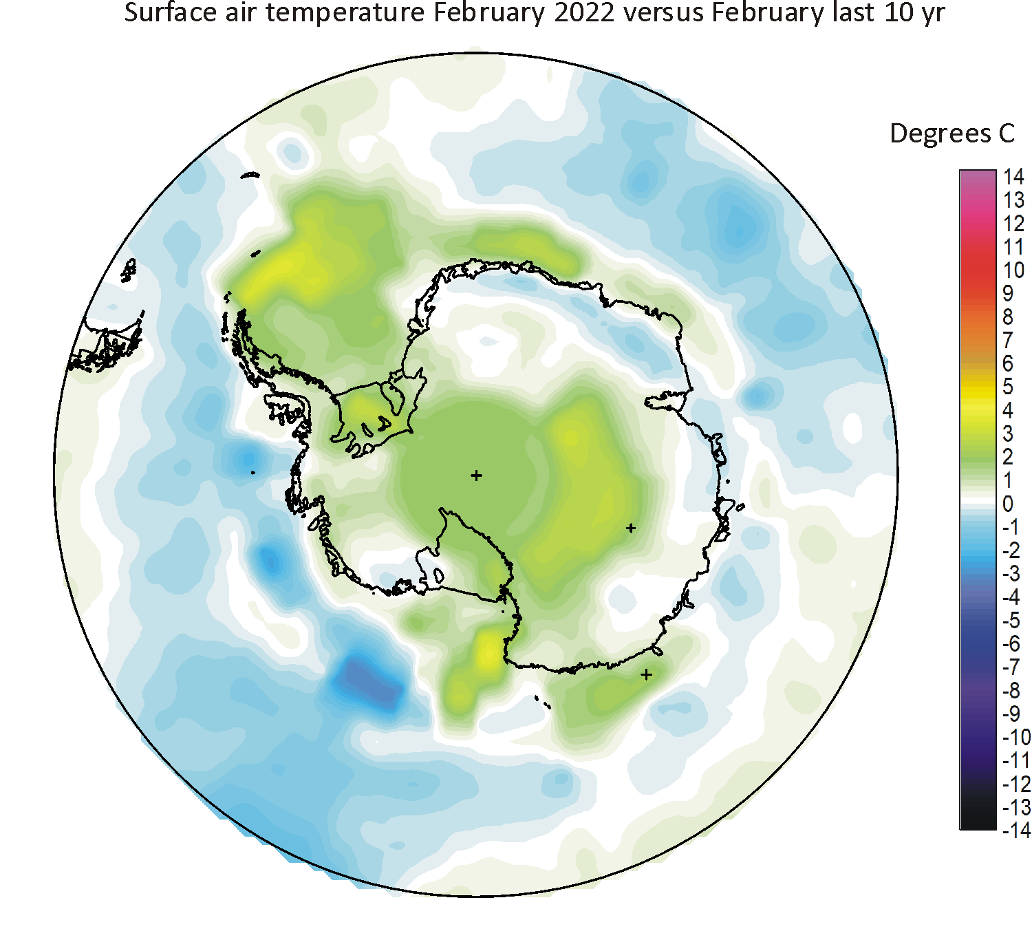
|
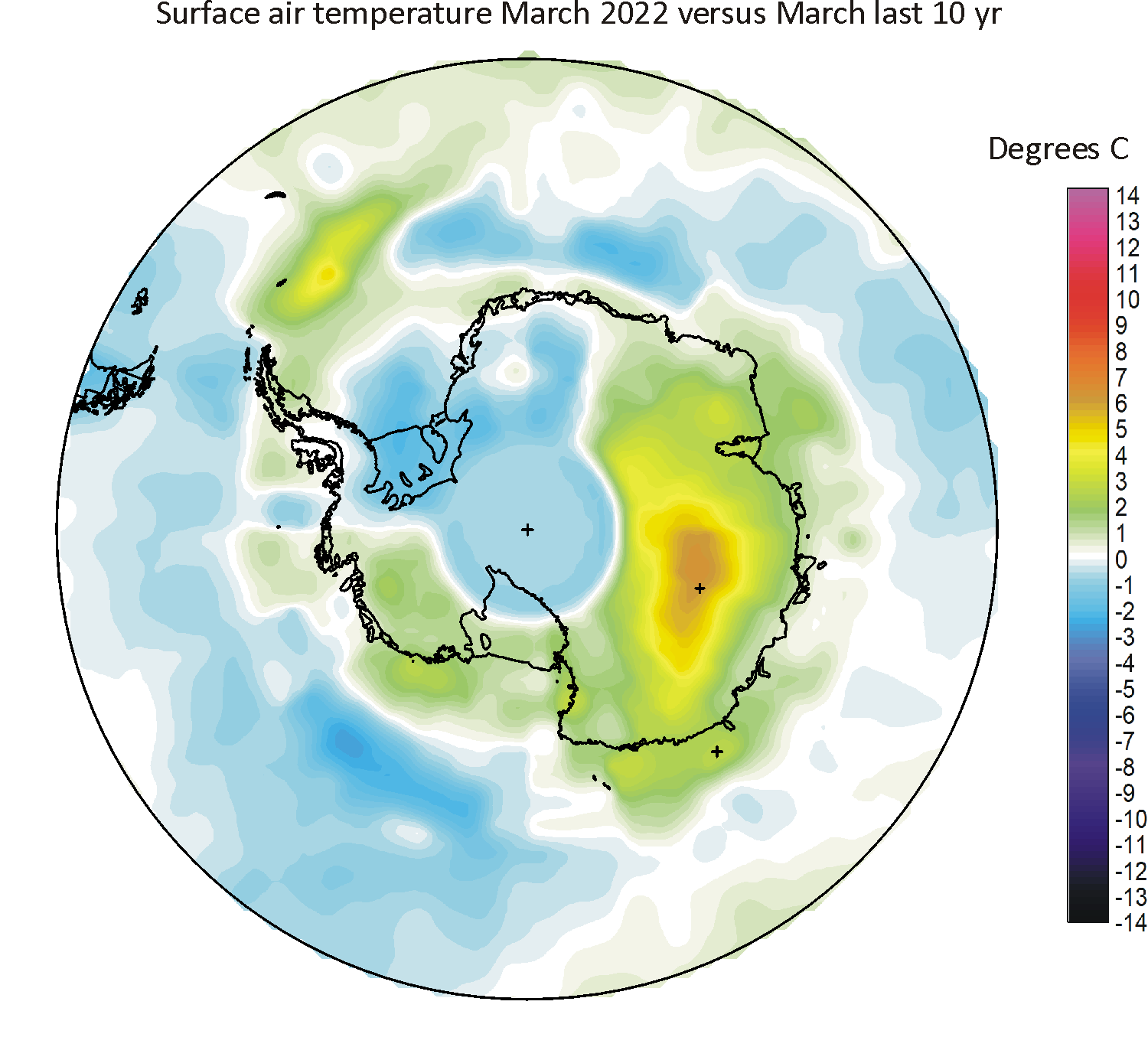
|
|

|
|
|
|
|
|
|
|
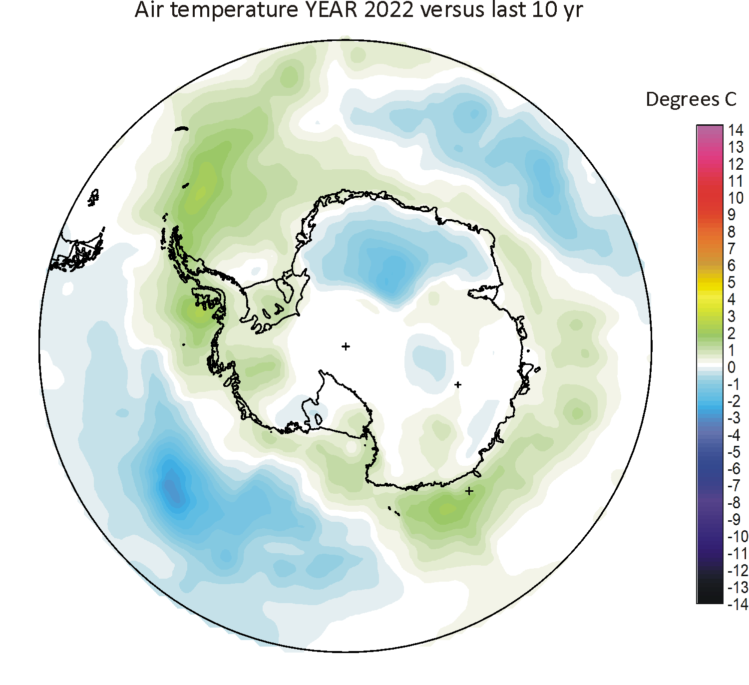
|
| 2021 | 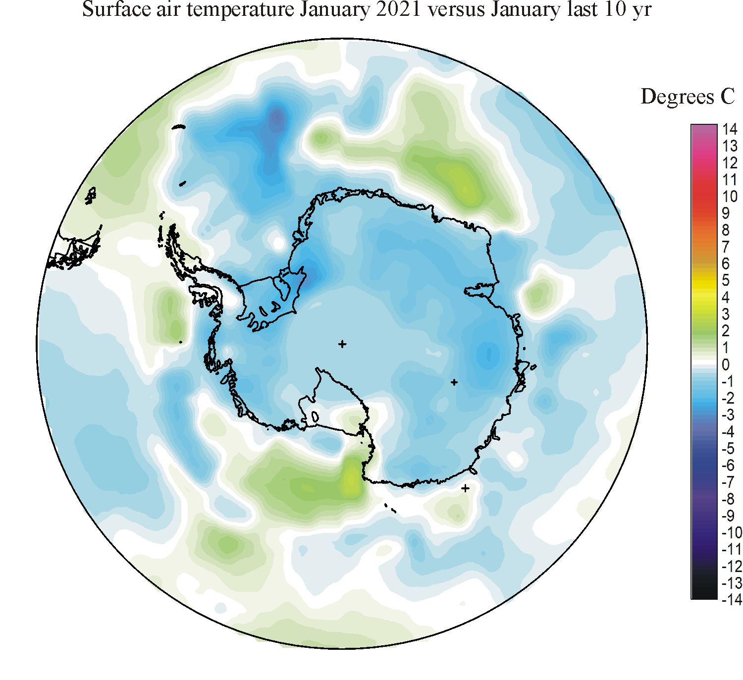
|
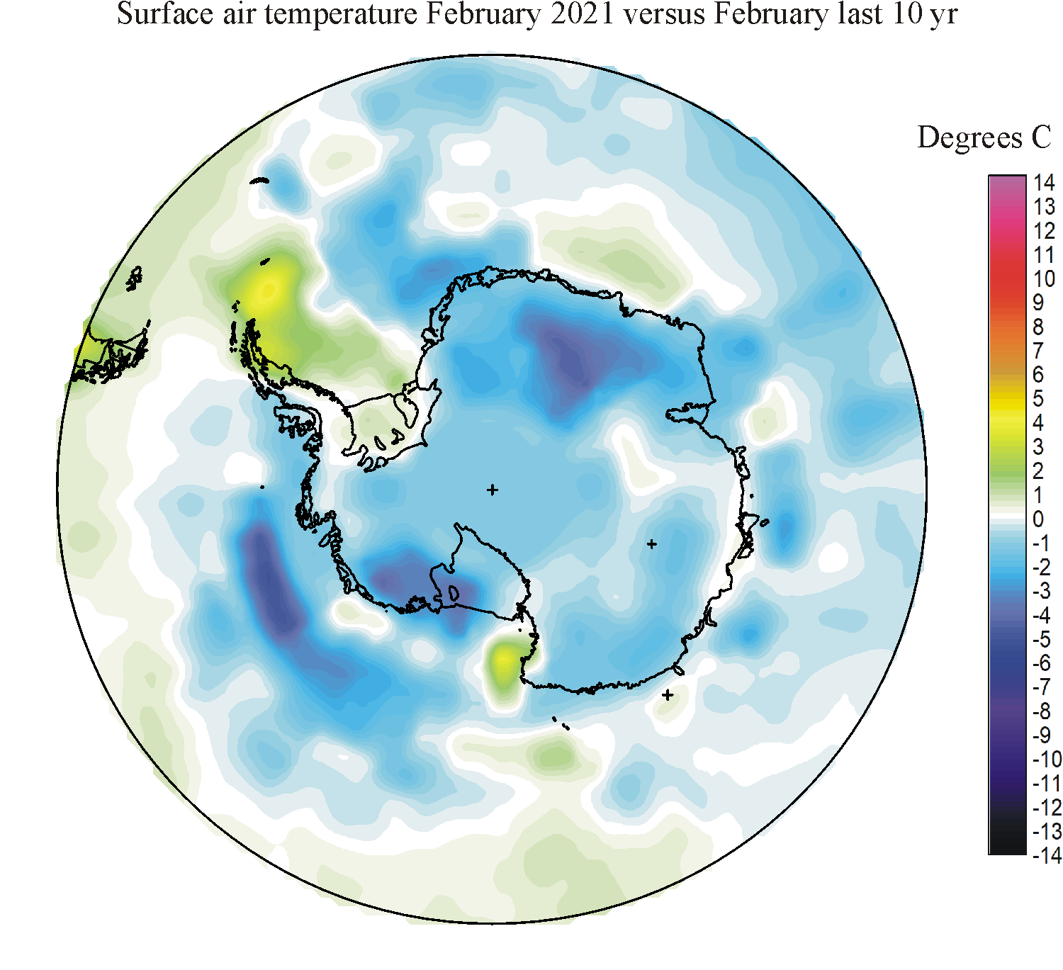
|
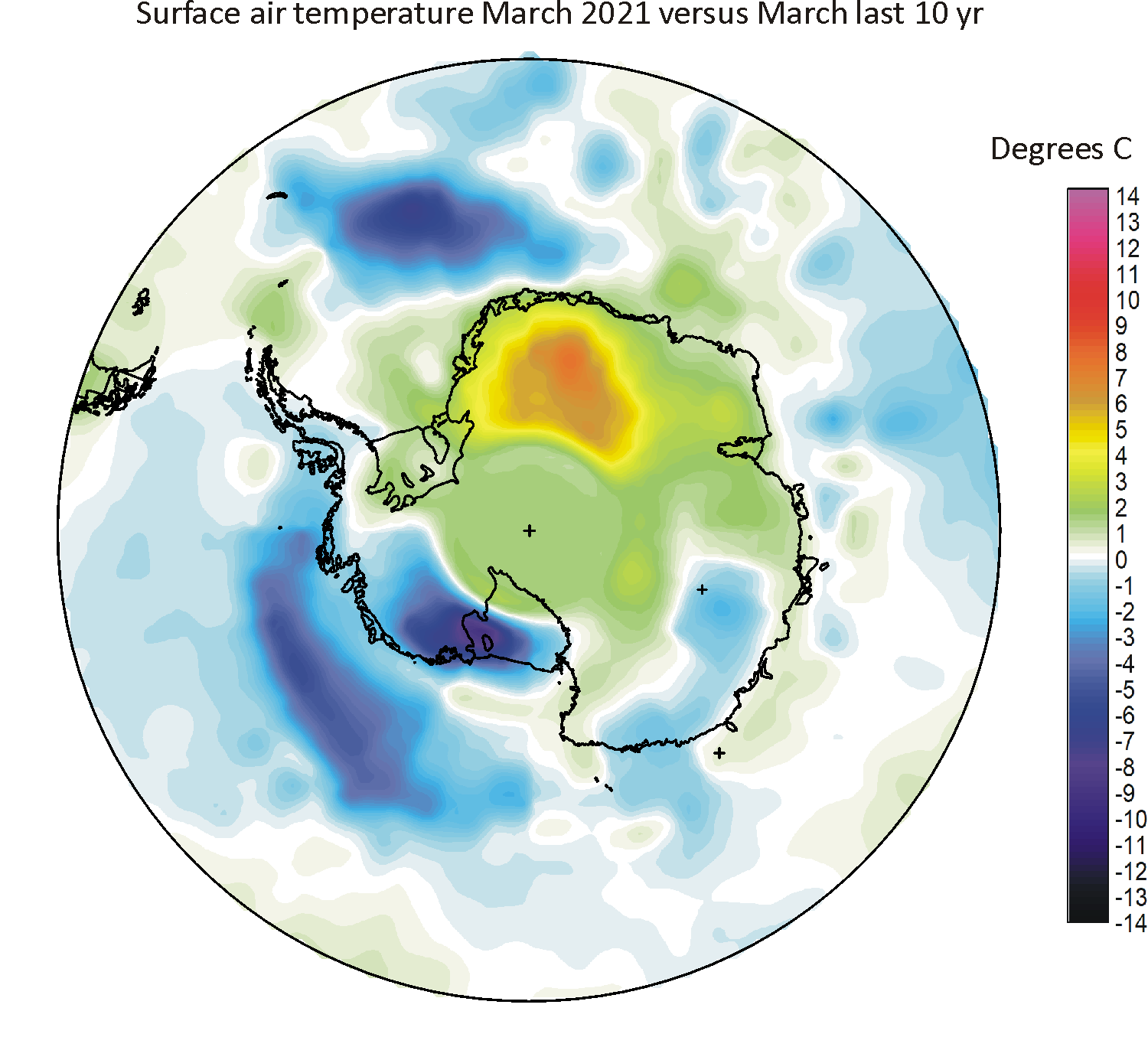
|
|
|
|
|

|
|
|
|
|
|
| 2020 | 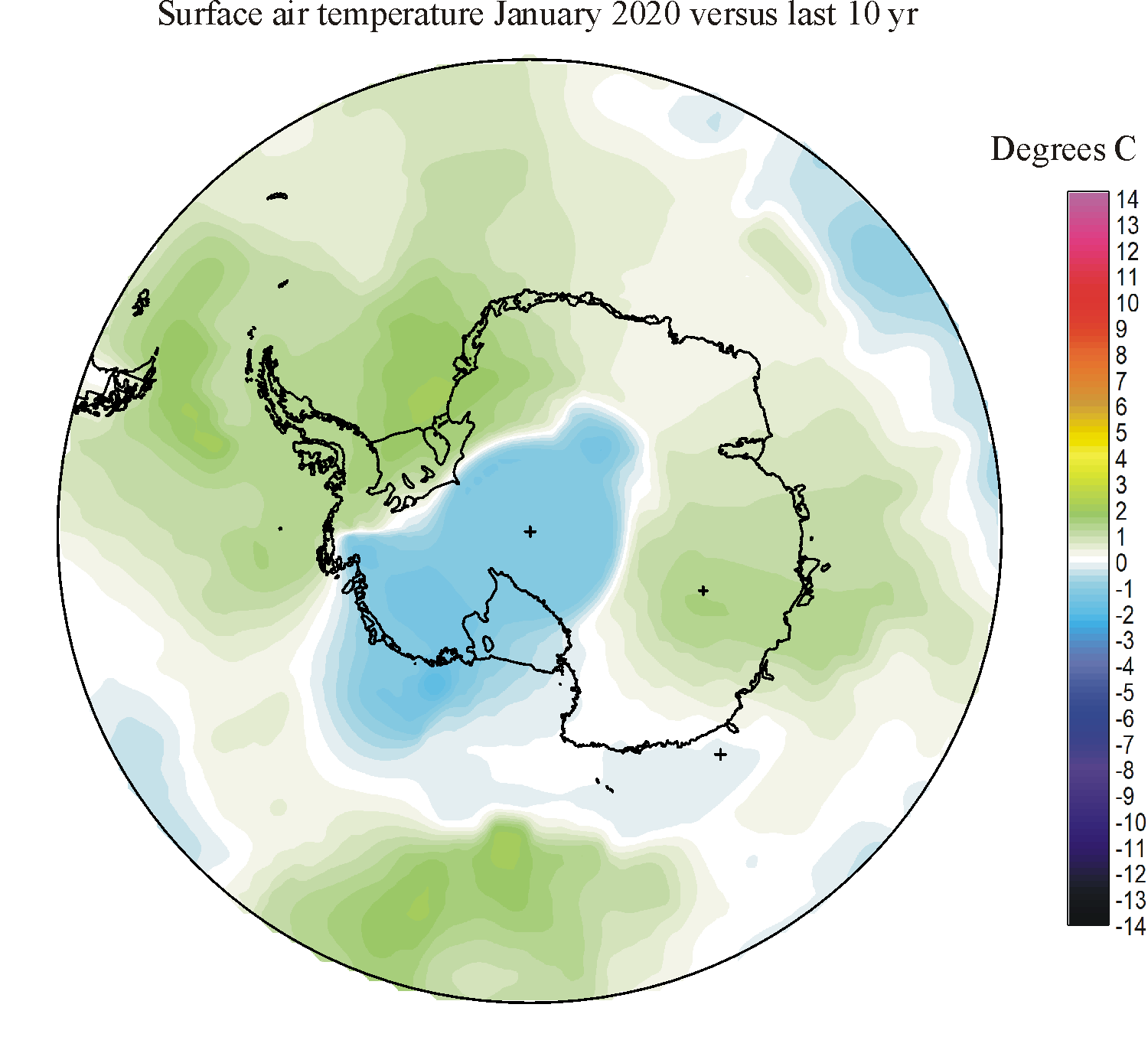
|

|
|
|
|
|
|
|
|

|
|
|
|
| 2019 | 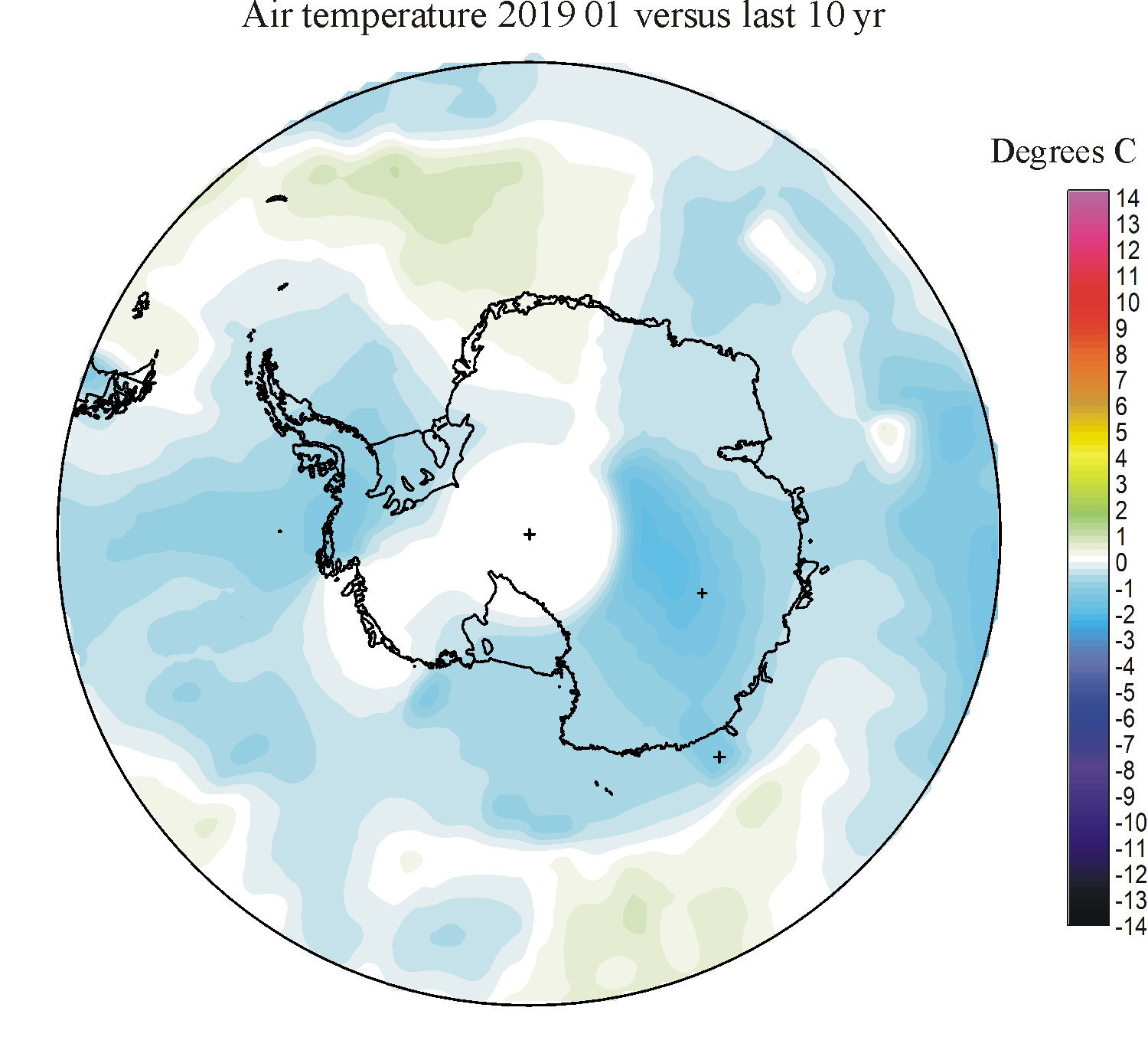
|
|
|
|
|

|

|

|
|
|
|
|
|
| 2018 | 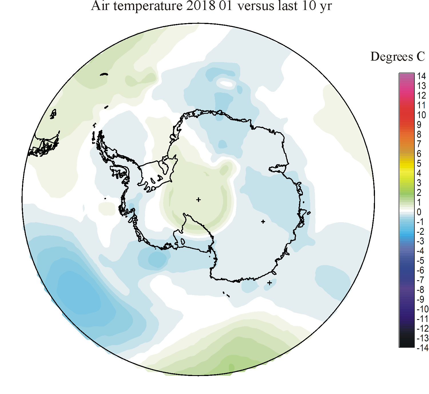
|
|
|
|
|
|
|
|
|
|
|
|
|
| 2017 | 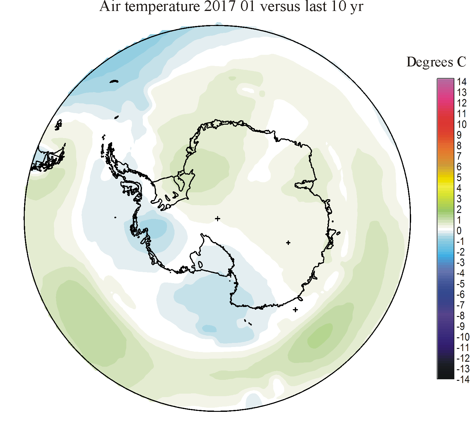
|
|
|

|
|
|
|
|
|
|
|
|
|
| 2016 | 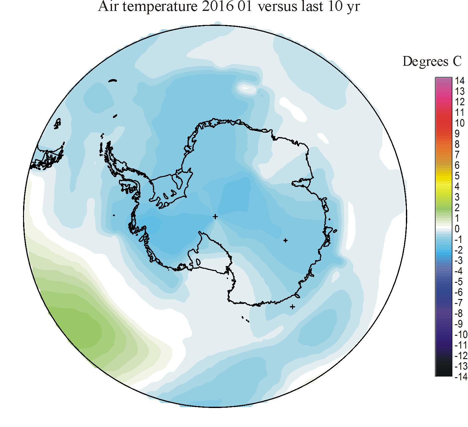
|
|
|
|
|

|
|
|
|
|
|
|
|
| 2015 | 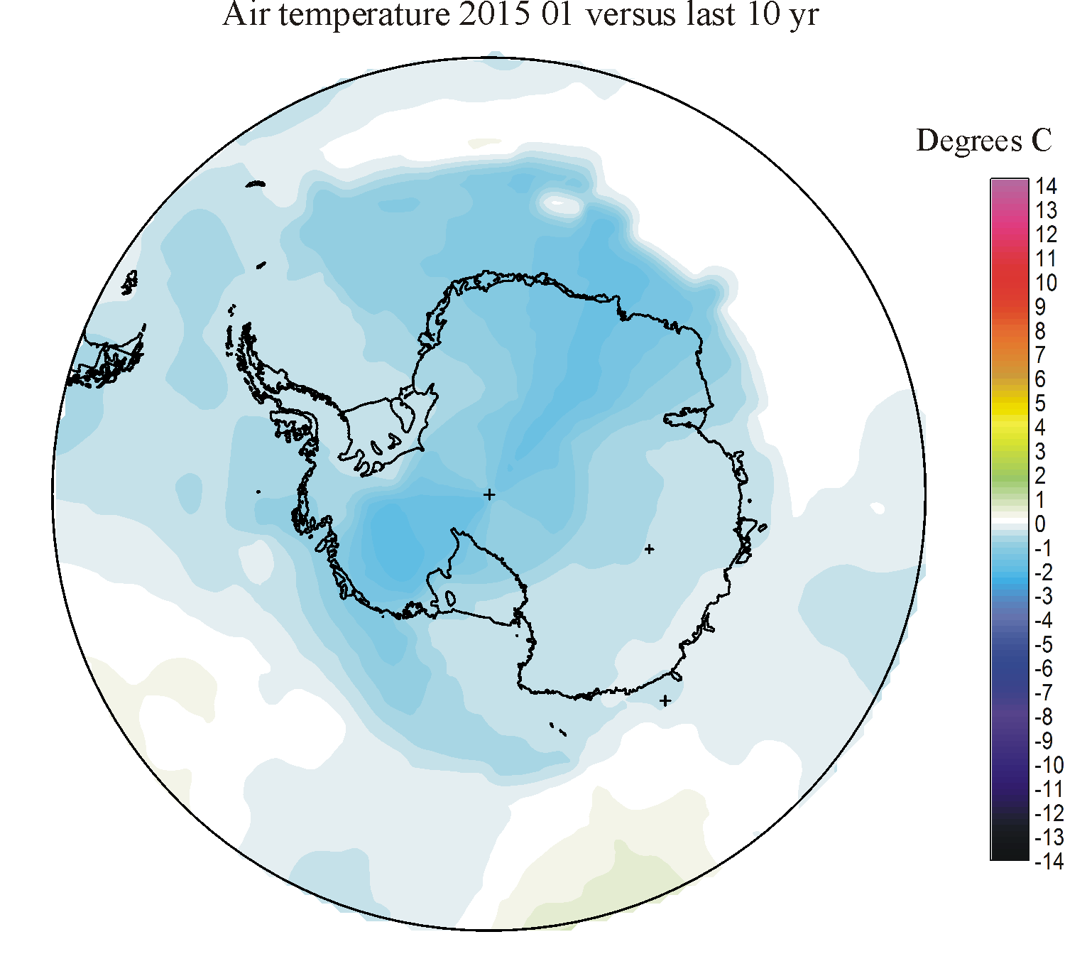
|
|
|
|
|
|
|
|
|
|
|
|
|
| 2014 | 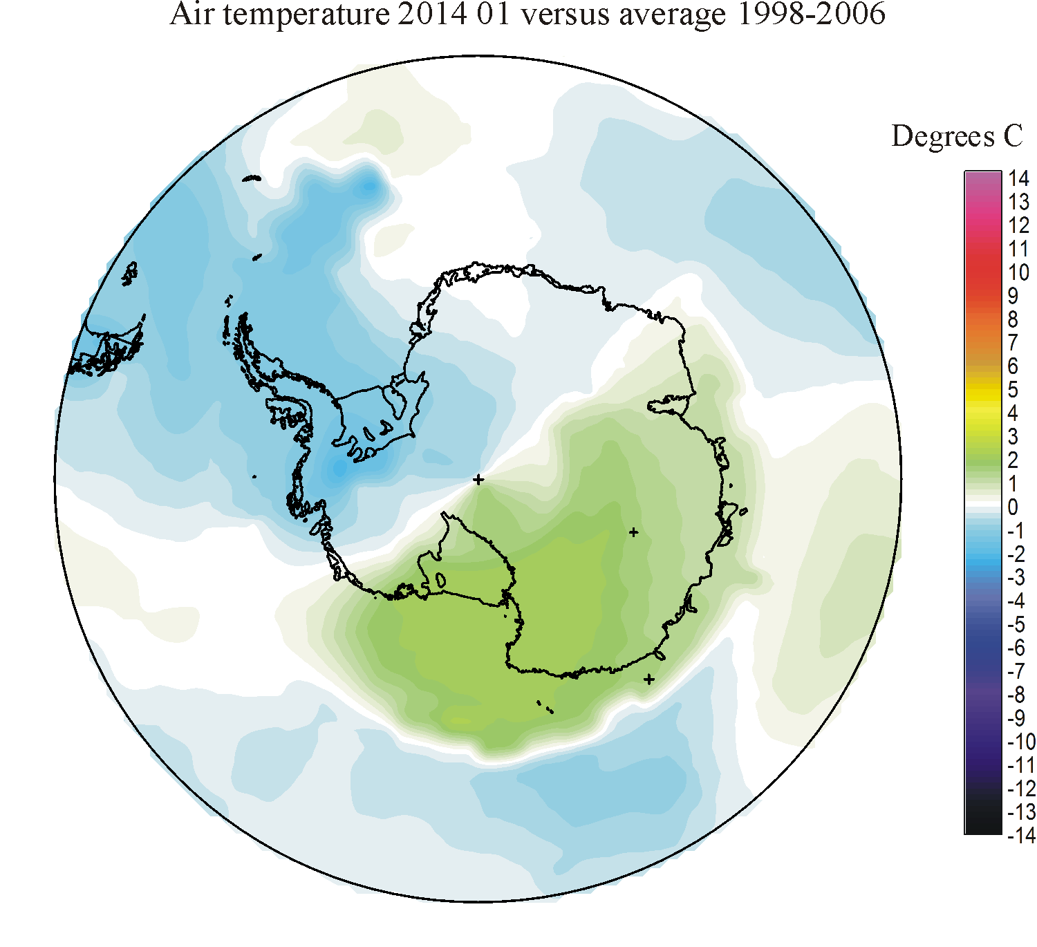
|

|
|
|
|
|
|
|
|
|
|
|
|
| 2013 | 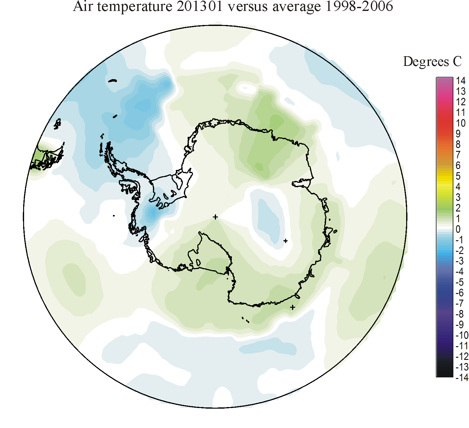
|
|
|
|
|

|
|
|
|
|

|
|

|
| 2012 | 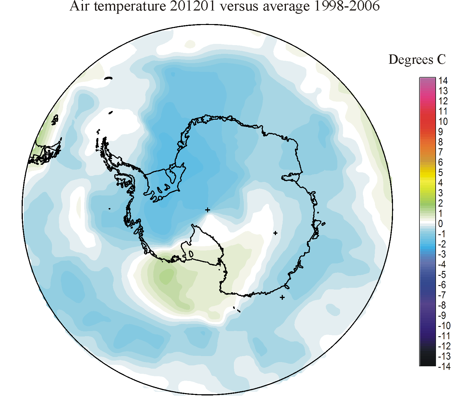
|
|
|
|

|
|
|
|
|
|
|
|
|
| 2011 | 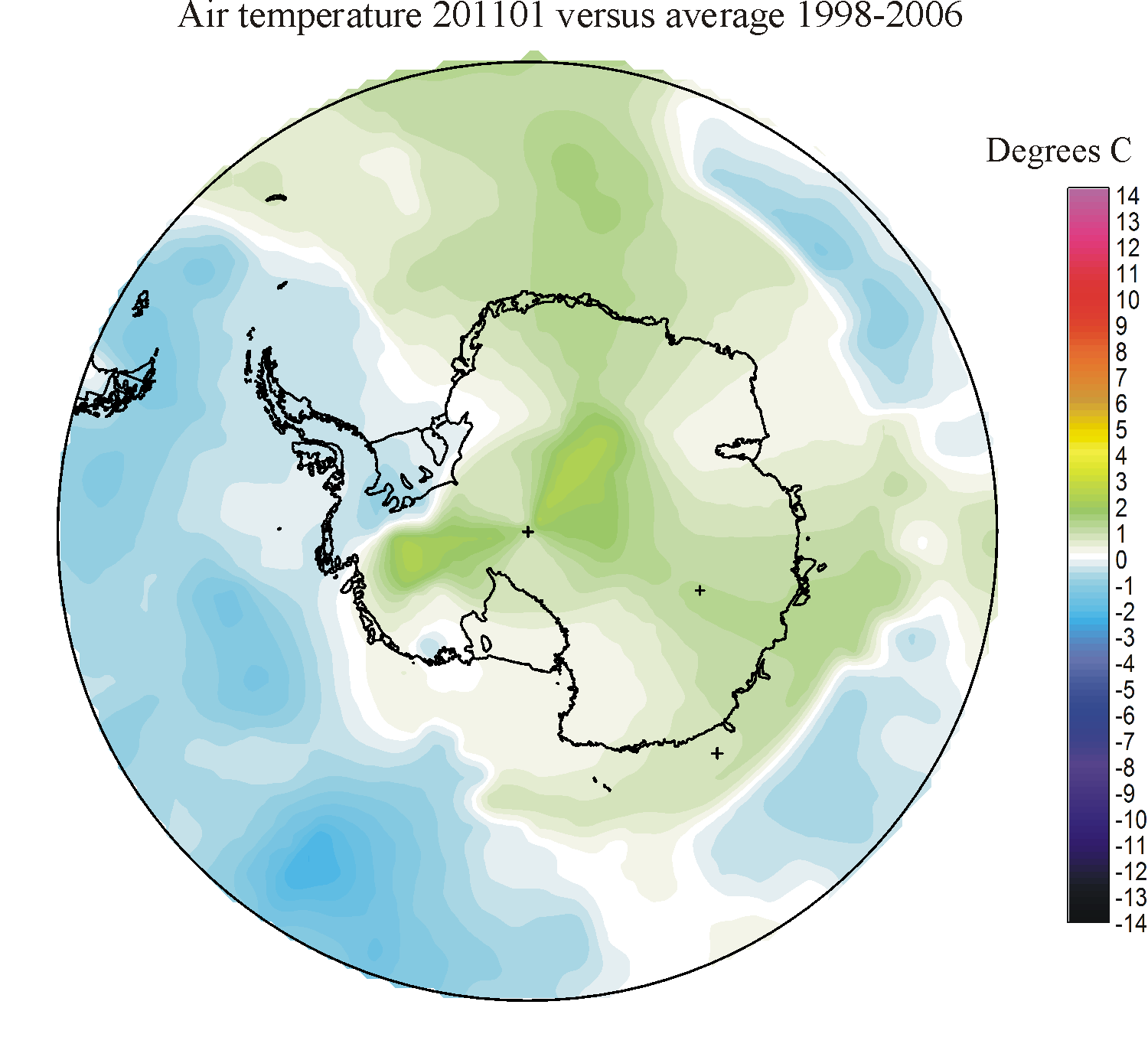
|
|
|
|
|
|
|
|
|
|
|
|
|
| 2010 | 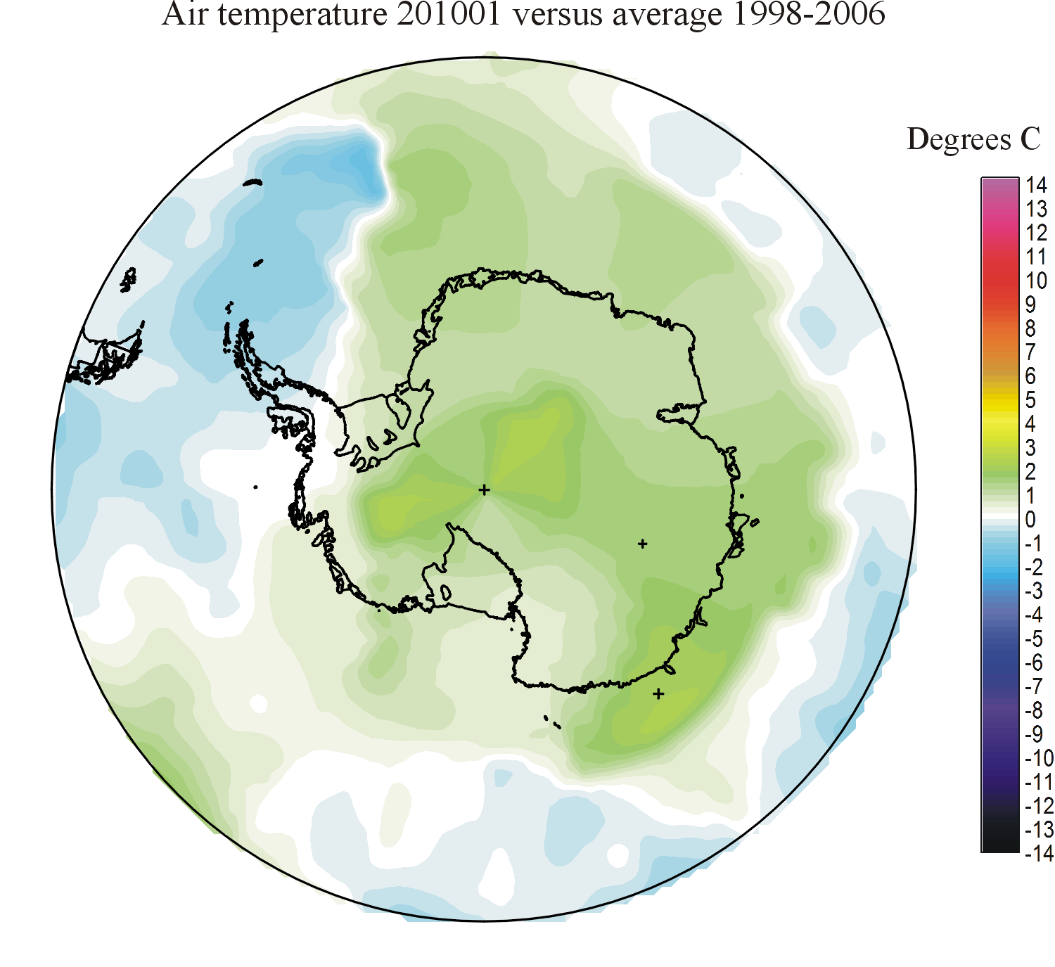
|
|
|
|
|
|
|

|

|
|
|

|

|
| 2009 | 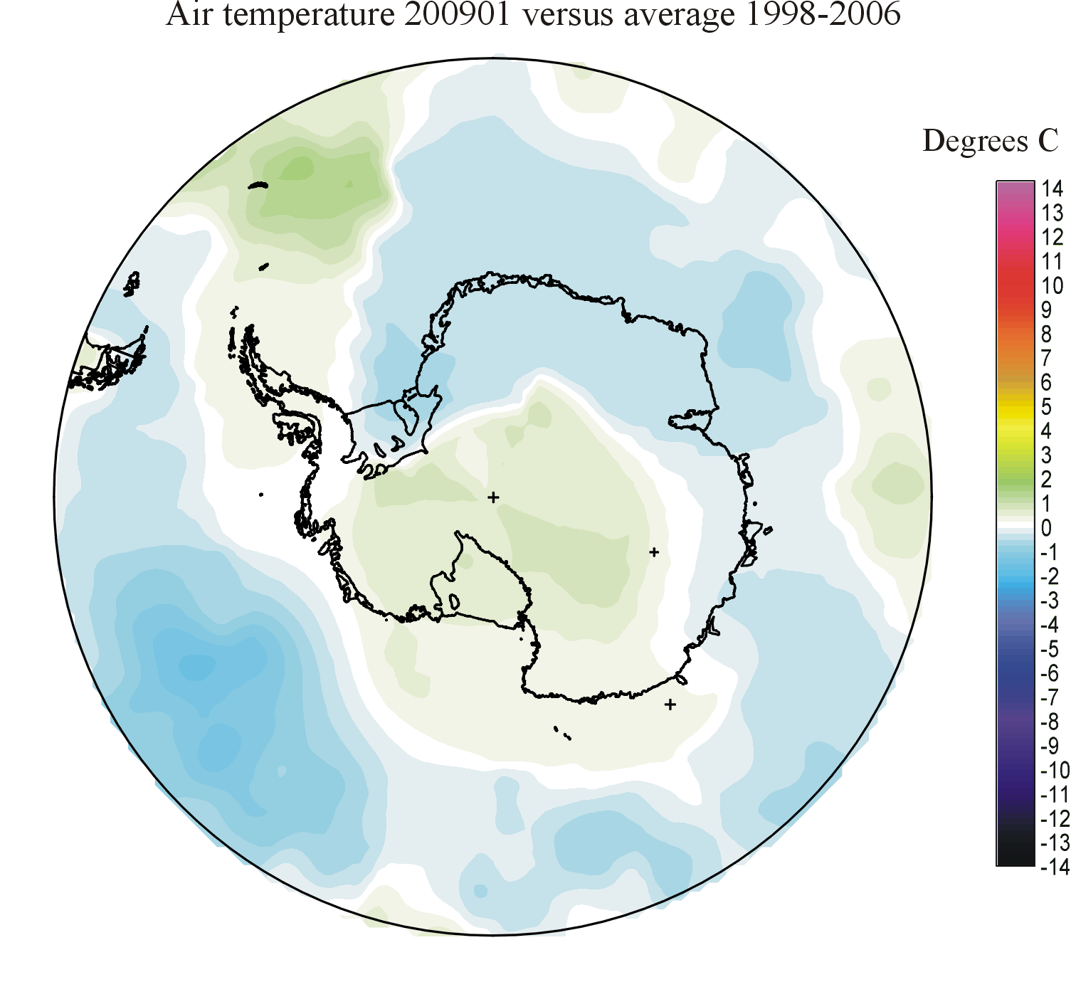
|
|
|

|
|

|
|
|
|

|
|
|

|
| 2008 | 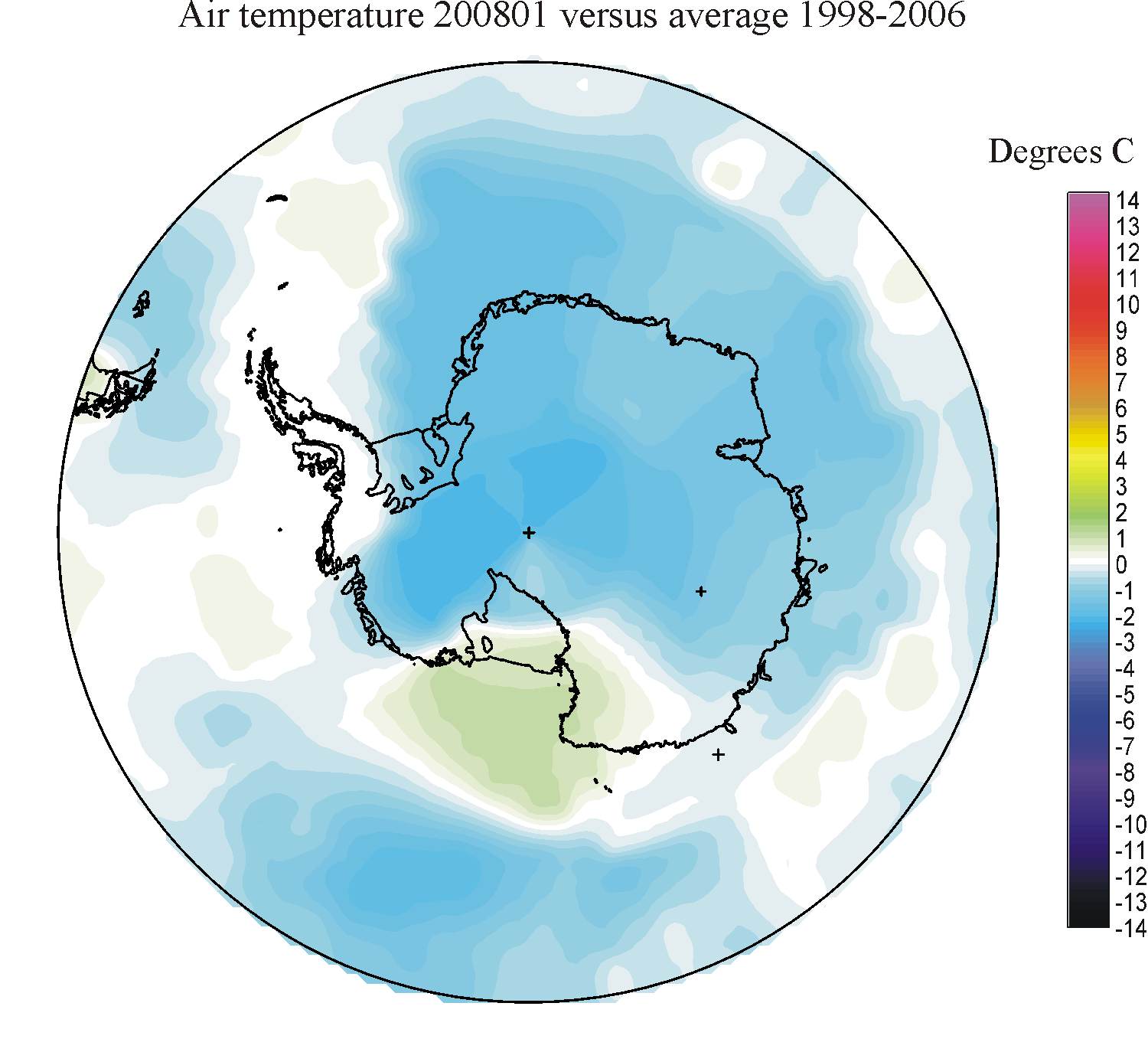
|
|

|
|
|
|

|
|
|
|
|

|
|
| 2007 |
|
|
|
|
|
|

|
|
|
|
|
|
|
| 2006 |
|
|
|
||||||||||
| 2005 | 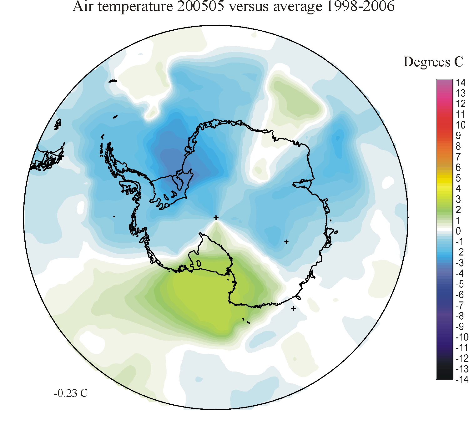
|
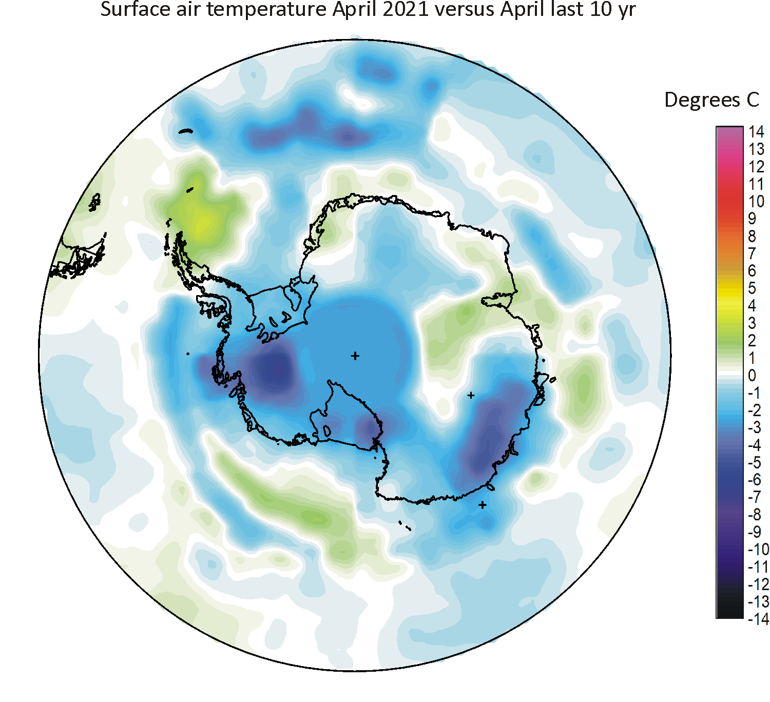
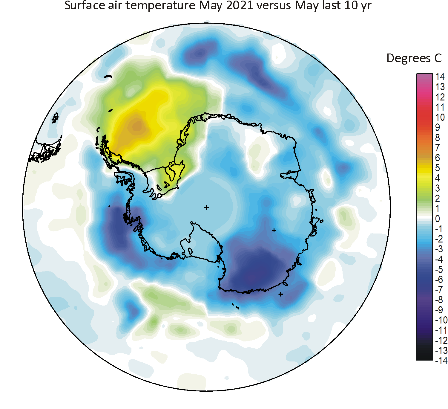
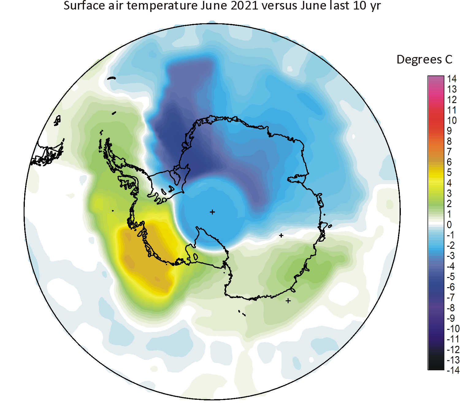
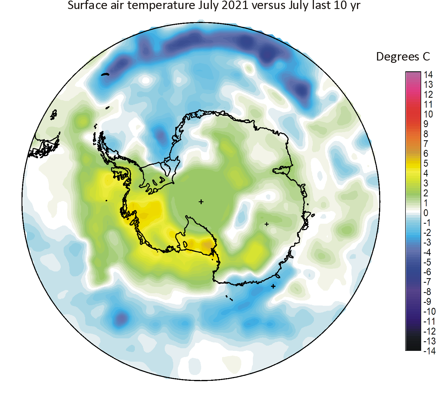
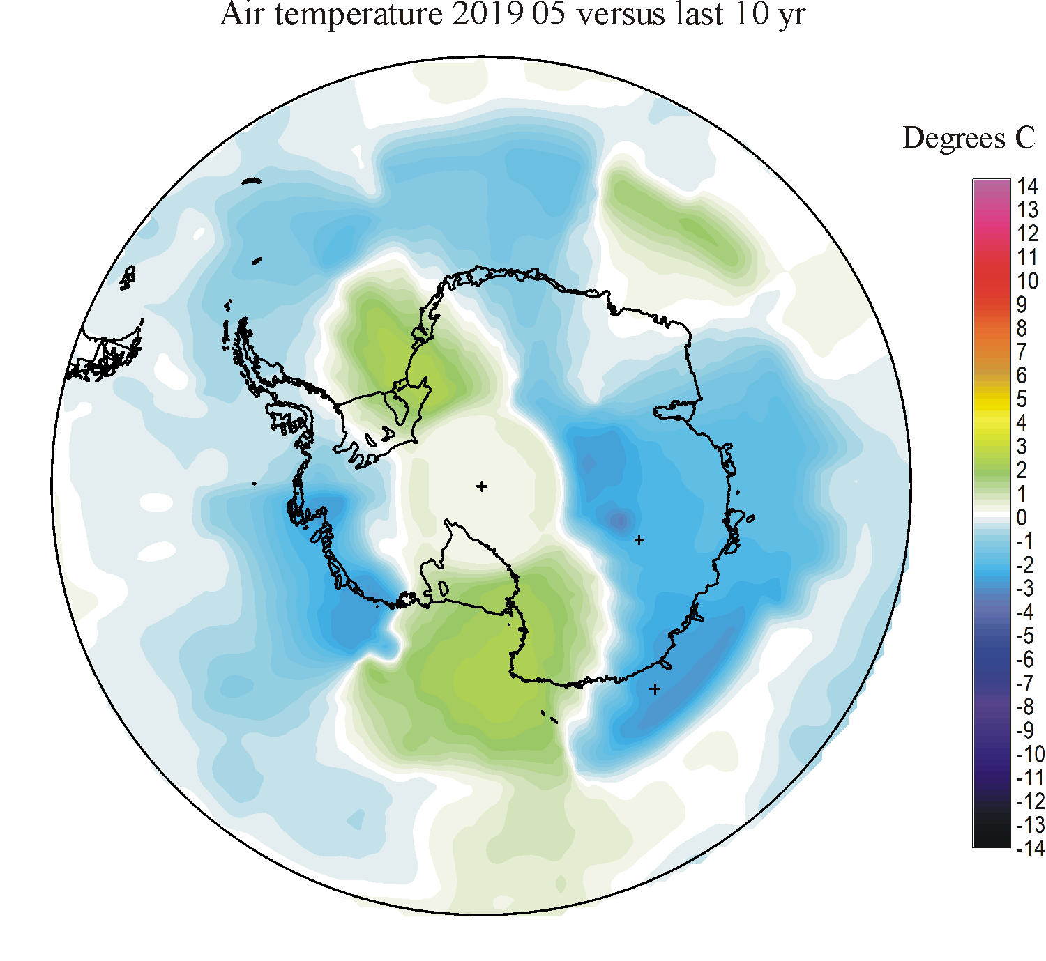
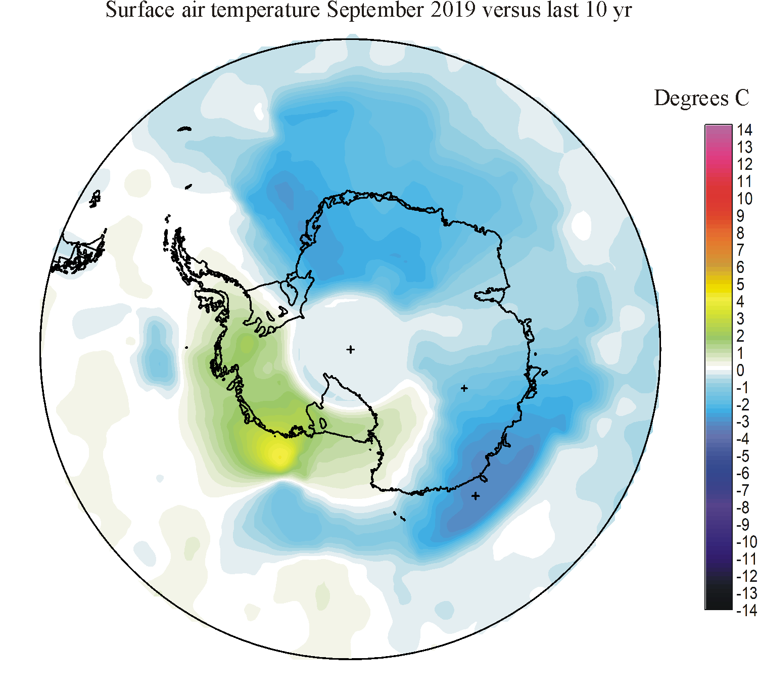
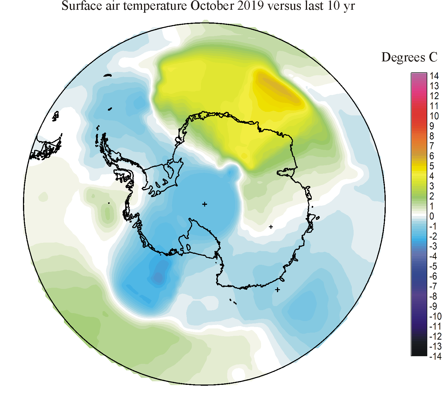
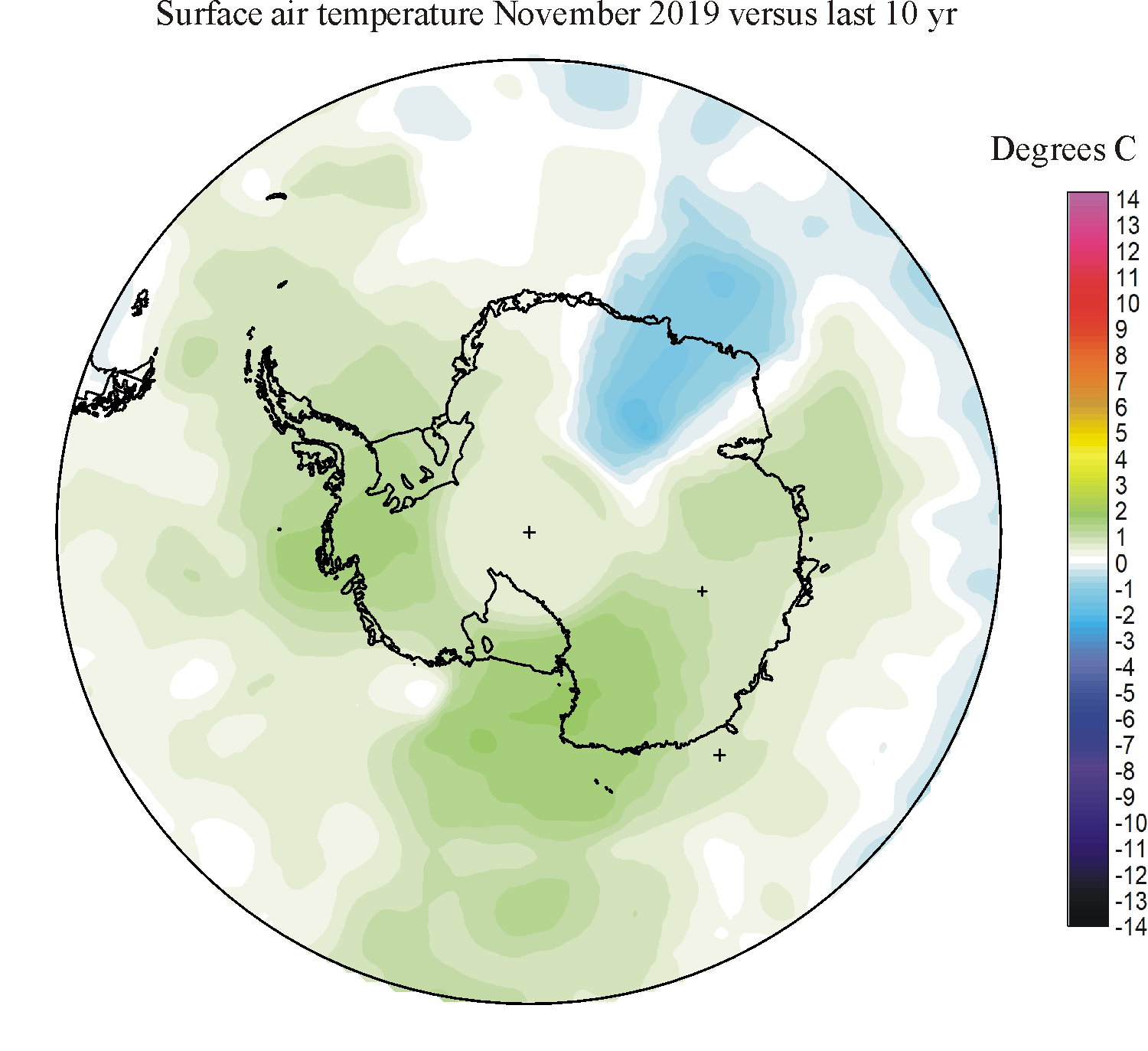
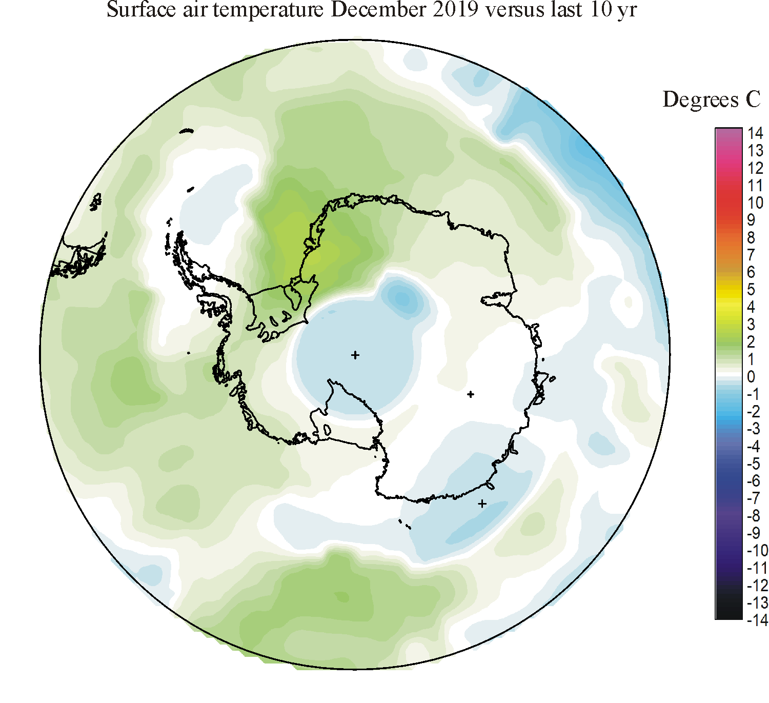
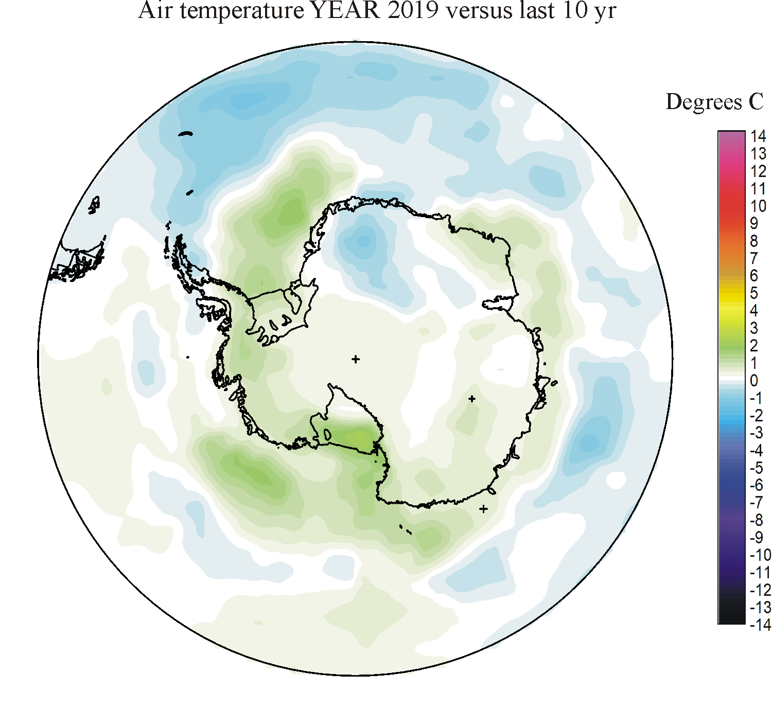
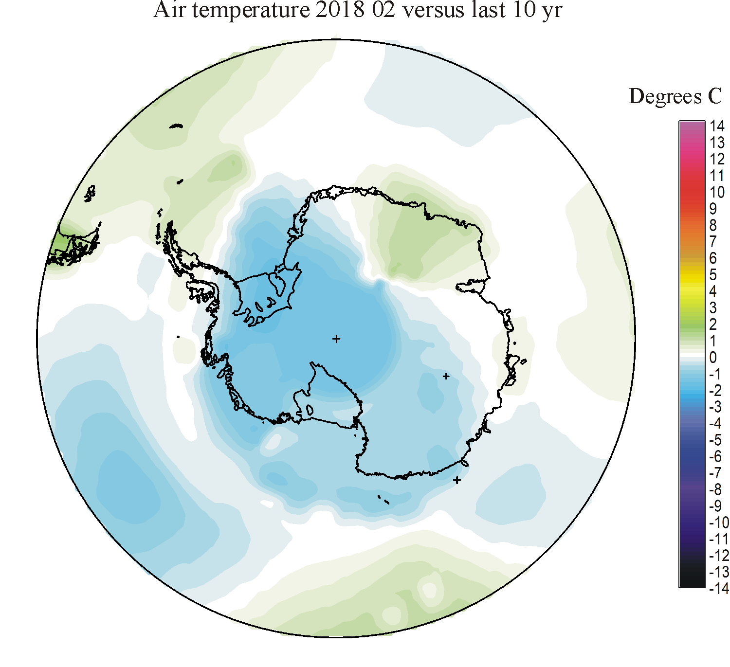
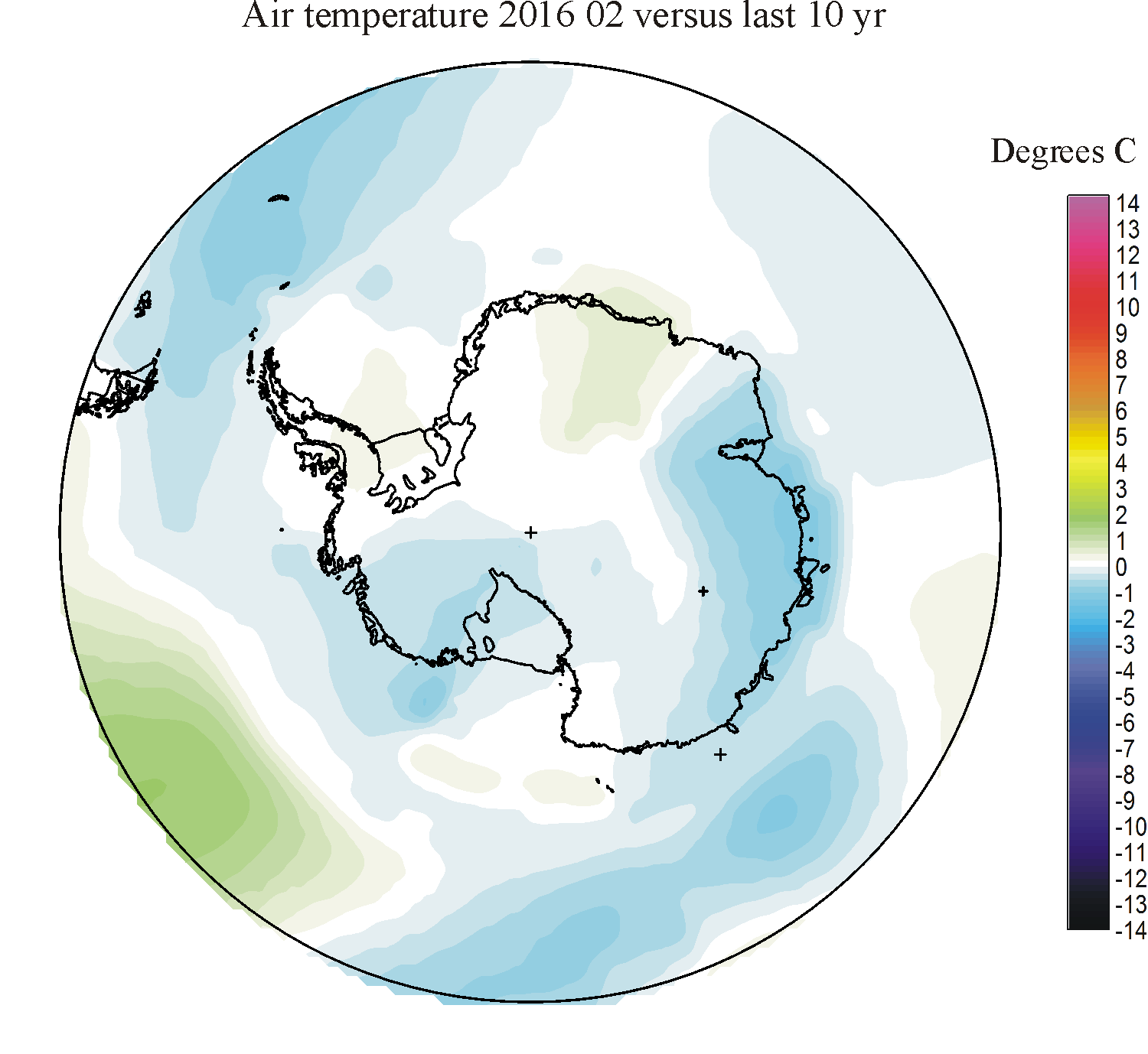
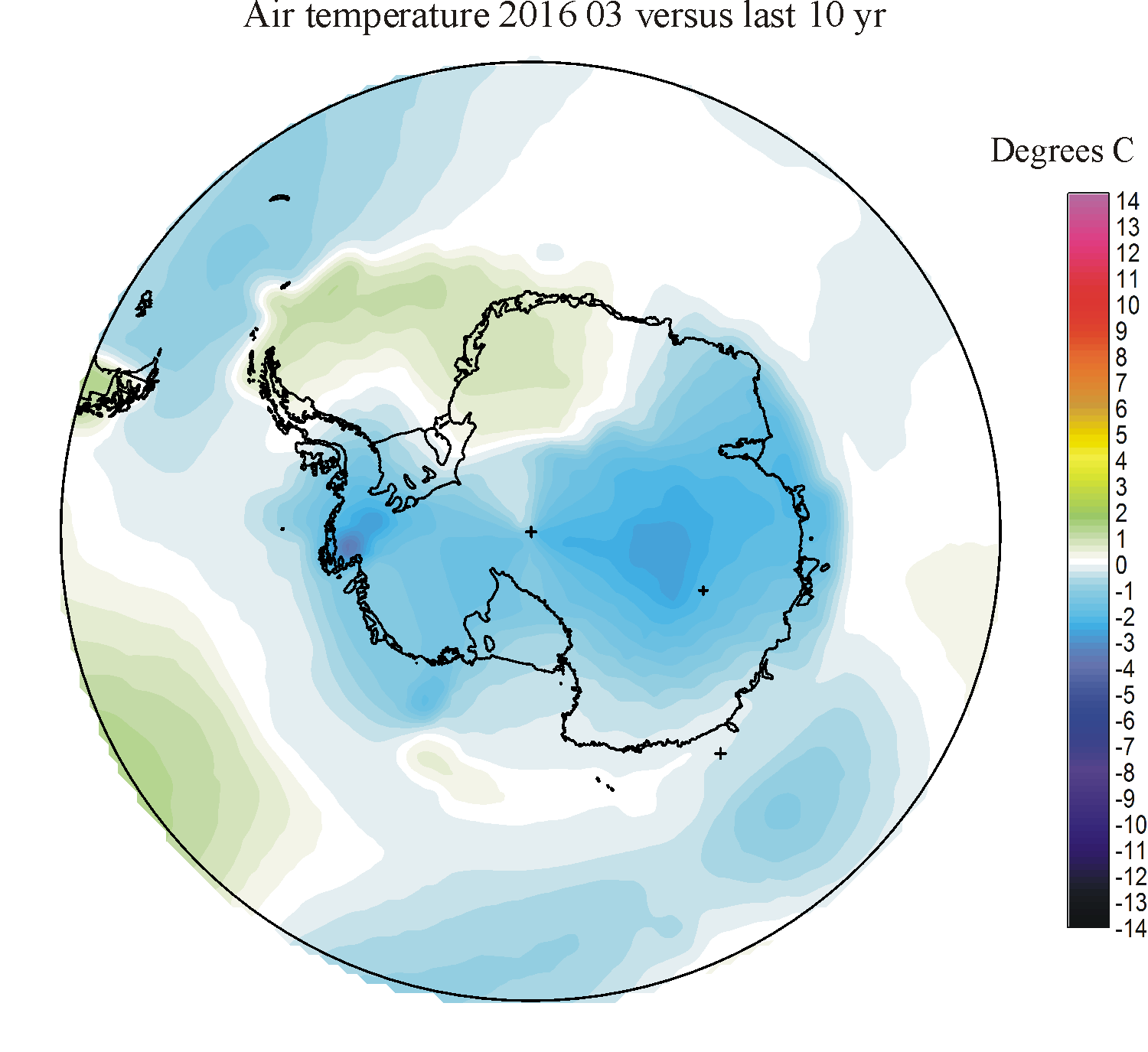
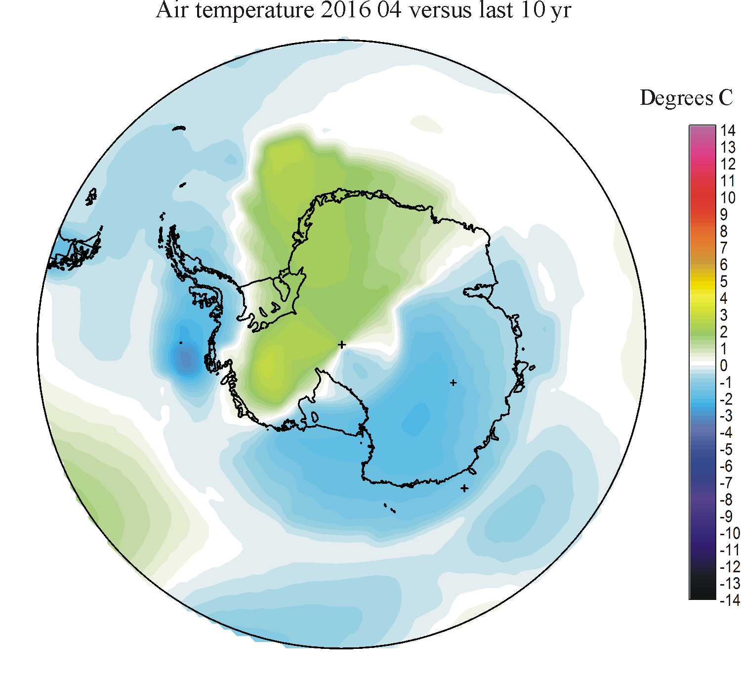
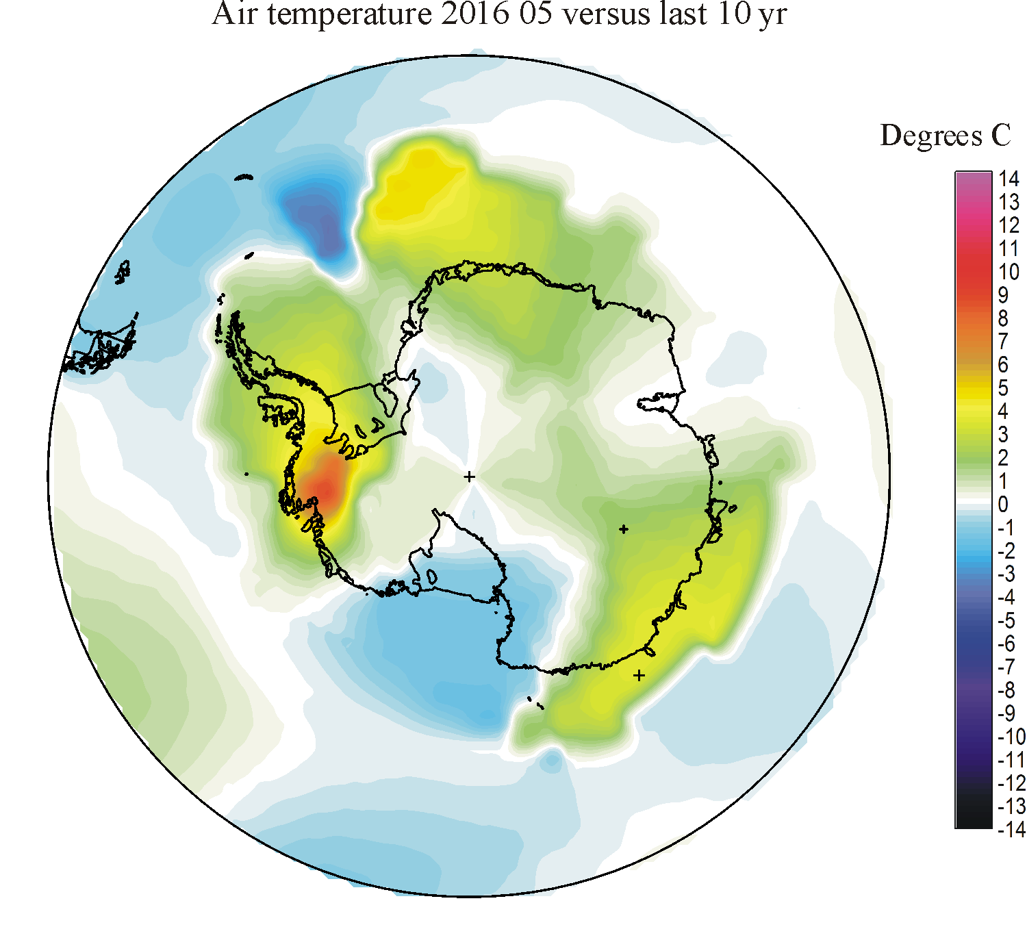
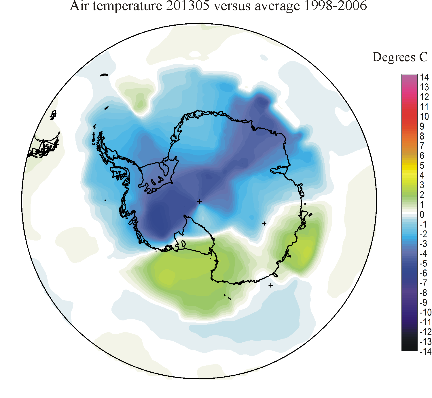
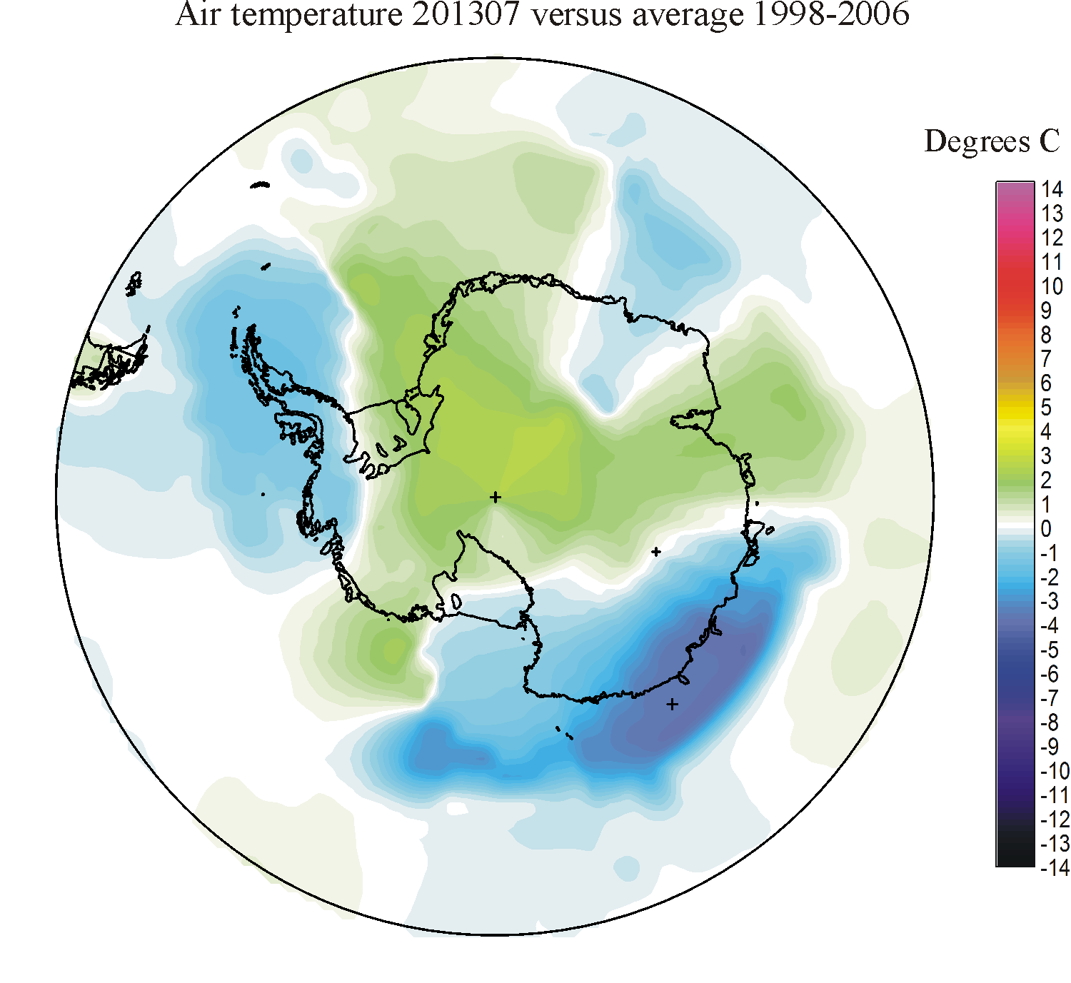
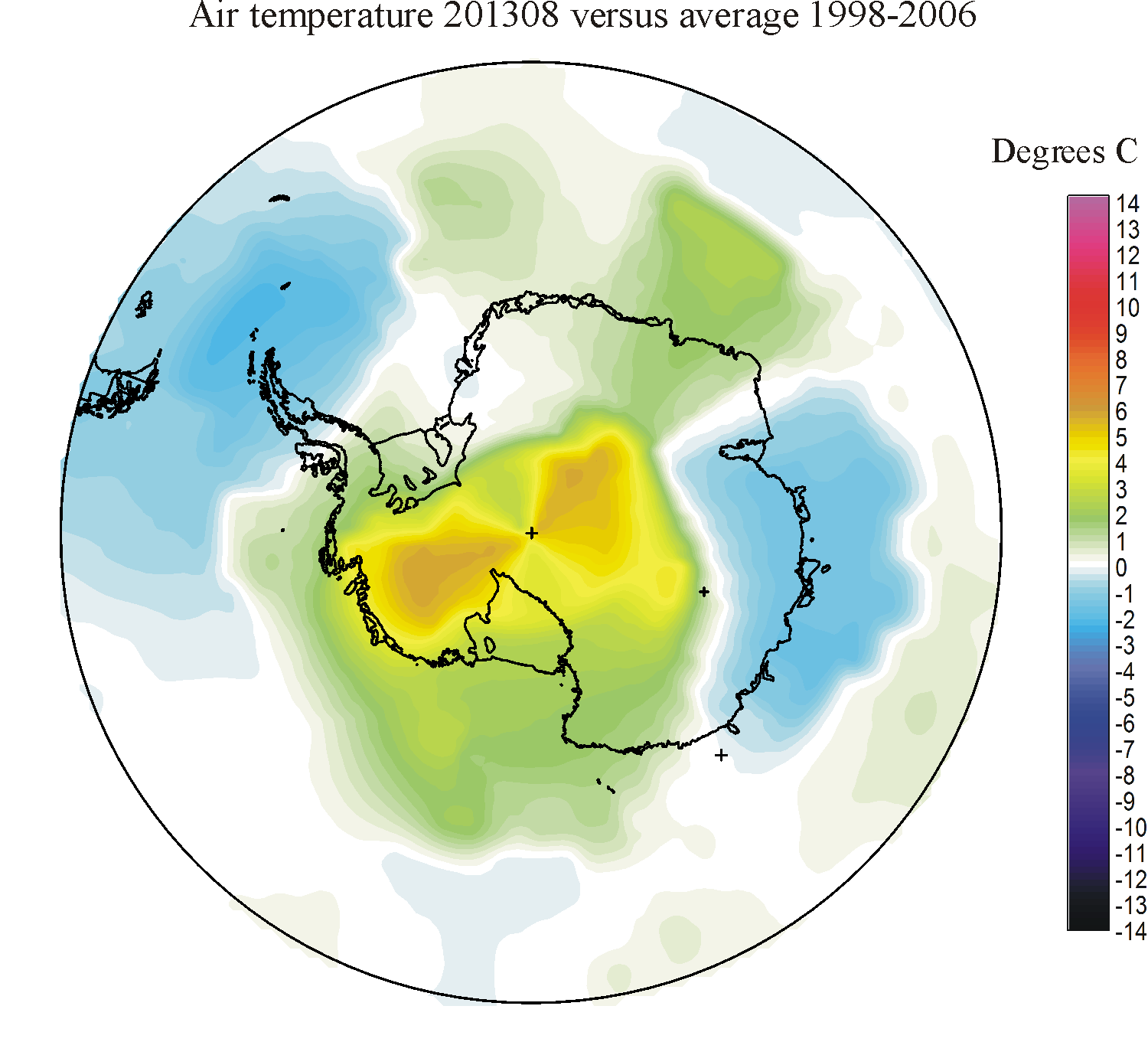
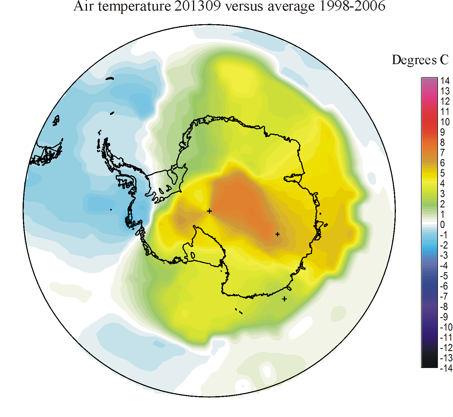
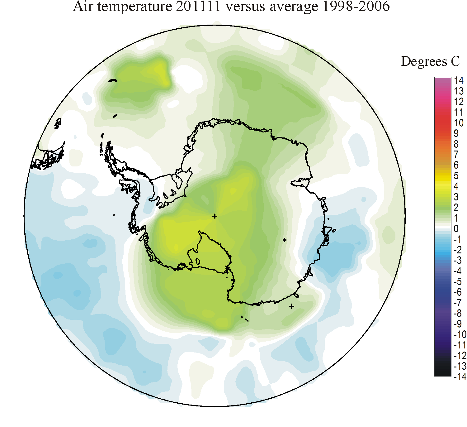
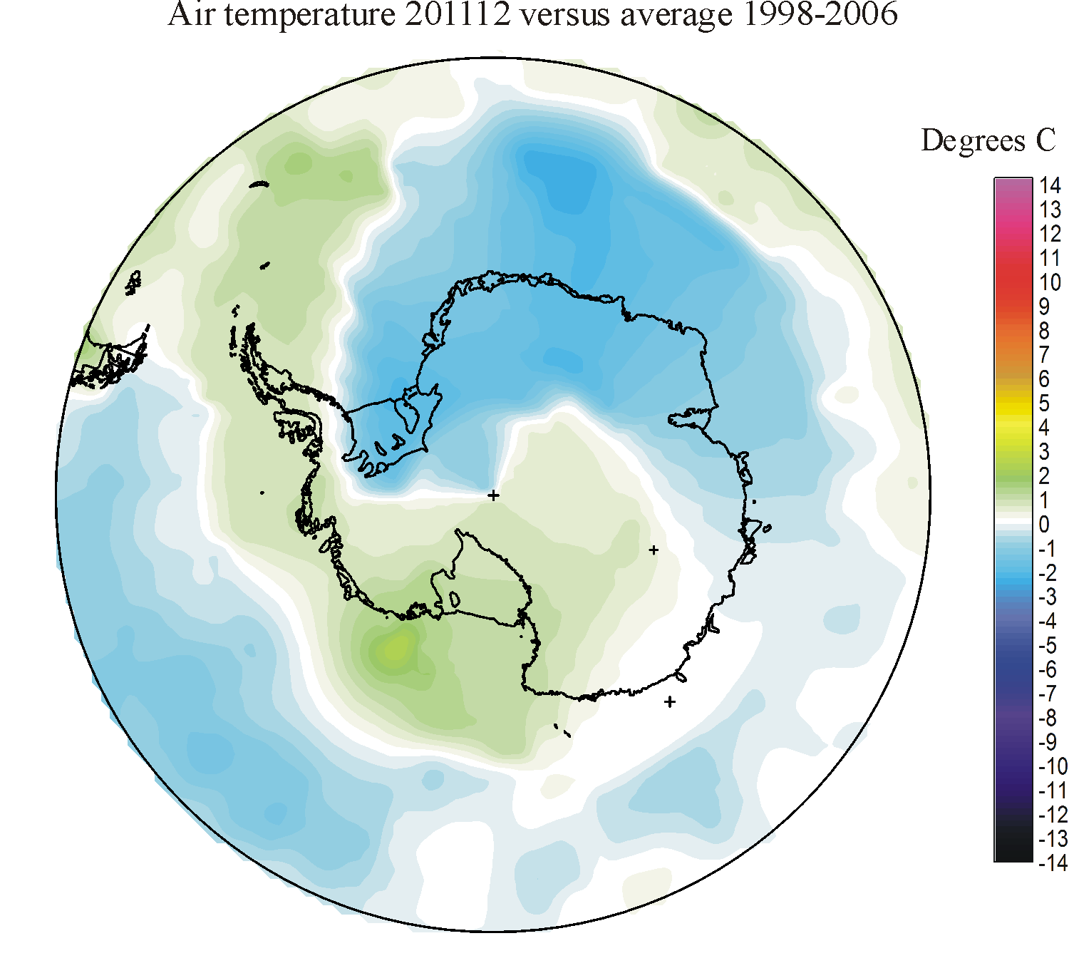
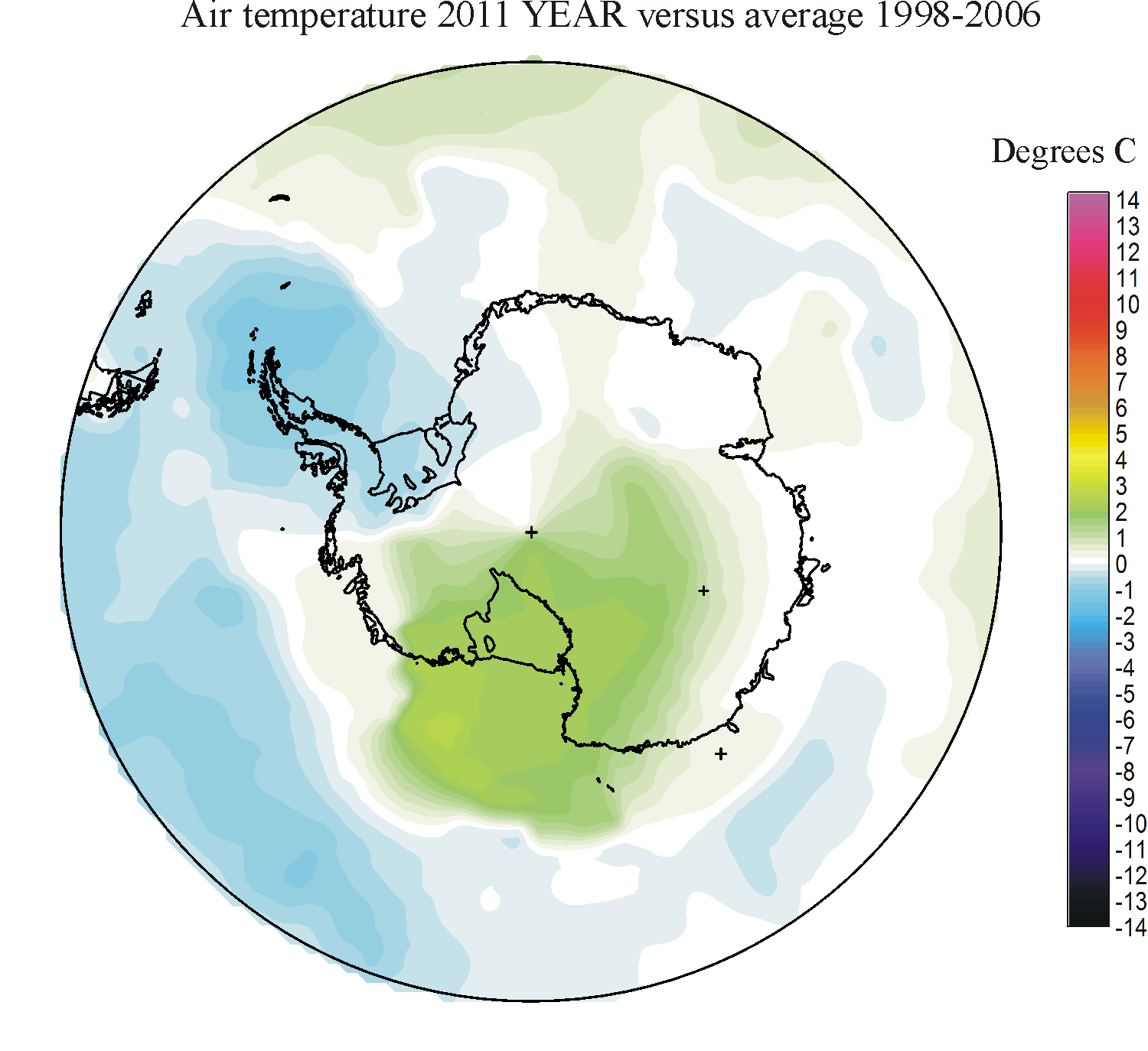
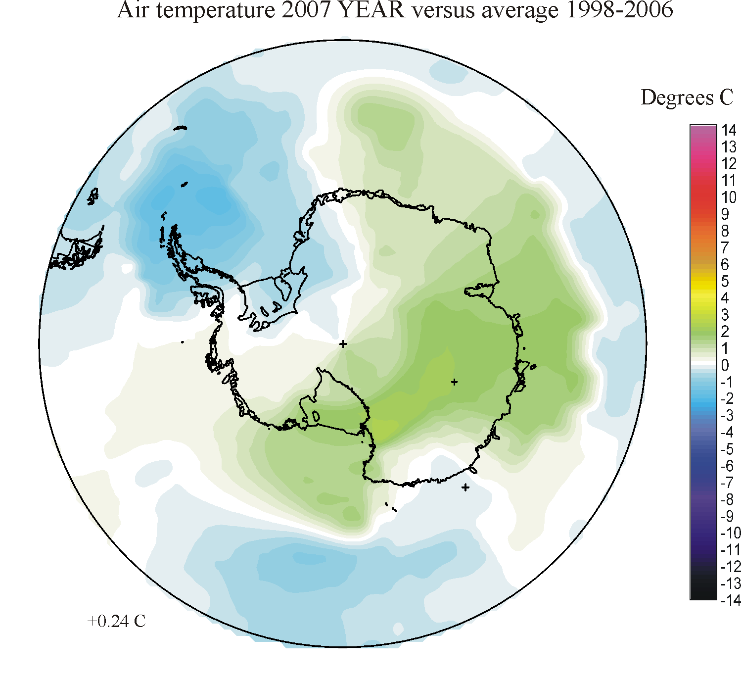
Spatial distribution of monthly
surface air temperature
deviation south of 60oS in relation to the average
for the period 1998-2006. Warm colours indicates areas
with higher temperature than the 1998-2006 average, while blue colours indicate lower than average temperatures.
Click here to jump back to the list of contents.
Antarctic monthly surface air temperatures south of 70S
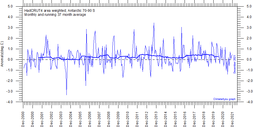
Diagram showing area weighted Antarctic (70-90oS) monthly surface air temperature anomalies (HadCRUT4) since January 2000, in relation to the WMO normal period 1961-1990. The thin blue line shows the monthly temperature anomaly, while the thicker red line shows the running 37 month (c.3 yr) average. Last month shown: December 2021. Last diagram update: 15 March 2022.
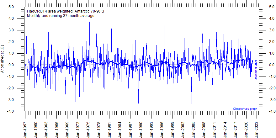
Diagram showing area weighted Antarctic ( 70-90oS) monthly surface air temperature anomalies (HadCRUT4) since January 2000, in relation to the WMO normal period 1961-1990. The thin blue line shows the monthly temperature anomaly, while the thicker red line shows the running 37 month (c.3 yr) average. The year 1957 was an international geophysical year, and several meteorological stations were established in the Antarctic because of this. Before 1957, the meteorological coverage of the Antarctic continent is poor. Last month shown: Last month shown: December 2021. Last diagram update: 15 March 2022.
Note
to the two Antarctic temperature diagrams above: As the HadCRUT4 data series has
improved high latitude data coverage (compared to the HadCRUT3 series) the individual 5ox5o
grid cells has been weighted according to their surface area. This is in
contrast to Gillet et al.
2008 which calculated a simple average,
with no correction for the significant surface area effect of latitude in polar
regions.
Click here to jump back to the list of contents.
Antarctic long meteorological data series

Long Antarctic surface annual air temperature series: Halley, Vostok, Amundsen-Scott and McMurdo. Annual values were calculated from monthly average temperatures. Almost unavoidably, some missing monthly data were encountered in some of the series. In such cases, the missing values were generated as either 1) the average of the preceding and following monthly values, or 2) the average for the month registered the preceding year and the following year. The thin blue line represents the mean annual air temperature, and the thick blue line is the running 5 year average. Click here to read about data smoothing. Data source: NASA Goddard Institute for Space Studies (GISS) and Rimfrost. Last year shown: 2024. Last figure update 7 February 2025.
The climate models runs for the IPCC's Fourth Assessment Report suggest that, with an increase in greenhouse gases of 1 percent per year, annual mean surface air temperatures in the Antarctic sea-ice zone over the 21st century would increase by 0.2-0.3oC per decade (WMO 2007). There would be a corresponding decrease in the extent of sea ice. Large parts of the high interior of the Antarctic would experience surface air temperature rises of more than 0.3oC per decade (World Meteorological Organization 2007).
Click here to jump back to the list of contents.
All diagrams shown in the tables above were prepared using gridded data downloaded from the public domain NASA Goddard Institute for Space Studies (GISS) web page. For surface interpolationof the gridded data a kriging algorithm was used, plotting all data in a polar projection map. The kriging procedure attempts to express trends and is widely considered one of the more flexible interpolation methods, producing a smooth map with few ‘bull eyes’. It is usually recommended for gridding almost any type of data set, especially data sets with a heterogeneous point distribution, such as characterising the present data set.
The GISS temperature database attempts to provide a more complete representation of the Arctic region than most other databases, which is the reason for using this particular database for preparation of temperature diagrams on this webpage. It does so by taking spatial correlation into account through extrapolating and interpolating in space. The real datapoints, however, remains identical to those used by other fine databases.
It should be noted that the observation network is not
charactericed by high or equal
density within the two polar regions. Thus, temperature changes displayed within the central part of the
Click here to jump back to the list of contents.
Polar regions as key regions for global climate change
Changes
in the Polar atmosphere-ice-ocean system observed in recent years have sparked
intense discussions as to whether these changes represent episodic events or
long-term shifts in the Arctic environment. Late 20th century concerns about
future climate change mainly stem from the increasing concentration of
greenhouse gasses in the atmosphere. Existing knowledge on Quaternary climate
and Global Climate Models (GCMs) predict that the effect of any ongoing and
future global climatic change should be amplified in the polar regions due to
feedbacks in which variations in the extent of glaciers, snow, sea ice and
permafrost as well as atmospheric greenhouse gases play key roles. In addition,
variations in the thickness of sea-ice tend to reinforce surface atmospheric
temperature anomalies by altering the heat and moisture transfer from the ocean
to the atmosphere. Thus, during the last 15 years the
The alleged enhanced temperature increase at high latitudes is mainly due to two theoretical greenhouse mechanisms:
-
Firstly, atmospheric carbon dioxide (CO2) has its greatest absorption of infrared radiation (IR) at sub-zero temperatures, as its absorption bands lie in the 12-16 micron wavelength band, corresponding to the wavelength of strongest IR surface emission from polar ice and snow. At higher temperatures, the typical wavelength of the strongest IR surface transmission is less than 12 microns, and therefore less affected by CO2. At temperatures near the average surface temperature of the Earth (c. 15°C), the strongest emission wavelength is around 10 microns, a wavelength which is largely unaffected by greenhouse gases. This is the so-called `radiation window' of the atmosphere where IR radiation from the surface escapes freely to the space.
-
Secondly, by far the most powerful atmospheric greenhouse gas is water vapour. Water vapour shares many overlapping absorption bands with CO2 and therefore an increase or decrease in atmospheric CO2 has limited effect on the overall rate of IR absorption in those overlapping regions, if water vapour is present in sufficient quantity. In the
For
the above reasons, an important enhanced greenhouse surface ‘fingerprint’ is
usually considered to be enhanced warming in the polar and sub-polar regions,
less warming in the tropics and sub-tropics, and least warming in equatorial
regions. This is the basic reason for much renewed research interest in Arctic
regions, and recent sub-continental scale analysis of meteorological data
obtained during the observational period apparently lends empirical support to
the alleged high climatic sensitivity of the
Click here to jump back to the list of contents.
Meteorological conditions in the Arctic
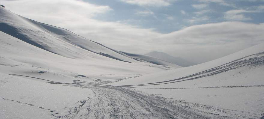
Winter conditions in the valley Fardalen, central Spitsbergen, April 10, 2007.
Modern
meteorological conditions and climate in the
Arctic
interior continental climates have more severe winters and precipitation is
usually small. The coldest part of the Northern Hemisphere is located in
northeast
In
winter, arctic weather is dominated by the frequent occurrence of inversions
where warm air overlies colder air near the terrain surface, decoupling surface
winds from stronger upper layer winds. For this reason, surface wind speeds tend
to be lower in winter than one might expect and cold (and dense) air tend to
accumulate in topographic lows. In summer, inversions are less frequent and
weaker, and the movement of low-pressure systems (cyclones) periodically
dominate Arctic weather, even in central
The
The
Icelandic Low is such a semipermanent low-pressure centre located between
Winter
cyclones in the Eurasian Arctic occur most frequently in the Barents and
The
summer distribution of air pressure and frequency of cyclones is different from
that of winter. With more uniform temperatures over the northern parts of the
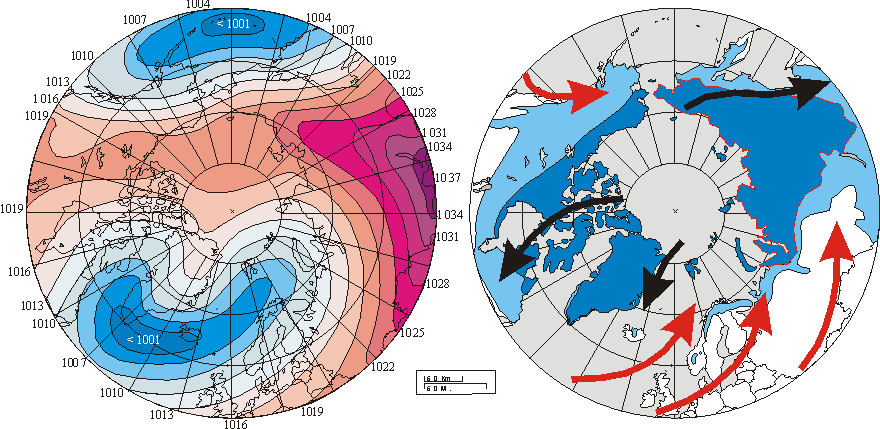
Left diagram shows winter (DJF) sea-level pressure (SLP) averaged over the period 1900-2001. Isobars are spaced every 3 hPa with red colours used for SLP values greater or equal than 1013 hPa and blue colours used for lower values. Numbers at circumference indicate SLP values in hPa. Right diagram shows the modern distribution of permafrost in the Northern Hemisphere. Continuous permafrost is shown by dark blue colour. Discontinuous and sporadic permafrost is shown by light blue colour. Red and black arrows show main surface air flow (warm and cold, respectively) as generated by the 20th century pattern of SLP. The overall wind systems set up by the average winter sea-level pressure appears to represent one of several controls on the present distribution of permafrost in the northern hemisphere.
The
Siberian High is an intense, cold anticyclone that forms over eastern
Click here to jump back to the list of contents.
Unsolved climatological and meteorological issues in the Polar Regions
The
meteorology of the
The
urban heat-island effect in the
A
central issue in Polar Region climate dynamics is to understand how climates in
the Northern and Southern hemispheres are coupled. The strongest of the rapid
temperature changes observed in
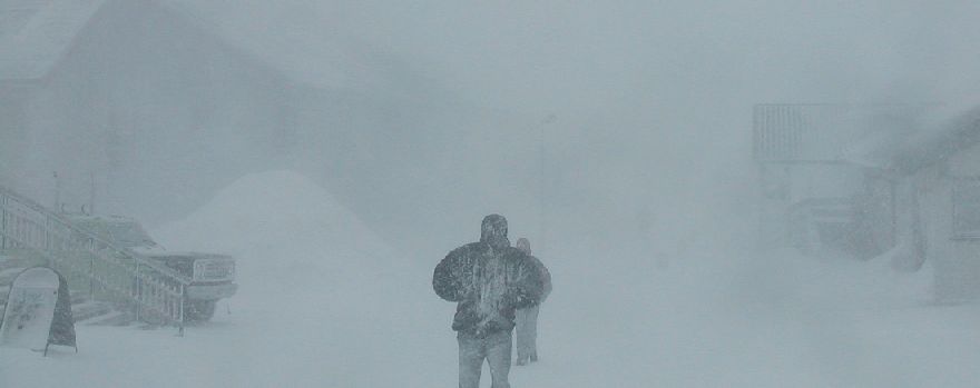
Blizzard in Longyearbyen, Svalbard, 8 April 2003.
Another pressing
meteorological issue is the distribution of precipitation
in the
The
general problem of reliable records on Arctic
precipitation, however, remains, and also has implications for knowledge on
duration and thickness of the snow cover, significant for the ground thermal
regime (Ballantyne 1978; Humlum
et al. 2003). Snow plays a key role in protecting plants and animals from
cold dry winter conditions. It is also important for the seasonal water cycle.
Variations in the snow cover may therefore have profound impact on biological
activity and geomorphic activity in the
A specific problem adheres to the lack of knowledge on mountain climate
in general. Despite the fact that high-relief areas (mountains) account for
about 20 per cent of the earth’s land surface, the meteorology of most
mountains is still little known. Meteorological stations are few and tend to be
located at conveniently accessible sites, often in valleys or along coasts,
rather than at points selected to obtain representative data. Precipitation
distribution in mountain areas has been a subject of debate and controversy
since the publication on orographic rainfall by Bonacina
(1945). The problem is compounded by the above-mentioned paucity of
high-altitude meteorological stations and the additional technical difficulties
of determining snowfall contributions to total precipitation, especially at
windy sites. As recognized early by Salter (1918)
from analysis of British data, the effect of altitude on the vertical
distribution of precipitation in mountain areas is highly variable between even
nearby geographical locations.
This poor understanding of the dynamics and characteristics of mountain
climate is particularly pronounced for the
Click here to jump back to the list of contents.
Click here to see decadal variations of precipitation and surface air temperature in the northern hemisphere polar region during the 20th century.
Click here to see a spatial analysis of monthly variations of surface air temperature in areas between 72oN and 60oS since 2005.
Click here for an update on present global, Arctic or Antarctic meteorological conditions.