Greenhouse gasses
Open Climate4you homepage
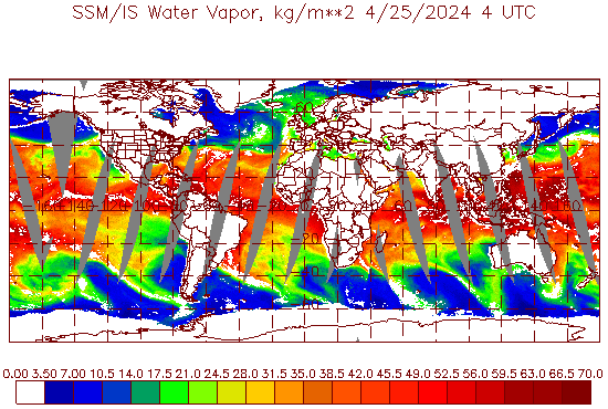
Total amount of water vapour in the atmosphere above the oceans 11 December 2024 (kg water vapour per m2). White areas are areas without data. Map source: NOAA, SSM / IS Products. Please use this link if you want to see the original diagram or want to check for a more recent update than shown above.
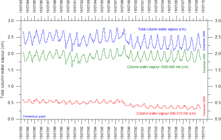
Variations in the total column water vapour in the atmosphere since July 1983 according to The International Satellite Cloud Climatology Project (ISCCP). Last data: June 2008. Last figure update: 14 June 2009.
The upper graph (blue) in the diagram above shows the total amount of water in the atmosphere. The green graph shows the amount of water in the lower troposphere between 1000 and 680 mb, corresponding to altitudes up to about 3 km. The lower red graph shows the amount of water between 680 and 310 mb, corresponding to altitudes from about 3 to 6 km above sea level. The marked annual variation presumably reflects the asymmetrical distribution of land and ocean on planet Earth, with most land areas located in the northern hemisphere. The annual peak in atmospheric water vapour content occur usually around August-September, when northern hemisphere vegetation is at maximum transpiration. The annual moisture peak occurs simultaneously at different levels in the atmosphere, which suggests an efficient transport of water vapour from the planet surface up into the troposphere. The time labels indicate day/month/year. There is a possibility that the step-like change shown 1998-1999 to some degree may be related to changes in the analysis procedure used for producing the data set, according to information from ISCCP.
Water vapour is the single most important greenhouse gas, and climate models forecast an increasing amount of atmospheric water vapour along with global temperature increase, because of enhanced evaporation of water from the planet surface. In addition to its direct greenhouse effect, water vapour is also important for cloud formation. Click here to see a few notes on this.
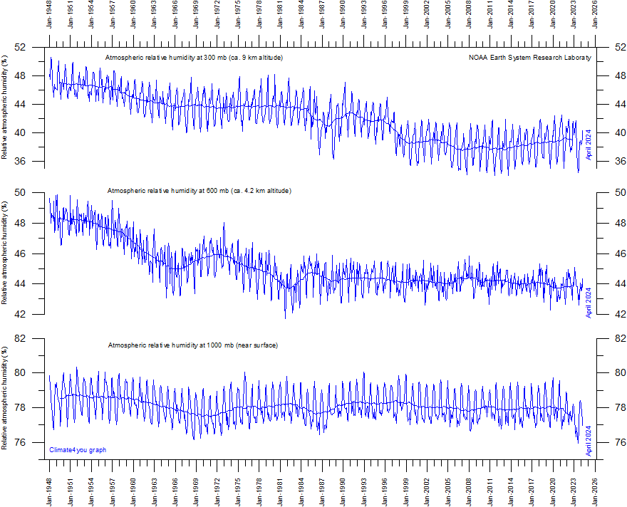
Relative atmospheric humidity (%) at three different altitudes in the lower part of the atmosphere (the Troposphere) since January 1948 (Kalnay et al. 1996). The thin blue lines shows monthly values, while the thick blue lines show the running 37 month average (about 3 years). Data source: Earth System Research Laboratory (NOAA). Pre-1973 data from the United States is not homogeneous according to Elliot and Gaffen (1991). See also data description by Kalnay et al. (1996). Last month shown: April 2025. Last diagram update: 6 May 2025.
-
Click here to download the raw data used to generate the above diagram. Use the following search parameters: Relative humidity, mb, 90N-90S, 0-357.5E, monthly values, area weighted grid.
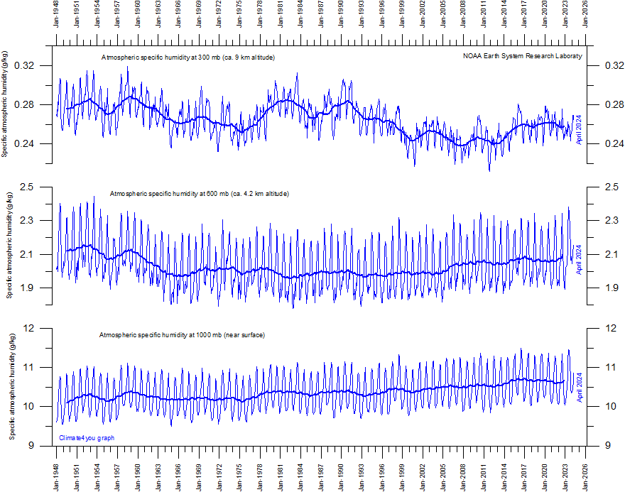
Specific atmospheric humidity (g/kg) at three different altitudes in the lower part of the atmosphere (the Troposphere) since January 1948 (Kalnay et al. 1996). The thin blue lines shows monthly values, while the thick blue lines show the running 37 month average (about 3 years). Data source: Earth System Research Laboratory (NOAA). Pre-1973 data from the United States is not homogeneous according to Elliot and Gaffen (1991). See also data description by Kalnay et al. (1996). Last month shown: April 2025. Last diagram update: 6 May 2025.
-
Click here to download the raw data used to generate the above diagram. Use the following search parameters: Specific humidity, mb, 90N-90S, 0-357.5E, monthly values, area weighted grid.
-
Click here to see association between sunspot number, sea surface temperature, and atmospheric specific humidity at 300 mb.
Most climate models assume that as an increasing amount of atmospheric CO2 induces slightly increasing atmospheric temperatures, the overall evaporation will increase from the planet surface, and thereby the specific humidity of the lower part of the atmosphere (the Troposphere) will increase as well. As water vapour is the most important greenhouse gas, additional warming will come about, resulting in a much larger temperature increase than that induced from CO2 alone. Climate models therefore, in general, assume the relative Tropospheric humidity to remain more or less stable, as increasing air temperatures are compensated by increasing specific humidity.
The above diagrams indicate that none of this has been the case since 1948. Only near the planet surface, the relative humidity has remained roughly constant (although with variations), but in the remaining part of the Troposphere below the Tropopause the relative humidity has been decreasing. Even for the specific humidity, this appears to be the case. It has, however, recently been suggested that it that the negative long-term specific humidity trends shown by the above data series are doubtful, and that instead the trend is towards increasing specific humidity (see, e.g., Dessler and Davis 2010).
Click here to jump back to list of contents.
Atmospheric carbon dioxide (CO2)
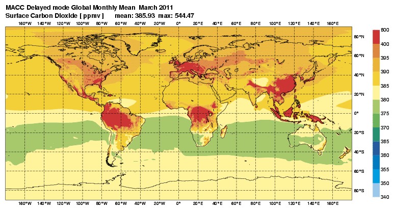
Average March 2011 surface concentration of CO2 (ppmv). The delayed-mode stream is running several months real-time to make maximum use of satellite and in-situ observations that are currently not provided in real-time. Source: Monitoring Atmospheric Composition and Climate (MACC-II). Click here to se the original diagram or to check for a more recent update.
Please
note that the map projection used above is of the type Mercator. This is a useful
cylindrical map projection that preserves angles at all locations, but scale
varies from place to place, distorting the size of land areas. In particular,
areas closer to the poles are more affected, making land areas of similar size
looking increasingly oversized towards the poles. To exemplify this effect, the
areas of
Atmospheric CO2 is measured at several sites distributed across the planet surface. Click on the link below see results from these measurement stations:
-
Mauna Loa, Hawaii, latest month
-
Mauna Loa, Hawaii, full monthly record
-
Different stations (click on station and then press 'Submit' button)
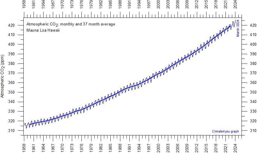
Monthly amount of atmospheric CO2 since March 1958, measured at the Mauna Loa Observatory, Hawaii. Data are reported as a dry mole fraction defined as the number of molecules of carbon dioxide divided by the number of molecules of dry air (water vapour removed), multiplied by one million (ppm). The thin line shows the monthly values, while the thick line is the simple running 37 month average, nearly corresponding to a running 3 yr average. Last month shown: April 2025. Last diagram update: 13 May 2025.
-
Click here to download the entire series of monthly CO2 values since March 1958.
-
Click here to read paper on the phase relation between atmospheric CO2 and global temperature.
-
Click here to read about data smoothing.
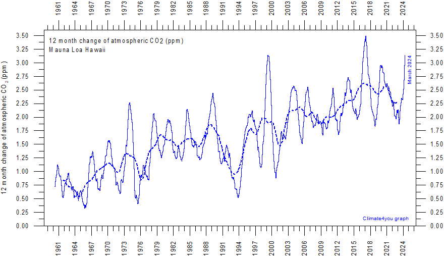
Annual (12 month) growth rate (ppm) of atmospheric CO2 since 1959, calculated as the average amount of atmospheric CO2 during the last 12 months, minus the average for the preceding 12 months. The graph is based on data measured at the Mauna Loa Observatory, Hawaii. Data are reported as a dry mole fraction defined as the number of molecules of carbon dioxide divided by the number of molecules of dry air (water vapour removed), multiplied by one million (ppm). The thin blue line shows the value calculated month by month, while the dotted blue line represents the simple running 3 year average. Last month shown: April 2025. Last diagram update: 13 May 2025.
-
Click here to download the entire series of monthly CO2 values since March 1958.
-
Click here to compare with sea surface temperature.
-
Click here to read paper on the phase relation between atmospheric CO2 and global temperature.
-
Click here to read about data smoothing.
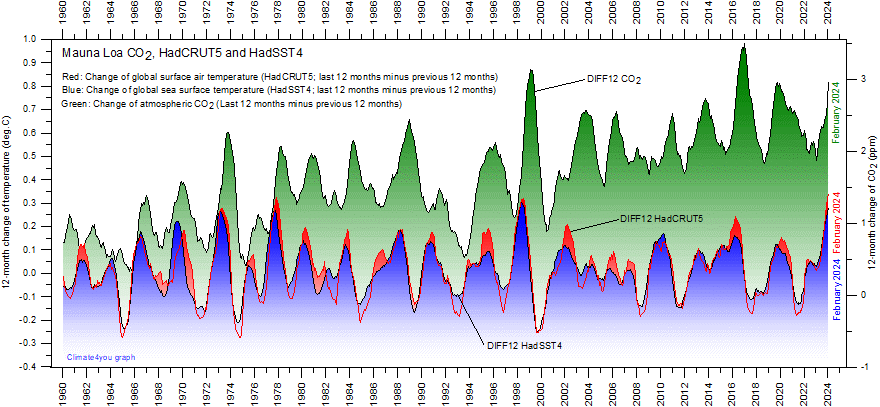
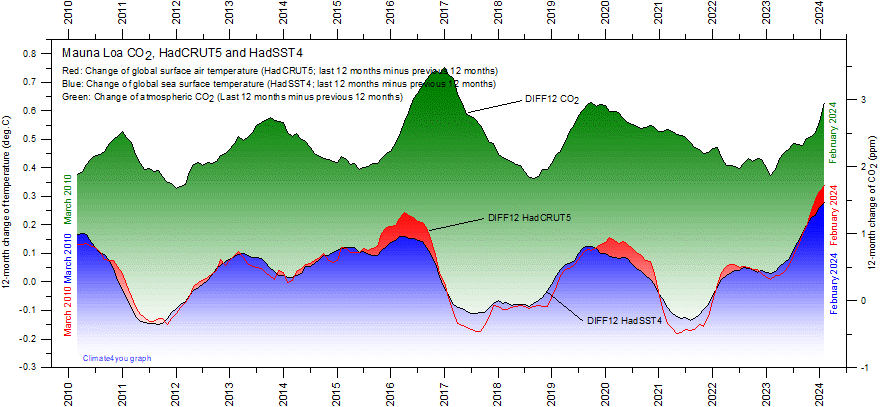
12-month
change of global atmospheric CO2 concentration (Mauna
Loa; green), global sea surface temperature (HadSST4;
blue) and global surface air temperature (HadCRUT5;
red dotted). Entire data series since 1958 are shown in the upper diagram, and
the last 15 years in the lower diagram, to enhance modern dynamics. All graphs are showing monthly values of DIFF12, the difference
between the average of the last 12 month and the average for the previous 12
months for each data series.
-
Click here to read about data smoothing.
-
Click here to read discussion on the fact that DIFF12 changes of atmospheric CO2 are tracking about 10-12 months after corresponding DIFF12 changes in air- and sea surface temperature.
-
Click here to read the original paper (Humlum et al. 2012) on the phase relation between atmospheric CO2 and global temperature, describing in greater detail the interpretation of the diagram above.
-
Click here to read a recent (2024) paper on the relation between atmospheric CO2 and global ocean temperature in the geological past.
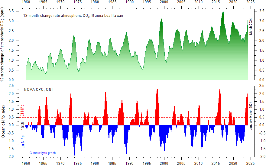
Visual
association between Oceanic Niño Index
(ONI) and annual growth rate of atmospheric CO2.
Upper panel:
Annual
(12 month) growth rate (ppm) of atmospheric CO2 since 1959,
calculated as the average amount of atmospheric CO2 during the last 12 months,
minus the average for the preceding 12 months (see
diagram above). The graph is based on data measured at the Mauna
Loa Observatory, Hawaii. Lower panel: Warm
(>+0.5oC) and cold (<0.5oC) episodes for the Oceanic
Niño Index (ONI), defined as 3 month running mean of ERSSTv4 SST
anomalies in the Niño 3.4 region (5oN-5oS, 120o-170oW)]. For historical purposes cold and warm episodes are
defined when the threshold is met for a minimum of 5 consecutive over-lapping
seasons. Anomalies are centred
on 30-yr base periods updated every 5 years. See also this
diagram.
-
Click here to download the entire series of monthly CO2 values since March 1958.
-
Click here to compare with sea surface temperature.
-
Click here to download the entire series of the Oceanic Niño Index (ONI) since December 1949 - February 1950.
-
Click here to read paper on the phase relation between atmospheric CO2 and global temperature.
-
Click here to read about data smoothing.
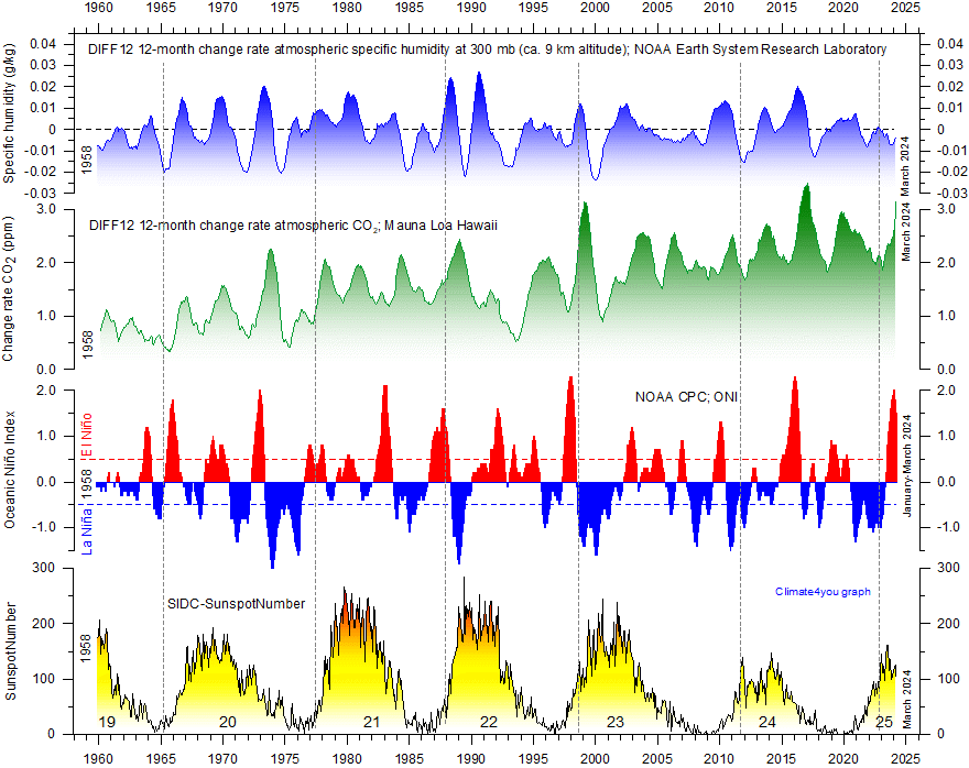
Visual association since 1958 between (from bottom to top) Sunspot Number, Oceanic Niño Index (ONI) and annual change rate of atmospheric CO2. and specific humidity at 300 mb (ca. 9 km altitude). Upper two panels: Annual (12 month) change rate of atmospheric CO2 and specific humidity at 300 mb since 1959, calculated as the average amount of atmospheric CO2/humidity during the last 12 months, minus the average for the preceding 12 months (see diagram above). Niño index panel: Warm (>+0.5oC) and cold (<0.5oC) episodes for the Oceanic Niño Index (ONI), defined as 3 month running mean of ERSSTv4 SST anomalies in the Niño 3.4 region (5oN-5oS, 120o-170oW)]. For historical purposes cold and warm episodes are defined when the threshold is met for a minimum of 5 consecutive over-lapping seasons. Anomalies are centred on 30-yr base periods updated every 5 years. Vertical stippled lines indicate the visually estimated timing of sunspot minima. Last diagram update: 13 May 2025.
-
Click here to download the measurements of atmospheric specific humidity since March 1958. Use the following search parameters: Specific humidity, 300 mb, 90N-90S, 0-357.5E, monthly values, area weighted grid.
-
Click here to download the entire series of monthly CO2 values since March 1958.
-
Click here to compare with sea surface temperature.
-
Click here to download the entire series of the Oceanic Niño Index (ONI) since December 1949 - February 1950.
-
Click here to read paper on the phase relation between atmospheric CO2 and global temperature.
-
Click here to read about data smoothing.
NOTE:
The above diagram is inspired by the work of Leamon et al. 2021:
Robert
J. Leamon, Scott W. McIntosh, Daniel R. Marsh. Termination of Solar
Cycles and Correlated Tropospheric Variability. Earth and Space
Science, 2021; 8 (4) DOI: 10.1029/2020EA001223
Click here to jump back to list of contents.
Temperature records versus atmospheric CO2
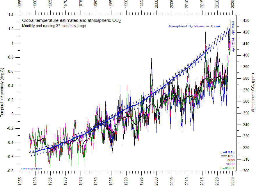
Superimposed plot of five different global monthly temperature estimates shown individually elsewhere. As the base period differs for these estimates, they have all been normalised by comparing to the average of their initial 120 months (10 years) from January 1979 to December 1988. Click here to go to the associated comparison of these five temperature records. The heavy black line represents the simple running 37 month (c. 3 year) mean of the average of all temperature estimates (before 1979 only the three surface records). The blue graph shows the amount of atmospheric CO2 (Mauna Loa station, Hawaii, see also above). The heavy blue line represents the simple running 37 month (c. 3 year) mean of the monthly CO2-values. The scale for atmospheric CO2 (right) is adjusted to display the CO2-graph roughly parallel to the 1975-2000 temperature increase. For the first two decades in the 21st century a warming of about 0.2°C per decade is projected for a range of SRES emission scenarios according to the 2007 IPCC Summary for Policymakers (p.7 and Fig.SPM.5). Last month shown: February 2025. Last diagram update: 13 May 2025.
-
Click here to read paper on the phase relation between atmospheric CO2 and global temperature.
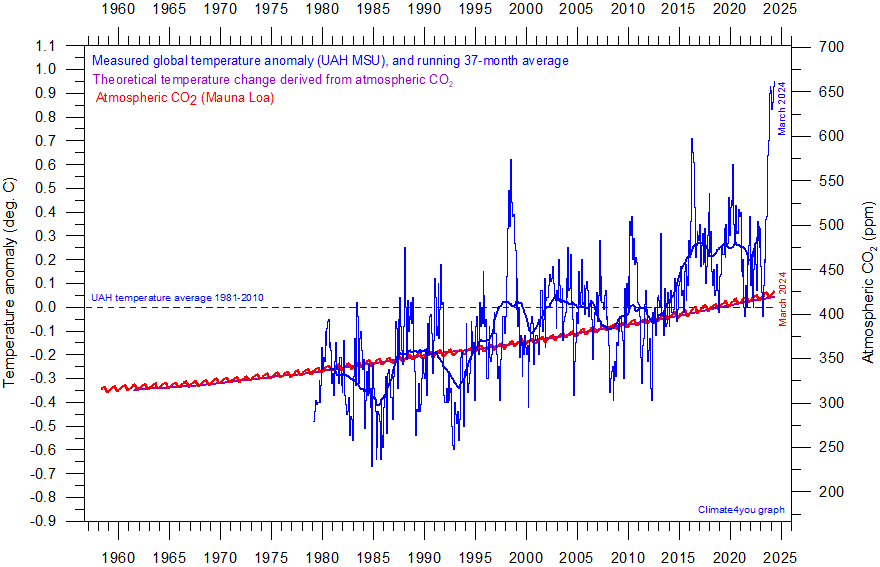
Diagram showing the University of Alabama (UAH) monthly global surface air temperature estimate (blue) and the monthly atmospheric CO2 content (red) according to the Mauna Loa Observatory, Hawaii. Purple line (running along red CO2 curve) shows theoretical temperature change due to changing atmospheric CO2. The Mauna Loa data series begins in March 1958, and 1958 has therefore been chosen as starting year for the diagram. Reconstructions of past atmospheric CO2 concentrations (before 1958) are not incorporated in this diagram, as such past CO2 values are derived by other means (ice cores, stomata, or older measurements using different methodology), and therefore are not directly comparable with modern atmospheric measurements. Last month shown: April 2025. Last diagram update: 21 May 2025.
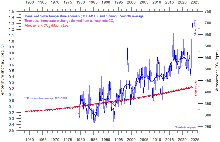
Diagram showing the Remote Sensing Systems (RSS) monthly global surface air temperature estimate (blue) and the monthly atmospheric CO2 content (red) according to the Mauna Loa Observatory, Hawaii. Purple line (running along red CO2 curve) shows theoretical temperature change due to changing atmospheric CO2. The Mauna Loa data series begins in March 1958, and 1958 has therefore been chosen as starting year for the diagram. Reconstructions of past atmospheric CO2 concentrations (before 1958) are not incorporated in this diagram, as such past CO2 values are derived by other means (ice cores, stomata, or older measurements using different methodology), and therefore are not directly comparable with modern atmospheric measurements. Last month shown: February 2024. Last diagram update: 20 March 2025.
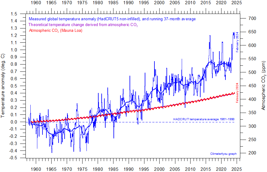
Diagram showing the HadCRUT5 monthly global surface air temperature estimate (blue) and the monthly atmospheric CO2 content (red) according to the Mauna Loa Observatory, Hawaii. Purple line (running along red CO2 curve) shows theoretical temperature change due to changing atmospheric CO2. The Mauna Loa data series begins in March 1958, and 1958 has therefore been chosen as starting year for the diagram. Reconstructions of past atmospheric CO2 concentrations (before 1958) are not incorporated in this diagram, as such past CO2 values are derived by other means (ice cores, stomata, or older measurements using different methodology), and therefore are not directly comparable with modern atmospheric measurements. Last month shown: February 2025. Last diagram update: 13 May 2025.
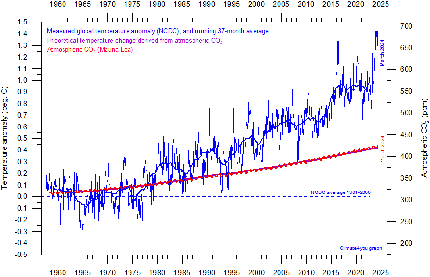
Diagram showing the NCDC monthly global surface air temperature estimate (blue) and the monthly atmospheric CO2 content (red) according to the Mauna Loa Observatory, Hawaii. Purple line (running along red CO2 curve) shows theoretical temperature change due to changing atmospheric CO2. The Mauna Loa data series begins in March 1958, and 1958 has therefore been chosen as starting year for the diagram. Reconstructions of past atmospheric CO2 concentrations (before 1958) are not incorporated in this diagram, as such past CO2 values are derived by other means (ice cores, stomata, or older measurements using different methodology, and therefore are not directly comparable with modern atmospheric measurements. Last month shown: April 2025. Last diagram update: 14 May 2025.
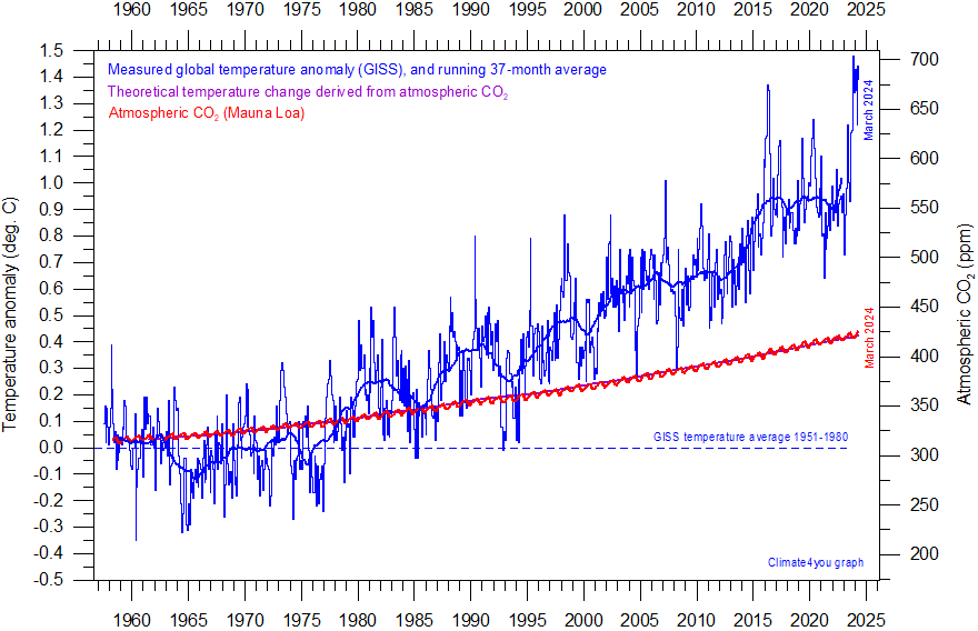
Diagram showing the GISS monthly global surface air temperature estimate (blue) and the monthly atmospheric CO2 content (red) according to the Mauna Loa Observatory, Hawaii. Purple line (running along red CO2 curve) shows theoretical temperature change due to changing atmospheric CO2. The Mauna Loa data series begins in March 1958, and 1958 has therefore been chosen as starting year for the diagram. Reconstructions of past atmospheric CO2 concentrations (before 1958) are not incorporated in this diagram, as such past CO2 values are derived by other means (ice cores, stomata, or older measurements using different methodology), and therefore are not directly comparable with modern atmospheric measurements. Last month shown: April 2025. Last diagram update: 18 May 2025.
A note on the relation between temperature and CO2:
It
is
generally agreed that, from a theoretical point of view, the temperature
effect ∆T of increasing
atmospheric CO2 may be expressed as (see, e.g. Myhre et al. 1998
and IPCC Third Assessment Report, section 6.1):
∆T
= ∆F * l
where
∆F = 5,35ln(C1/Co) W/m2, and where Co and C1 indicates the
concentration of atmospheric CO2 at the beginning and end of the
time interval considered. The factor l is a so-called climate sensitivity
parameter (expressing the global mean surface temperature response to the
imposed radiative CO2 forcing). This factor has been determined to
about 0,26oCW-1m2. The relation shows that as
the concentration of atmospheric CO2 increases, its
theoretical greenhouse effect increases in a logarithmic fashion, not linear.
Therefore, for each increase in CO2 concentration, the effect on
temperature is smaller and smaller.
If
all other effects in the real world are ignored, the above relation shows that
any doubling of atmospheric CO2 concentration produces a
temperature increase of nearly 1oC (0.96oC), no matter
how high the initial concentration of CO2.
The
purple line in the above diagrams is calculated using the observed
concentration of atmospheric CO2 since March 1958. The axis for CO2
is adjusted to show overlap between CO2 (red) and the calculated
accumulated temperature effect (purple). In all graphs, the temperature axis
has been adjusted to position the initial calculated effect of CO2
roughly at the average for the beginning of the observed temperature graph
(blue). This is done to make it possible to compare the theoretical CO2
temperature development (purple) with the observed development (blue).
All
these diagrams show the observed temperature development to be much more
complicated than the theoretical development from atmospheric CO2
alone. With exception of the UAH diagram, the overall observed temperature
increases since 1958 is much larger than calculated from CO2 alone.
In addition, the observed temperature development is characterised by
recurrent intervals characterised by increasing and decreasing temperatures,
respectively, a development extremely different from the calculated
temperature (purple graph). Clearly many other factors than only CO2
is in control of the real-world atmospheric temperature.
In
contrast to this real-world observation, climate models are programmed to give
the greenhouse gas carbon dioxide CO2 a leading role on control on
the global air temperature. The fact that the observed real-world temperature
has been changing much more than expected just from CO2, is usually
ascribed to an added greenhouse effect of atmospheric water vapour in the
upper Troposphere, the concentration of which by the models is expected to
increase along with CO2 (see, e.g. Schneider et. al. 1999).
However,
measurements of water vapour in the upper Troposphere apparently show this
assumption to be mistaken (see, e.g., diagram on p.46). Therefore, the quite
substantial difference between modelled and observed atmospheric temperature
must be caused by other factors. In addition, the very dynamic change pattern
displayed by the observed temperature also needs to be explained, before a
firm understanding of global climate dynamics can be claimed.
All
temperature-CO2 diagrams above shows both atmospheric temperature
and atmospheric CO2 to be increasing since 1959. However, this fact
does not demonstrate that temperature is controlled by CO2. In
fact, it might just as well demonstrate the opposite relation (temperature
controlling CO2), or, that both temperature and CO2 is
controlled by a third factor.
Litterature:
Myhre,
G., E. Highwood, K. Shine, and F. Stordal 1998. New
estimates of radiative forcing due to well mixed greenhouse gases, Geophys.
Res. Lett., 25(14), 2715–2718, doi:10.1029/98GL0190
Click here to read a few reflections on the relation between global temperature and the amount of atmospheric CO2.
Click here to jump back to list of contents.
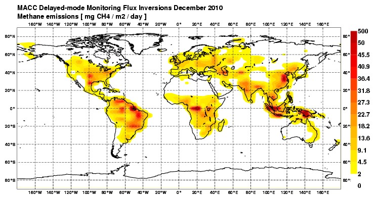
Average December 2010 methane emissions per day (mg CH4/m2). The delayed-mode stream is running several months behind real-time to make maximum use of satellite and in-situ observations that are currently not provided in real-time. Source: Monitoring Atmospheric Composition and Climate (MACC-II). Click here to se the original diagram or to check for a more recent update.
Please
note that the map projection used above is of the type Mercator. This is a useful
cylindrical map projection that preserves angles at all locations, but scale
varies from place to place, distorting the size of land areas. In particular,
areas closer to the poles are more affected, making land areas of similar size
looking increasingly oversized towards the poles. To exemplify this effect, the
areas of
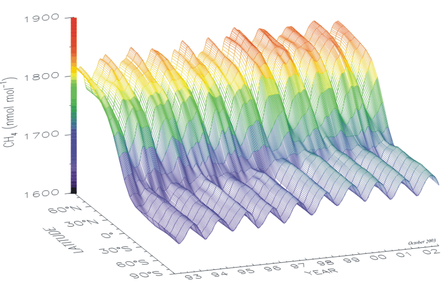
Plot showing showing the growth of atmospheric methane (in the marine boundary layer), the seasonal variations and the difference between northern and southern hemispheres (NOAA, GLOBALVIEW), from 1993 to 2002.

Diagram showing monthly of atmospheric CH4 since April 1984 at Cape Grim, Tasmania, Australia. Last month shown: December 2015. Last diagram update: 5 October 2016.
-
Click here to download the Tasmania data record since 1984.
-
Click here to read about data smoothing.
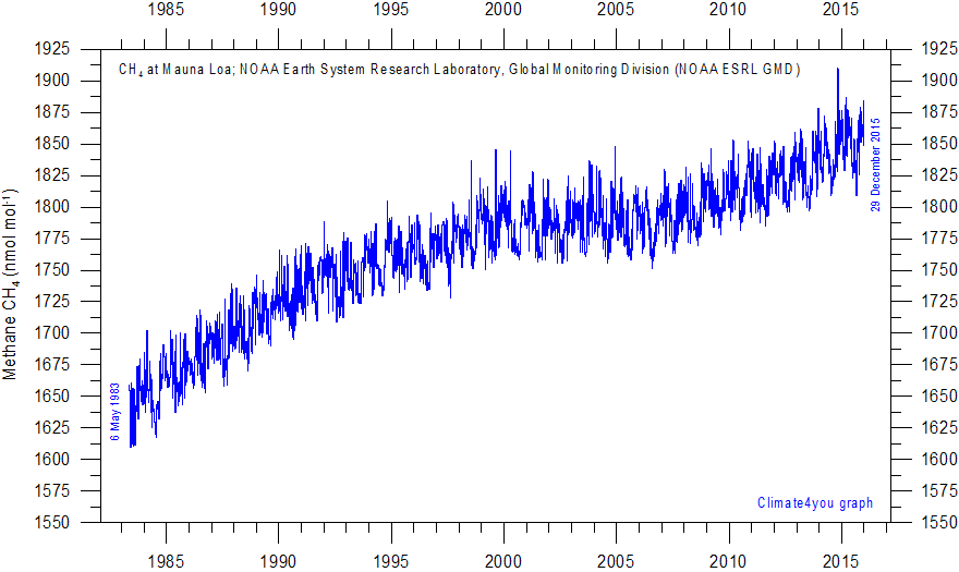
Diagram showing variations of atmospheric CH4 since May 1983 at Mauna Loa, Hawaii. No smoothing has been attempted, as data points are not equidistant. A number of apparent observation outliers have been removed. Last day shown: 29 December 2015. Last diagram update: 5 October 2016.
-
Click here or here to download the original Mauna Loa CH4 data series.
Atmospheric methane (CH4) is measured at several sites distributed across the planet surface. Click on the link below see results from different measurement stations:
-
Different stations (select CH4, click on station and then press 'Submit' button)
Click here to jump back to list of contents.