Climate reflections
-
20080214: Reflections on recent global surface air temperature changes
-
20080306: Reflections on the significance of recent global surface air temperature changes
-
20080715: Handling the present period without global warming by Groupthink
-
20080927: Reflections on the correlation between global temperature and atmospheric CO2
-
20120128: Reflections on effects of the NCDC and GISS transition to GHCN version 3
-
20120201: GISS corrections of the Nuuk Greenland surface air temperature record
Open Climate4you homepage
20080214: Reflections on recent global surface air temperature changes
Recently there has been much
attention drawn to the global temperature record since 1998 (IPCC
2007, Fourth Assessment Report of the Intergovernmental Panel on Climate Change).
No less than five years since 1998 has been the warmest recorded since the
latter part of the Little Ice Age (1850). The years listed by IPCC in their 2007
report as being especially warm are 1998, 2002, 2003, 2004 and 2005 (Trenberth
et al. 2007, p.237). The El Niño effect on the year 1998 is mentioned by Trenbert
et al. (2007), but the 1998 high global annual temperature remain listed
among the top five annual temperatures. In the 2007 IPCC Summary for Policymakers
the series of record high temperatures is highlighted, but unfortunately without
calling attention to the special character of the year 1998.
There is reason, therefore, to consider the whole temperature record since 1998
in some detail.
Estimates of the recent global temperature changes suggest that the planet may now have entered a period which deviates from the previous period since 1980, where increasing temperatures have prevailed. In contrast to this previous development, net changes since 1998 appear to be small. The year 1998 was especially warm due to the 1997-1998 El Niño in the Pacific Ocean, and was followed by a cooler period 1999-2000. From 2001 surface air temperatures remained essentially stable until 2007, where temperatures again began to decrease. Considering the whole 10-year period 1998-2007, however, net changes have been small.
It is impossible to know if this lack of warming will continue, but these observations are inconsistent with the predictions of the long-term global climate predictions, such as reported in the 2007 IPCC report. Three possibilities remain for the future development of the average global surface air temperature:
-
The planet have entered a period of more stable temperatures
-
The planet are just now passing a temperature peak and temperatures will begin to drop in the near future
-
Temperatures will begin to increase again
None of the existing global climate models have forecasted the apparent discontinuation of rising air temperatures following the transition period 1998-2001. Climate models forecast increasing temperatures along with the ongoing increase of atmospheric CO2. For the next two decades a warming of about 0.2°C per decade is projected for a range of SRES emission scenarios according to the 2007 IPCC Summary for Policymakers (p.7 and Fig.SPM.5). It is therefore of considerable interest to monitor the future surface air temperature development, especially in the polar regions, where changes are expected to be more rapid than elsewhere.
The cooling interval of the atmosphere since early 2007 is interesting, but may represent a short interval of low temperatures, only. This cooling does not demonstrate that global warming has stopped for many years to come, and it would be premature to attempt drawing conclusions before more data are available. Surface air temperatures might well bounce back to the previous level during 2008.
Presumably the La Niña event in the Pacific Ocean since August 2007 contributes to the present interval of cooling, affecting large surface areas near the Equator, just like another La Niña episode probably contributed to the 1999-2000 cool episode (click here to see diagrams). What appear noteworthy is the fact that several other ocean areas also are developing relatively low sea surface temperatures at the moment (February 2008). Generally speaking, only the North Atlantic remains relatively warm. Click here to see an updated map of the present global sea surface temperature anomaly.
Also other factors might be relevant to consider. As one example, it is interesting that the 1998 termination of global warming (since 1978) apparently is synchronous with a change in the global cloud cover: Satellite observations since 1983 show a decreasing trend from 1987 until 1999, from when the global cloud cover again has increased somewhat. As the global cloud cover have a clear net cooling effect on the global climate, the variations of the global cloud cover presumably is well worth to follow in the years to come. Click here to see a graph showing the variations of the global cloud cover since 1983.
Click here to jump back to list of contents.
20080306: Reflections on the significance of recent surface air temperature changes
In a normal scientific context the present period with essentially stable global air temperatures represents a classic example of what is known as empirical falsification, disproving the hypothesis on the dominant influence of CO2 and alleged associated effects on the global temperature. The atmospheric content of CO2 continues to increase, but the global surface air temperature is essentially stable, without large volcanic eruptions or other specific phenomena to explain the lack of increasing air temperature.
Clearly other factors
not fully represented by global climate models must recently have had a net cooling effect
of the same magnitude as
the alleged warming effect of greenhouse gasses. Consequently, global climate models
apparently are still not perfect, and may require modification
and presumably also the inclusion of additional processes.
This
observation does not disprove the general notion that atmospheric CO2
has influence on the global temperature. There are good reasons to expect
that all other things being equal, an increasing amount of atmospheric CO2
may lead to higher global temperature.
What
the falsification do demonstrate, however, is that the alleged dominance of CO2 apparently
is wrong, and that CO2 with associated warming effects have a smaller
relative importance than previously believed. The real relative importance of CO2
for the global temperature and other drivers will be demonstrated by the future global temperature
development as well as by various future research initiatives.
In
addition, the amount of atmospheric CO2, like most
other phenomena in nature, is likely to undergo natural variations.
For CO2 this has the additional implication, that the ocean
temperature presumably represents an important control on the amount of
atmospheric CO2.
Notwithstanding these considerations, the global average surface temperature since 1998 is still high and presumably higher than at any time since the end of the Little Ice Age (Trenberth et al. 2007). This observation, however, does not represent a valid argument for ignoring the significance of the recent temperature development. The CO2 hypothesis forecasts the global temperature to increase whenever the atmospheric CO2 concentration goes up, if not counteracted by any other known climatic phenomena, such as, e.g., volcanic eruptions. Whenever a situation like the present occurs, with increasing atmospheric CO2 and essentially stable (or decreasing) global temperatures over several years without known counter effect, the hypothesis is falsified. The general level of the global temperature, high or low, when seen in a longer time perspective does not matter in this context, as this may well be the result of variations in a number of other climatic drivers.
There has in the recent past been other periods where the global temperature stopped increasing, e.g. 1988-1989 and 1991-1993 (click here for diagram). These periods are, however, shorter than the present period, and some of these may be related directly to the cooling effects of volcanic eruptions (e.g., the 1991 Mt. Pinatubo eruption). On this background, the present period with essentially stable global temperatures over several years differs and is remarkable. It is useful to remember that the modern global warming concept refers to a 20-year period only, from 1978 to 1998, which is not a long period in a climatic context. The present period since 1998 without increasing temperatures is already half as long.
Click here to read a statistician's evaluation of the recent global temperature changes (since 1998) compared to the IPCC-temperature forecasts (located on the Public Policy Forecasting website).
In addition to the above considerations, the interested reader might also find it valuable to read a critique on the whole concept of calculating an average global temperature (Essex et al. 2006). In addition to this, surface air temperatures is a poor indicator of global climate heat changes, as air has relatively little mass associated with it. Ocean heat changes are the dominant factor for global heat changes. Apparently, climate models still have difficulties to model the dynamics of the oceans correctly.
The fact remains, however, that the estimated global surface air temperature continues to attract widespread interest, and many agree that this number at least may be considered a useful proxy for the present state of the global climate system. Transferring information on global temperature changes to a regional scale, however, gives only very little useful information. Climate change is essentially a phenomenon which must be understood on a regional scale. Click here to see an illustration of this for Europe during the 20th century.
Click here to jump back to list of contents.
20080715: Handling the present period without global warming by Groupthink
Global
temperature has not risen since 1998. The models relied upon by the
Intergovernmental Panel on Climate Change (IPCC) had not projected this recent
absence of global warming, as well as a number of other phenomena, such as, e.g.,
cooling in Antarctica (Doran et al. 2002), the
absence of ocean warming since 2003 (Lyman et al.
2006; Gouretski and Koltermann 2007), and
that the Pacific Decadal Oscillation recently changed from its warming to its
cooling phase.
The present period since 1998 with no global temperature increase thereby has caused some embarrassment for the notion that burning of fossil fuel causes a marked increase of global temperatures. The embarrassment is becoming more and more pronounced as the atmospheric concentration of CO2 continues to increase.
As increasing global temperature 1978-1998 was the main driver for concern about future climate, one would have expected this new temperature development to be broadly welcomed as a good development. Somewhat surprisingly, this has apparently not been the case. The lack of warming since 1998 has instead been ignored or defensively explained as being without significance. Some have simply chosen to refocus on other issues without direct relation to air temperature, such as, e.g., Arctic (not Antarctic) sea ice or retreating glaciers.
A widespread defensive reaction to the recent temperature development has been that of stressing the importance of natural multi-annual and decadal temperature variations to explain the lack of warming. Previously, this was not a widespread line of argumentation among people supportive of the notion of significant anthropogenic warming: In contrast, observed temperature increases were usually presented as indications of anthropogenic warming, and definitely not as the result of natural multi-annual and decadal temperature variations.
This way of asymmetrical reasoning is interesting from a psychological point of view, and is usually considered characteristic for groupthink.
Groupthink
is a type of thought exhibited by members of a group, trying to minimize conflict and
reach consensus without critically testing, analyzing, and evaluating ideas (text
from Wikepedia).
During
groupthink, members of the group avoid promoting viewpoints outside the comfort
zone of consensus thinking. A variety of motives for this may exist such as a
desire to avoid being seen as foolish, or a desire to avoid embarrassing or
angering other members of the group. Groupthink may cause groups to make hasty,
irrational decisions, where individual doubts are set aside, for fear of
upsetting the group’s balance.
The
contrast between the deliberations over two consecutive crises involving
In early 1961 President John F. Kennedy and his advisors fell into the trap of poor group decision-making practices that lead to their disastrous decision to launch the Bay of Pigs invasion (17 April 1961), which failed ignominiously, leading to the much more dangerous Cuban Missile Crisis in October 1962.
As
pointed out by Janis (1983) in his book Groupthink, the
The
subsequent October 1962 Cuban
Missile Crisis deliberations, again involving Kennedy and many of the same
advisors, avoided those groupthink characteristics and instead proceeded along
lines associated with productive decision-making, such as Kennedy ordering
participants to think skeptically, inviting outside experts to share their
viewpoints, allowing discussion to be freewheeling, having subgroups meet
separately, and occasionally leaving the Cabinet Room to avoid his overly
influencing the discussion himself (Diamond 2005). Ultimately, the 1962 Cuban missile crisis
was resolved peacefully, thanks in part to these prudent measures, and thanks in
part to the courage, realism and political competance shown by both President
John F. Kennedy and Soviet
Premier Nikita Khrushchev
But why did decision-making in these two Cuban crises unfold so differently? Much of the reason is probably that Kennedy himself thought hard after the 1961 Bay of Pigs fiasco, and he charged his advisors to think equally hard, about what had gone wrong with their decision-making in 1961. Based on that thinking, he purposely changed how he operated the advisory discussions in 1962, thereby avoiding the negative effects of groupthink.
The 2008 defensive reaction to the recent lack of global warming can be considered as another fine example of groupthink. A premature sense of apparent unanimity prevails (most scientists agree that global warming is real and manmade), and any doubts and contrary views are suppressed (by official institutions launching lists of ‘correct’ answers to a number of critical questions (so-called myths), including the lack of warming since 1998).
Irving
Janis (1977) devised eight symptoms that are indicative of groupthink (cited
from Wikepedia):
-
Illusions of invulnerability creating excessive optimism and encouraging risk taking.
-
Rationalising warnings that might challenge the group's assumptions.
-
Unquestioned belief in the morality of the group, causing members to ignore the consequences of their actions.
-
Stereotyping those who are opposed to the group as weak, evil, disfigured, impotent, or stupid.
-
Direct pressure to conform placed on any member who questions the group, couched in terms of "disloyalty".
-
Self censorship of ideas that deviate from the apparent group consensus.
-
Illusions of unanimity among group members, silence is viewed as agreement.
-
Mindguards — self-appointed members who shield the group from dissenting information.
Click here to jump back to list of contents.
In the latest IPCC report (IPCC 2007, Fourth Assessment Report of the Intergovernmental Panel on Climate Change) Figure 1 on page 253 in Chapter 3 (Observations: Surface and Atmospheric Climate Change) indicate that a new and accelerating global temperature rise have taken place during the 25 years 1981-2005. The topmost part of this figure is reproduced below:
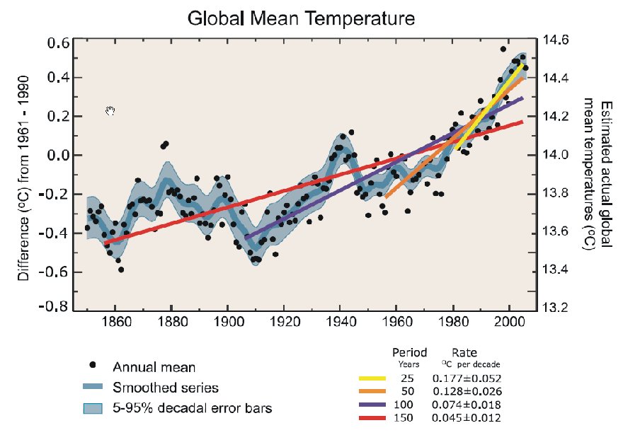
Figure
A. Figure text reproduced from IPCC 2007, chapter 3, page 253: Annual global
mean observed temperatures (black dots) along with simple fits to the data. The
left hand axis shows anomalies relative to the 1961 to 1990 average and the
right hand axis shows the estimated actual temperature (°C). Linear trend fits
to the last 25 (yellow), 50 (orange), 100 (purple) and 150 years (red) are shown,
and correspond to 1981 to 2005, 1956 to 2005, 1906 to 2005, and 1856 to 2005,
respectively. Note that for shorter recent periods, the slope is greater,
indicating accelerated warming. The blue curve is a smoothed depiction to
capture the decadal variations. To give an idea of whether the fluctuations are
meaningful, decadal 5% to 95% (light grey) error ranges about that line are
given (accordingly, annual values do exceed those limits). Results from climate
models driven by estimated radiative forcings for the 20th century (Chapter 9)
suggest that there was little change prior to about 1915, and that a substantial
fraction of the early 20th-century change was contributed by naturally occurring
influences including solar radiation changes, volcanism and natural variability.
From about 1940 to 1970 the increasing industrialisation following World War II
increased pollution in the Northern Hemisphere, contributing to cooling, and
increases in carbon dioxide and other greenhouse gases dominate the observed
warming after the mid-1970s.
From the text above the period 1981-2005 is identified by IPCC as being unique, representing a new trend characterised by an accelerated temperature rise. The accelerated temperature increase is suggested to be caused by atmospheric increases in carbon dioxide and other greenhouse gases, assumed to dominate the observed warming after the mid-1970s.
This is clearly an important conclusion, and the analysis leading up to the conclusion therefore deserves to be considered in some detail.
In the figure above, error bars and linear fits tend to hide the original data (the black dots). This is in itself most unfortunate, as the diagrams in the IPCC report should be prepared for consumption by policy makers and other intelligent lay persons. Therefore, they should be easy to understand, being faithful to both the data and the science, designed to shed light rather than to mislead.
In this respect, the procedure of comparing linear fits calculated for time windows of different lengths (diagram above) is highly unusual, if not plain wrong. In most cases, for obvious mathematical reasons, a linear fit calculated for a long temperature series will yield a smaller slope than a linear fit calculated for a shorter period. Comparing fits covering time windows of different length is therefore, in general, meaningless and should be avoided. The unusual and unfortunate procedure adopted by IPCC 2007 therefore calls for a new analysis of the post Little Ice Age temperature increase.
In the figure above HadCRUT3 global surface temperature estimates have been used. In the figure below, the original monthly HadCRUT3 data are plotted in a new diagram:
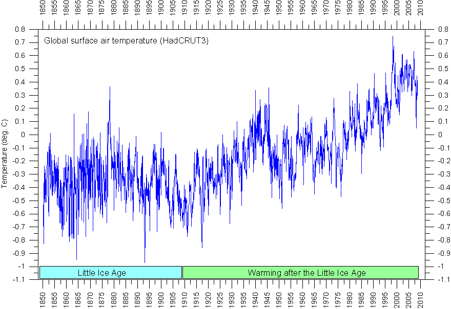
Figure B. Monthly global surface air temperature since 1850, according to HadCRUT3. The blocks in the bottom part of the diagram indicate the following interpretation od the data: The early data shown the last part of the Little Ice Age, and the younger data show the temperature rise since the termination of the Little Ice Age in the early 20th century. The data series is updated to August 2008.
The diagram above (Figure B) shows how the HadCRUT3 series may be interpreted to show 1) the final part of the Little Ice Age, and 2) the following period of warming, including the alleged unique warming period 1981-2005. The actual termination of the Little Ice Age differs somewhat from region to region, but in Figure B, for practical reasons, the year 1908 has been chosen as the first year in the post Little Ice Age warming period.
In the following diagram (Figure C), only the data points representing the post Little Ice Age period from 1908 are considered.
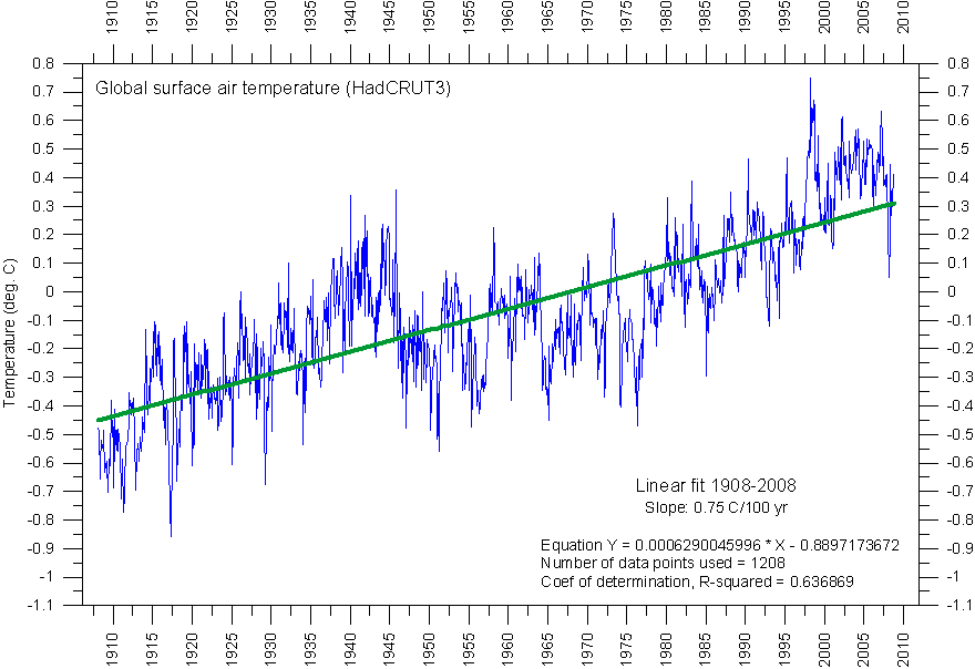
Figure C. Monthly global surface air temperature since 1908, according to HadCRUT3. The blue line show the variation of the monthly values, and the green line show a linear trend line calculated for the whole period 1908-2008. The data series is updated to August 2008.
In the diagram above a post Little Ice Age linear trend line has been calculated (green line). This trend line has a slope of 0.75oC per 100 year, suggesting that the overall global temperature increase since the termination of the Little Ice Age (here defined as 1908) has been about 0.75oC.
It is now possible to compare the rate of temperature increase from 1981 to 2005 with the general temperature rise since the termination of the Little Ice Age, to investigate if this period of rapid temperature increase is unique in relation to the remaining part of the data series since 1908.
This can be done by plotting the deviation of the individual data points from the overall trend line, as is shown in Figure D below.
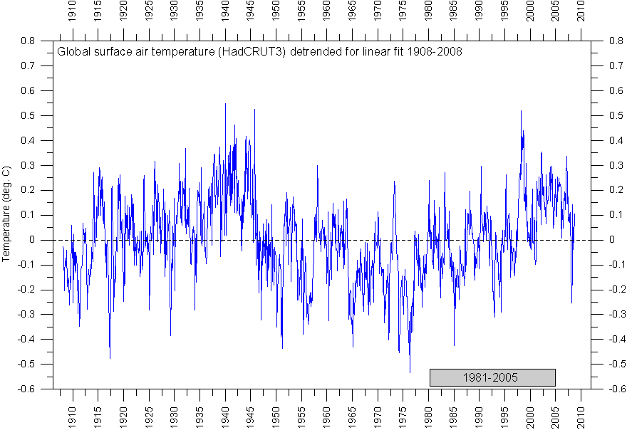
Figure D. Monthly global surface air temperature since 1908, according to HadCRUT3. The zero line indicate values defining the green overall trend line in the previous figure. The blue graph show the difference between the monthly temperature data and the green trend line in the previous diagram. The data series is updated to August 2008.
The zero line in Figure D represents values (year, temperature) which would plot exactly on the green line showing the overall global temperature increase since the termination of the Little Ice Age. From this figure it is not possible to identify the period 1981-2005 as a period characterised by a unique rapid temperature increase. The rate of temperature increase during the time leading up to the warm period around 1940 obviously was of similar magnitude.

Figure E. Monthly global surface air temperature since 1908, according to HadCRUT3. This diagram is identical to that above, except for the addition of a green graph representing the 61-month moving average (c. 5 year). The data series is updated to August 2008.
In the diagram above (Figure E), the temperature development during the post Little Ice Age temperature increase (Figure B) is attempted clarified by adding a graph showing the 61-month moving average. Once again, it is not possible to identify the period 1981-2005 as being characterised by a unique rate of temperature change. If anything, the diagram instead suggests the possible existence of a cyclic development superimposed on the general post Little Ice Age temperature increase, with the late 20th century temperature increase apparently coming to an end during the first decade of the 21st century. However, the data series is to short to conclude anything on this at the moment.
Another, and perhaps simpler, way of illustrating the lack of a special signature associated with the period 1981-2005 is to plot the monthly temperature change as a function of time, using the raw data shown in Figure C:
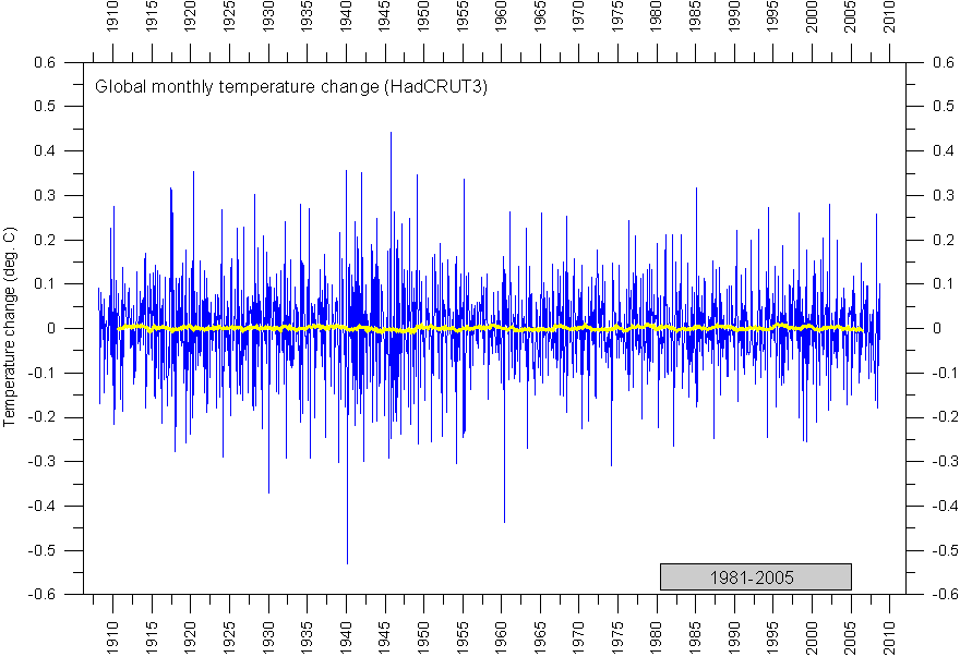
Figure F. Diagram showing the monthly change of the global surface air temperature since 1908, according to HadCRUT3. This diagram is prepared by simply calculating the temperature difference between successive months (no detrending), as shown in Figure C. The yellow line represents the 61-month moving average (c. 5 year). The data series is updated to August 2008.
In the diagram above (Figure F) the monthly global temperature change is shown as a blue graph, while the yellow line represents the running 61-month average. Should the period 1981-2005 stand out from the previous part of the post Little Ice Age warming by being characterised by accelerated temperature increase, a development towards more and more positive values should show up in the diagram. However, this does not seem to be the case. Instead, also from this point of view the 1981-2005 period apparently fits nicely into the previous part of the post Little Ice Age warming.
Summing up: The unfortunate procedure of comparing linear fits calculated for time windows of different lengths lead IPCC 2007 to the unwarranted conclusion that the temperature rise 1981-2005 was unique (Figure A). In reality, this is not the case. The temperature increase leading up to the warm peak around 1940 is entirely comparable to that characterising the period 1981-2005 (Figure E). Also when the monthly temperature change is considered, the 1981-2005 does not stand out (Figure F). Consequently the latter part of the post Little Ice Age warming do not differ from the early part of the warming period. The whole warming period since 1908 may therefore bee seen as representing one single development, not showing a new trend corresponding to the rising atmospheric levels of carbon dioxide and other greenhouse gases after the mid-1970s. Thus, the simplest interpretation of the global temperature increase since 1908 is that it represents mainly a natural recovery from low Little Ice Age temperatures, without clear anthropogenic impact.
This is not the first time this simple interpretation of the post Little Ice Age warming has been suggested. The interested reader should definitely visit the homepage of Dr. Syun-Ichi Akasofu. In the present context, especially his paper Is the Earth still recovering from the "Little Ice Age"? A possible cause of global warming is of high relevance.
Click here to jump back to list of contents.
20080927: Reflections on the correlation between global temperature and atmospheric CO2
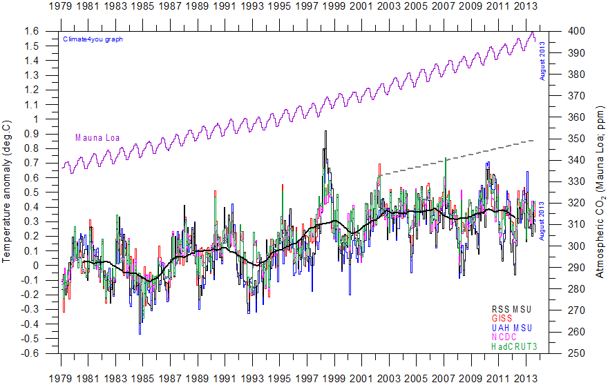
Superimposed plot of five different global monthly temperature estimates shown elsewhere. As the base period differs for the different temperature estimates, they have been normalised by comparing to the average of the initial 60 months (5 years) from January 1979 to December 1983. Click here to go to the associated comparison of these five temperature records. The heavy black line represents the simple running 37 month (c. 3 year) mean of the average of all five temperature records. The graph showing the amount of atmospheric CO2 is based on data from the Mauna Loa station, Hawaii, see also above. For the first two decades in the 21th century a warming of about 0.2°C per decade is projected for a range of SRES emission scenarios according to the 2007 IPCC Summary for Policymakers (p.7 and Fig.SPM.5). For comparison, the rate of this projected temperature increase is shown by the grey stippled line. Last month shown: August 2013. Last diagram update: 2 October 2013.
In
the diagram above five different well-known global
monthly temperature estimates are shown since January 1979, together with
the monthly atmospheric CO2 concentration, according to the Mauna Loa
measurement station, Hawaii. The estimated annual CO2 growth rates for
The year 1979 roughly marks the beginning of the late 20th century period of global warming, after termination of the previous period of global cooling (from 1940). According to the 2007 IPCC report the time window shown is a period characterised by an accelerating global temperature rise, due to increases in atmospheric carbon dioxide and other greenhouse gases. Finally, the year 1979 also represents the beginning of the satellite temperature measurements.
In the diagram above the scales for temperature and CO2 have been chosen to generate an identical overall visual slope of both CO2 and temperature, and the global temperature is seen to increase slowly in concert with the increase of atmospheric CO2. At the same time, however, it is clear that there are a number of 2-5 year long temperature variations superimposed on the general increase. Some of these variations can be explained by oceanographic variations ( e.g. 1998) or volcanic activity (e.g. 1992).
Towards the end of the data series, in the early 21st century, it appears that a new temperature development has begun, deviating from what might be expected from the general CO2 increase. The question remains if this is just another short-lived deviation, and that the global temperature will soon resume its previous increase, or is this the onset of a more significant change in the global temperature development, and consequently, in the relation between global temperature and atmospheric CO2 content ?
To investigate this, a somewhat longer time perspective may be considered (see diagram below).
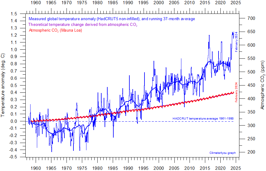
Diagram showing the HadCRUT5 monthly global surface air temperature estimate (blue) and the monthly atmospheric CO2 content (red) according to the Mauna Loa Observatory, Hawaii. Purple line (running along red CO2 curve) shows theoretical temperature change due to changing atmospheric CO2. The Mauna Loa data series begins in March 1958, and 1958 has therefore been chosen as starting year for the diagram. Reconstructions of past atmospheric CO2 concentrations (before 1958) are not incorporated in this diagram, as such past CO2 values are derived by other means (ice cores, stomata, or older measurements using different methodology), and therefore are not directly comparable with modern atmospheric measurements. Last month shown: December 2024. Last diagram update: 30 January 2025.
In the diagram above monthly surface air temperature (HadCRUT3) and atmospheric CO2 concentration (Mauna Loa) are shown back to 1958. Once again, the scales for temperature and CO2 has been chosen so temperatures visually follow the rise of atmospheric CO2 since about 1977. The most relevant temperature dataset to use is presumably satellite observations from the altitude corresponding to an infrared optical depth near 1 (Lindzen 2007). However such satellite data are not available before 1979, so the somewhat less suitable surface measurements (2 m altitude) are used here instead.
Considering the diagram above, the general global surface temperature development is again seen to deviate from the CO2 rise since the turn of the century. In addition, another period of visual deviation is now seen before 1977, reaching back in time at least to the beginning of the modern atmospheric CO2 measurements in 1958. Apparently, the period of positive correlation between the amount of atmospheric CO2 and global temperatures are limited to the approximate time window 1977-2001.
To investigate the potential significance of this visual impression, all monthly HadCRUT3 temperatures were plotted against the monthly Mauna Loa measurements in the diagram below.
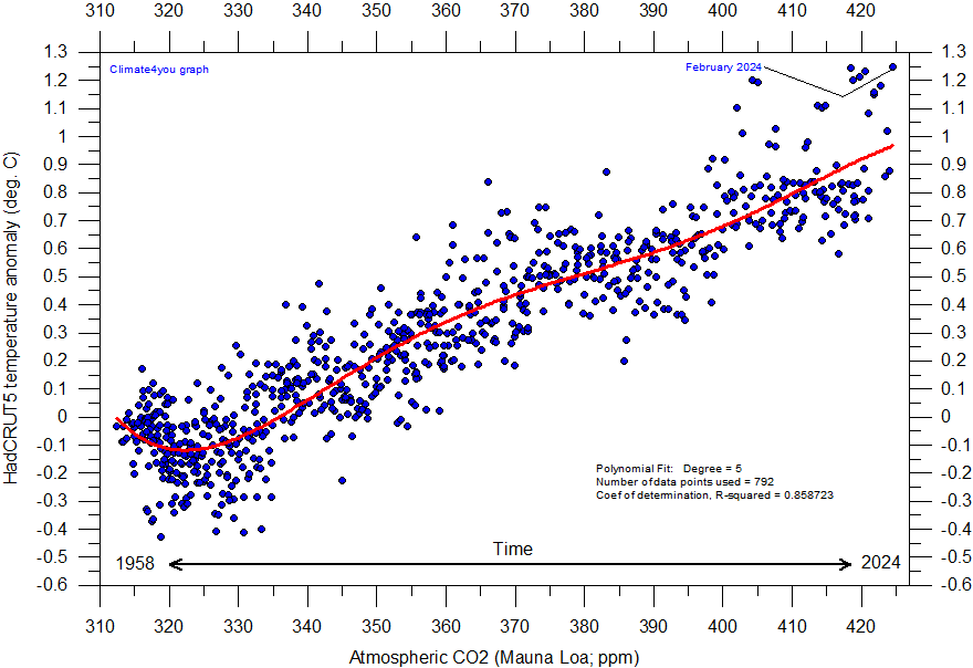
Diagram showing HadCRUT5 monthly global surface temperature estimate plotted against the monthly atmospheric CO2 content according to the Mauna Loa Observatory, Hawaii, back to March 1958. The red line is a polynomial fit with key statistics listed in the lower right part of the diagram. Last month included in analysis: December 2024. Last diagram update: 30 January 2025.
The diagram above shows all HadCRUT3 monthly temperatures plotted against the monthly Mauna Loa CO2 values, since the initiation of these measurements in 1958. As the amount of atmospheric CO2 have risen steadily since 1958, although with annual variations, the oldest values of temperature and CO2 are plotted close to the left side of the diagram, and more recent values are progressively plotted towards the right side of the diagram.
By this, the diagram illustrates that the overall relation between atmospheric CO2 and global temperature apparently has changed several times since 1958.
In the early part of the period, with CO2 concentrations close to 315 ppm, an increase of CO2 was associated with decreasing global air temperatures. When the CO2 concentration around 1975 reached 325 ppm this association changed, and increasing atmospheric CO2 was now associated with rising global temperatures. However, when the CO2 concentration at the turn of the century reached about 378 ppm, the association possibly changed back to that characterizing the period before 1975, before apparently changing again around 2014. This, however, may be an effect of the 2015-16 El Niño. Time will show.
The diagram above thereby suggests that CO2 can not have been the dominant control on global temperatures since 1958. Had CO2 been the dominant control, periods of decreasing temperature (longer than 2-5 years) with increasing CO2 values should not occur. It might be argued (IPCC 2007) that the CO2 dominance first emerged around 1975, but if so, the recent breakdown of the association around 2000 should not occur, either.
Consequently, the complex nature of the relation between global temperature and atmospheric CO2 since at least 1958 therefore represents an example of empirical falsification of the hypothesis ascribing dominance on the global temperature by the amount of atmospheric CO2. Clearly, the potential influence of CO2 must be subordinate to one or several other phenomena influencing global temperature. Presumably, it is more correct to characterize CO2 as a contributing factor for global temperature changes, rather than a dominant factor.
Click here to jump back to list of contents.
20120128: Reflections on effects of the NCDC and GISS transition to GHCN version 3
On May 2, 2011, NCDC transitioned to GHCN-M version 3 as the official land component of its global temperature monitoring efforts. GHCN-M version 2 mean temperature dataset will be updated through May 30, 2011, but no later support for this version of the dataset will be provided. The net effect of the change from version 2 to 3 for the NCDC global temperature estimate can be seen in the diagram below.
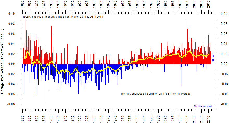
Net temperature effect on the NCDC global temperature estimate of the 2 May 2011 transition from GHCN-M version 2 to version 3 as the official land component of NCDC's global temperature monitoring efforts. The vertical lines indicate the net effect on monthly temperature values, and the yellow line shows the simple running 37 month average, nearly corresponding to 3 years. The GHCN-M version 2 mean temperature dataset will be updated through May 30, 2011, but no later support for this version of the dataset will be provided.
The overall net effect of the transition from GHCN-M version 2 to version 3 is to increase global temperatures before 1900, to decrease them between 1900 and 1950, and to increase temperatures after 1950. By this the 20th century temperature rise is about 0.04 oC larger in the new version 3 compared to the previous version 2 of the NCDC record. An additional version change took place in November 2011, enhancing this temperature rise effect even more.
From late November 2011 also the GISS surface temperature estimate is based on the adjusted GHCN version 3 data. Graphs comparing results of the GISS analysis using GHCN v2 and v3 are available on the GISS homepage for inspection, and in addition to this, the diagram below displays the net effect on the GISS global temperature estimate of the recent transition.
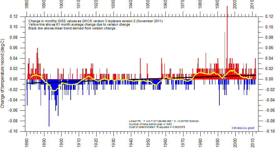
Net effect on the global GISS global temperature estimate of the November transition from GHCN version 2 to version 3. The vertical lines indicate the net effect on monthly temperature values, and the yellow line shows the simple running 61 month average, nearly corresponding to 5 years. The black line is the linear trend calculated for the changes introduced. Click here for a larger version of the diagram.
The overall effect of the change introduced in the GISS record is towards lover temperatures in the early part of the record, and higher in the latter part. The net result is therefore an enhancement of the overall global temperature rise since 1880, along with a certain flattening of the mid-20th century warm period.
Apparently the recent version change also resulted in some significant changes for individual station data series available from the GISS database, which raises a number of concerns. One of the individual records which has been exposed to such unexpected 'adjustments' is the Reykjavik (Iceland) monthly surface air data series. In the diagram below the official Reykjavik data series kindly provided by the Icelandic Met Office is shown in blue and the corresponding GISS data series in red. GISS offers three version of each station data series, of which the 'after removing suspicious records' is the default choice. This is the GISS Reykjavik data series shown in the diagram below.
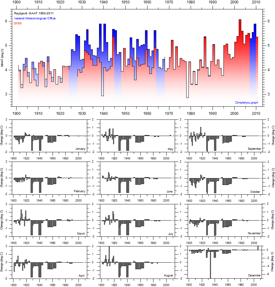
The mean annual surface air temperature 1900-2011 in Reykjavik according to the Icelandic Met Office (blue, upper panel) and the corresponding GISS data series after removing suspicious records (red, upper panel). The lower panels show the GISS adjustments introduced for the individual months. Apparently the process of removing suspicious records has resulted in a high number of monthly adjustments of exactly -0.8 and -1.8 oC, especially between 1923 and 1963. The biggest adjustment made is for December 1933, which has been adjusted with -6.9 oC. Some years are missing in the GISS data series, which is indicated by breaks in the red diagram. Click here for a larger version of the diagram.
The warm period around 1940 in Reykjavik ( see upper panel in diagram above) has entirely been removed by the new GISS adjustments, whereby a more uniform temperature increase throughout the 20th century is obtained, in concert with the atmospheric CO2 increase.
The diagram below shows the monthly adjustments of the Reykjavik temperature data series in a different visual way, calculated by comparing the official monthly data series from the Icelandic Met Office with the corresponding 'GISS data series entitled 'after removing suspicious records'.
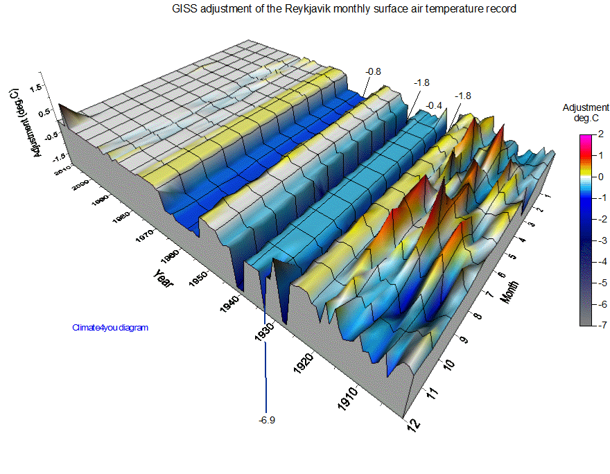
Year-month distribution of the monthly adjustments of the Reykjavik temperature data series, calculated by comparing the official monthly data series from the Icelandic Met Office with the corresponding 'GISS data series entitled 'after removing suspicious records'. The frontal scale indicate the year, and the other horizontal scale the individual months (1 = January, 2 = February, etc.). The magnitude of the adjustment made is shown by the z-axis. Click here for a larger version of the diagram.
It is difficult to understand the background for the number and magnitude of adjustments introduced in the GISS 'after removing suspicious records' data series, especially as the resulting data series differs significantly from the official Icelandic data series. Hopefully, the details of these (and others) adjustments will later be thoroughly explained by GISS. Such large and uniform adjustments will inevitably make the GISS data series (and NCDC) appear less reliable and useful than previously. In comparison to these two surface temperature series the HadCRUT3 data series until now clearly stands out as being much more stable over time.
At the moment it is not known how many other station records accessible from the GISS database have undergone similar adjustments as the above Reykjavik data series.
Along with the recent transition of GISS to the new GHCN version 3 the option of downloading raw (unadjusted) temperature data from the GISS site has disappeared. This is unfortunate, as the daily user of the GISS service then is cut off from studying the original data series for the individual stations.
The interested reader may instead access unadjusted station data from the fine Rimfrost database, including the data series from Reykjavik. A comparison of these data with the official data from the Icelandic Met Office shows the Rimfrost data to be identical to the official Icelandic data.
Click here to jump back to list of contents.
20120201: GISS corrections of the Nuuk Greenland surface air temperature record
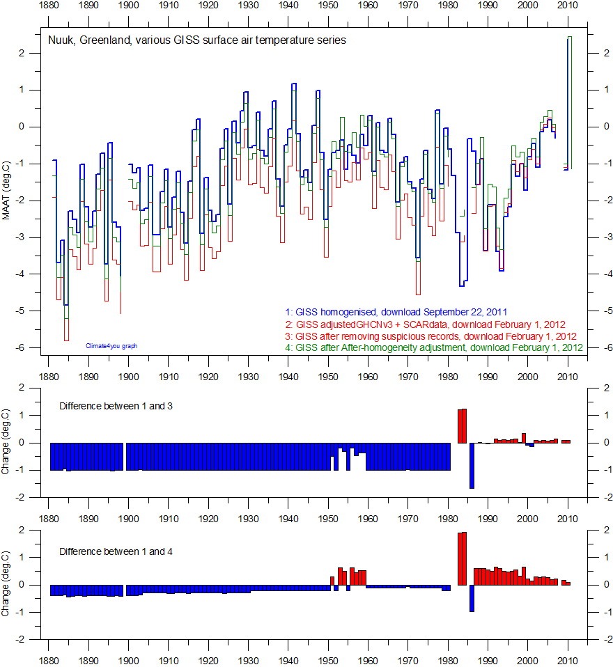
Four versions of the GISS mean annual air temperature (MAAT) data series (upper panel), with changes introduced since September 2011 (lower panels). The 'Adjusted GHCNv3 + SCARdata' and 'After removing suspicious records' series are identical. Click here for a larger version of the diagram.
Also the MAAT record for Nuuk, Greenland, has recently (November-December 2011) been exposed to some major changes. In the diagram above the blue graph (1) represents homogenised data downloaded from the GISS database on September 22, 2011, while the red (2 and 3) graph shows GISS data downloaded on February 1, 2012, 'Adjusted GHCNv3 + SCARdata' and 'After removing suspicious records', and the green graph (4) shows GISS 'After GISS-homogeneity adjustment' data, respectively. The two series 2 and 3 are identical. The two panels below show the difference between series 1 and 3, and 1 and 4, respectively.
The net result of the changes made is to make the warm period in west Greenland around 1940 appear less pronounced in series 2,3 and 4, compared to the older MAAT-series (1). In addition, the adjustments make the overall temperature change since 1880 as shown by 2, 3 and 4 to appear in better harmony with the atmospheric CO2 increase.
The changes made are significant and unfortunately difficult to understand. As an example, is is entirely unclear why a correction of exactly -1 oC has been applied for almost all years before 1980 for the 'After removing suspicious records' and 'Adjusted GHCNv3 + SCARdata' series? First, why should series 1 be adjusted? Secondly, it is difficult to understand the magnitude of adjustments, and why the adjustment exactly is -1 oC for almost all years before 1980?
Note added March 13, 2012: It is now again possible to download GISS version 2 data on this link; click here.
Click here to jump back to list of contents.