Year 2000 AD - today
-
2001-2003: Jakobshavn Isbræ in West Greenland retreats rapidly
-
2006: Winter storm Narve in Northern Norway and record high temperature in Svalbard
-
2007: The Met Office Hadley Centre forecasts climate until 2014
-
2007: Scientists find evidence for subsea volcanic blast of CO2
-
2008: Coastal erosion prompts Inuits in
-
2008: Half the years between 2009 and 2014 forecasted as being warmer than 1998
2001-2003:
Jakobshavn Isbræ in West Greenland retreats rapidly


Frontal positions of calving Jakobshavn Isbræ since 1851, after reaching the maximum Little Ice Age position around 1850 (Bauer et al. 1968). Between 1893 and 2003 the glacier front retreated about 34 km. According to inuit legends, the embayment Tissarissoq used to be glacier-free in the past and was used as hunting area (Hammer 1883), most likely before before the Little Ice Age glacier advance (Weidick et al. 2004). Picture source: Google Earth.
The Disko Bay region in central West Greenland (c. 70oN) is characterised by large outlet glaciers from the Greenland Ice Sheet (the Indland Ice). The major glacier Jakobshavn Isbræ is situated in a major subglacial valley, which can be traced inland for about 100 km (Echelmeyer et al. 1991). The water depth in the fjord reaches 1500 m in its outer parts (Iken et al. 1993).
Jakobshavn Isbræ is the main outlet glacier from the Greenland Ice Sheet, draining ice from about 6.5% of the total area of the ice sheet, and producing 30-45 km3 icebergs per year. This corresponds to more than 10% of the total output of icebergs from the Greenland Ice Sheet, and the Jakobshavn Isbræ is the most productive glacier in the northern hemisphere. The glacier flow velocity is also high, typically 20-22 meters per day. It is likely that the iceberg which sank Titanic in 1912 may have been produced by Jakobshavn Isbræ.
The first half of the 20th century was characterised by a 11 km frontal retreat of calving Jakobshavn Isbræ, following warming after the end of the Little Ice Age. During the latter half of the 20th century the glacier front was in an almost stable position, standing across a broad section of the fjord. Presumably, the quasi-stable glacier front position was influenced by the subglacial topography (Echelmeyer et al. 1991; Weidick 1992).
During the period 1850-1950 it has been estimated the the Jakobshavn Isbræ lost more than 200 m in ice thickness (Weidick 1992), gradually making is more easy for the glacier to float. Also between 1960 and 1980 the glacier thinning proceeded (Echelmeyer et al. 1991). Between 1993 and 1998 a slight thickening may have taken place (Abdalati et al. 2001), but from 1998 rapid thinning again dominated, spreading inland. The reduced ice thickness gradually made the glacier more prone to floating and thereby rapid calving, and around the year 2000 substantial changes of the calving front were therefore expected to take place (Weidick et al. 2004).
The expected rapid calving retreat took place from 2001 to 2003. In 2002 people living in Ilulissat observed unusually many icebergs in the icefjord, and observations carried out in 2003 further inland showed the floating glacier front to have retreated many kilometres (see picture above). At the same time, however, the position of the land-based glacier front of the ice sheet north and south of the floating glacier front has been stable. Thus, the spectacular calving retreat 2001-2003 should not be seen as a direct result of meteorological conditions during this short period, but instead reflects developments over a longer period. In addition, the depth and geometry of the fjord also influences on the retreat rate. Finally, the early 21st century air temperature in West Greenland is still clearly below what was recorded around 1940. Click here to see the entire temperature record from the capital at Nuuk, south of Jakobshavn.
Descriptions of the previous retreat of the glacier Jakobshavn Isbræ during the periods 1851-1893 and 1893-1942 can be found here and here, respectively.
Click here to jump back to the list of contents.
2002:
New knowledge obtained on Kilimanjaro glaciers 
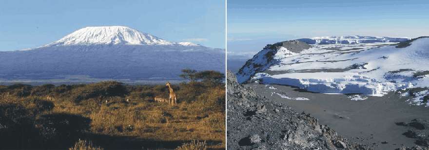
The stratovolcano Kilimanjaro (5895 m asl.) in northeastern Tanzania (left). The Furtwängler Glacier on the summit plateau of Kilimanjaro (right). The vertical ice cliffs are about 40 m high.
Kilimanjaro (5895 m
asl.) is an inactive stratovolcano in northeastern Tanzania, near the border to
Kenya. Kilimanjaro is also the tallest
free-standing mountain in the world, rising 4,600 m from the surrounding
plains. The first official climb of the highest summit was on 6 October 1889 by
the German Hans Meyer, the Austrian Ludwig Purtscheller, guided by the Marangu
army scout Yohanas Kinyala.
The
glaciers on Kilimanjaro have attracted much recent interest, especially in
relation to global temperature changes. The Furtwängler Glacier (see illustration above) is located near the
summit, and is a remnant of a bigger icecap which once crowned the summit of
A detailed analysis of six ice cores retrieved from the ice fields on the summit of Kilimanjaro shows that those glaciers began forming about 11,700 years ago (Thompson et al. 2002). The ice core records from the Furtwängler Glacier suggests conditions at the Summit of Kilimanjaro today are returning to those characteristic for the site 11,000 years ago.
For decades it has been known that solar radiation and sublimation, not air temperature, are the primary factors for loss of ice from tropical glaciers. In the tropics glaciers exist only at the highest elevations, and their size is controlled more by seasonal changes in precipitation than by air temperatures. Observations of the volume change of glaciers on Kilimanjaro suggest their total volume had already decreased by 66 percent from 1889 to 1953.
The balance between energy inputs and energy outputs are important to understand 20th century glacier reduction at Kilimanjaro. The primary input of energy is short-wave solar radiation, while ice loss is primarily by way of sublimation, the transition of ice directly to water vapour. Because neither solar radiation and sublimation depends primarily on surface air temperatures, air temperature change does not have a big role in the loss of ice from tropical glaciers. That this also applies to glaciers on Kilimanjaro can be seen from the fact that the ice on Kilimanjaro forms high vertical walls (see illustration above) and finger-like features called penitents (see illustration below), the result of sublimation driven by direct radiation from the sun, rather than ablation caused by warm air.
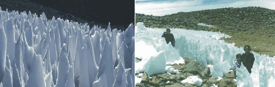
Examples of ice and snow
penitentes from tropical areas. The individual blades are between 1.5 and 2m in height, but may be as high
as several meters. Because penitentes are formed by sublimation driven by direct
solar radiation, their axis indicate the approximate position of the sun at noon
at this latitude and time of the year.
A
prolonged dry period may be responsible for the shrinking glaciers on
Kilimanjaro.
Kaser et al (2004) found that a marked drop in
atmospheric moisture at the end of the 19th century and the ensuing drier
climatic conditions are likely to represent the main driver for 20th century
glacier retreat on Kilimanjaro. Independent
surface observations of water levels from nearby
The ice core from from
the Furtwängler Glacier
(Thompson et al. 2002) yield evidence
of three catastrophic droughts in the tropics 8,300, 5,200 and 4,000 years ago.
The ice core also suggest a much wetter environment near Kilimanjaro 9,500 years
ago, contemporary with the existence of Megalake Chad. The ice core also showed a 500-year period beginning around 8,300
years ago when methane levels in the ice dropped rapidly, suggesting that
several lakes of
In addition, the ice core showed
an abrupt depletion in oxygen-18 isotopes that may signal a second drought event
occurring around 5,200 years ago (Thompson et al.
2002). This coincides with the period when anthropologists believe people in
the region began to come together to form cities and social structures. Prior to
this, the population of mainly hunters and gatherers had been more scattered. A
third marker type in the ice cores is a visible dust layer dating back to about
4,000 years ago (Thompson et al. 2002). This
is interpreted as marking a severe 300-year drought which struck the region.
Historical records show that a massive drought hit the Egyptian empire at the
time and threatened the rule of the Pharaohs. Until this time, people in
Click here to jump back to the list of contents.
2006:
Winter storm Narve in Northern Norway and
record high temperature in Svalbard 
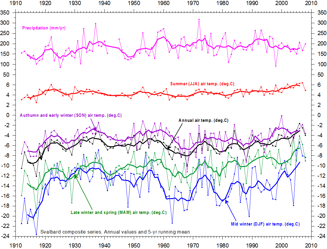

Examples of weather related news from different part of Russia and Europe during the period 16-23 January 2006.
The severe January 2006 winter storm named 'Narve'
created chaos in especially northern Norway, but also larger of Norway, Sweden
and Finland were affected. In the press it was presented as an example of 'extreme
weather'.
The wind over a period of several days from 15 January increased from
southerly and southeasterly direction, developing into a strong storm, almost
reaching hurricane-like conditions during 19 January. The storm was not
associated with much precipitation in northern Norway, but with air temperatures
down to -25oC, exposing people to serious wind chill and frostbites.
Many buildings were damaged by the wind and by flying debris. At the same time a
new high temperature record of was reported for Svalbard (78oN),
about 1000 km north of Norway. Many powerlines in northern Norway came down, and large areas, including the
cities of Tromsø and Kirkenes lost electricity and heating. In southern Norway
the southeasterly wind resulted in an ongoing blizzard for orographic reasons,
as the air masses were lifted across the highlands after flowing across the
ice-free sea south of Norway, picking up additional moisture. Also in this part of Norway powerlines failed, not
so much because of the wind, but because of excessive amounts of snow. The storm
lead to major disturbances for both railways and air traffic. Several major
highways were closed because of large snowdrifts, and schools had to be evacuated
both in southern and northern Norway. Narve lasted to 21 January, before slowly beginning to abate. Because of the
duration and strength, the storm immediately earned itself a place on the
official list of 'extreme
weather in Norway', indicating the special status of this meteorological
event.
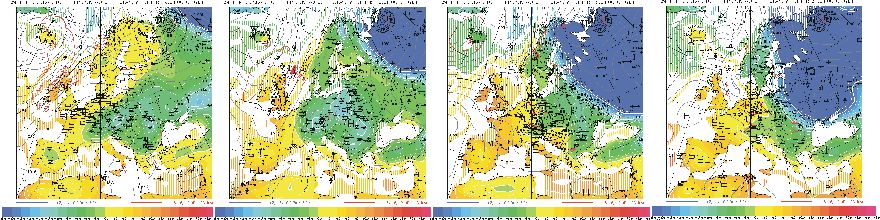
Weather maps showing surface air pressure and surface air temperatures over Europe 12, 16, 18 and 21 January 2006. Solid lines indicate lines of equal air pressure (isobars) and the colours indicate the temperature in degrees C. Sub-zero air temperatures are shown with green and blue colours, while above-zero temperatures are shown by yellow and red colours. Over the period the high pressure area with low air temperatures are seen to extent across eastern Europe, concentrating thermal and pressure contrasts over northern Norway and Sweden. Source: Universität zu Köln, Institut für Geophysik und Meteorologie.
The meteorological background for this storm was a large east-west air pressure gradient across northern Norway, because of a low pressure area over the North Atlantic and a high pressure over Russia and Finland. Actually, the high pressure area was a westerly extension of the Siberian high pressure area, which increased in extension to cover parts of eastern Europe as well because of extreme cold in Siberia and Russia.
The record high air temperatures recorded in Svalbard was caused by the southerly air flow across the warm waters of the North Atlantic Drift, warming up the air masses before reaching Svalbard. The strong southerly winds also pressed the southern limit of Arctic sea ice around Svalbard further north than usual.
By this, both the new air temperature record in Svalbard and the northerly position of the sea ice limit was a result of the extended position of the Siberian high pressure. Unfortunately, this greater meteorological perspective was never clearly communicated by the relevant meteorological institutions. Therefore, many people even today see both features as the result of global warming. In reality, they were both results of cold conditions in Russia and Siberia.
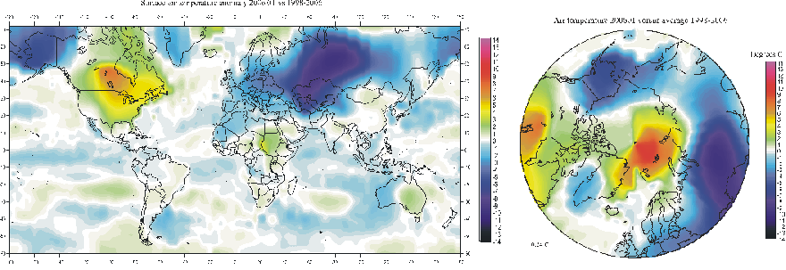
Maps showing the anomaly of surface air temperatures January 2006, compared to average conditions 1998-2006. Much of the northern hemisphere was colder than average, especially Alaska, Siberia, Russia and Europe. In contrast, USA and Canada experienced warmer than average conditions, as did an area extending from northeast Greenland across Svalbard to the Taymyr peninsula in northernmost Siberia. This warm regional anomaly is the result of persistent airflow from SW across the North Atlantic, along the western extension of the Siberian high pressure (see diagrams above). By this, this part of the Arctic experienced above average temperatures in January 2006, leading to the above mentioned temperature record in Svalbard. Temperature scale in degrees Celsius. Data source: NASA Goddard Institute for Space Studies (GISS).
Click here to jump back to the list of contents.
2007:
The Met Office Hadley Centre forecasts climate until 2014

News
release 10 August 2007:
The forecast for 2014...
The
new model incorporates the effects of sea surface temperatures as well as
other factors such as man-made emissions of greenhouse gases, projected
changes in the sun's output and the effects of previous volcanic eruptions
— the first time internal and external variability have both been
predicted.
Team
leader, Dr Doug Smith said: "Occurrences of El Nino, for example,
have a significant effect on shorter-term predictions. By including such
internal variability, we have shown a substantial improvement in predictions
of surface temperature." Dr Smith continues: "Observed relative
cooling in the Southern Ocean and tropical Pacific over the last couple of
years was correctly predicted by the new system, giving us greater
confidence in the model’s performance".
Click here to jump back to the list of contents.
2007:
Scientists find evidence for subsea volcanic blast of CO2
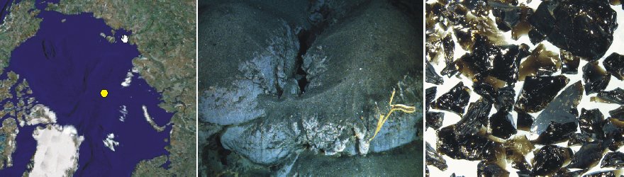
Location of Gakkel Ridge in the Arctic Ocean (yellow dot; left). Fine-grained volcanic debris blanketing the seafloor on the Gakkel Ridge. Grains like these are usually ejected by explosive eruptions and eventually settles through the water onto the seafloor (centre). Glassy, granular fragments of volcanic debris, providing evidence that volcanoes on the Arctic Ocean seafloor had erupted violently (right). Picture source: Google Earth and Carlowicz (2008).
Operating
from the Swedish icebreaker Oden, a research team led by Woods
Hole Oceanographic Institution in 2007 uncovered evidence of explosive
volcanic eruptions on the
“These are the first pyroclastic deposits we've ever found in such deep
water, at oppressive pressures that should inhibit the formation of steam,
and many people thought this was not possible,” said Rob Reves-Sohn, chief
scientist of an expedition to the Gakkel Ridge in July 2007. “This means
that a tremendous blast of carbon dioxide was released into the water column
during the explosive eruption.”
Click here to read more about volcanoes.
Click here to jump back to the list of contents.
2008:
Coastal erosion prompts Inuits in Alaska to sue oil and gas companies
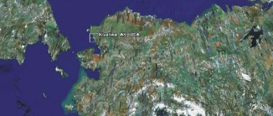
The location of the settlement Kivalina (ca. 68N, 165W) in northwestern Alaska. Kivalina is located on the northeastern shore of the Bering Strait. Easternmost Siberia is seen to the left. The picture measures about 2500 km from left to right. Source: Google Earth.
Inuits living in the
coastal settlement Kivalina in northwestern
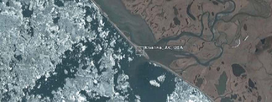
Arial photo of Kivalina, showing the partly ice covered Beiring Strait to the left, and land with rivers and lakes to the right. Kivalina is seen to be located on the coastal barrier island, separated from the mainland by a lagoon. The picture measures about 10 km from left to right. North is up. Source: Google Earth.
From a geomorphological point of view, the setting of Kivalina is interesting. The press release say that Kivalina is located on the tip of a barrier reef. This is not the case. The picture above shows the settlement to be located on a coastal barrier island (or shoal), caused by wave action, and thus demonstrating the occurrence of one or several previous periods with extensive open water conditions in the area, extensive enough to generate big waves. If not so, there would have been no barrier island to establish the settlement on. Thus, the present conditions with relatively little sea ice has most likely occurred one or several times before. Actually, in August 1728 Vitua Bering came close to Kivalina, sailing in open water.
The barrier island on which Kivalina is located must be a relatively new landscape feature, geologically speaking. It is adjusted to the present relative sea level (relative to the land), which in this area probably was reached about 3000-4000 years ago. During this time interval the barrier island have been established by storms during previous open water situations.
Coastal barriers are notorious dynamic landforms, changing form, location and surface relief along with changes in wave activity, wind direction and -strength, and the supply of new sediments (usually sand) by rivers from the hinterland. In periods with high precipitation and high summer river discharge and resulting high sediment transport by rivers, coastal barrier islands tend to aggrade, while the opposite (erosion) dominates in periods with little supply of sediment by nearby rivers. Therefore, not only variations in sea ice, but also a number of other climatic and geomorphological factors control the fate of such delicate coastal features. Usually, coastal barrier islands are considered problematic locations for buildings, roads and other fixed installations. Especially locations near outlets from rivers or lagoons behind are exposed to rapid changes in the coastal outline.
In the Arctic mosquitoes represent a major nuisance, especially in July. Presumably the location for Kivalina was chosen to avoid mosquitoes from the many lakes in the hinterland, and to be close to the open sea during the open water period (summer). The number and outline of the numerous lakes in the hinterland signal the existence of permafrost in the area. Barrier islands tend to orient themselves perpendicular to the dominant wind direction during the open water period (summer). In the present case the prevailing summer wind direction apparently is from southwest, helping to keep the mosquitoes at bay in the hinterland, away from Kivalina.
Click here to jump back to the list of contents.
2008:
Half the years between 2009 and 2014 forecasted as being warmer than 1998
April
29, 2008, the fall in global temperatures led to a
news release from the UK
Met Office with the headline 'Is global warming all over?'
In the news release the present cooling is presented as an example of interannual variability, due to a number of natural factors, the single most important being the El Niño-Southern Oscillation or ENSO. The global climate is currently (April 2008) being influenced by the cold phase of this oscillation, known as La Niña. It is also stated that ten-year forecasts produced by the Met Office Hadley Centre captures this levelling of global temperatures in the middle of the decade, and that effectively La Niña has been masking the underlying trend in rising temperatures.
Finally,
it is stated that these same forecasts also predict continued and increased
warming into the next decade, with half the years between 2009 and 2014 being
warmer than the current warmest on record, 1998.
Click here to jump back to the list of contents.
2008:
Global solar wind plasma output at 50-yr low
NASA News Release 08-241 states the following about recent solar activity and potential consequences:
Ulysses Reveals Global Solar Wind Plasma Output At 50-Year Low
WASHINGTON -- Data from the Ulysses spacecraft, a joint NASA-European Space Agency mission, show the sun has reduced its output of solar wind to the lowest levels since accurate readings became available. The sun's current state could reduce the natural shielding that envelops our solar system.
"The sun's million mile-per-hour solar wind inflates a protective bubble, or heliosphere, around the solar system. It influences how things work here on Earth and even out at the boundary of our solar system where it meets the galaxy," said Dave McComas, Ulysses' solar wind instrument principal investigator and senior executive director at the Southwest Research Institute in San Antonio. "Ulysses data indicate the solar wind's global pressure is the lowest we have seen since the beginning of the space age."
The sun's solar wind plasma is a stream of charged particles ejected from the sun's upper atmosphere. The solar wind interacts with every planet in our solar system. It also defines the border between our solar system and interstellar space. This border, called the heliopause, surrounds our solar system where the solar wind's strength is no longer great enough to push back the wind of other stars. The region around the heliopause also acts as a shield for our solar system, warding off a significant portion of the cosmic rays outside the galaxy.
"Galactic cosmic rays carry with them radiation from other parts of our galaxy," said Ed Smith, NASA's Ulysses project scientist at the Jet Propulsion Laboratory in Pasadena, Calif. "With the solar wind at an all-time low, there is an excellent chance the heliosphere will diminish in size and strength. If that occurs, more galactic cosmic rays will make it into the inner part of our solar system."
Galactic cosmic rays are of great interest to NASA. Cosmic rays are linked to engineering decisions for unmanned interplanetary spacecraft and exposure limits for astronauts traveling beyond low-Earth orbit.
In 2007, Ulysses made its third rapid scan of the solar wind and magnetic field from the sun's south to north pole. When the results were compared with observations from the previous solar cycle, the strength of the solar wind pressure and the magnetic field embedded in the solar wind were found to have decreased by 20 percent. The field strength near the spacecraft has decreased by 36 percent. "The sun cycles between periods of great activity and lesser activity," Smith said. "Right now, we are in a period of minimal activity that has stretched on longer than anyone anticipated."
Ulysses was the first mission to survey the space environment over the sun's poles. Data Ulysses has returned have forever changed the way scientists view our star and its effects. The venerable spacecraft has lasted more than 18 years, or almost four times its expected mission lifetime. The Ulysses solar wind findings were published in a recent edition of Geophysical Research Letters.
The Ulysses spacecraft was carried into Earth orbit aboard space shuttle Discovery on Oct. 6, 1990. From Earth orbit it was propelled toward Jupiter, passing the planet on Feb. 8, 1992. Jupiter's immense gravity bent the spacecraft's flight path downward and away from the plane of the planets' orbits. This placed Ulysses into a final orbit around the sun that would take it over its north and south poles.
The Ulysses spacecraft was provided by ESA, having been built by Astrium GmbH (formerly Dornier Systems) of Friedrichshafen, Germany. NASA provided the launch vehicle and the upper stage boosters. The U.S. Department of Energy supplied a radioisotope thermoelectric generator to power the spacecraft. Science instruments were provided by U.S. and European investigators. The spacecraft is operated from JPL by a joint NASA-ESA team.
More information about the Ulysses mission is available on the Web at: http://ulysses.jpl.nasa.gov
Click here, here, here and here for a few additional relevant links.
Click here to see the most recent estimates of the global temperature (monthly resolution).
Click here to jump back to the list of contents.
2009:
The the quietest sun seen in almost a century
The sunspot cycle from 1995 to the present (March 2009; NASA; left). Total solar irradiance calculated as the brightness summed across all wavelengths (NASA; right).
NASA Science News for April 1, 2009: The sunspot cycle is behaving a little like the stock market. Just when you think it has hit bottom, it goes even lower. 2008 was a bear. There were no sunspots observed on 266 of the year's 366 days (73%). To find a year with more blank suns, you have to go all the way back to 1913, which had 311 spotless days. Prompted by these numbers, some observers suggested that the solar cycle had hit bottom in 2008. Maybe not. Sunspot counts for 2009 have dropped even lower. As of March 31st, there were no sunspots on 78 of the year's 90 days (87%).
It adds up to one inescapable conclusion: "We're experiencing a very deep solar minimum," says solar physicist Dean Pesnell of the Goddard Space Flight Center. "This is the quietest sun we've seen in almost a century," agrees sunspot expert David Hathaway of the Marshall Space Flight Center.
Click here, here, here and here for a few additional relevant links. Click here to see the most recent estimates of the global temperature (monthly resolution).
Click here to jump back to the list of contents.
2010:
Blomstrandbreen in Svalbard begins new surge advance
Blomstrandbreen seen from SE on 10 August 2010. The central part of the glacier has developed a heavily crevassed surface and the glacier terminus has advanced about 150 m since August 2009.
In August 2002 Greenpeace launched a campain to exemplify how ongoing climate was affecting glaciers world-wide. One of the glaciers which at that time received much attention was Blomstrandbreen in NW Spitsbergen, Svalbard. Although there is little doubt that 20th century climate change since the end of the Little Ice Age in Svalbard have been unfavourable for glaciers in general, it was however pointed out in August 2002 by the present webmaster that Blomstrandbreen was not an optimal choice of glacier to demonstrate climate effects, as this particular glacier (as many glaciers in Svalbard) is a surge-type glacier. Surge type glaciers are characterized by short-lived, often spectacular advances, followed by longer periods of quiescence and retreat. In other words, the coupling between climate and frontal behaviour of such glaciers is complex and not yet fully understood. There are, however, ongoing research projects on Svalbard surge glaciers (Sund 2011) addressing this interesting research question.
As the surge character of Blomstrandbreen was pointed out in August 2002, an exchange of different opinions resulted, as exemplified by the reference list below. On this background is is interesting to note that Blomstrandbreen now apparently again have begun a new surge advance (see photo above). Presumably this recent advance started already in 2009, and in August 2010 the terminus had advanced about 150 m.
This demonstrates once again how careful one should be by comparing the position of glacier termini, and from this draw conclusions about climate change. While climate since about 1920 (end of the Little Ice Age in Svalbard) certainly has been unfavourable for Svalbard glaciers in general, the beginning decease of air temperatures since 2004-05 recorded at the nearby research facility Ny Ålesund and at Longyearbyen would hardly suffice to explain the recent advance of Blomstrandbreen.
Thus, in a glacier-climate context, one should compare the climatic development with the results of recurrent investigations on glacier mass balance and the resulting volume changes, and not with the frontal position. Otherwise, this may often result in misunderstandings and confusion, especially among people without glaciological training.
A list of recent glacier surges in Svalbard can be found here.
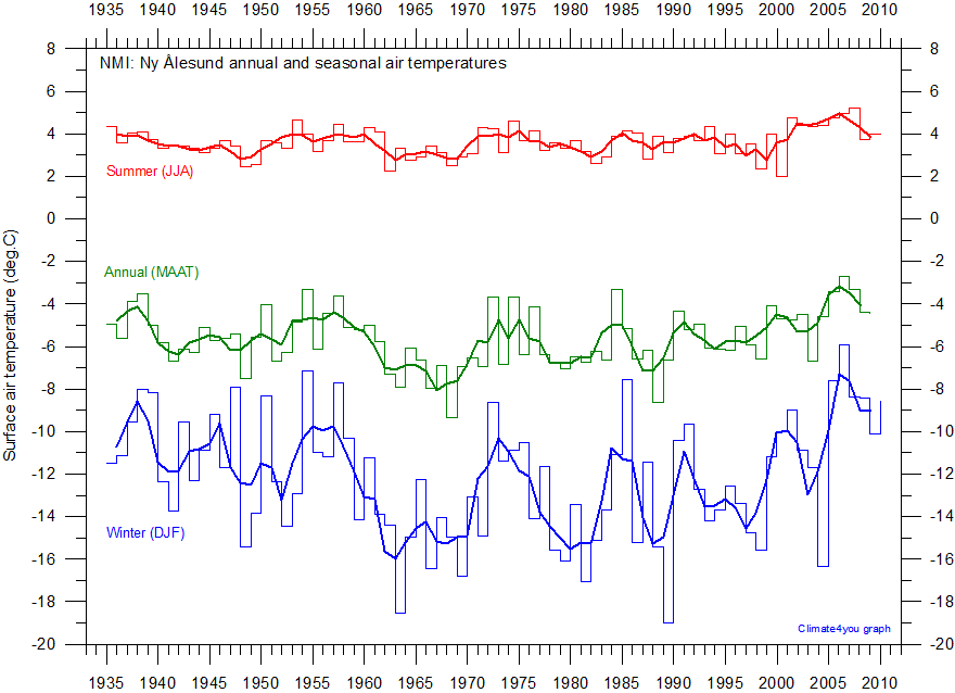
Annual and seasonal surface air temperature at Ny Ålesund, Spitsbergen, since 1935. The summer temperature is especially important for glacier loss of mass (melting, etc.). The data series is to short to demonstrate the warming at the end of the Little Ice Age around 1920, but the cooling since about 1935-40 until about 1980 and the following warming is clearly seen. The graphs are apparently dominated of a series of natural variations. Since about 2005 a renewed temperature decrease dominates. Data source: Norwegian Meteorological Institute.
References:
Greenpeace 2002. Arctic environment melts before our eyes. 7 August 2002.
Nordlyset 2002. Over breen og inn i banken. Editorial in Norwegian Newspaper 'Nordlyset', 20 August 2002.
Truls Gulowsen, Greenpeace, 2002. Klimaendringer er også menneskeskapt. Nordlyset, 9 September 2002.
Julian Isherwood 2002. Melting glacier 'false alarm'. Telegraph, 17 August 2002.
Humlum, O. 2002. Klima- og gletschergalop på Svalbard. Polarfronten 2002, 03, 13-14.
The Economist and the Greenpeace glacier photo stunt, 20 September 2006.
Sund M. 2011. SVALBARDGLACIER. A nice and useful site for those interested in glaciers in Svalbard.
Click here to jump back to the list of contents.
2014: Biblical floods in S and SE England January 2014
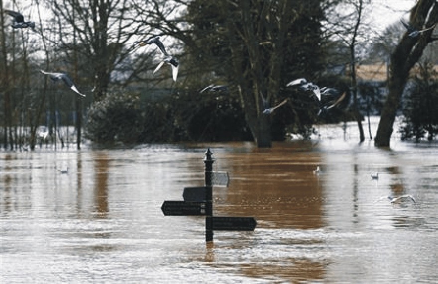
Birds fly past a sign surrounded by flood waters in Worester, central England, February 13, 2014 (Reuters)
Recent floods in southwest England and elsewhere have submerged crops and destroyed cattle bedding and feed, with the consequences likely to be felt for months, or even years, in terms of lower production of both crops and meat. Britain's Environment Agency had issued 416 flood warnings and alerts, as of early Thursday, including 16 under its most serious category, indicating danger to life. Thousands of acres of farmland in Britain are under water, with some submerged for weeks, although agricultural economists say it is too early to forecast how output might be affected (London, Reuters). The British Prime Minister David Cameron has described the floods as “biblical" in extent.
The flooding was apparently made worse than nessesary by unfortunate past administrative decisions. It has emerged that the UK Environment Agency rejected calls to dredge the flood-hit lower reaches of the Thames because of the presence of an endangered mollusc, making dredging of the Thames river bed ‘environmentally unacceptable’ due to the ‘high impact on aquatic species’. (Daily Mail, 13 February 2014).
This comes on the background that contingency planners apparently were advised by the UK Met Office to expect a dry winter 2013-14 less than four weeks before the heaviest rainfall in 250 years began. The official guidance to expect “drier than normal” conditions was issued in mid November, just weeks before the onset of one of the wettest new year period on record in England.
A very high number of people in SE and S England have been affected by this sad development. It once again shows how difficult it is to make reliable meteorological forecasts beyond very short periods. Nevertheless, it is still instructive to inspect the meteorological precipitation record for SE and S central England, which are the two regions most heavily affected by the recent floods (see maps below).
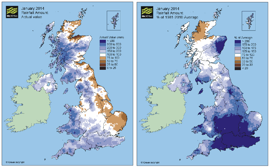
January 2014 precipitation in UK, absolute values to the left, and anomaly values to the right (base period 1981-2010). Source: Met Office.
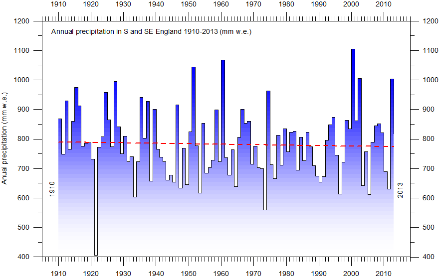
Annual precipitation in S and SE England 1910-2013. The annual values (mm w.e. = mm water equivalent) are shown by the blue columns, and the linear trend for the observation period by the red dotted line. Source: Met Office.
However impressive and distressing the present floods may appear, the precipitation record shows that there is no long term trend towards increasing annual precipitation in S and SE England (figure above). If anything, there is actually a weak trend towards slightly drier conditions over the entire observational period, although not statistical significant.
At first glance, the precipitation record may look quite uncomplicated, and without much interesting information to be gained except that this part of England on average has received about 800 mm w.e. annually since 1910. As expected, there are also large variations from one year to the next, but beyond that there may be little of interest to be seen from the record.
The substantial interannual variation in precipitation is highlighted by a very small AR(1)-value for the data series, about 0.05, indicating that there is very little connection between the value recorded for one year and the next. In a a statistical sense the signal represented in the data can therefore be be considered as a purely white noise signal, with almost no red noise present.
This is in strong contrast to temperature records, where one relatively warm year for obvious reasons tend to be followed by another warm year. This is also why the often made claim that it is highly unusual that the global temperature during the 2000-2009 decade has remained high has little scientific merit; this is simply to be expected because of high autocorrelation characterizing most natural temperature records.
However, as usual nature is trying to teach us something by way of data series, and this is also the case for the S and SE England precipitation series shown above. Consider the Fourier frequency analysis shown in the diagram below.
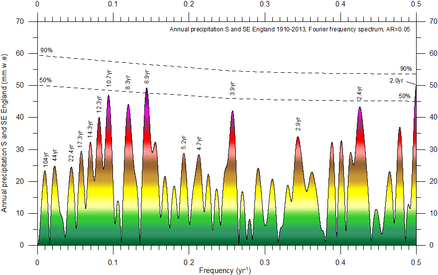
Fourier analysis (using Best Exact N composite algorithm) of the detrended precipitation series from S and SE England (diagram above). The horizontal stippled lines indicate peak-based critical limit significance levels (Humlum et al. 2011, 2012), while the color scale indicates increasing amplitude. The most important periods in the record are of about 10.7, 8.3, 6.9, 3.9 and 2.4 yr length, all with amplitude greater than 40 mm w.e. However, in a statistical sense, due to the very low autocorrelation and still limited length of the precipitation record, none of the peaks can be considered significant. Only frequencies lower than 0.5 yr-1 (periods longer than 2 years) are shown.
The spectral analysis shows the precipitation record to be characterized by a high number of peaks, of which none from a statistical point of view can be considered significant. This does not signify, however, that they are entirely without interest, but only that none of them can be considered unique or dominant because of the still limited record length (since 1910) and the high number of peaks present in the record.
Several of the most important periods are also identified in other independent types of records, which suggests that they are not artefacts but may represent real natural phenomena, potentially worth to consider. One immediate example is the 10.7 yr period, which is close to the well-known sunspot period.
Also the temporal dynamics of the above periods is worth to consider, as is illustrated by the following diagram.
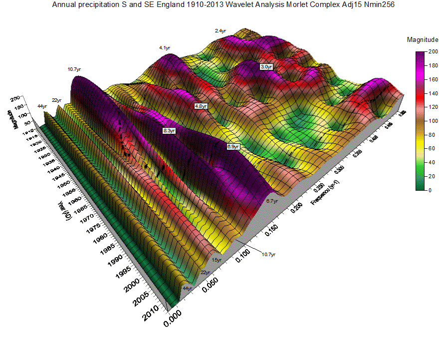
Diagram showing the continuous wavelet time-frequency spectrum for the S and SE England precipitation record. Time (AD) and frequency (yr-1) of cyclic variations embedded in the data are shown along the two horizontal axes. Frequencies higher than 0.5 yr-1 are not shown, corresponding to showing only periods longer than 2 yr. The vertical axis (and color scale) shows the component (magnitude) of the Continuous Wavelet Spectrum at a given time and frequency. The magnitude is calculated as sqrt(Re*Re+Im*Im), where Re is the real component of a given segment's FFT at a given frequency and Im is the imaginary component. Usually the magnitude is 3-4 times the corresponding amplitude. The dotted line indicates the extent of the cone of influence, where the magnitude of oscillations may be diminished artificially due to zero padding, especially towards the ends of the time scale.
The wavelet-diagram above shows that the 10.7 yr period was especially important for the annual precipitation in S and SE England until about 1940, after which the relative importance slowly diminished. The 10.7 yr period is, however, still visible in the diagram also in the most recent years.
Along with the relative loss of importance for the 10.7 yr period, a period of about 8.3 yr gained importance, until also this period began to lose relative importance around 1990. Along with this development an about 6.9 yr period can be seen to gain importance, and at the same time became slightly shorter with time, now about 6.7 yr. This period has large relative influence on the annual precipitation during the most recent years, and it is unlikely that it suddenly will lose relative importance within the next few years to come. The shorter periods also visible in the two above diagrams are temporally much more unstable, and tend to appear and disappear within few years, and therefore have little prognostic value.
Summing up, during the coming years the annual precipitation in S and SE England is likely to be under relatively strong influence (but far from entirely) of the 6.9-6.7 yr periodic variation. Based on a non-linear optimization to construct a sinusoidal model approximating the original data, it appears that this important period most likely will peak around 2014. Thus, it is likely that the following years will show a general trend towards somewhat lower annual precipitation values in this part of UK. Subsequently this development probably will be followed by another increase, and so on.
As
usual, time will show.
Click here to jump back to the list of contents.